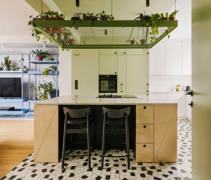
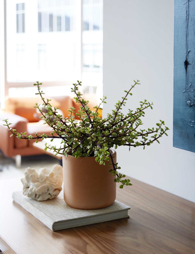
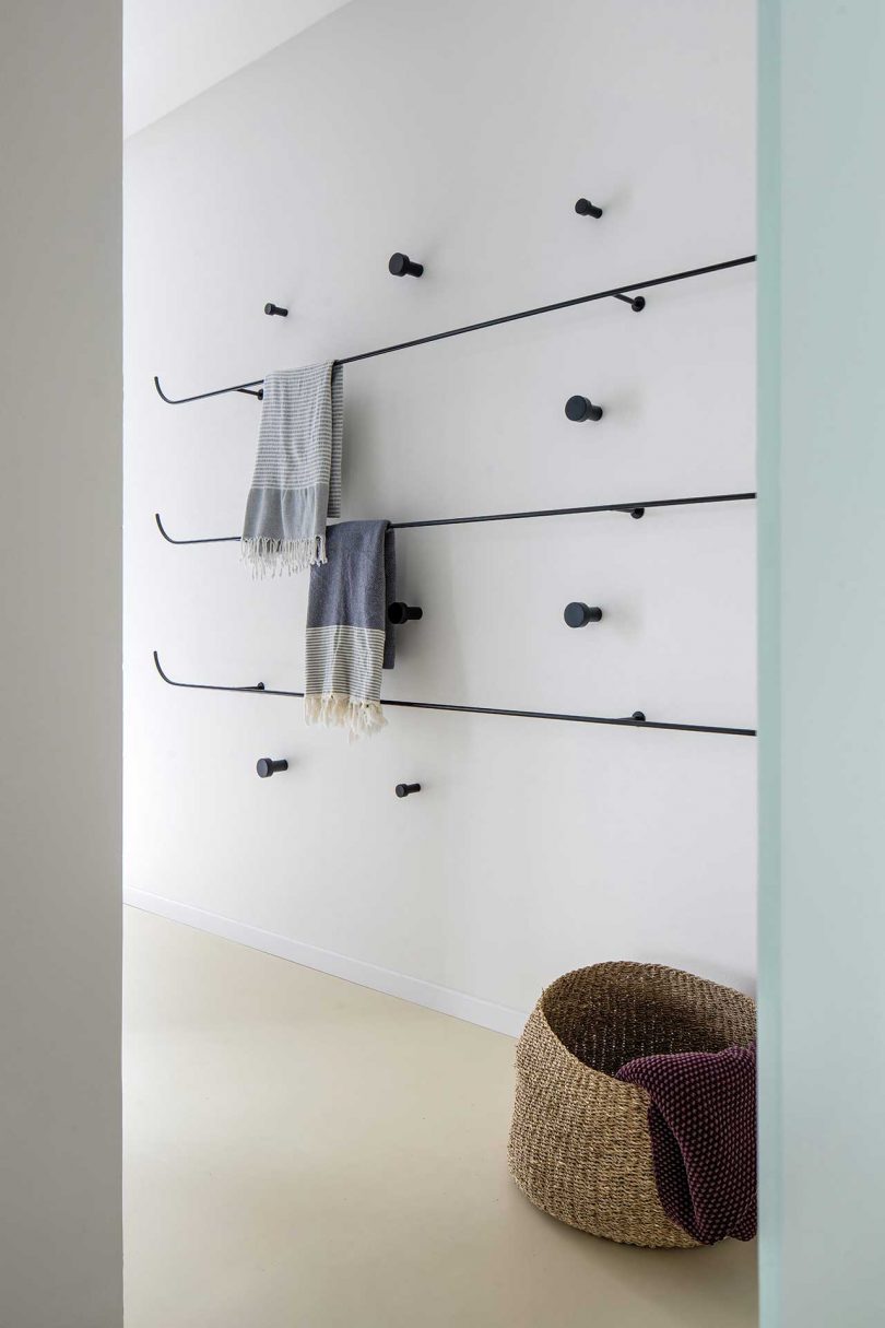
In Wroclaw, Poland is a lively terraced house that reflects the youthful energy of the couple who owns it. Designed by Znamy się for the owners, and their two dogs, who love to cook, entertain friends, and play board games. Drawing inspiration from the whimsical world of Playshapes (wooden blocks that can be moved, layered, or combined), this modern home now boasts a fusion of structures, forms, and vibrant colors that bolster creativity, socializing, and play.
The new interior holds many elements that allow the owners to play with form. Moveable furniture sets the stage with shelves on wheels that enable the couple to create flexible arrangements and new spaces. The kitchen island is not only the place for food prep and cooking, it stores board games and houses water dispensers for their beloved dogs. The dining table’s top lifts to play games and work puzzles.

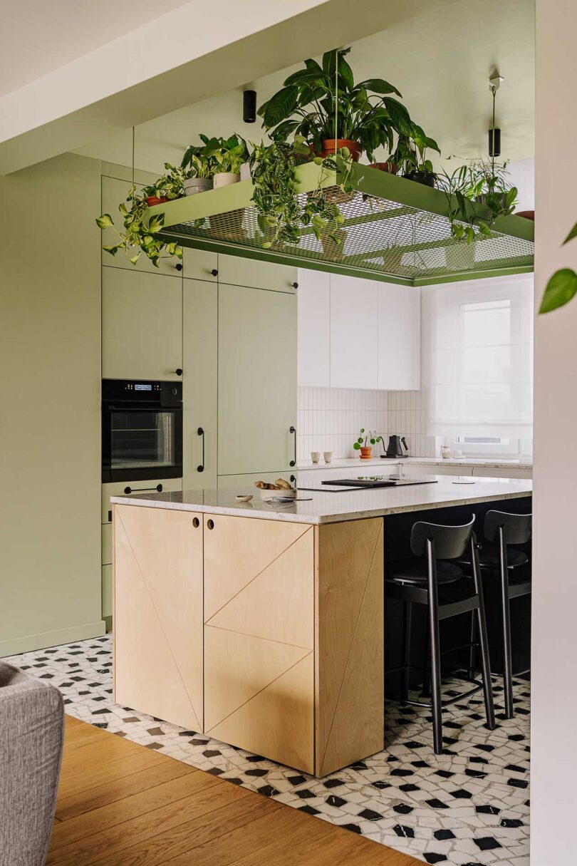
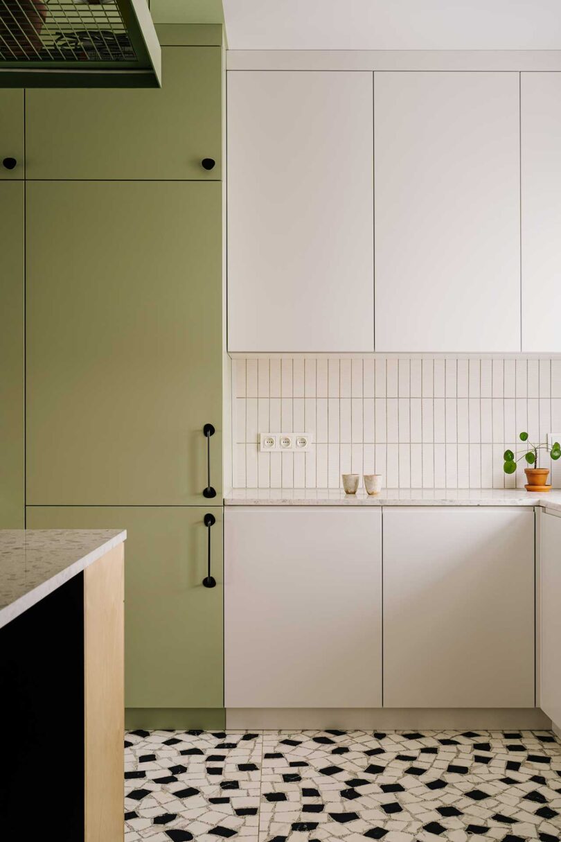
Geometric shapes and a strong palette of colors intertwine forming layered spaces rich in textures and visual intrigue. The inclusion of lots of wooden elements gives nod to Playshapes, while adding organic charm.
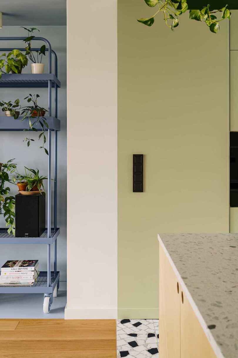
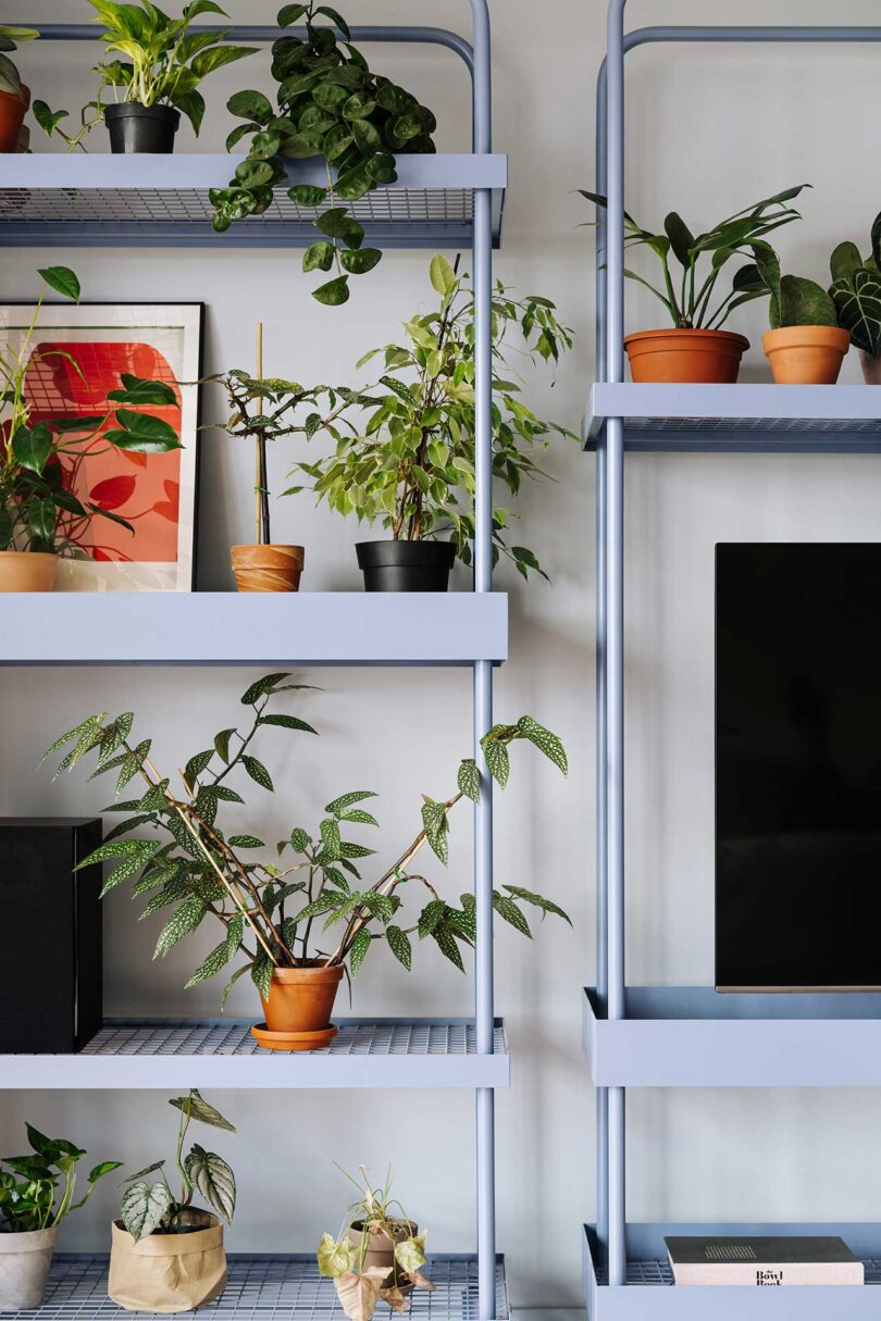
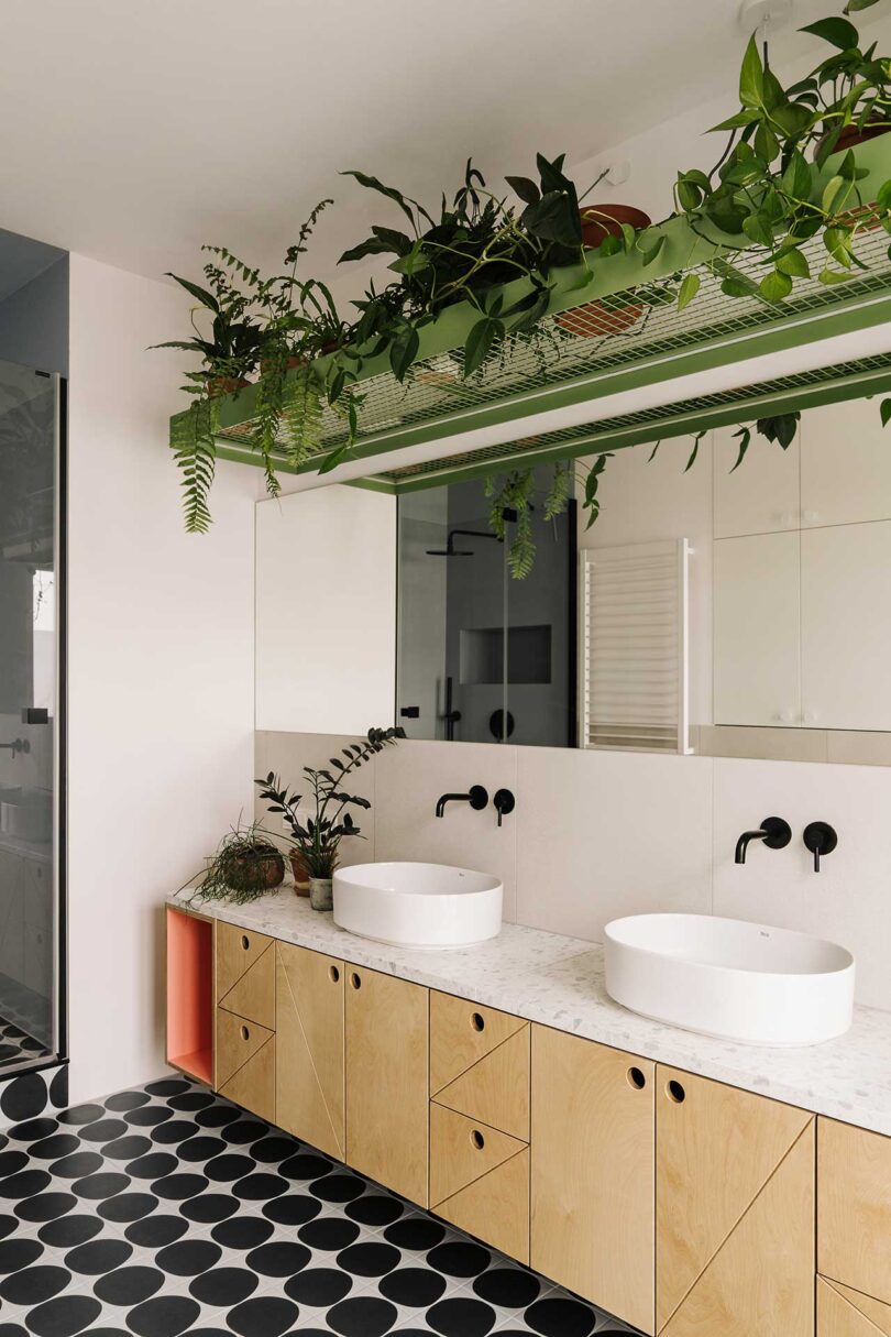
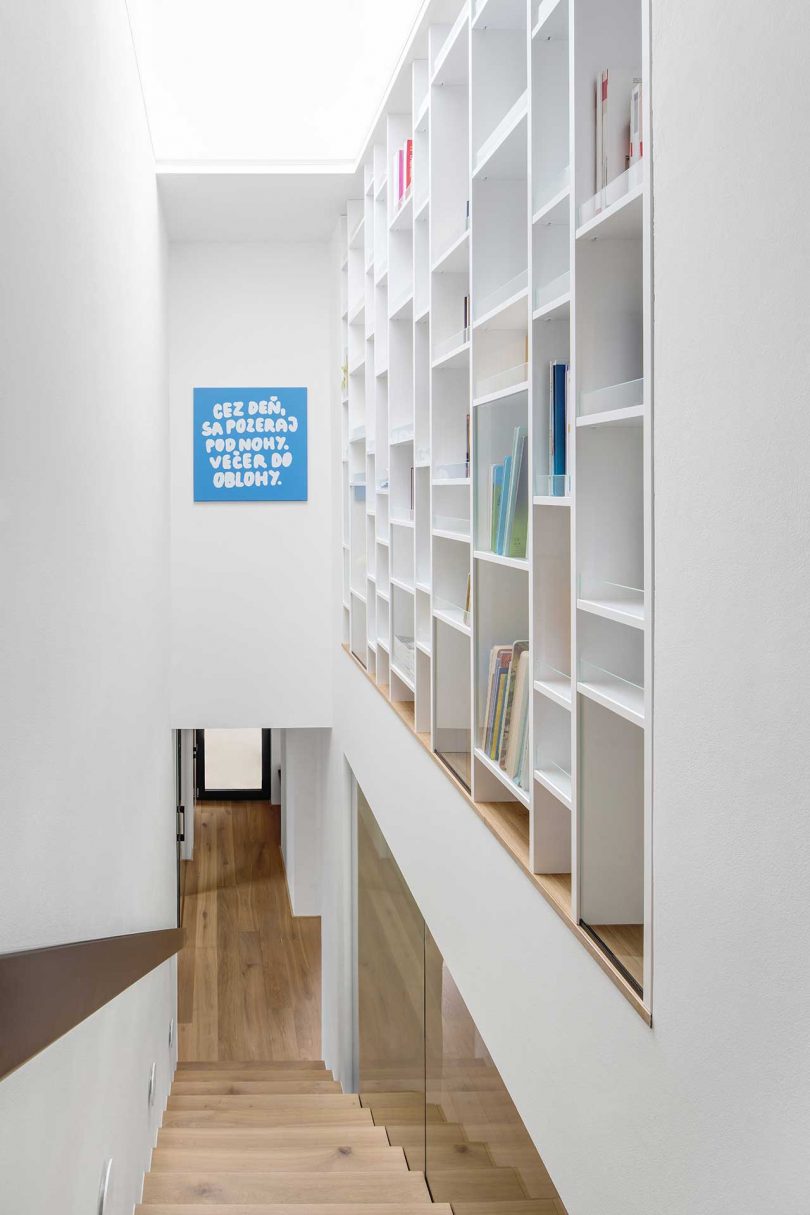
Three shelves set within a blue painted alcove hold a large selection of plants and objects for a touch of biophilia.

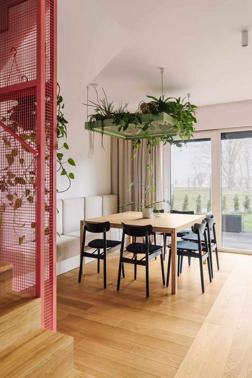
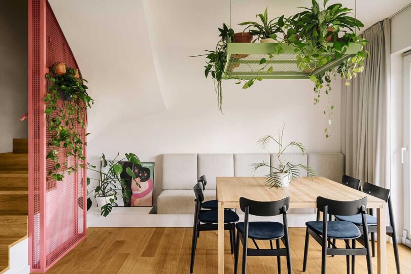
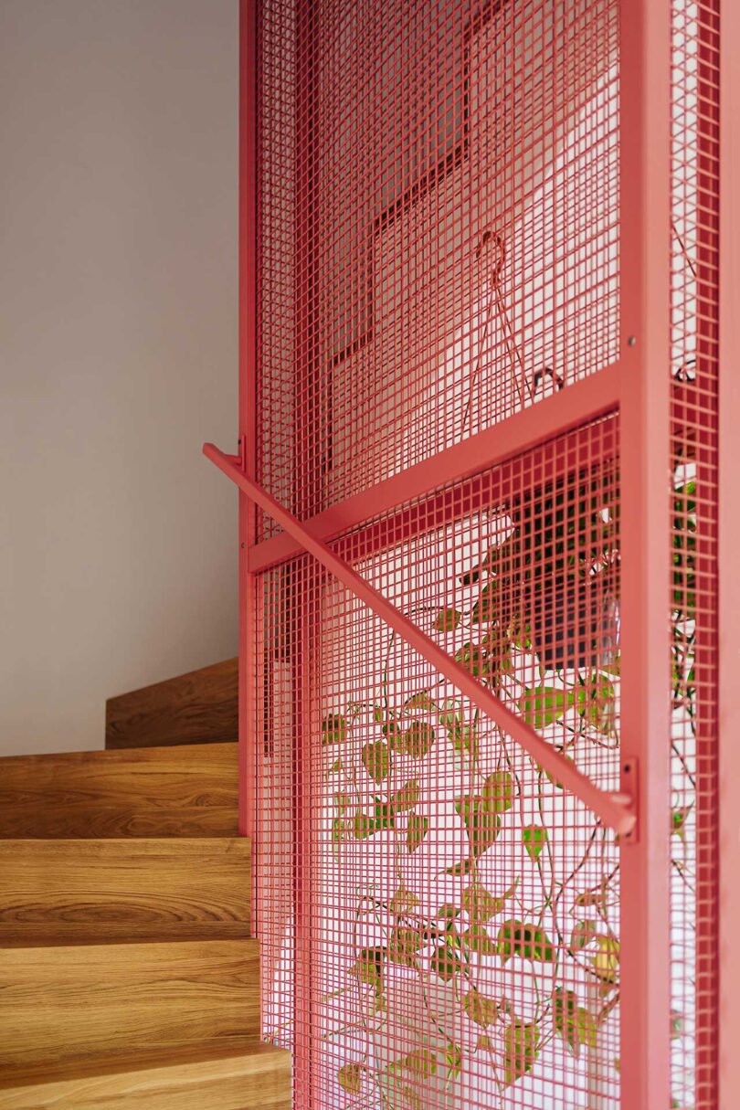
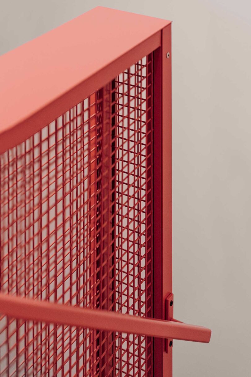
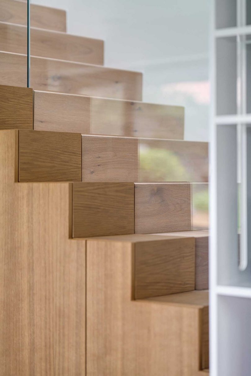
The square dining table lives under one of the hanging grids that holds plants. Similar gridded structures live alongside the wooden staircase adding a pop of color while providing safety for those climbing the stairs.
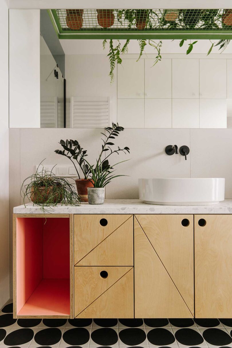
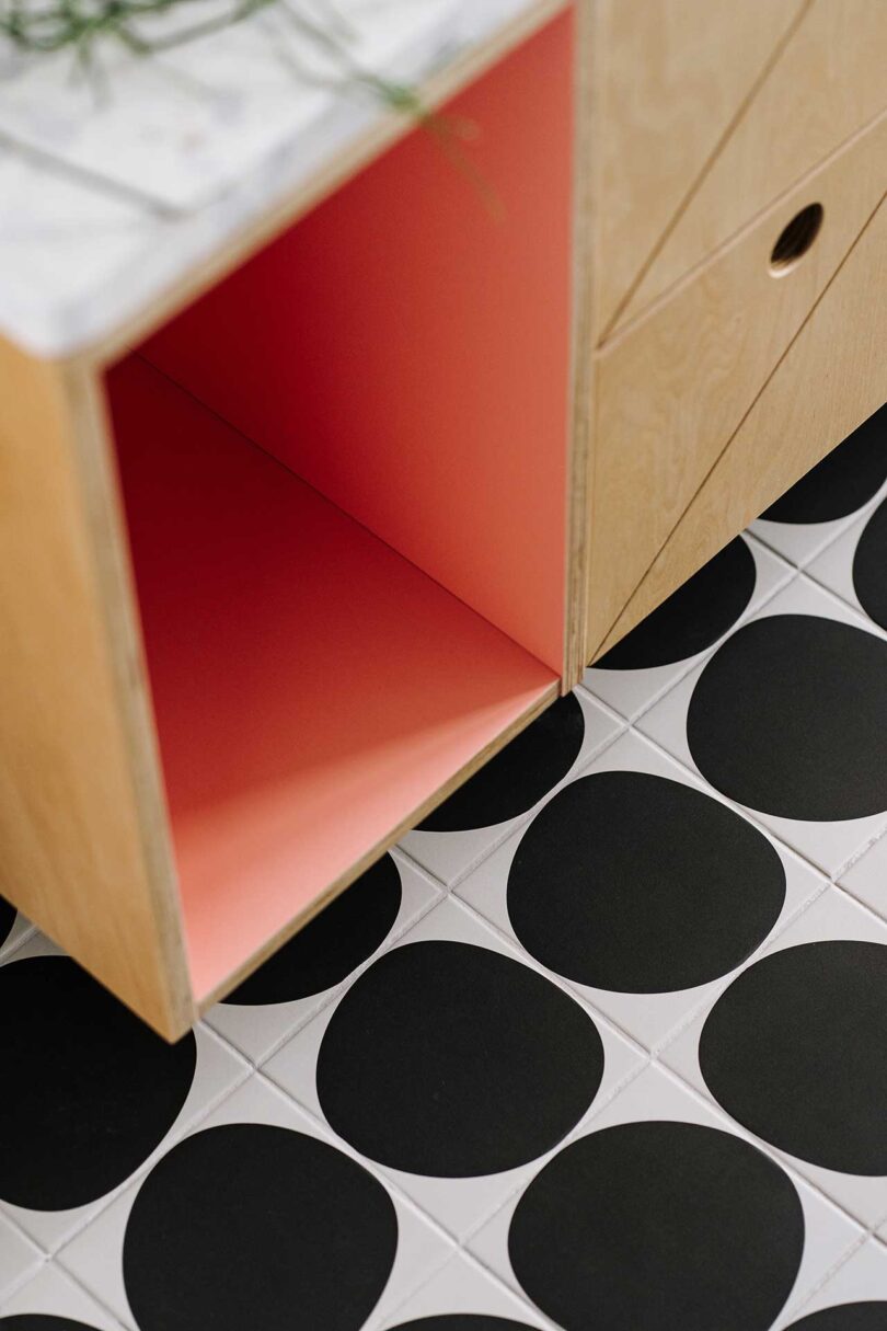
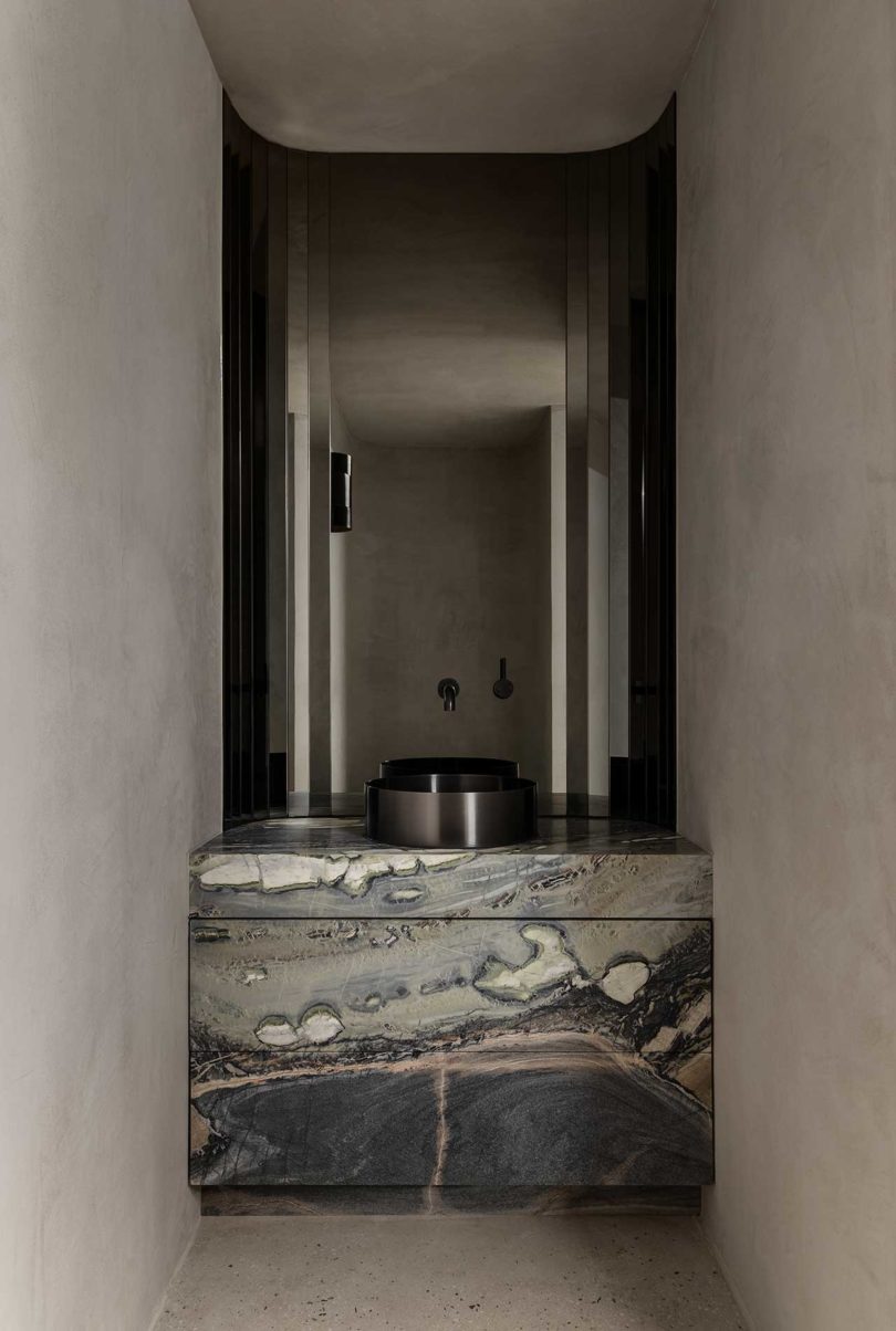
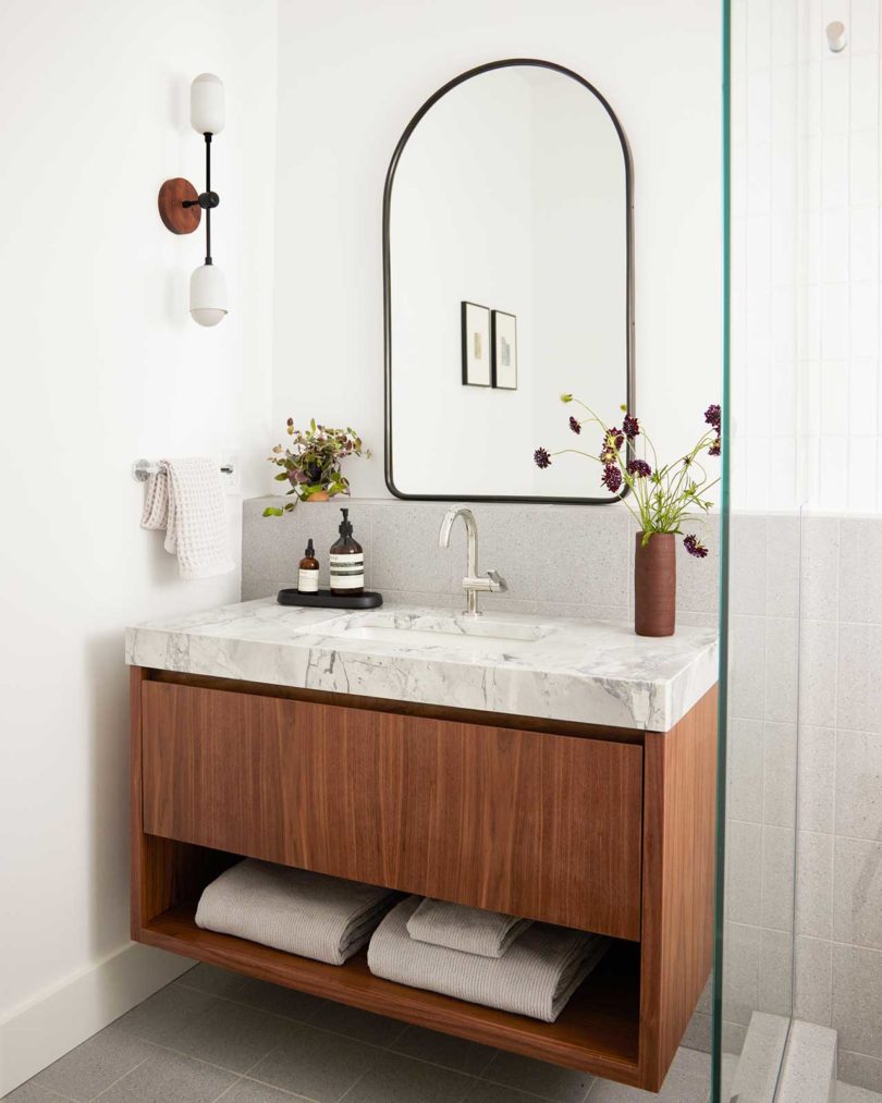
The bathroom features similar wooden cabinets as the kitchen island with geometric patterns adorning the fronts. An inset cabinet is painted a playful pink on the inside, pairing nicely with the black and white floor tile.
Photography by Migdal Studio.
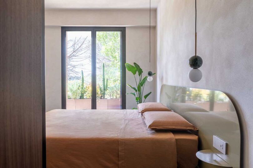
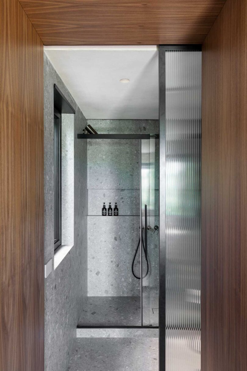
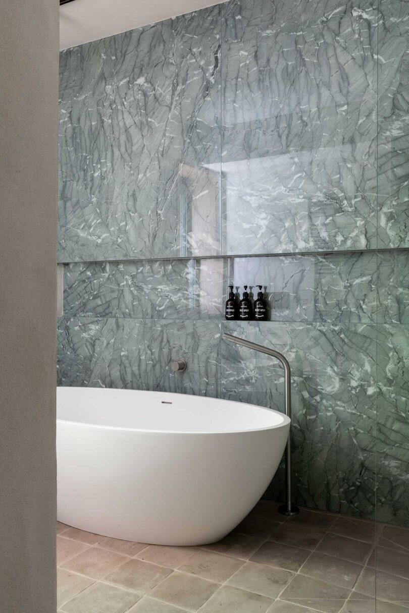
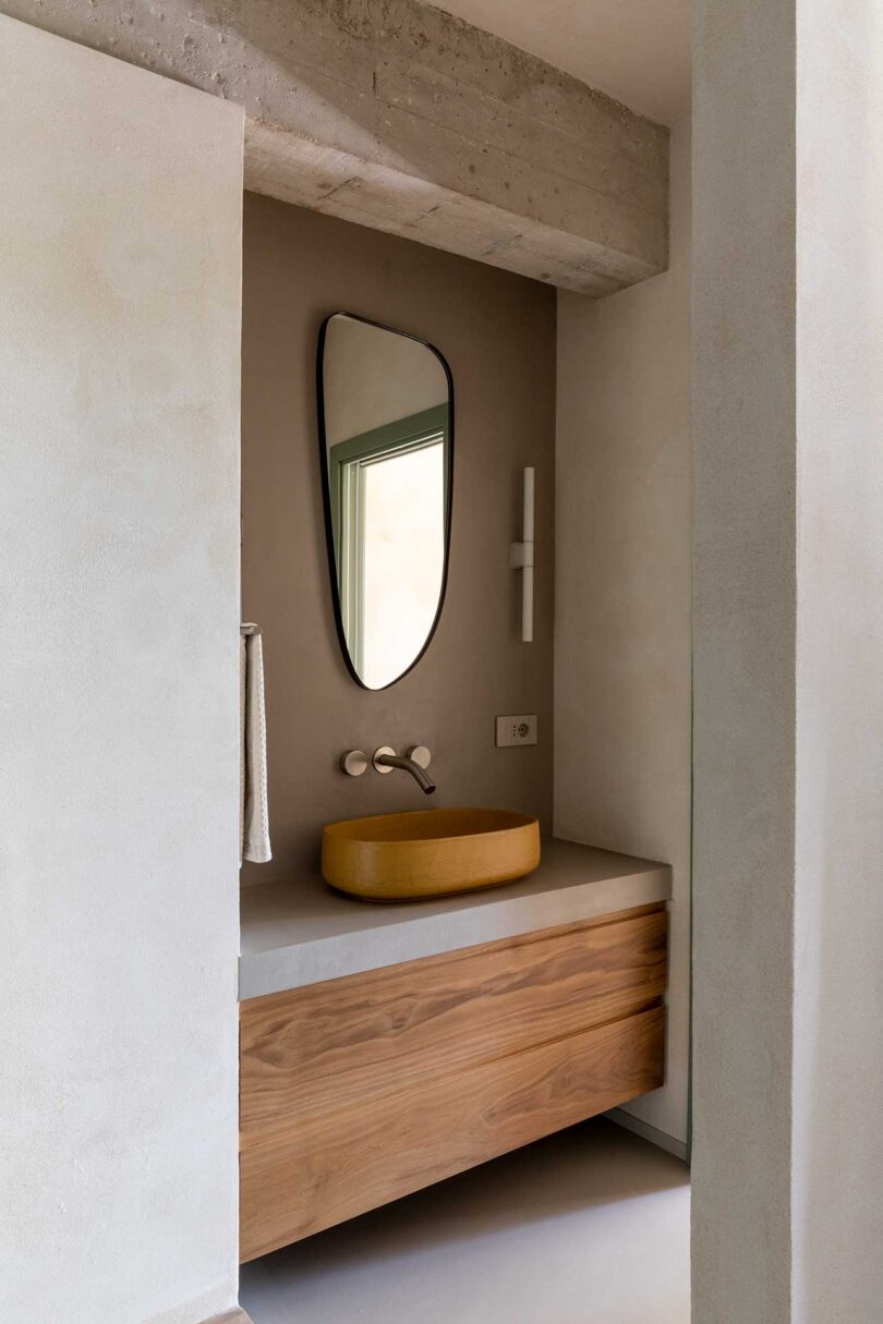
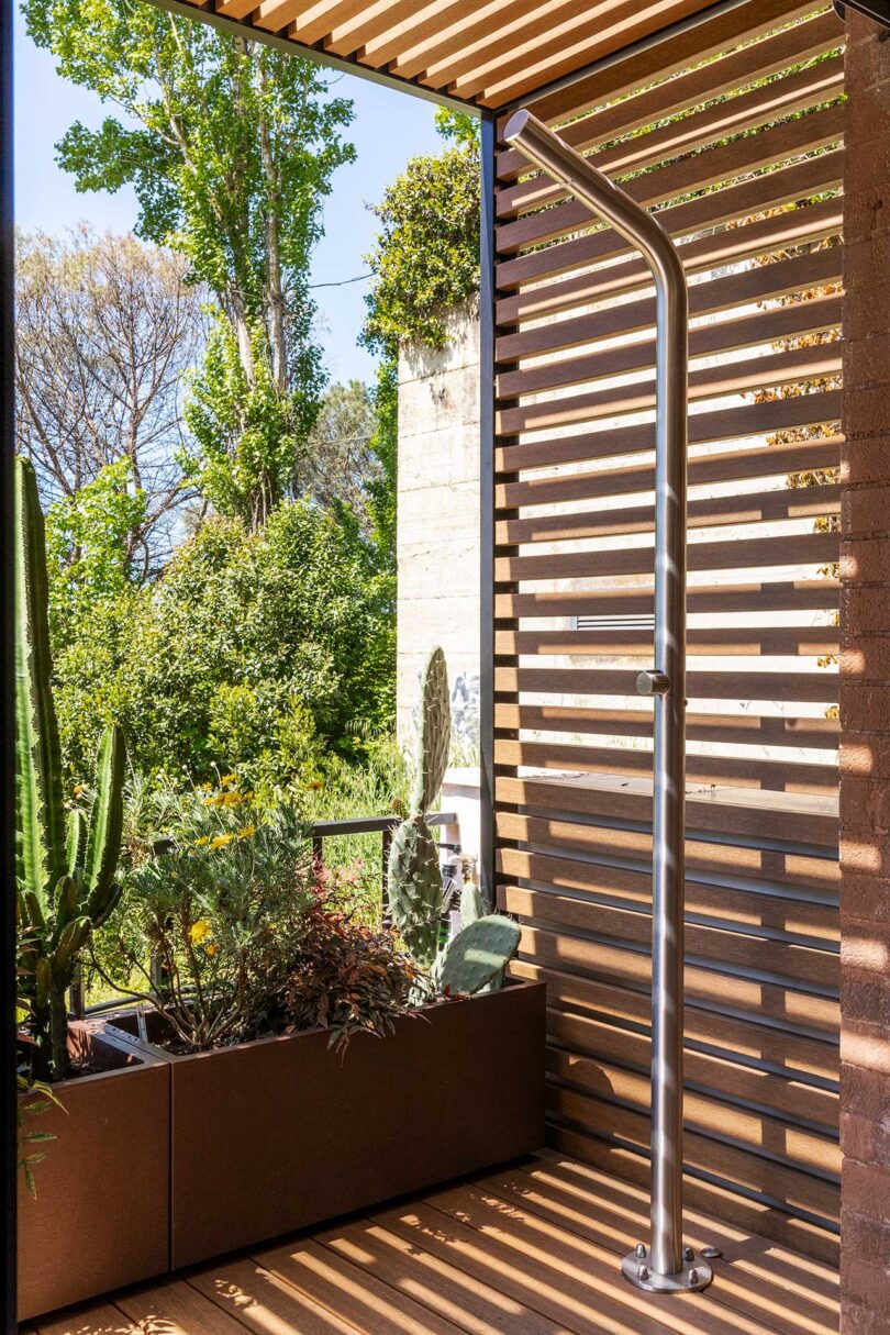
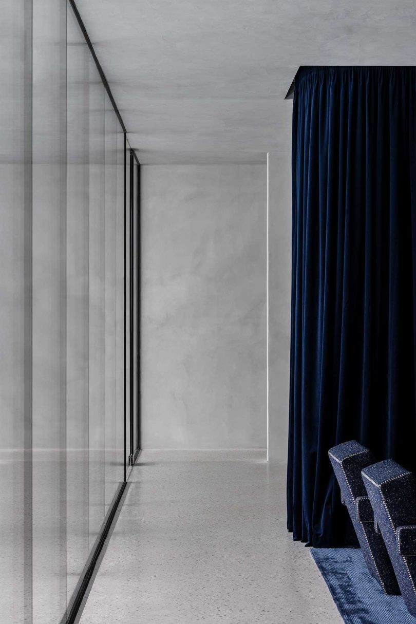
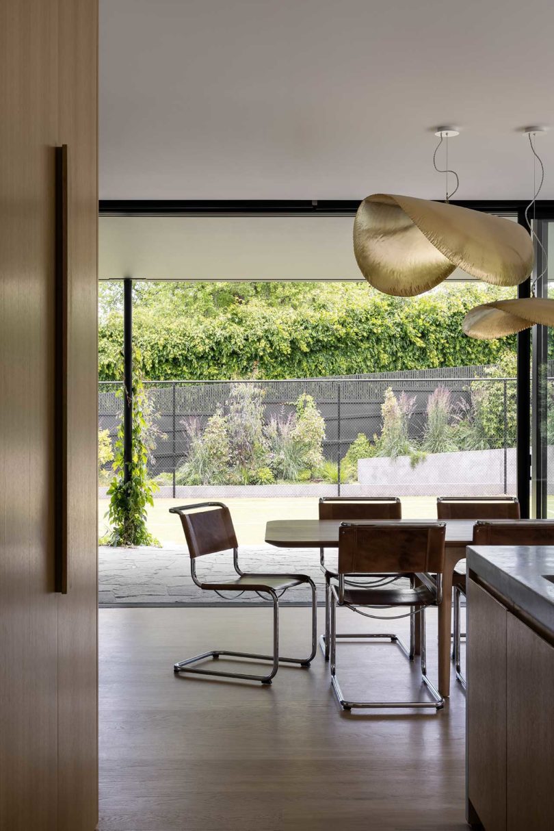
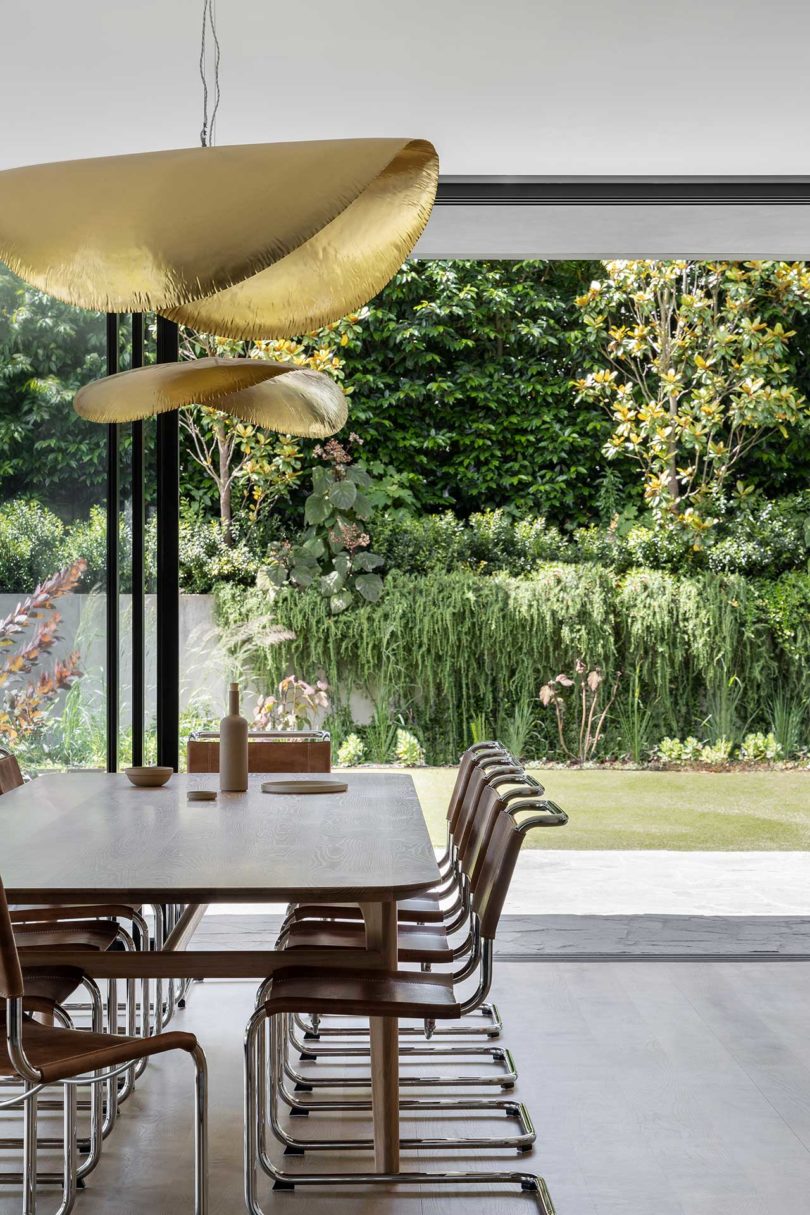
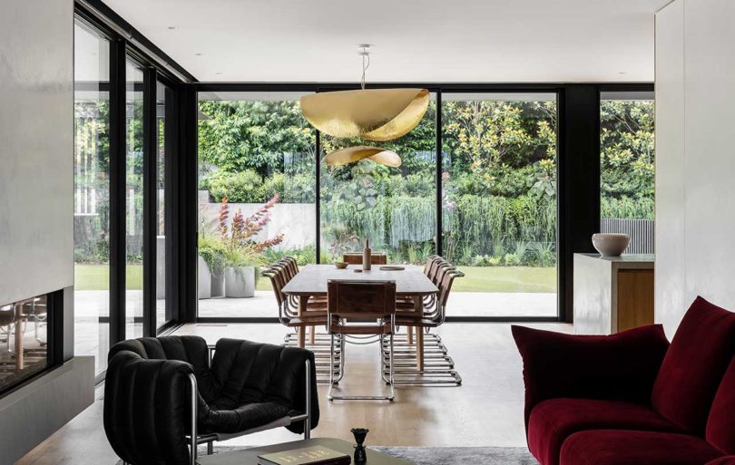
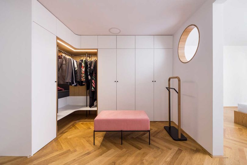
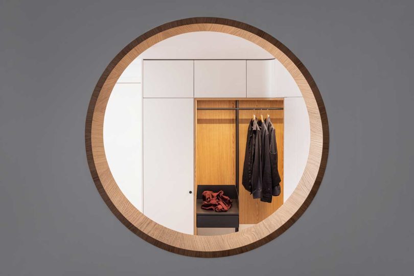
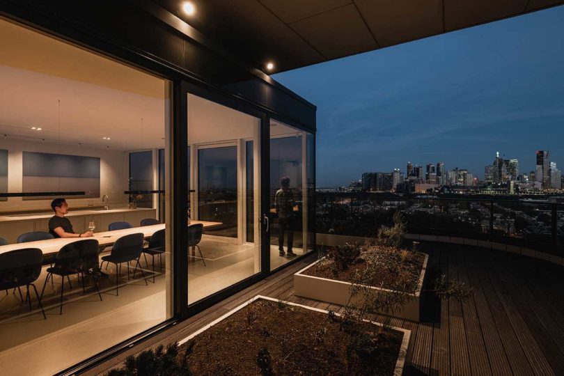
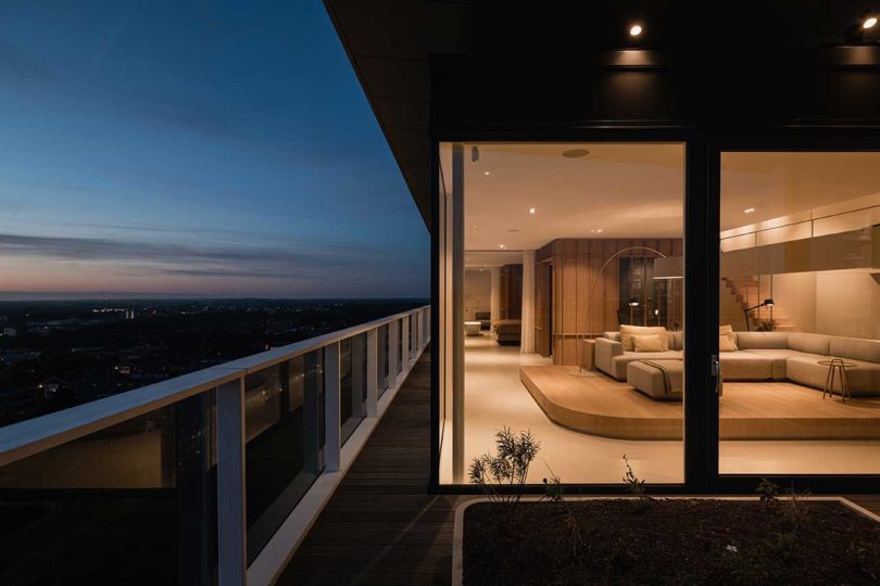
A Brutalist-inspired apartment in the suburbs of Rome in Tor de’ Cenci recently received a complete renovation by STUDIOTAMAT. Designed for a lawyer couple, the project consisted of renovating the 120-square-meter apartment, along with a coveted 40-square-meter terrace. The Casa Rude residence overlooks the Castelporziano Nature Reserve offering both wooded and sea views, an ideal locale after years of living in small apartments in the heart of the city. Now, their space is filled with natural light, original character, and modern conveniences.
“What guided us in the design was the desire to enhance the distinctive features of the unique terraced building, dating back to the 1980s, which houses the apartment. We wanted to restore fluidity to the spaces, encourage the opening, and the discovery of pre-existing materials and details, on which to set a new vision,” says STUDIOTAMAT co-founder Tommaso Amato.
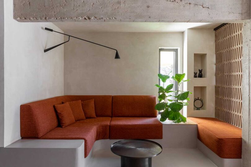
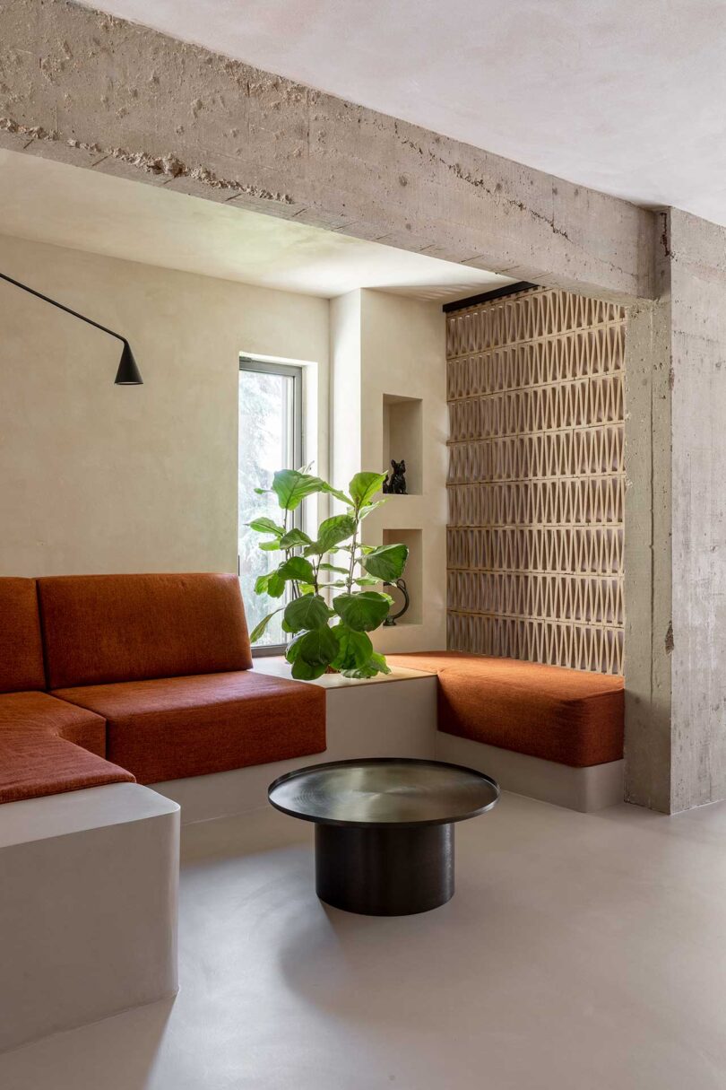
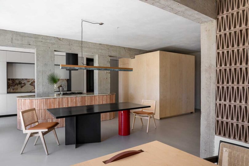
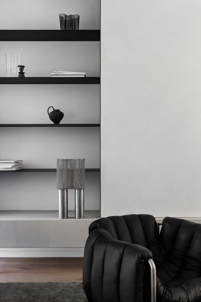
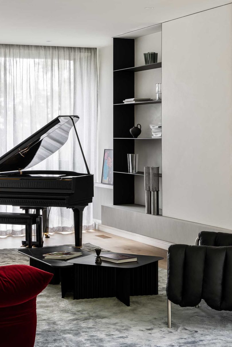
The main living area is designed much like a open plan loft with unfinished walls and the support structure’s exposed concrete visually connecting the spaces.
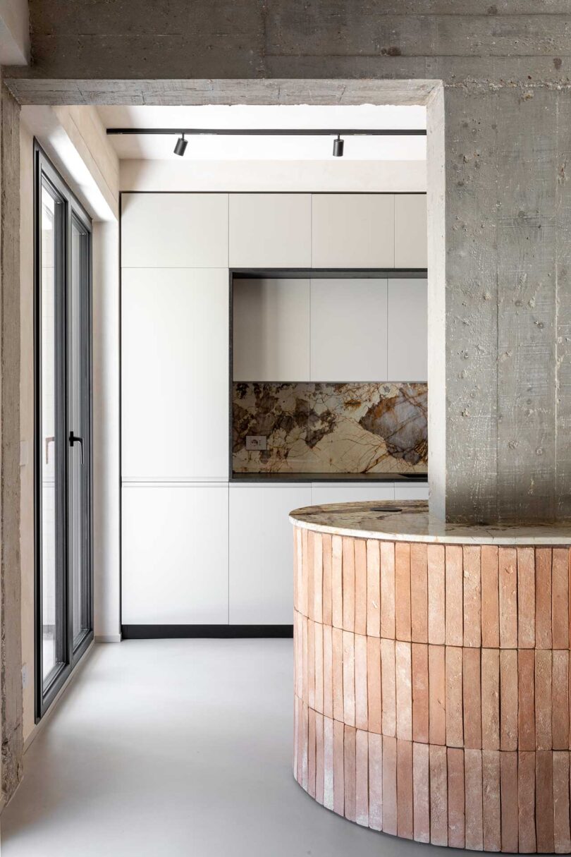

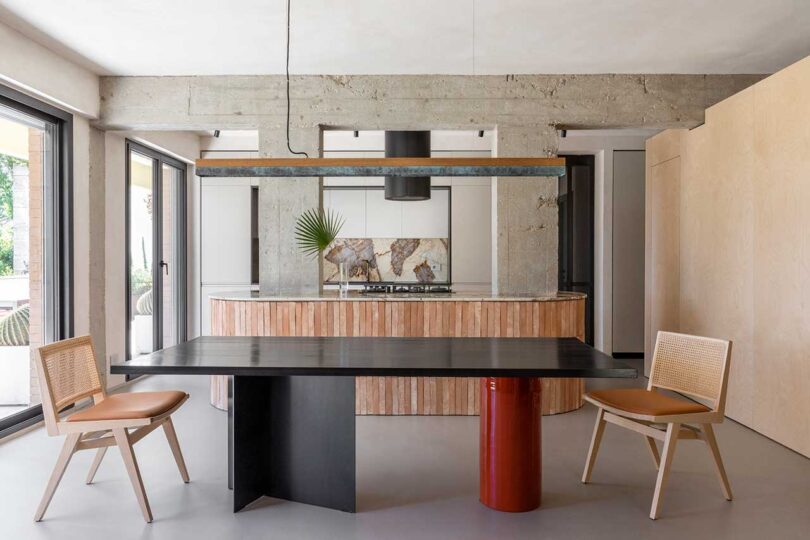
Paired with the original Brutalist details are a variety of tones, textures, and materials that add up to a visually enticing space. The roughness of the terracotta tiles on the oval island and concrete pillars are juxtaposed with the smooth Patagonia marble countertops that connect the two.
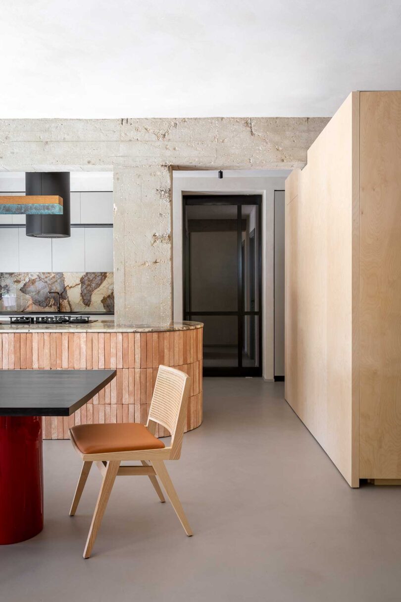
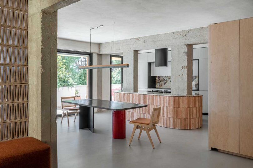
A custom dining table with a Shou sugi treated wood top rests on a black base and a glossy red ceramic leg for a sleek look.
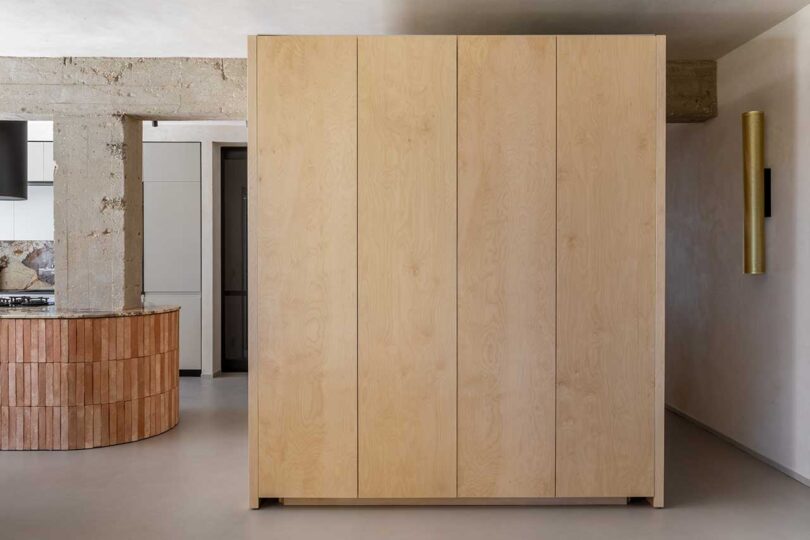
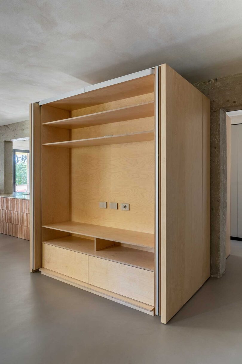
A large, multifunctional birch wood cube is built to hide the pantry, hold coats, provide storage, and house a TV.
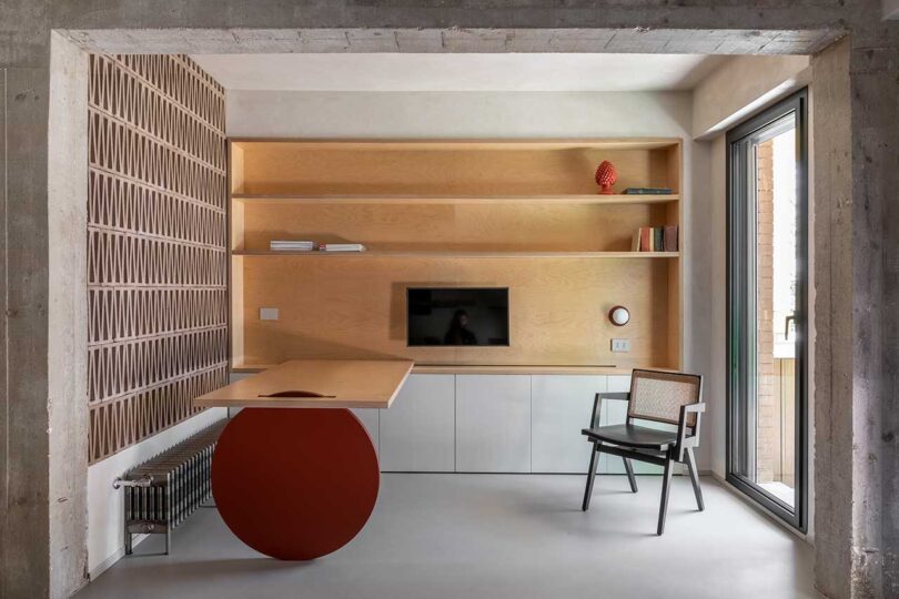
A wall of perforated bricks separates the living room and home office allowing natural light to pass through. A custom desk extends out from the built-in shelves and is held up by a circular red wheel, complementing the dining table’s leg a few feet away. The wheel allows the desk to roll along on a track to a new position.
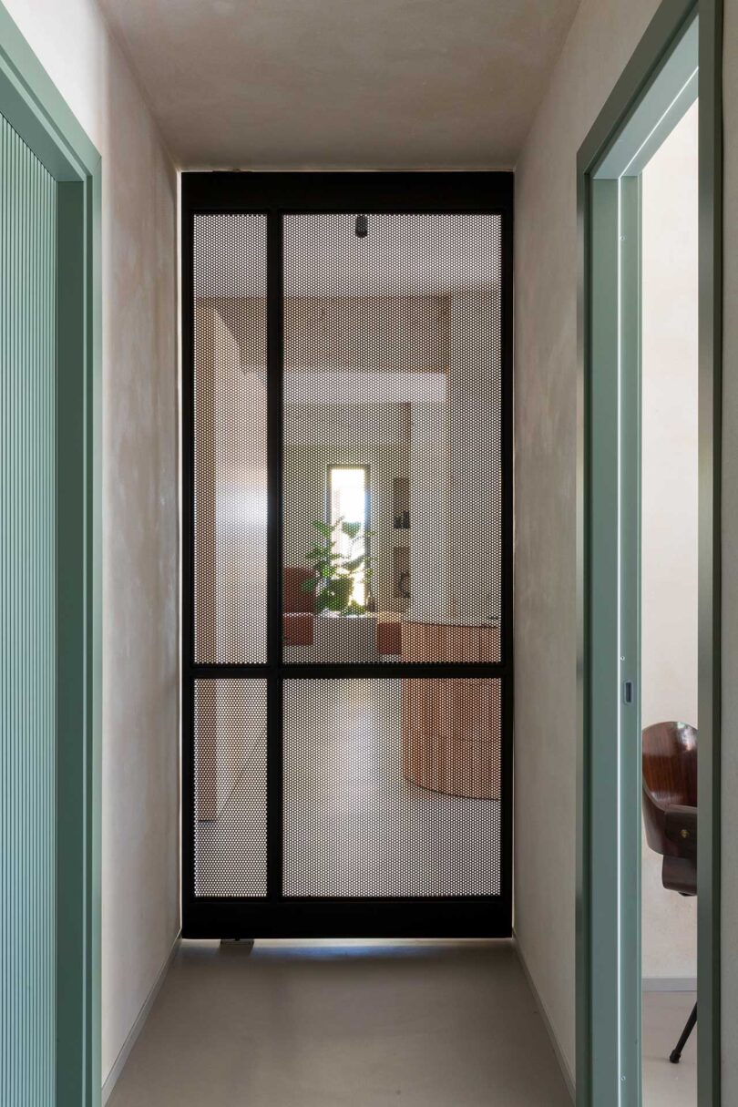
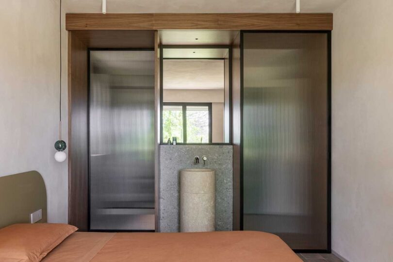
A pivoting door visually separates the public areas from the sleeping area, which houses a main bedroom with ensuite bathroom, and a guest room.
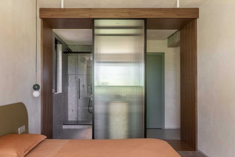
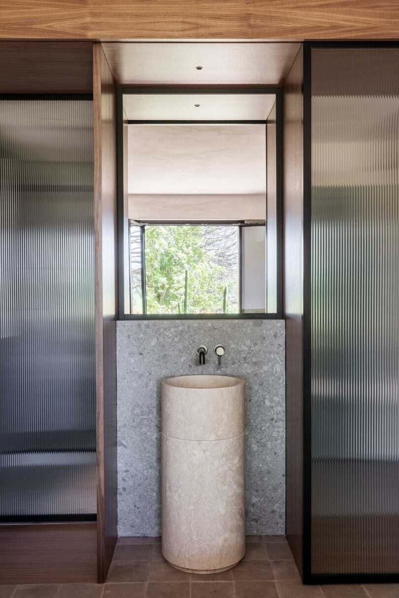
In the primary bedroom, sliding ribbed glass doors offer privacy to those in the bathroom while allowing light in.
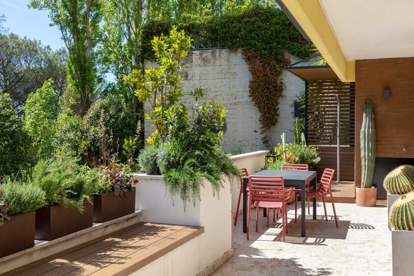
The large terrace features an outdoor kitchen, seating areas, dining space, and outdoor shower, all of which benefit from sunset views.

STUDIOTAMAT \\\ Photo: Flavia Rossi
Photography by Serena Eller Vainicher.

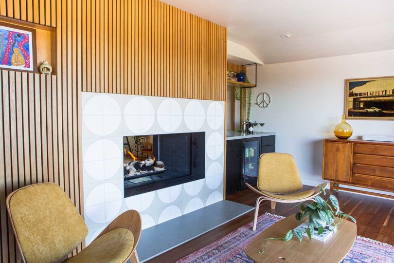
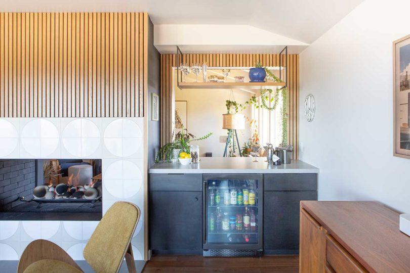
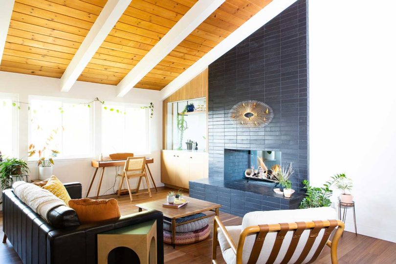
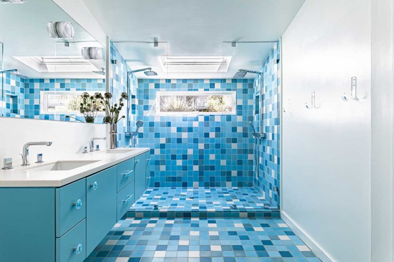
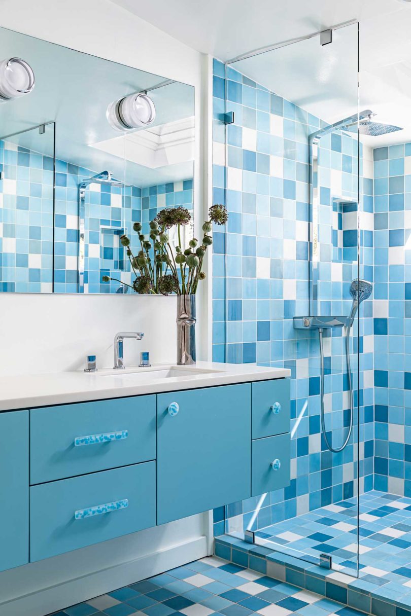
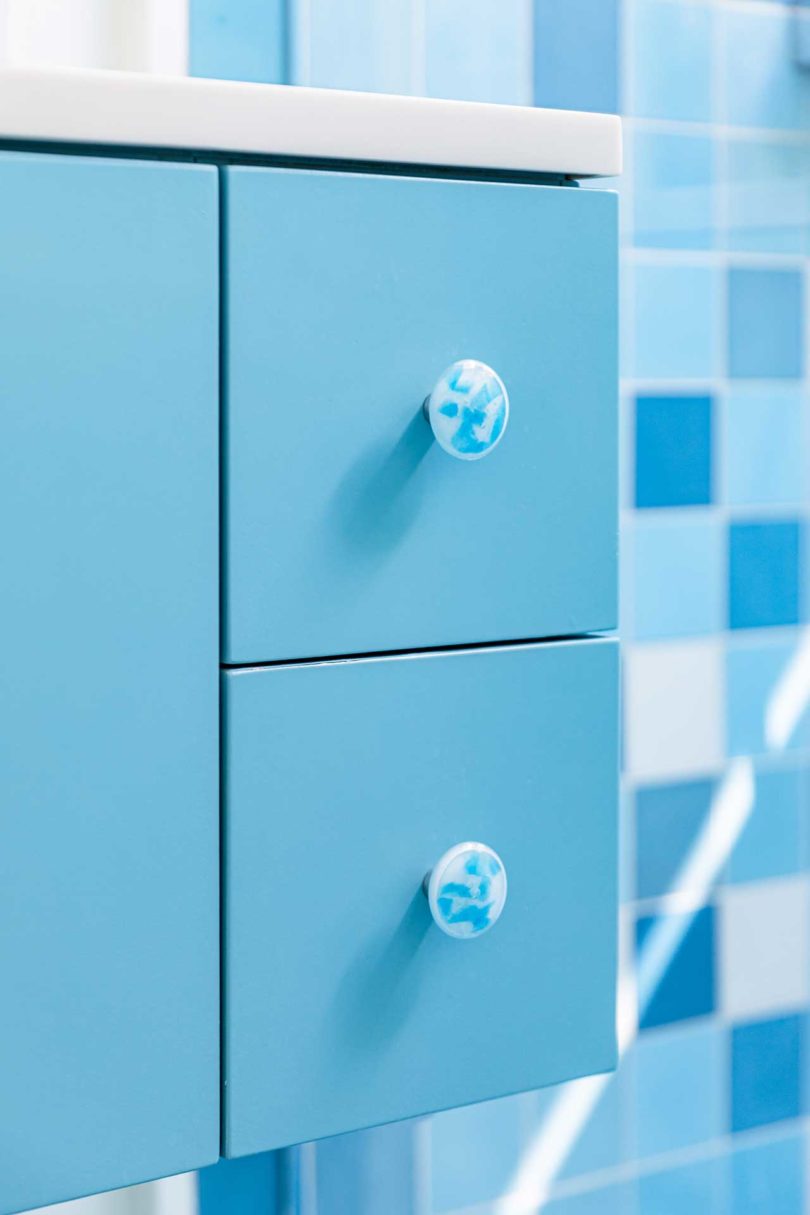
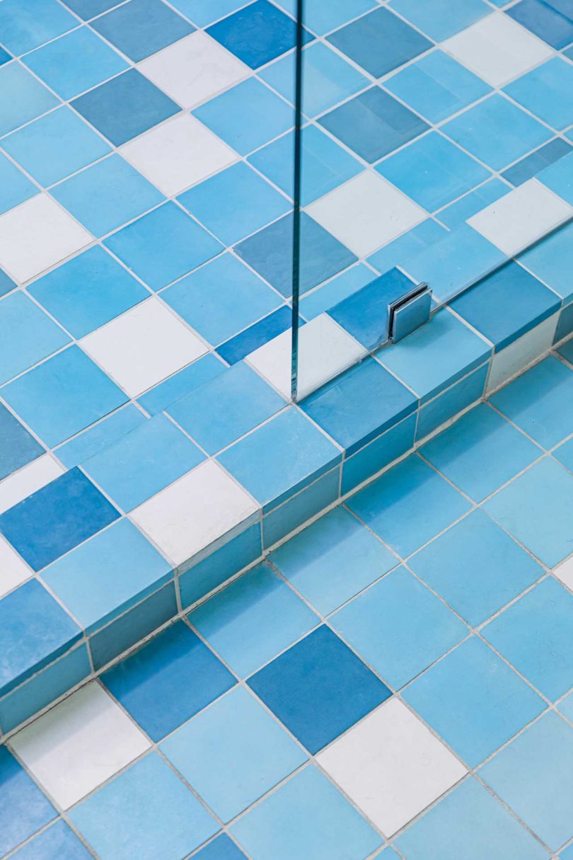
To reimagine a dated, 1970s ranch in Pleasanton, California, Destination Eichler partnered with Eyerly Architecture to bring this split-level house into today’s times. While the young family appreciated the 70s character of the home, they desired a fresh spin with added functionality seen in today’s builds. The updated abode now features modern details, mid-century furnishings, and a plethora of beautiful tile from Fireclay Tile.
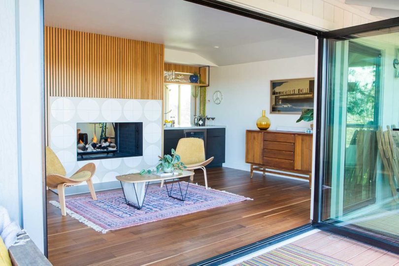
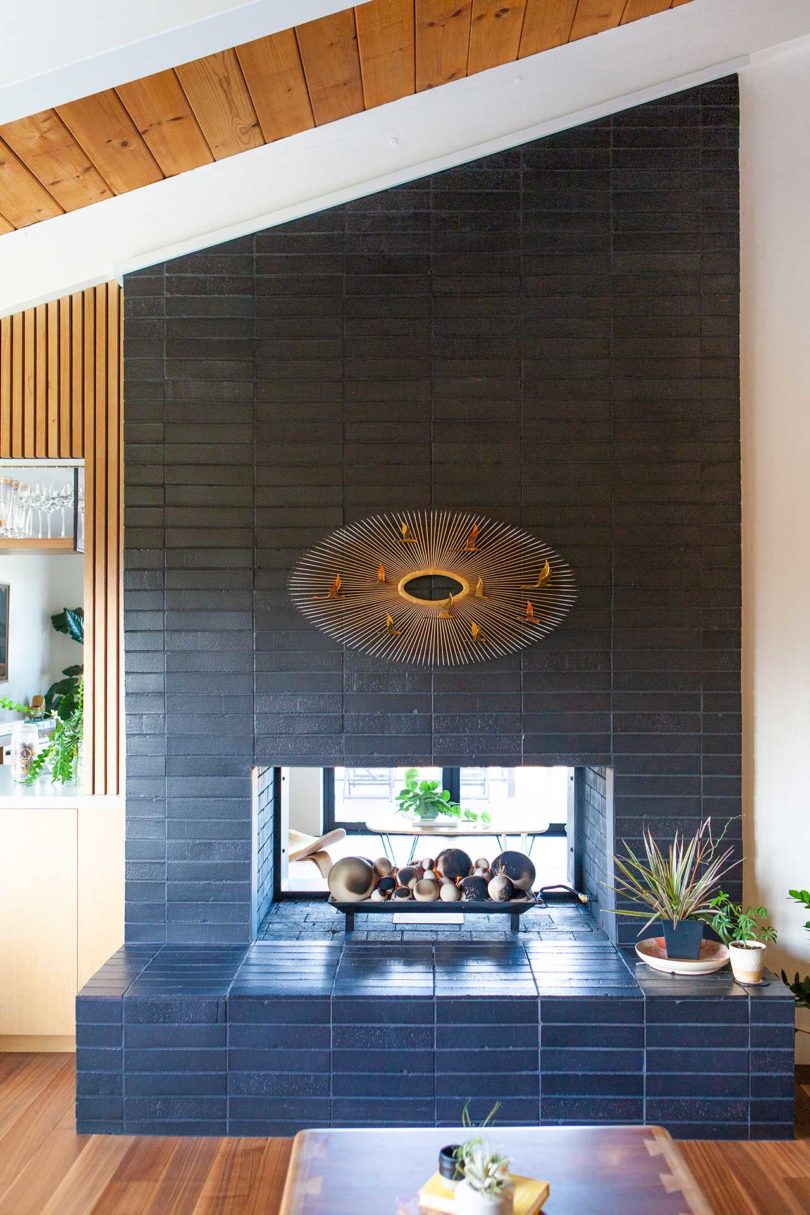
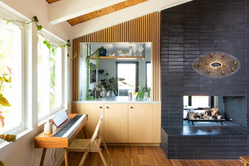
A glass wall opens out from a multipurpose room offering views of Mount Diablo. The room’s other focal point is a double-sided fireplace that was updated with vertical wood slats and tile in a large, circular pattern.
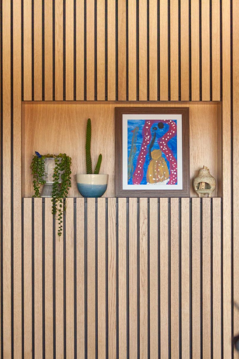
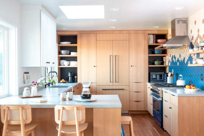
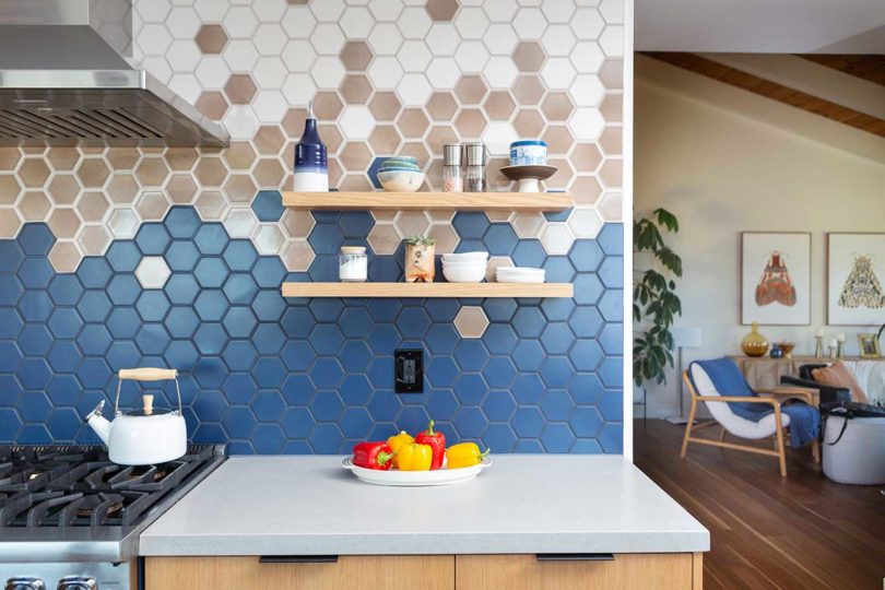
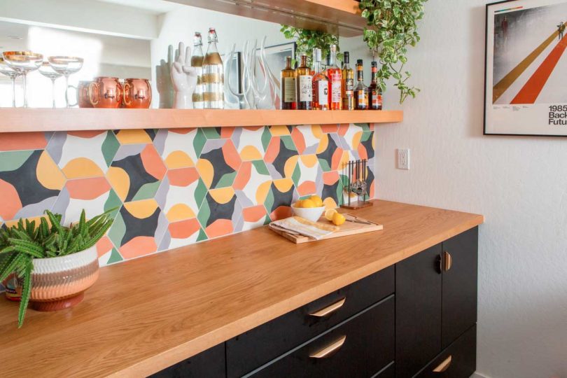
The kitchen is renovated with light wood cabinets and a mosaic wall made with hexagonal tiles that complement the blue range.
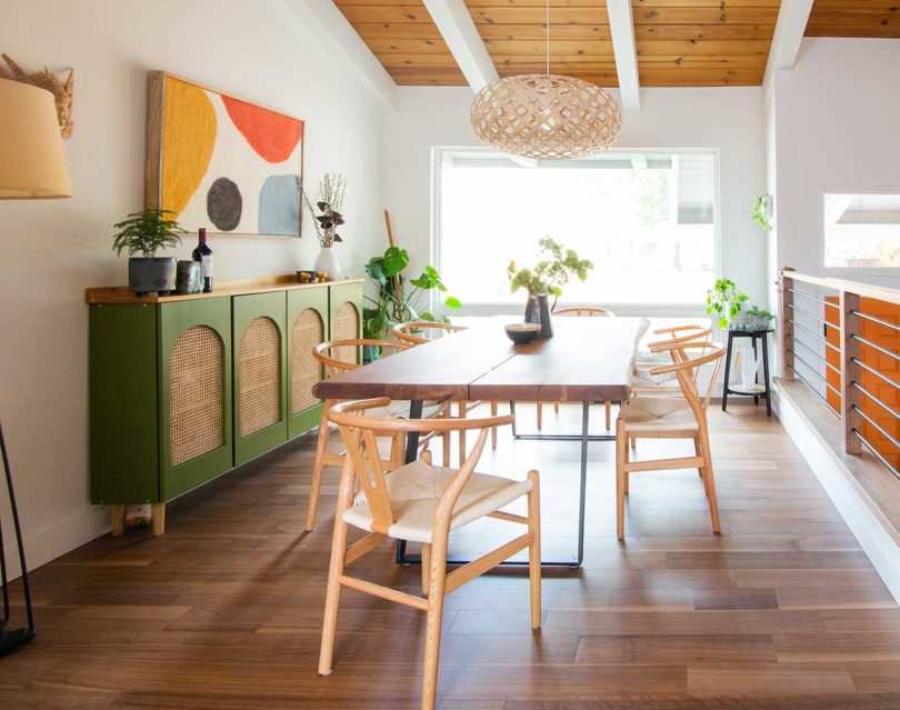

The main living room features an angled wood ceiling and the other side of the double-sided fireplace. Clad in matte black tile, the fireplace has a minimalist aesthetic that is perfectly juxtaposed with the white walls and beams.
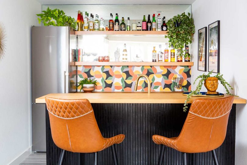
In the basement, which the original architect named “Rumpus Room,” a new kitchenette and bar is there to entertain guests.
Photos by John Shum.
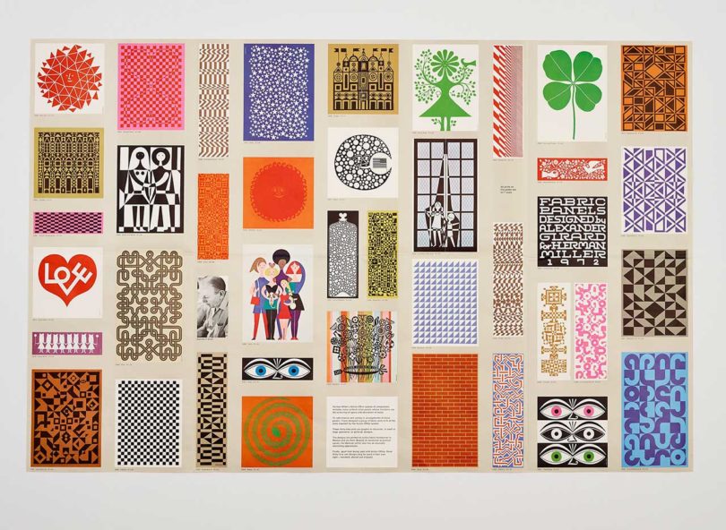
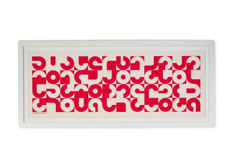
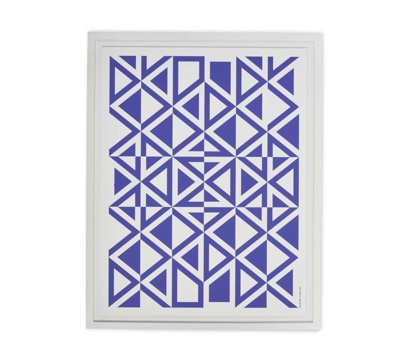
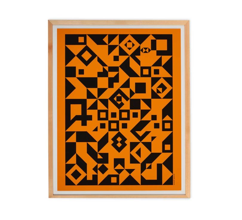
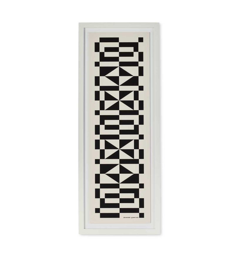
Once again, legendary design brand Herman Miller is opening up the vault to bring back some of their most iconic archival materials. Last time they released 15 prints featuring their product ads and brand nostalgia originally produced between 1949 and 1979. This go round, they’re reintroducing eight archival originals by Alexander Girard. Starting today, you can now bring a piece of Girard home with Herman Miller’s release of eight posters that includes some of his more recognizable designs, like Bouquet, Palace, Double Heart, and Eyes.
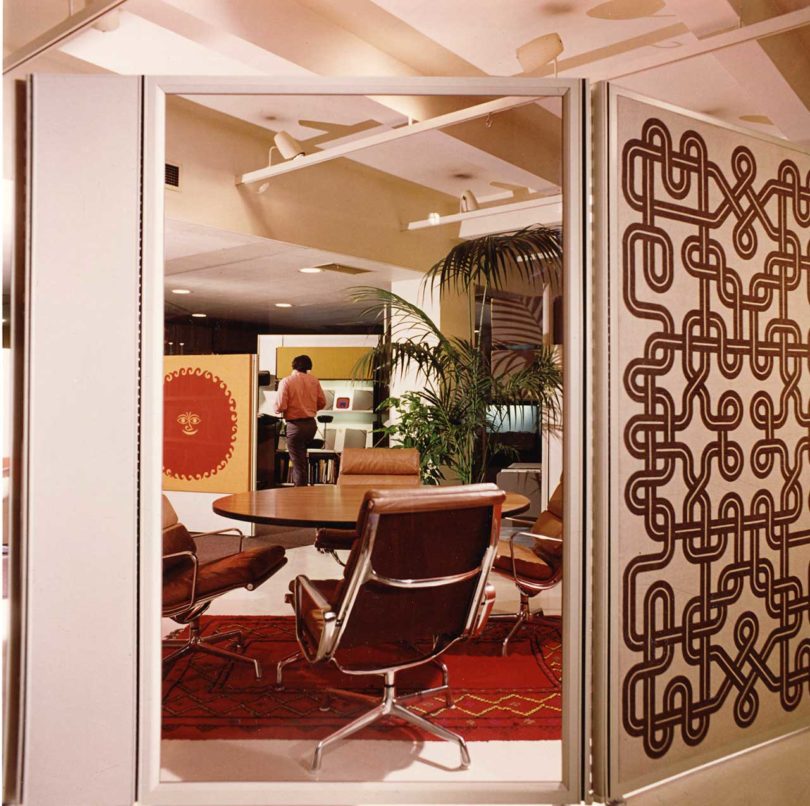
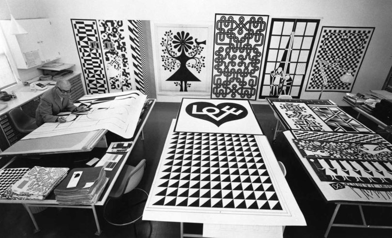
Archival shot of a mid-century office featuring Girard’s Environmental Enrichment Panels: “We referenced original Environmental Enrichment Panels in the Herman Miller Archives to create an accurate and faithful color match for each of the designs,” says Auscherman.
Girard’s name is always going to come up when discussing mid-century art, when his legendary designs landed on upholstery, wallpaper, restaurant interiors, airline branding, office panels – you name it. He spent 20 years in Herman Miller’s textile division starting in 1952 and during that time he produced over 300 textiles, objects, and furniture. One such notable design is his Environmental Enrichment Panels, an idea that feels just as modern in present time where they could easily work in today’s open office plans. “When the Environmental Enrichment Panels launched in 1972, there were 39 unique designs printed on textile that were offered in various sizes. They were meant to be incorporated into Herman Miller’s Action Office 2 System to inject color and levity to the workplace,” says Amy Auscherman, Director, Archives and Brand Heritage at MillerKnoll, “With this program, we were able to use the poster as a medium for these joyful designs that are perfectly suited for the home.”
Archival shot of Girard’s work in 1972
While most textile designers have always leaned towards practical and toned down to appeal to the masses, Girard carved his own path with an array of beloved designs. “As evidenced from the Girard Wing at the Museum of International Folk Art (truly his gesamkunstwerk) Girard drew inspiration from every corner of the world. I think incorporating multiple ideas and perspectives has rendered his work relevant and enjoyable to people across generations,” reflects Auscherman.
Archival shot of some of Girard’s work in 1970
Eyes
Palace
With so many to choose from, Herman Miller had the daunting task of narrowing down the release options, for which they selected eight designs. Auscherman shares, “I’m thrilled about this offer of geometric, architectural, and pictorial graphics by Girard, who worked across styles and mediums. No matter your taste or style, there is something for everyone in this release.” The collection includes Bouquet, Palace, Double Heart, Eyes, Circle Sections, Geometric C, Geometric D, and Geometric E.
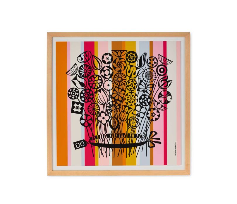
Bouquet
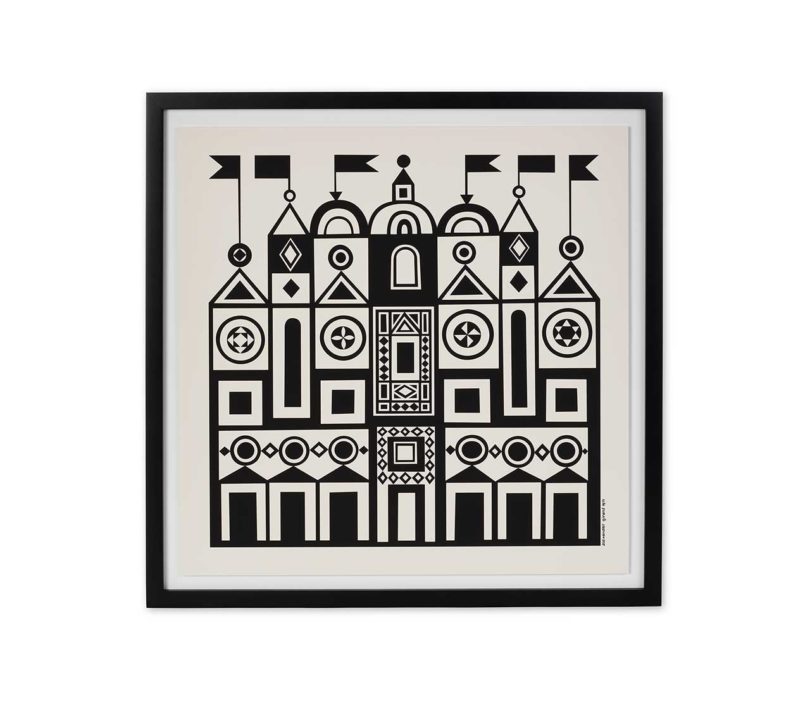
Palace
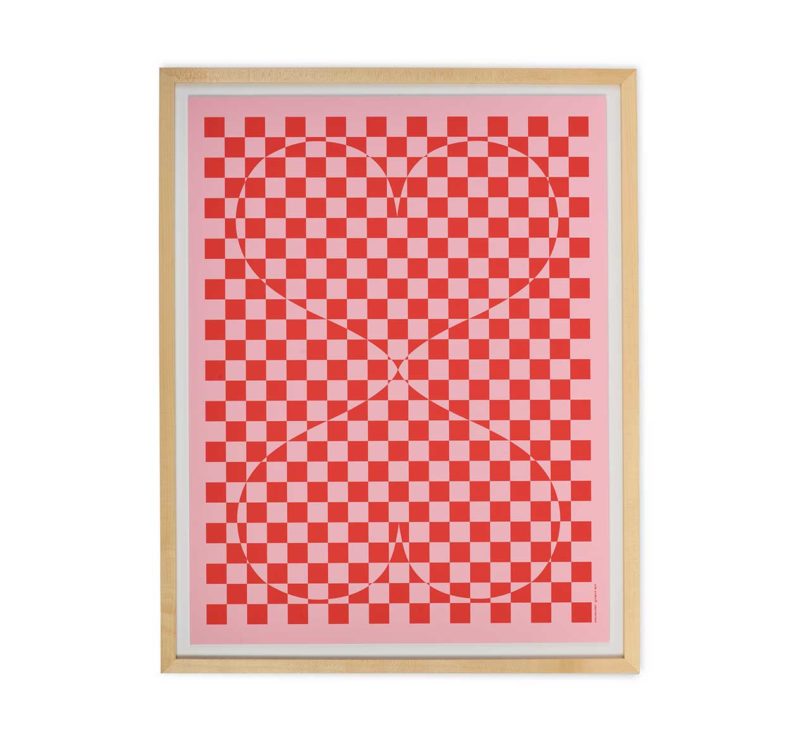
Double Heart
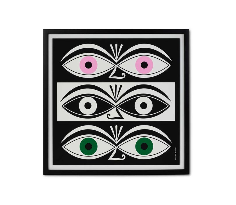
Eyes
Circle Sections
Geometric C
Curious to know what design Amy Auscherman would pick if she had to choose? “I have always been a fan of the Geometric designs, so I’m hoping to find a home for C, D, and E in my own home!”
Geometric D
Geometric E
Framed posters are available for purchase online at Herman Miller and Design Within Reach, as well as retail locations, beginning at $525. Unframed versions are available at select stores starting at $195.
This post contains affiliate links, so if you make a purchase from an affiliate link, we earn a commission. Thanks for supporting Design Milk!
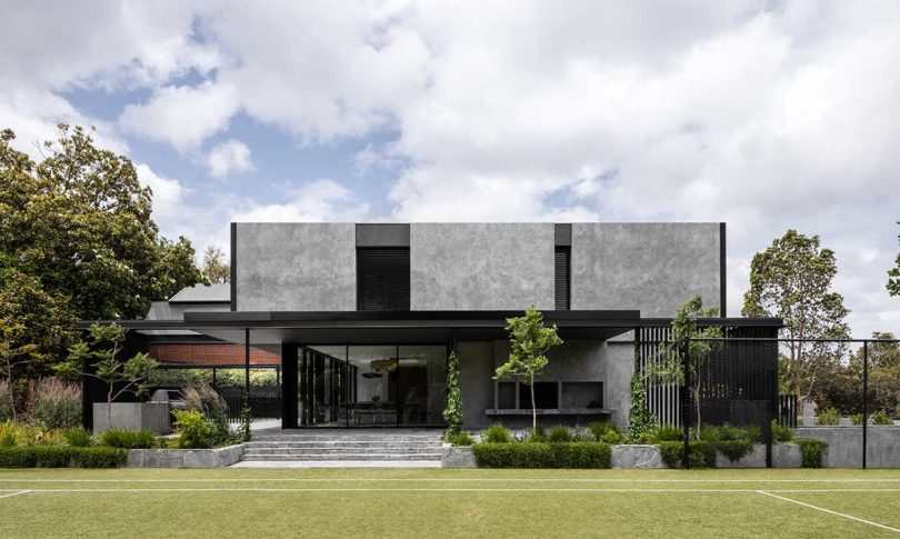
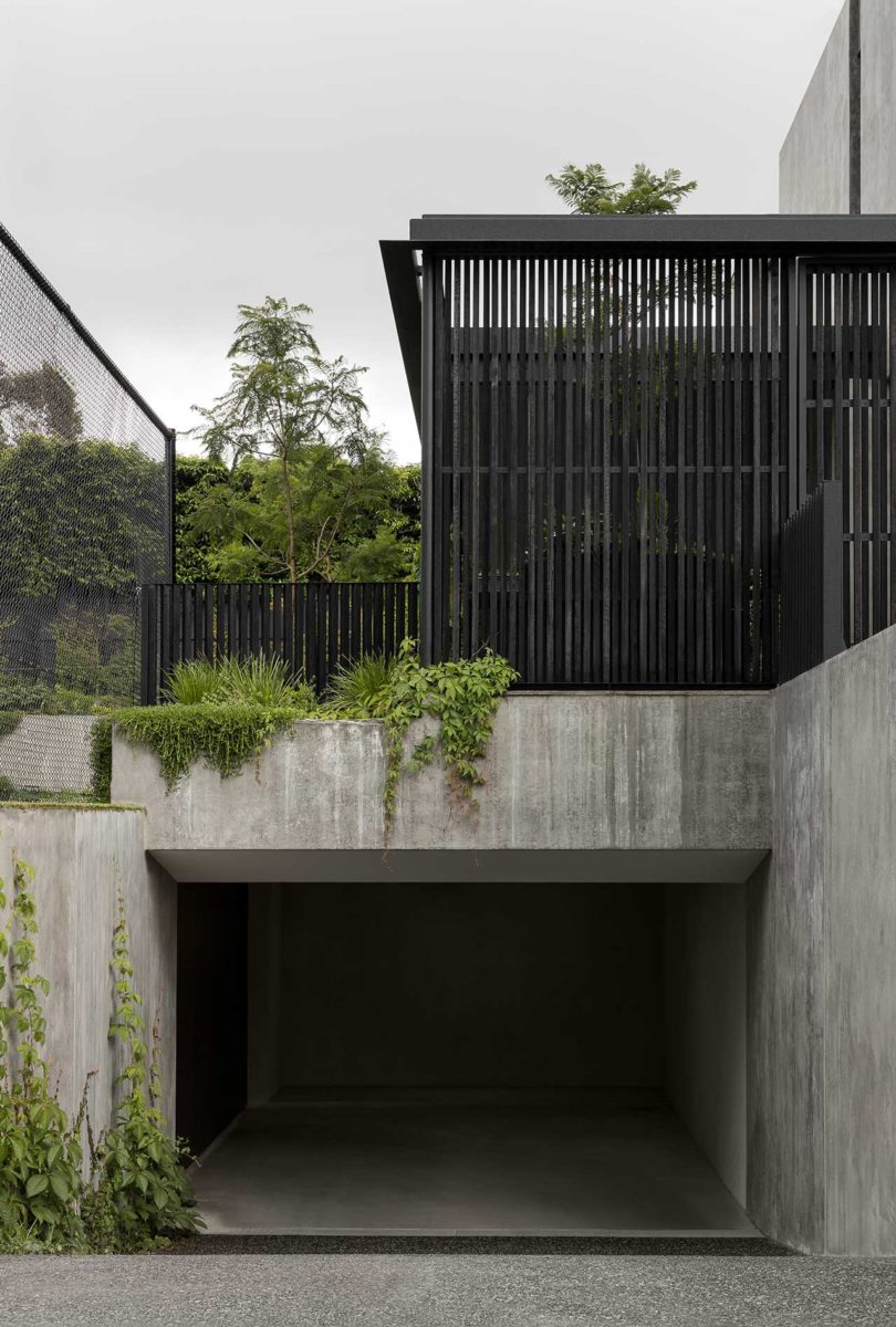
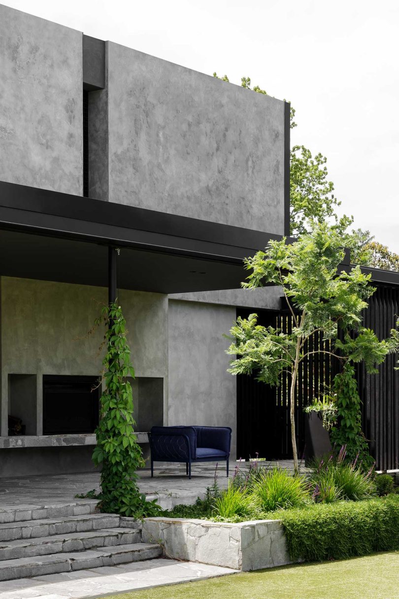
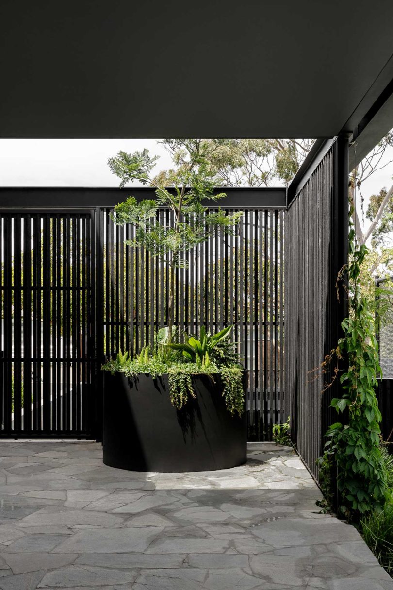
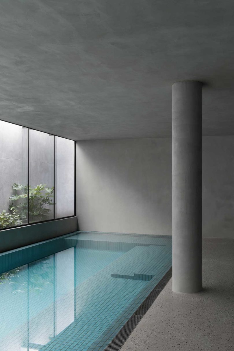
When an adjacent property went up for sale next to a young family of five, they bought it in order to create their dream Hideaway House. They hired Cera Stribley who utilized the excavated lot to design an underground living space that could house everything an adult could dream of, including an indoor pool, bar and lounge, gold room, and gym. The original home’s basement has been converted into a new guest suite and connects the house to the new underground space.
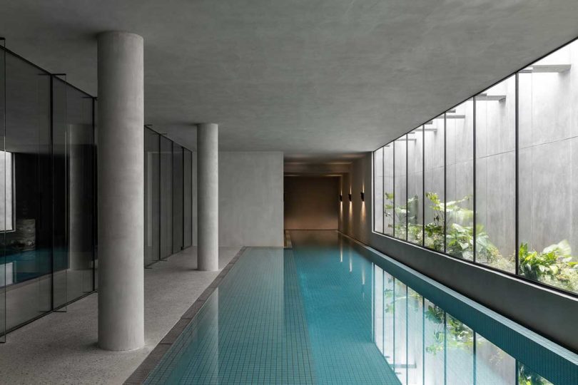
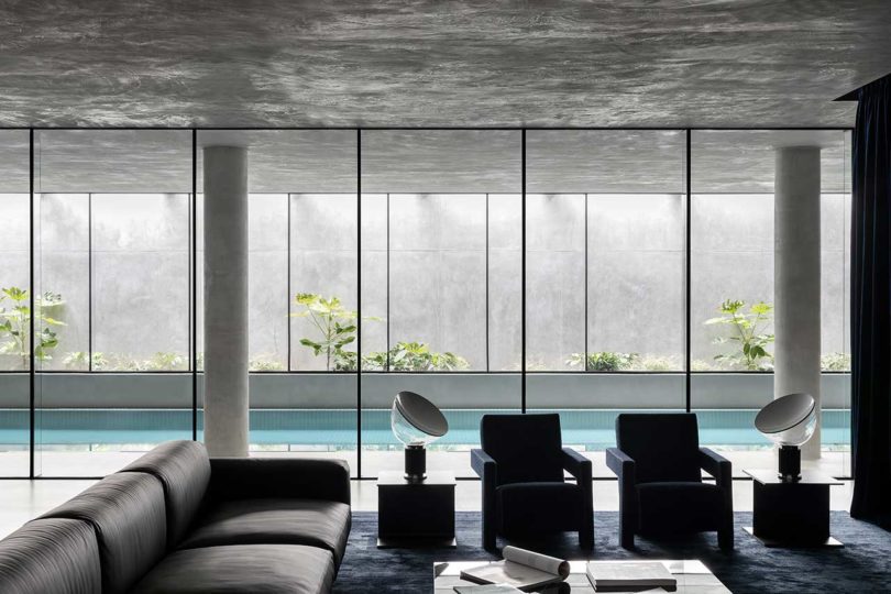
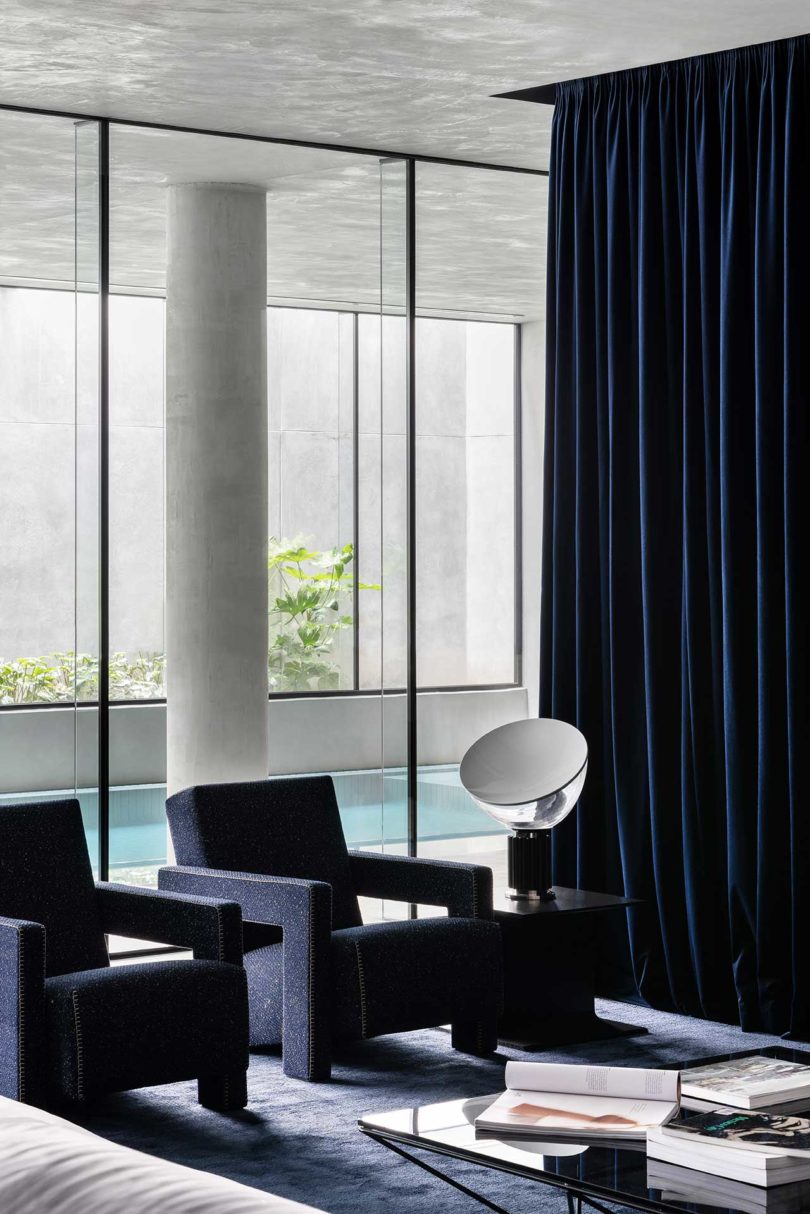
In order to maintain privacy in the subterranean space while bringing in natural light, a tall wall is spaced far enough away to allow light to filter down through the windows. A planter box adds nature to help soften surrounding hard surfaces. Whether lounging by the pool or swimming laps, the greenery makes one feel connected to nature.
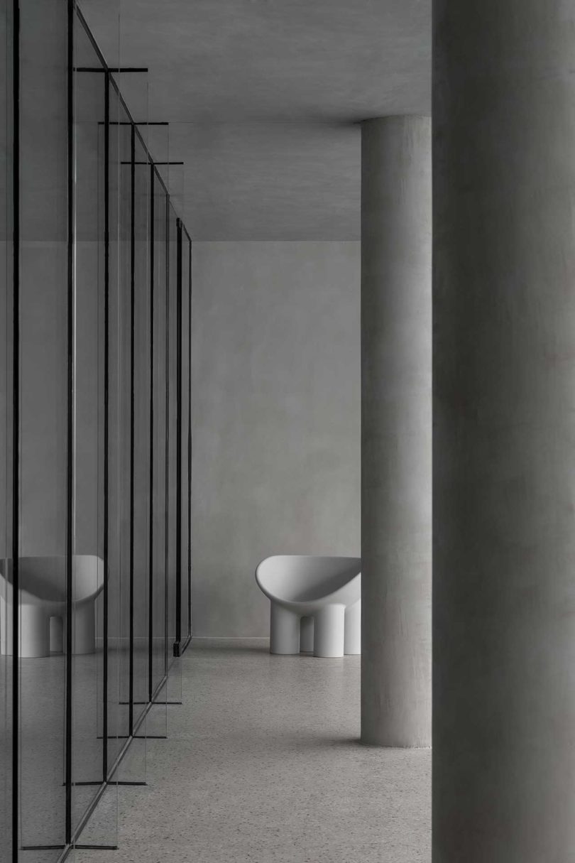
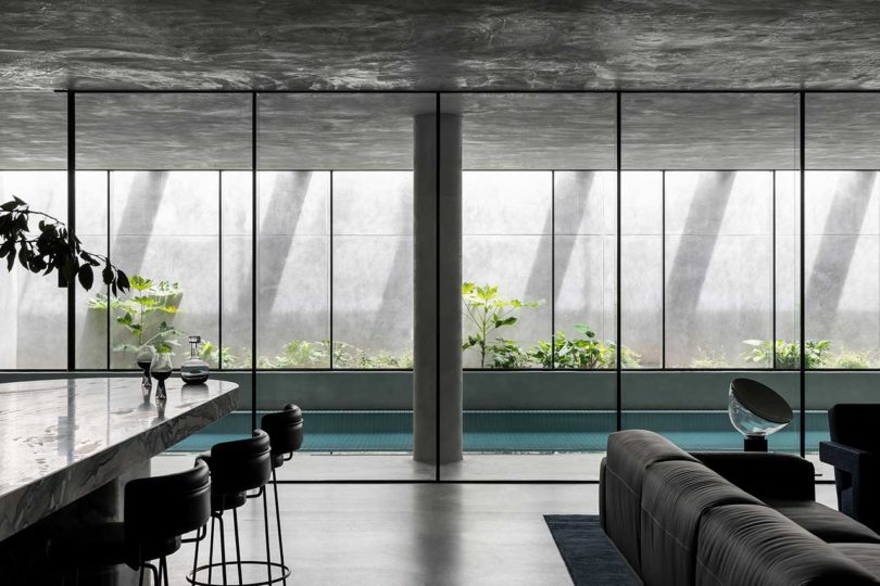
Behind another wall of glass windows is a sitting area and bar, both of which benefit from the plants and natural light.
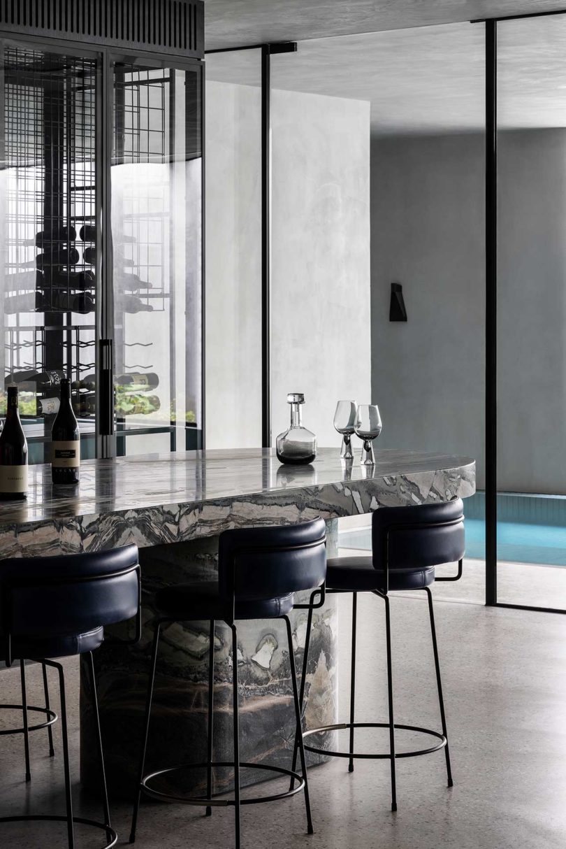
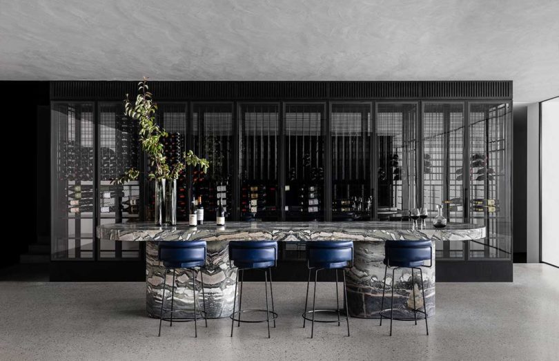
A glass-fronted wine cellar lives behind the massive marble bar. Blue leather bar stools complement the blue Cassina chairs and rug featured in the seating area.
In addition to the original basement’s transformation, the ground floor of the Hideaway House has been reconfigured to seamlessly join the backyard, which includes a tennis court.
Paola Navone brass pendants hang above the dining table, which is rounded out with Mies van der Rohe’s cantilevered chairs.
The design purposefully disguises all TVs in order to minimize the family’s screen time.

Architecture & Interior Design by Cera Stribley.
Landscape Design by Eckersley Garden Architecture.
Styling by Jess Kneebone.
Photography by Timothy Kaye.

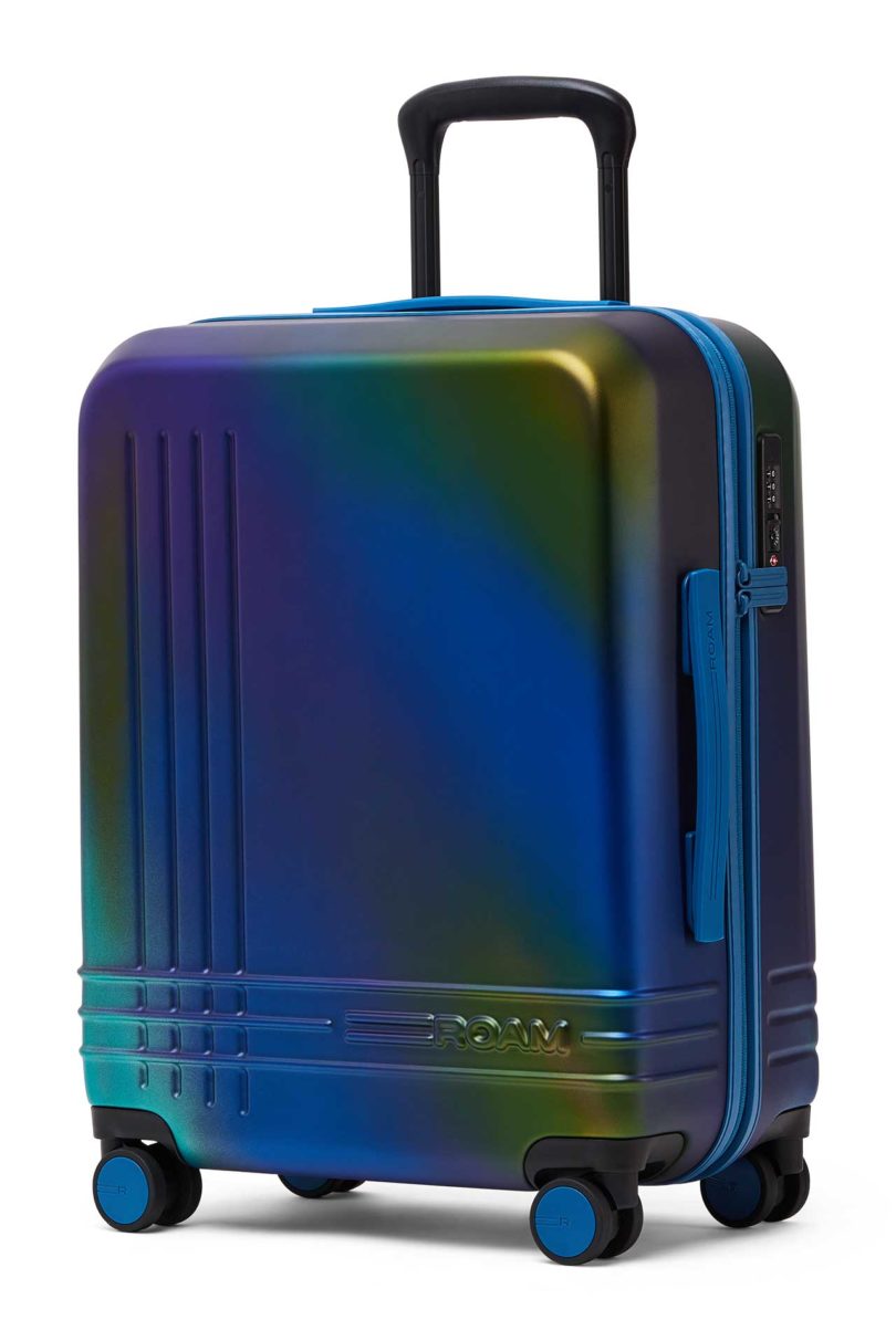
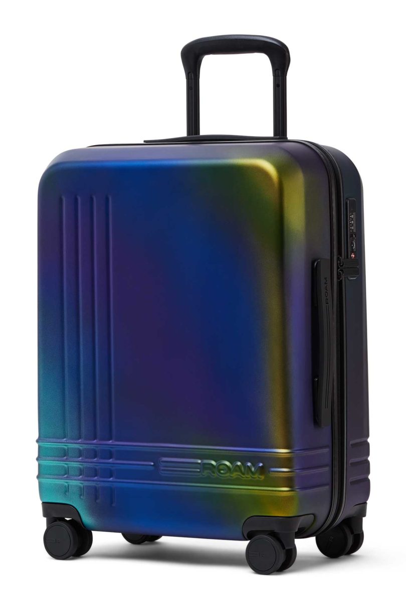
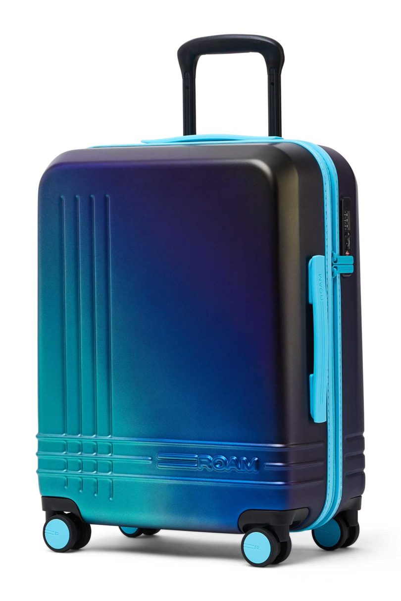
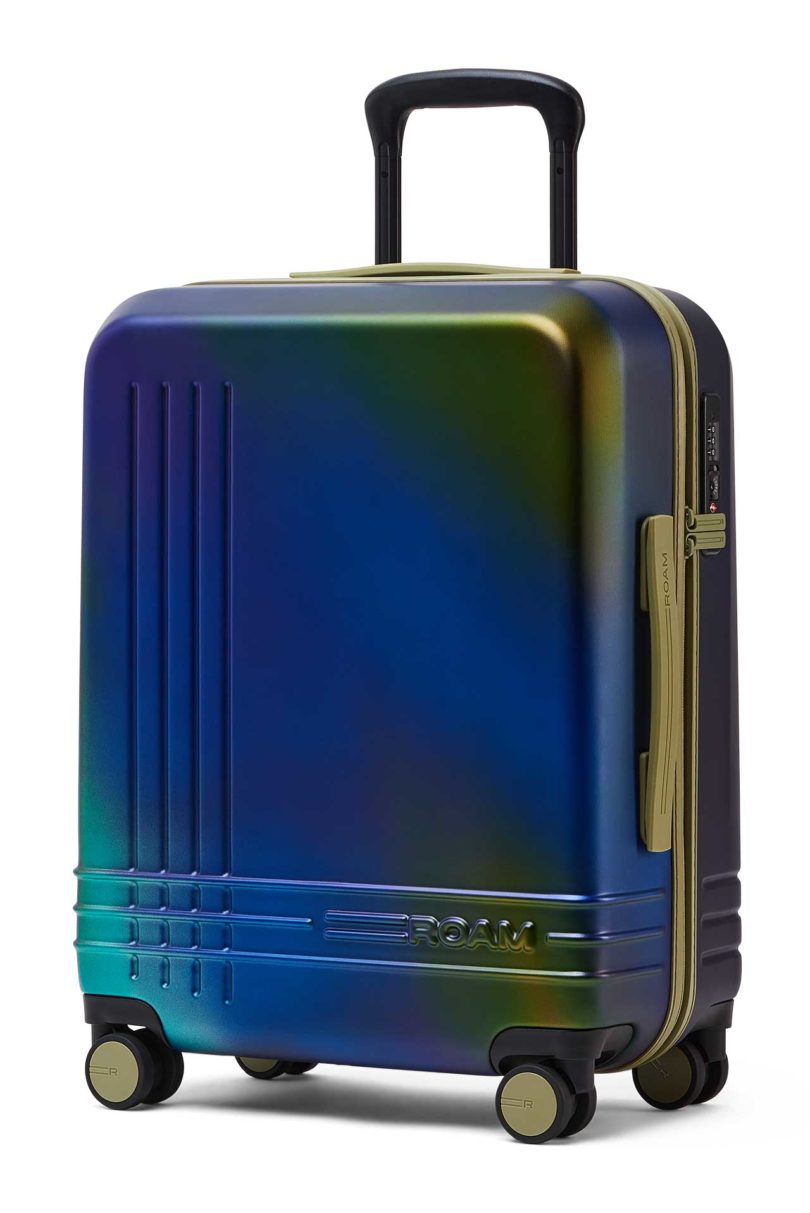
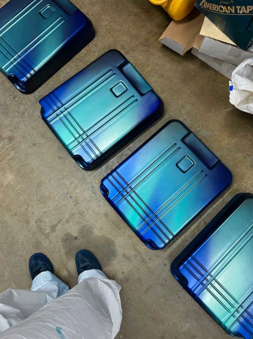
Well known in the tattoo world, artist Amanda Wachob is going back to her painting roots for a collaboration with ROAM. The Amanda Wachob x ROAM Limited Edition collection includes just 100 suitcases, each hand-painted by Amanda herself, resulting in one-of-a-kind pieces of luggage in gradient shades of blue, purple, teal, green, and gold. Four years in the making, the collection is the first, limited edition hand-painted luggage.

Amanda Wachob
The idea for the design came to Amanda while she was tattooing a scientist who studied beetles. Their intriguing iridescence led her to translate that same luminosity to luggage. To make it happen, Amanda went down to ROAM’s factory in Georgia where she painted 200 shells (two shells make one suitcase) with five to seven layers of paint. The labor-intensive process was well worth it when you see the results, as each one is its own piece of art. To make each suitcase even more unique, ROAM allows the customer to choose their own trim colors from Carolina Lilac, Kyoto Black, Venetian Green, Como Blue, and Ibiza Sky.

Two colorways are available: Cerulean, with blues and purples highlighted by radiant teal-green, and Noctorne, featuring black and purples with gold and green accents.

As with all ROAM luggage, each suitcase is made-to-order in the United States, which means no waste. Even the stitching is done by hand! The 100% U.S. virgin polycarbonate shells are durable and strong while also being lightweight – ideal for carry-on luggage.
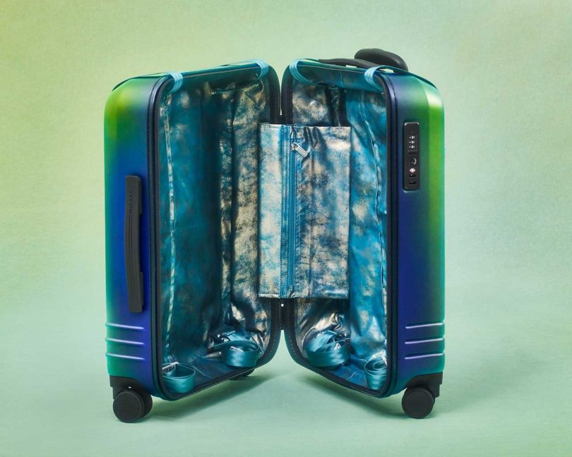
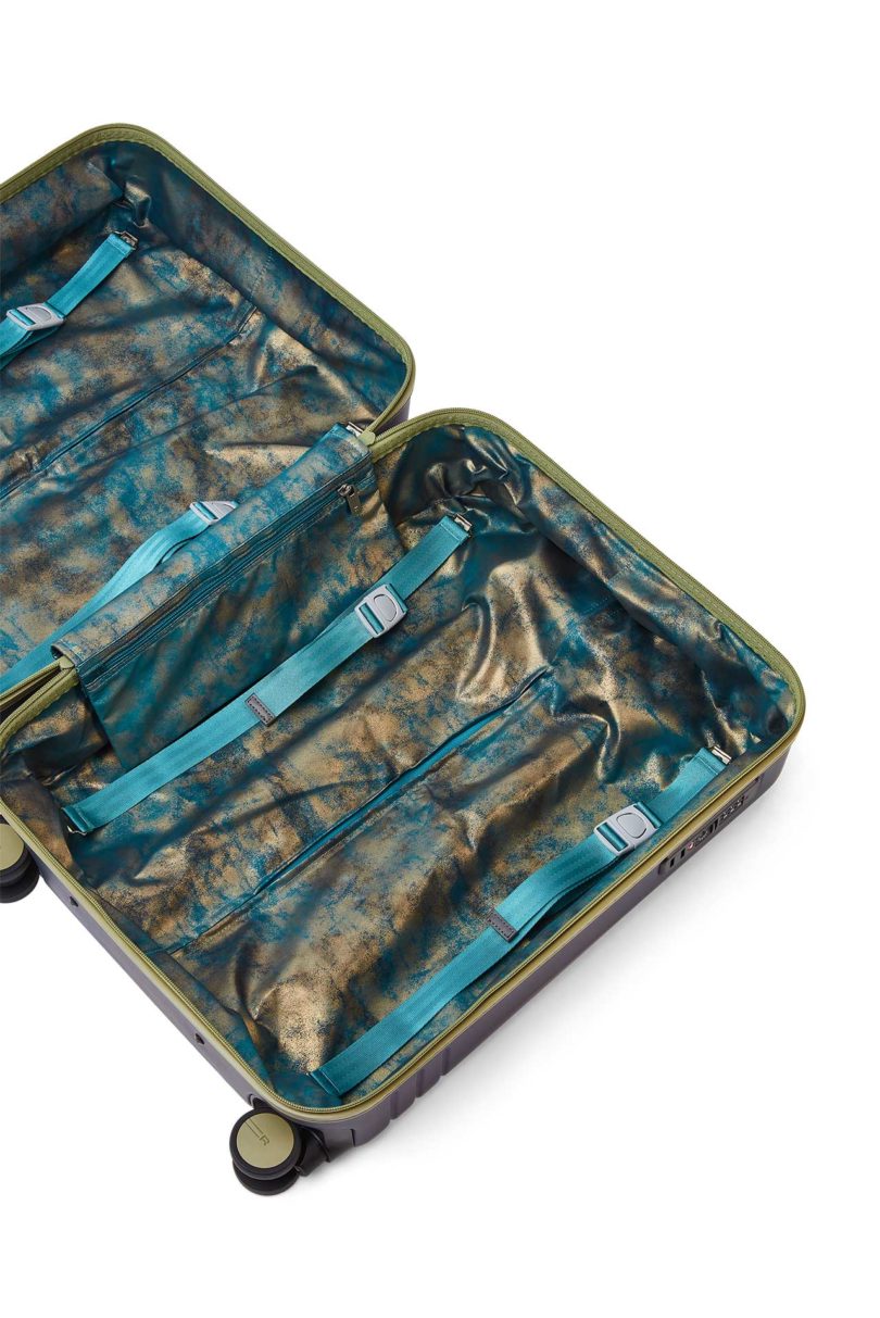
The interior complements the vibrant exterior with an iridescent shimmering lining that’s washable. An interior compression system on each side allows for maximum storage, while a laundry pocket and two accessory pockets keep your goods organized.
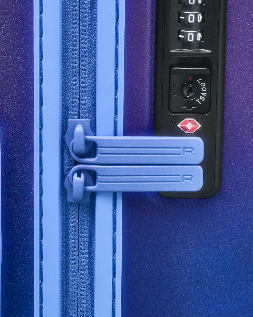
A TSA-approved lock and water-resistant zipper keep personal items safe.

The aircraft-grade aluminum handle can be set at four heights for easy handling, while four Hinomoto ball-bearing wheels make for seamless glides through airports.


Each suitcase is numbered and signed by Amanda and comes with a signed certificate of authenticity.

Mixing iridescent paint in the factory
Shells during the painting process
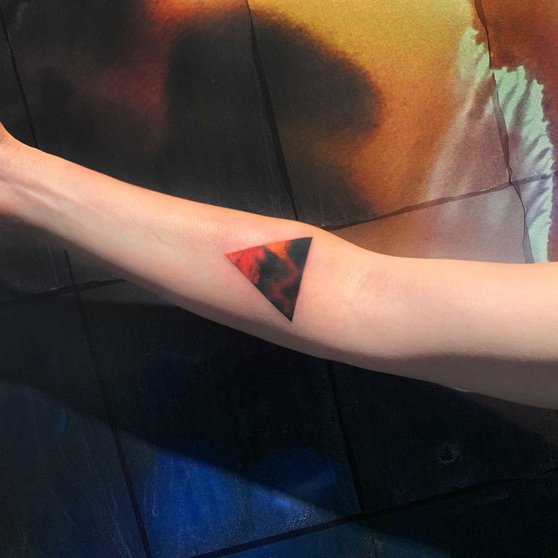
An Amanda Wachob tattoo
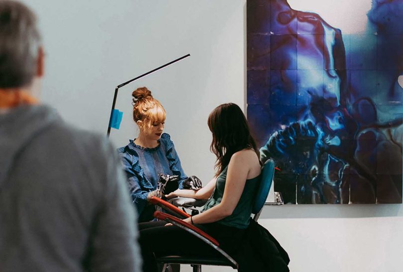
Amanda Wachob tattooing client
Works by Amanda Wachob:
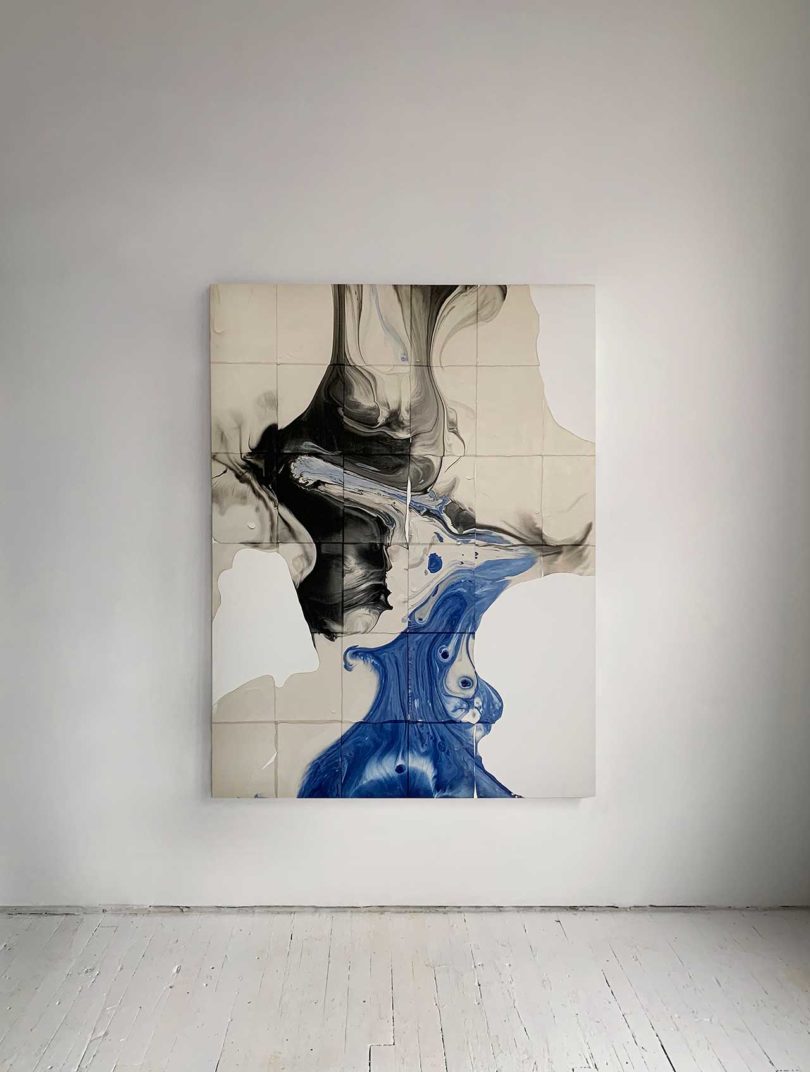
Dimensional Transmutation, tattoo ink and temporary tattoo paper on canvas, 46″x 60″, 2019
Tsunami, tattoo ink and temporary tattoo paper on canvas, 46″x 60″, 2019

Amanda with a finished suitcase
For those of us that have longed to get a tattoo by Amanda for years (she’s always had a very long waiting list), perhaps carrying her art around in a different way could suffice. You’ll definitely be part of a small group of people – 1 in 100 – to own one! The Amanda Wachob x ROAM Limited Edition collection launches today at roamluggage.com with suitcases priced at $975.
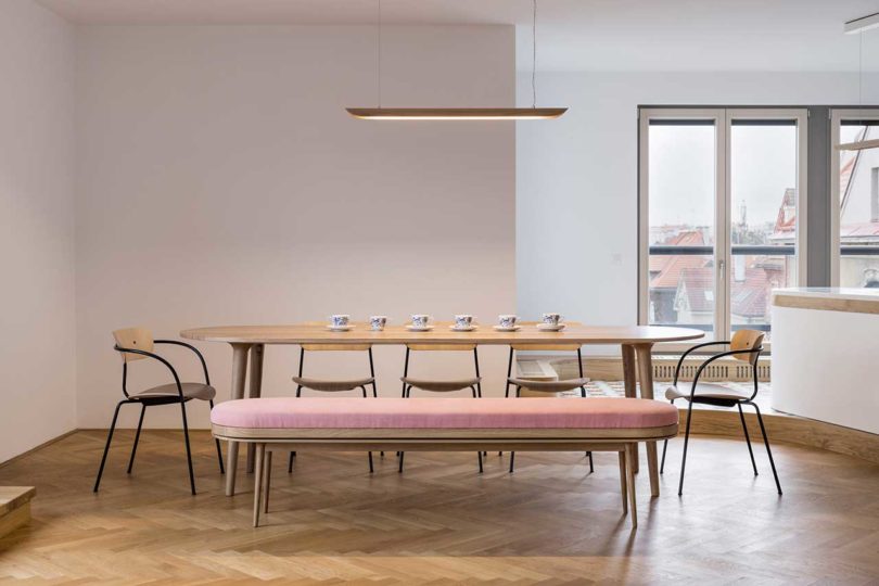
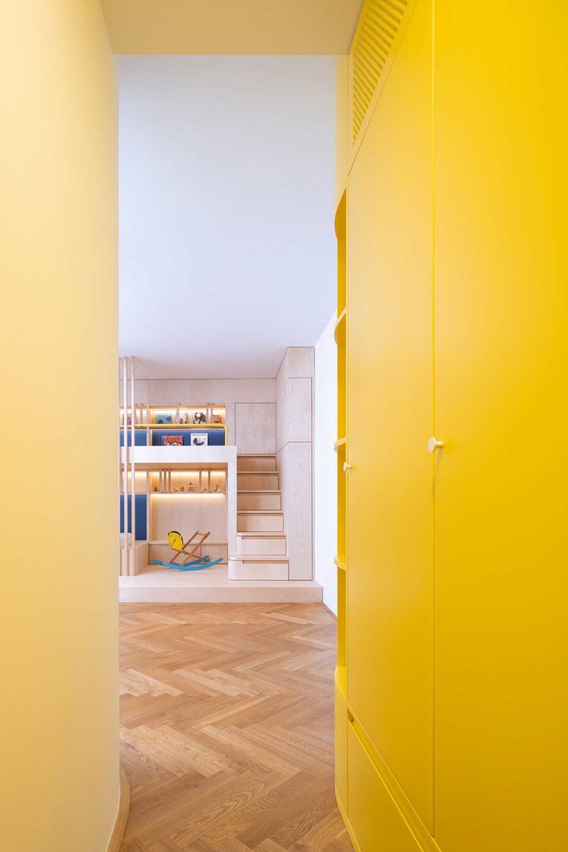
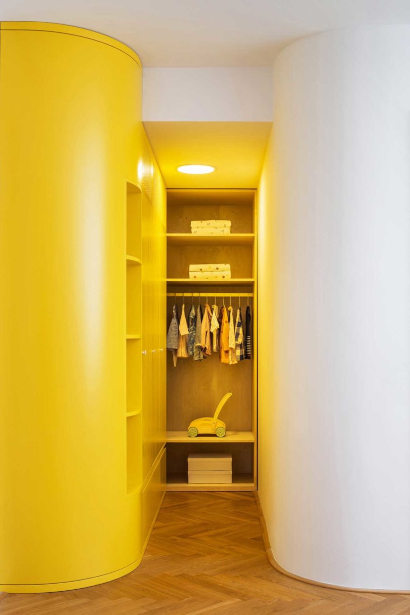
Welcome Home is a recently completed project by No Architects, who designed a modern apartment for a family with small children. The Prague apartment received a reconfigured layout that includes a new multipurpose room that works as a study, playroom, and guest room. Sliding doors can close to hide the room from the living room when it’s not in use or for privacy when someone is visiting or needing to work. Even with the doors closed, the open kitchen, dining room, and living room provide ample space for the family to enjoy.
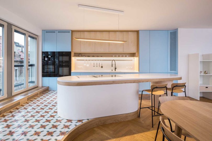
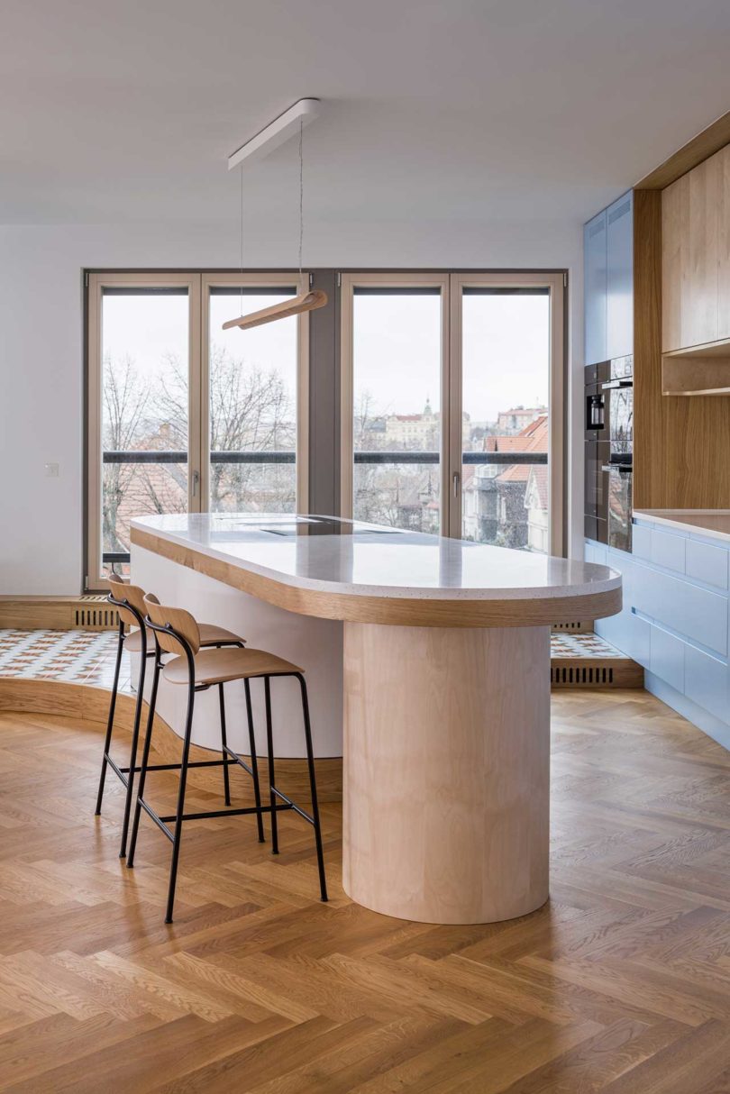
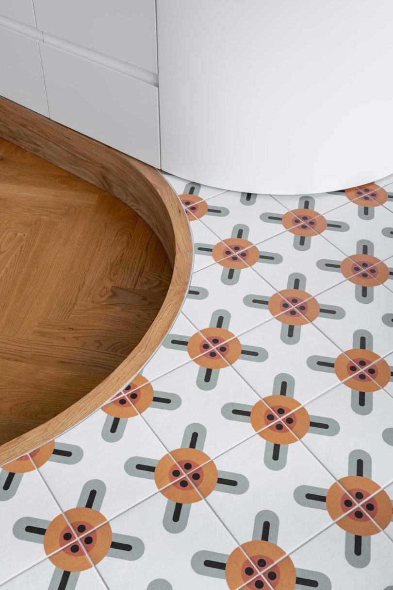
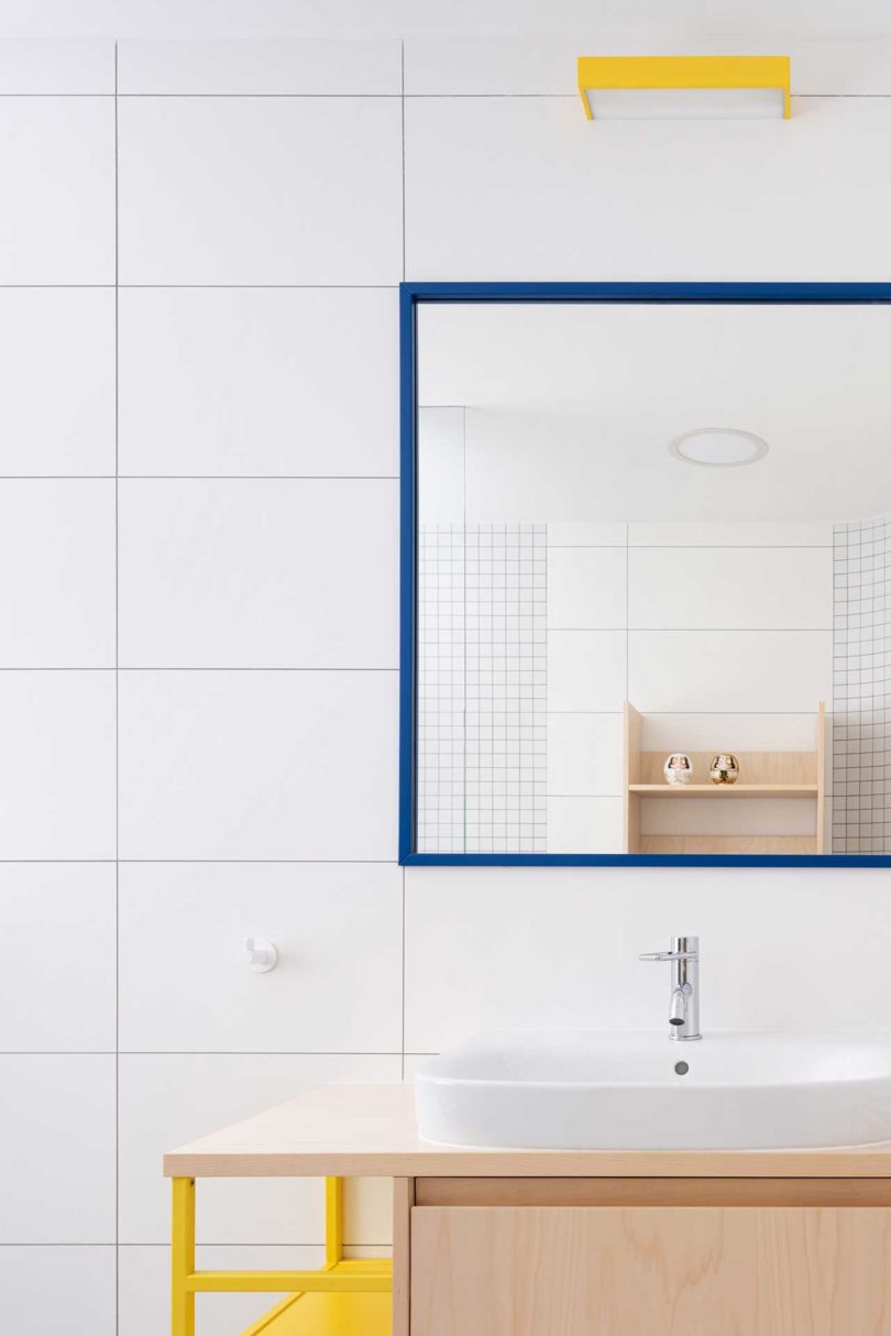
The unique kitchen boasts an oval, angled island with two bases in different finishes. The larger white base rests upon an elevated floor decked out in a patterned tile, while the wood column base sits on the main herringbone floor. The cabinets include a row of wood fronted uppers with light blue cabinets surrounding them.
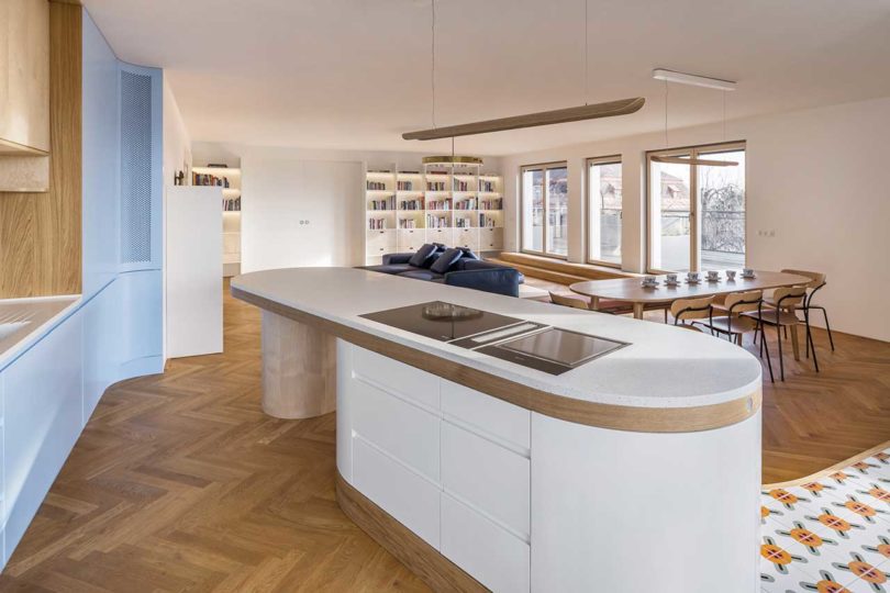
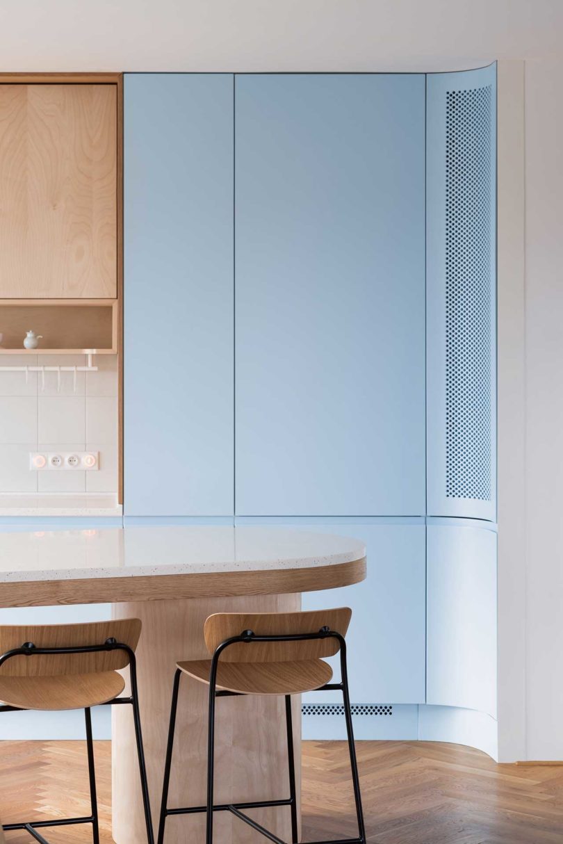
The blue cabinets curve at one end, complementing the curves of the island and raised tile floor.
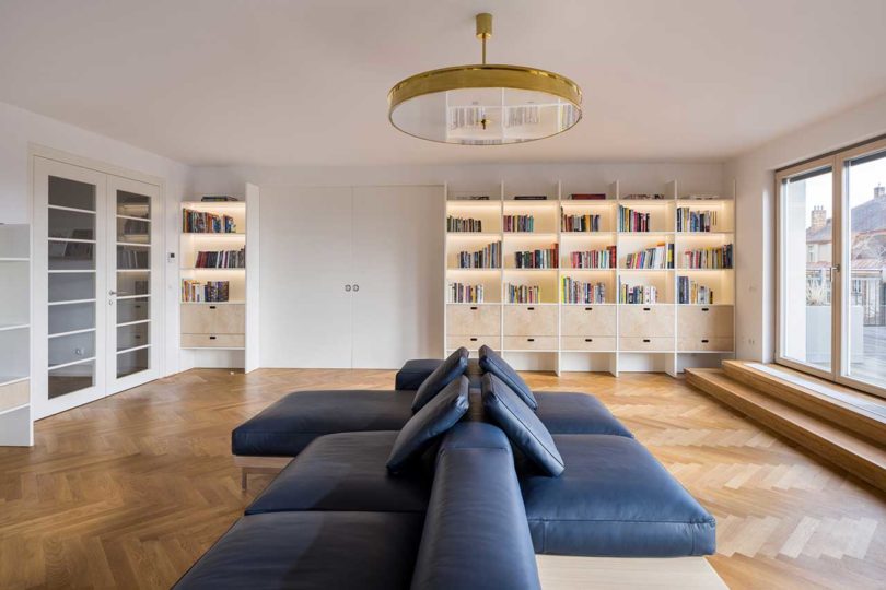
A double-sided, navy blue leather sofa floats in the center of the living room surrounded by built-in storage and display cabinets. One side of the sofa faces the television, while the other looks towards the windows with views of Prague.

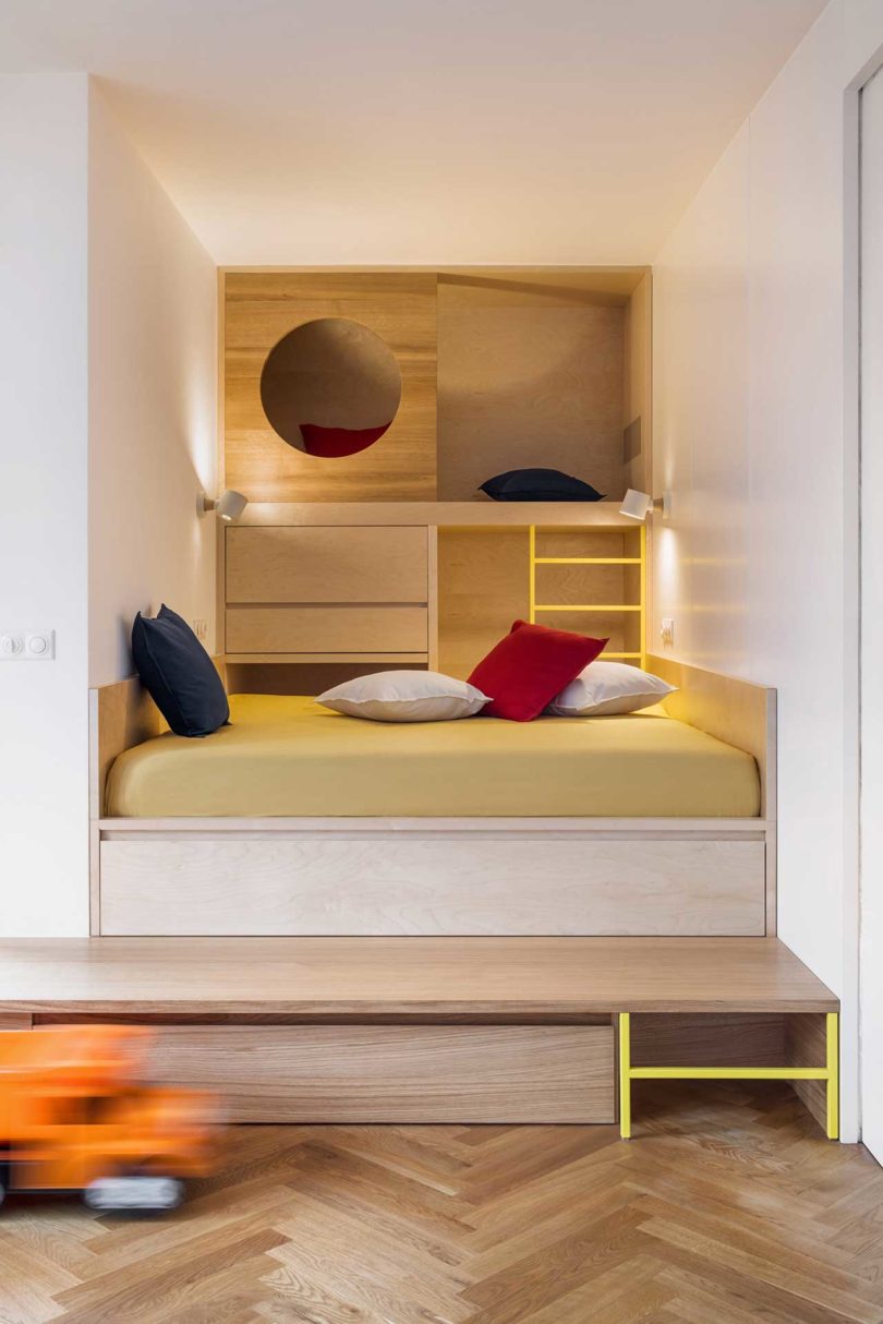
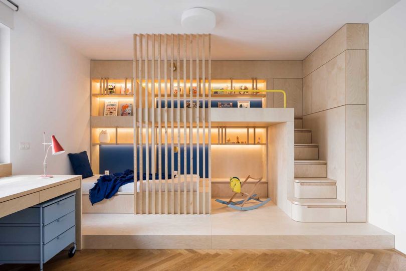
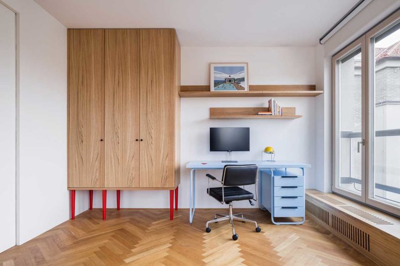
The combo room just off the living room houses an elevated, built-in bed with storage under and behind it. On the opposite side, a light blue desk setup lives beside a large wooden storage cabinet with red legs.
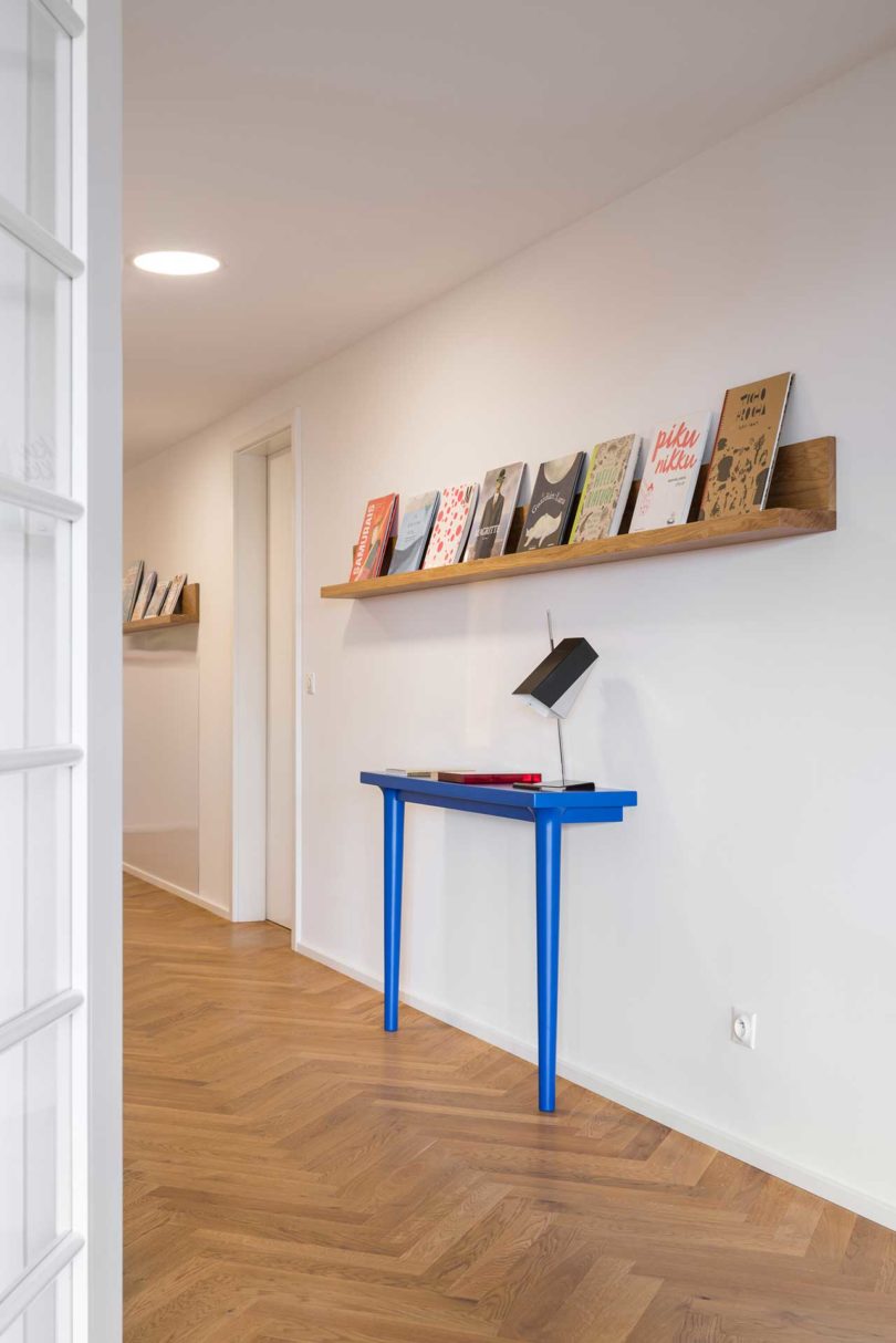
The all-white hallway gets a boost from a cobalt blue console table that rests against the wall.
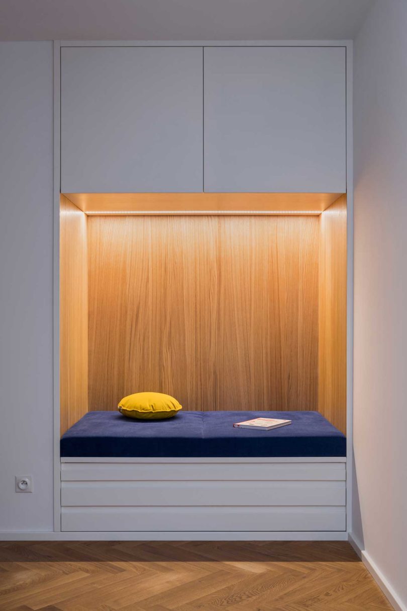
A seating nook with storage is built into the hallway near the front door, offering a good place to drop belongings after entering the apartment.
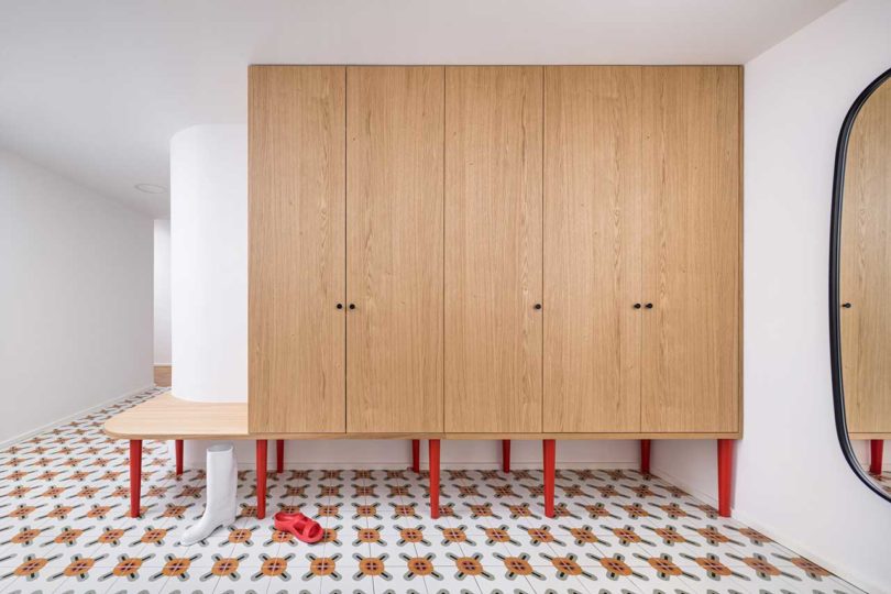
More wooden storage cabinets with red legs outfit the entryway.
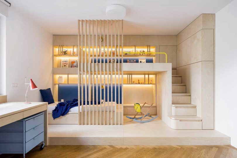
A child’s room features a modern bunkbed that’s complete with storage, stairs, hidden lighting, and a privacy screen.

No Architects
Photos by Studio Flusser.
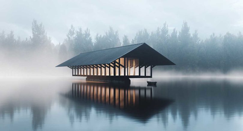
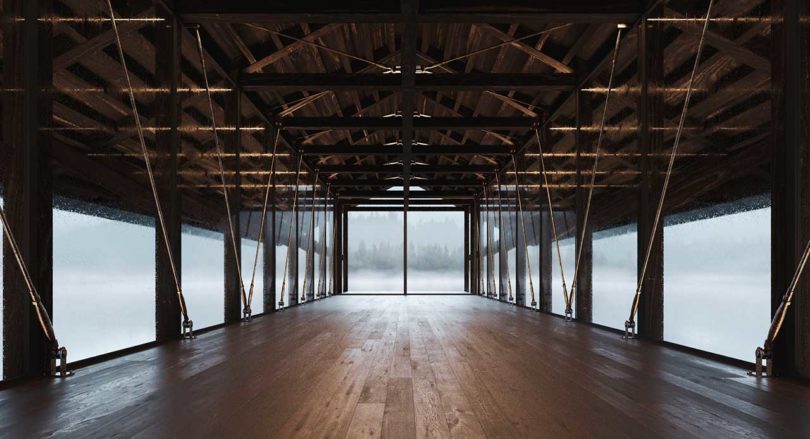
While we normally do not post design concepts, we couldn’t pass up the latest project from Marc Thorpe Design. Thorpe designed the Crystal Lake Pavilion as a concept proposed to reside in the West Catskills in New York on a 32-acre man-made lake. With the surrounding 497-acre Crystal Lake Wild Forest, the area offers seeps, streams, wetlands, a beaver pond, and rolling hills, all home to countless types of indigenous species of plants, trees, and flowers, as well as wildlife and insects.
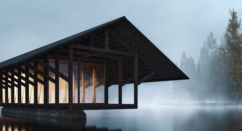
The pavilion’s tranquil location, which is reached by boat, provides the perfect backdrop for its designed purpose – meditation, yoga classes, and group therapy. The glass enclosure ensures nature views from all angles for optimum relaxation.
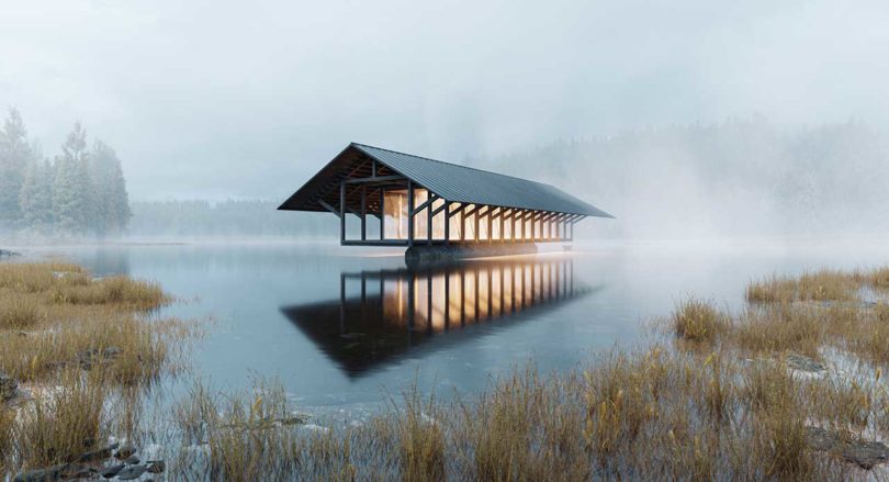
The Crystal Lake Pavilion is made with a traditional King Post construction method resulting in a timber frame structure with light steel connections, a standing seam steel roof, and a glass skin. The volume utilizes heavy pieces of timber with lap joints and pegged mortise and tenon joints.
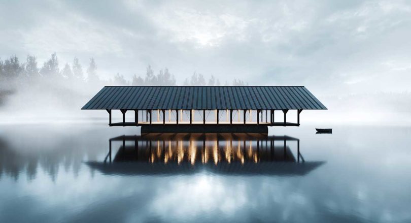
To elevate the design, both literally and figuratively, a solid concrete pier is set into the bed of the lake with a center post that cantilevers out to form the base. With just the single pier, the pavilion looks as if it’s hovering above the water, which creates an optical illusion that makes it appear weightless.

Architecture by Marc Thorpe Design.
Visualization by Truetopia.

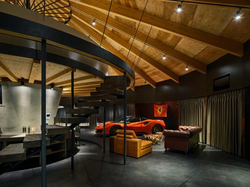
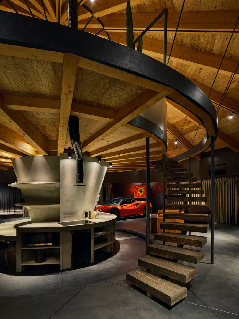
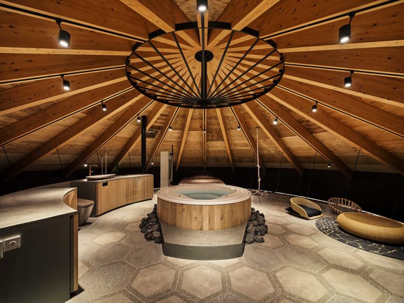
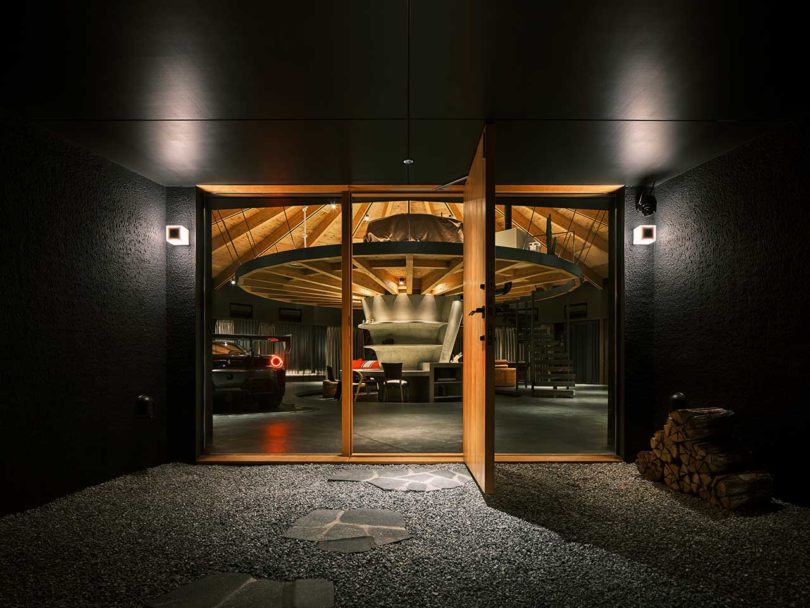
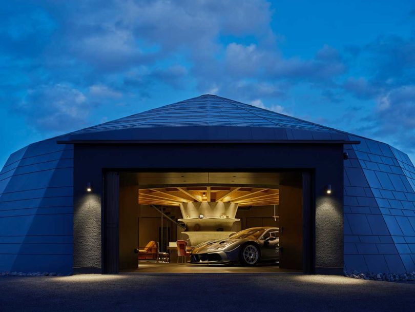
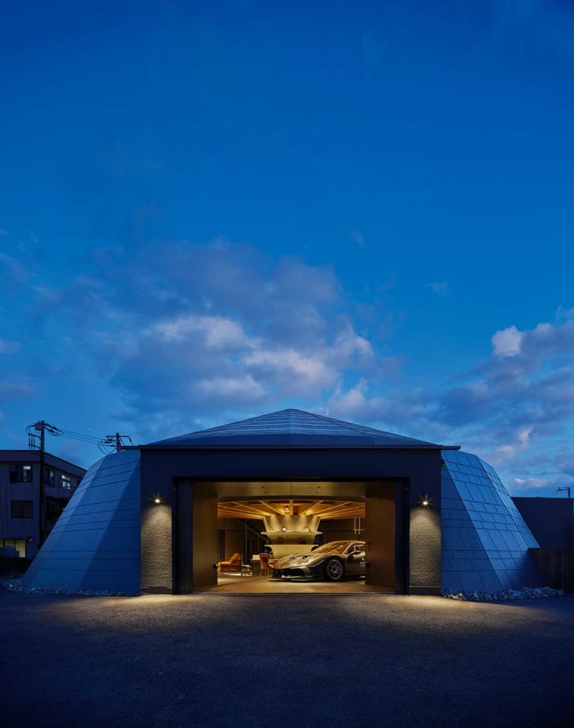
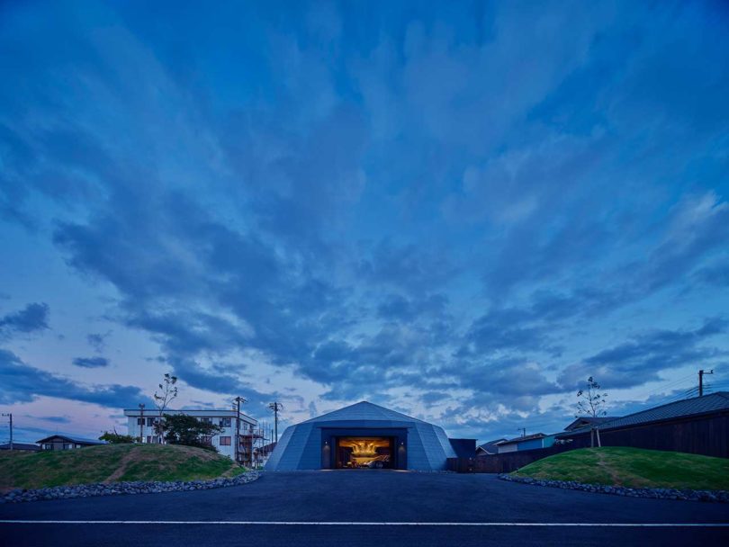
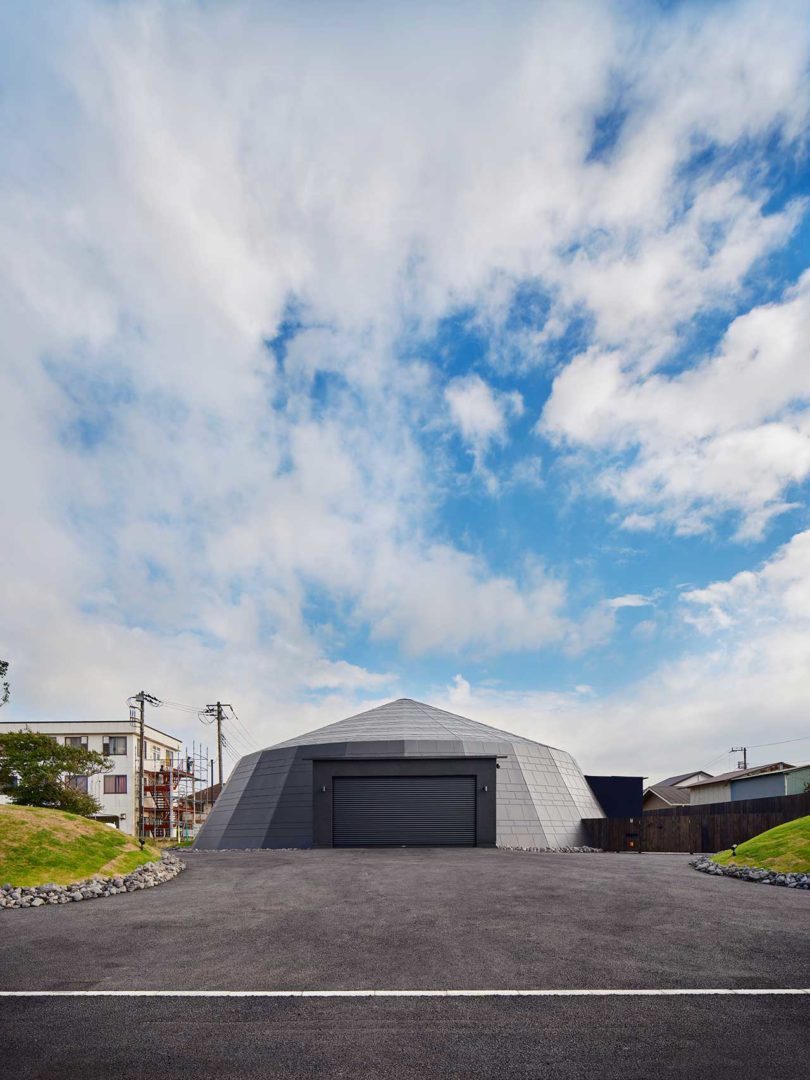
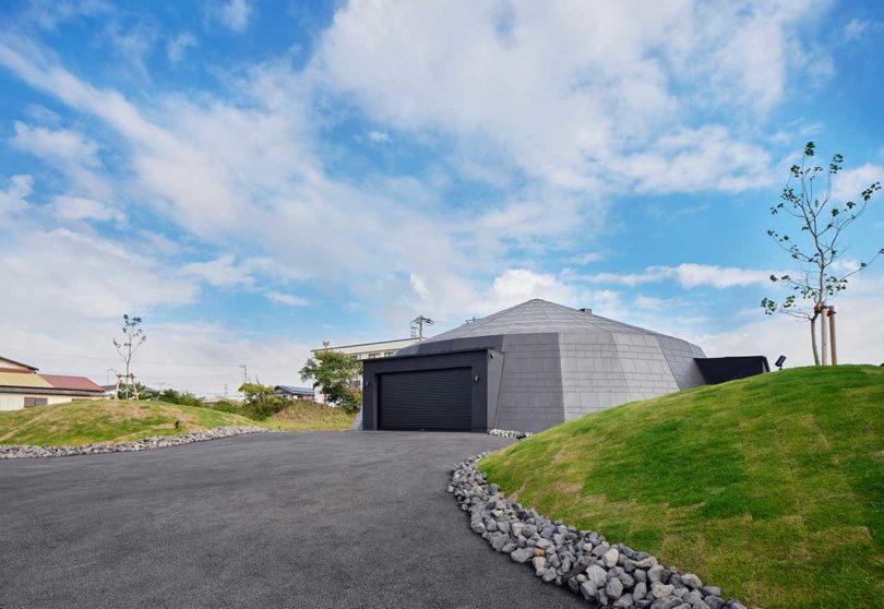
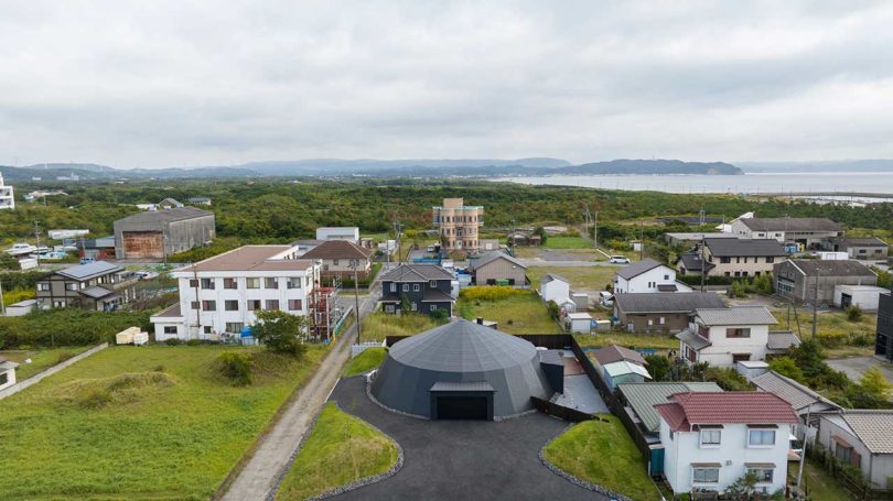
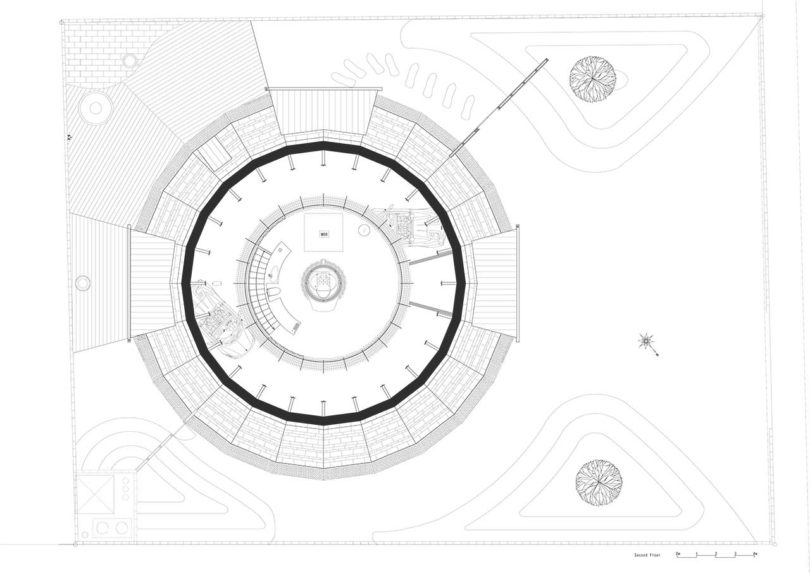
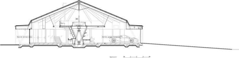
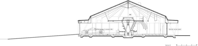
There are those people that love their car… and then those that really, really love their car. The latter is the case for the owner of this vacation house in Chiba, Japan, designed by Hitoshi Saruta of CUBO design architect. The 24-sided volume resembles a circus tent, making its name – The Circus – right on point. In lieu of a typical, built-in garage, the architect opted to unite both people and cars in a unique, relaxed environment. Now, they can “spend time with cars” and appreciate them while doing so.
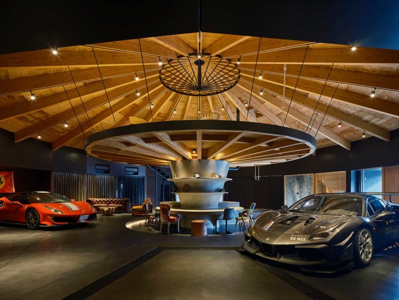
The dome-like space allows for all types of layouts that can easily be changed. An elevated, round table lives in the center to create the second floor, while forming a circular bar situation below.
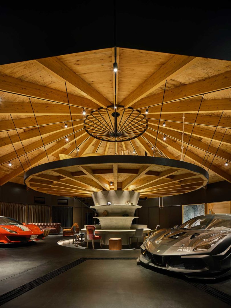
The roof and frame give the feeling of looking up into the inside of a paper umbrella, a nod to Japanese design.
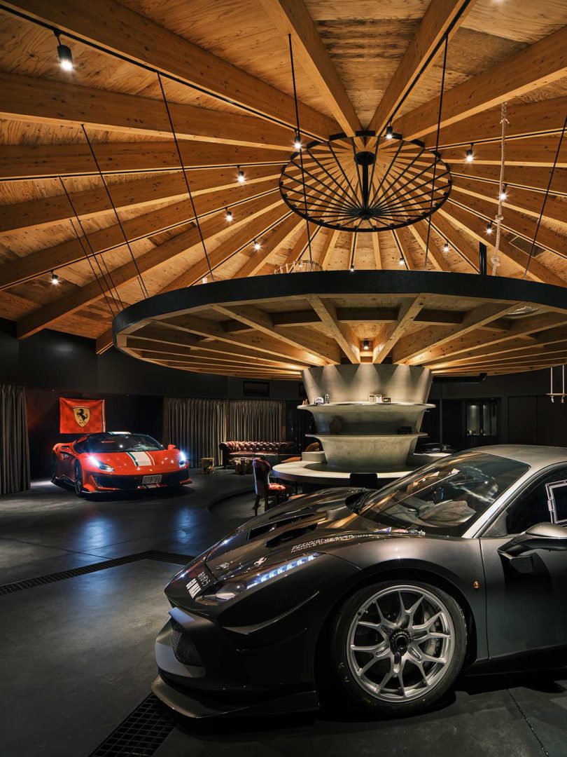
No support posts were required due to the slanted outer walls that maintain the tension.
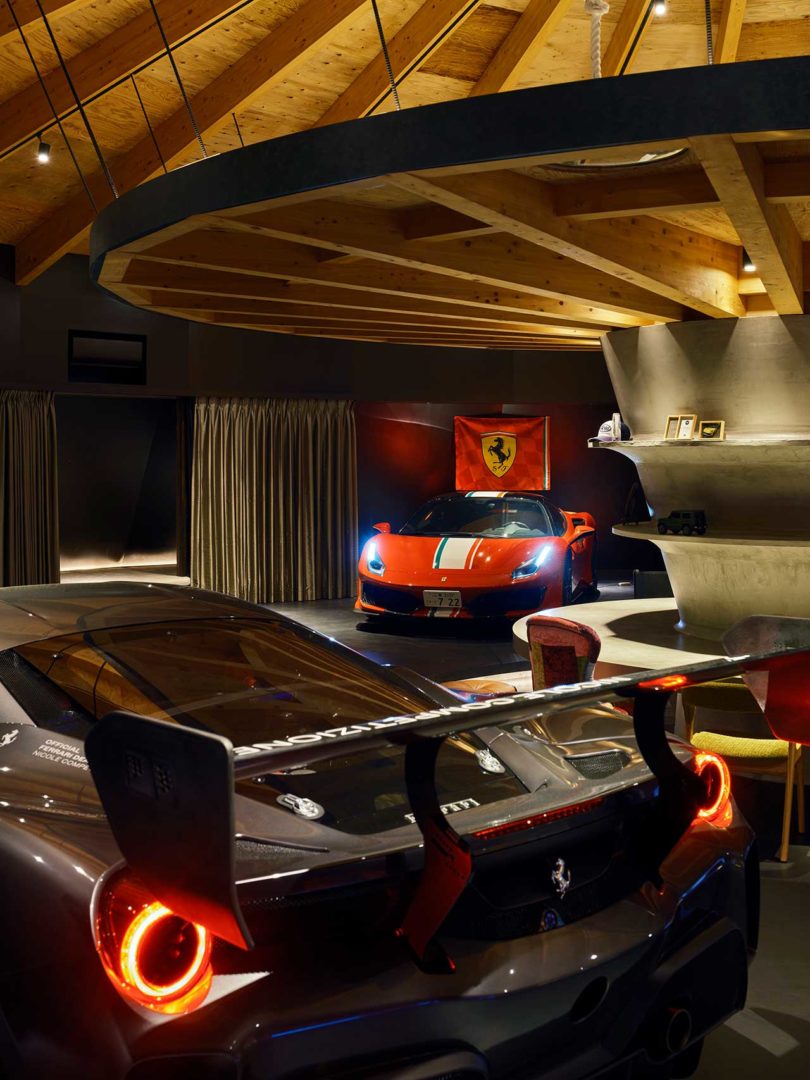
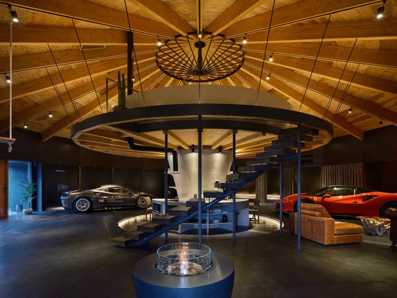
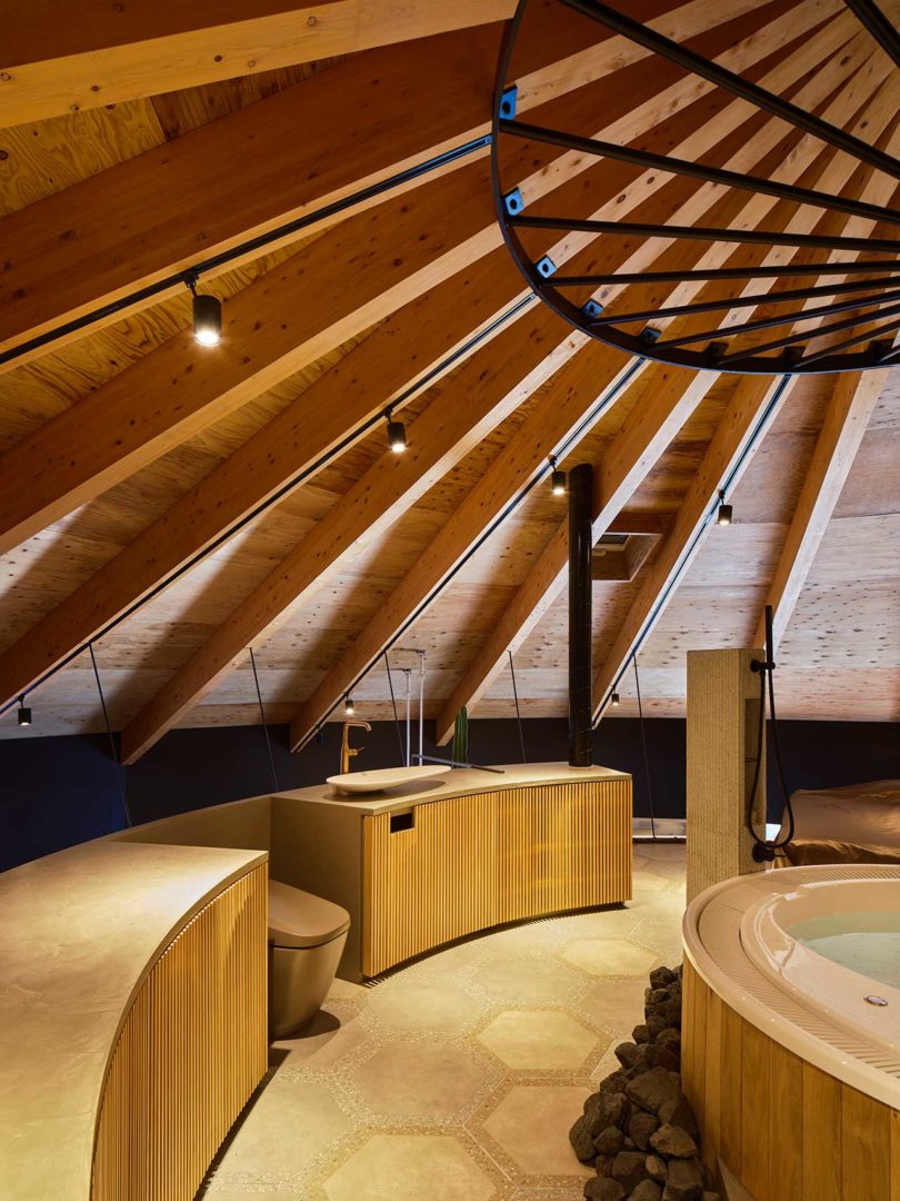
The main floor acts as a garage and living space with all functionally lining the perimeter and central core. A staircase leads to the open, second story which houses the owner’s bedroom with a jacuzzi and waterfall shower.


Photos by Koji Fujii / TOREAL.
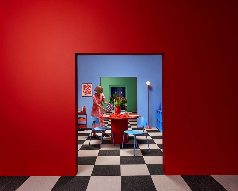
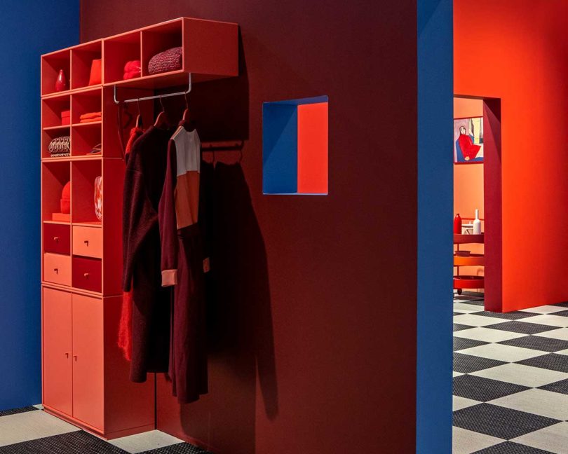
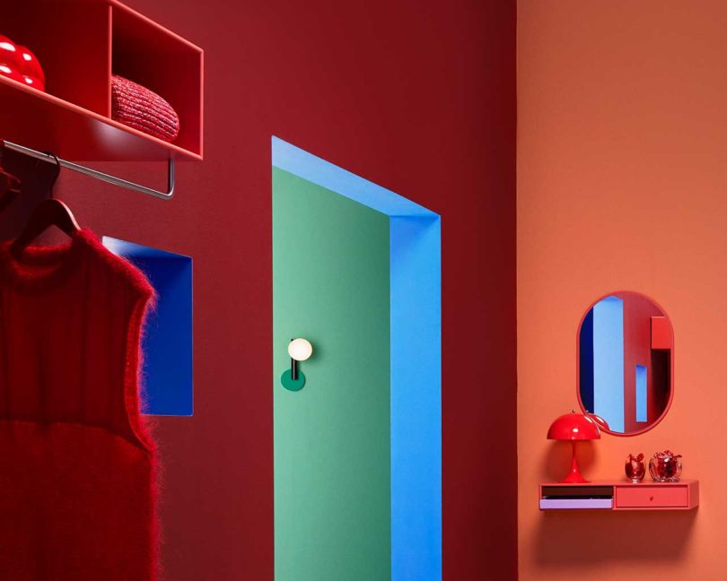
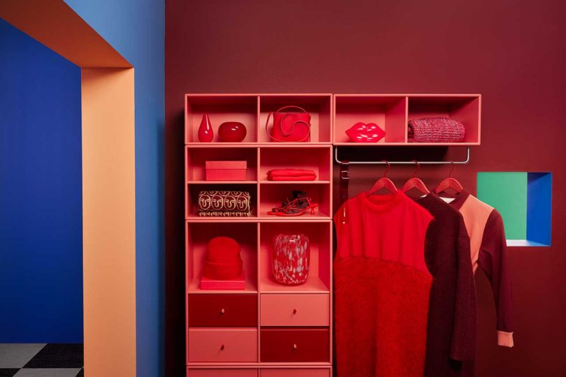
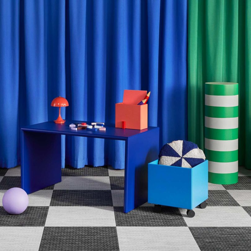
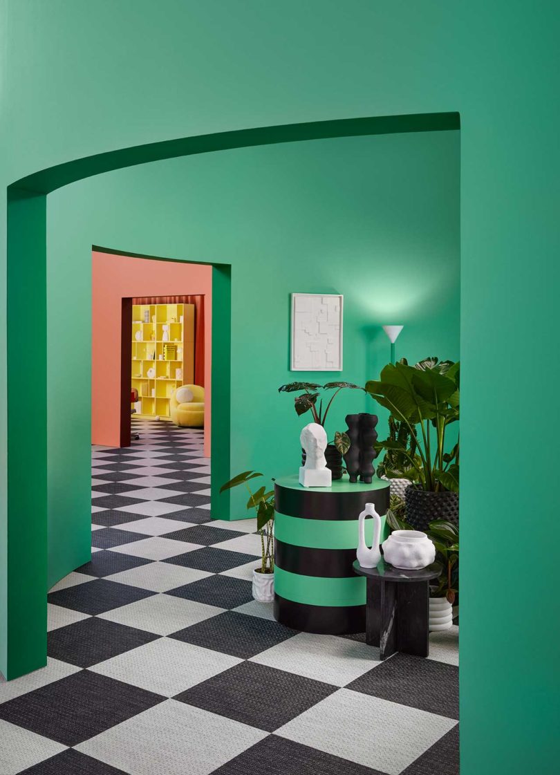
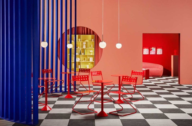
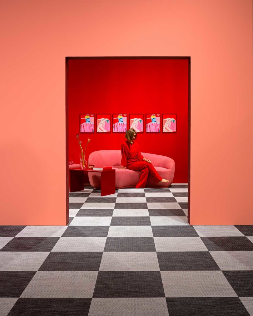
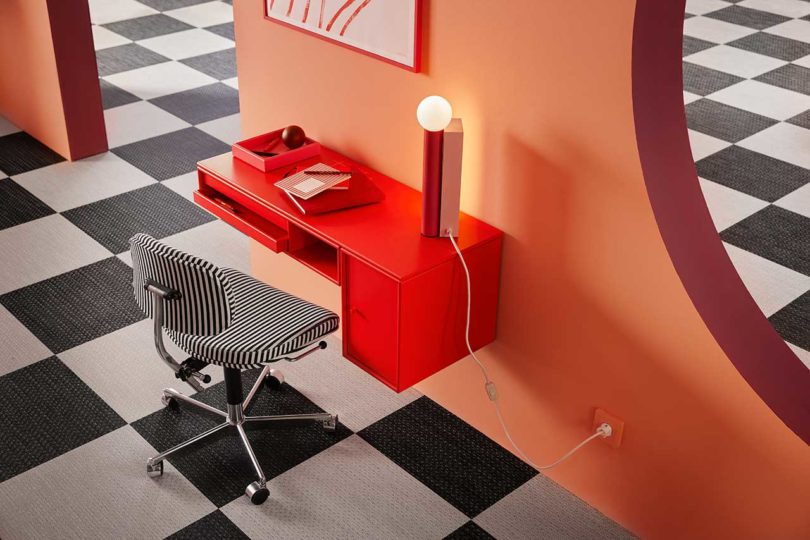
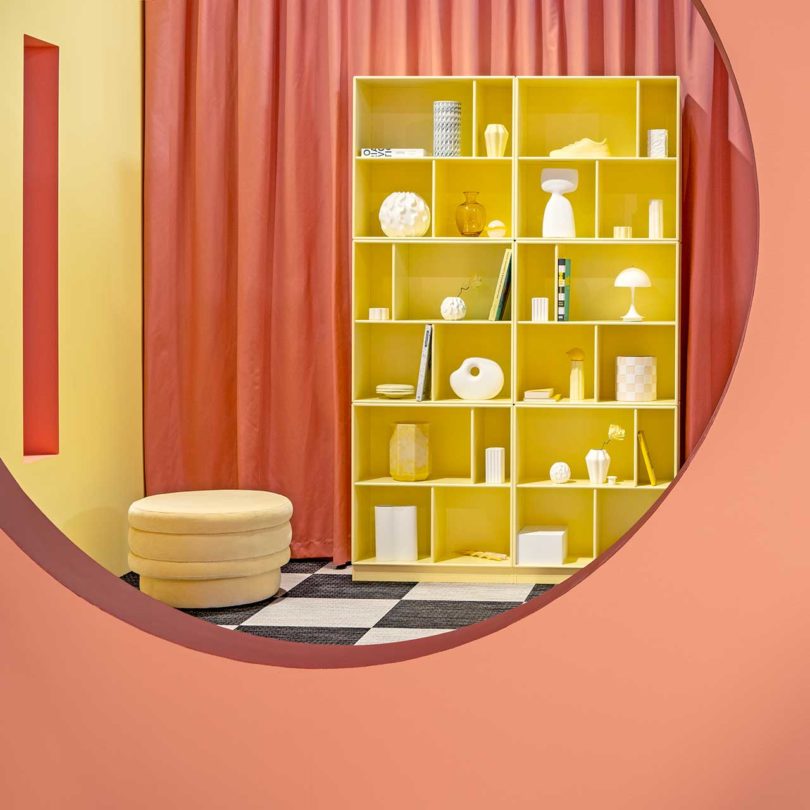
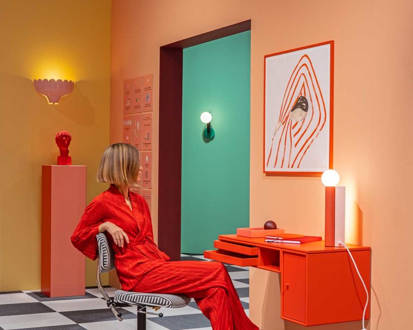
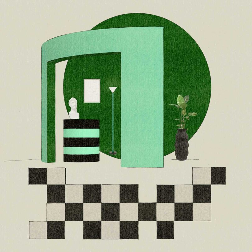
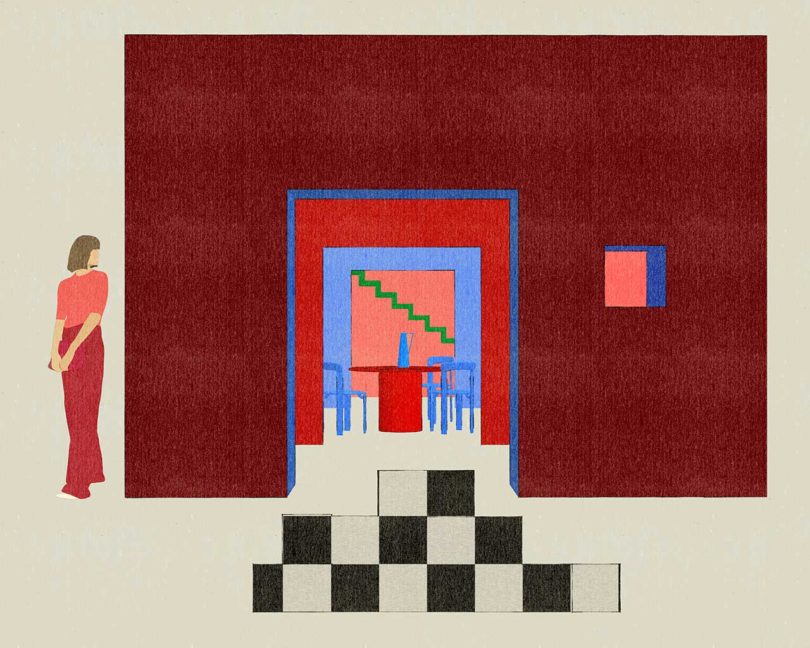
Working with the theme of “Colour Vibes,” color and design phenom Tekla Evelina Severin transformed a 250-square-meter (almost 2,700 square feet) empty space for the FORMEX interior fair last month. The project involved exhibition design, curation, and styling a series of rooms, which resemble either a beautifully staged set for a magazine photo shoot or a perfectly executed interior of a home. Taking inspiration from a labyrinth, hide-and-seek games, and a Rubik’s cube, Dimensions of Colour consists of multiple spaces placed in a zigzag formation, allowing for changes in perspective from every view. No matter the angle, new framed vignettes appear, as do ever-changing color palettes, making the space feel like it’s bouncing back and forth between realism and surrealism.
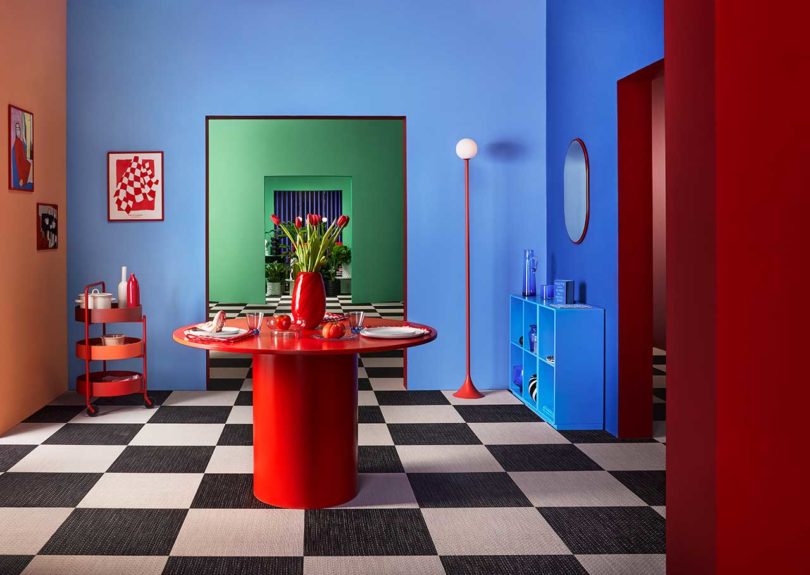
Immersed in Severin’s color-blocked world are a curated roster of 200 products sourced from 400 exhibitors, resulting in a broad mix of objects that feel like they belong.
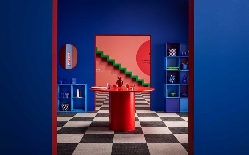
Each space features black and white checkered floors with layers of rich, saturated wall colors. Topped off with furnishings – some that match and some that contrast – that give each room a purpose, whether it’s a living room, kitchen, bedroom, kid’s space, atrium, or living room.
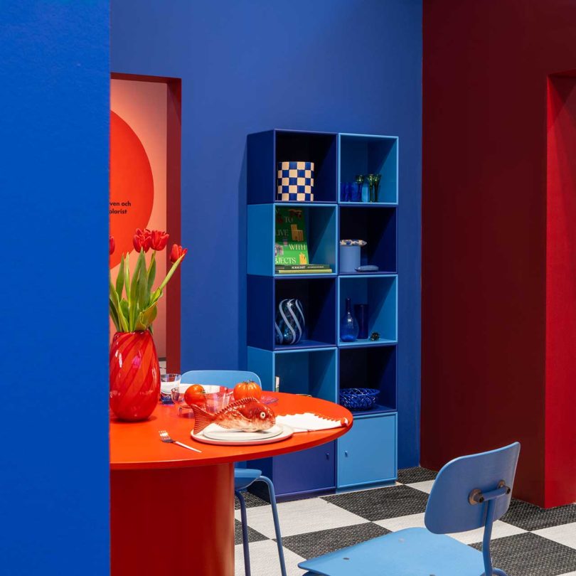

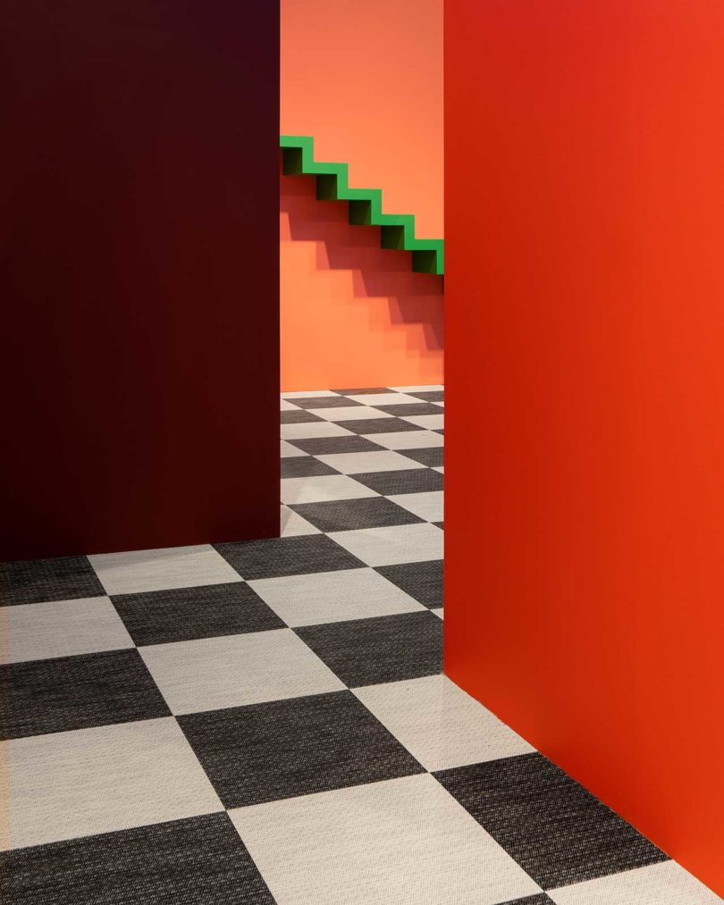

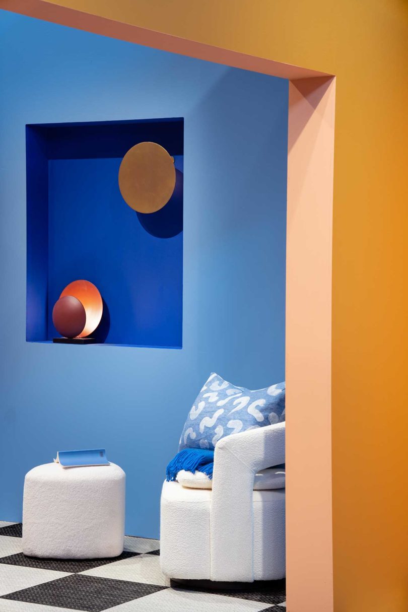
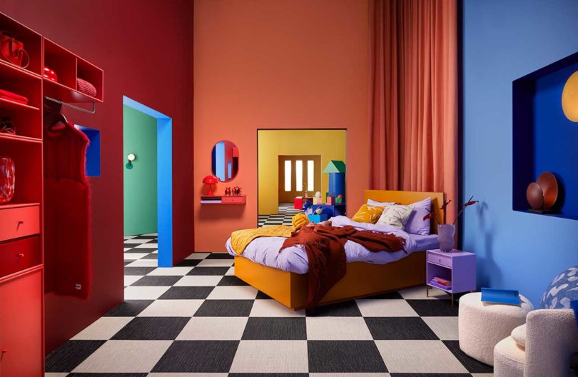
Despite the use of so many colors, none of them feel out of place, as each works with the color beside it, across the room, or in the next space.
Concept illustration
Concept illustration

Concept illustration
Photos by Fredrik Bengtsson and Tekla Evelina Severin.

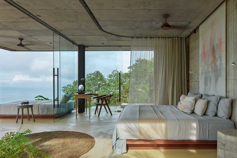
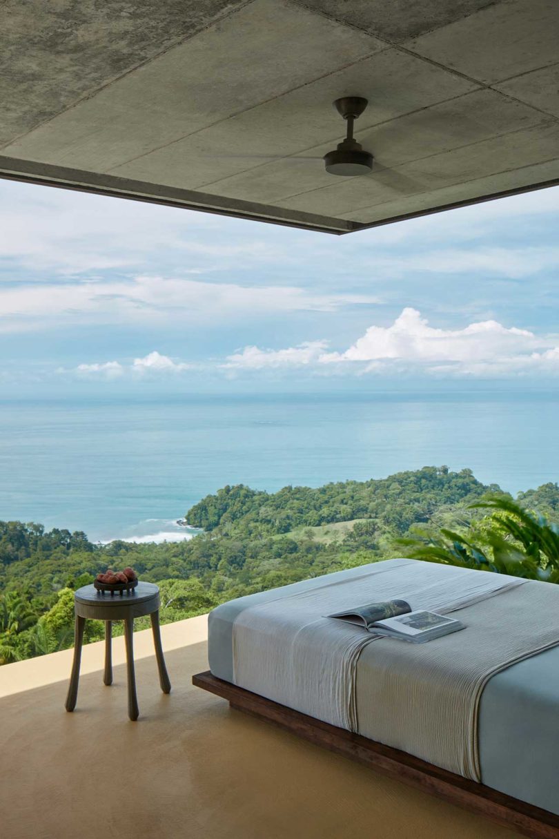
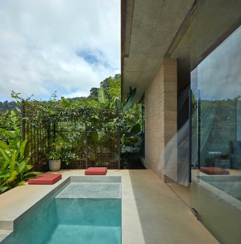
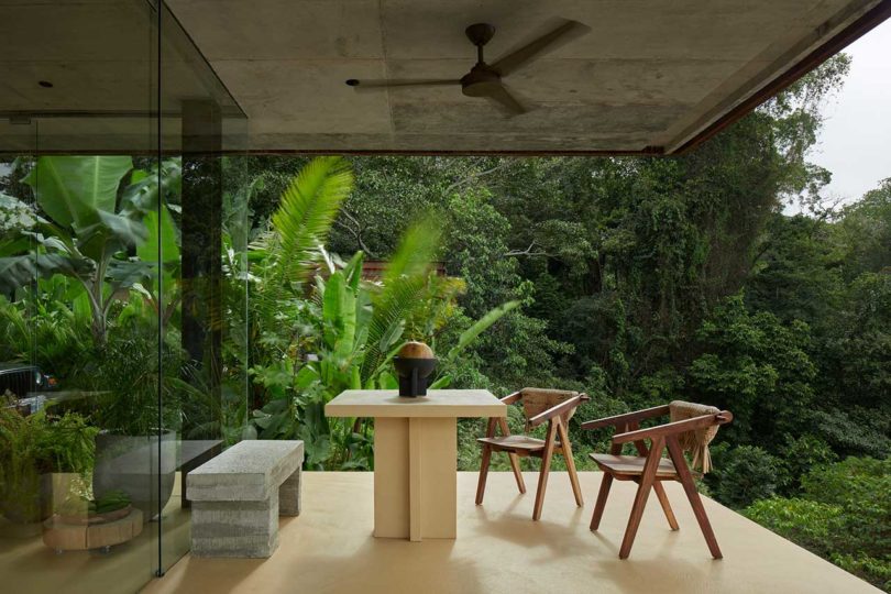
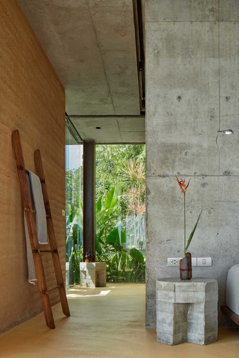
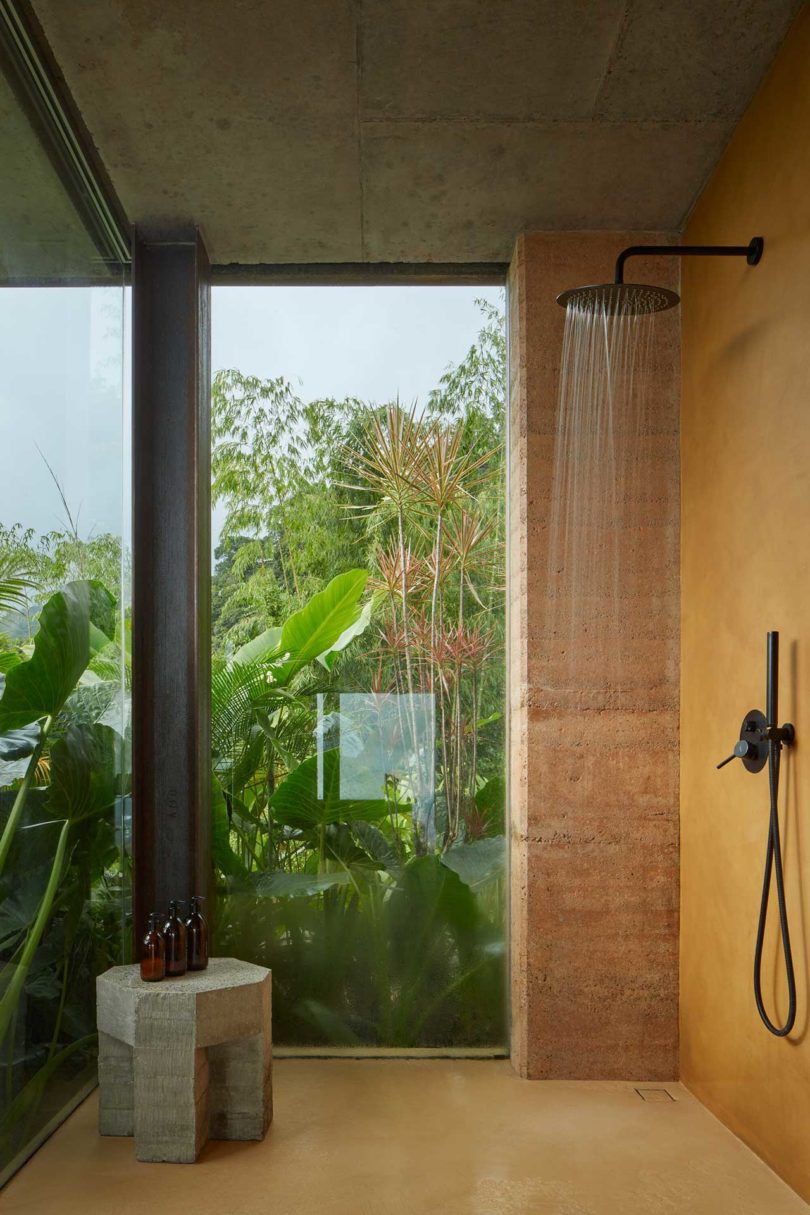
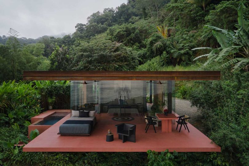
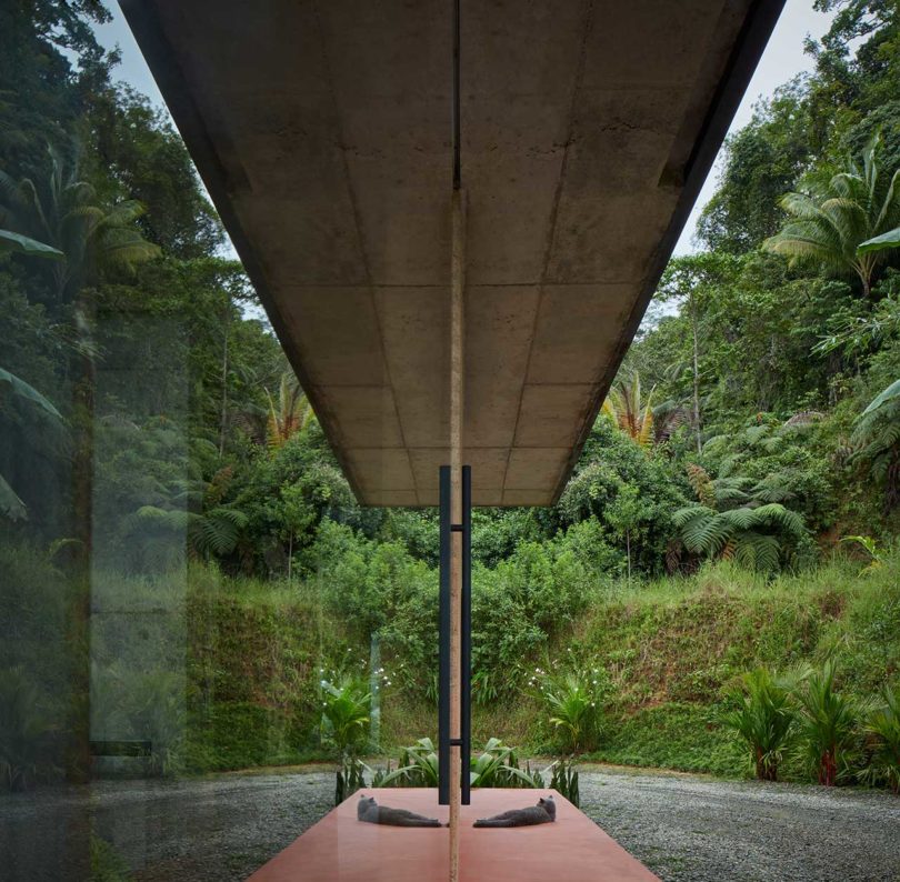
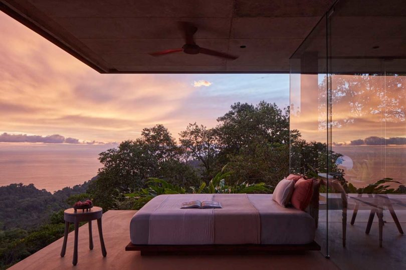
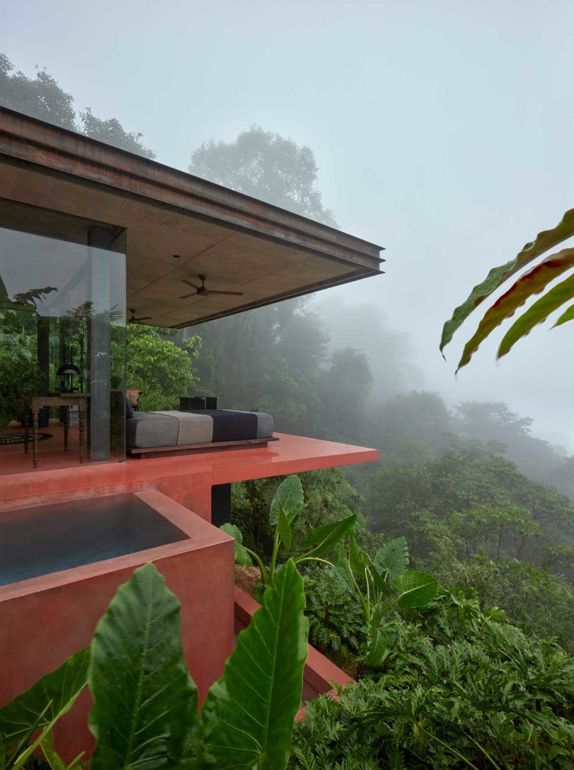
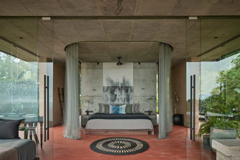
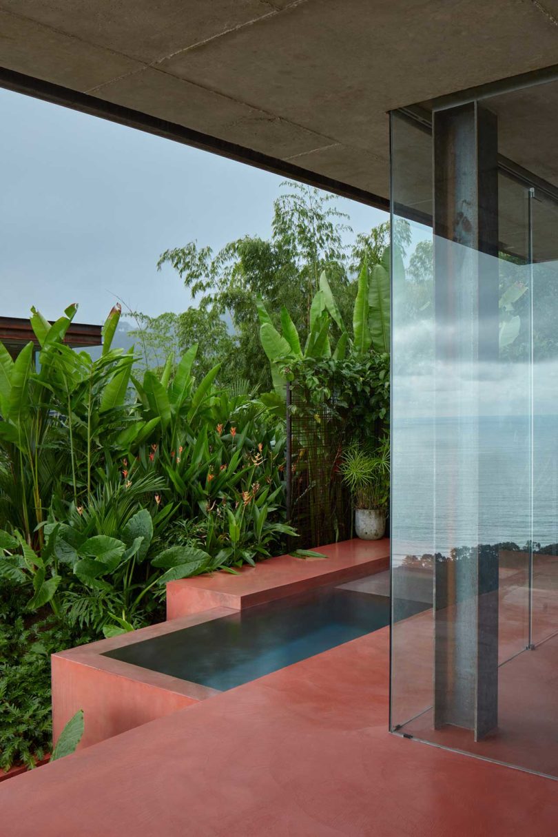
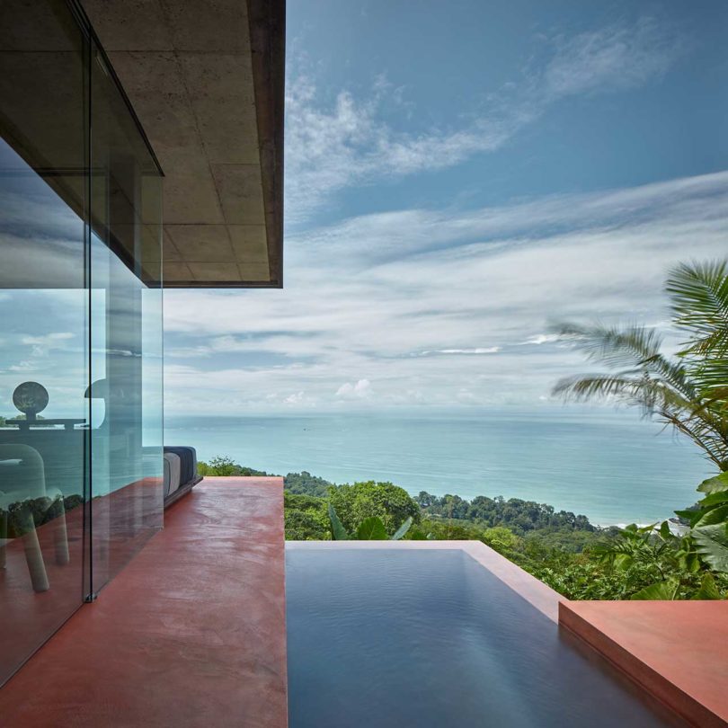
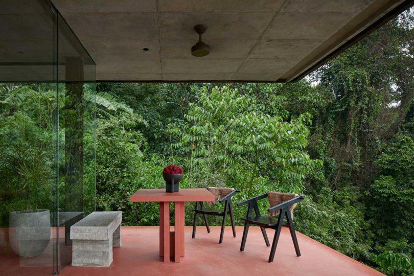
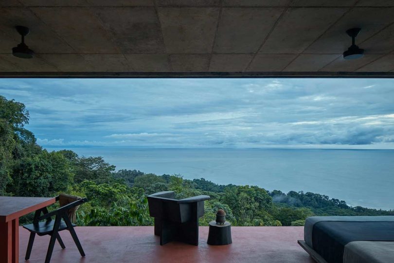
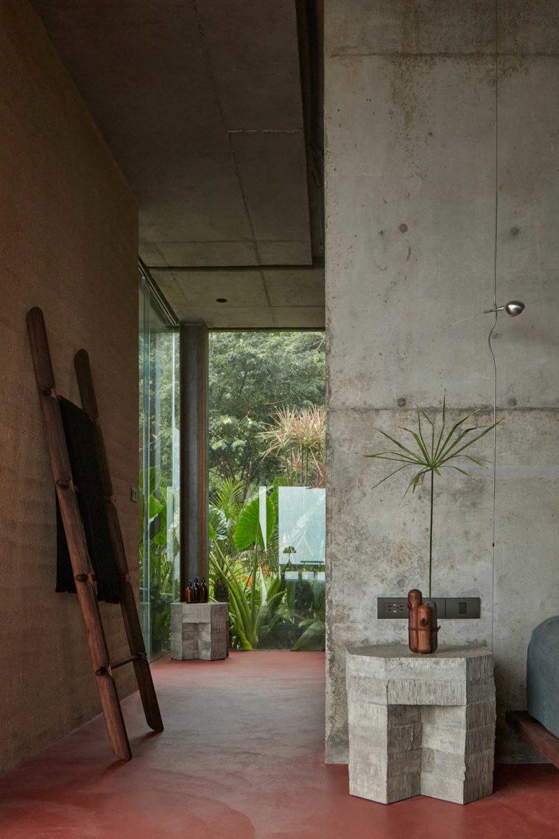
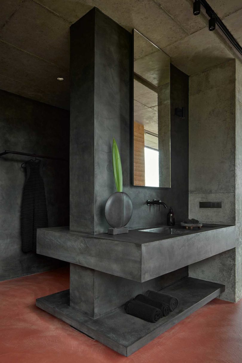
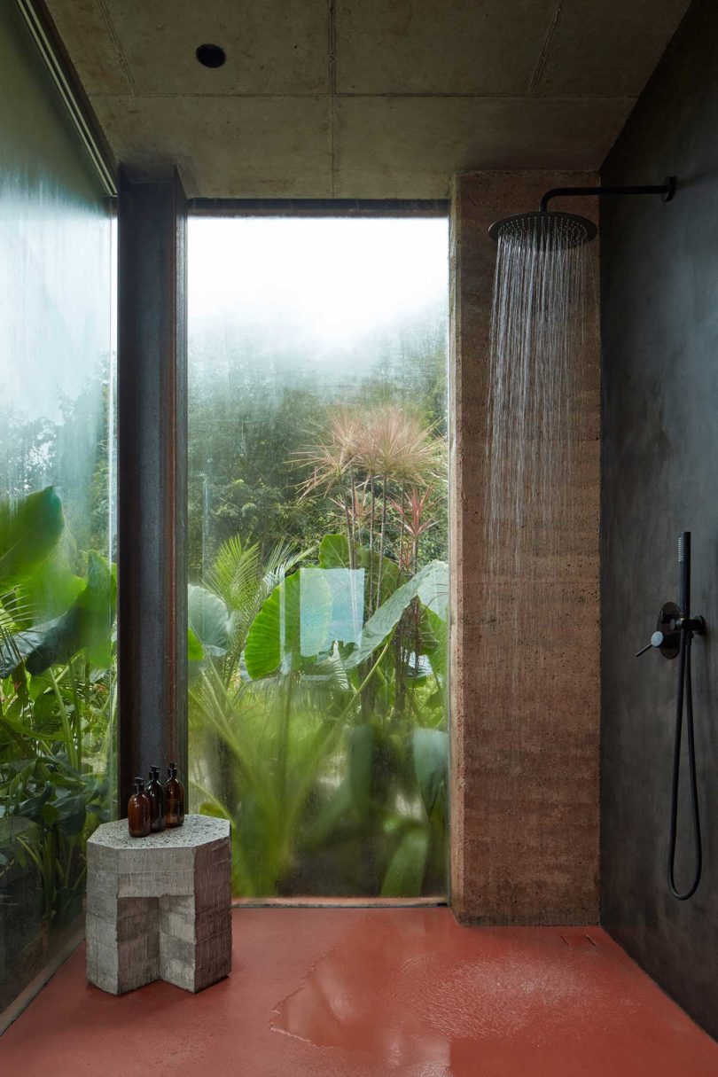
Dagmar Štěpánová of Formafatal recently completed the first rammed earth structures in Costa Rica that can be yours to rent for your next vacation. Achioté is a pair of minimalist villas in Playa Hermosa that look as if they’re levitating above an overgrown cliff by the Pacific Ocean. The homes are situated in a jungle-like environment with lush greenery all around for ultimate privacy. Throughout the design and building process, Formafatal paid careful attention to sustainability and protecting the wild locale.
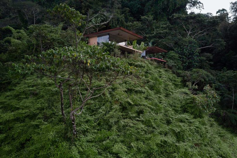
Each villa’s design is based on the energies felt in their locations by Štěpánová before construction even began. The vibrations led to two opposing designs – the Jaspis Villa (jaspis = jasper, bright villa) reflecting a yin energy connected to the sky and ocean with shades of sand being the standout color, while the Nefrit Villa (nefrit = jade, dark villa) reflects the yang energy with connection to the ground and the surrounding jungle and featuring a red-terracotta color.
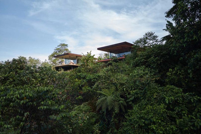
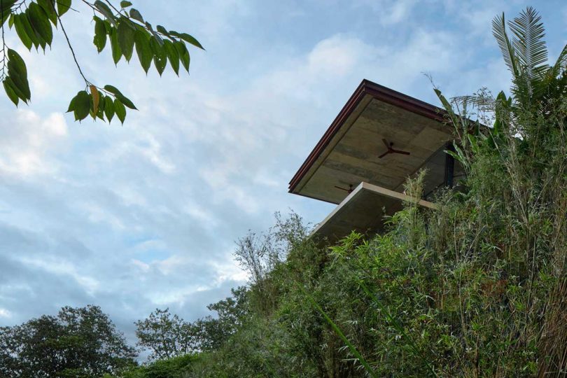
Cantilevered roofs extend out like the floors to provide protection from the sun and weather conditions.

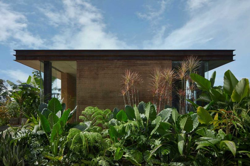
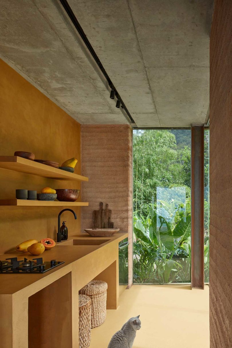
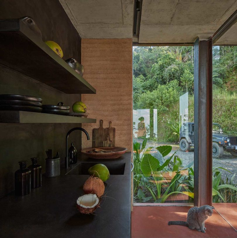
All of the outer walls are built using the clay soil they excavated during the construction process, thereby reducing materials that needed to be imported in for the build. New tropical plants were added once the villas were complete.
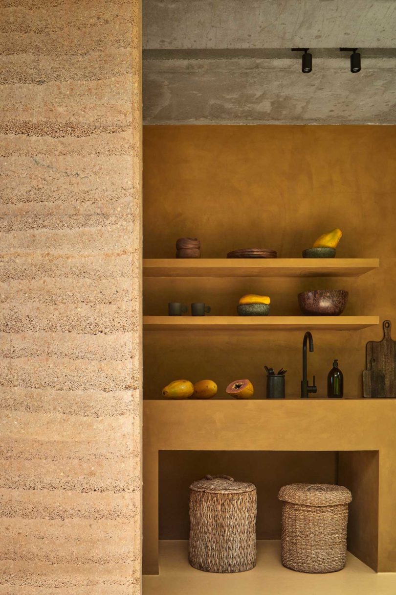
The layers of the rammed earth walls stand out, adding texture while telling the home’s story one layer at a time.
The 90-square-meter (approx. 969 square feet) villas are identical in size, layout, and orientation, while each structure utilizes its own choice of materials and color scheme.
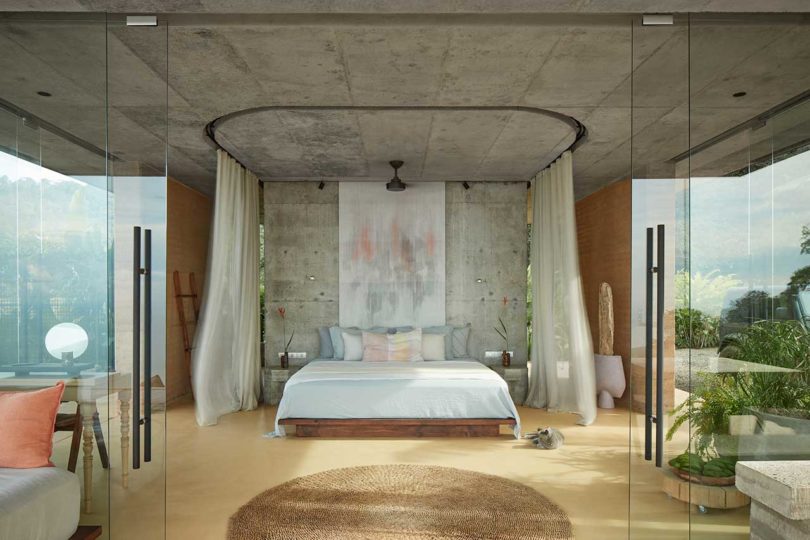
The center of each design is the bed, which can be sectioned off with sliding curtains for privacy and mosquito protection. The endless views can be enjoyed from the bed through the frameless glass walls. There’s another bed on the terrace if one wanted to relax in nature.
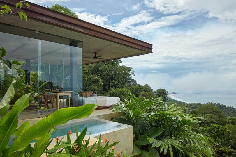
Just off to the side of the villas are built-in pools which will make you feel like you’re swimming right in the jungle.

To make the rammed earth walls happen, Formafatal enlisted Brazilian specialist, Daniel Mantovani of Terra Compacta, to help train local craftsmen to complete the work.
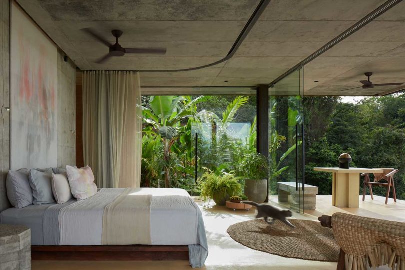
Behind the beds, the kitchens and bathrooms live with no doors separating the spaces.
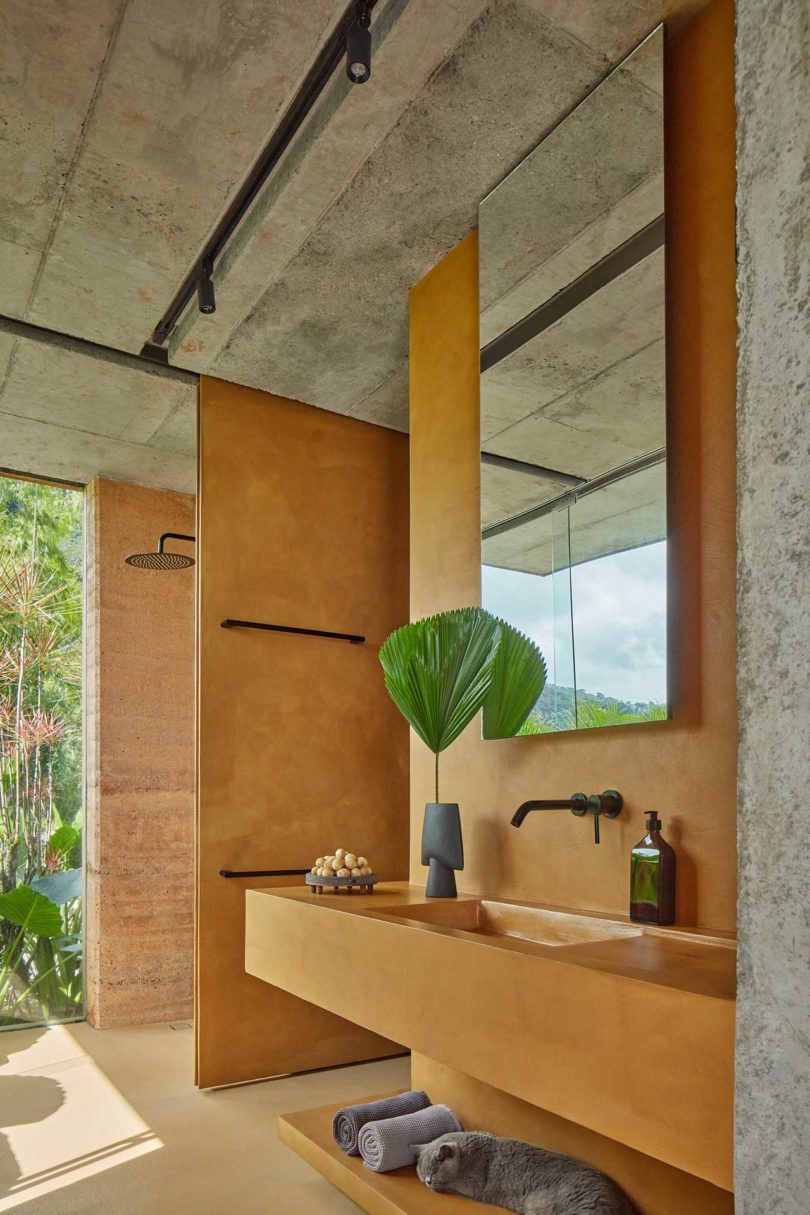
The bathroom sinks, shelves, kitchen counters, and beside tables are all custom made from concrete.
The Nefrit Villa features a much darker and moodier color palette, despite the villas being identical.


Dagmar Štěpánová of Formafatal \\\ Photo: Eva Wong
To book the villas, visit achioteproject.com.
Photos by BoysPlayNice.

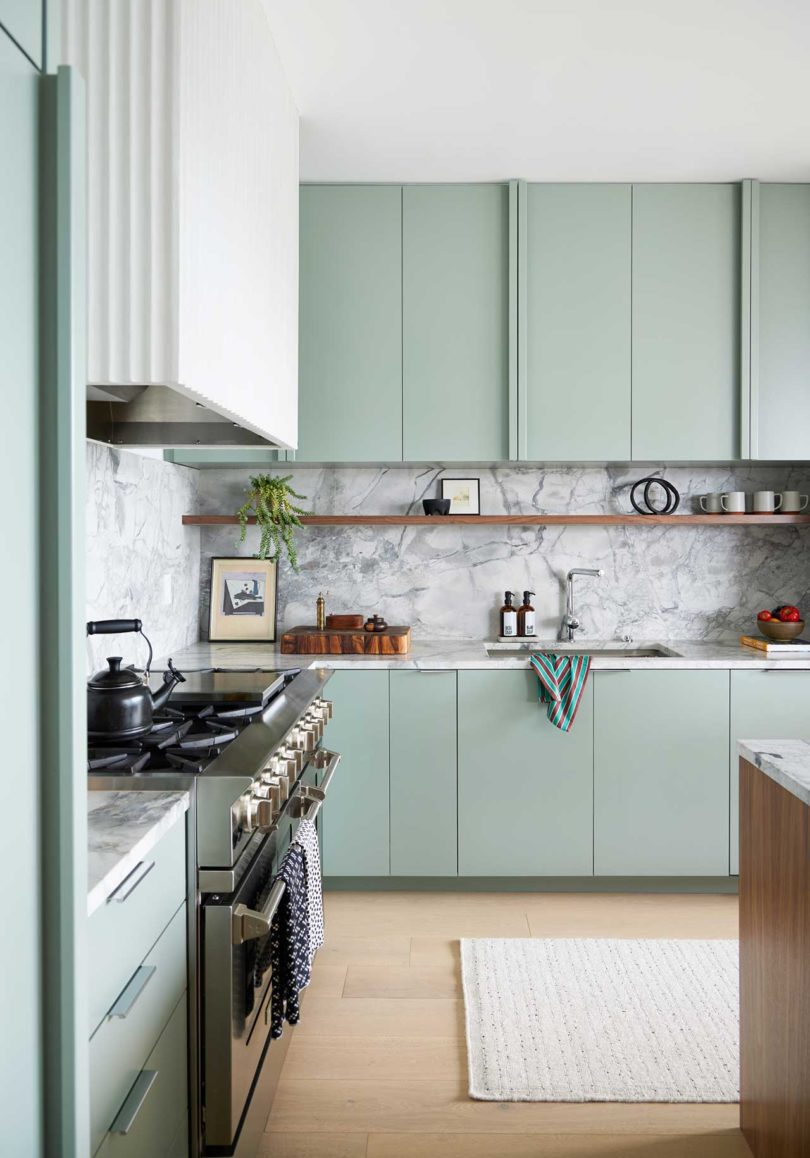
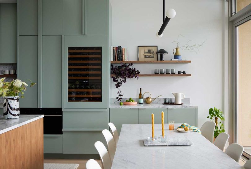
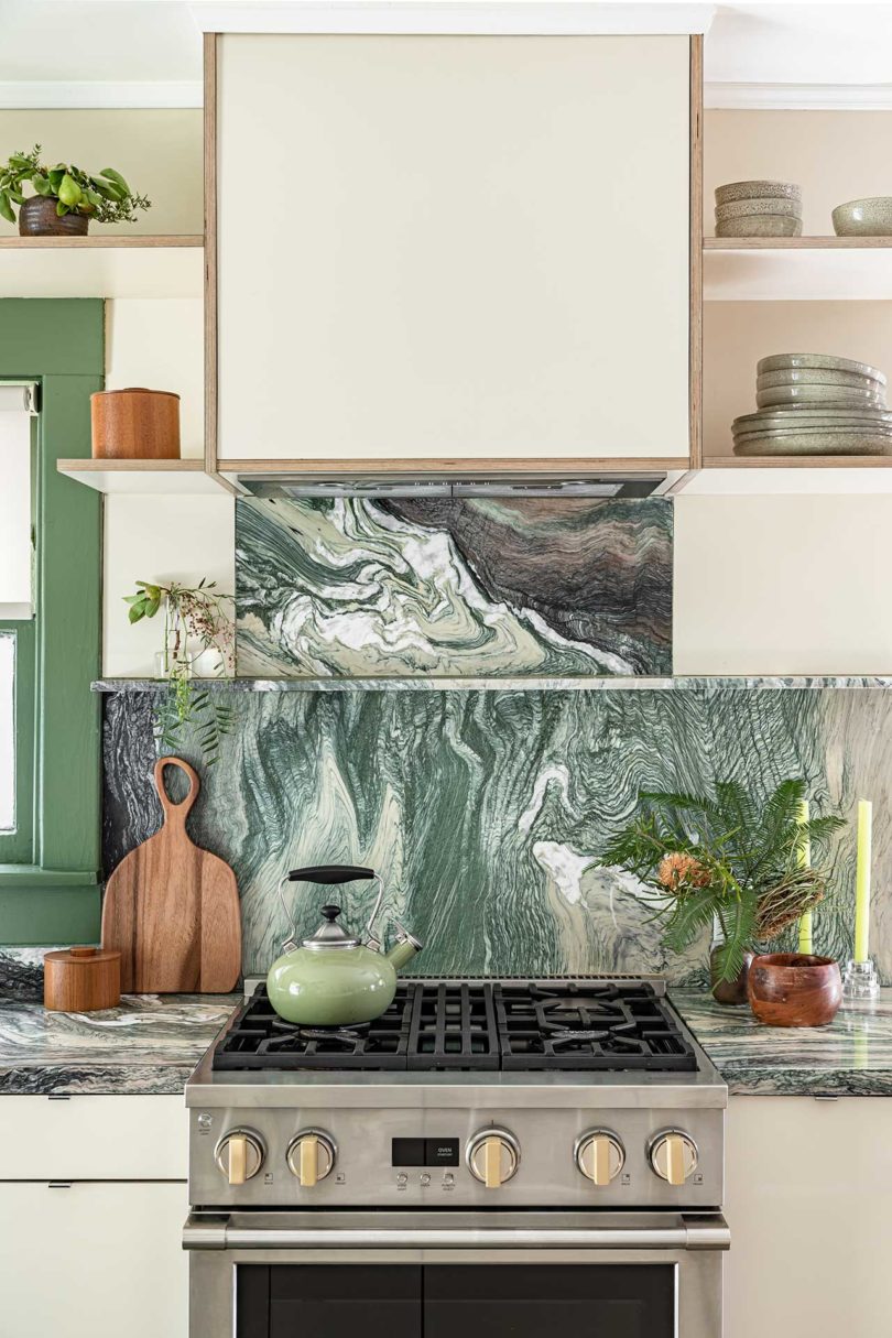
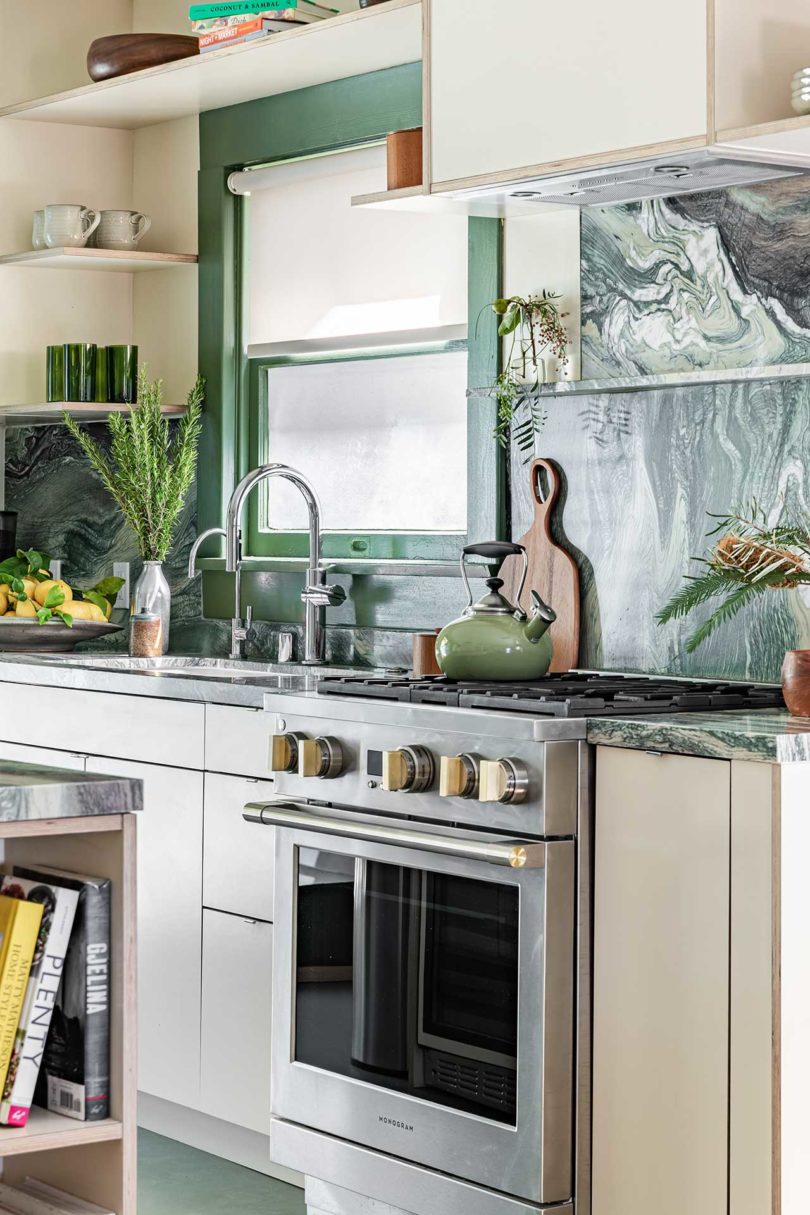
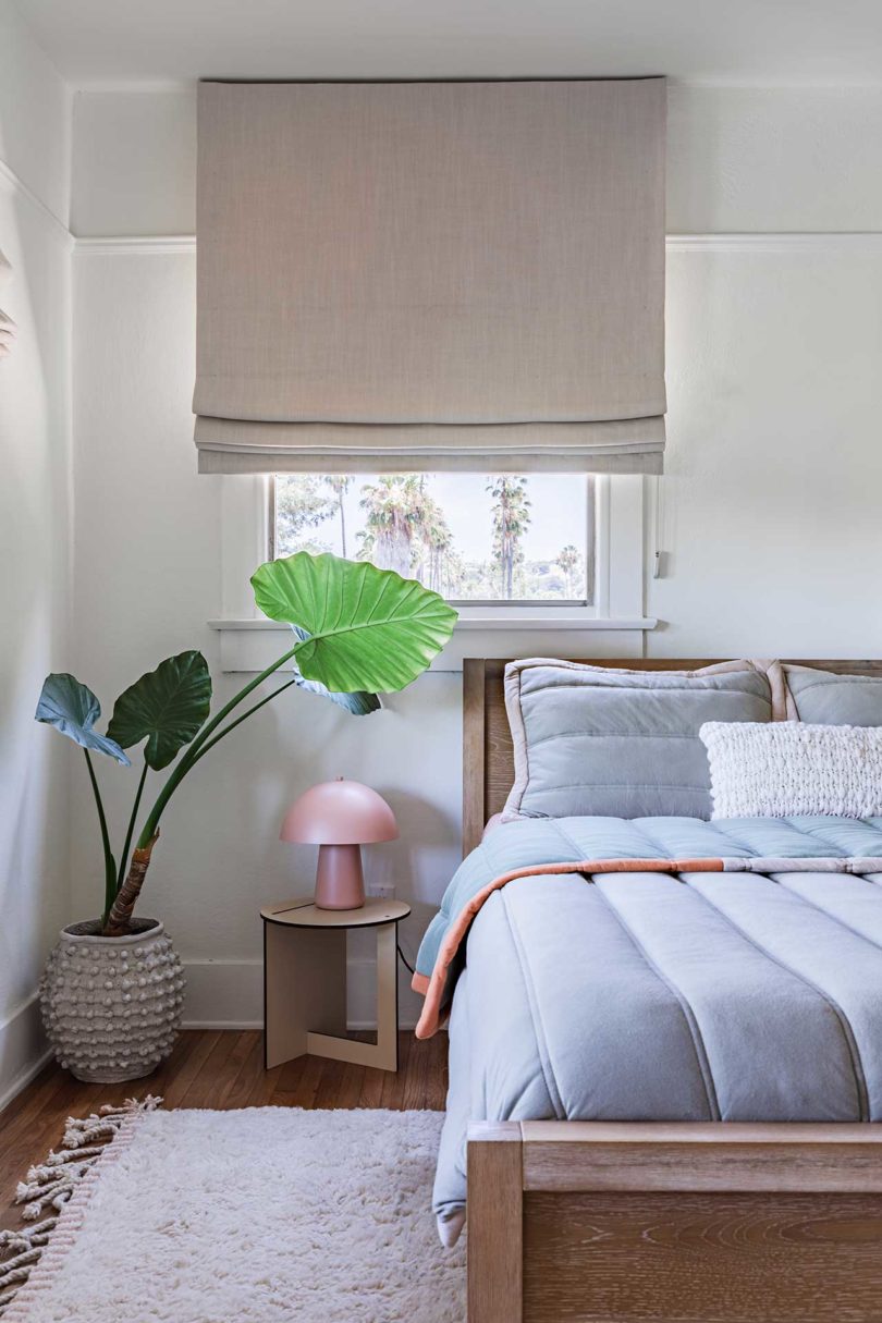
What began as a kitchen renovation and floor replacement in 2021, turned into a major renovation of a condo in Southwest Portland, Oregon. Overhauled by Casey Keasler, founder of interior design studio Casework, the once dated apartment needed its spaces reevaluated to make it work for the long time owners. The results of the bold transformation have brought about a modern and fresh aesthetic seen throughout, most notably in the main living space.
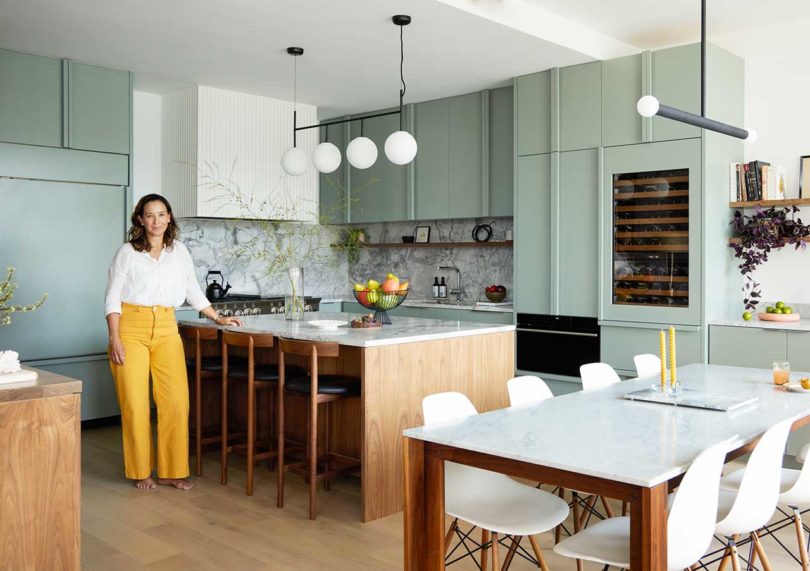
Homeowner Ana Quinones
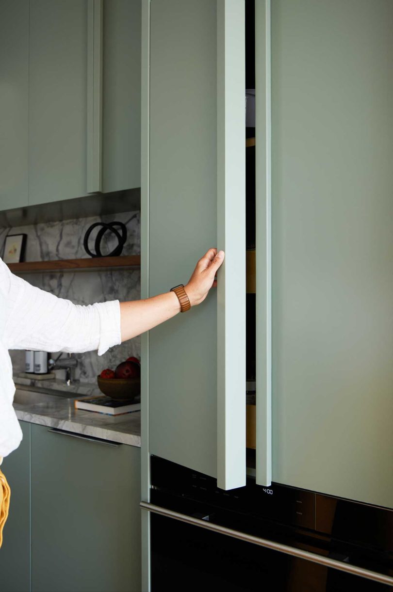
The contemporary kitchen stands out with its cabinets painted soft Rushing River green by Benjamin Moore. Paired with the marbled Dolomite countertops, island, and backsplash, and walnut elements, the kitchen feels high end yet livable.
Casework worked with general contractors, Hammer & Hand, to complete the transformation, which was inspired by some of the homeowner’s favorite museums and spaces, including The Walker in Minneapolis, SFMOMA, Portland’s Snow Peak store, and Stockholm’s Ett Hem. The couple loves clean, contemporary interiors and the use of natural materials, which Keasler incorporated into their new space. The design theme can be broken down into three works – purposeful, clean, and cultivated.
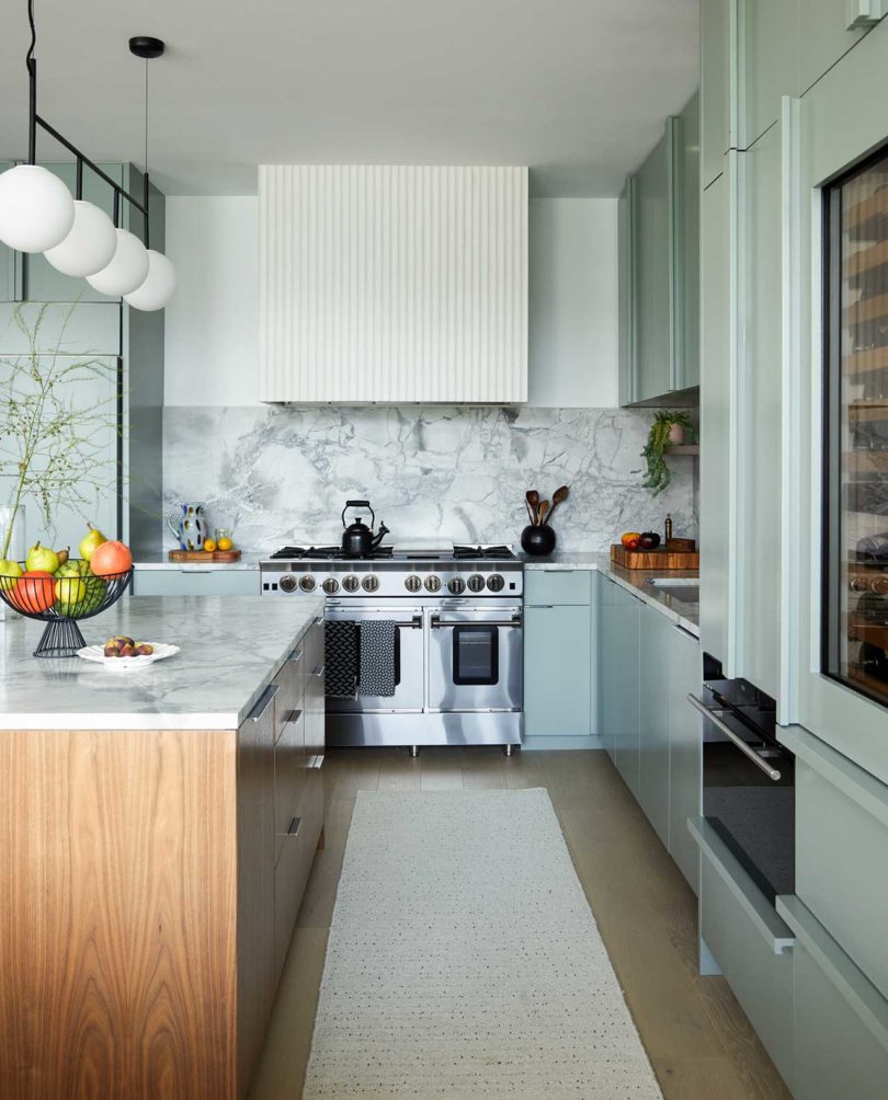
White oak flooring throughout the main areas and bedrooms, lightened the overall appearance of the space.
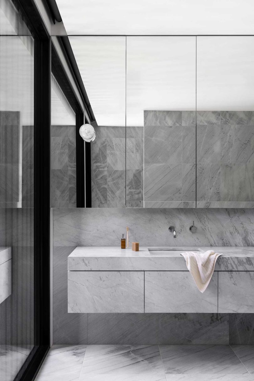
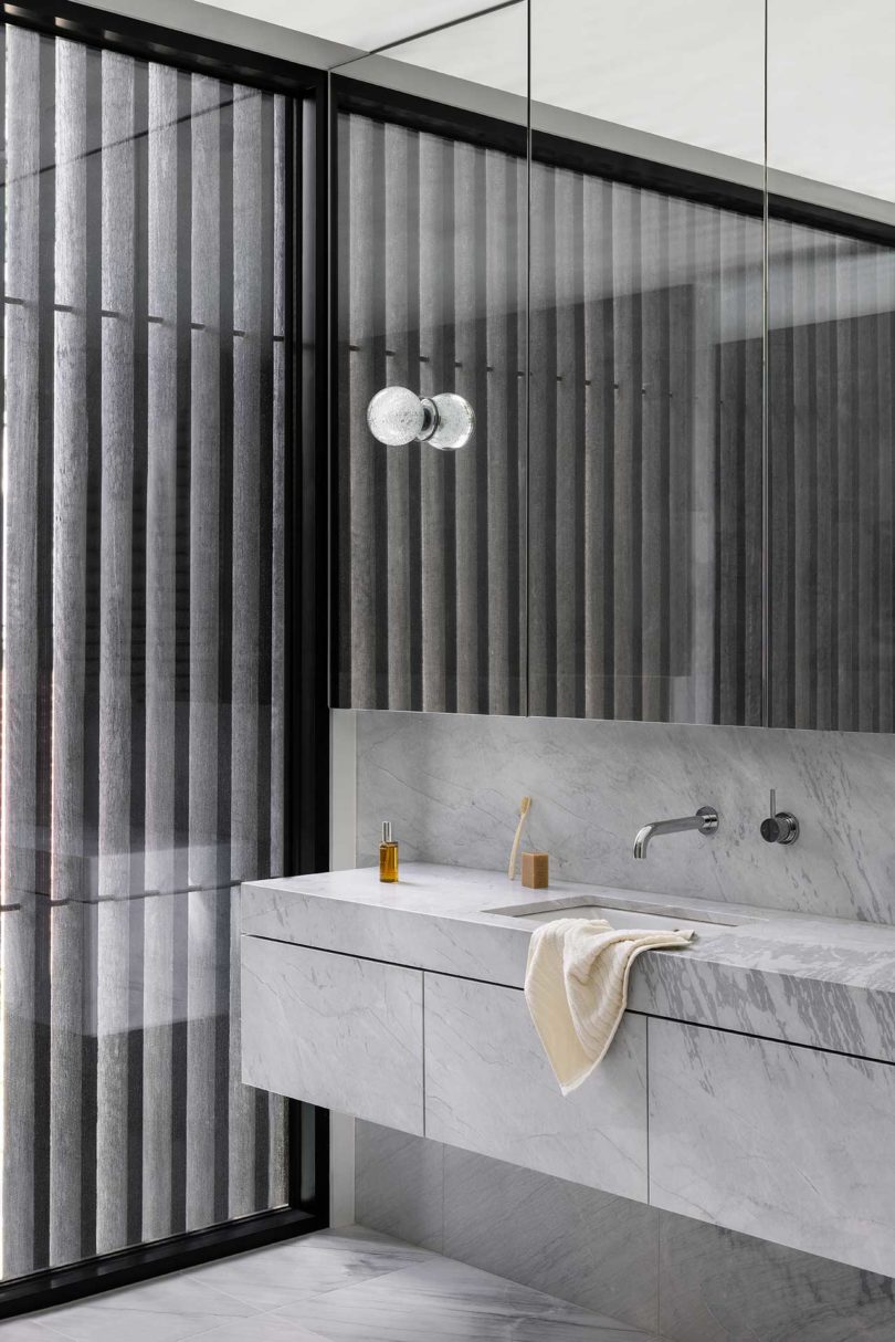
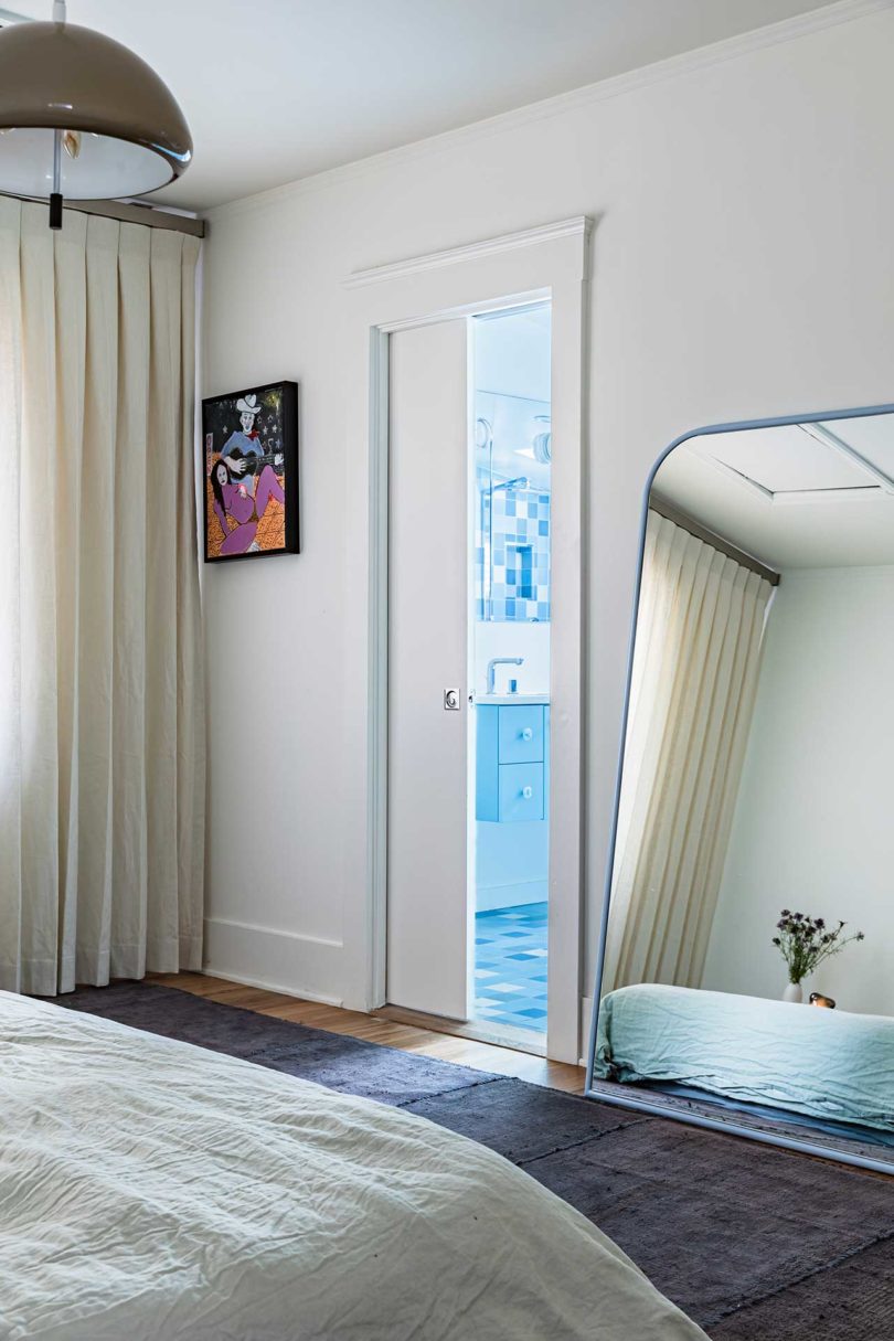
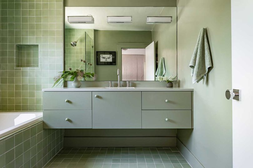
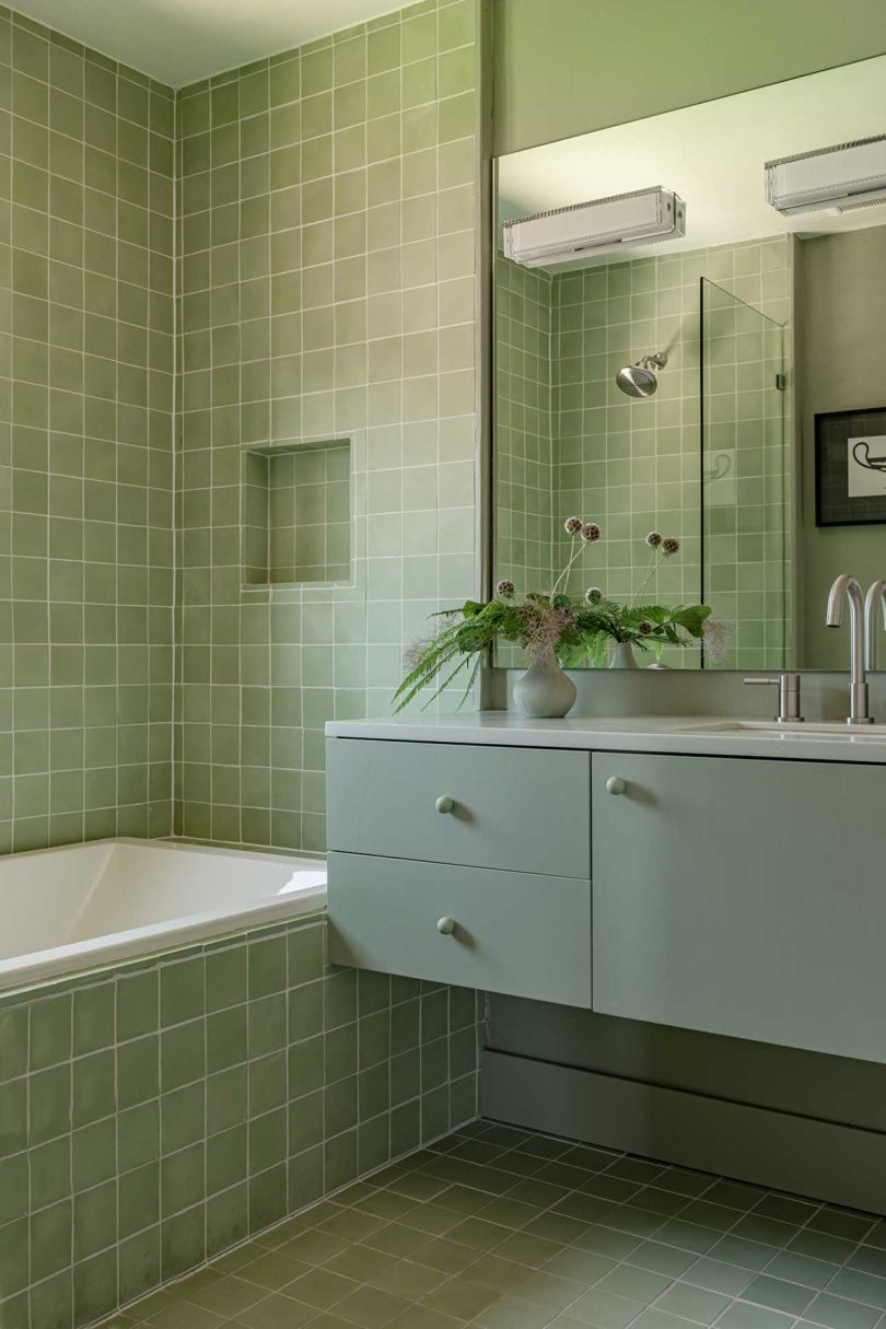
The main bathroom is contemporary with a classic feel, thanks to the mix of the textured marble pattern, rich wood details, and clean, white and grey tiles.

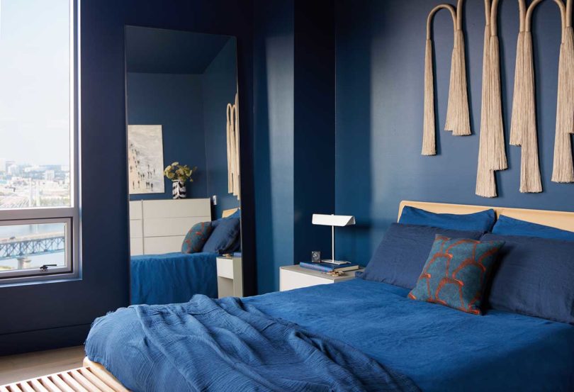
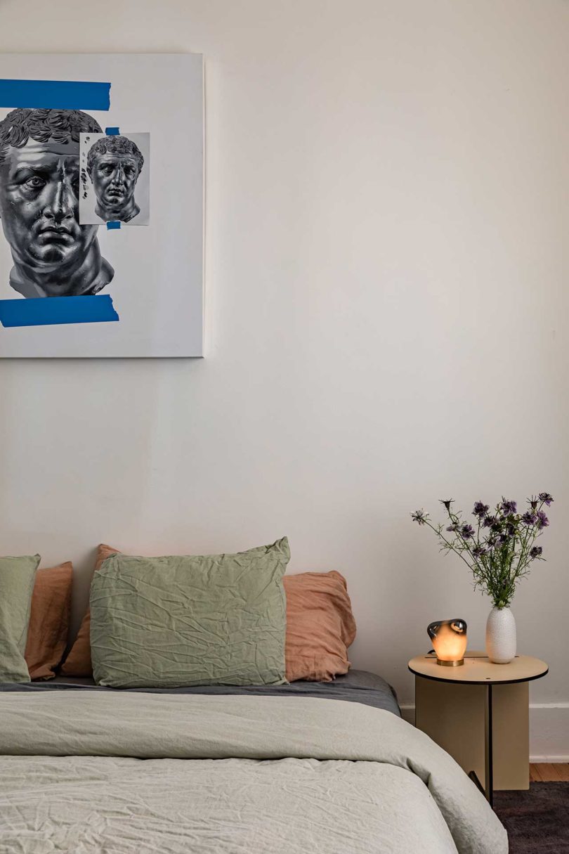
Rich shades of blue outfit the main bedroom, alongside lighter elements like the flooring, headboard, nightstands, and art piece above the bed.

Photos by George Barberis.

Every other week we’re inviting one of the Design Milk team to share five personal favorites – an opportunity for each of us to reveal the sort of designs we use and appreciate in our own lives from a more personal perspective. Editor-in-Chief Caroline Williamson returns this week for our Take 5 series.
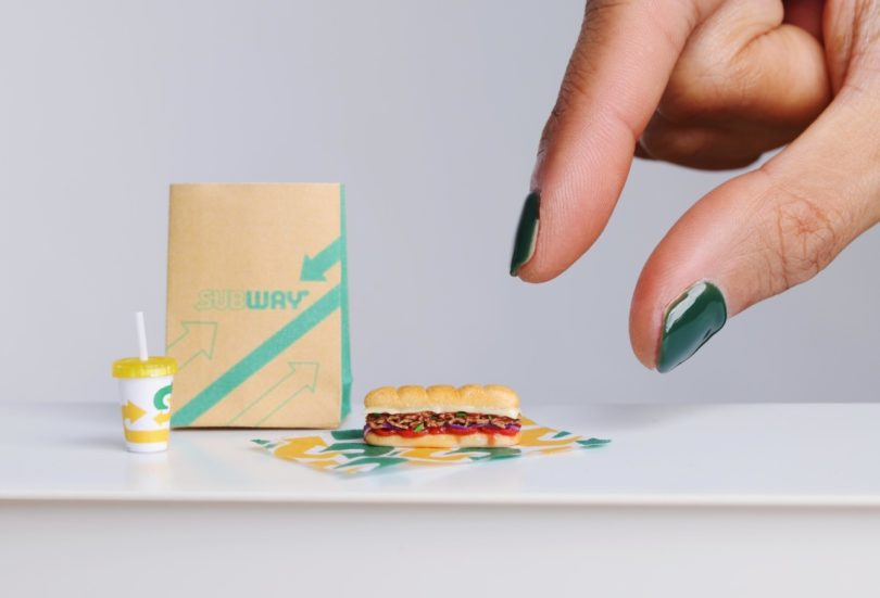
I admit, I’ve long been on the miniature loving train. How can you not fall for teeny tiny objects made with such detail? So when this landed in my inbox, I had to share! British miniature artist Nadia Michaux created the world’s smallest sub – 12x smaller than a regular Subway® Footlong – at just 2.2cm (less than 1 inch). The design is a clay replica of the new Footlong Teriyaki Steak Sub that’s been added to the sandwich chain’s new Japanese-inspired menu. She even nailed the exact colors by mixing clay colors, firing them, and then making necessary adjustments to get it right – a laborious task. Bottom line, it fascinates me.

Louis Vuitton® recently released their 2nd collaboration with Japanese artist Yayoi Kusama and to celebrate they launched several exhibitions to pay homage to her and her iconic dots. Each immersive, and most definitely Instagrammable, exhibition had a different look, including Harrod’s in London donning colorful dots both inside and out and complete with a human-looking Kusama robot, while the Tokyo pop-up was a yellow-dotted dream with a larger-than-life Kusama sculpture in the middle. Wish I could visit them in person!
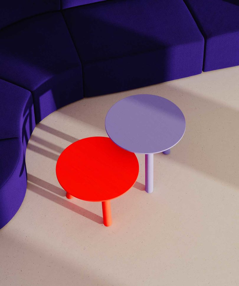
For some reason, I’ve been really gravitating towards home furnishings in the color lavender lately. If you look around, you’ll notice lavender goods popping up more and I’m loving it… except when it’s paired with other pastels and the palette all of a sudden looks like Easter. Instead, my eyes lean towards more dramatic pairings, like these two tables in lavender and electric red. It’s shocking but delightful!


I’ve had a life-long obsession with Polaroid and I love when they release anything new – cameras or film. And when they launch a collection with one of my favorite musicians of all time, I’m sold. Available in packs of 10, the David Bowie Edition film features 10 unique frame designs that reference his iconic album art and imagery, allowing you to make your own art alongside Bowie’s (even though we have to accept the fact that none us will ever be that cool).
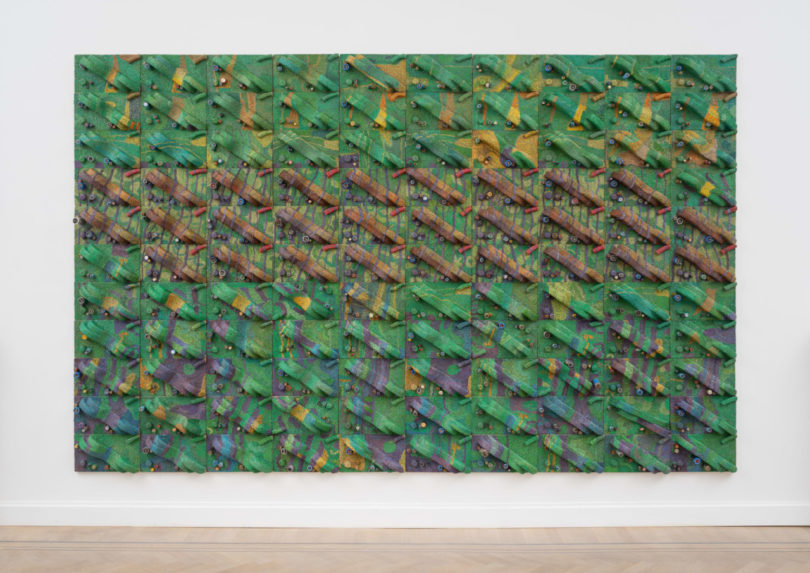
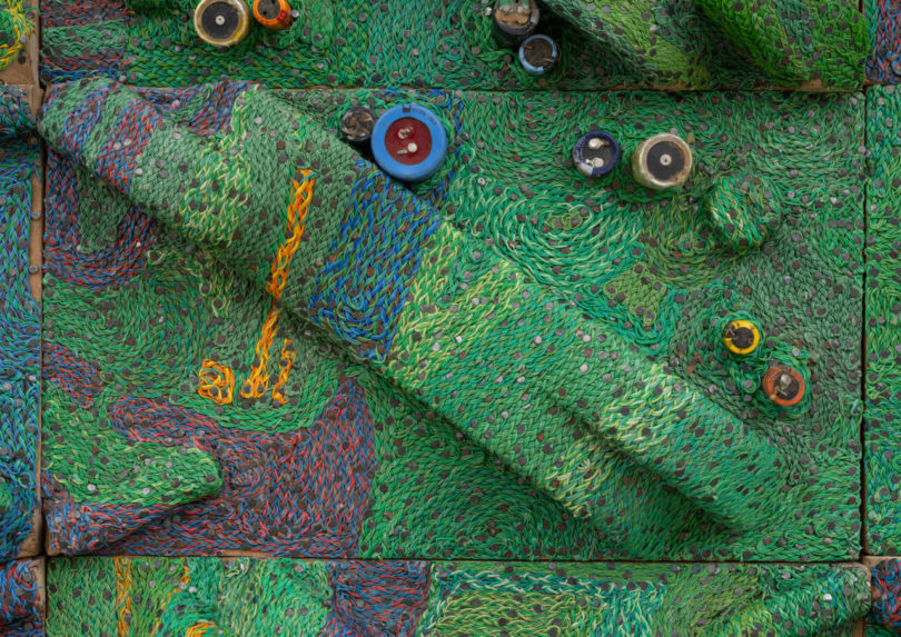
I’ve been intrigued by this piece by Elias Sime, part of a recently opened exhibition titled Tightrope: Behind the Processor. Sime uses recycled electronic components – keyboards, circuits, wires, and various other e-waste – that he braids and layers together to form abstract art, like this massive piece that spans 99-5/8″ x 157-1/2″. From far away, it almost looks like a landscape, like the view looking down while flying on a plane, but closeup, you see all the intricate braiding and weaving of the different components.
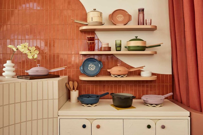
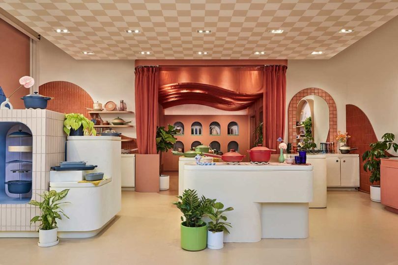
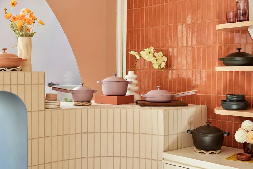
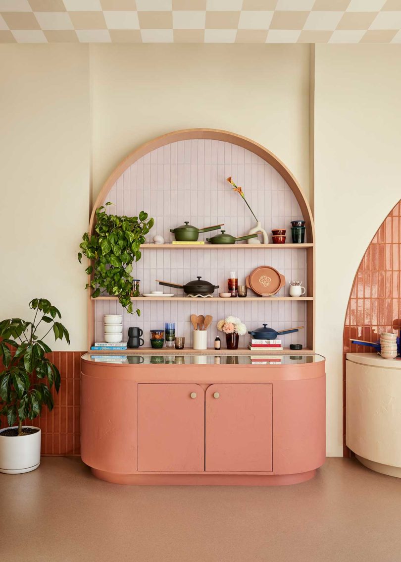
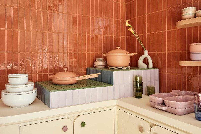
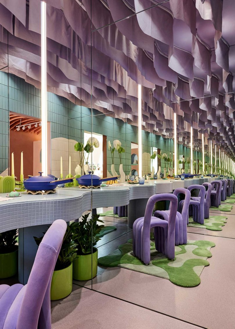
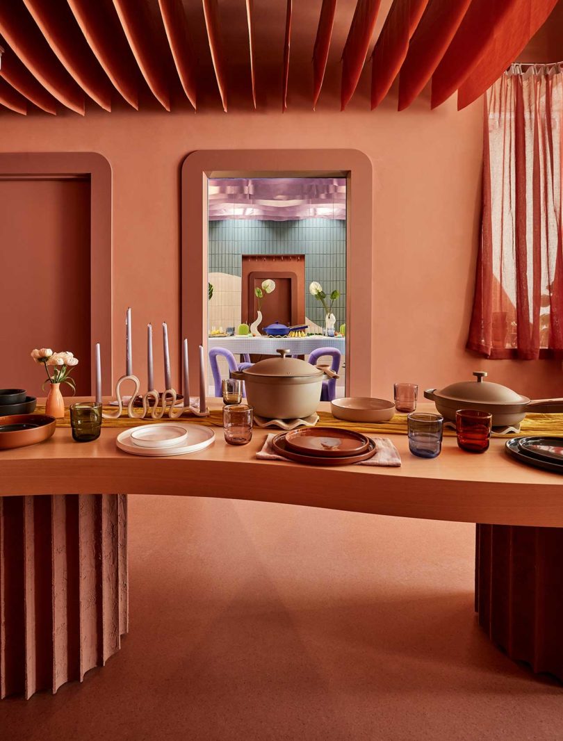
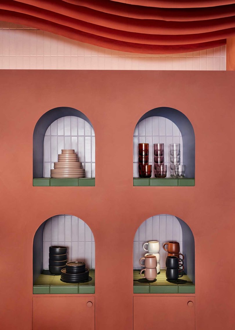
If you’ve spent any amount of time on social media the past three years, chances are you’ve run across the cookware brand Our Place. Founded in 2019 by Shiza Shahid, the direct-to-consumer brand has grown from its start-up days to now opening up their second Los Angeles retail location in West Hollywood. After the success of their Mythology-designed Venice location, Our Place turned to Ringo Studio to create a new store on Melrose that complements their designs and ethos. Alongside visually delightful product displays and a color palette that matches the colors of their popular pans, the space includes the Building a Bigger Table Room that exudes their mission to “welcome everyone to have a seat at the table.”
The store is designed as a one-stop shop where customers can check out the brand’s cookware, tableware, and kitchen tools up close. The home-like atmosphere features curated product vignettes that make each piece stand out, almost like a sculptural piece of art.
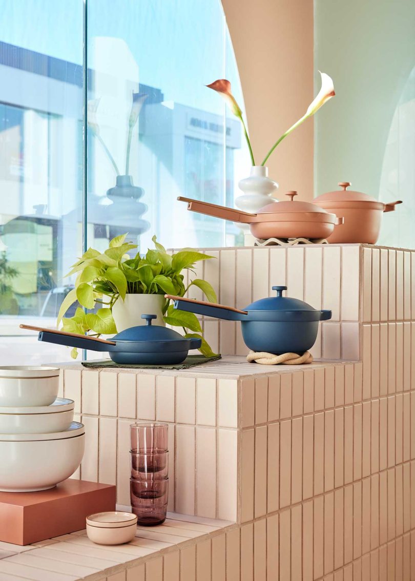
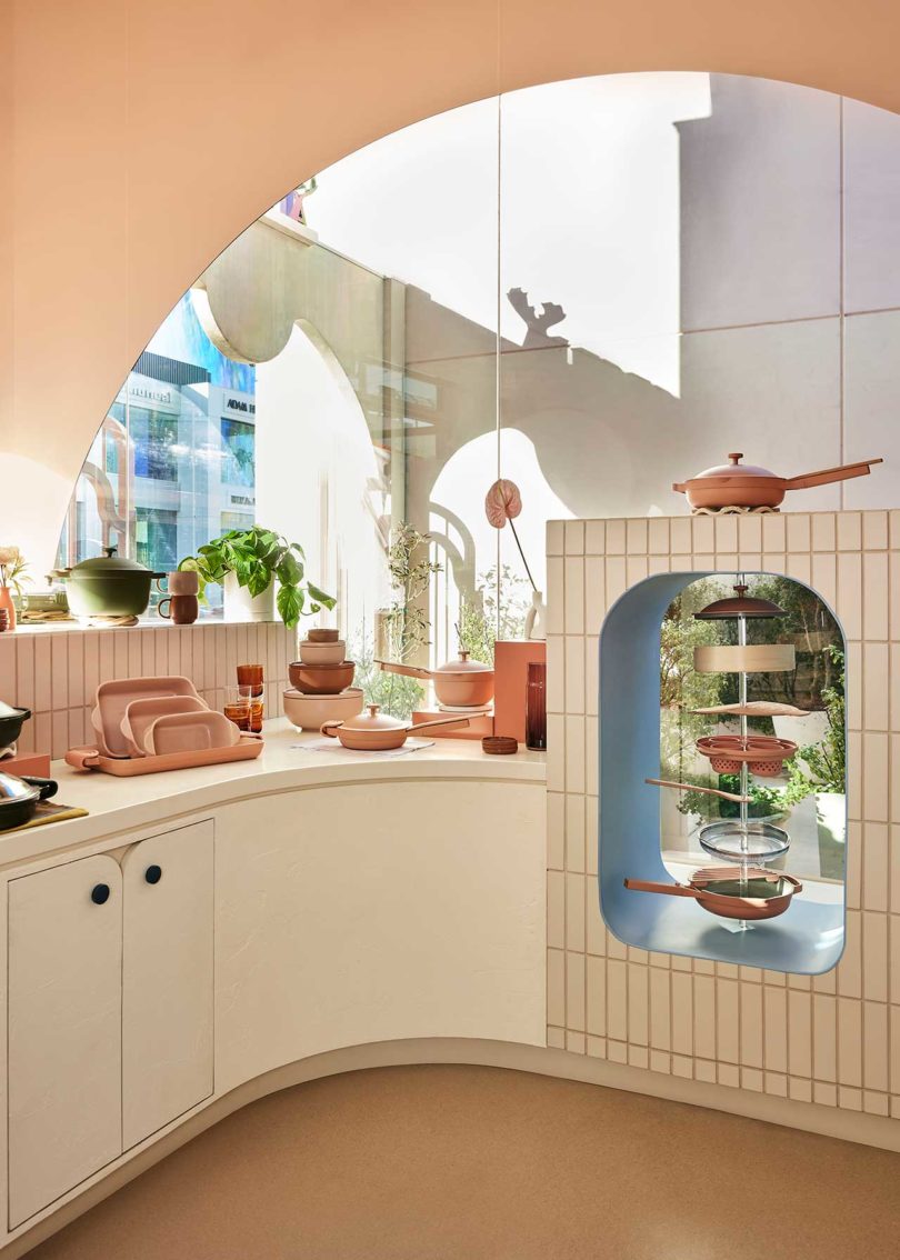
While the brand started with just one product – the Always Pan – they’ve expanded their line to include the newer Mini Always Pan, Perfect Pot, Mini Perfect Pot, Ovenware Set, dinnerware, drinkware, serveware, and kitchen tools.
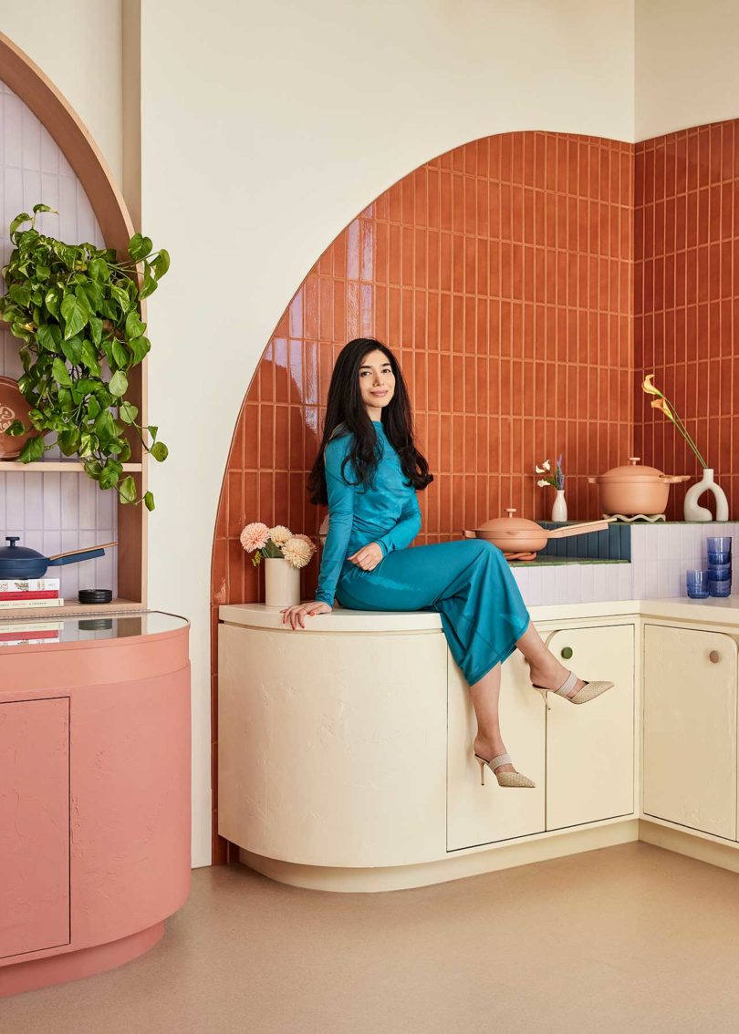
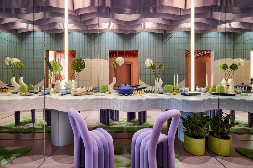
The Building a Bigger Table Room features curvy lavender fabric panels that hang from the ceiling, mimicking the curves of the wavy dining table. Mirrored walls give the appearance that the table spans into infinity, thereby making enough room for everyone to have a seat.
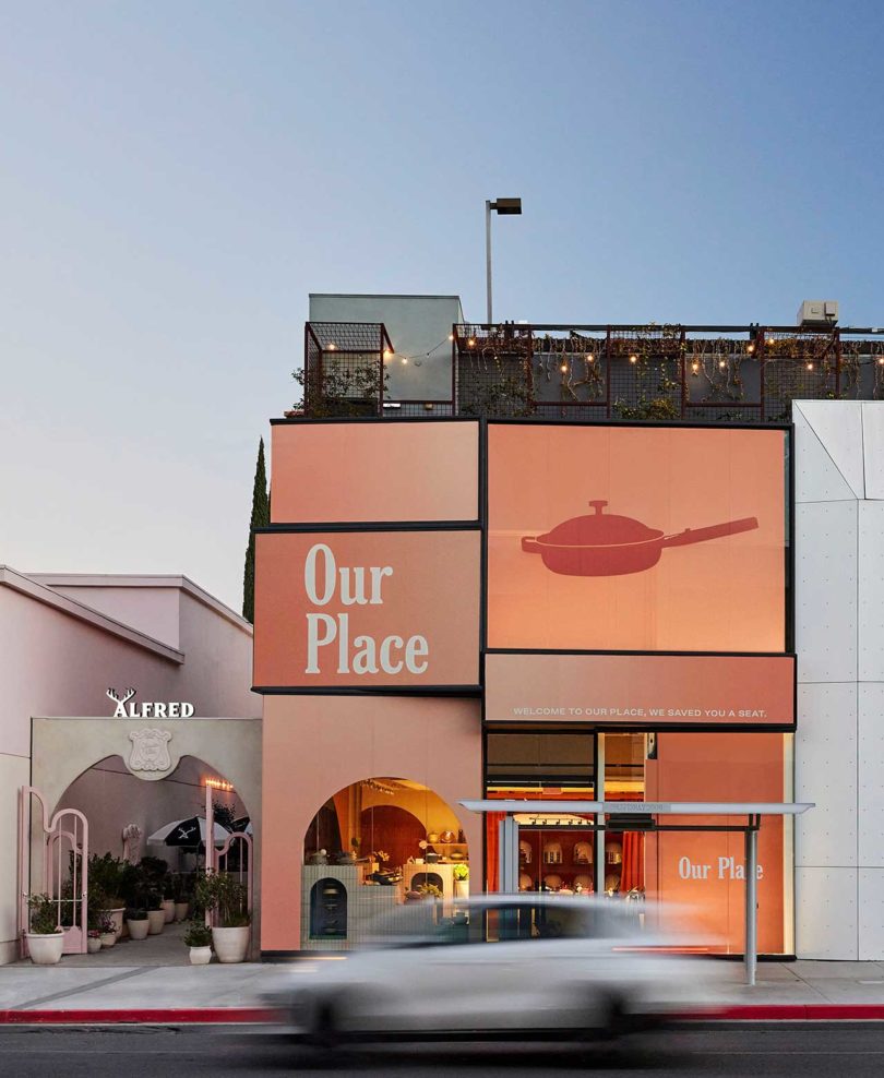
To see more from Our Place, visit fromourplace.com.
Photos by Jenna Peffley.
This post contains affiliate links, so if you make a purchase from an affiliate link, we earn a commission. Thanks for supporting Design Milk!
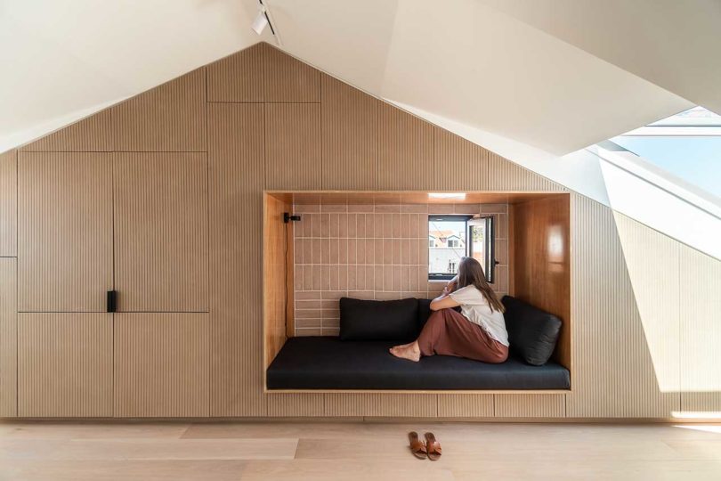
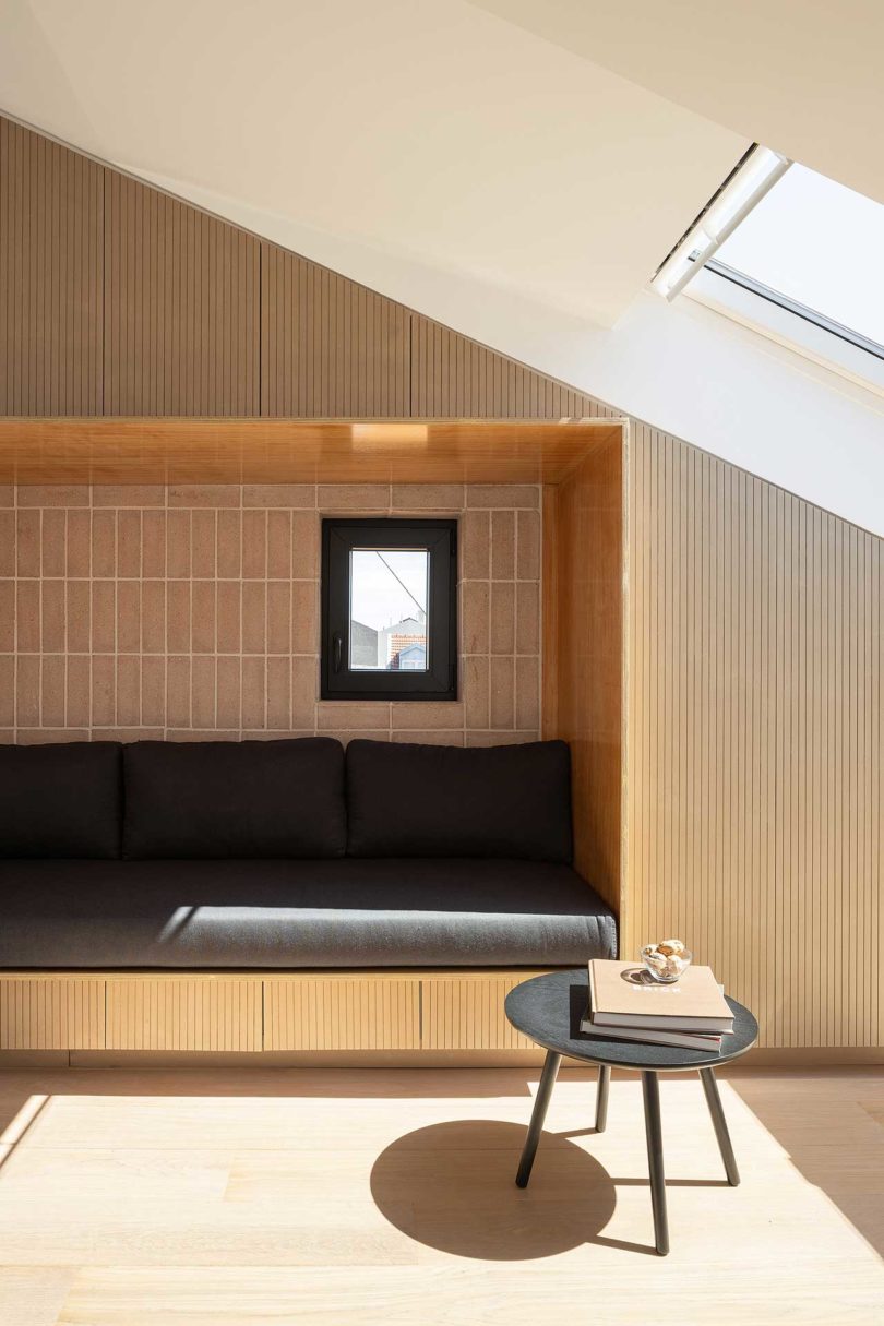
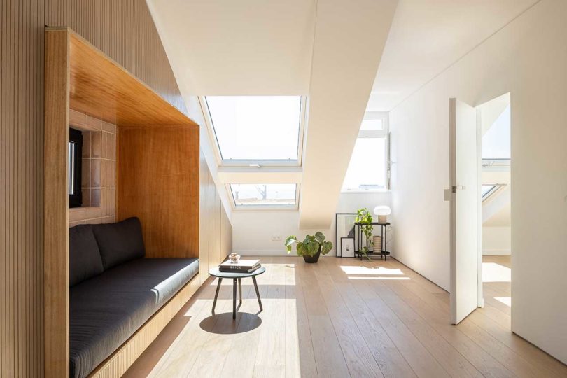
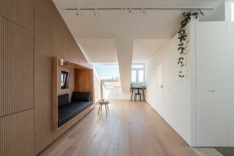
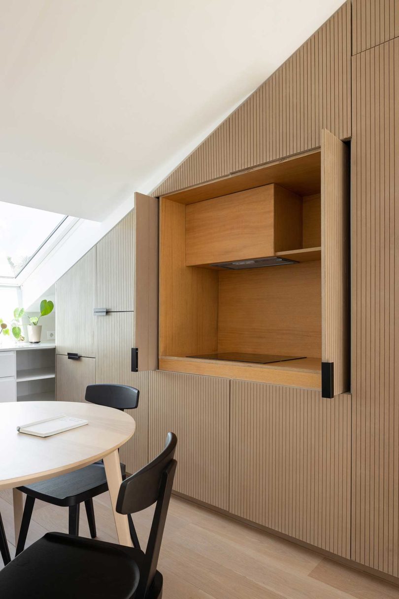
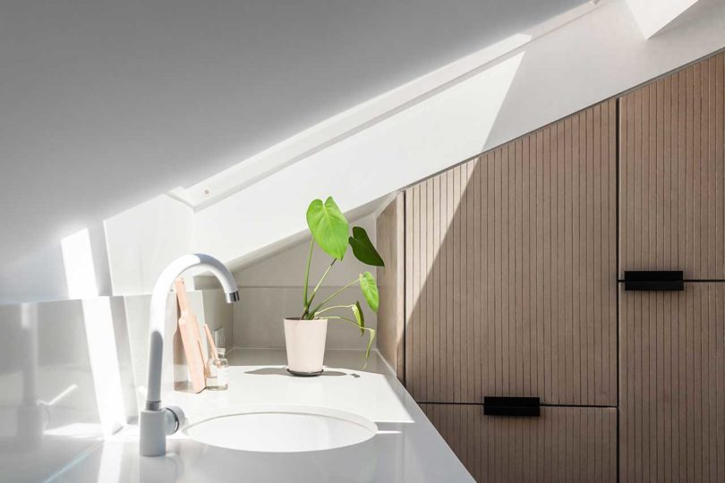
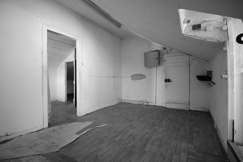
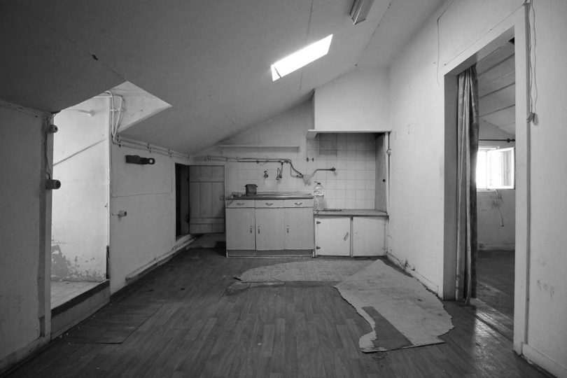
The 645-square-foot MARVILA ATTIC did not begin like this. Prior to KEMA studio renovating the space, it was an attic in disrepair in an old industrial area of Lisbon, Portugal. Finally, the neighborhood is undergoing a revitalization and this project is a part of it. KEMA studio transformed the unlivable attic into a bright and airy apartment with views of the nearby Tagus River.
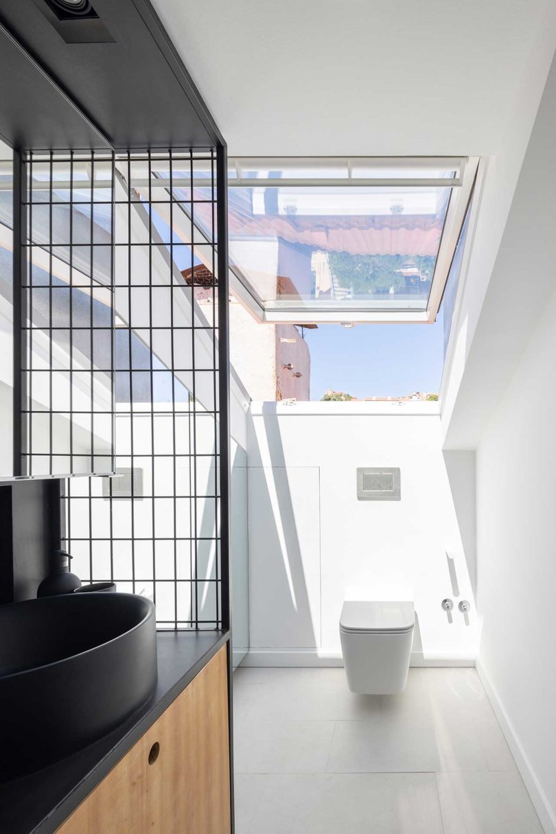
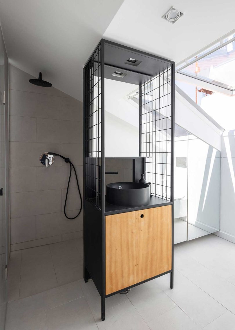
The renovation required a brand new roof and interior structure, leaving behind the only salvageable components, the floor structure and gable walls. A full bathroom and private entry were added to round out the space’s function.
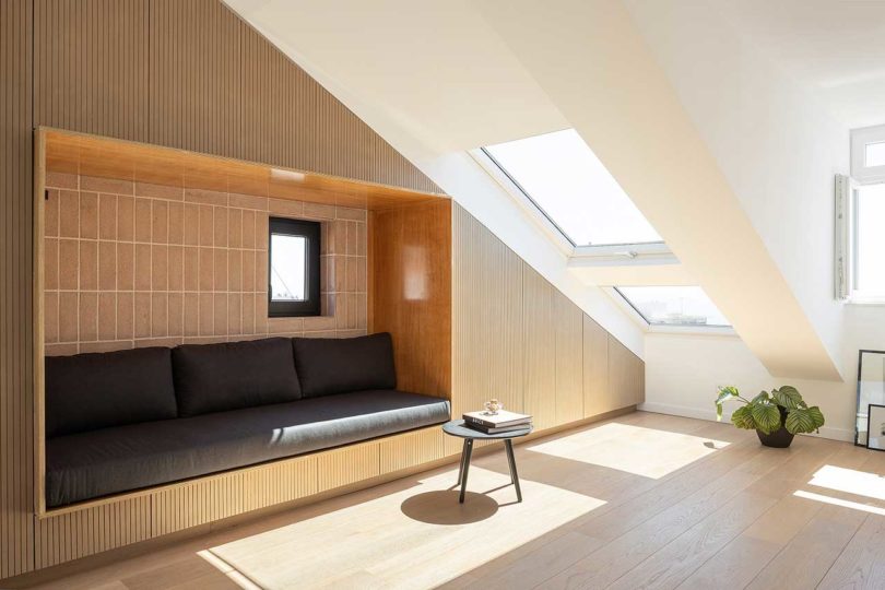
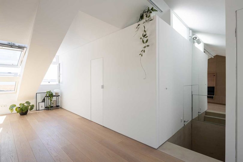
To maximize the natural light and airiness of the new design, the private areas are contained in a separate volume, leaving the public space open.
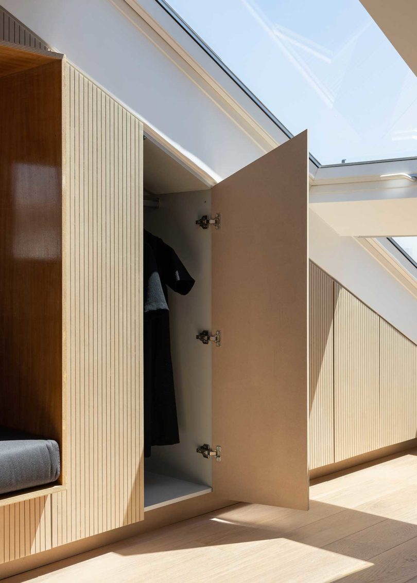
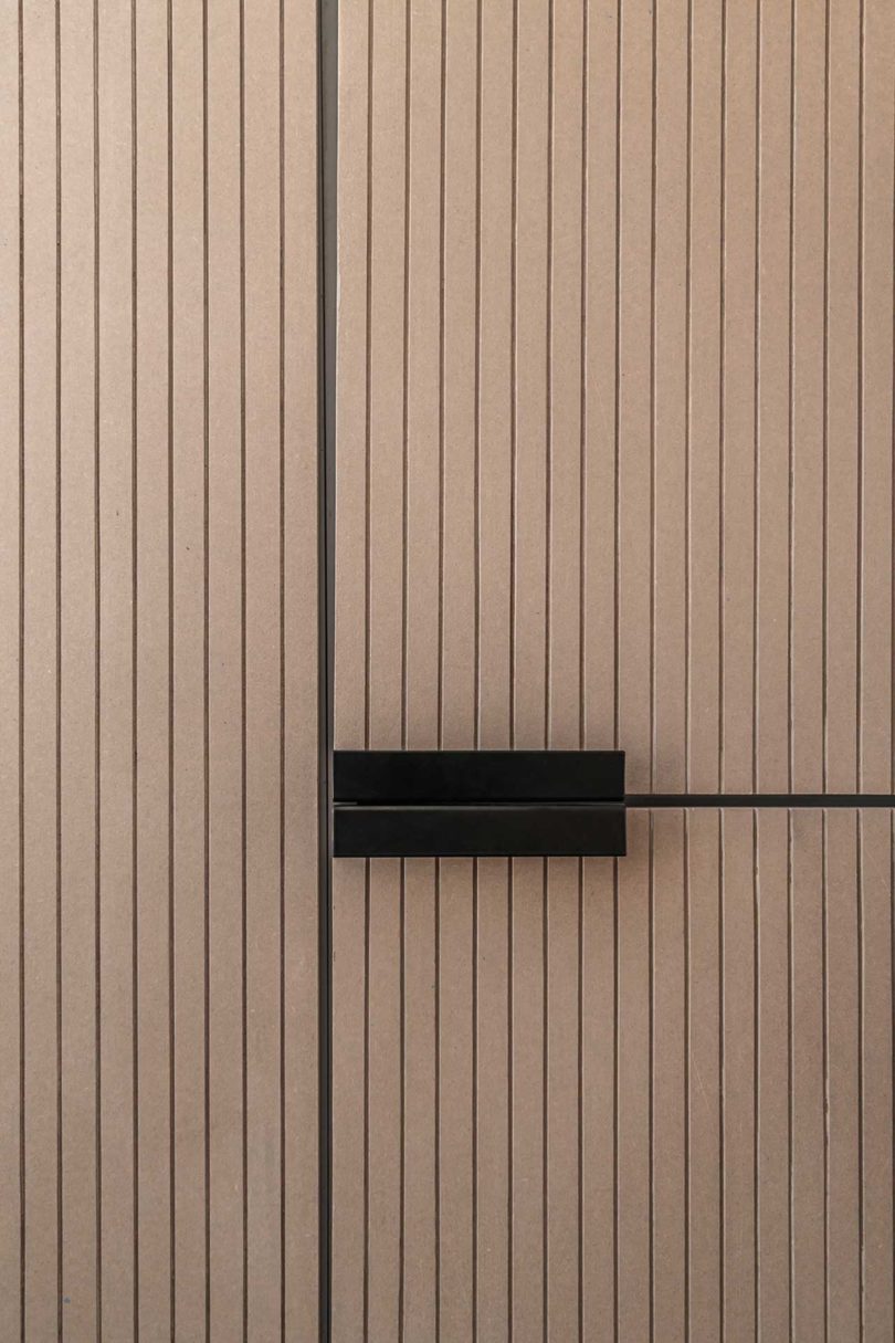
A separate volume in the living area houses storage, an embedded sofa, and the kitchen behind fluted wood panels. That leaves the remaining space as open and minimal as possible.
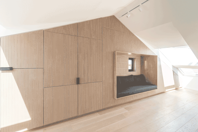
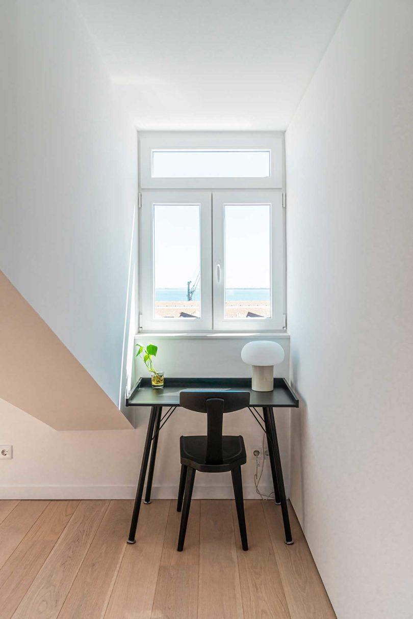
Four new skylights and two dormer windows are added to fill the space with daylight.
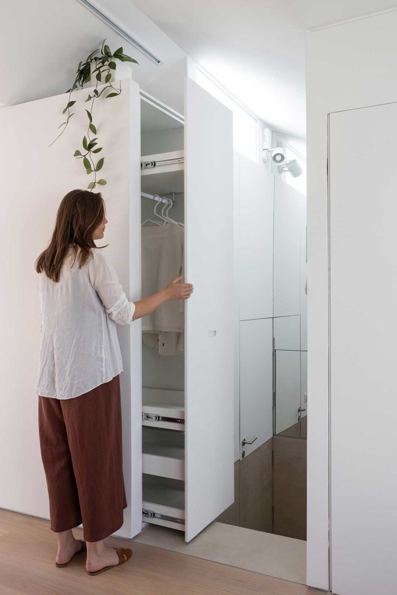
There’s even hidden storage in the wall by the entry stairs, perfect for jackets and shoes.
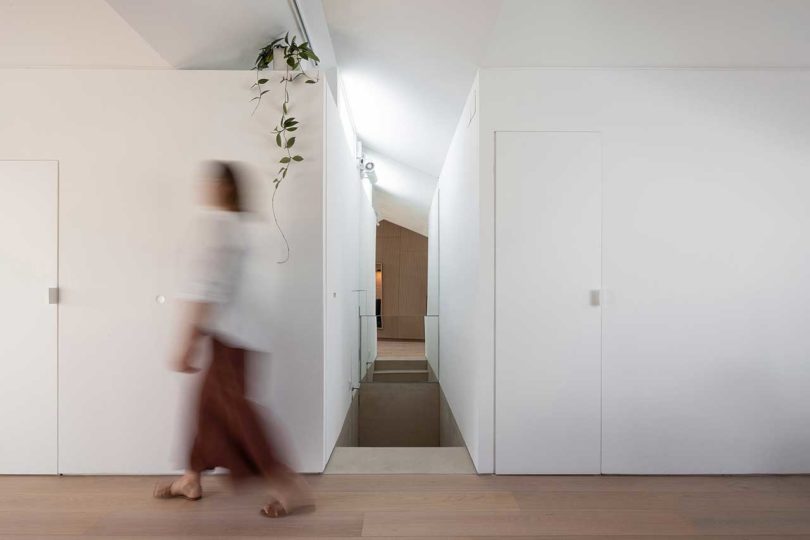
A window above the bedroom volume and a mirror on the back wall keeps the stairs well-lit.


Overall, the minimalist design comprises natural tones and sustainable + eco-friendly materials, like fiber cement panels, colored wood fiber panels, plywood, metal, brick tiles, and wooden floor.

Before:

KEMA studio \\\ Photo: Agata Mendes
Photos by Alexander Bogorodskiy and Eliza Borkowska – KEMA studio.

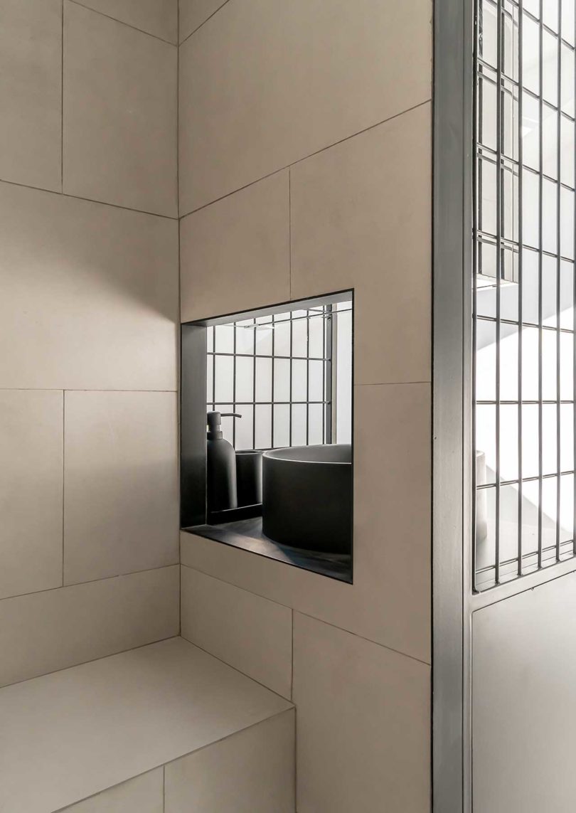
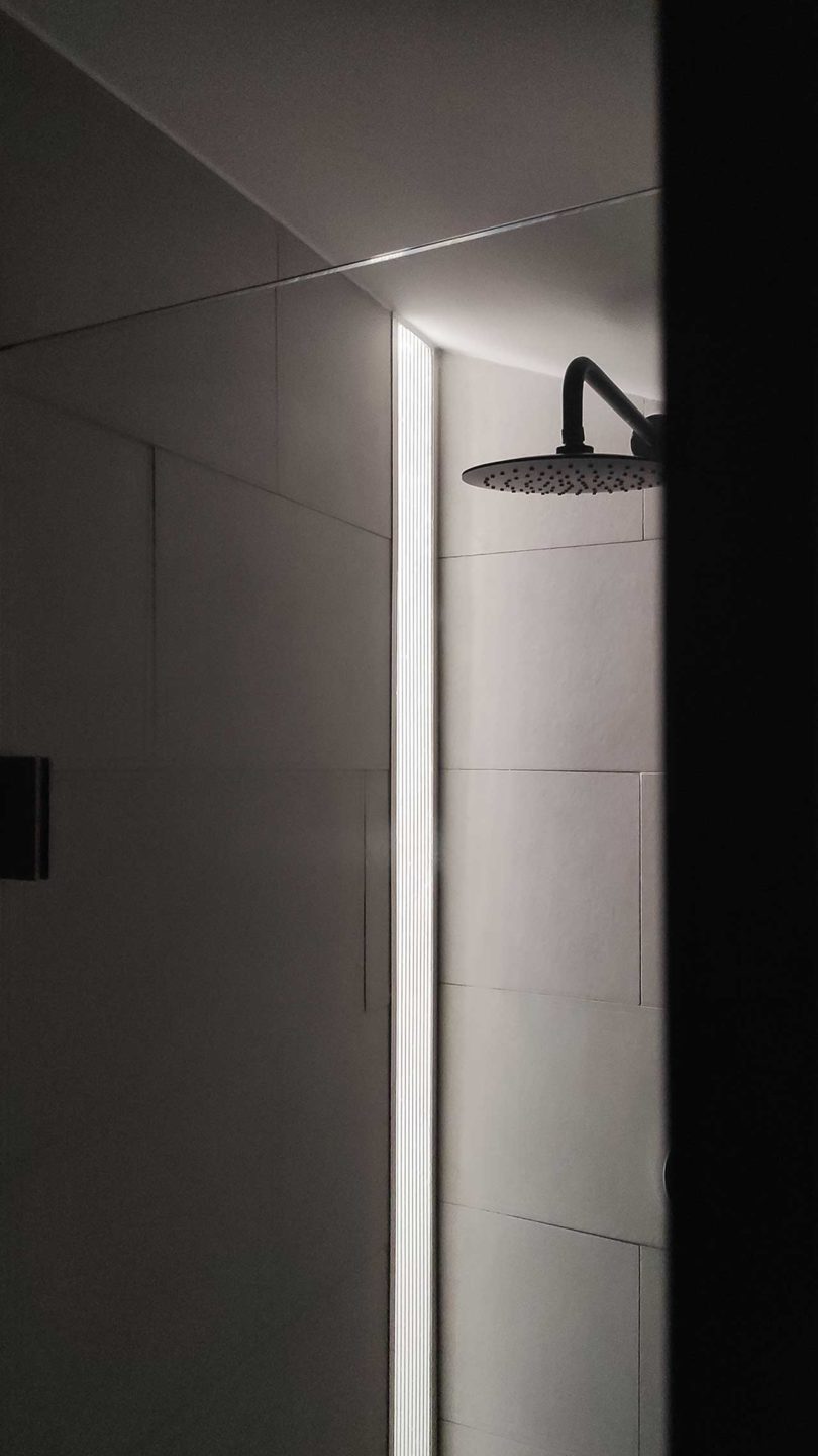
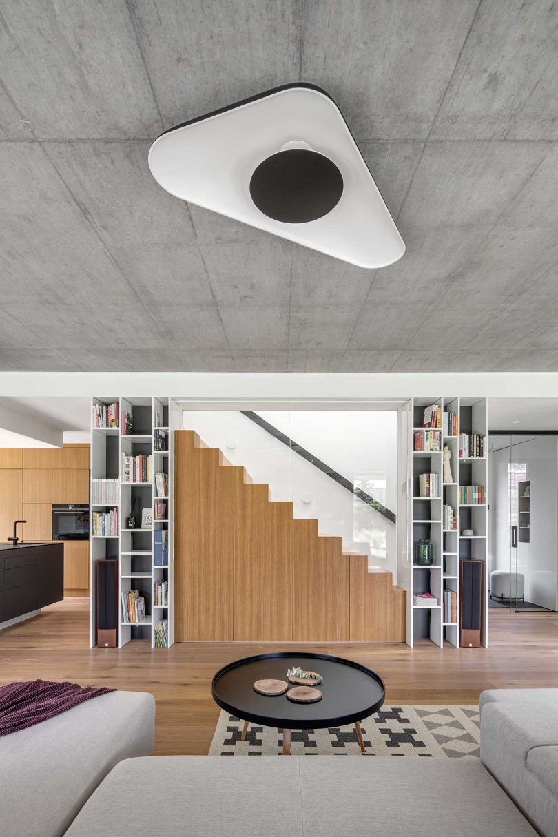
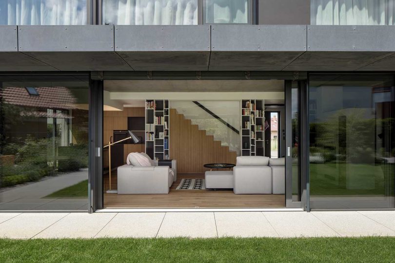
Located in Prague, Czech Republic, House for Dorothy was designed by boq architekti who were hired during the late stages of construction to design the interior for a family. The interior showcases concrete and wood as the materials of choice, which are topped off with playful details throughout. On the main floor, the open living space feels bright and open with surrounding windows and sliding glass doors that lead to the outdoor space.
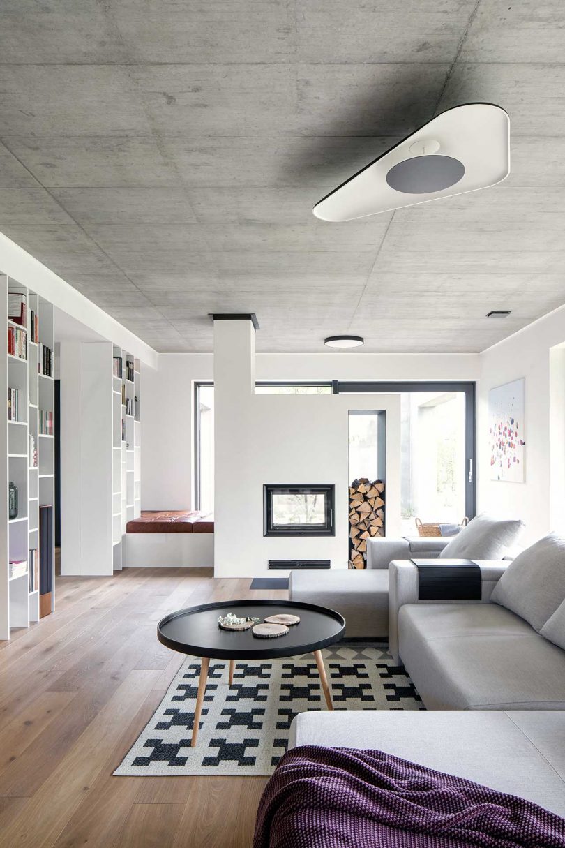
The designers keep the color palette neutral with the use of white, anthracite grey, and natural wood, along with the occasional curated use of color.
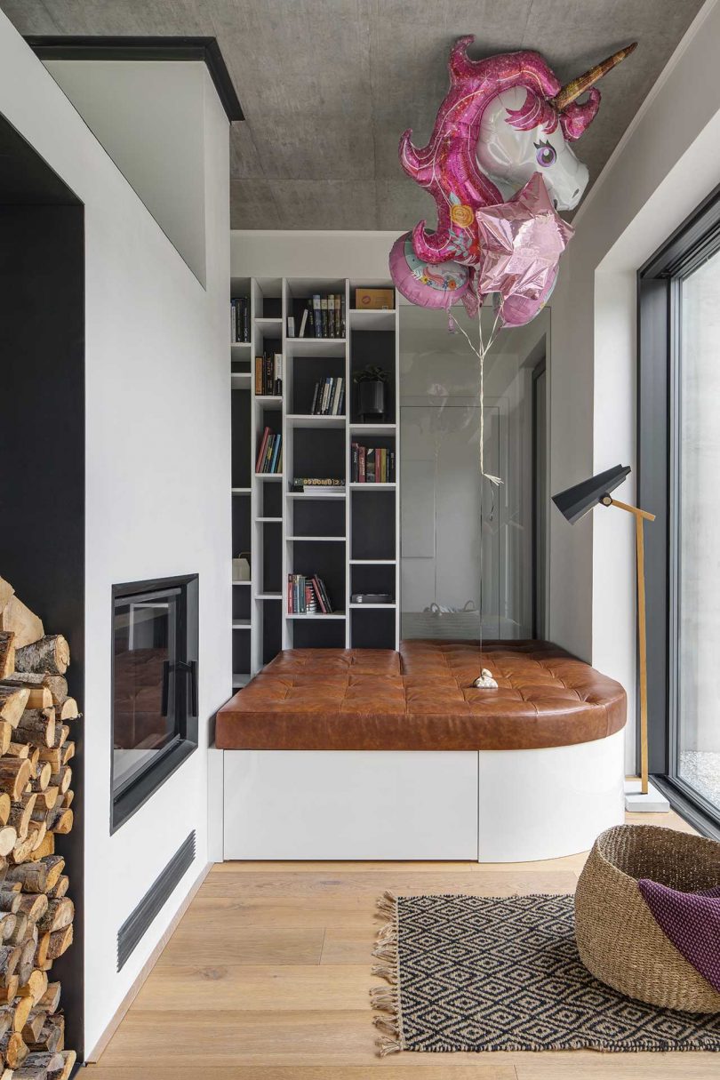
A cozy lounge space is situated at one end of the main floor offering a quiet space to read or relax by the fire.

The central living room features two white bookcases framing the staircase with space in the middle for a projection screen. When the screen is rolled up, the minimalist wooden staircase with glass railing stands out and cleverly disguises storage underneath.
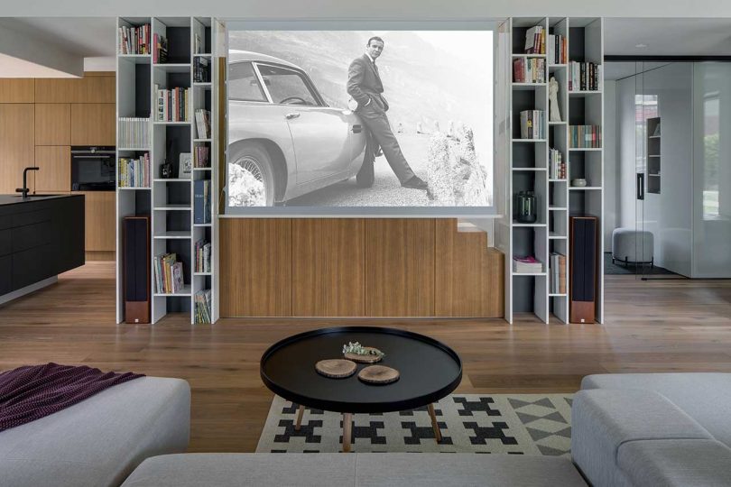
The sofa is modular and can be reconfigured into three different setups for various scenarios.
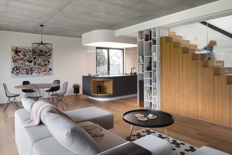


A massive kitchen island allows plenty of space for food prep. A dropped ceiling above the island mirrors its shape and offers ambient light as it’s backlit.

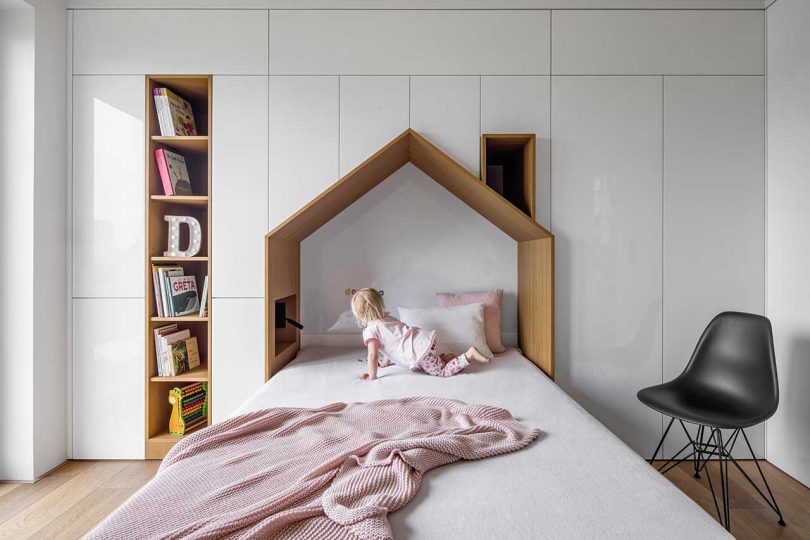
The kid’s room includes a multifunctional wall unit that houses storage while creating a house-shaped nook at the head of the bed.
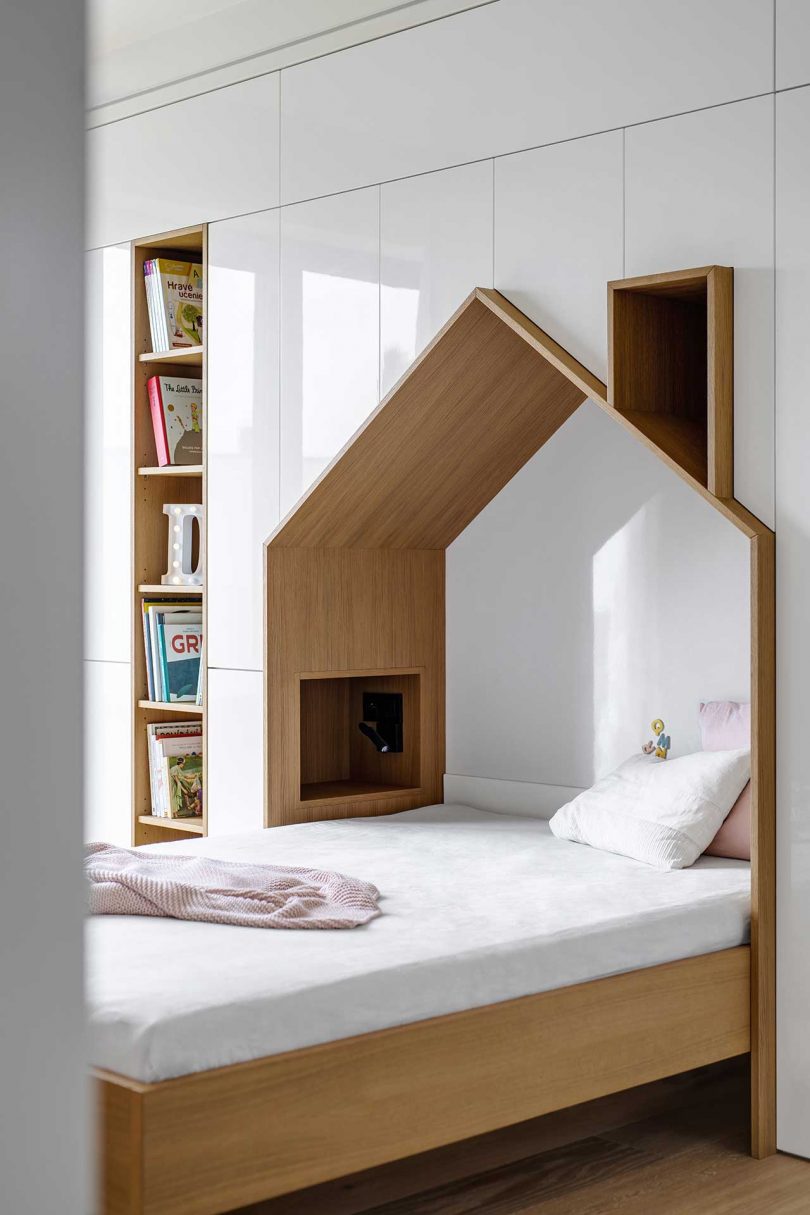
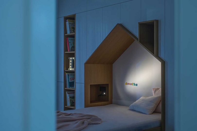
Photos by Tomas Dittrich.

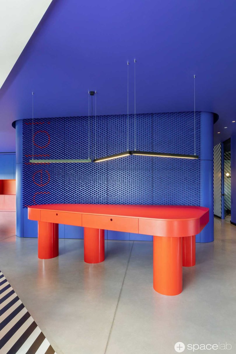
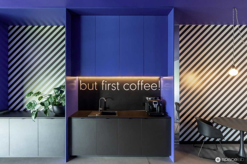
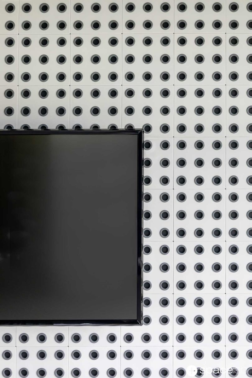
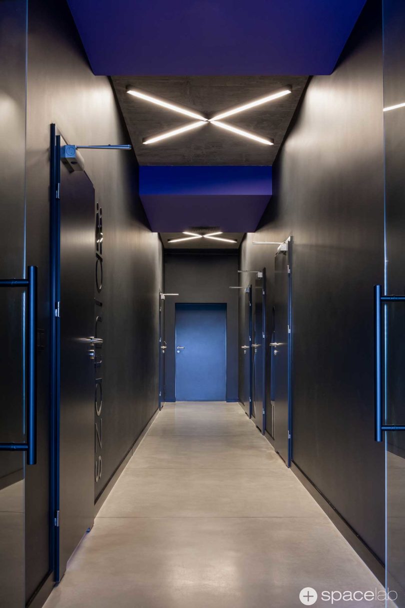
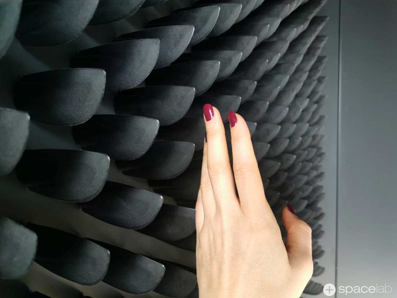
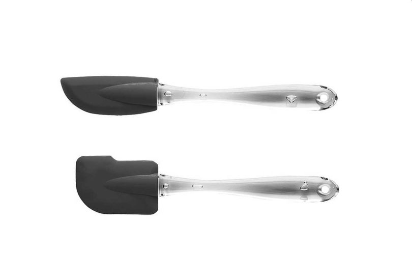
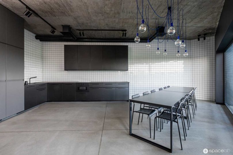
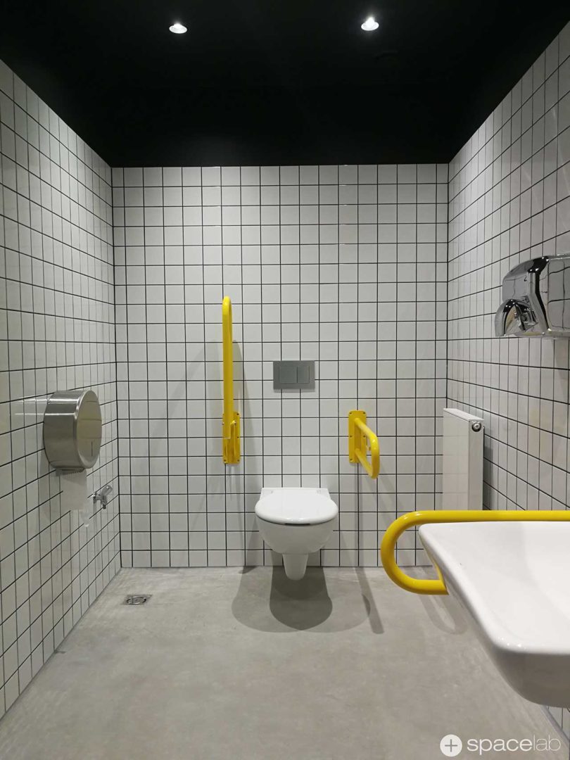
When it came time to design their new office in Poznań, Poland, FORMSON hired Polish design studio SPACELAB, led by architect Agnieszka Deptuła. The main source of the design’s inspiration came about on a visit to the company’s headquarters where they spotted bins of silicone spatulas that FORMSON manufactures. Seeing the identically shaped kitchen utensils all together gave them the idea of mounting thousands of them on different walls as three-dimensional advertisements using their own products.
FORMSON, known for their colorful kitchen equipment, carried the same vibe into their office space with the use of PANTONE colors. While the entry and staircase leading to the office is monochrome, vibrant colors greet guests as soon as they step inside.
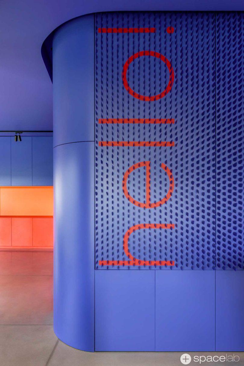
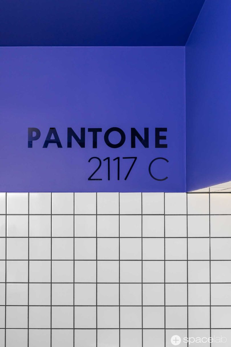
At front and center is a vibrant structure in PANTONE 2117C with a red ‘Hello’ behind a sea of matching spatulas jutting out from the wall.

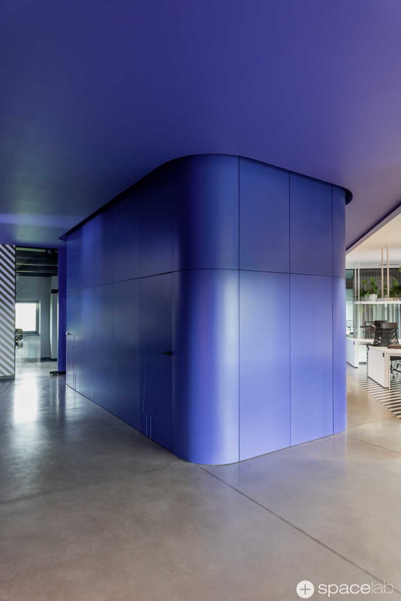

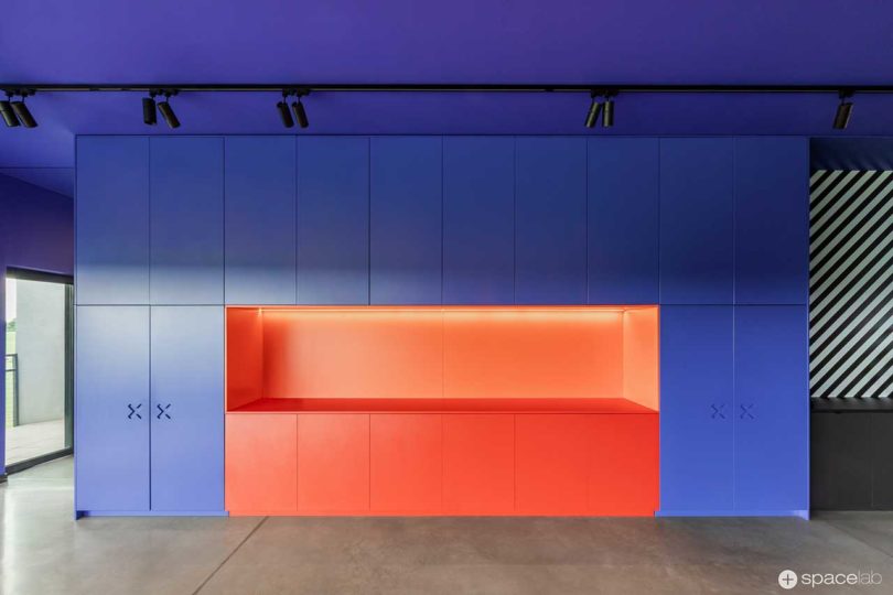
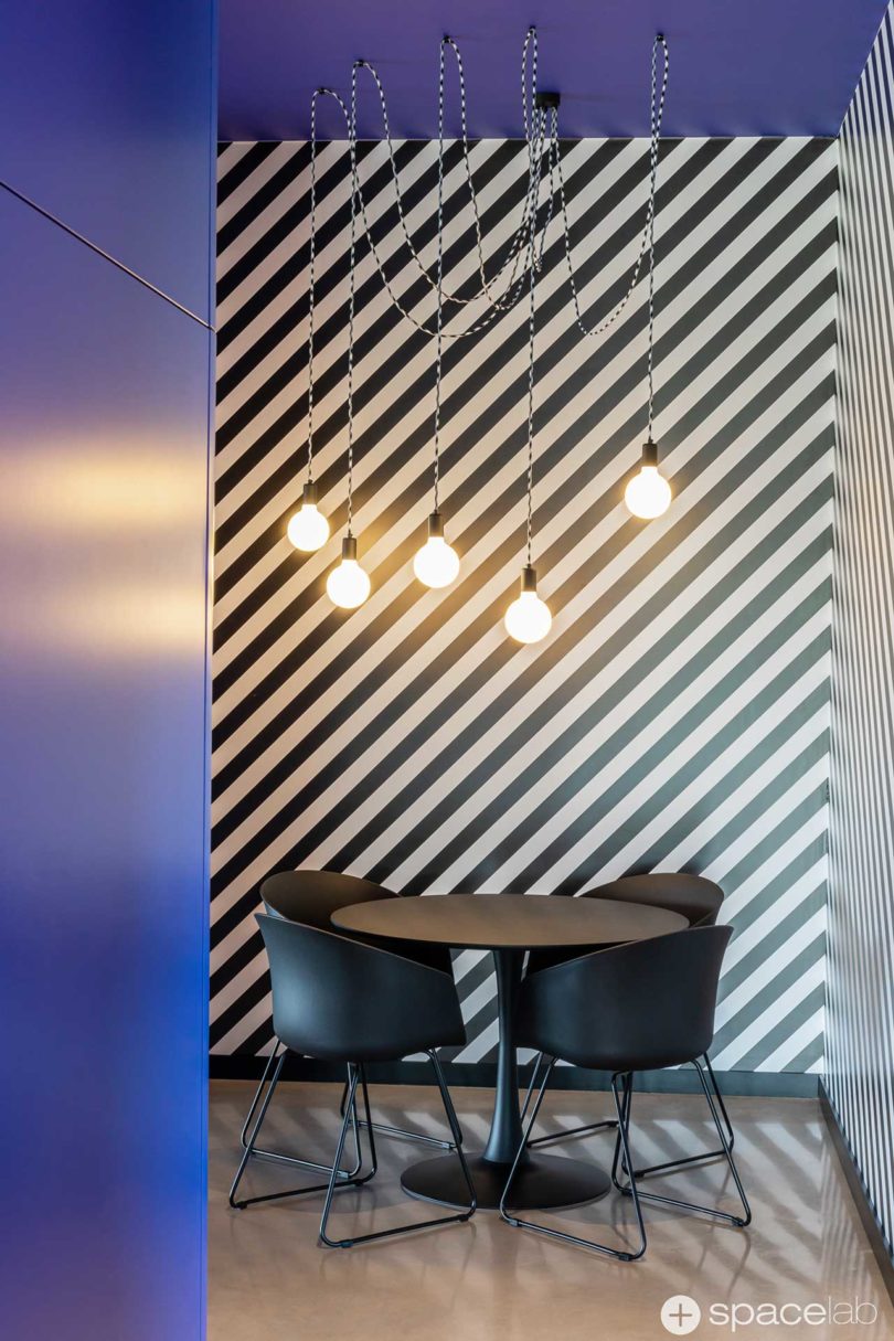
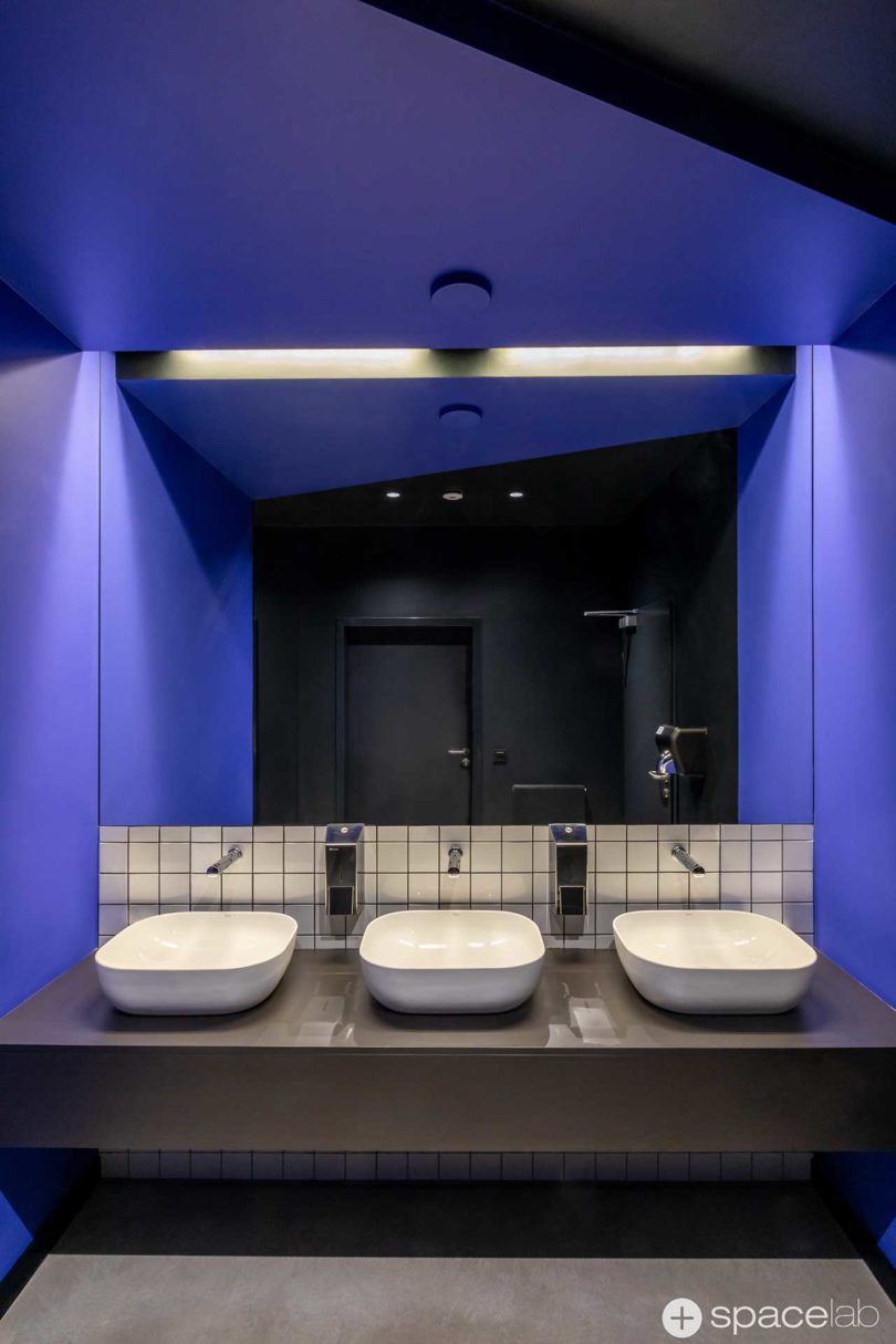
The purple-blue hue shows up throughout the office, interspersed with black and white stripes, and electric PANTONE Living Coral 15-1646.
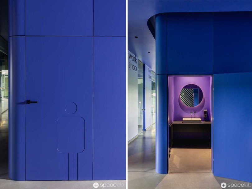
SPACELAB made use of another product made by FORMSON – perforated trivets – hung on the walls in the conference room. Used in a repeat pattern, the item becomes part of a dramatic backdrop that would never lead one to think they’re anything but a wall covering.
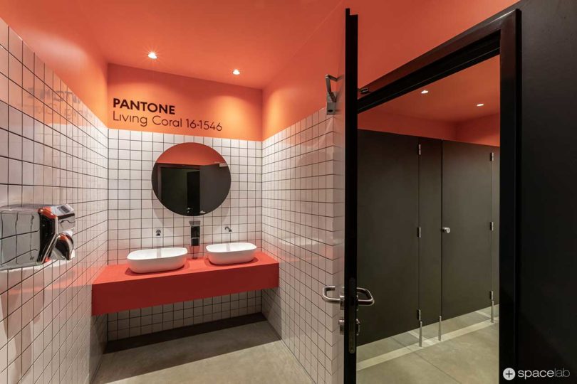
The colorful bathrooms are given the same playful treatment with the PANTONE colors continuing on along with white square tiles and black grout.
Photos by MOIZ.
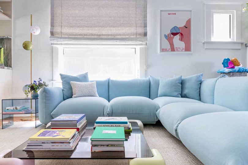
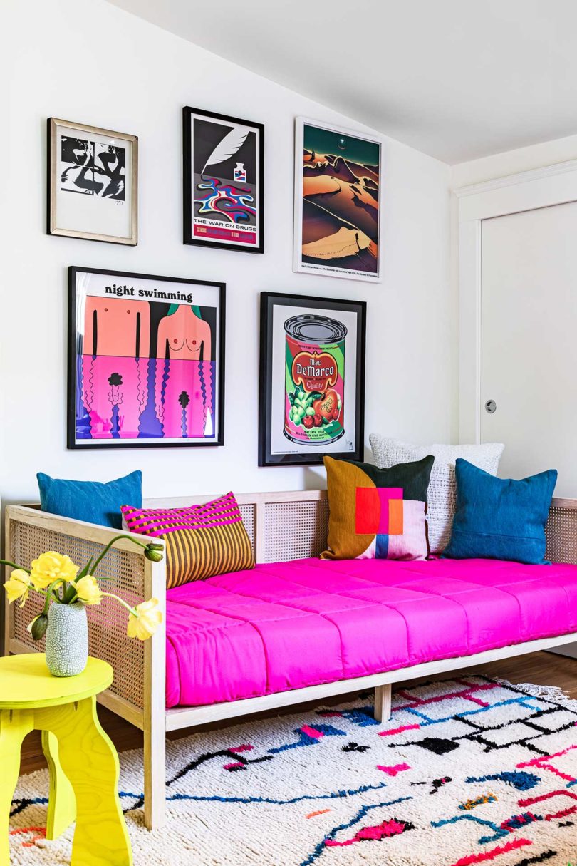
When Eric, a young art collector and entrepreneur, purchased a Craftsman house in Echo Park he knew immediately that Leah Ring of Another Human was the one to transform it. A full gut renovation was needed to create an open, light-filled layout where he had space to entertain and display his artwork. The process included raising the ceiling, moving walls, refinishing the floors, and doing away with the decorative trim, all leading to the home it is today – alive with lots of color and contemporary elements.

Between the blue Arflex sectional sofa and pair of grey chairs behind it, the living room now offers plenty of places to sit with guests when they’re over. The clean, white walls make for the ideal backdrop for Eric’s extensive art collection.
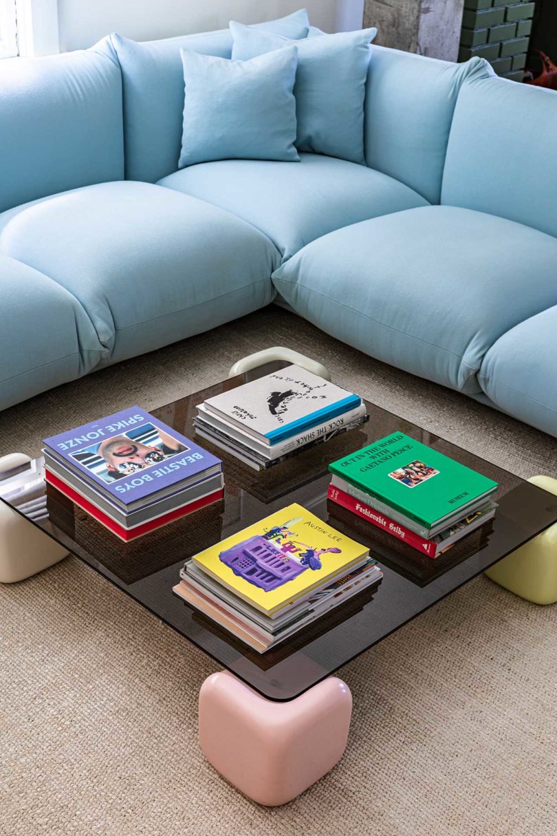
The sofa perfectly frames the Studio Mignone coffee table with black glass and pastel colored block feet.
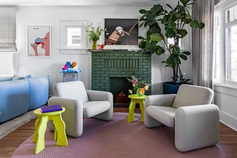
Another Human was able to help guide the curation and placement of each work of art, like hanging a David Shrigley painting near a Mark Whalen sculpture. To round out the living room, two Wilkes Chiclet Chairs are paired with two acid green tables resting atop a mauve colored rug.
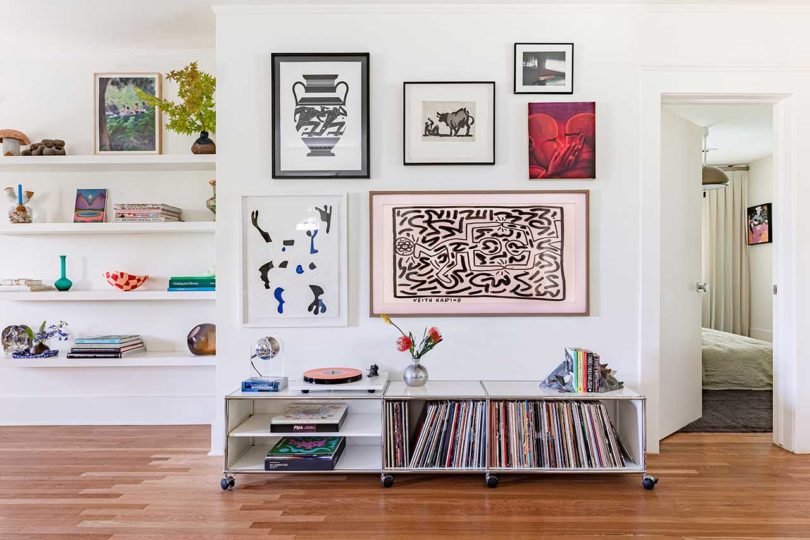
A gallery wall featuring works by Cleon Peterson, Johnny Negron, and Aryz Nacionalismo disguises a Samsung Frame TV in the mix. Just below it is a low console by USM Haller that holds a turntable and records.
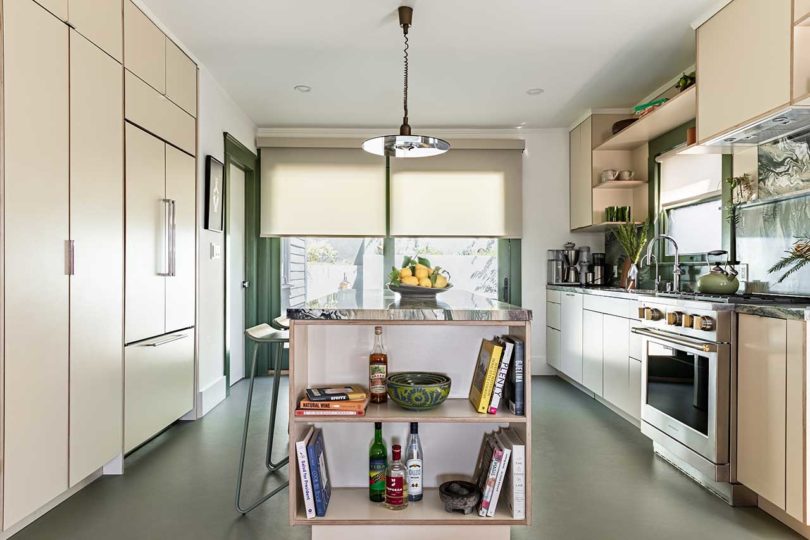
Green swirly marble sets the tone for the kitchen design, after an exhaustive search for the perfect color. While the kitchen boasts a muted green and neutrals color palette, the space is far from boring. Green linoleum grounds the room while cream colored cabinets lighten it up.


The green marble covers the countertops, backsplash, and island, adding just the right amount of visual interest.
The bedrooms lean towards minimalism with muted shades and limited furnishings, like the Bocci table lamps on simple wood end tables.
Just off the primary bedroom is its adjoining bathroom clad in six shades of blue Zia Tile in a random mosaic pattern.
The floating blue vanity is accented with glass pulls and sconces from RBW.
The guest bathroom revisits green, evoking a sense of calm and serenity.

Photos by Stephen Paul.
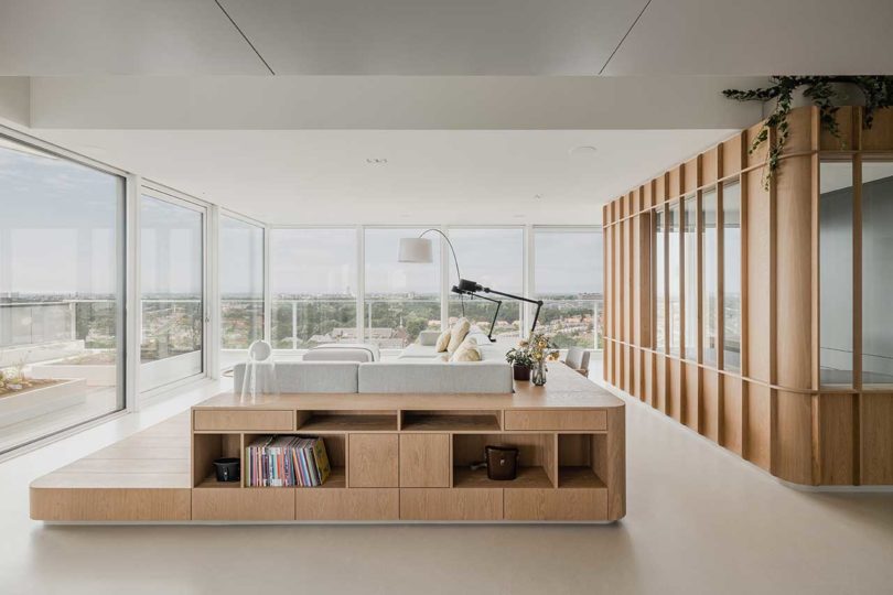
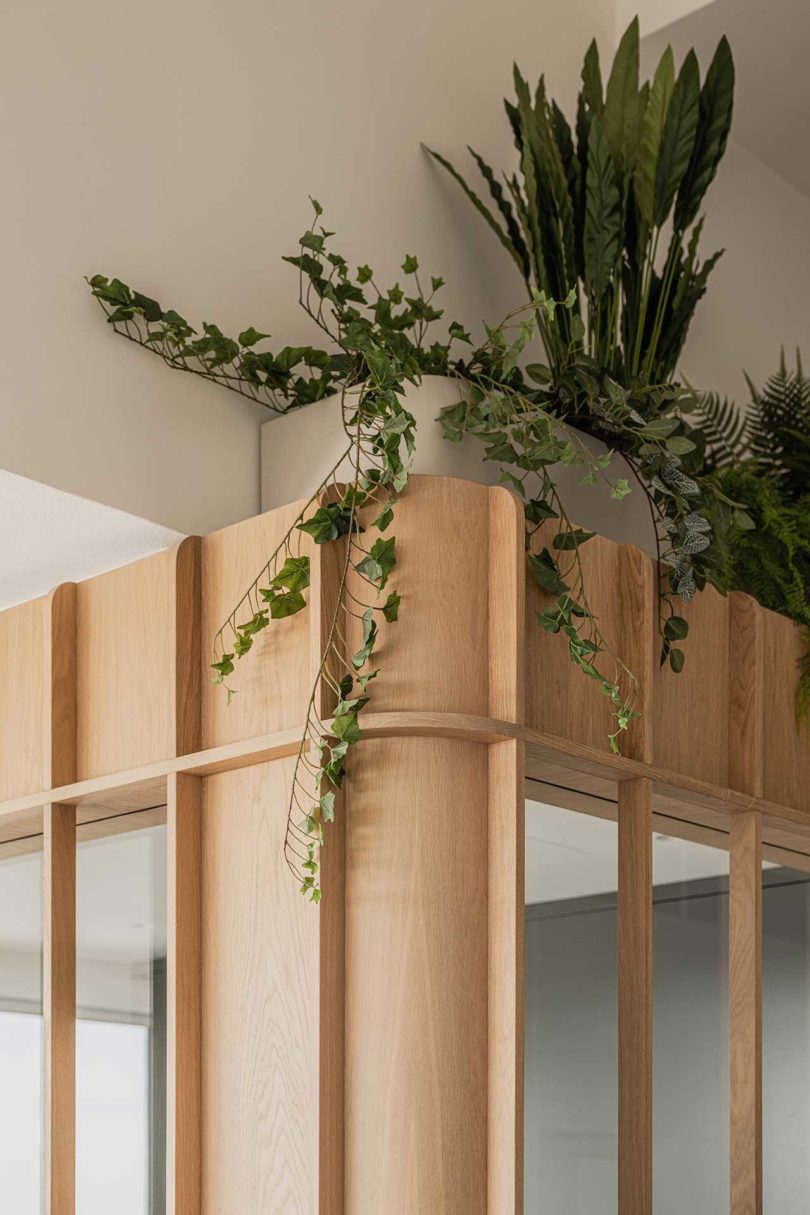
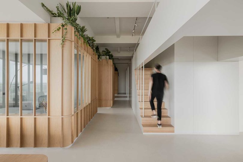
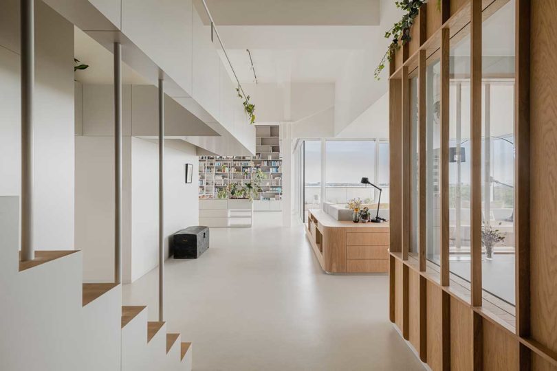
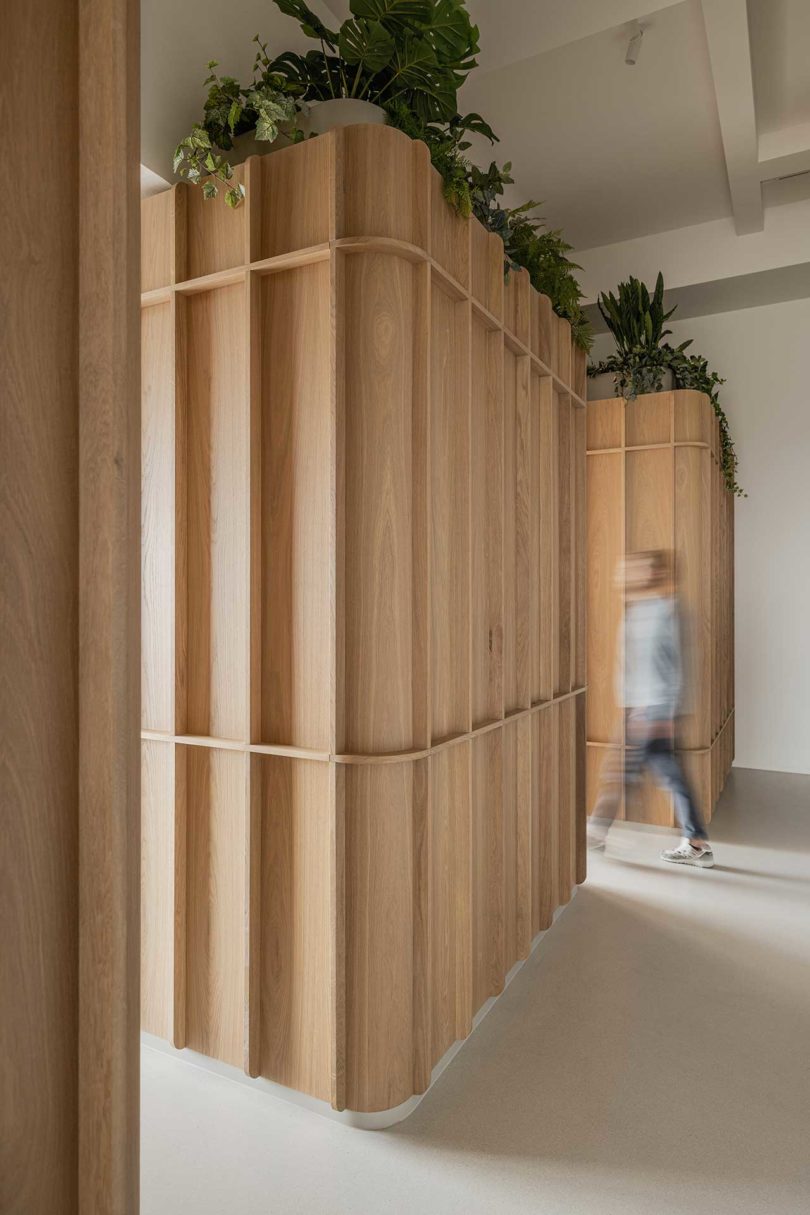
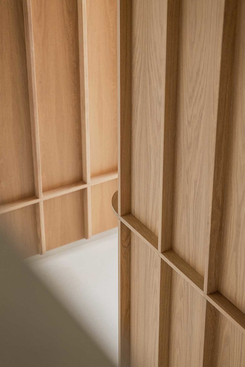
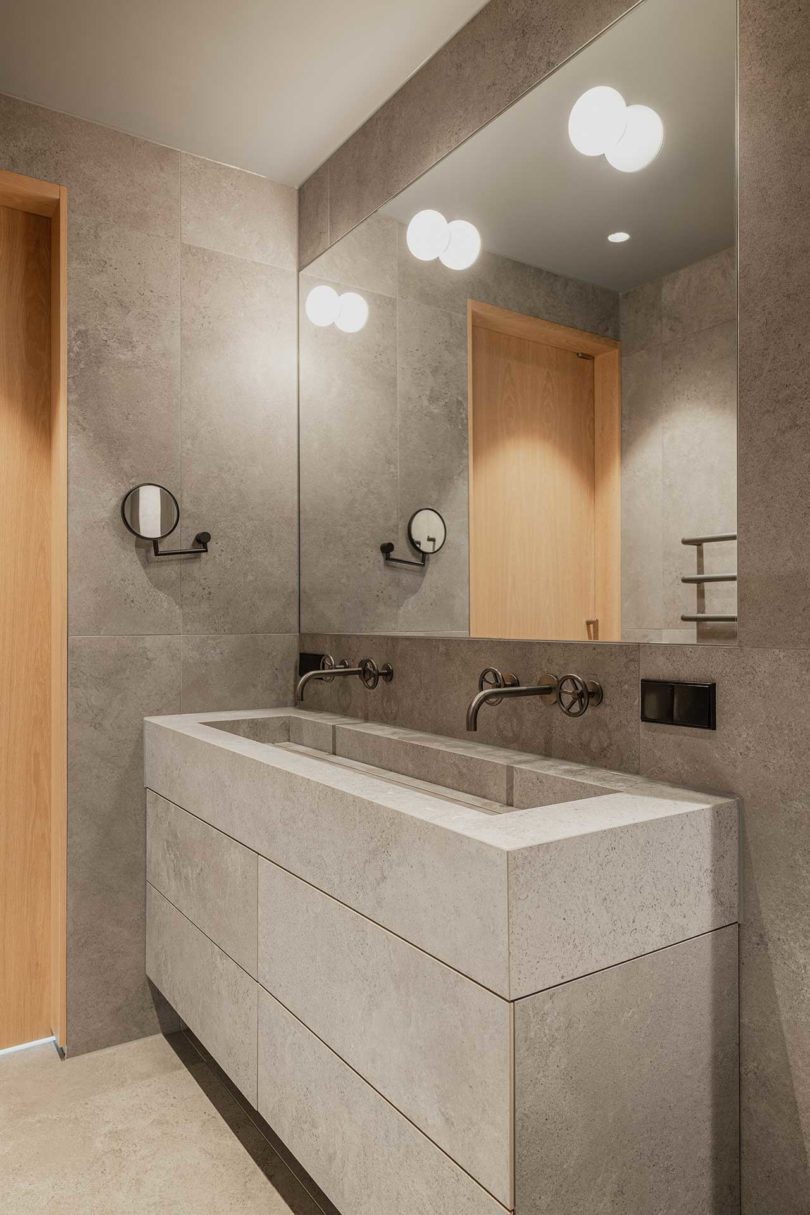
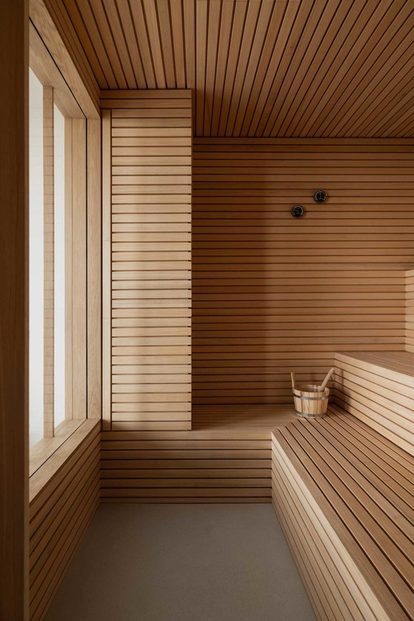
Bureau Fraai designed this modern penthouse with panoramic views that include both the sea and city in the Netherlands. The Panorama Penthouse apartment resides in an old office building that was transformed into a high-end residential building. The design plan required come creative thinking as they wanted to preserve the 180-degree views from all spaces. To make that happen, they designed free-standing oak structures to create an open layout. The four floating volumes disguise an office, walk-in closet, primary bathroom, and sauna. By being positioned as they are, they create privacy for both the primary and guest bedrooms, while still remaining open to the views.
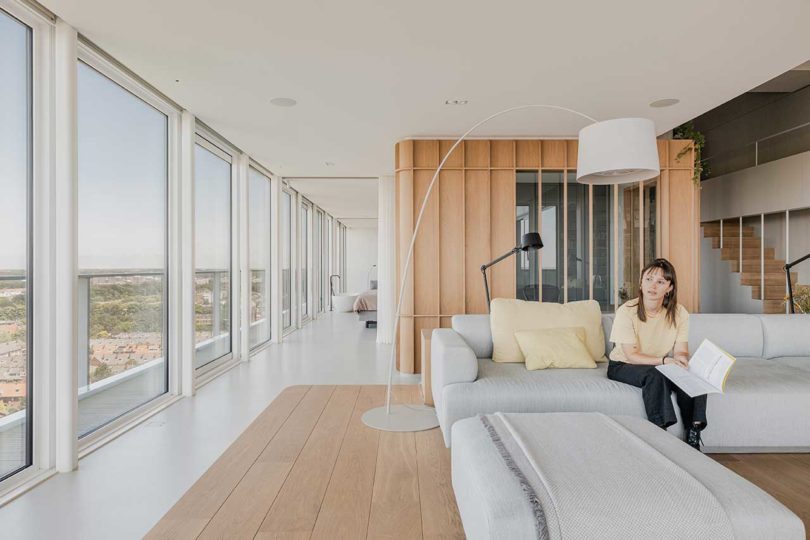
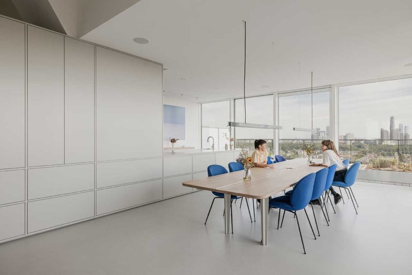
Floor-to-ceiling windows frame the outstanding views no matter where one stands.
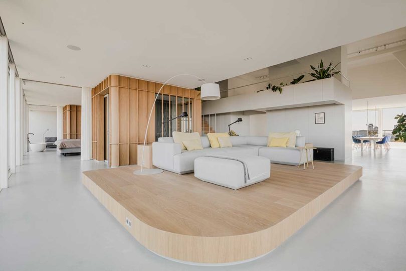
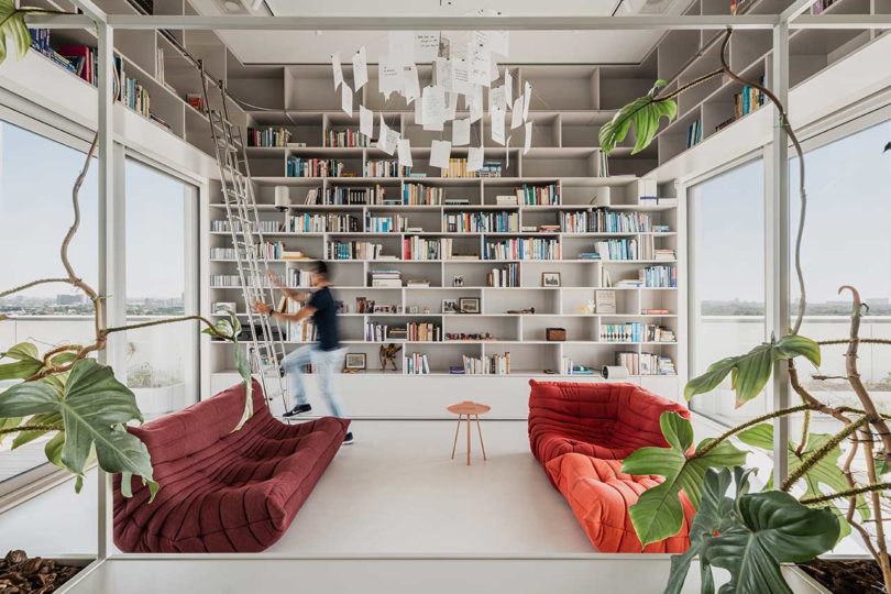
The living room rests on an elevated wooden platform framed by an outer bookcase. The sectional sofa is positioned toward the windows where one can gaze at the city’s sights.
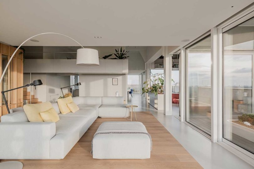
The overall apartment’s design leans towards minimalism with a white and light grey color palette. The wooden platform and volumes, along with the plants resting atop the structures, warm the space up.
Both the office and sauna volumes have windows that allow natural light into the closed spaces.
A media and lounge room bisects the lower level terraces but has sliding glass doors on both sides that open it up to the outdoors.
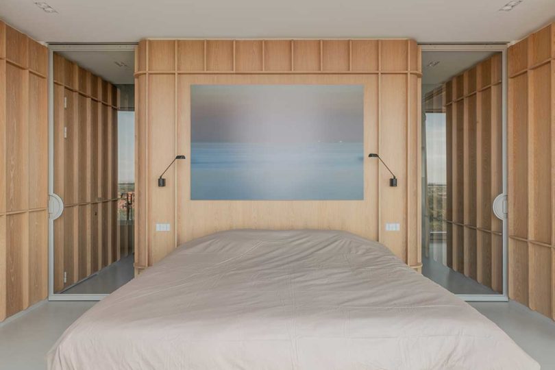
Sliding steel and glass doors close between the volumes to give the primary bedroom privacy. The walk-in closet is directly behind the bed, with the bathroom on the left and office on the right.
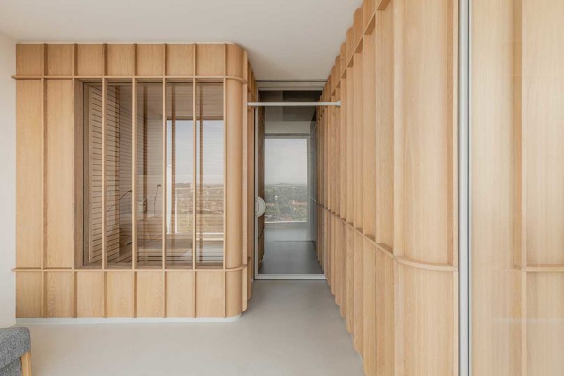
Just off the guest bedroom is the sauna which features windows on one side facing the perimeter windows so one can enjoy the views while in there.

Photos by Flare Department.
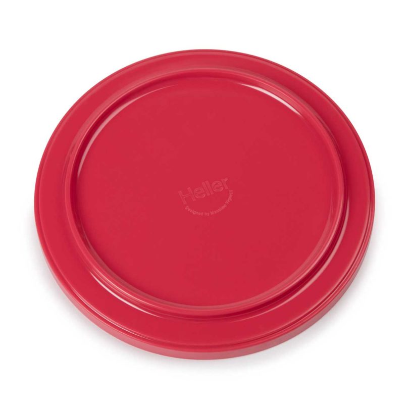
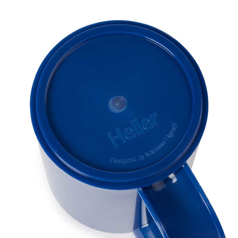
After John Edelman bought Heller last year, the company announced plans to bring back the iconic 1960s stackable Hellerware in white. The Vignelli-designed melamine dinnerware was originally manufactured in Italy in 1964, and then later in the United States by Alan Heller. Currently, the white Hellerware collection is available for pre-order on Heller’s site. The Hellerware rainbow colorway, however, has been in and out of production since the early aughts, but now the MoMA Design Store is bringing the legendary collection back in six vibrant colors. Starting today, they’re available in 6-piece sets, one of each color, of either dinner plates, salad plates, soup bowls, or mugs, for $60, via online or in-store.
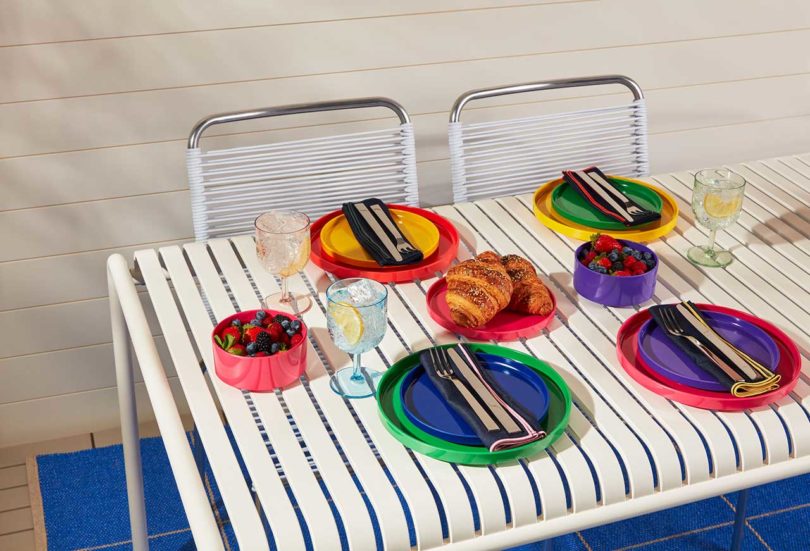

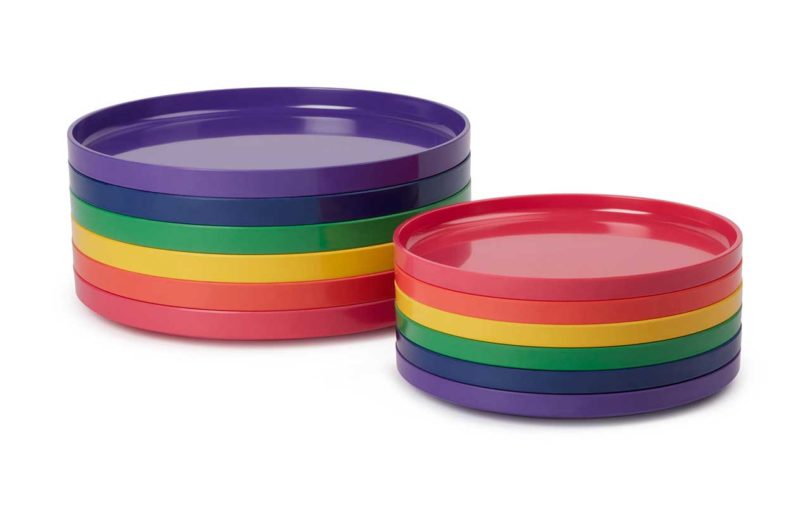
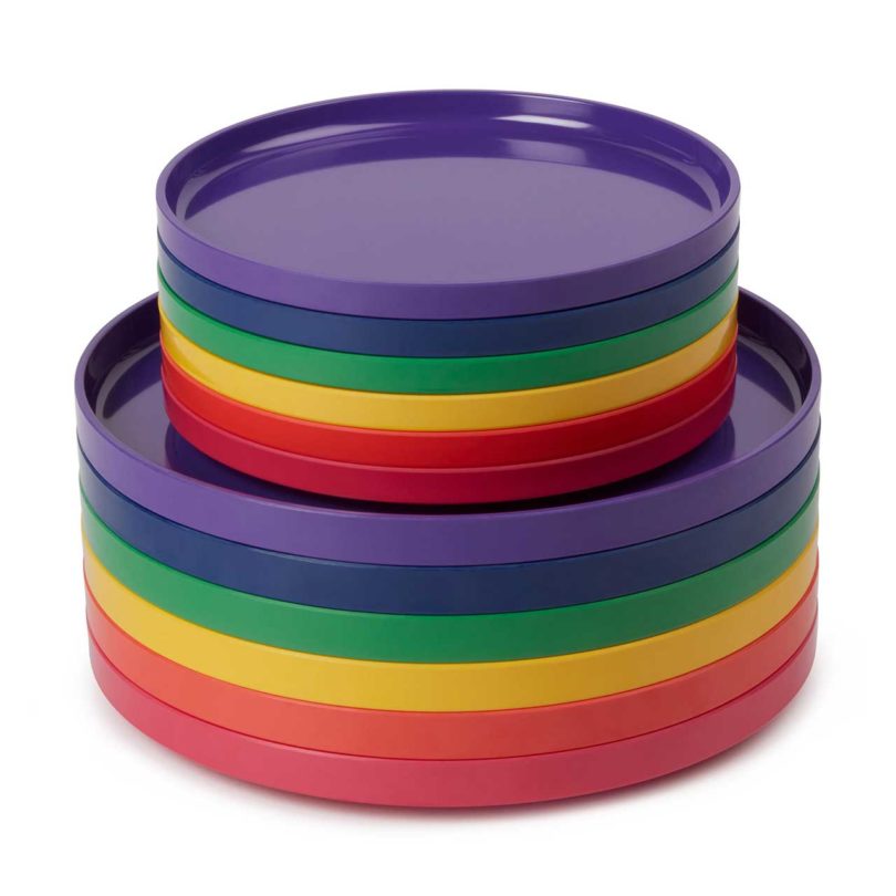


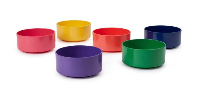


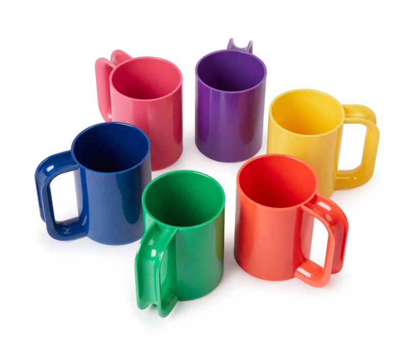

The Heller Rainbow Dinnerware collection launches today exclusively from the MoMA Design Store. Visit store.moma.org for more information.