
In Wroclaw, Poland is a lively terraced house that reflects the youthful energy of the couple who owns it. Designed by Znamy się for the owners, and their two dogs, who love to cook, entertain friends, and play board games. Drawing inspiration from the whimsical world of Playshapes (wooden blocks that can be moved, layered, or combined), this modern home now boasts a fusion of structures, forms, and vibrant colors that bolster creativity, socializing, and play.

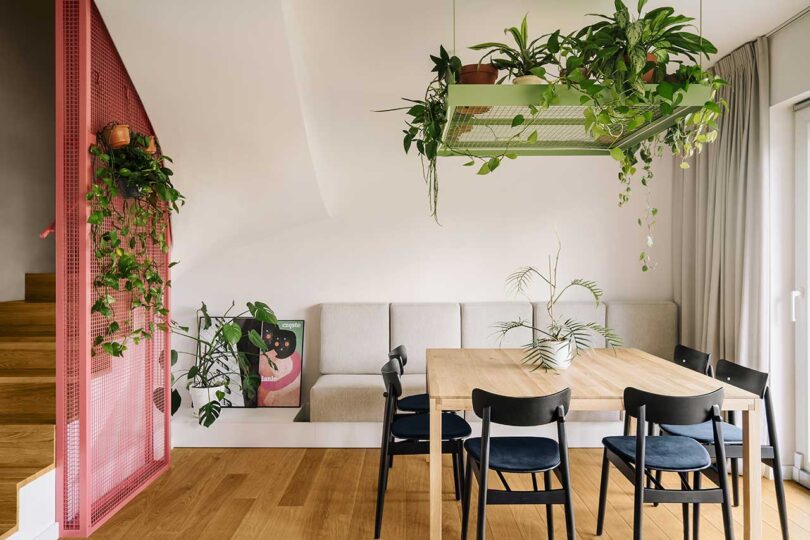
The new interior holds many elements that allow the owners to play with form. Moveable furniture sets the stage with shelves on wheels that enable the couple to create flexible arrangements and new spaces. The kitchen island is not only the place for food prep and cooking, it stores board games and houses water dispensers for their beloved dogs. The dining table’s top lifts to play games and work puzzles.


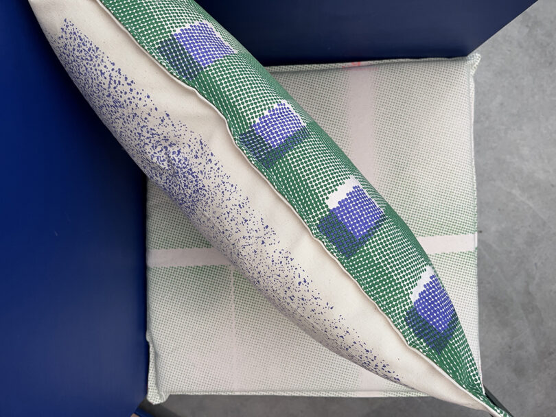
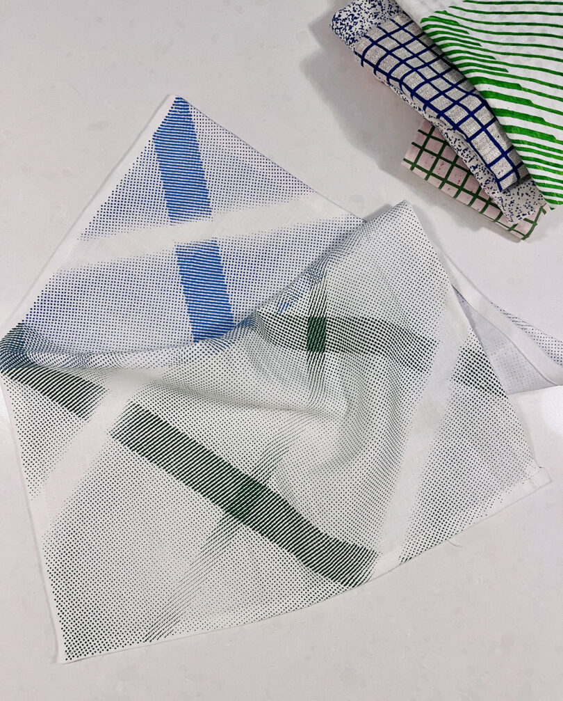
Geometric shapes and a strong palette of colors intertwine forming layered spaces rich in textures and visual intrigue. The inclusion of lots of wooden elements gives nod to Playshapes, while adding organic charm.


Three shelves set within a blue painted alcove hold a large selection of plants and objects for a touch of biophilia.

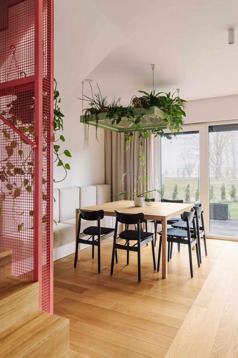
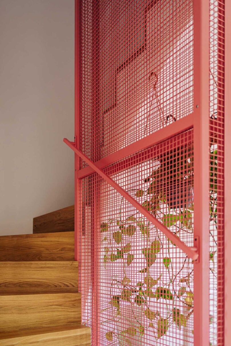
The square dining table lives under one of the hanging grids that holds plants. Similar gridded structures live alongside the wooden staircase adding a pop of color while providing safety for those climbing the stairs.


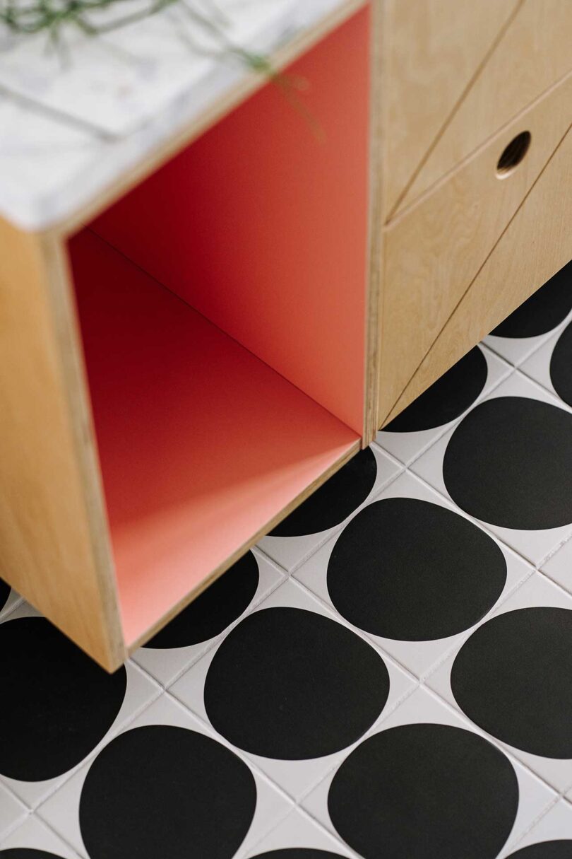
The bathroom features similar wooden cabinets as the kitchen island with geometric patterns adorning the fronts. An inset cabinet is painted a playful pink on the inside, pairing nicely with the black and white floor tile.

Photography by Migdal Studio.

It only takes a glance to see where the Lightbone floor lamp got its monicker – the connection point between the spherical glass globes and the wooden sections. Inspired by a bamboo forest on a trip to Japan and designed by FÄRG & BLANCHE for Oblure, Lightbone was originally exhibited during Milan Design Week 2017 as part of the “Armour Mon Amour” exhibition. At that point of the conceptual phase, the floor lamp was textile and measured up to three meters tall! In the following years it’s continued to evolve into the product you see here.

“We are really happy that we were able to develop this version of the Lightbone together with Oblure,” said the designers, Fredrik Färg and Emma Marga Blanche. “This time in solid Oak and all made in Sweden.”

The floor lamp can easily be used next to a sofa, but also looks amazing in a group or two or three. Multiples begin to resemble a small forest or act to divide spaces in hospitality projects.
Lighbone is available in natural Oak with a Black stain, Smoked Oak, and Cobalt Blue. It’s also available in custom colors on request.


Black Oak

Cobalt Blue Oak

Natural Oak

Smoked Oak
To lean more about LIGHTBONE floor lamp, visit oblure.com.

Scandinavian design is most often associated with a minimalist aesthetic, one emphasizing natural materials as a carefully considered employment of form following function. Wood often plays prominently, as does a subdued palette meant to evoke nature’s colors, with metal only used sparingly as accents. It’s all pretty much the antithesis of the PC gaming aesthetic and ethos, where gaming rigs tend to lean strongly into gaudy LED-illuminated showmanship.
Now imagine if Alvar Alto or Arne Jacobsen as an avid gamer today, and if they put their creative genius towards designing their very own gaming machine for their COD or Minecraft addiction. You might very well see something similar to Fractal Design’s North and Terra PC cases.

Fractal’s North is available with either a mesh or tempered glass side panel design. Either option includes two 140mm fans to keep air flow performance at a maximum within, while wood and metal combine into a handsome mid-century presence on the exterior side.

Fronted tastefully with a real oak or walnut paneled face, embellished with a faux leather tab, and sleek steel or brass detail buttons and ports, Fractal’s North PC case stood out enough from the crowded realm of audaciously outfitted PC gaming designs to earn the Gothenburg-based company a Red Dot Design Award 2023.

An integrated pull tab allows for easy access into the case for maintenance or upgrades.


Fractal’s Terra is a similarly conceived approach to PC gaming, featuring a smaller case option made with anodized aluminum panels and a CNC-milled, FSC-certified solid walnut front face.

Three front USB ports, including one USB 3.1 Gen 2 Type-C with fast charging support and speeds up to 10Gbps, are available on the exterior; seven bridgeless expansion slots within maximize the customization and upgrade options down the line.

Noting hardware upgrades play prominently in the PC gaming experience, North has designed the Terra case to be easily accessible from the side and top using an integrated tab.


An aluminum power button and two USB ports for connecting devices are integrated into the walnut wood detailing. The sum of the design makes it an ideal aesthetic candidate for a living room media PC or gaming machine connected to a home theater system.

Founded in 2007 in Sweden, followed by Fractal Design outposts opened in Dallas and Taipei, Taiwan, the company has distinguished itself by designing gaming accessories aimed at PC customers seeking an understated presence on their desktop. The company’s North and Terra cases epitomize this understated aesthetic displaying an almost architectural attention to detailing.
Fractal Design’s North PC case retails for $140 here, while the Terra PC case is available for $180 here.
This post contains affiliate links, so if you make a purchase from an affiliate link, we earn a commission. Thanks for supporting Design Milk!

Austin, Texas-based URBS Studio is joining us for July’s Designer Desktop with a background that’s cool-tempered but energizing. Through her interdisciplinary design studio, Alyson Beaton explores the urban culture that surrounds her. The details and detritus observed all contribute to the whole of the studio’s work: grids, grit, signs, symbols, rhythm, scribbles, weeds, chaos, order, and more. URBS translates these visual tales of urban renewal and environmental sustainability through spaces, textile collections, children’s products, and more. The man-made environments that are part of our everyday lives are constantly evolving in different ways, and most of it’s nothing you or I have control over. But we’ll never tire of seeing creativity rise from the most unexpected of places.
For this month’s Desktop, Beaton shares her Glimmer design inspired by “The glimmer of light that reflects off the glassy buildings when the sun hits just right.” The trippy design is paired with the quote, “While you are looking, you might as well listen, linger, and think about what you see,” from Jane Jacobs.
Download yours with the links below!

Town Square Text

Whichway Cover

Metropolis

Flaneur Cushion
Facade
Glimmer

Alyson Beaton, URBS Studio
DESKTOP: 1024×768 \\\ 1280×1024 \\\ 1680×1050 \\\ 1900×1200 \\\ 2560×1440
MOBILE: iPhone XS \\\ iPhone XS Max \\\ iPad Pro
Learn more about URBS Studio here and follow along on IG here.
View and download past Designer Desktops here.

Tinder’s new headquarters in West Hollywood, California designed by Rapt Studio could be imagined as a thoughtful response to the transformative changes that have affected the corporate workplace dynamics the last few years. The seven-story, 77,000-square-foot project, handled by the same creative consultancy responsible for developing other creative spaces for the likes of Google, Dropbox, and Vans, is imagined to reestablish the pandemic-frayed ties that bind individuals into creative collaborative teams – and by extension, between the app users they seek to support – designing a multi-level headquarters layered with a multitude of opportunities for collaboration and connection.

Rapt Studio began the project by researching existing public space typologies, from the town square to the speakeasy, that empower a progressive deepening of ties that bind workers with their work in an organic manner.

Modeled after a town square, The Commons is the largest and most expansive of the spaces, and also the entry point into Tinder’s new headquarters. The airy environment is intended to encourage casual interactions and large enough to accommodate for company-wide gatherings.


The café — or “Boost Bar” — sits on the second floor, giving employees access to the skills of an in-house barista, and in turn providing an informal space to work away from the desk.

The IT help desk is fashioned after the nostalgic memories of the neighborhood arcade.

Diffuse lighting, custom modular furniture on wheels, and walls clad in top-to-bottom whiteboards all inhabit La Galleria, a room drawing its atmosphere from the workshops and displays of an artist studio.


A custom hot-pink central table with cutouts along the edges offers a surprisingly idiosyncratic hue to the space’s otherwise muted purpose.

Floor six is dedicated to quieter activities and appropriately demarcated as The Stacks, a tranquil communal space fashioned after a library.

Deep blue hues across plush fabrics, with curvilinear walls and curtains framing windows overlooking the LA skyline give the pinnacle seventh floor a nightclub vibe. Seating arrangements are situated to encourage engagement within intimate groups – a “secret” employee getaway of sorts.
“Connection is at the heart of the Tinder brand,” says Rapt Studio CEO and Chief Creative Officer David Galullo. “To design a space that deepens connection within Tinder, we looked to the places where we typically build relationships and then mapped them onto a floor plan. The end project emphasizes how design itself can be a force of connection.”
Tinder’s new HQ shares some similarities to Rapt Studio’s previous project, The Schoolhouse, a creative office for The Google School for Leaders. Each share the goal to spur informal engagements between team members by carving out both shared and intimate spaces, and furnished to empower employees to adapt those spaces to their needs on an as-needed basis.

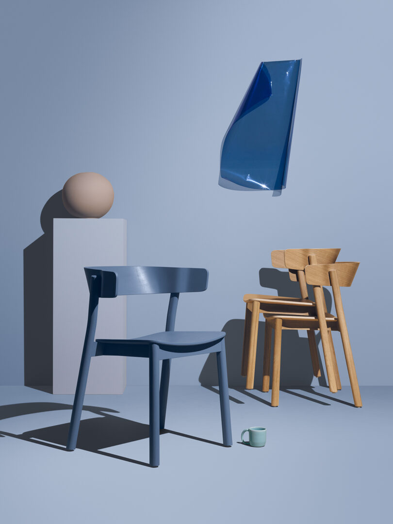
Creative and fun, Mizetto’s Summer 2023 Collection lives somewhere between work and play. The brand has pushed its own capabilities, exploring new materials, production methods, and functionality. Made in Sweden, the latest release includes a wood chair, a versatile table with attachments, a leaning piece, modular planters, and a trash/recycling bin. All share the qualities of clean lines and curves and leave you wanting to experience each for yourself. Known for its color combinations, Mizetto has also added five new “Nordic noir” hues: rusty burgundy, cloudy latte, forest green, latte, and dusty blue.

Lumber by Addi \\\ Photo: Jonas Lindstrom
Perhaps the most curious addition is Lumber by Addi, a piece meant for leaning, lingering, and loitering. The soft beam’s release marks the first upholstered product introduced by the brand. It’s a great answer to adding seating to small spaces, and we can’t help but note its resemblance to a dynamic piece of gymnastics equipment. A quick place to stop on the go for a coffee or email check, Lumber’s small tray-like table adds further functionality to a piece with no obvious front or back. It can even be hung on a wall for maximum space saving. Lumber’s upholstery is flameproof wool, with a cover that’s fully removable, repairable, and exchangeable. The legs are powder coated metal.

Lumber by Addi \\\ Photo: Jonas Lindstrom

Lumber by Addi \\\ Photo: Jonas Lindstrom

Lumber by Addi \\\ Photo: Jonas Lindstrom
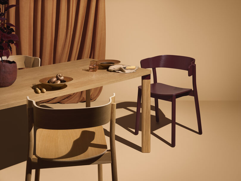
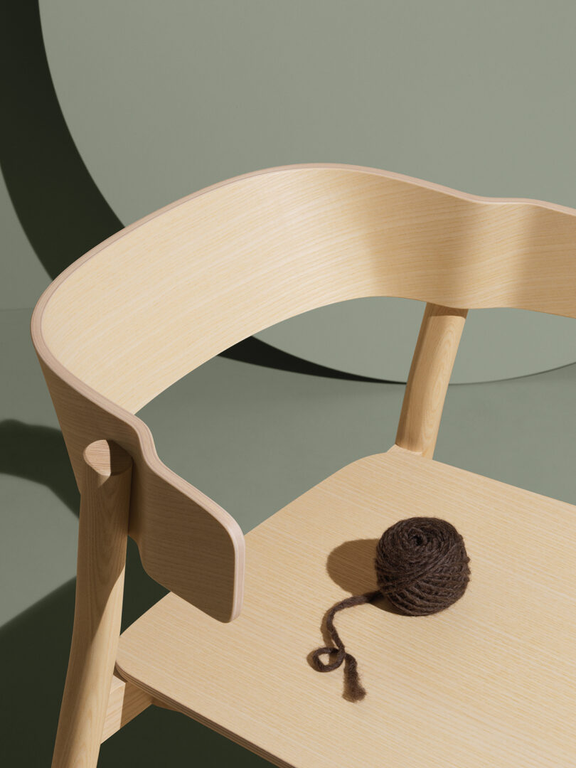
Embrace Chair by Sami Kallio \\\ Photo: Jonas Lindstrom
A wooden chair is new territory for Mizetto, so they turned to an expert for help – Finish-Swedish furniture designer and woodworker Sami Kallio. The Embrace armchair was a result of the brand lacking seating in their own spaces, and shortly after, Kallio walked in with a fully functioning prototype.
“A few alterations later, Embrace was born; a chair that seemingly hugs its user. I love how it can be hung on a tabletop and stacked, but still provide us with all the beauty and comfort we seek in a piece of furniture,” said Rickard Muskala, founder, and chief of product development.
Kallio is also behind the multi-purpose table in the Embrace series.
Embrace Chair + Embrace Table by Sami Kallio \\\ Photo: Jonas Lindstrom

Embrace Chair + Embrace Table by Sami Kallio \\\ Photo: Jonas Lindstrom
Embrace Chair by Sami Kallio \\\ Photo: Jonas Lindstrom

Plant Here by addi \\\ Photo: Jonas Lindstrom
Playful, fun, and modular, Addi’s Plant Here gives our green friends a pedestal fitting of their mood-enhancing ways. The planter pays attention to the various needs of different varietals through its accessible design, whether you’re a balcony or office gardener. Features include a generous depth, transparent inner pot for easy planting, different heights, shapes, sizes, and colors. Combine two or more to form endlessly possible installations.

Plant Here by addi \\\ Photo: Jonas Lindstrom

Pelican by Studio Nooi
Trash and recycling bins are a necessity, but that doesn’t mean they have to look like one. Pelican by Studio Nooi turns them into minimal decorative objects with touchless interaction. Their semicircular shape allows for modular design, creating an oval when placed back to back. Pelican’s design is suitable for residential as well as commercial spaces, and comes in two sizes and a variety of colors.

Pelican by Studio Nooi

Pelican by Studio Nooi \\\ Photo: Jonas Lindstrom

Pelican by Studio Nooi \\\ Photo: Jonas Lindstrom

Pelican by Studio Nooi
To learn more about Mizetto’s Summer 2023 collection, visit mizetto.se.

If names like Yeti, Tundra, and RTIC strike a chord, you’ve likely gone through the sticker shock associated with deliberating between very large rectangular blocks of insulated plastic. Ice coolers fall under the product category of “you wouldn’t believe how much these things cost,” at least when considering options amongst a top performing tier of coolers attached to price tags of hundreds of dollars. Oyster, a new Norwegian brand will still set you back $500, but it introduces a uniquely smaller and more efficient design aiming to suck out the air from its larger and bulkier competition.

Typically thermal energy is circulated within a cooler very slowly, affecting the overall temperature within. The Tempo thermal circulation is 380x faster than a comparable hard cooler, the equivalent of 190 watts/meter Kelvin versus 0.5 watts/meter Kelvin.

The Tempo is the most engineered ice cooler, inside and out, with an intelligently designed accessories system allowing easy and fast switches from a metal carrying handle to the included shoulder strap with only a couple turns of a dial. This assembly/disassembly construction also makes cleaning the cooler simpler and more thorough.
Even the best hard cooler requires pouring large amounts of ice to retain a cold drink temperature for hours, making for a laborious haul, ironically heating the carrier while attempting to keep the contents cool. The Tempo proposes something a bit wild: subtracting ice out of the equation. That is, if you start off by throwing in cold drinks or food to begin with. The Tempo’s patented double-wall vacuum insulation technology is so efficient in preventing heat transfer from occurring – keeping cold temps within from escaping and warmer ambient air from intruding. The cooler can keep cold foods or drinks chill for hours without ice… or for much longer aided by two included ice packs.

Two ice packs designed to fit perfectly into the Tempo are included, helping keep food and drinks cold(er) for longer periods. The precise fit of the two accessory packs into the aluminum lined interior illustrates the level of detail the Oyster team put into developing the Tempo over the span of six years. \\\ Photo: Gregory Han
The sleek extruded aluminum cooler essentially works just like those popular double-walled metal flasks you might already carry around everywhere to keep your coffee hot or water cold throughout the day, creating an insulated and vacuumed sealed interior large enough to fit 36 cans of beverages within. The only caveat of the design is if you dent it, it’s going to wear the signs of your mishaps forever (but that’s what strategically placed stickers are for).

The cooler’s rectangular shape is in itself an innovation; previous attempts to manufacture anything beyond a cylindrical vacuum-insulated shape would fail to retain their shape over an extended span of time. Oyster stands by their design so confidently, not only will they replace any broken parts, they claim their replacement policy even extends out to damage if your cooler is “mauled by a bear.”

The lid locks into a vacuum seal by securing two long handle hinges on both sides. Leave one in place and the lid levers open in a clamshell configuration. \\\ Photo: Gregory Han

Photo: Gregory Han

A strap or handle can be switched out quickly and easily thanks to the Tempo’s twist dial securing system. \\\ Photo: Gregory Han

A red nylon shoulder strap attaches easily to the Tempo for longer, heavier hauls after loading the 12.3-lbs (empty) cooler for outdoor destinations. \\\ Photo: Gregory Han
Outward appearances may give off the impression the Tempo is designed only for modest loads. But because of the thin-walled design, the Tempo offers three times the capacity compared to other rotomolded coolers of similar size.

Photo: Gregory Han
As the owner of an enormous and unwieldy rotomolded cooler, the Tempo’s manageable size is revelatory, and to be frank, suitable for more than 80% of our typical hiking, camping, or picnicking adventures. Pair that with the Tempo’s extraordinary ability to keep contents cold without bagfuls of ice, the quick-switch handle or strap carrying system, superior portability, and its subjectively standout industrial good looks, and the Tempo is arguably the coolest cooler on the market.
This post contains affiliate links, so if you make a purchase from an affiliate link, we earn a commission. Thanks for supporting Design Milk!

As Rhode Island School of Design’s (RISD) 18th president, Crystal Williams believes that education, art and design, and staying committed to equity and justice are essential to transforming our society. At RISD, the Detroit-born activist is working to drive meaningful change centered on expanding inclusion, equity, and access. To back that up, Crystal has more than two decades of higher education experience as a professor of English as well as serving in roles that oversaw diversity, equity, and inclusion at Boston University, Bates College, and Reed College. The ultimate goal behind Crystal’s role at RISD is to enhance the learning environment by making sure it includes diverse experiences, viewpoints, and talents.

Photo: Jo Sittenfeld
However, Crystal’s talents go beyond the halls and classrooms of colleges and universities – she’s also an award-winning poet and essayist. So far, she’s published four collections of poems and is the recipient of several artistic fellowships, grants, and honors. Most recently Detroit as Barn, was named as a finalist for the National Poetry Series, Cleveland State Open Book Prize, and the Maine Book Award. Crystal’s third collection, Troubled Tongues, was awarded the 2009 Naomi Long Madgett Poetry Prize and was a finalist for the 2009 Oregon Book Award, the Idaho Poetry Prize, and the Crab Orchard Poetry Prize. Her first two books were Kin and Lunatic, published in 2000 and 2002. Crystal’s work regularly appears in leading journals and magazines nationwide.
Today, Crystal Williams is joining us for Friday Five!

Martha’s Vineyard \\\ Photo: Crystal Williams
Originally, I was going to write about a place that inspires me. But when I truly started to consider places I find inspiring, I realized that each of them elicits and enables silence and stillness, a refraction of silence (at least for me). So then, silence itself is the thing that inspires me. Silence inspires me to delve and investigate and allows me to situate myself in wonder and awe – in the amplitude and magnitude of who and what and how we are as a species, to sometimes take issue with personal fears or traumas or worse – the behaviors that ultimately impede personal and spiritual growth or insight.
For me, silence is a great gift. Perhaps the greatest. It is a balm. Through it, I connect to the world not as Crystal Williams of this particular body but as a congregation of embodied energy and spirit. In this way, it is the catalyst through which all good art, poetry, ideas, and leadership emerge. So it is among the most inspirational things in my life – and among the most rare, given my life.
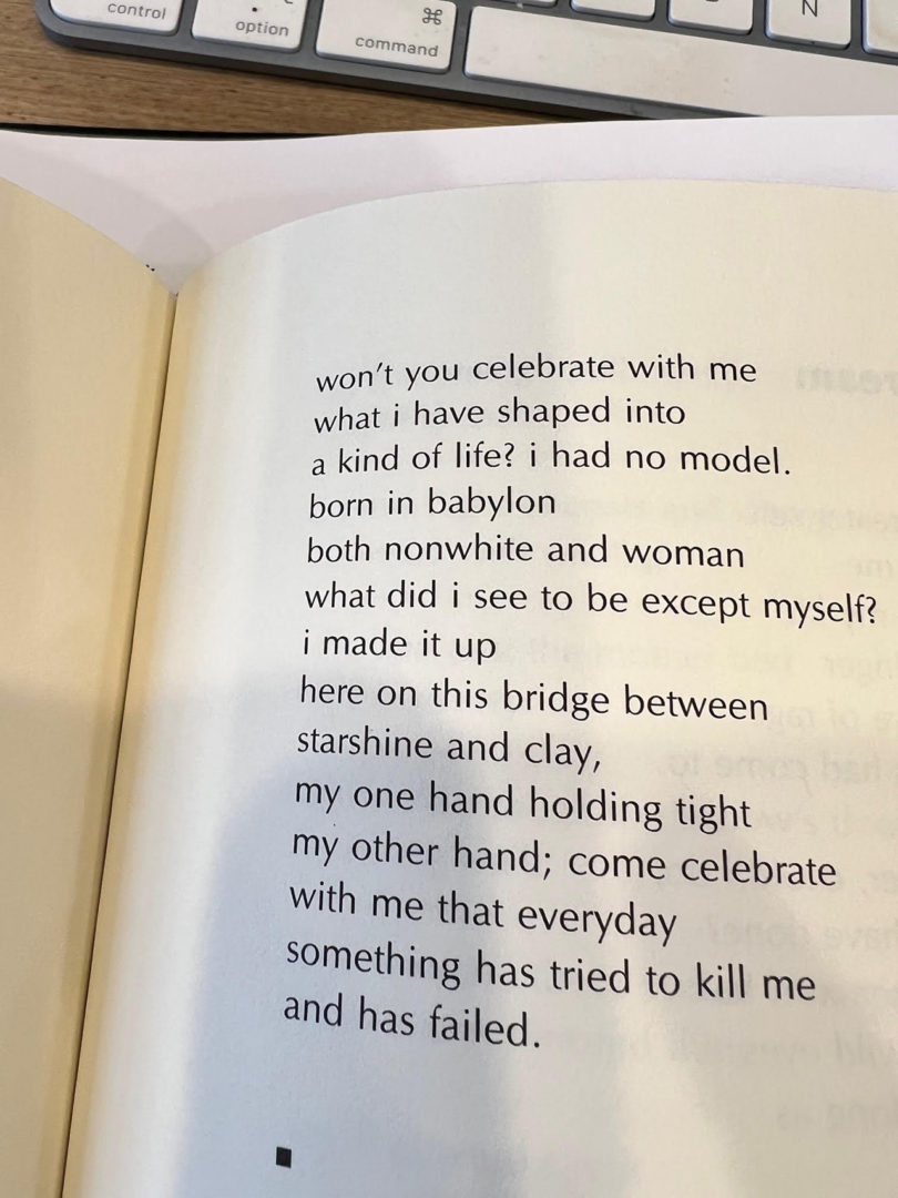
Photo: Crystal Williams
I admire many poems. But Lucille Clifton’s “won’t you celebrate with me” (which is how it is commonly known although Clifton did not, in “Book of Light” originally title the poem), is the one that inspires me the most. It is a poem that speaks to resilience, fortitude, bravery, imagination, hope, and it names what being a Black woman in the United States can and often does elicit.
“won’t you celebrate with me
what I have shaped into
a kind of life? i had no model.
born in babylon
both nonwhite and woman
….
…come celebrate
with me that everyday
something has tried to kill me
and has failed.”

Nancy Wilson, Carnegie Hall, 1987 \\\ Video still courtesy YouTube
There are moments in art when an artist transforms one thing into another, utterly broadening, deepening, and transmuting the original meaning. In this live version of “How Glad I Am,” her encore performance at the 1987 “Live at Carnegie Hall” performance, Wilson – a vocalist I listened to obsessively as a younger person – transforms a simple song between lovers into a rousing tribute from an artist to her audience. This performance is the most profoundly loving example I have witnessed of an artist speaking directly and forcefully to the mutuality between artists and audiences. And it’s become a kind of personal soundtrack when I’m walking through my life, especially my life as a poet and now as president. Often, when I’m among creatives, I hear Wilson’s gorgeous, gravely voice imploring: “you don’t know how glad I am [for you].”

RISD students \\\ Photo: Jo Sittenfeld
Listen, these young people at RISD and young creatives everywhere are our best-case scenario. They are our visionaries, if only we can amplify them, listen to them, and then get out of their way. They have all the love (and strategy and insight and knowledge) we need if we can help them wield it successfully. They have all the intelligence and ingenuity we need to help solve our challenges and advance what is good, right, and just among our species. Added to those attributes are other facts: they are funny and curious and eager to learn and gloriously unusual.
I watch them here at RISD in their multi-colored outfits, hair-dos, and platform shoes, giggling with each other in front of the snack machine or intensely applying their best thinking to each others’ work during critiques. I listen to them grappling with big ideas, considering, reconsidering, and redesigning our world as if on slant, eschewing the boxes into which we have crammed stale ideas that continue to guide our actions. And I watch them in their magnitude – in the more quotidian actions of their lives trudging up and down the severe hill outside with their humongous portfolios and unwieldy art projects, and think through it all, “Wow” and think “to be so young and so powerful and necessary” and think “thank God” and think “Thank you, young people, for saying yes to the impulse that brought you here.” Not only do they inspire me, they humble me and they – each one of them – feel like a balm, like hope incarnate.

Photo: Crystal Williams
My folks married in 1967 against all odds. They were of different ethnicities – he Black, she white. Different places – he from the Jim Crow South, she from Detroit, Michigan. Different eras – he born in 1907, she in 1936. Different careers – he a jazz musician and automotive foundry worker, she a public school teacher. And different educational backgrounds – he, we think, not a high school graduate, she a college graduate. And yet, they found each other over the keys of a piano and decided, against society’s cruel eye and hard palm, to love each other and to love me. I now understand the courage it took for all of that to be true, for them to make a way, for them to walk through the world in 1967 as a couple and with me as their child. That courage inspires me. Those decisions inspire me. They inspire me. Everyday. All day.

Kin by Crystal Williams, 2000 \\\ Williams utilizes memory and music as she lyrically weaves her way through American culture, pointing to the ways in which alienation, loss, and sensed “otherness” are corollaries of recent phenomena.
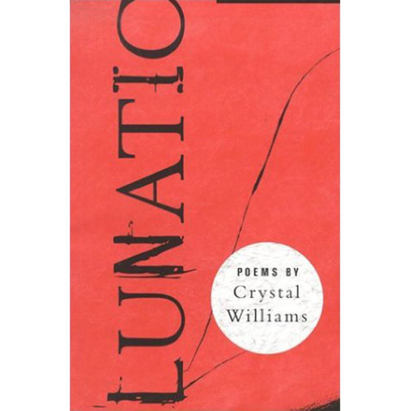
Lunatic: Poems by Crystal Williams, 2002 \\\ Williams confronts large-scale social and cultural events such as September 11, the death of Amadou Diallo, and the Chicago Race Riots in addition to exploring the often paralyzing terrain of loss, desire, and displacement. Among its most common themes is personal responsibility.
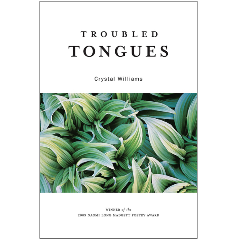
Troubled Tongues by Crystal Williams, 2009 \\\ In each of the three sections of this book is a prose poem meant to be read aloud in which a character, interacting with other characters, is named for a quality. They are Beauty, Happiness, and Patience.

Detroit as Barn: Poems by Crystal Williams, 2014
This post contains affiliate links, so if you make a purchase from an affiliate link, we earn a commission. Thanks for supporting Design Milk!
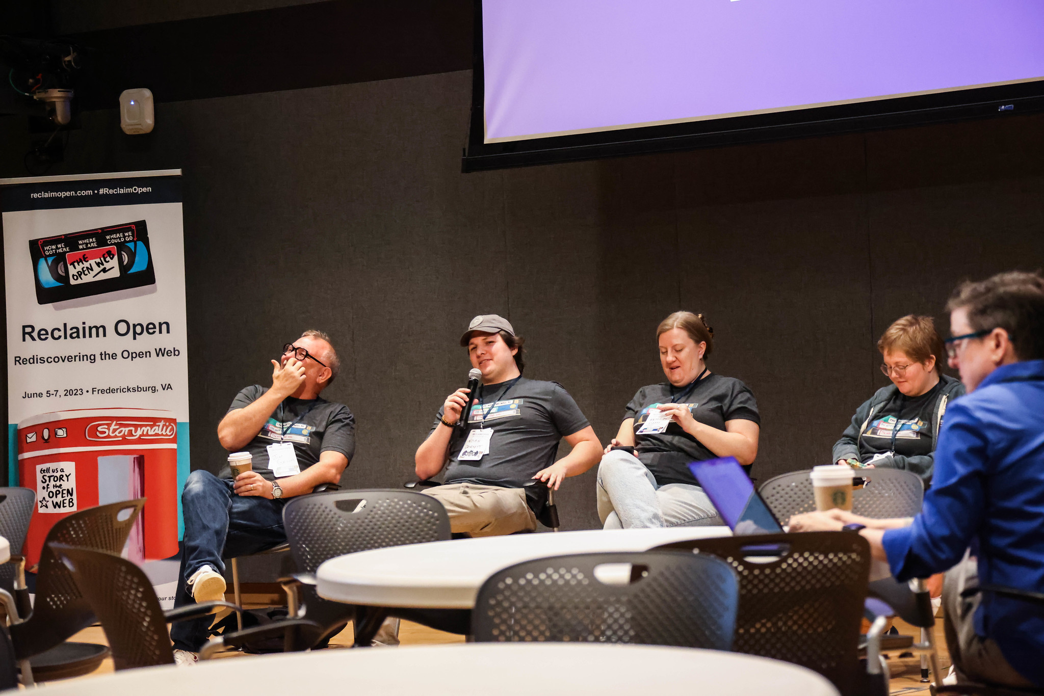
I feel a bit behind the curve in writing about Reclaim Open, but I suppose it’s better late than never. We’re still technically in June, meaning the in-person event was just earlier this month, and we still have the online recap coming throughout the month of July, so perhaps my tardiness may be forgiven!
Reclaim Open is Reclaim Hosting’s 4th biennial conference following Domains17, Domains19, and OERxDomains21. It can be easy to compare each conference to those preceding it, but if there’s one thing I’ve learned while hosting these through the years, it’s that each event captures a moment in time and creates a space for connection– however it may be needed or defined in that moment by each participant– and they’re all uniquely special. In some ways these conferences snowball and build over time; we take the lessons that we learn from one and embed them into the next one. In other ways, each conference is its own entity where a distinctive group of folks will converge, share ideas and inspire, and then part ways again. The conversations are always different, but the goal (at least for me when planning) is always the same: to create a space where folks feel comfortable to share, challenge, and build alongside each other.
OERxDomains21 came at a time during covid where connection and professional support felt more difficult to come by. That event was collaborative, powerful, and pushed boundaries – all while being completely online. Domains 17 & 19 were equally powerful, and reinforced art & creativity by taking place in various museum hotels (penguins & tv stack installations included).

While there were no penguins this go around, Reclaim Open was no different in how it carved out space for a community to join forces. In many ways, this conference felt like a reunion, celebration, and call to action all in one. The conference themes were perfect for this:
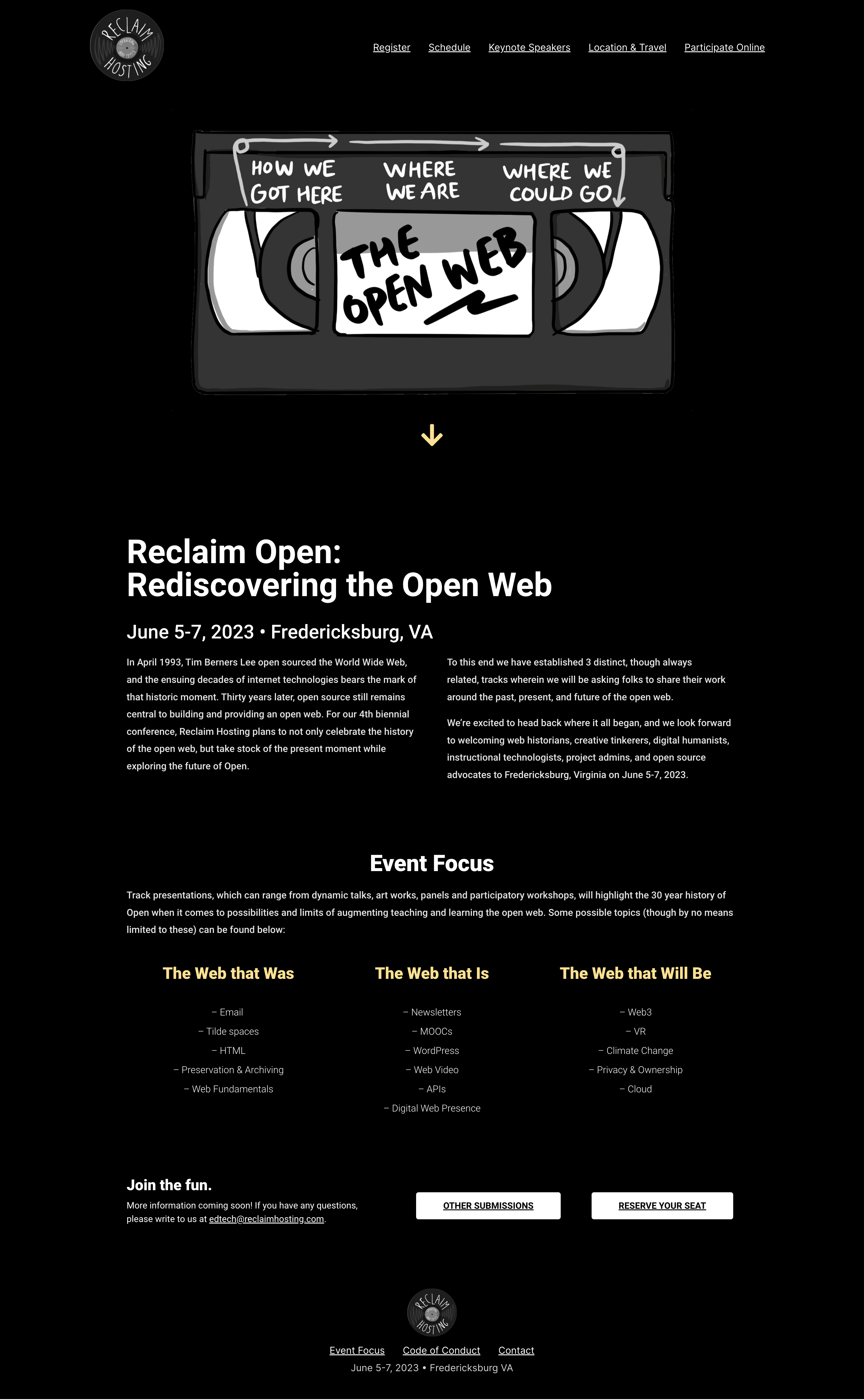
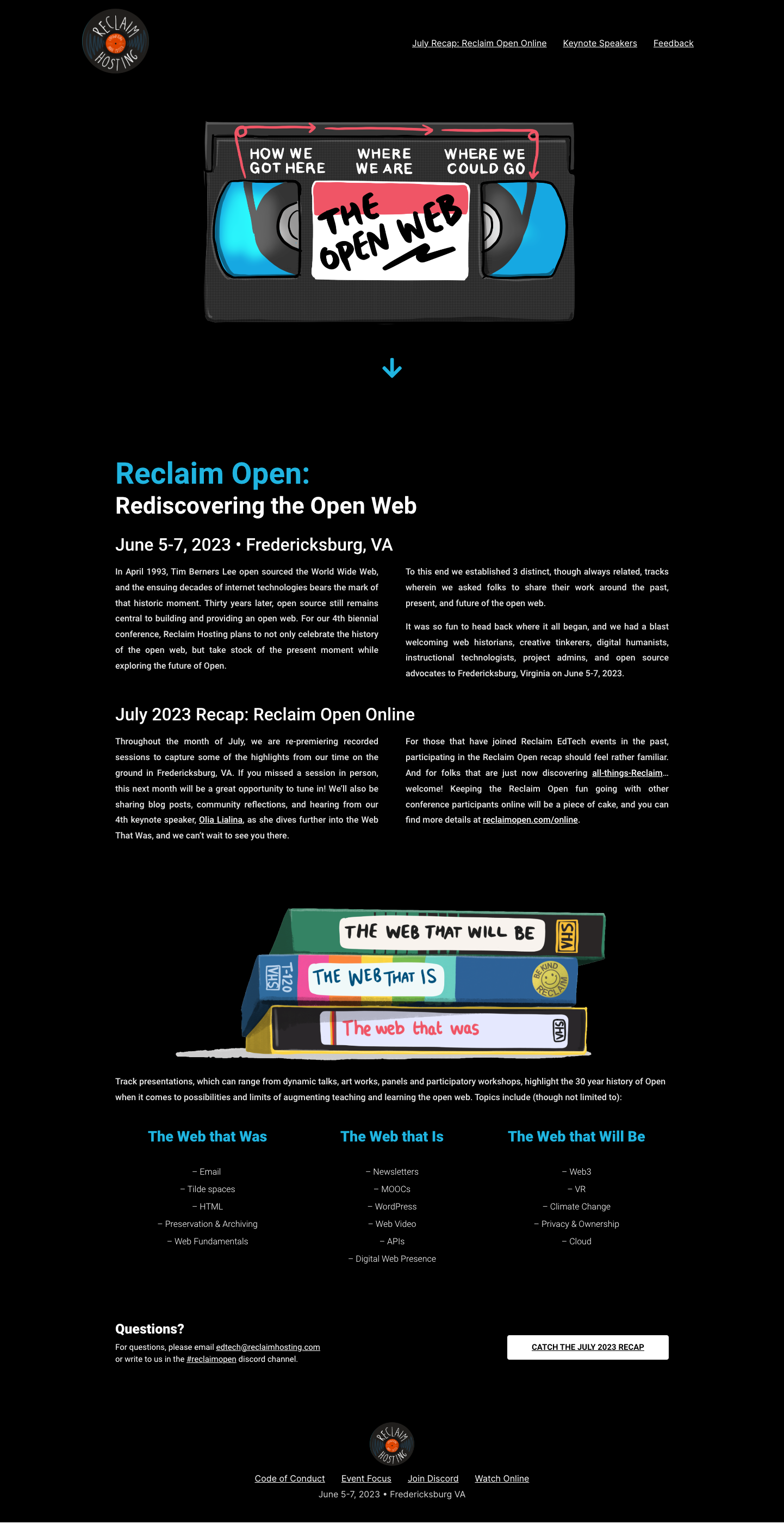
In April 1993, Tim Berners Lee open sourced the World Wide Web, and the ensuing decades of internet technologies bears the mark of that historic moment. Thirty years later, open source still remains central to building and providing an open web. For our 4th biennial conference, Reclaim Hosting plans to not only celebrate the history of the open web, but take stock of the present moment while exploring the future of Open. To this end we established 3 distinct, though always related, tracks wherein we asked folks to share their work around the past, present, and future of the open web. It was so fun to head back where it all began, and we had a blast welcoming web historians, creative tinkerers, digital humanists, instructional technologists, project admins, and open source advocates to Fredericksburg, Virginia on June 5-7, 2023.
Excerpt on reclaimopen.com
The past, the present, the future: going back to where it all began in Fredericksburg, VA and sharing stories with old and new friends; a celebration of how far we’ve come, marking Reclaim’s 10th year in business and the anniversary of the open web; dreaming up where we want to be and how the future of the web will shape that path.

Each time we dream up, plan for, and host an event like this, I always re-learn just how much work goes into hosting a conference and I have so much respect and admiration for folks that do this more regularly. Coordination for the logistics alone are no joke, and we added a bit of complexity this year by recording sessions, live-streaming and experimenting with Hybrid, and producing an on-the-fly documentary. These extra elements would not have been possible without the amazing Dream Team, and it was such an honor to work alongside them these past few weeks/months (years!) to make it happen.
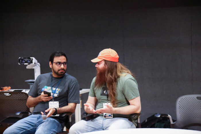
In no particular order, here’s a list of some of my Reclaim Open highlights:
The Reclaim team dinner after the event where we talked about the future of green web hosting, inspired by Bryan Alexander‘s keynote, What might the web become in its next generation?
Unveiling the documentary, and hearing the impromptu, round-robin experiences from conference goers at the end of day 3.
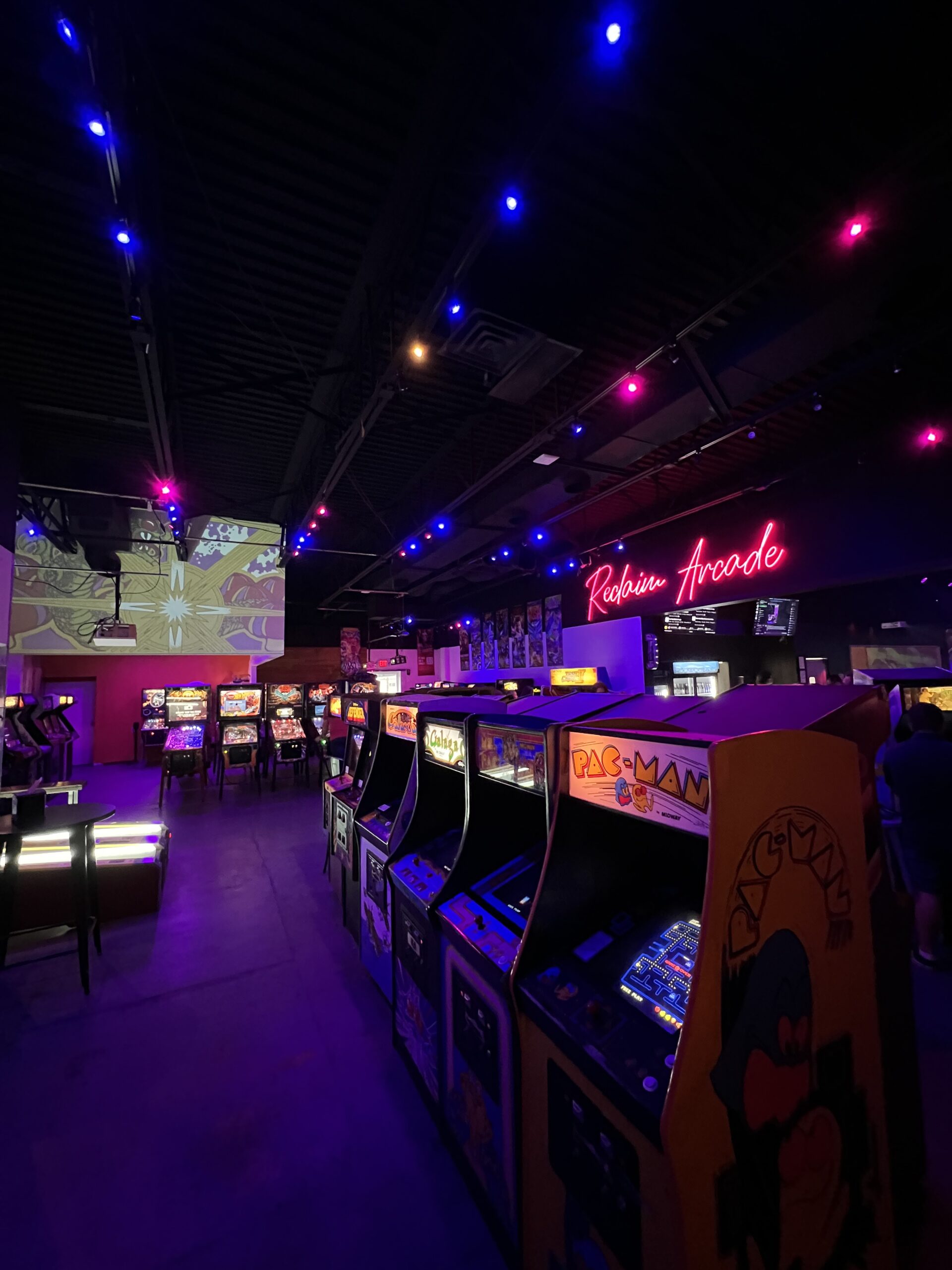
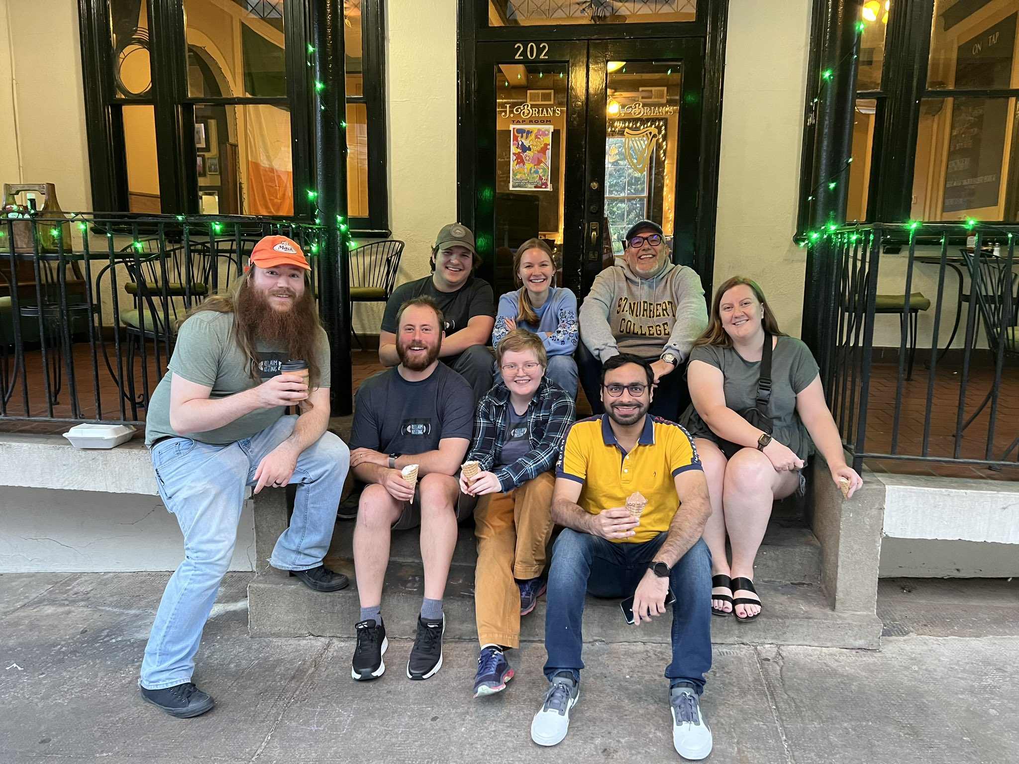
Checking out Reclaim Arcade. Still so in awe with how that space has transformed, and that evening was a blast!
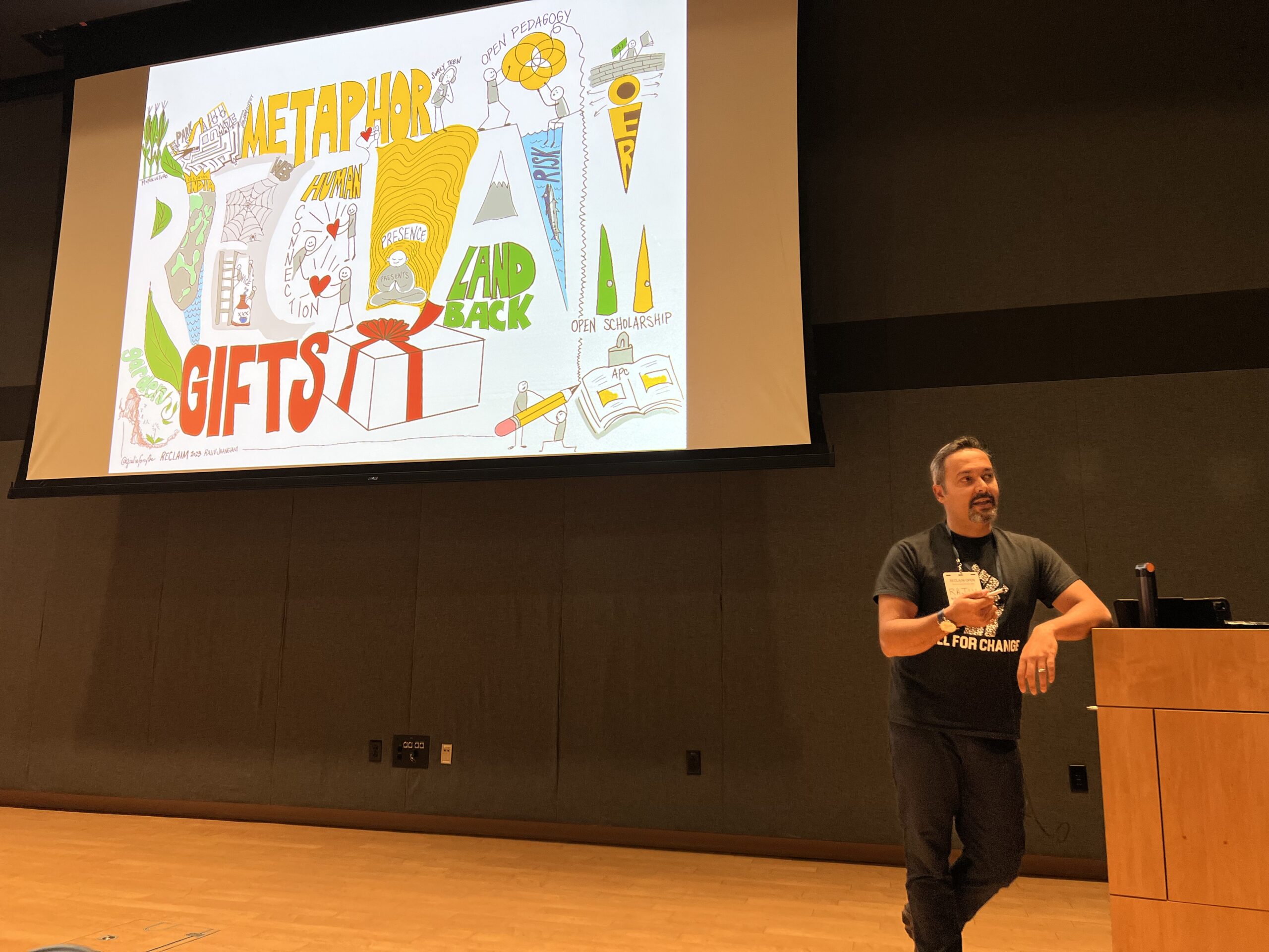
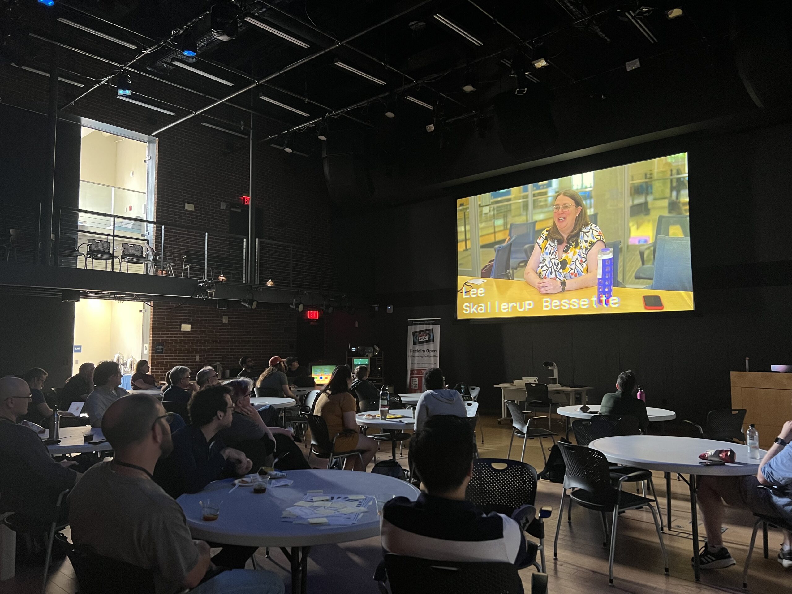
The way that Rajiv Jhangiani used storytelling and visual/audio aids in his keynote, Accept all cookies and continue: The many presents of the web.
I was really interested in juxtaposing elements of “old” with our techy, future-driven web conference as a way of thinking about how the past and future can intersect. It was fun to loosely play with this using color on the website, which was black & white until the week of the conference.
I also really enjoyed creating the conference programs, which ended up sitting somewhere between a newspaper and a zine.
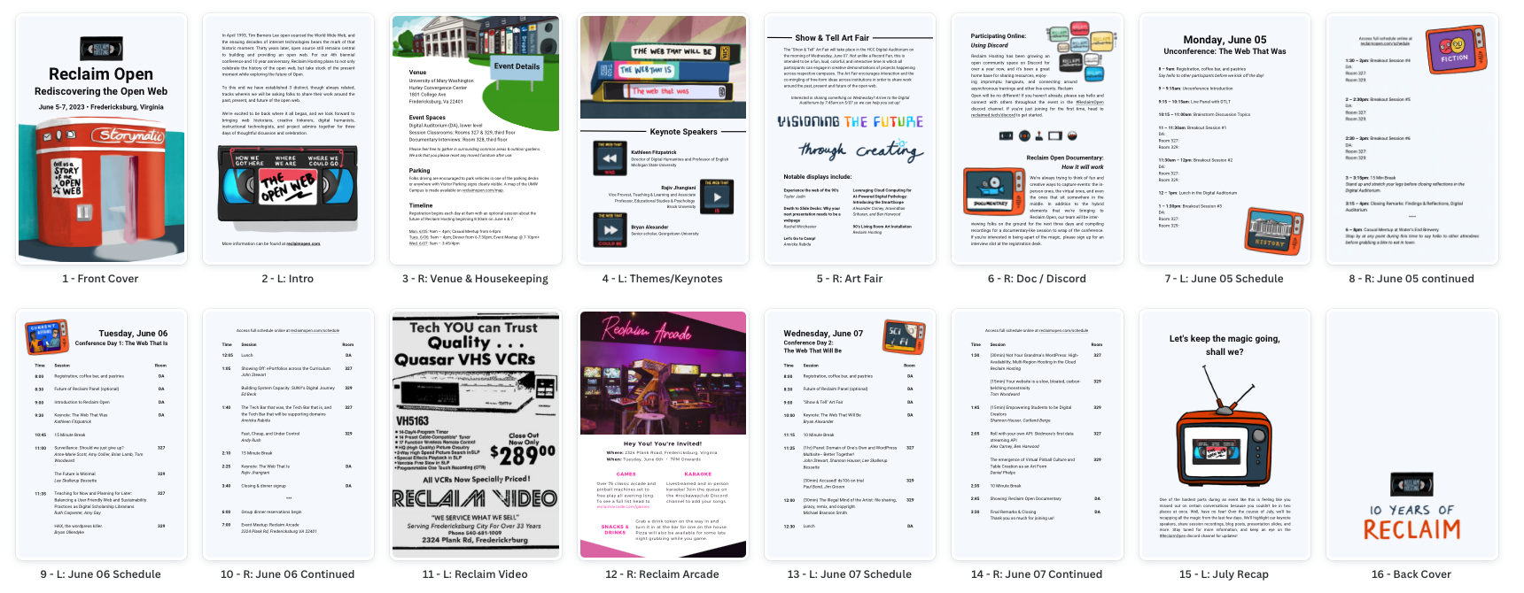
The programs were created using Newspaper Club and their provided Canva template for the Digital Mini Magazine. I really love how these came together in the end, along with the other stickers and t-shirts we had on hand to showcase Bryan Mathers‘ fantastic artwork:
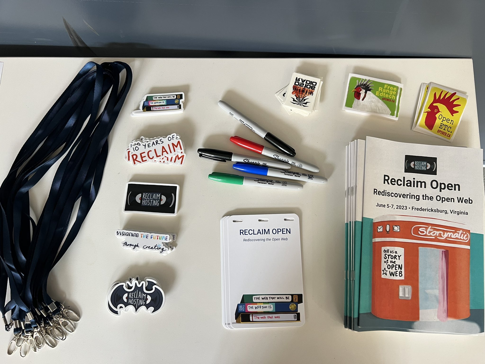
And because I’m always curious what folks use for other conferences… the name tags were created and printed using Conference Badge and the lanyards were purchased in bulk on Amazon. Stickers were printed through Sticker Mule, which we’ve used for years, and our collection of Reclaim Open t-shirts were designed and printed through Spreadshop on shop.reclaimhosting.com.
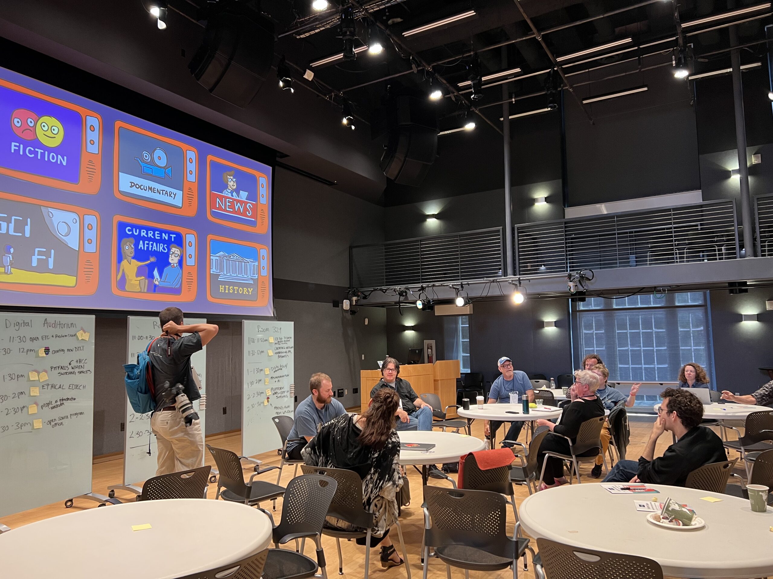
Back to the list of highlights– I loved the casual nature of the Unconference. The slower pace on day 1 felt like a great way to kick off the event.
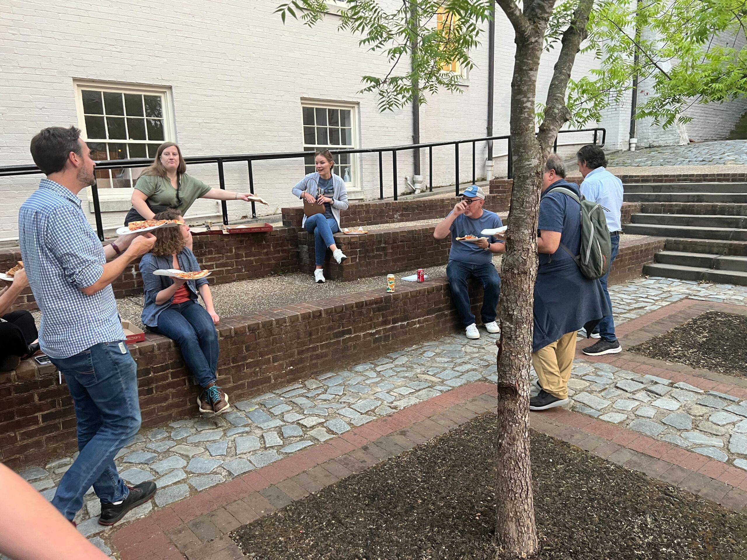
Hanging in downtown Fredericksburg again and eating all the Benny’s pizza I could manage.
The power of A.I. Levine

And last, but certainly not least, I really loved witnessing other Reclaimers run the show. This was a true team effort and I’m so glad to have been a part of it.
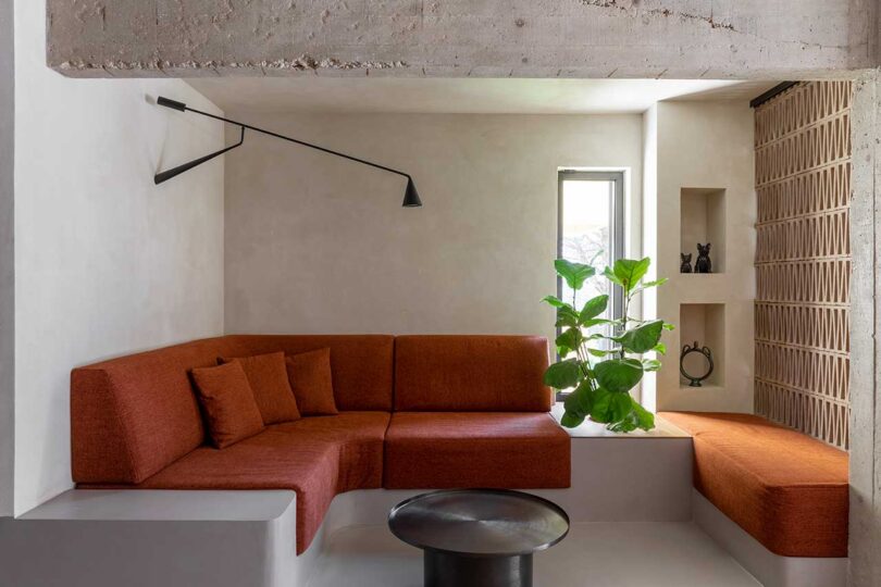
A Brutalist-inspired apartment in the suburbs of Rome in Tor de’ Cenci recently received a complete renovation by STUDIOTAMAT. Designed for a lawyer couple, the project consisted of renovating the 120-square-meter apartment, along with a coveted 40-square-meter terrace. The Casa Rude residence overlooks the Castelporziano Nature Reserve offering both wooded and sea views, an ideal locale after years of living in small apartments in the heart of the city. Now, their space is filled with natural light, original character, and modern conveniences.
“What guided us in the design was the desire to enhance the distinctive features of the unique terraced building, dating back to the 1980s, which houses the apartment. We wanted to restore fluidity to the spaces, encourage the opening, and the discovery of pre-existing materials and details, on which to set a new vision,” says STUDIOTAMAT co-founder Tommaso Amato.
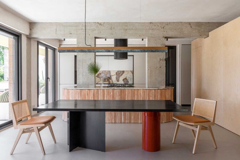
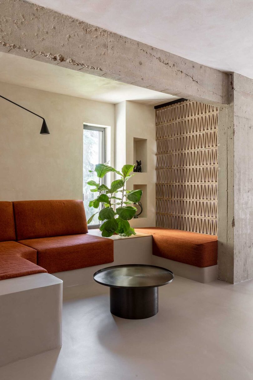
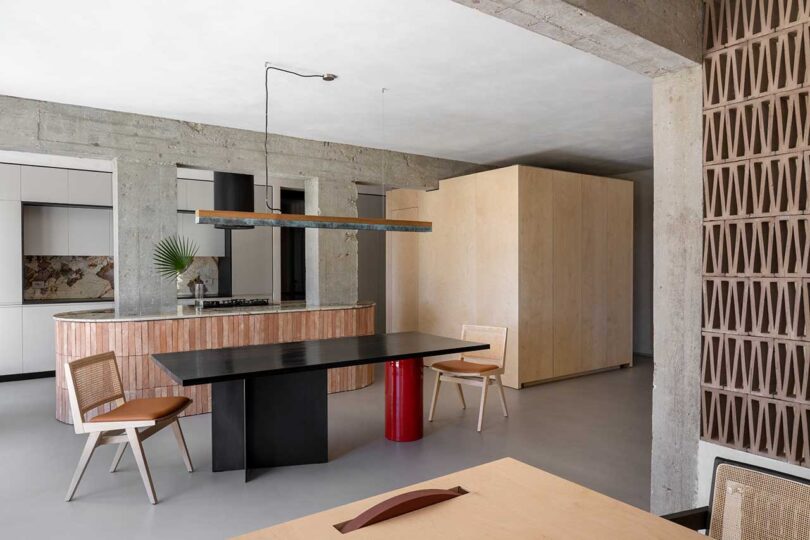
The main living area is designed much like a open plan loft with unfinished walls and the support structure’s exposed concrete visually connecting the spaces.


Paired with the original Brutalist details are a variety of tones, textures, and materials that add up to a visually enticing space. The roughness of the terracotta tiles on the oval island and concrete pillars are juxtaposed with the smooth Patagonia marble countertops that connect the two.


A custom dining table with a Shou sugi treated wood top rests on a black base and a glossy red ceramic leg for a sleek look.

A large, multifunctional birch wood cube is built to hide the pantry, hold coats, provide storage, and house a TV.


A wall of perforated bricks separates the living room and home office allowing natural light to pass through. A custom desk extends out from the built-in shelves and is held up by a circular red wheel, complementing the dining table’s leg a few feet away. The wheel allows the desk to roll along on a track to a new position.

A pivoting door visually separates the public areas from the sleeping area, which houses a main bedroom with ensuite bathroom, and a guest room.

In the primary bedroom, sliding ribbed glass doors offer privacy to those in the bathroom while allowing light in.


The large terrace features an outdoor kitchen, seating areas, dining space, and outdoor shower, all of which benefit from sunset views.


STUDIOTAMAT \\\ Photo: Flavia Rossi
Photography by Serena Eller Vainicher.

The Lattice Day Bed is a minimalist daybed made of grey quarry stone designed by Mexico-based designer Andrés Monnier. The original design features a stainless steel and marble base, while variations can also include white marble, travertine, volcanic rock, basalt, or granite rock.
“Is our human existence an interconnected reverie?” Such is the provocative question posed by the designer, an invitation to contemplate our roles within our perceived reality. The theory underscores the vast tapestry of human consciousness, where each individual weaves their unique interpretation of existence.
The daybed serves as both a physical representation of Monnier’s interpretation of dreams, while also functioning as the very conduit to actualize said dreams. He believes that the collective dream-state might not merely be an idle illusion, but a platform for transformative energy.


In celebration of Pride, Artsy happily presents the Artsy Impact Auction: Artists for Pride, benefiting the Ali Forney Center. New works by a diverse group of emerging and established artists will be bid on through June 29th at 12 pm EST. TM Davy, Didier William, Jo Messer, Kyle Meyer, Kate Pincus-Whitney, Erin M. Riley, Emma Kohlmann, Caitlin Cherry, Elizabeth Glaessner, Jordan Nassar, Haas Brothers, Vickie Vainionpää, Leilah Babirye, Darryl Westly, and Nedia Were have come together in allyship to support the cause by way of sharing their talents.

Vickie Vainionpåå, Soft Body Dynamics 111, 2023
Ali Forney Center’s mission is to protect LGBTQIA+ youth from homelessness and to empower them with the tools needed to live independently. Through this partnership, the auction will directly support the critical care, direction, education, and career services that Ali Forney Center offers to these at-risk homeless youth.

Nedia Were, The Black Swan, 2022
We had the opportunity to speak with Simon Haas of the Haas Brothers, who have their Fairies Witherspoon piece featured in Artists for Pride (seen in the lead image). “This piece is from a body of work we call Fairy Berries. Each of these pieces is a little like a Faberge Egg, small and ornate,” said Simon. “These pieces are little meditations – they take a really, really long time and a steady hand, and the resulting piece is an opulent little world of its own.”

Kate Pincus Whitney, Gertrude Stein and Slice B Toklas Muss
“A lot of the work we make is playful, but an equal amount of it is intensely process-based. When I am doing beadwork or making process-intensive projects like this I am very much in a meditative state of mind,” Simon shared. “This kind of work is almost necessary for me and my mental health.

Leilah Babirye, Lady Nabuuso, 2016
Measuring 10 1/4 × 4 1/2 × 4 1/2-inches, Fairies Witherspoon is hand thrown and slip trailed porcelain detailed with gold lustre and brass plate. The underside is stamped with “HAAS BROTHERS 2020”, and it’s accompanied by a Certificate of Authenticity signed by Nikolai and Simon Haas.
Kyle Meyer, Unidentified 91a, 2023
“Being gay myself, and having experienced first hand the challenges that come with that, it is really meaningful to me to be able to support my community. I can’t imagine the added difficulty of facing homelessness caused by or made more difficult by being LGBTQIA+. This is a truly important cause, particularly in this time of increasing intolerance.” Simon went on to add that he plans to “continue being a vocally out gay man and advocating for others in my community. It is so important that we make ourselves heard and support each other in our fight for equality. The LGBTQIA+ community is not a monolith, we are a collection of communities, but by coming together and advocating for each other we can accomplish so much more than we could on our own.”

Jo Messer, Show up whenever, 2023
To learn more about Artsy Impact Auction: Artists for Pride or place a bid, visit artsy.net.

High impact meets compact design in Division Twelve’s new Twigz café collection, created in collaboration with design duo Jones & de Leval. The furniture family’s throughline is a minimal frame with a small footprint, proving you don’t need visual heft to make a big impact. Twigz’s design details are ready to add plenty of interest to any small space, with both indoor and outdoor options available. Combine stackable chairs, benches, and tables to create a unique setup that’s all your own.
Twigz offers plenty of options to make it happen. Steel or upholstered chairs, round or rectangular table, and 20 powder coat colors are your creative playground. The one thing you won’t have deliberate is whether to play up form or function – Twigz does it all. Furthermore, the collection does so while being fully carbon neutral. Watch below to learn more about Twigz:
So there’s two reasons for this post. The first is that I was going through my list of those miscellaneous ideas that you can do at some point in the future that would be fun or helpful (hopefully) but that you never quite get around to, and I saw something on there that seemed like it would be quick and maybe hopefully useful to someone.
The second one is that, by the deadlines that I personally have set, today is the last day to publish a blog post that will make it into the June newsletter and if I put something out then I will have two blog posts in a newsletter for the first time since October 2022 (I need to blog more).
Anyway, I was going through my to-do list and in the section of “miscellaneous ideas for the future” I saw something about making a diagram of how the three systems of Domain of One’s Own work together. It’s something I have to explain a lot when training new admins, and while I feel like I’ve got a pretty good handle on the overarching metaphor by now, training usually focuses on each system’s user interface and what admins can do with that system, so I always worry I’ve skimped on making sure they’ve got the full picture.
To that end, I made a diagram.
This was very much something I saw on the list and went “Hey, I could do a pretty version of that in the future given a couple of days and some dedicated resources, or I could do a functional version of that right now using Google Drive’s weird photomanipulation-ish drawing platform.” And functional now is better than pretty later.
So, voila: The Diagram.
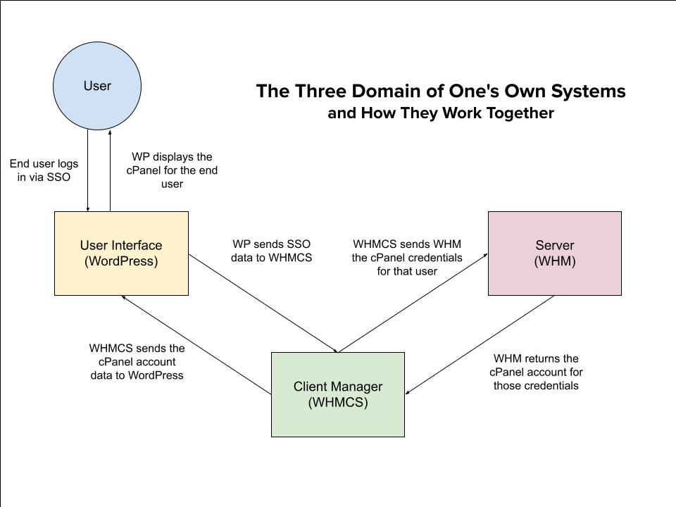
Hope I didn’t hype it up too much.
Is this accurate? That’s gonna be a strong “maybe.” But it’s close enough for our purposes, it only took about twenty minutes, and I got this blog post done in time for the Roundup deadline, so I’m going to call this a win.
It’s definitely not perfect. Looking at it now I’m thinking of all the little adjustments that I want to make, both in the text and in the design. But like I said back in October, sometimes you have to let perfection go.
Also, it’s here as a PDF too I guess, since Google Draw also offers that as an export format.

Chronicling the history of science at a recent event, the eminent primatologist Frans de Wall lamented the long-burning damage Skinner and the behaviorists of the mid-twentieth century did to our understanding of non-human minds and lives — the way their views stalled science and thwarted empathy. I asked him which of our current paradigms about other animals we will look back upon in another century with the same shamed shudder with which we now look back upon the behaviorists. Without hesitation, he flagged factory farming and the large-scale consumption of animal meat.
A century and a half before us, the Victorian visionary Samuel Butler (December 4, 1835–June 18, 1902) bent his gaze past the horizon of his culture’s paradigms, giving impassioned voice to this sentiment and contouring a different moral future for our species in his prophetic 1872 novel Erewhon (public library | public domain).

Butler — an Ursula K. Le Guin for his time, who presaged with astonishing foresight our artificial intelligence predicament — invites us to consider the arc of moral progress and changing mores since the dawn of our species, tracing that arc forward toward our widening circles of compassion. He writes:
Once upon a time your fore-fathers made no scruple about not only killing, but also eating their relations. No one would now go back to such detestable practices, for it is notorious that we have lived much more happily since they were abandoned. From this increased prosperity we may confidently deduce the maxim that we should not kill and eat our fellow-creatures.

An epoch before Jane Goodall radicalized the study of animals by illuminating the presence of higher consciousness in nonhuman primates, before octopus intelligence stopped us in our tracks, before we knew that whales remember and elephants grieve, Butler adds:
It cannot be denied that sheep, cattle, deer, birds, and fishes are our fellow-creatures. They differ from us in some respects, but those in which they differ are few and secondary, while those that they have in common with us are many and essential.
[…]
If it was wrong of you to kill and eat your fellow-men, it is wrong also to kill and eat fish, flesh, and fowl. Birds, beasts, and fishes, have as full a right to live as long as they can unmolested by man, as man has to live unmolested by his neighbours.
Complement with Shelley’s prescient case for animal rights and the spiritual value of vegetarianism, then revisit naturalist Sy Montgomery on how to be a good creature.
For a decade and half, I have been spending hundreds of hours and thousands of dollars each month composing The Marginalian (which bore the unbearable name Brain Pickings for its first fifteen years). It has remained free and ad-free and alive thanks to patronage from readers. I have no staff, no interns, no assistant — a thoroughly one-woman labor of love that is also my life and my livelihood. If this labor makes your own life more livable in any way, please consider lending a helping hand with a donation. Your support makes all the difference.
The Marginalian has a free weekly newsletter. It comes out on Sundays and offers the week’s most inspiring reading. Here’s what to expect. Like? Sign up.
If wonder springs from the quality of attention we pay to things and joy springs from our capacity for presence with wonder, then the quality of our attention shapes the quality of our lives. It is a dangerous falsehood that to find wonder in reality is to relinquish our realism — rather, this attentive gladness, this fluency in the native poetry of the universe, may be the truest realism we have.
That is what Robert Louis Stevenson (November 13, 1850–December 3, 1894) explores in some breathtaking passages from his long essay “The Lantern-Bearers,” found in his 1892 collection of personal writings Across the Plains (public library | free ebook).

Stevenson writes:
There is one fable that touches very near the quick of life, — the fable of the monk who passed into the woods, heard a bird break into song, hearkened for a trill or two, and found himself at his return a stranger at his convent gates; for he had been absent fifty years, and of all his comrades there survived but one to recognize him. It is not only in the woods that this enchanter carols, though perhaps he is native there. He sings in the most doleful places. The miser hears him and chuckles, and his days are moments. With no more apparatus than an evil-smelling lantern, I have evoked him on the naked links. All life that is not merely mechanical is spun out of two strands, — seeking for that bird and hearing him. And it is just this that makes life so hard to value, and the delight of each so incommunicable. And it is just a knowledge of this, and a remembrance of those fortunate hours in which the bird has sung to us, that fills us with such wonder when we turn to the pages of the realist. There, to be sure, we find a picture of life in so far as it consists of mud and of old iron, cheap desires and cheap fears, that which we are ashamed to remember and that which we are careless whether we forget; but of the note of that time-devouring nightingale we hear no news.

Half a century before Anaïs Nin contemplated the elusive nature of joy, he adds:
The ground of a man’s joy is often hard to hit. It may hinge at times upon a mere accessory, like the lantern; it may reside… in the mysterious inwards of psychology… It has so little bond with externals… that it may even touch them not, and the man’s true life, for which he consents to live, lie together in the field of fancy…. In such a case the poetry runs underground. The observer (poor soul, with his documents!) is all abroad. For to look at the man is but to court deception. We shall see the trunk from which he draws his nourishment; but he himself is above and abroad in the green dome of foliage, hummed through by winds and nested in by nightingales. And the true realism were that of the poets, to climb after him like a squirrel, and catch some glimpse of the heaven in which he lives. And the true realism, always and everywhere, is that of the poets: to find out where joy resides, and give it a voice far beyond singing.
For to miss the joy is to miss all. In the joy of the actors lies the sense of any action. That is the explanation, that the excuse… for no man lives in the external truth among salts and acids, but in the warm, phantasmagoric chamber of his brain, with the painted windows and the storied wall.
Complement with poet Ross Gay on the discipline of delight and René Magritte on the courage of joy, then revisit Hermann Hesse on the life-magnifying value of the little joys.
For a decade and half, I have been spending hundreds of hours and thousands of dollars each month composing The Marginalian (which bore the unbearable name Brain Pickings for its first fifteen years). It has remained free and ad-free and alive thanks to patronage from readers. I have no staff, no interns, no assistant — a thoroughly one-woman labor of love that is also my life and my livelihood. If this labor makes your own life more livable in any way, please consider lending a helping hand with a donation. Your support makes all the difference.
The Marginalian has a free weekly newsletter. It comes out on Sundays and offers the week’s most inspiring reading. Here’s what to expect. Like? Sign up.

To be human is to continually mistake our frames of reference for reality itself. We so readily forget that our vantage point is but a speck on the immense plane of possible perspectives. We so readily forget that there are infinitely many kinds of beautiful lives.
The discipline of countering our reflex for self-righteousness is a triumph of existential maturity — one increasingly rare in a culture where most people would rather armor themselves with judgment than tremble with uncertainty, would rather be right than understand.
The pioneering psychologist and philosopher William James (January 11, 1842–August 26, 1910), who coined the term “stream of consciousness,” explores the making of that triumph in a pair of wonderful lectures — “On a Certain Blindness in Human Beings” and “What Makes Life Significant” — posthumously collected in the 1911 volume Talks to Teachers on Psychology: And to Students on Some of Life’s Ideals (public library | public domain).

With an eye to “the price we inevitably have to pay for being practical creatures,” James considers those rare moments when our habitual blinders fall away and we see a fuller picture of reality:
Only in some pitiful dreamer, some philosopher, poet, or romancer, or when the common practical man becomes a lover, does the hard externality give way, and a gleam of insight into the ejective world… the vast world of inner life beyond us, so different from that of outer seeming, illuminate our mind. Then the whole scheme of our customary values gets confounded, then our self is riven and its narrow interests fly to pieces, then a new centre and a new perspective must be found.
That new perspective includes the recognition that other people strive for happiness and meaning in ways other than our own, just as valid in the making of a life. James considers the value of this shift in understanding:
It absolutely forbids us to be forward in pronouncing on the meaninglessness of forms of existence other than our own; and it commands us to tolerate, respect, and indulge those whom we see harmlessly interested and happy in their own ways, however unintelligible these may be to us. Hands off: neither the whole of truth nor the whole of good is revealed to any single observer, although each observer gains a partial superiority of insight from the peculiar position in which he stands.

Observing “the falsity of our judgments, so far as they presume to decide in an absolute way on the value of other persons’ conditions or ideals,” observing “how soaked and shot-through life is with values and meanings which we fail to realize because of our external and insensible point of view,” observing how often and how readily we judge the outward choices of others while losing sight of the “inward significance” of those choices, James writes:
The first thing to learn in intercourse with others is non-interference with their own peculiar ways of being happy, provided those ways do not assume to interfere by violence with ours. No one has insight into all the ideals. No one should presume to judge them off-hand. The pretension to dogmatize about them in each other is the root of most human injustices and cruelties, and the trait in human character most likely to make the angels weep.
Complement with Joan Didion on learning not to mistake self-righteousness for morality, then revisit William James on the psychology of attention, how our bodies affect our feelings, and the four features of transcendence.
For a decade and half, I have been spending hundreds of hours and thousands of dollars each month composing The Marginalian (which bore the unbearable name Brain Pickings for its first fifteen years). It has remained free and ad-free and alive thanks to patronage from readers. I have no staff, no interns, no assistant — a thoroughly one-woman labor of love that is also my life and my livelihood. If this labor makes your own life more livable in any way, please consider lending a helping hand with a donation. Your support makes all the difference.
The Marginalian has a free weekly newsletter. It comes out on Sundays and offers the week’s most inspiring reading. Here’s what to expect. Like? Sign up.
While the French seamstress turned scientist Jeanne Villepreux-Power was solving the ancient mystery of the argonaut, her compatriot Jean Baptiste Vérany (1800–1865) — a pharmacist turned naturalist and founder of Nice’s Natural History Museum — set out to illuminate the wonders of cephalopods in descriptions and depictions of unprecedented beauty and fidelity to reality. Half a century before the stunningly illustrated Cephalopod Atlas brought the life-forms of the deep to the human imagination, Vérany published Mediterranean Mollusks: Observations, Descriptions, Figures, and Chromolithographs from Life — a consummately illustrated catalogue of creatures entirely alien to the era’s lay imagination, suddenly and vividly alive in full color.

When Vérany began working on his dream of bringing the underwater world to life on the page, chromolithography — a chemical process used for making multi-color prints — was still in its infancy in France. Determined to capture the living vibrancy of these creatures that had so enchanted him, he set out to teach himself the craft. Looking back on his long labors at mastering this art-science and applying it to his dream, he reflects:
Despite having no practice at lithography and no knowledge of chromolithography, I launched myself, with courage and confidence, into this enterprise… Thanks to trial and error and patience, I have often succeeded in depicting the softness and transparency that characterize these animals.


The German marine biologist Ernst Haeckel, who coined the term ecology, was introduced to the wonders of cephalopods by Vérany’s work and incorporated some of the art into his own studies of symmetry. Victor Hugo copied one of Vérany’s illustrations in ink for his 1866 novel Toilers of the Sea. The book itself became a catalyst for the study of octopus intelligence.


Radiating from the chromolithographs is Vérany’s shimmering passion for his subject. He was especially captivated by the red umbrella squid, Histioteuthis Bonelliana, which he saved from a fisherman’s net and placed in a tub to study and draw from life, wonder-smitten by its beauty. He recounts:
It was at this moment that I enjoyed the astonishing spectacle of the brilliant points whose forms so extraordinarily decorate the skin of this cephalopod; sometimes it was the brightness of the sapphire which dazzled me; sometimes it was the opaline of the topazes which made it more remarkable; other times these two rich colors confused their splendid rays. During the night, the opaline points projected a phosphorescent glare, making this mollusk one of the most brilliant productions of Nature.

Complement with Ernst Haeckel’s otherworldly drawings of jellyfish from the same era, then revisit Sy Montgomery on how the octopus illuminates the wonders of consciousness.
For a decade and half, I have been spending hundreds of hours and thousands of dollars each month composing The Marginalian (which bore the unbearable name Brain Pickings for its first fifteen years). It has remained free and ad-free and alive thanks to patronage from readers. I have no staff, no interns, no assistant — a thoroughly one-woman labor of love that is also my life and my livelihood. If this labor makes your own life more livable in any way, please consider lending a helping hand with a donation. Your support makes all the difference.
The Marginalian has a free weekly newsletter. It comes out on Sundays and offers the week’s most inspiring reading. Here’s what to expect. Like? Sign up.
One thing I’ve been thinking about recently is how schools can successfully run WordPress Multisite, Domain of One’s Own, and Reclaim Cloud Sandbox spaces together in a way that feels integrated and seamless. We’ve always led with the idea that these tools don’t compete with each other, and that actually the opposite is true: by running them in parallel to each other you can offer a little bit of something for everyone. Perhaps even in tiers or layers as described in my Nashville recap post from 2021. But how can we do that while still keeping the digital footprint for landing pages and end user sites as simple and intuitive as possible? I last explored this in my blog post called A New Model for Domains: DoOO & WPMS and shared how some schools like Coventry University and Oklahoma University are directing traffic and handling domain structures for landing pages and end user sites (which can feel like half the battle).
I love how some of our DoOO and WPMS schools are controlling growth on these platforms, as well as keeping things sustainable, by pushing all new signups to the WordPress Multisite by default. The WPMS then has a very limited set of plugins and themes that are easy to support and maintain for a large group of users. From there, if an end user wants to install a different theme, or explore a different application entirely, they’re directed to Domain of One’s Own. There’s more freedom here, but it likely involves a request form submission or a conversation with an admin before a cPanel account is granted. What’s ultimately happening now is that there are two paths for a user to take. And especially if we’re looking to add a third (Reclaim Cloud for next generation apps or sites that need more resources) it’s important for Reclaim to assist schools with correctly carving out these paths and creating very clear entry points.
This concept has come up in so many different conversations ranging from the visuals and metaphors we use to explain different topics, to how we’re articulating it in support scenarios, to how we’re providing more data for admins to make decisions, to how we’re pulling in these tools to help users choose the path that makes the most sense for them. We’ve been working on a few side projects to help with these scenarios, and now it feels like the right time to compile everything together.
When a new school comes to Reclaim to set up DoOO, WPMS, and the Cloud, I want them to have a cohesive menu of things that they can select or add to their setup to make it work to their preference. I’ve alluded to this with support articles like Domain of One’s Own Setup Features, which covers different signup workflows and cPanel customizations available for DoOO so a new admin can go through and decide what they’ll need. Even still, this article doesn’t quite capture everything that’s available in DoOO anymore, and it definitely doesn’t pull in WPMS & Reclaim Cloud. Where this “menu” lives or how it’s delivered is still a question mark (maybe as simple as adding in a few more guides) but for the purposes of this post I want to share a running list of some of the other projects we’ve been working on with the help of folks like Tom Woodward and Bryan Mathers to think more broadly about user choices, carving out paths, and connecting tools together.

While the landing page can be designed however admins prefer and even framed as a choice between WPMS and DoOO, you could still opt to push new signups to a default starting point. In that case, the above “landing page” would actually live on the WPMS directly, integrate with SSO, and be able to reflect what plugins/themes are in use like the demo above. An example domain might be sites.school.edu for the homepage and sites.school.edu/user for end-user sites.
If users decide they want more flexibility in cPanel, they would click a menu link that takes them to a homepage for DoOO like domains.school.edu. This space has its own SSO integration and signup workflow, so users can create or request accounts depending on admin preference.

^This dashboard was shared more thoroughly at the end of the last DoOO 201 workshop, and you can watch the final session called What’s Next for Domain of One’s Own for more info about how it works!

The admin landing page has worked well as a home base for new schools because it’s simple and to the point. But how is this WP install managed or updated long term? Do admins still find this space useful 2-3 years in? What if the landing page “quick links” were instead pulled into the WP dashboard, similar to Taylor’s Data Dashboard work or similarly to what the Ultimate Dashboard plugin does?
Similarly, I’d love to keep thinking about the future of end-user support docs. As mentioned above, this project gets complicated quickly because it becomes quite difficult for Reclaim to update each documentation site after they’ve been delivered to an institution. (Especially if the admin makes changes after the fact– we don’t want to overwrite those.) There’s a balance of ownership between what Reclaim can do to help and what admins choose to make available as a support resource, but I’m all for Reclaim providing starting templates where we can.
My latest thinking is that it may make sense for Reclaim to bring these templated guides into our main knowledge base under a new category of our Domain of One’s Own section. From there, new admins have two choices: they can point their users directly to those guides, which would have to be pretty generic to work for all/most setups, or admins could adopt articles for their own knowledge base sites. If and when Reclaim makes changes to one of our article templates, admins are notified by subscribing to the knowledge base section (already possible) and by hearing about it in our monthly newsletter.
I also think we’re not far off from really improving how we’re keeping different types of folks notified at Reclaim. In the early days we truly had 1 mailing list for the capital A “Administrator” of a project to get all notifications. Through the years we’ve been able to start separating out billing, support, SSO, and server maintenance notifications. We’ve also added the Roundup mailing list and Reclaim event notifications to the mix as well. It’s not a totally perfect system yet, but Pilot’s newest project setup questionnaire is a testament to how far we’ve come:
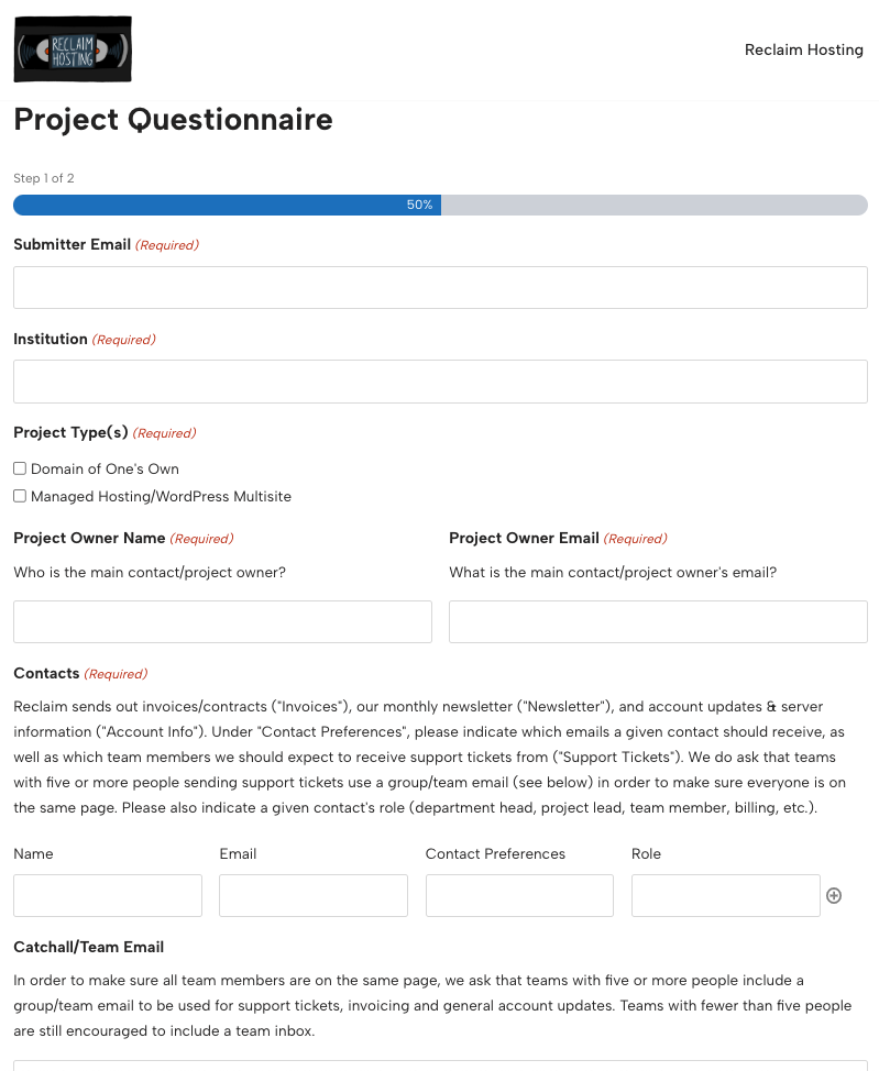
Pilot killed it with their work to improve how we’re collecting initial information from admins for new server/project setups. How we got by with a .PDF for so long, I’ll never know. :)

A common galvanizing trope among progressives claims the good and open-minded among us are in a constant battle against the evil right, who wishes to stamp out the struggling and marginalized. This holds true in the trans debate.
Just last night at the Met Gala, actress Gabrielle Union told Variety she and her husband, former Miami Heat basketball player Dwyane Wade, had decided to leave Florida on account of the couple’s “trans child.” She explained that “in 2016, there was a move towards a less inclusive world,” going on to imply that their children would have nowhere to attend school were they to stay in Florida, as schools in the state were not “open to teaching facts and accurate history.”
“Where can they say gay, much less trans?” Union asked, referencing a parental rights bill passed in Florida in March, inaccurately dubbed the “Don’t Say Gay” bill. She expressed concern that she and Wade “might get arrested for affirming [their] child’s identity.”
Her commentary was odd, considering that it those who challenge gender identity ideology and the practice of transitioning kids who are under threat, not the other way around. Indeed, a Vancouver father was jailed in 2021 for refusing to go along with his child’s transition. Bill C-6 (which later became Bill C-4) passed in Canada last year, claiming to ban “conversion therapy,” but in fact criminalizing therapists and medical practitioners who do not practice the “affirmative model” — which means confirming a child’s “trans identity” unquestioningly, and placing them on a path towards medicalization.
These reversals aren’t new. Indeed they have been the go-to narrative in the media for many years now.
Last month, The New York Times published a piece entitled, “How a Campaign Against Transgender Rights Mobilized Conservatives.” In it, Adam Nagourney and Jeremy W. Peters argue that the swift rise of trans rights activism began on account of the right having nothing left to fight against once gay marriage rights were won. They write:
“The ruling stripped them of an issue they had used to galvanize rank-and-file supporters and big donors. And it left them searching for a cause that — like opposing gay marriage — would rally the base and raise the movement’s profile on the national stage.”
It was frankly one of the strangest reversals I’ve yet to read on this issue, blaming conservatives for igniting the fight for trans rights rather than the other way around.
It is true that this movement appeared suddenly, as if out of nowhere, leaving many of us searching for an explanation. What other movement in history has taken hold of every institution, media outlet, and political party so quickly?
The answer, though, is not in Republican strategizing. It is much more simple than that: it was about funding.
In 2015, the Supreme Court ruled by a 5-to-4 vote that same-sex couples had the right to marry. This decision was, as reported by The New York Times, “the culmination of decades of litigation and activism.” This changed things for individual gay people, of course, but it also changed things for the gay rights organizations who had been fighting for this decision for years. The charities and NGOs and civil rights organizations once heavily invested in advocating for same-sex marriage no longer had a raison d’etre, and as such lost a key justification for future funding.

Gluing the “T” to the LGB allowed for an easy transition into a new civil rights movement, using the same language and mantras of “born this way” and “accepting people as they are,” as well as a need to fight for “equal rights” on this basis.
Indeed, it was the Democrats and Democrat-adjacent organizations that were looking for a new way to galvanize their base and solicit funding, and Republicans were frankly the last to catch on.
Trans intrusion on women’s spaces and the women’s rights movement began long ago, but didn’t really take hold until money was involved. While we often hear men on the right demanding to know “Where are all the feminists?!” the feminists were in fact the only ones to notice the advancement of trans ideology and its impending threat to women’s spaces for many years. Second wave feminists like Gloria Steinem, Robin Morgan, and Germaine Greer spoke out against the very sexist lie that a man can transform himself into a woman through stereotypes and cosmetic alterations long before this was on the radar of Republicans.
In 1977, Steinem responded to the situation of James Humphrey Morris, a British army officer who transitioned to become Jan Morris, and the transition of tennis player Richard Raskind to Renée Richards, by writing that, “Feminists are right to feel uncomfortable about the need for and the uses of transsexualism.” While it was important, she believed, to “protect the right of an informed individual to make that decision [to transition], and to be identified as he or she wishes,” it was also clearly not a “feminist goal.” A preferred solution would be to “transform society” so that men feel comfortable stepping outside traditional masculine roles and women can step outside the rigid limitations of feminine stereotypes, without need to “mutilat[e] our bodies into conformity.” Steinem added that, “In the meantime, we shouldn’t be surprised at the amount of publicity and commercial exploitation conferred on a handful of transsexuals.”
In 1973, Morgan, a founder of Ms. Magazine, was even more forthright, responding to a scheduled performance by Beth Elliott, a “male-to-female transsexual” folk singer at the West Coast Lesbian Conference in Los Angeles, by saying in her keynote speech:
“I will not call a male ‘she;’ 32 years of suffering in this androcentric society, and of surviving, have earned me the title ‘woman;’ one walk down the street by a male transvestite, five minutes of his being hassled (which he may enjoy), and then he dares, he dares to think he understands our pain? No, in our mothers’ names and in our own, we must not call him sister.”
Greer, ever outspoken, wrote an article for The Independent magazine in 1989 entitled, “On why sex-change is a lie.” It began:
“On the day that The Female Eunuch was issued in America, a person in flapping draperies rushed up to me and grabbed my hand. ‘Thank you so much for all you’ve done for us girls!’ I smirked and nodded and stepped backwards, trying to extricate my hand from the enormous, knuckly, hairy be-ringed paw that clutched it. The face staring into mine was thickly-coated with pancake makeup through which the stubble was already burgeoning, in futile competition with a Dynel wig of immense luxuriance and two pairs of false eyelashes. Against the bony ribs that could be counted through its flimsy scarf dress swung a polished steel women’s liberation emblem.
I should have said ‘You’re a man. The Female Eunuch has done less than nothing for you. Piss off.’”
Greer went on to describe how this man would mysteriously turn up outside her hotel, and that while he “certainly considered that he was psychologically a female… he behaved exactly like a predatory man.”
Her article could have been written today, though it likely wouldn’t have been published. Needless to say, we were warned:
“Knee-jerk etiquette demanded that I humour this gross parody of my sex by accepting him as female, even to the point of allowing him to come to the lavatory with me. Bureaucratic moves were afoot to give him and his kind the right to female identity, a female passport even…”
Predicting exactly the future that came a couple of decades later, Greer wrote, “The general populace, despite the evidence of their eyes and ears, will go along with this bluff.”
Where were all the feminists?!
Radical feminists continued this fight for the years leading up to 2015/16, which is when gender identity ideology began to take hold across institutions, followed by the passage of gender identity legislation.
I was interviewed for a 2014 article by Michelle Goldberg published in The New Yorker entitled “What is a woman?” My interview was omitted, but she spoke with a number of other feminists who had organized a conference in Portland in an attempt to discuss the encroaching ideological and institutional takeover. Goldberg documents numerous attempts by such women to speak against this, all of whom were subsequently shut down, no-platformed, threatened, and harassed endlessly — cancelled, as it’s known today. Lierre Keith, Sheila Jeffreys, Janice Raymond, and Julie Bindel were among these women, as well as many lesser-knowns.
I interviewed Lee Lakeman, a founding member of the Vancouver Rape Relief and Women’s Collective (VRR), in 2012, about her battle to defend women-only space at the shelter and transition house, beginning back in the 90s. VRR has been plagued by attacks and accusations of “transphobia” ever since, resulting in the City of Vancouver pulling their funding in 2019.
Great efforts were made to suppress debate surrounding not just the social and cultural phenomenon of transgenderism, but the related legislative changes. Because most of the pushback was coming from women with no financial or political power, that was not hard to do.
I am aware of course, that the modern, mainstream feminist — the kind of “feminist” who did have a voice within Democratic organizations, well-funded institutions, the mainstream media, and academia — went along with the whole thing. This baffled me for a long time. I didn’t understand the funding mechanisms behind the whole operation, and was livid at seeing organizations that should be among the most invested in understanding how the female body works — reproductive rights organizations, for example — suddenly and in unison erasing women from their work and politics.
~~~
On September 2, 2016, Planned Parenthood tweeted that “Menstruators in New York started to #tweetthereceipt celebrating the repealed tampon tax…” A day later, the Planned Parenthood account reported that “Purvi Patel has been released from prison, but people continue to be criminalized for their pregnancy outcomes.”
These tweets might seem innocuous, but were significant. Where once would have been the word “woman,” we saw “menstruators” and “people.” And Planned Parenthood was not alone. The word we had always used to describe adult human females rather suddenly had cooties.
In 2013, Lauren Rankin, an American reproductive rights activist, wrote that “abortion rights activists have overlooked and dismissed a very important reality: Not everyone who has an abortion is a woman,” adding:
“We must acknowledge and come to terms with the implicit cissexism in assuming that only women have abortions. Trans men have abortions. People who do not identify as women have abortions.”
Rankin explained that an organization called the New York Abortion Access Fund (NYAAF) was “leading the way on becoming more gender inclusive around the issue of abortion,” directing a change in language. NYAAF had changed its language a year earlier, in 2012, replacing sexed language in its mission statement with words like “anyone,” “every person,” and “the people who call our hotline.” In 2013, they explained that “embracing gender inclusivity” meant “not assuming the gender pronouns that our callers use and replacing ‘woman’ with ‘people’” on their website, and had taken it upon themselves to “reach out to the LGBTQ communities and inform them that NYAAF helps fund abortions for all people, not just women.”
In 2015, Fund Texas Women, which pays the travel and hotel costs of women who need to get an abortion but don’t have access to a clinic nearby, became Fund Texas Choice. Co-founder Lenzi Scheible wrote:
“With a name like Fund Texas Women, we were publicly excluding trans* people who needed to get an abortion but were not women. We refuse to deny the existence and humanity of trans* people any longer.”
At the time, longtime feminist and political columnist Katha Pollitt noted that while the idea that the word “woman” was “exclusionary” or “cissexist” might “sound arcane to most people,” this directive had been “quietly effective” in reproductive rights activism.
She was right. But most had not yet caught on to this push to erase women from language.
Why, of all places, is this starting in the reproductive rights movement? A movement that, if nothing else, is centered around about female bodies and autonomy?
The truth is in the funding.
Big name funders and billionaire philanthropists like Jennifer Pritzker, the Arcus Foundation, George Soros’ Open Society Foundations, and Jon Stryker not only fund numerous trans rights and LGBT organizations, but Planned Parenthood. At the same time it was decided the “T” would be added to the “LGB,” the associated New Speak was applied across the board, not just to trans lobby groups and LGBT organizations, but to reproductive rights organizations and clinics across the US.
Journalist Jennifer Bilek has done ample work demonstrating the funding sources behind the trans ideology takeover, pointing out that men like Pritzker also fund the now trans-obsessed American Civil Liberties Union (ACLU), who joined Planned Parenthood as a major player in the institutionalization of “female-erasing language.”
Not only that, but Planned Parenthood has since moved into the trans market, selling kids on puberty blockers and hormone treatments. Today, the organization claims to be America’s “second largest provider of hormone therapy.”
Embracing trans ideology was rendered mandatory for any organization wishing to continue getting funding from these corporations and donors. If you’ve ever wondered why UN Women has continued to insist “transwomen are women” despite endless pushback from women or why the Twitter accounts of Amnesty International and Human Rights Watch (HRC) appear to be run by woke teenagers, it’s useful to know that Arcus, founded by Stryker, is a key funder. Of course the Democrats are compromised as well. As Bilek also points out, even Obama’s campaign was deeply connected to and funded by Pritzker.
Needless to say, this was no “grassroots movement.” It has never been “the civil rights issue of our time,” as then Vice-President Joe Biden called it in 2012. Certainly it wasn’t “the result of careful planning by national conservative organizations to harness the emotion around gender politics” in response to “gender norms shifting and a sharp rise in the number of young people identifying as transgender,” as Nagourney and Peters claim in The Times.
From the moment men began attempting to identify their way into womanhood, feminists have been there, saying “no.” Some of those women became compromised, as apparently Steinem did, recanting in 2013, claiming that her words were “taken out of time and context” and that what she “wrote decades ago does not reflect what we know today as we move away from only the binary boxes of ‘masculine’ or ‘feminine’ and begin to live along the full human continuum of identity and expression.” Others always were — careerist in their intentions and profiting too much from their cowardice to veer towards truth.
The reason, I now realize, that radical feminists could speak up against transgenderism was the same reason they weren’t heard: radical feminists aren’t funded by anyone.
Once mainstream feminists made their activism their careers, they became dependent on the same funding sources pushing trans ideology from the top down. While feminists like me who had always worked independently, free to push back against what I saw as the anti-feminist third wave and the big name women who kept their message neat and tidy and confined to Democrat-stamped messaging, struggled to understand why anyone would fall for this clearly anti-woman nonsense, it actually did all make sense.
When you start putting your paycheck ahead of your integrity, you’ll say anything. Even “menstruator.” Even “transwomen are women.”
It’s fair to say that since this debate has finally exploded into the public realm, the fight against transgender ideology has probably become a grift for some men on the right (and beyond). But this is not where it began. It began with the selling of the “T” to people who needed the money, and continued to the point of practically no return because those pushing back didn’t have a bargaining chip.
The post It’s the funding, stupid appeared first on Feminist Current.