
The proof of concept period is complete, which means it is time for Lamy to finish the transformation of the Balloon Rollerball into the Vista Fountain Pen.
I first reviewed the Balloon over a decade ago, and the tale of two pens that was present in that design - great barrel, poor refill - unfortunately continues on in their latest version of this colorful pen. That’s what gets me the most about the Balloon: it’s a stunner! At least to look at. Writing? Not so much.

The Lamy T11 rollerball refill is the single worst proprietary refill they make, in a sea of other good to great proprietary refills. That was my primary complaint with the previous model. Given the usage of the same refill, I had hoped to see some performance improvements over the years, but my hope was misplaced.
The medium blue refill is inconsistent. That’s the long and short of it. A good rollerball line should be consistent and smooth, laying down a saturated ink color. The line from the Lamy T11 is so inconsistent, repeatedly going from thin line to thick, that I would almost say it is skipping. That’s a word I’ve never used in relation to a rollerball refill. It’s a bad writing experience, to be kind.

Odds were that this would be the expected result of the writing experience, but that’s not why I bought this pen to review. I bought it for the barrel.
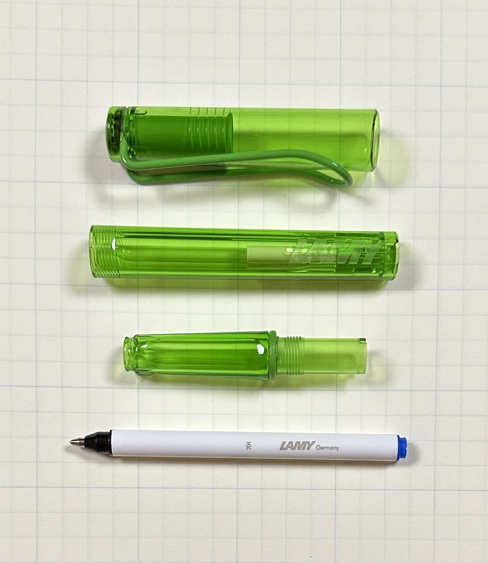
Even though the Balloon uses the same terrible refill it always has, Lamy made some changes to the barrel design. Primarily focusing on the cap, they changed the clip to the famed Lamy wire clip, including the addition of a separate finial cap to slot the clip into.

Kind of looks like a Lamy Vista, doesn’t it?

Lamy Vista.
My dream for Lamy has long been to upgrade the Vista fountain pen lineup to include transparent color barrels. Fun colors, as seen in the Balloon for years. Currently, Blue, Lime, and Pink are part of the rotation. Imagine Purple, or Orange? The technology to manufacture this type of barrel is obviously available, and now parts to match have been added to the lineup. So I have to ask: when, Lamy?
Soon, I hope.
Until then, I would avoid the Lamy Balloon, despite the cool looks, and the reasonable $18 price tag. The writing experience isn’t worth it.
(Pen Chalet provided this product at a discount to The Pen Addict for review purposes.)
Enjoy reading The Pen Addict? Then consider becoming a member to receive additional weekly content, giveaways, and discounts in The Pen Addict shop. Plus, you support me and the site directly, for which I am very grateful.
Membership starts at just $5/month, with a discounted annual option available. To find out more about membership click here and join us!

 For the majority of my fountain-pen-using days, I have only ever bought pens from major manufacturers. I tend to prefer smaller pens with solid, simple colors and it’s always seemed like most handmade pens are quite large and colorful. It wasn’t until The Colorado Pen Show in 2018 when I purchased my first handmade pen, and since then I’ve picked ...
 (Kimberly (she/her) took the express train down the fountain pen/stationery rabbit hole and doesn't want to be rescued. She can be found on Instagram @allthehobbies because there really are many, many hobbies!.)
After almost 6 years in this rabbit hole, it may come as a surprise that I still enjoy “entry-level” or budget-friendly pens very much. I still use a Pilot Metropolitan every day to write the day/date in my bullet journal, while Platinum Preppies, Lamy Al-Stars (Team #AlStarAlways), and others are also in regular rotation. I’ve asked the Bossman to keep me in mind whenever these kinds of pens come up for review. And when Pen Chalet sent us the Pilot Explorer for review, I jumped at the opportunity.

Released in 2019, the Pilot Explorer enters a fairly crowded budget-friendly steel nibbed fountain pen field, especially since several of the pens in that field are also made by Pilot. Other Pilot pens in this range include the Kakuno, Plumix/Pluminix/Penmanship and of course, the Metropolitan (the Prera is just on the cusp of budget-friendliness).
The Pilot Explorer that I am reviewing today is the clear one, but it also comes in a total of 12 colors (hmm, is Clear a color?) ranging from Black Matte to Blue, Silver or Turquoise, etc. which are metallic finishes. All of them come with a black clip and black finials. The snap cap has an embossed Pilot brand and logo and inside is a black inner liner - which is very obvious with the Clear model - which prevents ink from drying out in the cap. After inking it and writing with it on/off for several weeks, I deliberately left this pen untouched for over a month - thank you, Fountain Pen Companion for keeping track of this - and it wrote up right away without any issue.

Hard to tell but the logo is the same color as the cap, which in this case, is clear.
The Pilot Explorer comes in a metal tin and depending on where you buy it, may or may not include a Con-B squeeze converter. (Tip: if it does include the Con-B, do yourself a favor and use anything else but that converter because you can’t see if there’s any ink in it, can’t tell if it’s clean, etc.) It can also fit the Con-40, Con-50 and is also long enough to use the Con-70 if you wish to do so (it’s my second least favorite converter). Resist the urge to eyedropper this pen because there are small holes/gaps at the base of the barrel which will leak - I’m glad I tested this with water over my dump cup because the leak was immediate and messy, lol.
It comes in Fine and Medium nib sizes and is the same size steel nib as the Pilot Metropolitan, Plumix/Pluminix, Penmanship, Prera; and Kakuno (though the Kakuno has irresistibly cute faces on it), and they are interchangeable if you wanted to swap nibs. Just gently pull the nib/feed straight out to remove them. This means that the writing experience will be the same as with the other models if you’ve already tried them before. This one is a Fine and writes just like my Metropolitan Fine which I use every day. I inked the Explorer up with a Pilot Mixable Blue Black cartridge and it wrote right away without any issue. As expected, the writing experience is good - the nib is firm, no flex, and the nib lays down a fine line without being scratchy.

Yup, writes just like a Pilot steel nib fountain pen should.
The Pilot Explorer and Kakuno are the two pens in the steel lineup that are the most similar to each other. The Explorer weighs in at 0.42 ounces (11.9g), with the cap weighing 0.20 oz (5.39g) and the rest without converter or cartridge is 0.22 oz (6.24g). The Kakuno is 0.39 oz (11g), cap 0.13 oz (3.69g) and the pen 0.26 oz (7.37g). The Metro is almost double the weight.

Left to Right: Pilot Kakuno, Explorer, Metropolitan - you can see that the Kakuno’s grip section is a little girthier than the other two.
The Explorer and Metropolitan have more similar grips. Both are flared near the nib to prevent your fingers from sliding forward. The Explorer does not have the step near the barrel that the Metro does - this step is one of the things that some users don’t like about the Metro. The Kakuno, Metro and Explorer all have snap caps.

Comparison L to R: Pilot Metropolitan, Pilota Kakuno, Pilot Prera, Pilot Explorer, Pilot Pluminix, Pilot Plumix, Pilot Penmanship, Platinum Preppy, Platinum Prefounte, TWSBI Eco.


The Pilot Explorer retails for $25, and whether a Con-20 or Con-B is included is up to the retailer, so be sure to check what is/is not included with your purchase. The Kakuno, on the other hand, sells for around $15. The Kakuno doesn’t have a clip, doesn’t include a converter and its color combinations may not look and feel as “professional” as the Explorer but I’m not sure that either of those things justify the near double price tag. I will admit that comparing two Clear pens doesn’t help the Explorer because the metallic finish does look and feel nicer than the plastic versions. The Explorer is priced about the same as the Metropolitan, which feels much more substantial and has a more traditional style, and also the TWSBI Swipe or Eco, both of which have a much larger ink capacity.
All in all, the Pilot Explorer is a good pen, but at its price point, it really doesn’t compete with the Pilot Metropolitan in looks and heft or with the TWSBI Eco in function and ink capacity. Nor does it compete in price with its cuter sibling, the Kakuno or with the Platinum Preppy or Prefounte. But if you like how the Metro writes, but don’t like the step or the weight (or both), the Explorer might be the pen for you.
(Pen Chalet provided this product at no charge to The Pen Addict for review purposes.)
We stationery lovers love picking out perfect product matches. Whether that is a wooden pencil paired with a textured paper, or a fountain pen inked with a complimentary color, we all spend way too much time and effort getting things just right. It’s our nature, and we love it!
One thing I am going to start doing is sharing some of the pairings I make, especially when testing new fountain pens and inks. I have plenty of both that come across my desk, and do consider how products work together, even if it is mostly aesthetic.
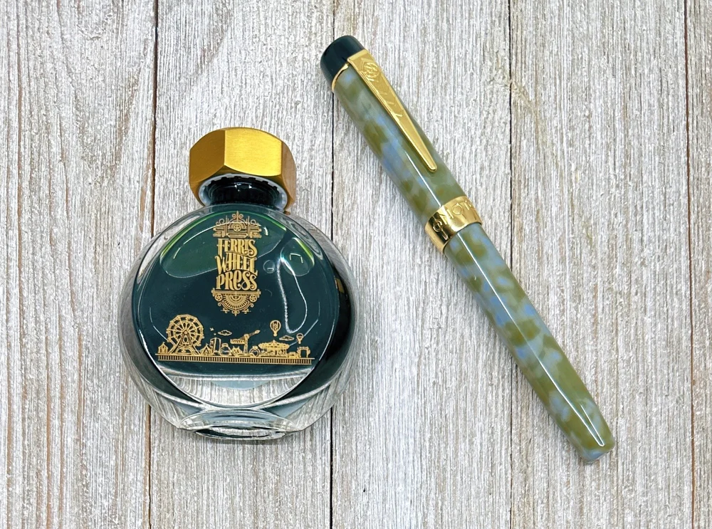
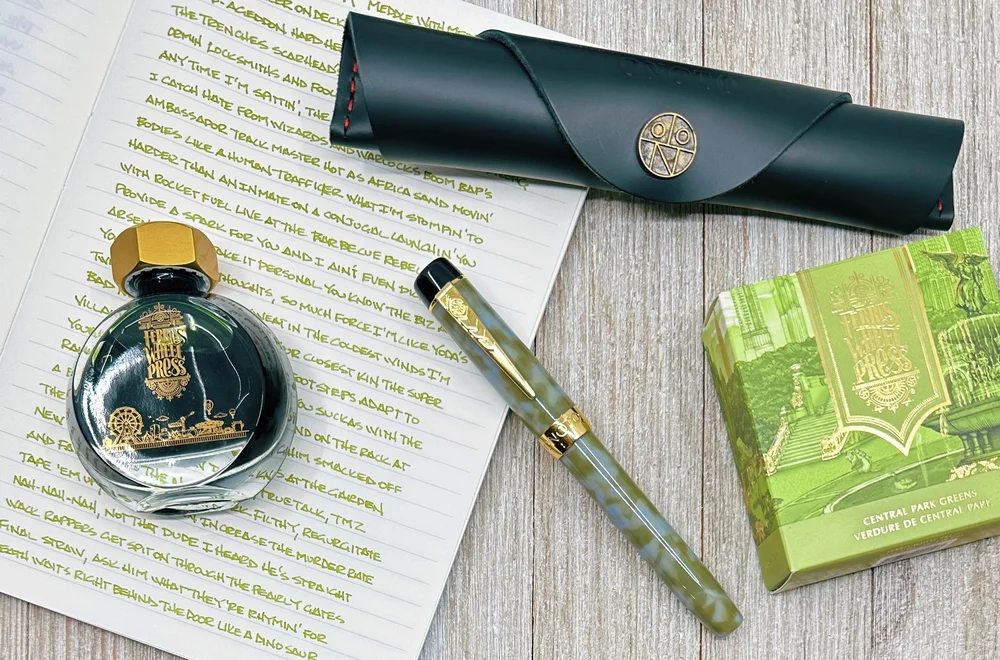
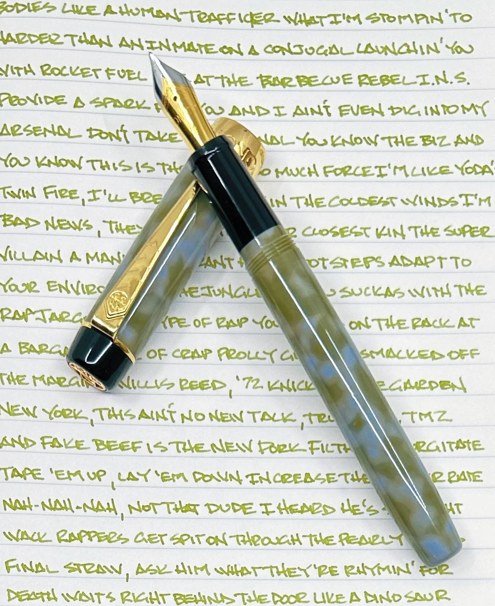
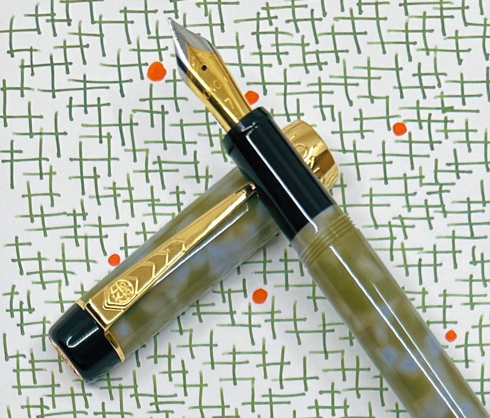
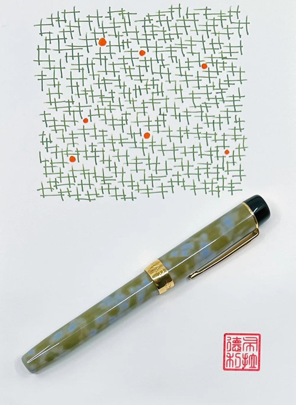
I went matchy-matchy with this pairing of the Onoto Scholar Highland Fountain Pen, inked with Ferris Wheel Press Central Park Greens. The greens of both work well together, with the ink color bringing out the subtle shades of green in the acrylic pen barrel.
This is my first experience with the Onoto Scholar, from the classic British pen maker. Onoto’s original run as a manufacturer ran from 1905 to 1958, with the Onoto we know today re-launching in 2005, restoring these British-made pens back to their former glory.
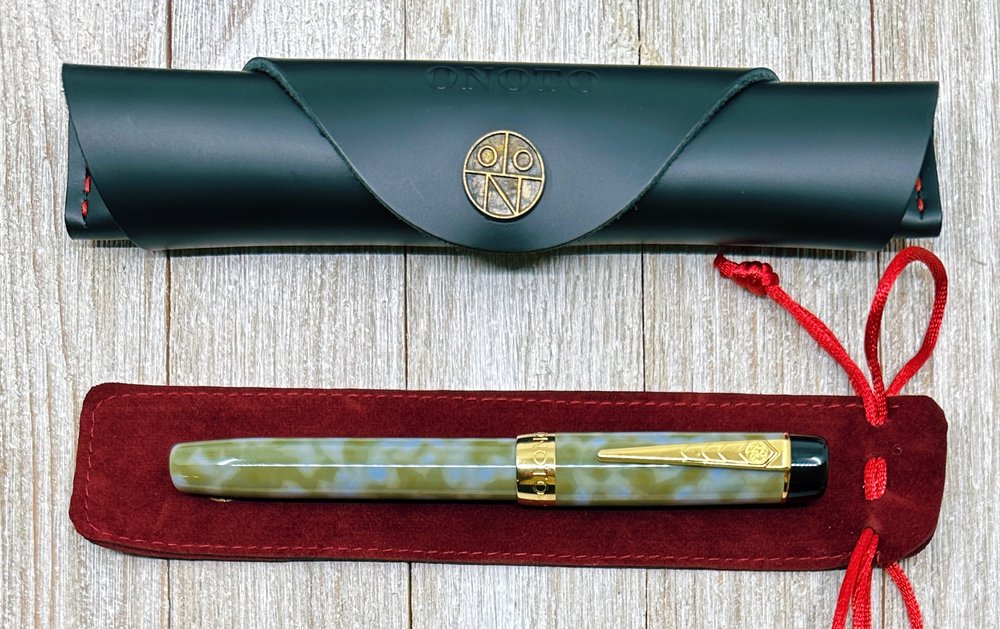
As great as Onoto packaging is, I’m not sure I need two pen sleeves. The leather option is beautiful, but removing that and dropping the total price to under $250 might be an easier sell.
Modern Onoto pens are classically-styled, and feature amazing craftsmanship at many different price points. Up until the release of the Scholar, there wasn’t a dedicated introduction product lineup to the brand. To jump into an Onoto at a base-level would cost you somewhere in the $400-$500 range, but the Scholar brought that down to a more reasonable $270 price point, while keeping the high quality they are known for. Yes, that is still pricey, but is a far better solution for those wanting to test out the brand for the first time.
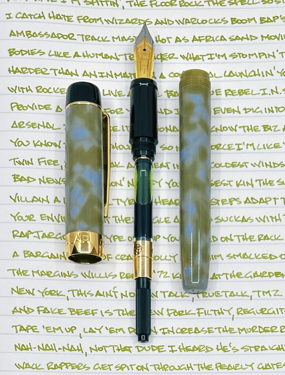
That’s what I’m doing with the Scholar, and it has been great in every way. This gold trim model (silver trim is also available) features a uniquely-patterend green and grey polished acrylic barrel and cap material, with a polished black grip section and top finial. The Fine Steel two-tone gold-plated Onoto #7 nib is rock-solid, with a firm feel and a smooth line. It works perfectly with the overall size and feel of the pen, which checks in at a mid-range 25 grams in total. It uses a cartridge/converter filling system.
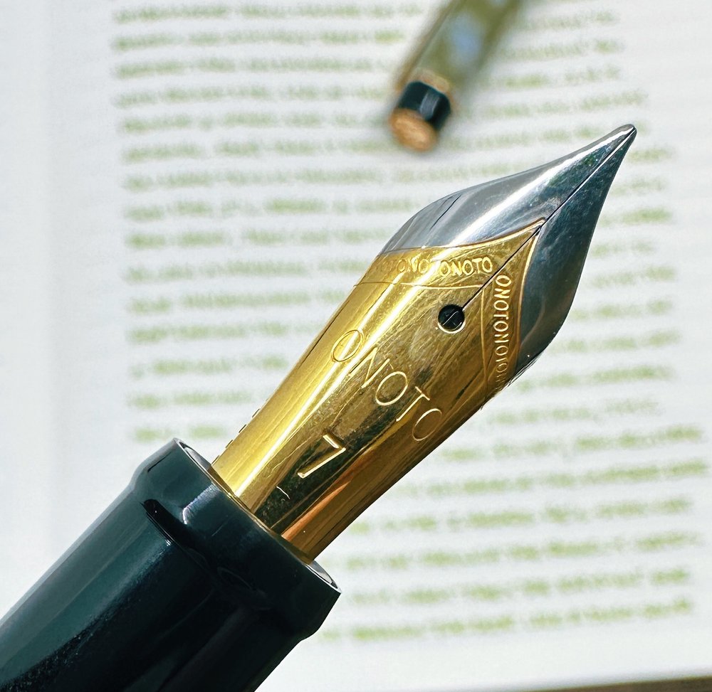
This is a Fine nib, and was a wet writer out of the box.
As a fan of classic designs for modern times, I would be remiss if I didn’t call out the beauty of the Onoto chevron clip. That, in conjunction with one of the best logos in the business on the top finial, completes this British design wonderfully.
To match the Highland, I went with another first-time test in Central Park Greens. Despite being around for years, this is my first Ferris Wheel Press experience. This is a standard ink, with good flow, average shading, no sheen, and a moderate dry time. The green ink leans slightly yellow, but is more than legible on most pages. In short, it is an excellent writing ink, and a great choice for putting words on the page.
The Onoto Scholar comes in many classic solid barrel colors including the vintage-styled Mandarin, and Rosso-both of which harken back to classic fountain pen barrel colors found in the early 1900’s. Along with Highland, Onoto has done a fantastic job bridging design philosophies of old and new, and now price points as well.
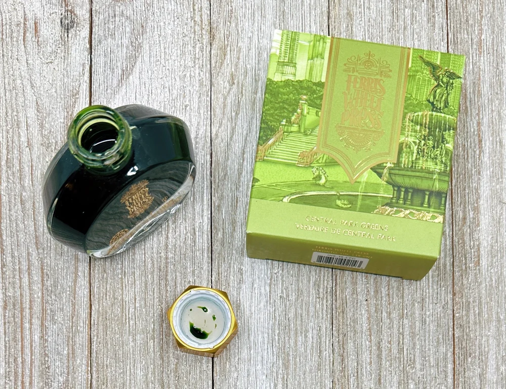
I stuck the converter directly into the bottle to fill due to the small opening, and unbalanced bottle.
As for Ferris Wheel Press, the choice is endless. I will say, as great as the ink is, and as beautiful as the bottles are, they are some of the least functional from a pen filling perspective. Syringes or pipettes may be required for wider-barreled pens, and a more solid bottle base maybe be required, less you end up with an inky mess on your hands-or counter top.
This pairing was a party, and a fun way to look at two products together-especially when both products are new to me. I’ll be looking for ways to work in more pairings posts into future reviews.
(Vanness Pens loaned this product to The Pen Addict for review purposes.)
Enjoy reading The Pen Addict? Then consider becoming a member to receive additional weekly content, giveaways, and discounts in The Pen Addict shop. Plus, you support me and the site directly, for which I am very grateful.
Membership starts at just $5/month, with a discounted annual option available. To find out more about membership click here and join us!

(Sarah Read is an author, editor, yarn artist, and pen/paper/ink addict. You can find more about her at her website and on Twitter. And check out her latest book, Out of Water, now available where books are sold!)
I have wanted to try CW&T Pen Type-B ever since I heard Brad annoy Myke with it on the podcast, many years ago. The POP it makes when you open it is endlessly satisfying, and the machined precision that causes it to float back into place when capped is absolutely magical. I'm unabashedly obsessed with this slightly ridiculous pen.

The version of the Pen Type-B that I have here is a stainless steel body with a brass tube cap that extends almost the full length of the body. Both are plain cylinders, except that the cap has one flattened side that keeps the pen from rolling away. There's no lettering, no grip section--just two metal tubes living together in perfect harmony. The brass cap is meant to take on character as it is used, though I've used it almost daily for weeks and it hasn't started to patina yet. It did take on some character where I dropped it in my driveway, but that's just a wee scratch, and the pen itself appears indestructible.

The precision tolerance of the machining is what creates the air-tight seal between the body and cap, resulting in that glorious POP when you open it, and the slow piston closure. If you open the pen partway, it will slowly sink back into the cap from the suction generated by the airtight seal. This trick only works if the pen is machined absolutely perfectly, and CW&T inspect every pen to make sure they are indeed perfect. The fidget factor here is off the charts. I had to attend two all-day professional training seminars last month, and I have a weekly 3-hour zoom class. This pen is responsible for keeping me in my seat, appearing somewhat sane (that's as good as it gets, for me. Fully sane is unattainable).

The pen body has no seams or interruptions. The access to the refill is through the back end of the pen, where there is a small bolt that unscrews. It's easy to do--I was able to unscrew it with my fingernail, though a coin or key would also work. When the small bolt is removed, the refill simply slides out.

The pen body can be used by itself for writing, or the cap-sleeve can be posted if you want a thicker, heavier pen. This isn't a light pen, as one can probably guess from the materials. It's 90 grams altogether. I haven't used it for long writing sessions, though I think I could if it were unposted, and I continuously reach for it to jot down quick notes or sign something.
The included refill is fantastic. It's the Pilot Hi-Tec C, and it comes with a black 0.3 mm insert. I love the ultra-fine point on this refill, and it writes like a dream. It's smooth and has a nice flow, with no scratching or skipping. The ink is dark enough to be visible even with fine writing. It's perfect for writing very small notes, or in the wee squares of a pocket calendar.

But what if you don't like the Pilot Hi-Tec C? There are a variety of spacer inserts available, from 2mm to 27mm, that allow this pen to take just about any refill you can imagine.
It's quite a feat for a pen to be so minimal and yet so EXTRA at the same time, and I am totally here for it. I'm about to sit down to my last 3-hour lecture of my grad school career, and I've got it right here on my desk, ready for notes--and fidgets.
(JetPens provided this product at no charge to The Pen Addict for review purposes.)
Enjoy reading The Pen Addict? Then consider becoming a member to receive additional weekly content, giveaways, and discounts in The Pen Addict shop. Plus, you support me and the site directly, for which I am very grateful.
Membership starts at just $5/month, with a discounted annual option available. To find out more about membership click here and join us!


(Jeff Abbott is a regular contributor at The Pen Addict. You can find more from Jeff online at Draft Evolution and Twitter.)
This Leonardo Supernova that I've had on my desk the last couple of weeks has really stolen the show in terms of my stationery rotation. I couldn't pass it up when I saw it online, but seeing the pen in person is even more striking.

The Leonardo Supernova is a regular edition that features a beautiful marbled acrylic that is made in Italy. The color I have is called Star Light Blue with Ruthenium Trim, but there are three other colors options as well. All four materials are gorgeous, but I'm a sucker for bright blues and turquoise with hints of green.

The swirl of color in this material is one thing, but Leonardo added a little extra character by including a sprinkle of reflective particles that subtly sparkle and twinkle under the light. The sparkle gives the acrylic just a little more depth and visual interest that makes the pen pop.
The fit and finish of this pen is fantastic, and I was impressed by how well-made it is for the price. Everything lines up perfectly and feels solid in the hand, and the dark trim complements the bright blue body beautifully. The wide band features a geometric design that looks great without drawing attention away from the acrylic. Aside from the band, there's also a small ring at the bottom of the pen and a functional clip on the cap. The clip is a sleek shape and has a wheel at the end that makes it just a little easier to clip onto things while still keeping the pen secure.

The Supernova sports a steel #6 Jowo nib with some decorative scroll work and the nib size inscribed at the base. The dark nib matches the rest of the trim on the pen and continues that delicious contrast between the dark metal and bright acrylic. The fine nib on this pen was smooth and crisp out of the box, and flows well with the couple of inks I've already tried with it.
Writing with the Supernova is fantastic due to the smooth nib and even balance of the pen body. You can post the cap on the back of the pen, but I prefer leaving it unposted since it's a full-size fountain pen. I like the balance without the cap a little better, but just know that the cap posts securely if you like to write with the additional weight. No one likes a loose cap on the back of the pen when trying to write!

Along with the pen and gift box, Leonardo include a standard cartridge converter so that you can ink the pen up with your favorite ink. I wish more pen manufacturers would do this instead of including a couple of generic black or blue ink cartridges!

From when I first saw the Leonardo Supernova on Goldspot's website, I had high expectations. At $152, it's not a cheap pen, and straddles a really interesting and competitive price point. At a minimum, it needs to perform like other amazing pens that you can buy at this price. I'm happy to say that this pen exceeds my expectations. It's a pleasure to use, and it looks so awesome on my desk. I can't help but pick it up and twirl it around under the light to admire the personality in the acrylic.
Aside from the fine nib, you have the option of extra fine, medium, broad, elastic extra fine, elastic fine, and 1.5mm stub. And good luck picking just one color out of this exceptional lineup of materials!
(Goldspot provided this product at no charge to The Pen Addict for review purposes.)
Enjoy reading The Pen Addict? Then consider becoming a member to receive additional weekly content, giveaways, and discounts in The Pen Addict shop. Plus, you support me and the site directly, for which I am very grateful.
Membership starts at just $5/month, with a discounted annual option available. To find out more about membership click here and join us!

(Kimberly (she/her) took the express train down the fountain pen/stationery rabbit hole and doesn't want to be rescued. She can be found on Instagram @allthehobbies because there really are many, many hobbies!.)
Color me shocked when the Bossman sent me a pen for review and it was orange! It was the Kilk Orient - I had never heard of the brand Kilk, so I was eager to check it out and see how it performed.
Kilk is a pen company that was founded in 2012 in Istanbul, Turkey. They have several models of fountain pens in addition to the Orient.
The pen comes with a steel “V2 nib” (per Goldspot, it is a #6 Bock) engraved with the Kilk logo and nib size. The pen also comes with a screw-in standard international converter as well as a polishing cloth for cleaning the silver band and instructions on how to care for the pen. The pen comes with a 2 year warranty against manufacturing defects.

The first thing I noticed was how distinctive the shape is. It has its own look and doesn’t really look like other pens out in the market. The second thing I noticed was the silver band and trim, as in 925 silver, not just silver colored. You don’t see actual silver accents on a pen in this (or any) price point very often. The band design is classy and detailed without being overly intricate or busy.
The cap is quite large and has an almost bulbous shape to it. The clip band sits a little lower down from the tip of the cap (reminds me a little of vintage Pelikan caps) and the clip point is very pointy, maybe a little too pointy. The clip works well and easily slides over my binder’s elastic straps as well as over shirt pockets. The metal band is not on the cap, as is often the case with other pens, but on the barrel of the pen. To me, it looks a little odd but this is definitely personal preference and does not affect writing performance since the band sits between one’s fingers and the crook of the hand. The barrel of the pen is also a bit curvy, with a slight flare at the nib which prevents fingers from sliding down. The taper on the other end also allows you to post the cap fairly deeply without making it too back-weighted.

Pen still feels fairly balanced when posted, though it does extend a ways back. Of course, I would prefer this one (and all pens) unposted.
The Orange Orient is made from a beautiful bright orange acrylic that has swirls of chatoyance and is slightly translucent. You can just barely see the converter if you look carefully. The material is highly polished and can feel a bit slick, especially if you live/work in a more humid environment. The Kilk Orient is well-made and doesn’t feel cheap or flimsy in any way even though it isn’t a heavy pen.

Slightly translucency of the material.

Comparison to similarly sized pens (L to R): Opus 88 Halo, Leonardo Momento Zero, Kilk Orient, Pelikan M800, Pilot Custom 823, Visconti Homo Sapiens.

You can really see how much girthier the Kilk Orient grip and body are compared to the others.

Despite it’s girth, it is the shortest pen when posted.
As I’ve mentioned in past reviews, I know it’s good advice to rinse/clean pens prior to first use but honestly, I’m lazy and too eager to try out new pens, so I went ahead and inked it up with Visconti Cafe Terrace at Night without any cleaning. The Fine nib was smooth but the writing experience felt a bit dry. Hard to tell if it was the nib or the ink so I flushed out the converter and nib and put in good ol’ Waterman Serenity Blue.


The nib didn’t perform much better with Serenity Blue. It wasn’t hard starting or anything like that but the ink just didn’t seem to flow very well. I used my loupe to check for any misalignment or baby’s bottom and there wasn’t any but since I wasn’t sure my loupe handling skills should be trusted, I took it to the Philly Pen Show to have it looked at by a professional. I asked Gena Salorino of Custom Nib Studio to take a quick peek (without making any nib modifications) and they agreed that it was a bit on the dry side, so phew, it wasn’t just me. The nib is usable as-is but I think it would be so much better with a little bit of tuning. According to Goldspot, the nibs are tested and tuned in the Kilk workshop before being exported so maybe they don’t tune them as much for a wetter flow.
The Kilk Orient fountain pen costs $260 USD with a steel nib and is available from EF to BB. A gold nib option is available from the Kilk website for $380. The aesthetics of the Kilk Orient fountain pen aren’t really my jam, but I appreciate that it is a different design that doesn’t look like every other pen out there. I also like that it has real silver accents, which does add to the price, though it is still in the range of many custom pens. Given its unique styling, the Kilk Orient pen may not be for everyone, but if you like how it looks and appreciate the addition of real silver trim, this might be a good addition to your collection.
(Goldspot provided this product at no charge to The Pen Addict for review purposes.)
Enjoy reading The Pen Addict? Then consider becoming a member to receive additional weekly content, giveaways, and discounts in The Pen Addict shop. Plus, you support me and the site directly, for which I am very grateful.
Membership starts at just $5/month, with a discounted annual option available. To find out more about membership click here and join us!
(Note from Brad: Since I wouldn’t review this pen myself, my friend Diane asked if she could step in and tackle a product I had a direct hand in making. This is her review below. Thank you Diane!)
In early 2021, Spoke Design introduced not one but 3 fountain pens - the Icon, Axle and Axle S. All 3 designs are available in a variety of mix and match color combinations.
Right away I wanted to get at least one of these pens, but. which? I loved all 3, and it took time to narrow down the choices. Despite its cuteness, I managed to eliminate the tiny Axle S because of its cartridge-only filling system. While the Axle’s tool-like aesthetic was appealing and I liked the threaded posting, I found the Icon the most intriguing with its open 6-slotted barrel revealing a contrasting inner sleeve. Soon after the release, alternative grips including a knurled version were added for the Icon only.
For a while I held out for a pen show where I could evaluate the models in person, but over a year passed with no pen shows attended by Spoke.
I had decided that I wanted the knurled grip and sleeve in the same color, with a surprise color contrast to the cap and barrel. Of all the knurled grip colors, I liked the cyan best. That just left the choice of cap and barrel color.
I found the gunmetal or silver combination with cyan too conservative; the purple and cyan, on the other hand, seemed too gaudy.
Time passed, and the unfinished business of choosing an Icon remained. Meanwhile the colors slowly sold out and my choice was made - cobalt blue and cyan.
The pen arrived securely packed in foam-line tin within a Spoke Design logo box,. In the website photos, the Icon looks like a chunky, heavy pen. In fact it’s smaller than I expected and also at 23.6g capped, it weighs about the same as a Lamy Safari, substantially less than most of the pens I use daily. There are benefits to lighter weight and benefits to substance. The option of brass grip and insert may allow the pen to be customized to be heavier if that’s preferred.

From the top: Rotring 600 pencil; Rotring Newton; Lamy Al-Star; Spoke Icon; Diplomat Aero; Levenger L-Tech.

Fitting a new pen into my life When taking handwritten notes in meetings, I like a pen with an efficient, geometric, logical appearance; unconventional but not flamboyant. I also have a dread of a pen drying up while uncapped, so I like to use either a snap cap or a retractable. My go-tos are Rotring Newton, Diplomat Aero, Pilot Vanishing Point and Platinum Curidas, all with EF nibs. My heptagonal, F nibbed Levenger L-Tech could be a runner up here as it channels the Rotring design aesthetic; although it’s not a snap cap, it can be uncapped in less than a full turn.
For daily ephemeral work notes and sketches, I use my notetaking pen du jour, something else from rotation, plus a stub or architect with a different colored ink for accents and separators.
When flying, I value pens that don’t dry out if left unused for a while as I believe this makes them more resistant to air pressure changes and leaking. Kaweco Al-Sport, Schon DSGN pocket 6, Esterbrook Estie and Platinum 3776 have served well here; the retractables stay at home.
For home note-taking and journaling, abalone and crazy resins are welcome as well as modern flex nibs, stubs and italics.
Viewed through this lens, the Spoke Icon has the logical, geometric aesthetic that I like for the office. It wrote instantly and did not leak after 2 flights with 2 weeks of non-use over the holidays. In the months since obtaining the Icon, it has been a daily driver for work and home.
Unlike its Axle siblings, the Icon is not designed to post. At first glance the cutouts look like they are there to provide roll stop behavior. They don’t - the pen rolls easily and when placed on a desk, defensive measures are necessary.
The Icon’s barrel has an o-ring that prevents it from unscrewing on its own, and attempts to unscrew the cap don’t cause the barrel to come undone. The cap thread does not make contact with fingers while in use. One downside is that the cap has a single thread and takes over 3 full rotations to undo. While this provides for a moment of quiet meditation when uncapping the pen, it makes it a less than ideal choice for meeting notes.
There’s a special fatigue caused by writing with a slippery pen. The mental energy required to keep control of the pen is not available for the thought processes involved in writing. The first time I picked up a pen with a knurled grip, I experienced an unexpected peace and increased focus.
Until the Icon, I only had two knurled grip writing instruments - a Rotring 600 pencil and the Rotring-inspired Levenger L-Tech fountain pen. I received all 3 available grip variants with my Icon and rated each on the following factors:
Grip Comfort - 1 minimum, 5 maximum, higher is better.
Slip vs grip - 1 slippery, 5 grippy, higher is better.
The Icon’s concave grip scored 5; it is one of the most comfortable grips I have ever used. However, it scored 2 on the slip versus grip scale, being slippery both longitudinally and rotationally.
The Icon’s groove grip scored 3 for comfort and 4 for slip vs grip; longitudinal slip is gone but rotational slip remains.
The Icon’s knurled grip scored 4 for comfort, dropping a point relative to the concave, and a perfect 5 for grip.
While the Levenger L-Tech also scored 4 + 5 due to its knurled grip, both the Rotring Newton and Diplomat Aero have unforgiving straight slippery grips, scoring 2+2 = 4 each.
Retractables have their own grip comfort challenges, which I see as a necessary compromise for retractable functionality, so I won’t rate them here.
The knurled grips are clear winners in this highly subjective evaluation. The surprise is just how badly I rate two of my go-to pens in comparison.

Spoke Icon Concave Grip.

Spoke Icon Groove Grip.
The Icon uses standard cartridge / converter filling and with the barrel sleeve in place, there’s no ink window. The sleeve can be removed with the available tool in order to replace it with a different color. Removing the sleeve completely gives a view of the ink level in the converter, at the expense of the flash of contrasting color from the sleeve. It’s worth noting that the sleeve is open ended, so if the cartridge or converter were dislodged, ink could escape from the barrel. This is also a consideration for the Lamy Safari and Al-Star; I have never had it happen with either. The main downside of the knurled grip is that when filling from an ink bottle, ink may get into the knurled texture and is then hard to remove. Even when it seems to be gone, tiny amounts of ink remain and transfer to fingers when writing. There are many ways to avoid this - rinsing the grip after filling, syringe-filling the converter, filling the converter from the bottle or from a TSWBI inkwell - and I’m happy to use these methods in return for the knurled grip.
The nib is always the most important part of any pen and yet in this case, also the least important. Since the Icon takes a standard Jowo #6 nib unit, any other Jowo #6 will fit, giving access to needlepoint, stub, fine cursive italic, modern semi-flex, architect and more from a variety of sources.
The Spoke Icon is available with a standard Jowo #6 nib unit in EF, F, M and B, all engraved with the Spoke logo. I selected the Jowo #6 EF somewhat reluctantly as I already have several in other pens. I have come to think of the Jowo #6 EF as Heaven - every time I come back to it, I marvel at its precise, clean line, reliability and ease of use. But it’s Heaven by the Talking Heads - the ennui of perfection.
The Spoke Icon is everything I hoped it would be. Its clean but unconventional design suits me both at work and at home. It sparks joy when its cyan accents flash through the barrel cutouts or appear when the cap is removed. Its knurled grip allows me to focus on writing. Its nib is perfect and also easily replaced. And I can live with the 3 turns to remove the cap.
As I made arrangements to get the Icon’s nib tailored to UEF and obtain a reverse architect / engineering nib, I reflected on one of my all-time favorites - the gold fine cursive italic in the Lamy Dialog, purchased from the Pen Addict during a previous herd-thinning event.
For me, this is all that’s missing from the Spoke Icon - it would be great to be able to order a Spoke pen pre-sprinkled with Pen Addict nib magic.
(I received the Spoke Icon at no charge in return for this unbiased review.)

For a brand that has been in existence for less than four years, Nahvalur has remained extremely busy. From the launch of the Original at the 2019 Washington D.C. Pen Show, to store collaborations, to new pen models and materials, and yes, even to manufacturing and naming drama, they have made even the most active stationery fans heads spin. Mine included.

All of that work in has led to their latest release, the Original Plus, a vacuum-filling upgrade to the Original, which uses a piston filling system. It’s my favorite Nahvalur pen yet.


The first Original Plus models released mimicked the transparent swirl barrels of the Original, but it was only when the two latest models launched-Matria White and Lovina Black-that I got my hands on them to test.

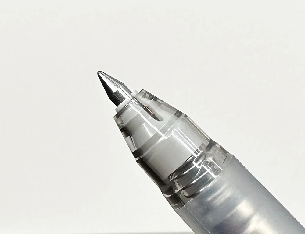
Easy to take apart for cleaning.

Right out of the box, the Original Plus impressed. I chose the Matria White model to ink up, with a Fine Steel nib, dunking the section right into an ink bottle and engaging the vacuum filler. On first fill, the barrel reached around 50% capacity. I wanted more, so I pushed the ink back into the bottle and went with a double-pump vac, which got me a more expected 75% plus fill. If I were perfectly efficient, I’m sure I could get close to the full 1.5 ml of ink capacity available in the barrel.

When writing, the barrel feels perfectly balanced and comfortable. It checks in at 27 grams due to the added internal mechanism (the Lamy Safari weighs 15 grams, for example,) but it doesn’t feel heavy. The barrel is cylindrical, and the grip section has a slight taper down to a ridge at the bottom edge. The Original Plus doesn’t break any new ground design-wise, but is built for all-day writing. It succeeds in that aspect.

What I was most impressed with was the performance of Nahvalur’s Fine Steel nib in this pen. I had the same nib in my Original review and didn’t enjoy it nearly as much as this one. The tipping of Nahvalur’s nibs made the line too wide and inconsistent for me, but that tipping seems to have been refined on nibs used for the Original Plus. My lines are perfect, and meet my line width expectations for a Fine nib.

The nib was my primary hangup with the Original. The build quality was there, but I didn’t love using it. The Original Plus changed that for the better, and added a vacuum filling system to the mix. And the best part? The price. At $55, the Original Plus is a great value for such an enjoyable experience.
Only 500 of each of the Matria White and Lovina Black were created, and they have begun to sell out at various retailers. The original Original Plus fountain pen colors are still available as well. Either would make a great choice no matter your experience level.
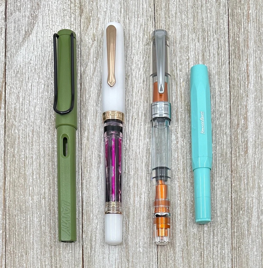
L to R: Lamy Safari, Original Plus, TWSBI 580AL, Kaweco Sport.

Nahvalur has become a brand to watch as they broaden their fountain pen, nib, and ink offerings. The next thing I’m keeping my eye out for is the addition of Extra Fine nibs into their lineup. One can hope!
(Nahvalur provided this product at no charge to The Pen Addict for review purposes.)
Enjoy reading The Pen Addict? Then consider becoming a member to receive additional weekly content, giveaways, and discounts in The Pen Addict shop. Plus, you support me and the site directly, for which I am very grateful.
Membership starts at just $5/month, with a discounted annual option available. To find out more about membership click here and join us!


(Sarah Read is an author, editor, yarn artist, and pen/paper/ink addict. You can find more about her at her website and on Twitter. And check out her latest book, Out of Water, now available where books are sold!)
Sometimes I pick a pen based on looks (I'll admit it) and "odd" is definitely a look. The Uni Jetstream Edge looks odd. But I love Uni refills and I like Mint Green, so I had to try it. And it's a decent pen, though I think there are better houses for the exceptional Jetstream refill.

The metallic sheen on this pen deceives the eye, as the body is all plastic--only the grip section (and clip) are metal. The plastic is smooth and well made, but very light, so almost the entire weight of the pen is in the grip. This is apparently to give the pen a low center of gravity, which is intended for better control. I don't know all the science of the ergonomics behind that, but the imbalance it creates is something that takes a little getting used to. The pen also tapers so that the grip is the widest point, with a snorkel-like tube to protect the super-fine refill tip.

The body has a hexagonal shape, while the grip is round with some light etching along the length. I do find the grip a bit slick. I think the etching could have gone around the grip instead of along it, for better traction.
The clip has a wave pattern to it, and it looked like it might have a hinge, but it's a friction clip. It's fairly stiff, though the lip on it makes it easy to slide onto papers.

The top of the pen has a black plastic click mechanism to deploy the tip. It's a satisfying click, and the parts are all up in the top of the pen, so there are no flying springs or loose pieces when you change refills.
And the refill is where this pen shines. Because inside this slightly alien looking pen body is one of the best refills I've ever used, the Uni Jetstream .38 ballpoint.

This is the smoothest ballpoint ink I've ever used. It has the glide of a gel ink, but it is water-resistant, fade-resistant, and forgery-resistant, so it's perfect for taking your most important notes. Despite the absolute itty bittiness of the tip, there is no scratchiness or dragging feeling to this refill at all. It looks like you're writing with a sewing needle, but it writes like hot butter. I would use this refill every day.

But, I confess, I am not reaching for this pen every day--and when I am, it's because I need the refill, not because I want to write with the pen itself. It's not a bad pen at all, it's just odd, and that imbalance throws me off a bit. Beyond that, the $15 price feels a bit high, especially when you can get a 3-color Jetstream pen for $7.
I don't mind an odd pen (to be fair, I'm odd, myself), and I'd say that if you like the look of this pen, you're bound to be very happy with it. While I prefer other Uni pen models, my critiques of this pen are all very subjective, and you may find this one to be your personal favorite.
(JetPens provided this product at no charge to The Pen Addict for review purposes.)
Enjoy reading The Pen Addict? Then consider becoming a member to receive additional weekly content, giveaways, and discounts in The Pen Addict shop. Plus, you support me and the site directly, for which I am very grateful.
Membership starts at just $5/month, with a discounted annual option available. To find out more about membership click here and join us!


(Jeff Abbott is a regular contributor at The Pen Addict. You can find more from Jeff online at Draft Evolution and Twitter.)
You ever pick up a pen that you think is new to you, only to discover you've used it in the past? That's me when I recently picked up a Pelikan Jazz Velvet ballpoint pen to try out. Turns out, I had picked up a Pelikan Giant 337 to try out back in 2020 and really had no memory of it at all. Even better, Brad reviewed this exact pen back in 2021, only in a different body color. Time goes by so quickly, and it's easy to miss or forget things! But I'm really glad the Pelikan Jazz Velvet and its Giant refill made it back into my life.
The Jazz Velvet is a ballpoint pen that uses the ubiquitous Parker-style refill shape. The refill doesn't use a hybrid ink formula, either. Just a huge amount of traditional blue ballpoint ink.

Given the price (around $14), I really wasn't expecting much from this pen. I assumed it would provide a mediocre writing experience and come with an ink that isn't bold or saturated. Nothing to write home about, but nothing to complain about either for the price. My assumptions were dead wrong.
This pen doesn't look like an expensive pen on the outside, and I wouldn't expect it to given the price. But what I didn't expect at all was that it feels so great in the hand. The balance is perfect thanks to the heavy top end and tapered body. For my writing grip, it's perfect and feels fantastic. The matte blue coating over the barrel has just enough texture and oil-resistance to provide superb grip. Every time I pick this pen up and start writing, I'm surprised by how much I like it.


This pen uses a twist mechanism to extend and retract the writing tip. This motion was really stiff and imprecise when I first got the pen, but after a couple dozen cycles with regular use, it feels a lot smoother and predictable. It's easy enough to operate with one hand, but I normally use two hands because that's a little quicker.
The all metal top portion of the pen also holds the signature Pelikan clip, which does its job beautifully. It keeps the pen attached to stuff and also prevents it from rolling away.

Writing with the Giant refill in this pen is another factor that makes the pen so surprisingly good to use. It's a really smooth refill that has bold, crisp ink. It starts easily, doesn't skip, and produces clean lines when writing. I love it, and I'm starting to prefer it over my trusty Schmidt EasyFlow 9000 refills for this refill shape.
At $14, I think the Pelikan Jazz Velvet is a sleeper and a fantastic deal. Since the refill costs almost $12, it's even more shocking that the pen feels so great in the hand. Seriously, just add one to your next order and have some fun using it and comparing it to your other favorite Parker-style refills.
(Goldspot provided this product at a discount to The Pen Addict for review purposes.)
Enjoy reading The Pen Addict? Then consider becoming a member to receive additional weekly content, giveaways, and discounts in The Pen Addict shop. Plus, you support me and the site directly, for which I am very grateful.
Membership starts at just $5/month, with a discounted annual option available. To find out more about membership click here and join us!


Are erasable pens a gimmick? Right up to the launch of the Pilot FriXion, I would have said yes. Pilot had other ideas, and changed the entire erasable pen market single handedly. That’s how far ahead the FriXion is over the competition. Most other manufacturers don’t even try to challenge them.
That gives the FriXion free reign, and to Pilot’s credit, they haven’t stopped improving since launching in 2006.
Those first FriXion’s showed technical promise (friction erasing thermo sensitive ink worked!) but the ink color on the page left a lot to be desired. The colors were muted, almost faint, especially compared to more saturated traditional gel links, as found in Pilot’s own G2 lineup. You had to want to use erasable ink to choose the FriXion over almost anything else.
Over the years, Pilot kept working on the ink, and iterating on the barrel design, eventually ending up with a pen in the Ball Knock that could compete with standard gel pens first, and, oh by the way, had erasable ink. This solid base design allowed them to expand the lineup with new ink colors, barrel designs, and even tip sizes down to 0.38 mm.

Given its popularity in Japan, the FriXion has become a bit of a playground for Pilot. The Ball Knock Zone is their latest effort, and brings several changes into the mix.

Starting with the ink, Pilot states that with this release, the black gel ink is 30% more vibrant than the ink found in the original model. I believe that, too, as the original black ink was more of a grey. This new formula is still not near the G2 in color saturation, but it is clearly better than the old one. Enough so that I would feel fine using this black ink every day.

Secondly, Pilot made some barrel changes with the Ball Knock Zone to quiet down the retractable parts of the barrel. There is a spring in the clip knock for quieter deployment, and a “clutch” inside the barrel tip to hold the refill in place and prevent tip rattle when writing. I put “clutch” in quotes, because it really isn’t one. To me, a clutch is a mechanical part that actively widens and narrows as you deploy and retract the tip of a pen or pencil. This is not that. This is a fixed plastic ring that holds the refill in place, and yes, it does what the marketing says by quieting tip rattle, but it’s not a clutch.
Pilot FriXion Ball Knock Zone
Semantics aside, the third thing Pilot has done is go premium with the lineup. The basic Ball Knock Zone runs $7, compared to $3.50 for the standard model. You can also upgrade to one of three Wood Grip models for $28, and there are three more Marble Acrylic grip models priced at $41.
What is happening here? Popularity. That is what is happening. Even Hobonichi mentioned they had to consider the FriXion when choosing their new paper for their 2024 planner lineup. Pilot has a huge hit on their hands, and it shows.


The biggest question is if you will like the FriXion in your own hands. It depends, of course. If you need erasability, or want a pencil alternative, then I highly recommend it. The friction eraser works well, removing most ink from the page when needed. It’s impressive, and there isn’t a better option. (Pro tip: You don’t need special paper or notebooks for the eraser to work.)

Sanzen Tomoe River paper.

Write Notepads Engineering Grid.
Do you like gel ink pens in fun colors, great barrel designs, and various tip options? I would consider the FriXion, but the ink color will lag behind any standard gel from any major manufacturer, such as Uni-ball, Pentel, Zebra, and yes, Pilot.
I like the FriXion as an option to have around the desk for when the need arises. I also think the standard Ball Knock barrel is one of the best barrels on the market in any category. It’s the barrel that I wish Pilot would use as an upgrade to the G2 barrel. The Ball Knock is over $3 per pen cheaper than the Ball Knock Zone, too, and I’m not sure the upgrades to the new model are worth the price difference.
If you are a FriXion fan already, the premium price might be worth it to try out. And, you should also be pleased with the direction that Pilot is going with the product lineup. I’m just not sure that anyone else needs to try the new Ball Knock Zone given the price.
(JetPens provided this product at no charge to The Pen Addict for review purposes.)
Enjoy reading The Pen Addict? Then consider becoming a member to receive additional weekly content, giveaways, and discounts in The Pen Addict shop. Plus, you support me and the site directly, for which I am very grateful.
Membership starts at just $5/month, with a discounted annual option available. To find out more about membership click here and join us!


(Sarah Read is an author, editor, yarn artist, and pen/paper/ink addict. You can find more about her at her website and on Twitter. And check out her latest book, Out of Water, now available where books are sold!)
It's been a long time since I've tried the Pilot Juice Gel Pens, and this adorable set of limited-edition Pokémon versions made me think it was time to revisit them. It was a good reminder that these are awesome pens.
My favorite thing about these pens, right off the bat, isn't even the adorable characters--it's the ink. Pilot Juice gel ink is pigment-based, water-resistant, and they can write on shiny surfaces like photographs as well as on paper. When I set down my fountain pens and reach for something clicky, these are the kinds of ink qualities I'm looking for. The pigments are also strong and bold, so even this very fine-pointed .38 mm tip writes a nicely visible line. I have had no issues with skipping or drying out.

My second favorite thing about them is definitely the characters. This Set B features four colors and Pokémon: Black (Pikachu), Leaf Green (Yamper), Red (Piplup), and Violet (Alolan Vulpix). The designs are colorful and charming, and (best of all) designed so that the character is facing you when you hold the pen.


The pen bodies are clear plastic with a click mechanism that matches the color of the ink inside, which makes it easy to select the color you want when the pens are in a case. They have a springy alligator-style clip that can attach to a variety of widths, though they aren't super strong or grippy. The grip section has a rubbery surface that is comfortable to hold. The section unscrews from the body of the pen so that the refill can be replaced as needed.

The price for these sets is $13.50 at JetPens, which isn't cheap for four pens, but it's reasonable for a limited edition set of pen bodies that are also refillable. There is also a Set A of 0.5 mm pens as another option. They're definitely in the "worth it" category for me, which is good, because my kids already stole mine.
(JetPens provided this product at no charge to The Pen Addict for review purposes.)
Enjoy reading The Pen Addict? Then consider becoming a member to receive additional weekly content, giveaways, and discounts in The Pen Addict shop. Plus, you support me and the site directly, for which I am very grateful.
Membership starts at just $5/month, with a discounted annual option available. To find out more about membership click here and join us!


(Jeff Abbott is a regular contributor at The Pen Addict. You can find more from Jeff online at Draft Evolution and Twitter.)
There's no denying how prevalent the design of the Kaweco Sport is in the stationery world. There are several different models of the Sport that all feature the same faceted barrel and minimal style. It's a thing of beauty, and I'd bet that most fountain pen fans have at least one in their collection. But what if you're not a huge fan of the pocket pen size, the lack of a clip, or the small nib that comes on the Sport models? In that case, the Kaweco Original Fountain Pen is meant for you.
The Kaweco Original is a modern take on a classic design that looks like a Sport model has been stretched a bit to a more standard length. Oh, and it has a clip built in to the cap. The chrome accents against the matte black body are classic Kaweco all the way, and those facets on the body and cap remind you of all the Kaweco Sport models that came before it.

The branding on the pen is normal for Kaweco; there's a "Kaweco Original Germany" stamped on the side of the body, "Kaweco" is stamped into the clip, and the top finial has the traditional "Kaweco" split into three parts in a circle pattern. This is all standard for all of Kaweco's pens (as long as the pen also has a clip. The nib also features the round logo stamp along with a nib size indicator and some minimal scroll work around the edge of the nib shoulders. All of this is right in line with all the other pens in Kaweco's lineup.

Aside from the additional length, there's one other major difference with this pen compared to other Kaweco pens — the nib size. Most Kaweco pens comes with their 060 size steel nib, which is the smaller sized nib that fits the Sport models quite well. The 250 nib size on this pen is quite a bit larger, but fits the longer and wider body perfectly. I've seen this nib on the Supra, and I know a couple other models come with it, but it's still somewhat hard to find on Kaweco pens. It's a $25 upcharge, but I think it's totally worth it. The nib was buttery smooth out of the box, and the writing experience is great. I've taken to writing without posting the cap since there's a good balance with just the pen body due to the extra length.

Another thing that the longer body affords us is the ability to use a standard size cartridge converter! Another rarity with many Kaweco models, you will have no problems popping a standard converter in here to use your favorite inks. I opted for a Kaweco cartridge this time around, but I tested the fit with a converter to be sure. I've tried all the small Kaweco converter, and they either don't work well, don't hold enough ink to be worth the hassle, or they're just fiddly and unreliable compared to cartridges. Being able to use a standard converter is fantastic. I just wish Kaweco included one in the box at this price.

The Kaweco Original with the larger 250 nib comes in a $125 (the smaller 060 variant is $105.50). The Kaweco AL Sport starts at around $76, and I think the Original is fairly priced given the additional body length, the larger cap and clip, and then of course the large 250 nib. You can save a few bucks with the 060 model, but I'd strongly urge you to go with the large 250. It's perfect on this pen.
You can pick one of these up with an EF, F, M, or B nib in either the 250 or 060 nib size, but matte black with chrome trim is the only color option. If you enjoy the timeless design of the Kaweco Sport but want a little longer body, this is the pen made for you!
(JetPens provided this product at no charge to The Pen Addict for review purposes.)
Enjoy reading The Pen Addict? Then consider becoming a member to receive additional weekly content, giveaways, and discounts in The Pen Addict shop. Plus, you support me and the site directly, for which I am very grateful.
Membership starts at just $5/month, with a discounted annual option available. To find out more about membership click here and join us!


“I love engineered plastics!”
This is one of those phrases us pen fans wouldn’t say in mixed company. But here, among pen friends? Absolutely. And in my case, it is true. Give me all of the weird barrel materials-such as Ultem and Peek-that make for fun and unique fountain pen barrels.
This review is going to focus on the Schon DSGN Full Sized Peek Fountain Pen. What is Peek? Known as Polyether ether ketone, it is a thermoplastic used in applications that require high chemical and/or temperature resistance. For example, bearings, pistons, pumps, and a wide range of medical implants.

Do fountain pens need the high tolerances that those parts require? Not necessarily. But what Peek offers pen makers is a barrel material that is ultra light and exceedingly strong. This pen checks in at around 15 grams, with thin barrel walls that will be able to withstand much more than typical plastic barrel pens in the same weight class.

The Peek features the same o-ring setup as the Ultem, which you can see on the left.
Being a specialty material, you might guess that it comes with a cost. Peek is expensive, and poses different machining challenges than traditional acrylics and metals. That cost, $285 with a steel nib, does come with several Schon DSGN added features, such as internal o-rings throughout the grip section, barrel, and cap, making this a perfect pen to eyedropper fill. It’s quite a piece of work.

If there is one knock on Peek, it’s that many consider the color of the material to be-let’s see how I can be nice here-uninspiring. It’s 1980’s computer tower beige, and that’s it. That’s the color Peek comes in. I dig the weirdness, but it is not for everyone. I always make sure to have a fun ink color loaded up, such as magenta, to bring some excitement to the page. For my latest fill, I decided to go with a classic: Rohrer & Klingner Alt-Goldgrun.

The Schon DSGN Peek doesn’t have to be eydroppered. It is designed to fit standard international converters, which is what I use most of the time. I don’t need the mass ink capacity that eyedroppers offer, and I’ll admit that using a converter is safer if you think this pen might be banging around in a pocket or purse. It is tailor made to handle that, but I still lean towards converters the majority of the time.
Schon DSGN does offer a few mix-and-match options with the Peek barrel and the two colors, Amber and Black, of Ultem barrels. You can swap in a different grip section color between the three, and even swap into an Amber Ultem grip section to fit larger #8 size nibs. Mine is full Peek, but I did add a bit of uniqueness with the nib itself.

At the San Francisco Pen show this past Summer, I bought one of Schon DSGN’s Full Sized Aluminum Barrel Fountain Pens, and had the option to add a Custom Nib Studio Mini Naginata-togi grind on a Jowo #6 Broad Steel nib. Yes please, I would like that very much! The standard Peek fountain pen is designed around the Jowo #6, so when I bought my pen second-hand I didn’t need a nib, and added this one right in.
This level of mix-and-match and cool materials is why I love stationery so much. Standard pens and paper give me plenty of these options, but fountain pens are the true playground. The Schon DSGN Peek is a perfect example.
Enjoy reading The Pen Addict? Then consider becoming a member to receive additional weekly content, giveaways, and discounts in The Pen Addict shop. Plus, you support me and the site directly, for which I am very grateful.
Membership starts at just $5/month, with a discounted annual option available. To find out more about membership click here and join us!


(Kimberly (she/her) took the express train down the fountain pen/stationery rabbit hole and doesn't want to be rescued. She can be found on Instagram @allthehobbies because there really are many, many hobbies!.)
Sorry not sorry about the earworm but if you don’t have any idea what I’m talking about, Mahna Mahna. Anyway, read on...


When I first saw IG stories and teasers about the in-house nib that Ian Schon of Schon Dsgn was making, I knew that I wanted one. Now, let’s be clear, I’m less of a “nib person” than others. I am not too picky as long as it writes out of the box and doesn’t write like pants. I am also not usually an early adopter. After a career in Quality Assurance in software, I came to the conclusion that it isn’t always the best to be the first to market, nor to be the first to own it either. But then you throw in the fact that Ian and his team make some absolutely great products and I changed my tune!
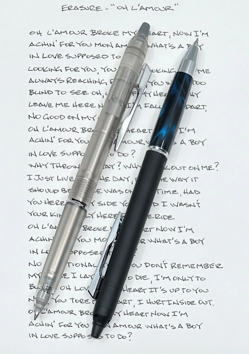
I pre-ordered the Monoc in December and picked it up at the Philly Pen Show two weeks ago. After immediately inking up the pen and writing with it for a while, I wanted to chat with Ian to better understand his latest creation. And since pictures are worth a thousand words, I decided to handwrite this review so you can see writing samples.

The Monoc is the name of the in-house nib and feed system designed and created by Schon Dsgn. The nib is cut from a rod of titanium and the feed is made from Ultem, which is an extremely durable engineered plastic. Making the nib from a rod of titanium versus stamping from a sheet means that you can have the nib and housing as a singular piece, so there is no need for a separate housing to hold the nib and feed as a unit.

You can unscrew the nib and feed for use in any Jowo 6-compatible pens.

The name “Monoc” is derived from monocoque construction which is more common in car racing and airplane manufacturing. Basically, it means that it is made from a single “shell” of material which provides strength, giving it a technical advantage from being single piece versus being constructed from multiple parts.
While known mostly as a machinist and engineer, Ian is also a designer and an artist of sorts. Maybe not in the Van Gogh kind of way (although this nib is a work of art), but in the way he approaches product ideas and designs. The Monoc is not out to solve some nib or writing experience problem; it’s about “bringing something new and different to the pen world.” The whole process around coming up with a new design, workflow, cutting out the nib from a rod of titanium versus sheets, figuring out how to angle the nib and feed so that it flows well, making something unique, even if it is extremely difficult, expensive and time-consuming - this is what gets Ian jazzed up. While he loves all the products that he makes, the Monoc is really his passion project.


If you use a standard international converter, you just dip the nib into a vial or bottle of ink and use the converter to draw up ink as usual (which I just had to do because I was writing the pen dry at the bottom of the previous page) and you’re ready to write as the feed is already primed with ink. If you’re using a cartridge, however, you will need to get the ink to flow to the feed and saturate it so it can start writing. To do so, orient the pen nib down after inserting the cartridge until you see ink flowing to the tip of the feed and nib, then invert it nib up for about 5 seconds. Repeat a few times, blot and you should be good to go. More detailed instructions are included with the nib.
The Monoc is a wet and smooth writer, with just a hint of feedback; not wet like a fire hose but definitely not a dry writer. Widthwise, I would describe it as a “wet medium”, almost broad. Ian designed this nib to give you “a consistent, predictable writing experience.” Traditionally, titanium nibs (most notably by Bock) were bouncy and prone to being sprung if you bounced them a little too hard. The Monoc is made from a different grade of titanium, which is stronger, and the nib is also thicker than stamped nibs. This makes it a much stiffer nib than gold, titanium or even steel nibs, such that when you put it to paper, you won’t get as much tine movement (at the microscopic level), resulting in a more consistent writing experience for a wider range of writers. Because it is a firm nib, do not expect it to be bouncy or flexy. If I had to compare it to something already on the market, I would say it has the stiffness of a Jowo steel nib, with the wetness of a Pelikan gold nib and the slight feedback of a Platinum gold nib.


Here are some writing samples with nibs of different nib sizes/grinds.
Yes! You can use a bulb syringe or converter to clean the nib, like you would with any other cartridge/converter fountain pen, but Ian and team have included a specially-drilled syringe since most syringes don’t fit on the end. You don’t have to use it, it just helps with cleaning if you don’t already have a bulb syringe. Because the nib and feed are hand-set and tuned, do not try to take the nib and feed apart. For this reason, I would advise against using shimmer inks with the Monoc.


Right now, there is an introductory price of $400 for the nib, which includes a black, full-size aluminum Schon DSGN pen. You can also get a different pen body and apply $100 towards the purchase of that (please read the website for more details on the offer). I picked the black Ultem feed and blue anodizing for the nib engraving. At some point, the nib will be offered separately, but right now, this is a good deal since this price includes a pen. Lastly, the nibs are made to order, so you won’t get your nib & pen right away. There is a limited number of nibs that can be made each month, so you will need to select a month for future delivery (currently, February and March are available delivery options).

Yeah, $400 for a nib. It is a lot, but why so much? Nibs like this aren’t easy to make. Designing and engineering a new nib and feed system is a lot of work, requiring a lot of design and manufacturing time, making and testing prototypes, not to mention taking away resources from making other products. In addition to the R&D and manufacturing time, each nib is individually (and manually) inspected, assembled and hand-tuned - does it even write, do all of them write correctly, are the feeds delivering ink properly? Once it is put together and all tuned up, every nib then needs to be cleaned, polished, anodized, and all of that takes a lot of time. Each nib takes countless hours post production to make. To put it into perspective, Ian said they can only make hundreds of these nibs each year, not thousands.

First of all, this is definitely not a product for everyone. It is an expensive purchase. It will not miraculously make your handwriting stunning (though with regular practice, it certainly could help). You would get this not only because it writes well, but because it is a gorgeous nib. Because it is a technical marvel. Because titanium is cool, but also because this titanium nib won’t spring on you. And I’ll be honest, because it is sexy as heck. It’s like the Pilot Myu or Murex - people don’t love them because they are necessarily the best writers out there, but because they look and feel amazing. And while I really like how the Monoc writes, I love how it looks even more. This is definitely an emotional purchase as opposed to a functional one and I have zero regrets.


If you are looking for a Fine, Extra Fine or Needlepoint, the Monoc is not for you, though one can hope that other nib sizes will be offered in the future. Ditto if you’re looking for a flexy nib or an inexpensive “instabuy” product. But if you value creativity and ingenuity of this project, the pushing of boundaries of what one man and his team can do, the inevitable “holy crap, that’s gorgeous” or “oh wow, this is nice!” responses that you’ll get when you bust it out at a pen meetup, as well as a really nice writing experience, the Monoc just might be for you.
(Disclaimer: All products shown were purchased by me, at regular prices. I preordered the Monoc from the website in December and picked it up in January.)
Enjoy reading The Pen Addict? Then consider becoming a member to receive additional weekly content, giveaways, and discounts in The Pen Addict shop. Plus, you support me and the site directly, for which I am very grateful.
Membership starts at just $5/month, with a discounted annual option available. To find out more about membership click here and join us!