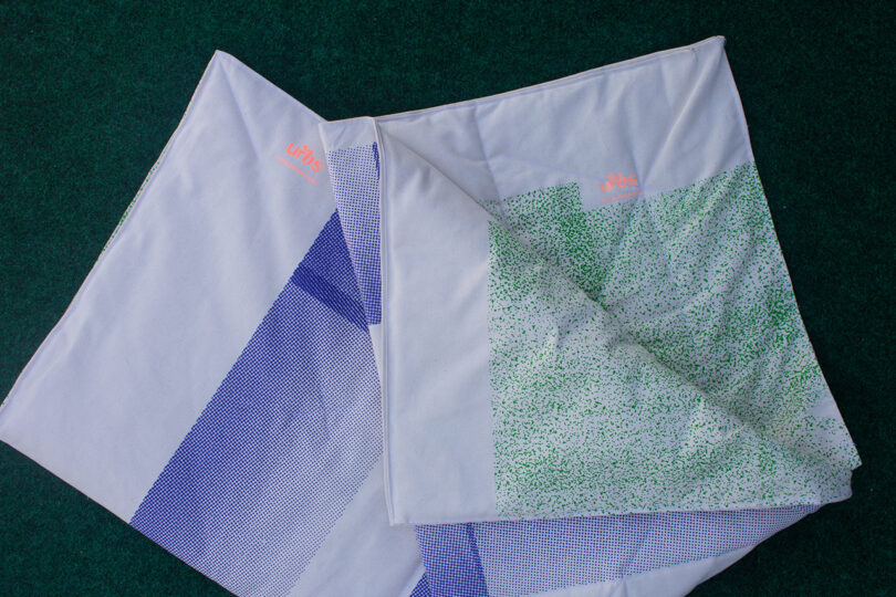
Austin, Texas-based URBS Studio is joining us for July’s Designer Desktop with a background that’s cool-tempered but energizing. Through her interdisciplinary design studio, Alyson Beaton explores the urban culture that surrounds her. The details and detritus observed all contribute to the whole of the studio’s work: grids, grit, signs, symbols, rhythm, scribbles, weeds, chaos, order, and more. URBS translates these visual tales of urban renewal and environmental sustainability through spaces, textile collections, children’s products, and more. The man-made environments that are part of our everyday lives are constantly evolving in different ways, and most of it’s nothing you or I have control over. But we’ll never tire of seeing creativity rise from the most unexpected of places.
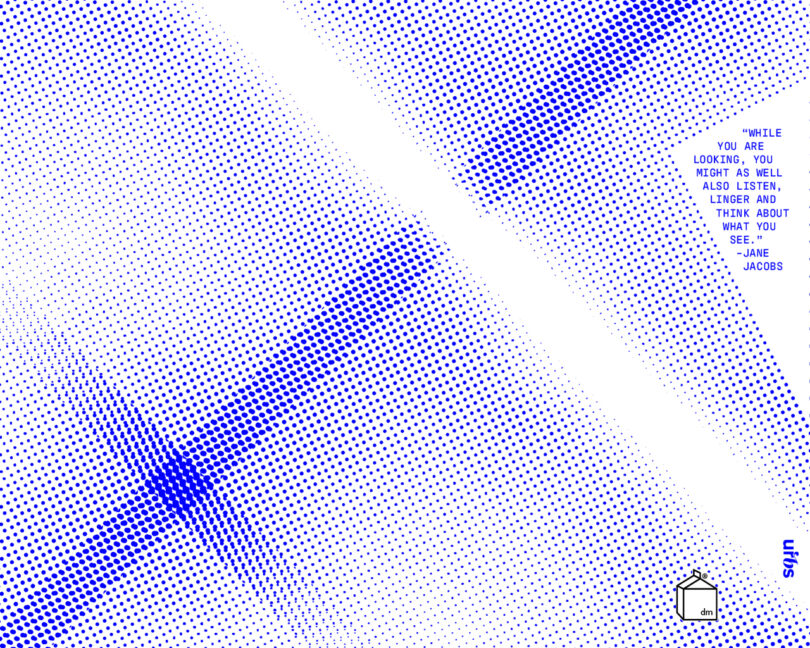
For this month’s Desktop, Beaton shares her Glimmer design inspired by “The glimmer of light that reflects off the glassy buildings when the sun hits just right.” The trippy design is paired with the quote, “While you are looking, you might as well listen, linger, and think about what you see,” from Jane Jacobs.
Download yours with the links below!
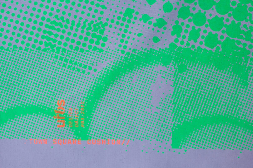
Town Square Text
Whichway Cover

Metropolis
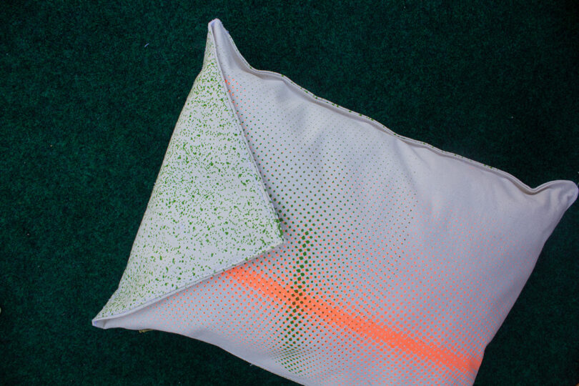
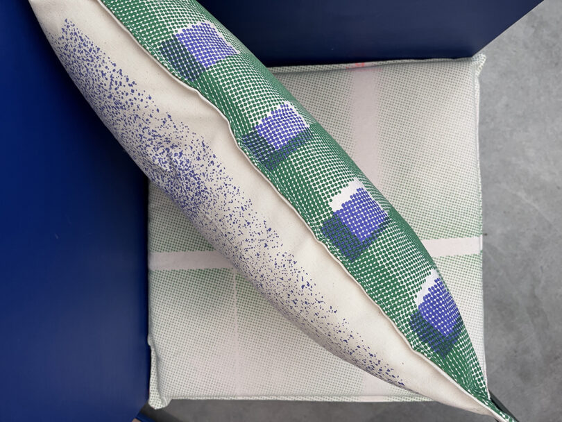
Flaneur Cushion
Facade
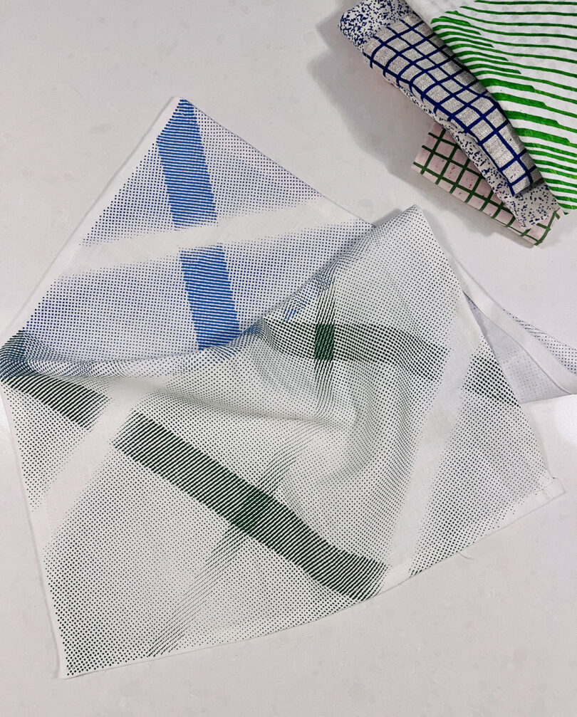
Glimmer

Alyson Beaton, URBS Studio
DESKTOP: 1024×768 \\\ 1280×1024 \\\ 1680×1050 \\\ 1900×1200 \\\ 2560×1440
MOBILE: iPhone XS \\\ iPhone XS Max \\\ iPad Pro
Learn more about URBS Studio here and follow along on IG here.
View and download past Designer Desktops here.

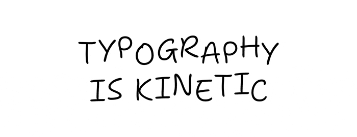
Artist Shantell Martin has been catching peoples’ eyes for more than a decade with her large-scale black-and-white drawings. They simply can’t be ignored! Often times they include messages and questions – such as “Who are You” – in Martin’s signature all-caps handwriting. Now, with the open source release of Shantell Sans, everyone has access to this bold, playful, easy-to-read font!
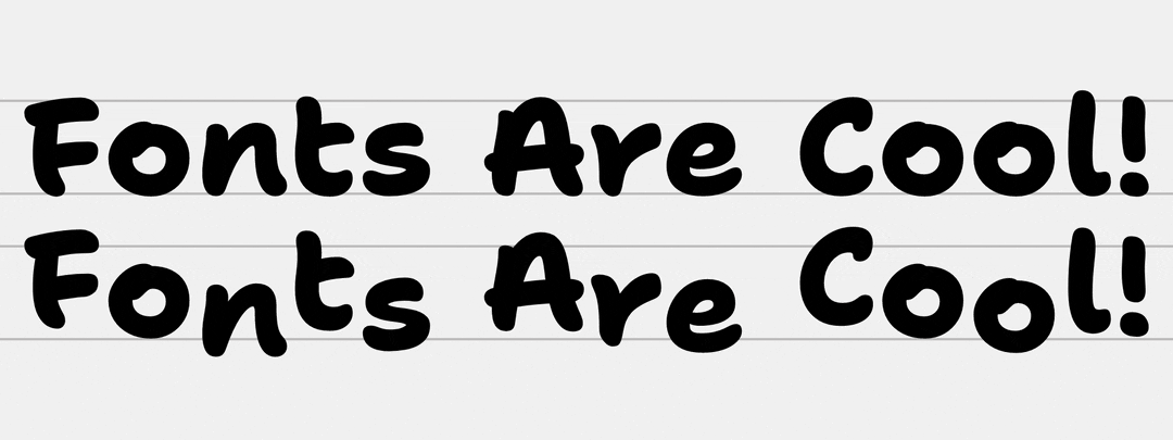
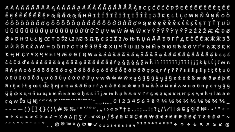
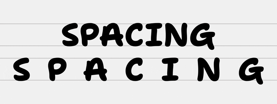
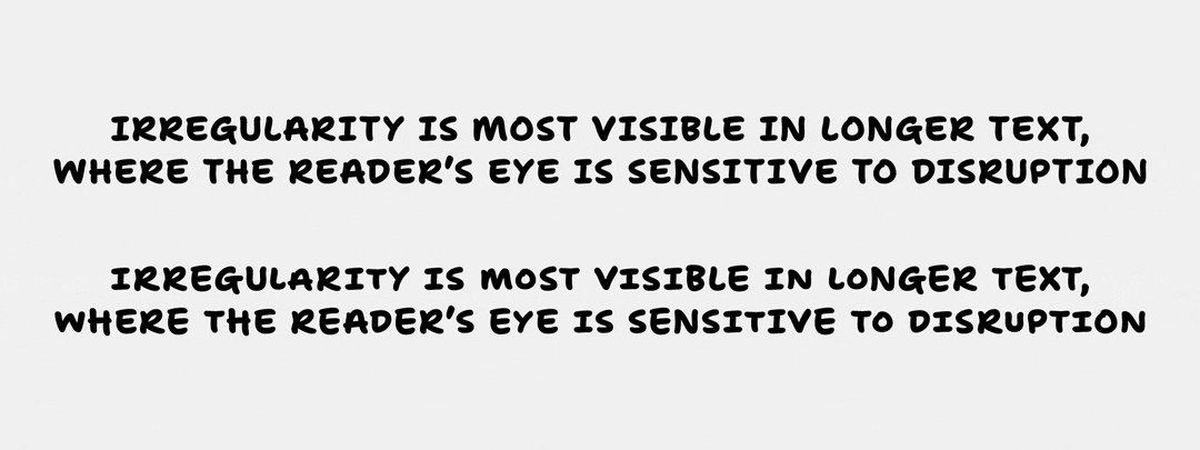
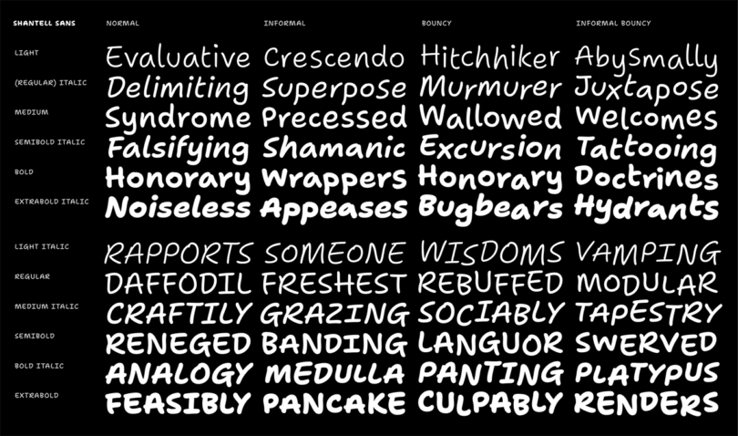
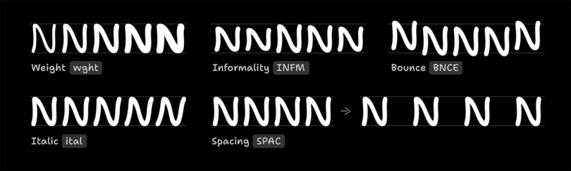
The marker-style font was built for all types of creative expression by Martin, Arrow Type, and Anya Danilova. They made sure to include Latin and Cyrillic characters to support languages throughout the Americas, Europe, Central Asia, and Vietnam. Shantell Sans can be adjusted by weight, spacing, informality, bounce, and italics. It’s also worth mentioning that its all-caps design is especially easy to read.
Martin’s relationship with fonts and type go way back because she lives life as a proud dyslexic. “I always wanted to reclaim that space due to my dyslexia, and defeat my past challenges. The creation of my own font was an innate process and an extension of my artwork, and something I always wanted to do,” she said. “I think fonts can really change the mood of a person in the way that they can be dense and limiting, or, on another hand, open and playful. I think we do pick up on these subtle messages on a subconscious level. I wanted to share my work in a new, exciting medium accessible to anyone.”
Fun, welcoming, energetic, approachable, and creative are just a few of the words Brooklyn-based Arrow Type’s Stephen Nixon used to describe Shantell Sans. “The variable axes of bounce, informality, and spacing take the basic font and add in more of the natural variance and personality from Shantell’s writing, and I especially hope to see people find uses for those in animated text in video titles and stuff,” he shared. “Shantell Sans is a little bit like an elevated, less stiff Comic Sans. It’s also a little bit soft and inky like Cooper Black or Windsor.”
Download Shantell Sans for free here.
To learn more about the making of Shantell Sans, visit shantellsans.com.