The Home Office has revealed how much it believes it will cost to send migrants arriving in the UK to Rwanda – a staggering £169,000 per person. This estimate is even more surprising when you consider that one of the aims of the government’s migration policy is to stop spending billions of pounds on housing refugees in the UK.
Although the Court of Appeal has ruled the government cannot legally proceed with its plan to send deported migrants to Rwanda, the prime minister, Rishi Sunak, has already said the government will appeal it in the supreme court.
The government has arrived at this £169,000 number from five separate calculations. Each of these is itself wildly uncertain and, as the government’s own assessment notes, does not include a wide range of other costs that are sure to emerge. That implies that the true cost per head is likely to be even higher.
The largest component of the £169,000 is £105,000 for “third country costs”. This is the amount the government believes it will have to pay to cover the costs incurred by a third country like Rwanda to host a refugee if they cannot be returned to their home country.
The calculation is based on a National Audit Office estimate of the cost of hosting Syrian refugees in the UK. This was published in 2016, at the beginning of the programme to take in Syrian refugees and so is itself a forward-looking estimate. The NAO itself recognised that the actual cost was “uncertain”.
To reach £105,000, the government has taken the estimated average cost per refugee coming to the UK in 2016 (£17,340), multiplied it by five and transformed it into 2023 costs. This was based on the Syrian resettlement scheme lasting five years – but there is no explanation as to why they assume someone deported from the UK would need support for that period.
A presumably more accurate estimate of these costs has recently been agreed in the partnership signed with Rwanda but the government has not published this figure, deeming it “commercially sensitive”. Publishing a figure that the UK will use in all future agreements (still to be negotiated) will result in this being used as a minimum starting point by any other third-country negotiators.
“Flight and escorting costs” are estimated at £22,000 per person. This is based on an “uncertain assumption” that 50 people will be deported per flight, which is extremely optimistic. In 2022, an average of 25 people were on each deportation flight out of the UK and most of these were to European destinations, which are easier logistically and cheaper than other third countries outside of Europe. And that only includes flights that took off.
Another element of the calculation is “Home Office resource costs”, estimated at £18,000. This is probably the most accurate component of the cost estimate, since it is based on current average legal costs of appeals. Still, this figure does not include costs to retrain Home Office officials or related capital costs for things such as building new detention centres.
The final two costs are more problematic. The figure of £7,000 for detention assumes 40 days between arrival and deportation. The inaccuracy of this figure may be judged by the 374 days that the passengers on the inaugural flight to Rwanda have spent in detention between June 14 2022, when the flight was cancelled, and the judgment on June 29 2023 that Rwanda deportations cannot go ahead.
Finally, £1,000 for “Ministry of Justice costs” includes only the costs of legal aid, not all of the other costs incurred by the Ministry of Justice to hold legal proceedings.
The final hole in these calculations comes from the recognition that this cost is only for those who are successfully deported and does not include those who, for whatever reason, remain in the UK.
Usually, economic impact assessments lay out the financial cost of legislation as a whole. So it’s notable that we’re now getting a “cost per head” of the proposed policy.
But the most surprising element of the impact assessment of this policy, as immigration expert Lucy Mayblin has pointed out, is the Home Office’s frank admission that it has no idea how the bill will work once it becomes law.
The document itself states that this is “a novel and untested scheme, and it is therefore uncertain what level of deterrence impact it will have”.
In other words, the government does not know if people will stop trying to enter the UK if they know they could be deported to Rwanda or another third country on arrival. That uncertainty around how many people are implicated makes it impossible to calculate a total cost. And given the limited success of deterrence tactics so far, it seems entirely plausible that the eventual cost will be much higher.
Michael Collyer is Chair of Sanctuary on Sea, the Brighton and Hove branch of City of Sanctuary. He is also Chair of the Independent Advisory Group on Country of Origin Information, within the Office of the Chief Inspector of Borders and Immigration. Both are voluntary positions. This article is written in a personal capacity. He currently receives funding from the Economic and Social Research Council (grant numbers ES/T008067/1 and ES/T004509/1).
Finland has been the happiest country on earth for the past six years, according to the World Happiness Survey. This survey relies on the Cantril ladder life evaluation question:
Please imagine a ladder with steps numbered from zero at the bottom to 10 at the top. The top of the ladder represents the best possible life for you and the bottom of the ladder represents the worst possible life for you. On which step of the ladder would you say you personally feel you stand at this time?
Finland comes out top, followed by Denmark and Iceland. Just why Finns are happier than others comes down to a number of factors including lower income inequality (most importantly, the difference between the highest paid and the lowest paid), high social support, freedom to make decisions, and low levels of corruption.
The graph below shows all 44 counties for which there is both happiness data and income inequality data, each as a coloured dot. The vertical scale shows average happiness, the horizontal scale income inequality.
Average levels of happiness and inequality by country
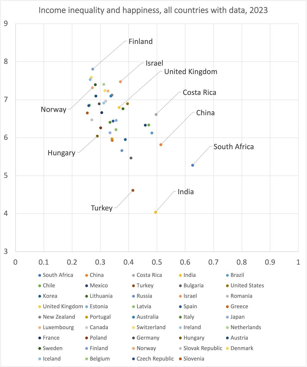
The measure of income inequality used here is the Gini coefficient of income inequality, as reported by the OECD. It is the highest rate recorded in each county in any year after 2010 up to the most recent year for which there is data. The graph shows the close relationship between these two measures. In general, when income inequality is larger, money matters more and people are less happy.
Finland also has other attributes that may help people feel happier. It has a highly decentralised publicly funded healthcare system and only a very small private health sector. This is far more effective and efficient than some alternatives used in other countries. Public transport is reliable and affordable, and Helsinki airport is ranked as the best in northern Europe.
There is a Finnish proverb that seems relevant here: Onnellisuus on se paikka puuttuvaisuuden ja yltäkylläisyyden välillä (Happiness is a place between too little and too much).
Finland, Norway and Hungary report similar levels of income inequality, yet people in Finland are, on average, happier. Why is this?
According to the World Inequality Database, the highest-paid tenth of people in Finland take home a third of all income (33%). That contrasts with the same group taking 36% in the UK and 46% in the US. These differences may not appear great, but they have a huge effect on overall happiness because so much less is left for the rest in the more unequal countries – and the rich become more fearful. When a small number of people become much richer, this is an understandable fear.
Read more: How to ditch 'fomo' and foster 'jomo' – the joy of missing out
In 2021, it was suggested by a sociology professor that simply by having more reasonable expectations, people in Nordic countries appeared to be happier. However, that cannot explain why Finland is so very different from Norway on the happiness scale.
All kinds of explanations are possible, including slight nuances of language as well as culture. There is now even the question of whether this global survey is beginning to introduce its own bias, as Finns now know why they are being asked the question (they moved even further ahead of Denmarkin the most recent survey).
However, it is very likely that Finland having more equitable schools, where you are likely to get a good education whichever you choose, as well as a fairer school policy than Norway (almost all Finns go to their nearest school) might actually matter too. So too, a better housing policy with a wide variety of social housing and lower homelessness, a health service with waiting times that are the envy of the world – sometimes just being a matter of days (even during the worst years of the pandemic) – and numerous other accolades.
Finland ranks first, second or third in over 100 global measures of economic and social success – better than Norway does. And it has less money overall (and hardly any oil). You could excuse the Finns a little smugness (omahyväisyys).
Why does Hungary do so badly despite the income gap between its people being hardly any wider than in Finland and Norway? One could argue that this is to do with its divided politics. In 2022, the European parliament suggested that “Hungary can no longer be considered a full democracy”.
Freedom matters to people greatly, as well as freedom from fear, and that could explain also why Turkey and India have lower levels of happiness than their levels of economic inequality might predict.
In contrast, South Africa and China may be a little happier than their levels of inequality would suggest. South Africa became a democracy in 1994 shortly after Nelson Mandela was freed, and many people will remember the previous period. People in China are not as fearful as they are often portrayed in the west.
Most countries exhibit happiness levels (and much else) that are very predictable from their inequality levels. The UK is spot on in the middle of what you would expect for one of Europe’s most economically unequal countries.
The graph above also shows that (almost as unequal) Israel is a little happier than it ought to be – although it is not clear that the sample taken there included all groups that currently live under that state. Also, that sample was taken in 2022, before the recent widespread protests in Israel.
The other outlier shown in the graph is Costa Rica, where the president said in 2019:
Seventy years ago, Costa Rica did away with the army. This allows for many things. Eight per cent of our GDP is invested in education because we don’t have to spend on the army. So our strength is human talent, human wellbeing.
So what can the people of a country do if they want to be happier? The most important thing is to elect governments that will ensure the country becomes more equal by income. After that, ensuring your social services – school, housing and healthcare – are efficient and equitable matters most. And finally, consider your degree of freedom, whether you are actually including everyone in your surveys, and how fearful your population is.
Danny Dorling does not work for, consult, own shares in or receive funding from any company or organization that would benefit from this article, and has disclosed no relevant affiliations beyond their academic appointment.
The vast boreal forests of the Northern Hemisphere stretch from Scandinavia through Siberia, Alaska and Canada. They cover a tenth of the world’s land but hold one-third of the land’s carbon, stored mainly in organic-rich soils and in trees. Now, a new study in the journal Science provides further evidence that emissions from wildfires in high northern latitudes are already increasing at an alarming rate.
In these forests, the cold climate and often waterlogged ground means fallen tree bark, needles and other dead organic matter takes a long time to decompose. This has allowed the soils to accumulate carbon over thousands of years after the ice sheets retreated at the end of the last ice age. Since then, these ecosystems have mainly been shaped by wildfires ignited by lightning.
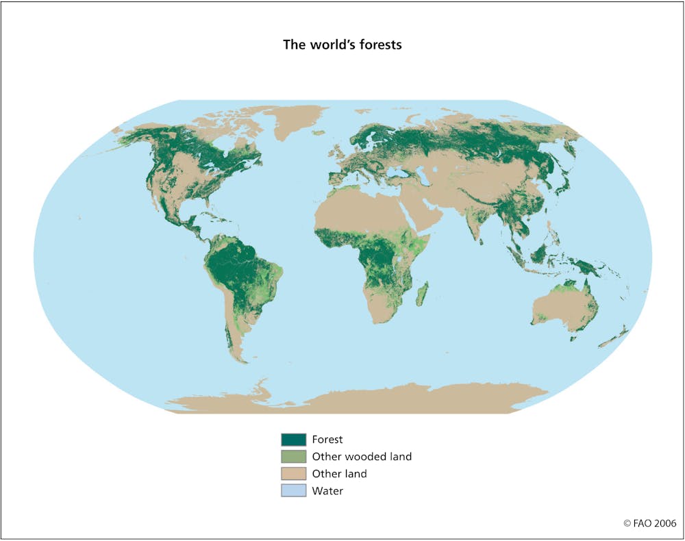
These fires release some of the carbon stored in trees and in the upper layer of soil back into the atmosphere. The release of soil carbon is hugely significant. It means a boreal forest fire will release 10 to 20 times more carbon compared to a similarly sized fire in other ecosystems where fires consume mainly vegetation and where the soil itself does not contain enough carbon to burn.
However, these boreal forests might burn only once a century, sometimes even less often than that. This is much longer than in most other fire-prone ecosystems, and the extra carbon stored in soils and trees in the long period between fires normally exceeds the losses from fires. For the past 6,000 or so years this delicate relationship between carbon uptake and release was quite stable and boreal forests served as a globally important carbon sink.
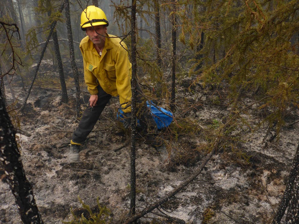
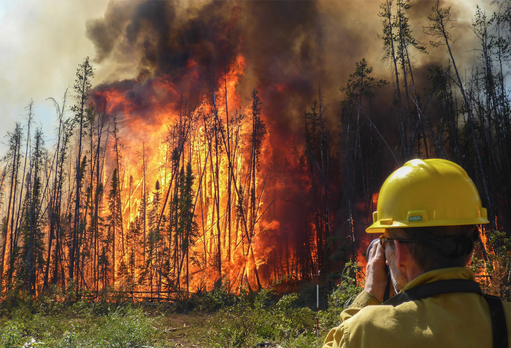
But global heating, which is particularly pronounced in the Northern Hemisphere’s high latitudes, is threatening the balance. Soaring temperatures have lengthened the fire season and increased the frequency and severity of wildfires and there is growing evidence that as the interval between fires shortens, more carbon is being released from organic soils in boreal forests than the ecosystems can reabsorb.
That’s where the latest study in Science comes in. The researchers, mostly based in China, used satellite observations of wildfire smoke plumes to look for carbon monoxide, which is invisible to the naked eye but shows up at certain infrared wavelengths. Carbon monoxide isn’t itself a greenhouse gas, but if you know how much of it there is, you can infer the amount of carbon dioxide in wildfire smoke as well.
This contrasts with the more conventional methods employed by current wildfire emission models. These also use satellites, but record active fires or burned areas simply by comparing before and after images. They then factor in a range of assumptions on how much vegetation would typically have been consumed and how much carbon is emitted per area of different types of vegetation and soil burned.
While this new carbon monoxide method has its own uncertainties, it provides independent and more direct estimates of wildfire emissions. It also has potential to give us a more detailed understanding of the differences in wildfire carbon emissions between different ecosystems.
The new study showed a significant increase in emissions from boreal fires over the past two decades. Things were particularly dramatic in 2021, when they comprised a record 23% of global vegetation wildfire emissions, more than twice their contribution in a more typical year.
If this trend continues, the boreal forest may very soon become the dominant source of global emissions from biomass burning, overtaking the notorious tropical peatland fires (such as those in Indonesia in 2015) in terms of global significance and adding further to the “fire–carbon-climate warming” feedback.
The 2021 fire season was made particularly extreme by simultaneously hot and dry conditions both in North America and northern Europe and Asia. If such weather patterns do become more frequent, leading to more fires in the boreal region, these forests may reach a “wildfire tipping point”. A study examining the extreme fires of 2014 in boreal north-west Canada demonstrated that some areas were already turning from carbon sinks into net emitters. This new study covering the entire boreal biome suggests this ecosystem as a whole – from Siberia to Canada – is rapidly approaching this tipping point.
Don’t have time to read about climate change as much as you’d like?
Get a weekly roundup in your inbox instead. Every Wednesday, The Conversation’s environment editor writes Imagine, a short email that goes a little deeper into just one climate issue. Join the 10,000+ readers who’ve subscribed so far.
Tadas Nikonovas receives funding from the UK Natural Environment Research Council (NE/T003553/1)
Stefan H Doerr receives funding from the UK Natural Environment Research Council (NE/T003553/1; NE/T001194/1; NE/X005143/1), the Swedish Research Council (Urgent grant Nr. 2018/02700) and the European Commission (H2020 FirEUrisk project no. 101003890)