 Login
Login
“Sustainable” design is a paradigm that emphasizes the impact that design practices and workflows have on the environment with the goal of reducing carbon emissions. The design decisions we make are reflected in our planet’s climate, from the energy consumption of the tools we use to how the products we build interact with the environment and plenty of other things in between. In this collection, we compiled resources to help you understand the principles of sustainable design and how to integrate them into the way we work and the things we make.
Design For SustainabilityThe EU Science Hub’s Sustainable Product Policy estimates that over 80% of all product-related environmental impacts are determined during the design phase. But how can design teams ensure that sustainability is at the core of every design choice they make? To help their designers develop design habits about sustainability, IBM published “IBM Design for sustainability.”
At the heart of the framework is the idea that the user, community, and social value should outweigh any negative environmental and social impact in the present and the future. To achieve this vision, experiences need to be inclusive, easy to learn and use, and efficient for both users and overall power consumption.
The sustainability checklist is part of the framework and it gives practical tips for optimizing designs to meet these goals. It’s no rocket science, but the checklist does offer useful considerations that will help improve performance, speed, and responsiveness.
Sustainability Methods and Design PrinciplesThe Sustainability Guide from SVID is an overarching framework for sustainable design and development practices that contains sections wholly dedicated to methods and design principles that are centered around sustainable practices.
The design section illustrates the system-wide lifecycle of the design process, describing it as a circular system where everything in a product design is interconnected and linked by environmental criteria that is embedded at all stages.
The methods section is an archive of tools, resources, case studies, and expert advice that can be used to educate a team, as well as kickstart a team into sustainable environmental practices.
Sustainable Design StrategiesThe crux of sustainable design strategies, according to Leyla Acaroglu, is ensuring that the tools we use in a design workflow and how we use them today do not have a negative impact on the planet in the future.
What Leyla does in this extensive Medium post is curate an ecodesign strategy set that covers core considerations for product design that build sustainability into the process, from manufacturing and recyclability to efficiency and modularity. By including these considerations into the design lifecycle, it is possible to develop products and services that reflect sustainable practices, such as a product’s ability to dematerialize, how easily it can be recycled, how long it lasts, whether it can be dissembled by customers, and to what extent it can be repurposed for other uses.
Sustainable Web Design PracticesIs the admin experience as easy and intuitive as the front-end experience? Is the message useful for your target audience? Could a Progressive Web App be an efficient solution? A lot of questions need to be asked when you want to deliver digital products and services that respect the principles of the Sustainable Web Manifesto. The site Sustainable Web Design helps you find the right sustainability strategy for your project.
The strategies are divided into different categories: design, client and project ethos, content and marketing, development, hosting, and business operations. In each category, you’ll find questions worth considering and an explanation of why it matters. Links to further reading resources let you dive deeper into each aspect. A helpful guide that supports you on every step of the design process.
Sustainable Web Hosting CompaniesAccording to some estimates, the impact of the Internet and our gadgets on global greenhouse emissions is similar to that of the airline industry. To speed up the transition towards a green, fossil-free Internet, there’s a question we all can ask ourselves: Are our websites hosted green?
The Green Web Foundation built a checker to help you quickly find out if your hosting provider is using green energy or compensating for its services. All you need to do is enter the URL. If you want to make the switch to a green hosting provider, the foundation also published a directory of 478 green hosting companies in 35 countries. A small step that makes a difference.
Sustainability Score CalculatorSo, just how large is the carbon footprint of your website? The Internet uses electricity, of course, but it also relies on data centers that distribute information, and the energy to power each and every device that receives that information. Even a small website has a carbon footprint.
The Sustainability Score Calculator is one way to find out. Employing a methodology that takes energy-consuming attributes into account, this free calculator estimates the amount of carbon dioxide produced by a particular website. It looks at the weight of images on a page, whether web fonts are integrated, and any front-end frameworks in use, among other considerations, to inform its calculations.
The exact amount of carbon dioxide produced by a website can probably be evaluated in a number of ways, and this specific calculator makes its own assumptions. Regardless of the exact inputs used in the results, the fact that the Sustainability Score Calculator can come up with a rough estimate for a website’s carbon dioxide output on a per page view basis is a reasonable starting point for determining just how big of a footprint a site has on the environment.
Sustainable UX Design ToolkitThe Sustainable UX Design Toolkit is a resource produced by the Sustainable UX Network, a non-profit organization that has established a community of designers around sustainable environmental design practices.
The organization developed the toolkit as a Miro board that is freely available to clone into your own Miro account. Not a Miro user? You can still reference the embedded board and zoom into it to view the four-step process that walks you through concept to presentation, providing useful considerations, best practices, and even templates you can use right away.
Sustainability Nudges in UXIn the last few years, customers have become more and more aware of how important environmental friendliness and social responsibility are when making a purchase. But even with increased awareness, businesses still play a key role in informing, enabling, and encouraging sustainable behavior. In his post “7 behavioural UX approaches encouraging sustainable purchases,” Damien Lutz takes a closer look at how e-commerce businesses encourage sustainable purchases and what we can learn from them.
From Zalando’s sustainability filters and Amazon’s Climate Pledge Friendly Hub to Qantas’ Green Tier membership and sustainable shopping assistants, Damien analyzes different strategies of nudging customers towards more sustainable decisions. Based on his observations from these real-life examples, he summarizes practical behavioral UX tips that help everyone create experiences that promote sustainability. Interesting insights are guaranteed.
Green the Web PodcastSince 2019, UX/UI designer Sandy Dähnert shares her passion for a sustainable web on her site Green the Web. Last year, she started the Green the Web Podcast on all things sustainable design best practices, ecological and social user research, information architecture, user interface design, and more.
Whether it’s sustainability-infused user journey maps, UX/UI factors for a lightweight website, or approaches for greener checkout, in the podcast Sandy shares her deep love of sustainable UX and UI design to encourage everyone to step into green design and play an active role in shaping this new design philosophy. You can listen to the podcast on Spotify or Apple Podcasts.
Sustainable UX PlaybookThe Sustainable UX Playbook is a yet-to-be-released work in progress by the same folks who maintain the Sustainable UX Manifesto. The playbook is set to provide guidelines, best practices, and examples to help you and your team adopt an environmentally-centered design approach.
The exact date of when the Sustainable UX Playbook will be available is to be determined, but it will be published to SustainableUXPlaybook.com (which currently redirects to the Sustainable UX Manifesto) when it is ready.
Sustainability Figma KitThe Sustainability Figma Kit that Elisa Fabbian, Rachele Pedol, and Margherita Troilo created helps digital designers move from human-centered design to a more sustainable life-centered design approach. It consists of a learning guide, 23 action cards, and a flowchart.
The learning guide introduces you to the broader context and importance of designing products and services with a reduced environmental impact. The action cards explore problems you might encounter in different phases of the design process and how to solve them. Last but not least, the flowchart helps you find out which sustainability actions can be applied to the specific type of project you are working on by providing useful tips for designing in a more conscious way.
Sustainability Innovation FrameworkSustainability Innovation Framework is an effort from Sebastian Gier that is all about the planning phase of an effort to scope work for projects aimed at reducing carbon emissions.
The process is mapped to traditional design thinking, helping you start work by aligning objectives and documenting assertions before tying them into user needs. What makes this framework particularly useful is that it helps prioritize the ideas generated by the process by their environmental impact.
The entire framework is available as a collaborative FigJam board that can be cloned to your own Figma account.
EcoCards Game Workshop ToolkitOne of the most difficult hurdles to adopting a sustainable design process is figuring out how to discuss the topic as a team. Getting everyone on the same page about what it means to design sustainably and how to establish a process for it are paramount for any team.
That’s what makes the EcoCards Game Workshop Toolkit such a valuable resource. The toolkit is a collection of three card-based games designed to facilitate team discussion on sustainable design practices. Each game is framed as a “workshop” meant to take place at different stages in the design process, detailing the game rules with a series of steps using a plain deck of playing cards to move the discussion forward.
The EcoCards are created as a FigJam board that can be cloned to your Figma account. They are available in English and French translations.
Team Sustainability RetrospectiveOK, so perhaps your team has adopted a sustainable design process that aims to reduce carbon emissions. How do you know it’s working? That’s the purpose of the Team Sustainability Retrospective, a Miro template produced by Paddy Dhanda.
Rather than high-fiving your team for implementing a sustainable system, this set of templates will help you assess whether or not your efforts are paying off in a streamlined five-step process. This way, your team can re-group after the implementation of the design process and properly measure its impact with data that form actionable insights for improving the process even further.
World Wide Waste BookWorld Wide Waste is a book by Gerry McGovern, aiming to debunk the perception that being “digital” is akin to being “green.” It provides a healthy dose of statistics about the impact of digital products and services and details the crisis of energy consumption in the world.
For example, McGovern attempts to clear up the misunderstanding that cloud technologies are somehow ethereal elements that are carbon-free, but rather physical data centers that result in large quantifiable emissions. If nothing else, this book will equip you with the information you might need to help convince your team to adopt more sustainable practices with statistics and case studies to make the case.
Sustainable Web Design BookIf the World Wide Waste book is all about defining and diagnosing unsustainable design practices, then this offering from A Book Apart is aimed at curing those symptoms. Written by lead author of the “Sustainable Web Manifesto” Tom Greenwood, Sustainable Web Design is a collection of practical web design advice for everything from how to measure a website’s environmental impact and identifying low-carbon design practices to creating energy-efficient development processes and creating a hosting environment that helps reduce climate costs.
Like all A Book Apart publications, Sustainable Web Design is available in print and digital editions — just remember that the digital copy is not a carbon-free option, as many of the resources in this roundup have noted. Then again, the printed copy also has climate considerations due to the costs of transporting the book to your front door. Just buying the book is an excellent example of the conundrums of sustainable design.
Climate Tech Guide For DesignersIf you’re looking for help establishing yourself in a career in sustainable design, Enrique Allen and the Designer Fund team offer the Climate Tech Guide for Designers.
This guide is less about teams adopting sustainable design standards than it is a resource for helping you make a decision about where you work and who you work for. How passionate is the company about climate? What problems is the company trying to solve, and are the solutions based on climate technology and considerations? These are the types of questions that will allow you to find the right fit for your career.
What makes this Climate Tech Guide for Designers especially useful is that it goes beyond company considerations by offering advice for how to position yourself for a career in climate technology, capping things off with an extensive list of companies that demonstrate sustainable practices.
Ethical Design HandbookThe Ethical Design Handbook is a book we offer right here at Smashing Magazine. Written by authors Trine Falbe, Martin Michael Frederiksen, and Kim Andersen, these guidelines serve as a roadmap to learn about adopting and integrating ethical design practices into a business model.
Wait, why are we talking about “ethical design” when we’ve been sharing resources on “sustainable design”? Ethical and sustainable design work hand-in-hand, as ethical design relies on sustainable digital business practices in addition to a slew of larger concepts that determine an organization’s ethical practices, from transparency in how data is collected to how inclusiveness is built into a design. In other words, ethical and sustainable design are united by a cause to prevent harm to people. A sustainable design process supports a healthy environment that, in turn, supports an ethical responsibility to care about the impact we have on the planet.
All in all, the Ethical Design Handbook is about leveraging ethical business practices as a market differentiator that can be used as a competitive advantage. Sustainable design principles are part of that matrix, demonstrating that sustainable practices can be aligned to — and even enhance — business objectives.
Ethical Design ResourcesAnother useful resource to help designers and developers live up to the responsibility of causing no harm and ensure that the experiences they build are inclusive, honest, and safe are the Ethical Design Resources which Lexi Namer maintains in collaboration with the Ethical Design Network and Kate Every.
On Ethical Design Resources, you’ll find articles, books, courses, frameworks, tools, talks, videos, podcasts, and more covering different aspects of ethical design. They help you assess the impact of your design decisions, uncover harmful practices, and support you in making design choices that respect your users.
And if you need more resources, take a look at Ethical Design Guide and Humane By Design.
Wrapping UpThere you have it, a deep collection of toolkits, frameworks, and resources you can use to learn about sustainable design practices and how to adopt them into your own design process. Notice how the collection reveals that sustainable design is a multifaceted topic that considers everything from how we work to the specific tools we use to work. It even covers product design as a whole and the decisions that impact the sustainability of a product, not to mention how business objectives influence environmental objectives.
There may not be a single silver bullet or resource that immediately aligns you and your work with sustainable design practices. That said, the resources provided in this roundup can help you make big and small gains alike, whether it’s reflected in something as seemingly small as the hosting provider you decide to use for your website or something more involved such as integrating environmental considerations at every stage of the design process.
Often, it’s the little things that inspire us and that we treasure most. The sky shining in the most beautiful colors at the end of a seemingly endless summer day, riding your bike through a light rain shower on a hot afternoon — or maybe it’s a scoop of your favorite ice cream that refuels your batteries? No matter what big and small adventures July will have in store for you this year, our new collection of wallpapers is bound to cater for some inspiration along the way.
More than twelve years ago, we started this monthly wallpapers series to bring you a variety of beautiful, unique, and inspiring wallpapers every month. It’s a community effort made possible by artists and designers from around the globe who challenge their creative skills to cater for some good vibes on your screens. And, well, it wasn’t any different this time around.
In this post, you’ll find their wallpaper designs for July 2023. All of them come in versions with and without a calendar and can be downloaded for free. To make the month even more colorful, we also compiled a selection of July favorites from our wallpapers archives at the end of this post. A huge thank-you to everyone who submitted their artwork — this post wouldn’t exist without you!
“Two friends sat under the enchanting moonlight, enjoying the serene ambiance as they savoured their cups of tea. It was a rare and precious connection that transcended the ordinary, kindled by the magic of the moonlight. Eventually, as the night began to wane, they reluctantly stood, their empty cups in hand. They carried with them the memories and the tranquility of the moonlit tea session, knowing that they would return to this special place to create new memories in the future.” — Designed by Bhabna Basak from India.

Designed by Ricardo Gimenes from Sweden.

Designed by Lieke Dol from the Netherlands.

“Hey there, chess champs and rook-ies! Today, we’re rolling out the red carpet for the grandest celebration in the chess universe. It’s World Chess Day, where we celebrate the brain-bending battles, knightly maneuvers, and epic pawn sacrifices that keep us coming back for more! Step into the realm of kings and queens, where the fate of nations is decided over a checkered battlefield. Chess, the ultimate game of mental gymnastics, proves that you don’t need biceps of steel to flex your strategic muscles!” — Designed by PopArt Studio from Serbia.

“On this trip around the world, we return to Europe, specifically to London. We walked through its streets and decided to cross the bridge to enjoy both sides of the city. We may take one of its famous red buses or take a walk along the Thames. In any case, we have a whole month to become true Londoners.” — Designed by Veronica Valenzuela Jimenez from Spain.

Designed by Rebecca Curiel.

“I admire artwork that is made using simple shapes and colors in Illustrator, also known as flat design. The amazing things you can make with these simple shapes are just mind-blowing. The buildings in the artwork come from my hometown ’s-Hertogenbosch in the Netherlands. I am most proud of the great cathedral on the left. The number of hours I’ve put into it is not normal.” — Designed by Mitch van Trigt from the Netherlands.

Designed by Ricardo Gimenes from Sweden.

“July is the time to relax. What about having a rest underneath a… banana tree, lala la la? You know this song? Yes it’s about a mango tree, but never mind.” — Designed by Philippe Brouard from France.

“Everyone’s imagination when reading books is different. One person thinks of a village and another of a city. That’s the beauty of reading.” — Designed by Britt van Falier from the Netherlands.

Our wallpapers archives are full of timeless treasures that are just too good to be forgotten. So here’s a small selection of favorites from past July editions. Please note that these designs don’t come with a calendar.
“Welcome to the sweltering July — the month when it’s so hot that even the fruits are edgy. Our ice-creamy, vibrantly-colored monthly calendar is melting as the temperature rises, so make sure to download it as quickly as possible!” — Designed by PopArt Studio from Serbia.

Designed by Ricardo Gimenes from Sweden.

“This month, we travel to London with Mary Poppins to discover the city. We will have great adventures!” — Designed by Veronica Valenzuela from Spain.

Designed by Lívi Lénárt from Hungary.

“I’m an avid runner, and I have some beautiful natural views surrounding my city. The Smoky Mountains are a bit further east, so I took some liberties, but Tennessee’s nature is nothing short of beautiful and inspiring.” — Designed by Cam Elliott from Memphis, TN.

Designed by Ricardo Gimenes from Sweden.

“Summer is coming in the northern hemisphere and what better way to enjoy it than with watermelons and cannonballs.” — Designed by Maria Keller from Mexico.

“And once you let your imagination go, you find yourself surrounded by eternal summer, unexplored worlds, and all-pervading warmth, where there are no rules of physics and colors tint the sky under your feet.” — Designed by Ana Masnikosa from Belgrade, Serbia.

“July in South Africa is dreary and wintery so we give all the southern hemisphere dwellers a bit of color for those gray days. And for the northern hemisphere dwellers a bit of pop for their summer!” — Designed by Wonderland Collective from South Africa.

“Rain has come, showering the existence with new seeds of life. Everywhere life is blooming, as if they were asleep and the falling music of raindrops have awakened them. Feel the drops of rain. Feel this beautiful mystery of life. Listen to its music, melt into it.” — Designed by DMS Software from India.

Designed by ActiveCollab from the United States.

“In times of clean eating and the world of superfoods there is one vegetable missing. An old, forgotten one. A flower actually. Rare and special. Once it had a royal reputation (I cheated a bit with the blue). The artichocke — this is my superhero in the garden! I am a food lover — you too? Enjoy it — dip it!” — Designed by Alexandra Tamgnoué from Germany.

Designed by Xenia Latii from Germany.
“Warm summer weather inspired the color palette.” — Designed by Marijana Pivac from Croatia.

“I enjoy creating tropical designs. They fuel my wanderlust and passion for the exotic, instantaneously transporting me to a tropical destination.” — Designed by Tamsin Raslan from the United States.

“In summer everything inspires me.” — Designed by Maria Karapaunova from Bulgaria.

Designed by Erik Neumann from Germany.

“What’s better than a starry summer night with an (unexpected) friend around a fire camp with some marshmallows? Happy July!” — Designed by Etienne Mansard from the UK.

“Make sure you have a refreshing source of ideas, plans and hopes this July. Especially if you are to escape from urban life for a while.” — Designed by Igor Izhik from Canada.

“My son and I are obsessed with the Amphicar right now, so why not have a little fun with it?” — Designed by 3 Bicycles Creative from the United States.

Designed by Ricardo Gimenes from Sweden.

“Based in the Alentejo region, in the south of Portugal, where there are large plains used for growing wheat. It thus represents the extensions of the fields of cultivation and their simplicity. Contrast of the plain with the few trees in the fields. Storks that at this time of year predominate in this region, being part of the Alentejo landscape and mentioned in the singing of Alentejo.” — Designed by José Guerra from Portugal.

“Ever watched Joe’s Apartment when you were a kid? Well, that movie left a soft spot in my heart for the little critters. Don’t get me wrong: I won’t invite them over for dinner, but I won’t grab my flip flop and bring the wrath upon them when I see one running in the house. So there you have it… three roaches… bringing the smack down on that pesky human… ZZZZZZZAP!!” — Designed by Wonderland Collective from South Africa.

Designed by Ricardo Gimenes from Sweden.

Designed by Cátia Pereira from Portugal.

Designed by Joana Moreira from Portugal.

“July is coming and the nights are warmer. Frogs look at the moon while they talk about their day.” — Designed by Veronica Valenzuela from Spain.

Design process is messy. You might be following a structured approach, but with all the last-minute changes and overlooked details, too often, it takes a life of its own. And before you know it, you are designing in a chaotic environment full of refinements, final-final deliverables, and missed deadlines.
This article is part of our ongoing series on design patterns. It’s an upcoming part of the video library on Smart Interface Design Patterns 🍣 and is a part of the live UX training as well.
What’s The “Right” Design Process?Of course, there is no “right-and-only” way to frame a design process. It’s defined by whatever works well for you and for your team. Personally, I tend to rely on 4 design models that seem to fit well with my design work:
These ways of thinking about the design process translated into a process that works well for me but has to be adjusted for every project that I’m working on. In a nutshell, here’s how it would work.
A Process That Works For MeThere is no such thing as enough user research. In every project, I start with involving users as early as possible. I explore all the data we have, interview customer support and the service desk, check for technical debt and design issues, backlog items, and dismissed ideas. I explore organizational charts to understand layers of management. I set the right expectations and seek allies.
From there, I would typically spend weeks or even months in diagrams and spreadsheets and endless docs before drawing a single pixel on the screen. I try to get developers on board, so they can start setting up the dev environment already.
I bring in stakeholders and people who have a vested interest in contributing to the success of the project. Voices that need to be heard but are often forgotten. I see my role as a person who needs to bridge the gap between business requirements and user needs through the lens of design.
Then I take a blank piece of paper and start sketching. I sketch ideas. I sketch customer journey maps. I sketch content boxes. I write down components that we will surely need in the product — the usual suspects. I set up a workshop with designers and developers to decide on names. Then developers can go ahead and prototype while designers focus on UI and interaction design.
To make sure I get both sides of the equation right, I draft customer journey maps, brainstorm ideas and prioritize them with the Kano model and Impact ÷ Effort matrix (with developers, PMs, and stakeholders).
I don’t want to waste time designing and building the wrong thing, so I establish design KPIs and connect them with business goals using KPI trees. I get a sign-off on those, and then the interface design starts.
I develop hypotheses. Low-fidelity mock-ups. Speak to developers. Get their feedback. Refine. Throw the mock-ups to developers. Bring them into HTML and CSS. Test hypotheses in usability sessions until we get to an 80% success rate for top tasks. Designers keep refining, and developers keep building out.
Establish a process to continuously measure the quality of design. Track task completion rates. Track task completion times. Track error rates. Track error recovery rates. Track accessibility. Track sustainability. Track performance. In a B2B setting, we track the time customers need to complete their tasks and try to minimize it.
Make them visible to the entire organization to show the value of design and its impact on business KPIs. Explain that the process isn’t based on hunches. It’s an evidence-driven design.
Establish ownership and governance. The search team must be measured by the quality of search results for the top 100 search queries over the last two months. People who publish content are owners of that content. It’s their responsibility to keep it up-to-date, rewrite, archive, or delete it.
Refine, refine, refine. Keep throwing new components and user journeys to developers. Stop. Test with users to check how we are doing. Keep going and refine in the browser. Continuously and rigorously test. Launch and keep refining. Measure the KPIs and report to the next iteration of the design.
Admittedly, it is a bit messy. But it helps me stay on track when navigating a complex problem space in a way that delivers measurable results, removes bias and subjectivity from design decisions, and helps deliver user-centric designs that also address business needs.
Wrapping UpOf course, there is no “right-and-only” way to frame a design process. It’s defined by whatever works well for you and for your team. Explore options and keep them in mind when designing your design process. Whatever you choose, don’t follow it rigidly just for the sake of it, and combine bits from all models to make it right for you.
As long as it works well for you, it’s right. And that’s the only thing that matters.
You can find more details on design patterns in the video library on Smart Interface Design Patterns 🍣 — with a live UX training that’s coming up in September this year.
When it comes to browser DevTools, we all have our own preferences and personal workflows, and we pride ourselves in knowing that “one little trick” that makes our debugging lives easier.
But also — and I know this from having worked on DevTools at Mozilla and Microsoft for the past ten years — most people tend to use the same three or four DevTools features, leaving the rest unused. This is unfortunate as there are dozens of panels and hundreds of features available in DevTools across all browsers, and even the less popular ones can be quite useful when you need them.
As it turns out, I’ve maintained the DevTools Tips website for the past two years now. More and more tips get added over time, and traffic keeps growing. I recently started tracking the most popular tips that people are accessing on the site, and I thought it would be interesting to share some of this data with you!
So, here are the top 15 most popular DevTools tips from the website.
If there are other tips that you love and that make you more productive, consider sharing them with our community in the comments section!
Let’s count down, starting with…
15: Zoom DevToolsIf you’re like me, you may find the text and buttons in DevTools too small to use comfortably. I know I’m not alone here, judging by the number of people who ask our team how to make them bigger!
Well, it turns out you can actually zoom into the DevTools UI.
DevTools’ user interface is built with HTML, CSS, and JavaScript, which means that it’s rendered as web content by the browser. And just like any other web content in browsers, it can be zoomed in or out by using the Ctrl+ and Ctrl- keyboard shortcuts (or Cmd+ and Cmd- on macOS).
So, if you find the text in DevTools too small to read, click anywhere in DevTools to make sure the focus is there, and then press Ctrl+ (or Cmd+ on macOS).
Chromium-based browsers such as Chrome, Edge, Brave, or Opera can also display the font used by an element that contains the text:
Note: To learn more, see “List the fonts used on a page or an element.”
12: Measure Arbitrary Distances On A PageSometimes it can be useful to quickly measure the size of an area on a webpage or the distance between two things. You can, of course, use DevTools to get the size of any given element. But sometimes, you need to measure an arbitrary distance that may not match any element on the page.
When this happens, one nice way is to use Firefox’s measurement tool:
Note: To learn more, see “Measure arbitrary distances in the page.”
11: Detect Unused CodeOne way to make a webpage appear fast to your users is to make sure it only loads the JavaScript and CSS dependencies it truly needs.
This may seem obvious, but today’s complex web apps often load huge bundles of code, even when only a small portion is needed to render the first page.
In Chromium-based browsers, you can use the Coverage tool to identify which parts of your code are unused. Here is how:
The file appears in the tool along with blue and red bars that indicate whether a line of code is used or unused, respectively.
Note: To learn more, see “Detect unused CSS and JavaScript code.”
10: Change The Playback Rate Of A VideoUsually, when a video appears on a webpage, the video player that displays it also provides buttons to control its playback, including a way to speed it up or slow it down. But that’s not always the case.
In cases when the webpage makes it difficult or impossible to control a video, you can use DevTools to control it via JavaScript istead.
<video> element in the Elements tool (called Inspector in Firefox).$0.playbackRate = 2; and press Enter.The $0 expression is a shortcut that refers to whatever element is currently selected in DevTools; in this case, it refers to the <video> HTML element.
By using the playbackRate property of the <video> element, you can speed up or slow down the video. Note that you could also use any of the other <video> element properties or methods, such as:
$0.pause() to pause the video;$0.play() to resume playing the video;$0.loop = true to repeat the video in a loop.
Note: To learn more, see “Speed up or slow down a video.”
9: Use DevTools In Another LanguageIf, like me, English isn’t your primary language, using DevTools in English might make things harder for you.
If that’s your case, know that you can actually use a translated version of DevTools that either matches your operating system, your browser, or a language of your choice.
The procedure differs per browser.
In Safari, both the browser and Web Inspector (which is what DevTools is called in Safari) inherit the language of the operating system. So if you want to use a different language for DevTools, you’ll need to set it globally by going into System preferences → Language & Region → Apps.
In Firefox, DevTools always matches the language of the browser. So, if you want to use DevTools in, say, French, then download Firefox in French.
Finally, in Chrome or Edge, you can choose to either match the language of the browser or set a different language just for DevTools.
To make your choice:
Note: To learn more, see “Use DevTools in another language.”
8: Disable Event ListenersEvent listeners can sometimes get in the way of debugging a webpage. If you’re investigating a particular issue, but every time you move your mouse or use the keyboard, unrelated event listeners are triggered, this could make it harder to focus on your task.
A simple way to disable an event listener is by selecting the element it applies to in the Elements tool (or Inspector in Firefox). Once you’ve found and selected the element, do either of the following:
Note: To learn more, see “Remove or disable event listeners.”
7: View Console Logs On Non-Safari Browsers On iOSAs you might know, Safari isn’t the only browser you can install and use on an iOS device. Firefox, Chrome, Edge, and others can also be used. Technically, they all run on the same underlying browser rendering engine, WebKit, so a website should more or less look the same in all of these browsers in iOS.
However, it’s possible to have bugs on other browsers that don’t replicate in Safari. This can be quite tricky to investigate. While it’s possible to debug Safari on an iOS device by attaching the device to a Mac with a USB cable, it’s impossible to debug non-Safari browsers.
Thankfully, there is a way to at least see your console logs in Chrome and Edge (and possibly other Chromium-based browsers) when using iOS:
about:inspect page.
Note: To learn more, see “View console logs from non-Safari browsers on an iPhone.”
6: Copy Element StylesSometimes it’s useful to extract a single element from a webpage, maybe to test it in isolation. To do this, you’ll first need to extract the element’s HTML code via the Elements tool by right-clicking the element and choosing Copy → Copy outer HTML.
Extracting the element’s styles, however, is a bit more difficult as it involves going over all of the CSS rules that apply to the element.
Chrome, Edge, and other Chromium-based browsers make this step a lot faster:
You now have all the styles that apply to this element, including inherited styles and custom properties, in a single list.
Note: To learn more, see “Copy an element’s styles.”
5: Download All Images On The PageThis nice tip isn’t specific to any browser and can be run anywhere as long as you can execute JavaScript. If you want to download all of the images that are on a webpage, open the Console tool, paste the following code, and press Enter:
$$('img').forEach(async (img) => {
 try {
   const src = img.src;
   // Fetch the image as a blob.
   const fetchResponse = await fetch(src);
   const blob = await fetchResponse.blob();
   const mimeType = blob.type;
   // Figure out a name for it from the src and the mime-type.
   const start = src.lastIndexOf('/') + 1;
   const end = src.indexOf('.', start);
   let name = src.substring(start, end === -1 ? undefined : end);
   name = name.replace(/[^a-zA-Z0-9]+/g, '-');
   name += '.' + mimeType.substring(mimeType.lastIndexOf('/') + 1);
   // Download the blob using a <a> element.
   const a = document.createElement('a');
   a.setAttribute('href', URL.createObjectURL(blob));
   a.setAttribute('download', name);
   a.click();
 } catch (e) {}
});
Note that this might not always succeed: the CSP policies in place on the web page may cause some of the images to fail to download.
If you happen to use this technique often, you might want to turn this into a reusable snippet of code by pasting it into the Snippets panel, which can be found in the left sidebar of the Sources tool in Chromium-based browsers.
In Firefox, you can also press Ctrl+I on any webpage to open Page Info, then go to Media and select Save As to download all the images.
Note: To learn more, see “Download all images from the page.”
4: Visualize A Page In 3DThe HTML and CSS code we write to create webpages gets parsed, interpreted, and transformed by the browser, which turns it into various tree-like data structures like the DOM, compositing layers, or the stacking context tree.
While these data structures are mostly internal in-memory representations of a running webpage, it can sometimes be helpful to explore them and make sure things work as intended.
A three-dimensional representation of these structures can help see things in a way that other representations can’t. Plus, let’s admit it, it’s cool!
Edge is the only browser that provides a tool dedicated to visualizing webpages in 3D in a variety of ways.
The Z-Index mode can be helpful to know which elements are stacking contexts and which are positioned on the z-axis.
The DOM mode can be used to easily see how deep your DOM tree is or find elements that are outside of the viewport.
The Composited Layers mode shows all the different layers the browser rendering engine creates to paint the page as quickly as possible.
Consider that Safari and Chrome also have a Layers tool that shows composited layers.
Note: To learn more, see “See the page in 3D.”
3: Disable Abusive Debugger StatementsSome websites aren’t very nice to us web developers. While they seem normal at first, as soon as you open DevTools, they immediately get stuck and pause at a JavaScript breakpoint, making it very hard to inspect the page!
These websites achieve this by adding a debugger statement in their code. This statement has no effect as long as DevTools is closed, but as soon as you open it, DevTools pauses the website’s main thread.
If you ever find yourself in this situation, here is a way to get around it:
Note: To learn more, see “Disable abusive debugger statements that prevent inspecting websites.”
2: Edit And Resend Network RequestsWhen working on your server-side logic or API, it may be useful to send a request over and over again without having to reload the entire client-side webpage and interact with it each time. Sometimes you just need to tweak a couple of request parameters to test something.
One of the easiest ways to do this is by using Edge’s Network Console tool or Firefox’s Edit and Resend feature of the Network tool. Both of them allow you to start from an existing request, modify it, and resend it.
In Firefox:
In Edge:
Here is what the feature looks like in Firefox:
Note: To learn more, see “Edit and resend faulty network requests to debug them.”
If you need to resend a request without editing it first, you can do so too. (See: Replay a XHR request)
And the honor of being the Number One most popular DevTools tip in this roundup goes to… 🥁
1: Simulate DevicesThis is, by far, the most widely viewed DevTools tip on my website. I’m not sure why exactly, but I have theories:
It’s important to realize, though, that DevTools can’t simulate what your website will look like on another device. Underneath it, it is all still the same browser rendering engine. So, for example, when you simulate an iPhone by using Firefox’s Responsive Design Mode, the page still gets rendered by Firefox’s rendering engine, Gecko, rather than Safari’s rendering engine, WebKit.
Always test on actual browsers and actual devices if you don’t want your users to stumble upon bugs you could have caught.
That being said,
Simulating devices in DevTools is very useful for testing how a layout works at different screen sizes and device pixel ratios. You can even use it to simulate touch inputs and other user agent strings.
Here are the easiest ways to simulate devices per browser:
Here is how simulating devices looks in Safari:
Note: To learn more, see “Simulate different devices and screen sizes.”
Finally, if you find yourself simulating screen sizes often, you might be interested in using Polypane. Polypane is a great development browser that lets you simulate multiple synchronized viewports at the same time, so you can see how your website renders at different sizes at the same time.
Polypane comes with its own set of unique features, which you can also find on DevTools Tips.
ConclusionI’m hoping you can see now that DevTools is very versatile and can be used to achieve as many tasks as your imagination allows. Whatever your debugging use case is, there’s probably a tool that’s right for the job. And if there isn’t, you may be able to find out what you need to know by running JavaScript in the Console!
If you’ve discovered cool little tips that come in handy in specific situations, please share them in the comments section, as they may be very useful to others too.
Wikipedia is more than a website — it’s perhaps a cornerstone of the World Wide Web. For decades, the site has provided a model for collaborating online, designing long-form content layouts, and supporting internationalization.
One of the more endearing qualities of Wikipedia is its design, which is known for its utilitarian aesthetics that have stuck around since its 2001 inception. The site has undergone redesigns before, but they are rare and often introduce subtle updates.
This year, 2023, marks the first Wikipedia redesign since 2014. Alex Hollender and Jon Robson led the effort and were kind enough to discuss it with us. The following is an interview that delves into what changed in this latest design, getting into the process as well as design and development details that we all can learn from.
InterviewGeoff Graham: When I think of Wikipedia as a website, I think about the design first and foremost. It’s classic for its focus on function over aesthetics, yet often considered a relic along the same lines as Craigslist. How was it decided that “now” is the right time for a redesign?
Alex Hollender: You know, it’s funny, I think people sometimes assume that organizations make these super-calculated, methodical decisions, and maybe some do. What I’ve experienced more often are opportunistic decisions resulting from some combination of intuition and relationships. Nirzar Pangakar, the design director back in 2019, knew what the organization was hoping to accomplish in the coming years and understood that media and content on the internet were changing rapidly. He saw that we needed to set ourselves up with a better foundation to iterate on top of going forward. He also imagined how the website looked to newcomers and thought that making it a bit more familiar to them would offer a more inclusive experience. And I think he also sensed that in terms of the culture of the Wikipedia community, if we let any more time pass before making some changes, the conservativism and ossification would grow more and more intense, and projects like this would only become more difficult down the road.
So it’s not like something was severely broken, or data was pointing us towards a specific problem or opportunity. There were a few concrete things we knew could be improved, but the driving force was Nirzar’s intuition regarding some of these larger things. He had a great relationship with the Chief Product Officer, Toby Negrin, and our team’s Product Manager, Olga Vasileva, and found an opportunity to get the project started. And because it can be somewhat difficult to articulate these sorts of intuitions, Nirzar, Olga, and I made a little design sprint to help others envision and understand the types of changes we could start with and where they might lead us.
Geoff: Wikipedia is more than just a website, right? It’s more like 300 sites where each instance is a different language. How do you approach a design system for a large network of sites like that? Is there a single, centralized source of truth, or is it something looser, depending on the locale?
Alex: Right, so there’s Wikipedia in over 300 languages, then there’s also a bunch of sister projects, including WikiData, Commons, WikiQuote, WikiSource, and others — all of which use the same interface. I’d say the needs are maybe 80-ish percent the same across all of the experiences. Then you’ve got things where specific languages need special functionality, or the WikiData search bar needs something extra, or the WikiSource “article” page has different needs from the Wikipedia one.
There’s, unfortunately, no single source of truth — we don’t even have all of the customizations and variations documented. A big part of being a designer here is just building a catalog in your mind over time. Different people know about different little nooks and crannies and would remind us like, “Hey, if you want to put a button there, you’re going to have to figure out something for project X in language Y because they’ve got a custom feature living in that spot currently.” It’s this very organic, emergent kind of thing where it’s just grown to fit people’s needs in a very unstructured, decentralized way. Super cool but quite difficult when you want to tweak some of the more fundamental/foundational parts of the experience.
Jon Robson: Before I worked on Wikipedia, I’d never worked on multilingual sites. There’s such a fascinating depth to it, for example, how numbering systems differ in different languages, how quotation marks should be considered translated content, how certain projects have content in two scripts, and how some projects add their own cultural flavor to the design. If you look at the Navajo Wikipedia website, they use a Navajo rug pattern which they’ve had since at least 2005.
It was fascinating how during this redesign, every release risked disrupting something small, as it was impossible to audit everything that was happening in all those projects. We had to make peace with the fact that we might not be able to retain them all and that things would break, and we’d iterate and find a happy medium. Often it’s unclear who to talk to about these things within the organization. Some projects just notice our changes and adapt, while other communities are more vocal. So we have to work together to reconcile these extremes. I’ve been impressed with how Alex has remained so stoic as a designer despite the curve balls the project has thrown at him.
Geoff: I imagine there’s a fine balance when working on a redesign for a site that’s as ubiquitous and that has as a long legacy as Wikipedia. How important was maintaining a sense of familiarity with the design for users? And how constraining was that for introducing new design elements?
Alex: Ultimately, we were focused on delivering the best reading and editing experience we could, somewhat regardless of familiarity for experienced users. For example, moving the table of contents from being inline below the lead section to being a sidebar, from a familiarity perspective, was a huge shift, and a lot of experienced users couldn’t get past that. For them, it violated the platonic form of a Wikipedia article or something, like if the table of contents wasn’t inline, then the article wasn’t a Wikipedia article. And while they tried to justify that preference from a functionality standpoint, their reasons weren’t strong, and I think it was mostly about them being uncomfortable with the unfamiliar. Meanwhile, all of the testing and the functional justifications we, and some community members, put forth made it super clear that the sidebar was the better approach. So, that’s how we made that particular decision.
Jon: The table of contents going from within the article to outside the article also uncovered a lot of interesting innovations our community had made for certain articles. For example, in some articles, they’d converted the standard table of contents to a horizontal layout using some inline styles or only listed the top-level headings using display: none in CSS to hide the rest. These customizations were broken when we implemented our redesign, which has opened up interesting discussions about whether customizations should be core parts of the software and how they should work in the new design.
Alex: I think the question of familiarity came into play more in terms of the rollout and how much we could change at once. We were sensitive to the risk of upsetting this very small part of the community that has an outsized influence on our decisions. Our fear was they would try to shut the project down, which has happened with other projects, big and small, in the past. So, for example, we didn’t include an increased font size in the first version of the new interface, even though we (and many community members) strongly believed it would be a significant improvement. We know from past projects that typography is a particularly hot-button topic.
Geoff: Who else was involved in the redesign? What roles did they play, and how did you manage all the work?
Alex: As far as our team goes, it’s about 5-6 Engineers, a Product Manager, a Community Specialist, and someone on Quality Assurance. Pretty much everyone was involved in a meaningful way in terms of exploring design challenges and weighing in on various options. Olga, the Product Manager, and several of the Engineers are better than I am when it comes to thinking about certain challenges. One clear example is accessibility.
There were several community members who were close collaborators and hundreds of others who were more casually involved. The majority of that collaboration happens on Phabricator, which is our task-tracking system. Of course, the timing gets tricky because community members might jump in with ideas or concerns as we’re finishing up a feature, maybe just because they weren’t aware that the conversation had started a few months back or whatever.
And then there’s the Wikimedia Foundation (WMF) design team. Each member of the design team has their own product team they belong to, so involvement, for the most part, happens via design reviews. There was a bunch of overlap, particularly between the work we were doing and the stuff the editing team worked on, so I got to collaborate closely with that designer. Also, each designer is assigned a design mentor. So, Rita, who is my design mentor — and who also happens to be an incredible designer and person — was behind the scenes all along, helping me figure everything out.
To me, the whole process felt pretty inclusive. A lot of the time, it felt like the process and the conversations were guiding things more than any one individual, which is both cool and a little scary.
Geoff: Wikipedia has been used to study online text legibility (PDF) because of its heavy focus on content. Yet, there have been so many advances in web fonts and typography since the last significant Wikipedia redesign in 2004, from variable font formats and fluid typography to even newer stuff in CSS from this past year, like the super new text-wrap: balance and a new line height (lh) unit. What design considerations went into the text in the latest redesign?
Alex: As far as I understand, there was a typography refresh back in 2014, which succeeded in some ways but was also super contentious. In terms of design ownership, there’s an unwritten understanding that the volunteer community owns the content, and WMF owns the interface. And while the typography is clearly a fundamental part of the overall user experience of the site, it’s definitely on the content side of the content-interface divide, which makes it more difficult for us to work on.
Prior to this project, a lot of great work had already been done by the Design Systems Team regarding the font stack (which is critical, given all of the different language editions of Wikipedia), how the type sizing is declared (which has a big impact on the experience if you manually change the font size), and other things like that.
For this project, from a sort of 80/20 perspective, I think 80% of the room for improvement was managing the line length by adding a max-width, and increasing the base font-size value (which is hopefully coming soon). We did spend a bunch of time looking into other refinements that are forthcoming.
Jon: I actually worked on that typography refresh early in my career at the Wikimedia Foundation. It was contentious for two reasons. First, we added a limited container width for the content and used Helvetica Neue for the font. The latter was a problem due to the “open source” nature of the project, which the community felt strongly about. We compromised by preferring an open font when available, which I think was Linux Libertine at the time.
That project was a lot shorter in terms of time, and we had more important problems to solve, such as having a functioning mobile site and a WYSIWYG editor. So, no compromise could be found on the limited width front. But I was glad we finally got that in with this redesign, even if it came eight years later. Free knowledge is more a marathon than a sprint.
Alex: I do think it’s ironic that Wikipedia, one of the most popular text-based websites on the internet, doesn’t necessarily have a super strong typography practice, at least from a design perspective. Maybe a lot of that has to do with how varied the content is, how many different templates we have, and all of the different languages we need to support. Maybe it would have to almost be a language-by-language endeavor if we were ever to pull it off. I’m not sure.
Editor’s Note: The main discussion and prototype for the project’s typography efforts are available to view.
Geoff: Speaking of the differences in web design since 2004, the term “responsive web design” was also coined in that span of time. Wikipedia has no doubt had a mobile presence for some time, but were there any new challenges to make the site more responsive, given how best practices have evolved?
Alex: We set a soft goal of delivering a great experience down to a 500px browser width. I think it’s fairly uncommon for people to be using desktop or laptop devices with browsers that narrow. But these days, it’s pretty easy to achieve a fully-responsive site with CSS alone, so there didn’t seem to be much of a tradeoff there. Plus, we heard from a few editors that they often tile two or three browser windows side-by-side, so it can get narrow in those cases. The updated interface does feature three menus that can be pinned open as sidebars or collapsed as dropdowns, which is a configuration mainly for logged-in users in order to give them more control over their workstations. And the state of those menus is managed by JavaScript, which presented a slight challenge. Jon wrote a great article a few years ago about why we still have separate mobile and desktop sites.
I think another aspect of making things work well down to 500px was that we wanted to push ourselves to see how close we might be able to get to have one site for all devices, though we’re not quite there yet.
Jon: If I remember correctly, Alex and I had a good back-and-forth about that 500px threshold. In theory, we could have supported a breakpoint below that, and Alex had the mockups ready, but I was concerned that it would slow down development. Plus, the use case was not there as most of our users were resizing browsers, and we could back that up with data.
In fact, during the redesign, vocal members of our community pushed us to introduce an explicit viewport size in our markup because they were annoyed that the table of contents component was collapsing inconsistently in browsers. If you view the source, you’ll now see <meta name="viewport" content="width=1000">.
Note: You can even read the entire discussion about the change.
Geoff: I know front-end nerds will want to know how CSS is written and managed in this latest design because, well, I’m one of them! What does the process look like to make an edit to the styles?
Jon: You have to remember that Wikipedia — and the MediaWiki software that provides it — is quite old and very large, and some of our technology stack reflects that.
MediaWiki is primarily a progressively enhanced web page written in PHP, so we tend to ship HTML with vanilla JavaScript and CSS that enhances it. Our front end is really unusual in that we have no build scripts for our JavaScript and CSS. We write ES6 code without transpiling it, and we use LESS compiled at runtime in PHP, with heavy caching, for our CSS. HTML is provided by Mustache templates.
We are very conservative about what libraries and technologies we use, particularly if they are likely to have an impact on others in the stack. We use TypeScript in the project to validate our code using JSDoc blocks but do not write our code in TypeScript as many of our volunteers do not know the language, and we don’t want to alienate them.
There was talk about replacing LESS with a different CSS preprocessor, but we decided to retain the status quo we’ve used since 2013 because we don’t want to fragment our codebase. We currently use Mustache templates because that’s what we’ve used since 2014, but we hope to eventually phase those out and replace them with Vue.js templates.
All our code is open-sourced, which is pretty unusual and cool! So, if you ever see some visual thing that looks off or could be improved, we’re always happy to take PRs with CSS that fix it.
Geoff: Another nerdy but key question for you: how important were performance considerations to the redesign? What specific things do you look for in Wikipedia’s performance, and what tools do you use to measure them?
Jon: Performance is really important to us, as Wikipedia is global, and we have many projects growing in areas with slower internet connections. We have a performance dashboard that we monitor where we collect global data from our users using the NavigationTiming API. And we run automated synthetic performance tests using Sitespeed.io. This is all public, and anyone can dig into the data!
One of the biggest concerns for this redesign project was how replacing the internal search feature might lose users if it became too slow or unresponsive. We added instrumentation specifically designed to monitor this, and there’s a detailed write-up on how we analyzed the findings with synthetic performance tests.
Besides thinking about performance for specific features, we monitor bundle sizes of our render-blocking CSS assets, and our CI pipeline blocks anything that goes over our performance budget. We also run spikes to see if there are additional ways to improve performance. For example, in a quiet period, we ran a spike, which made our mobile site 300ms faster.
Given that we have hundreds of volunteers and staff collaborating on the codebase,
It’s a challenge to uphold our own high-performance standards. We’re currently working on implementing a performance budget across all our projects to formally enforce this and share the knowledge more widely for everyone to reference.
Geoff: Alex, you’ve noted that one of the goals you defined for the project was to “develop a more flexible interface with an eye towards future features.” What makes the new interface more flexible compared to how it was before, and what future features are you anticipating?
Alex: A small example of a new feature is the sticky header, which is currently only available when you are logged into the site. We built it knowing that for different types of pages, like article pages versus discussion pages versus help pages, et cetera, we would want to put different types of tools in the sticky header. That forethought can save a lot of time and complexity in terms of development.
Another aspect of flexibility, or maybe more specifically, extensibility, is information architecture. The previous interface had two different places for page tools: in the sidebar menu on the left and then above the article title. So, whenever we worked on a new page tools feature, we had to decide where it would go. Creating a clearer and more structured information architecture for the site means there’s one place for page tools, one for global navigation, and so on. I think this will make it easier for us to design new features in the future.
In terms of future features, we’re thinking about reading settings: dark mode, the ability to increase and decrease the font size and line height more easily, and maybe even themes like the Wikipedia apps have. We’re also thinking about ways to help people discover more knowledge related to what they are reading. Other things we might consider are reading features, like the ability to take notes and create collections of articles.
Geoff: Thanks so much to you both for spending some time to share your work with us! Is there anything especially interesting about the design or the work it took to make it that might not be immediately obvious but that you are proud of?
Alex: I think it’s cool to think about super small things that have a big impact. Links are a critical part of the reading experience, and following from that, knowing which links you’ve already visited is important. Previously, there was so little contrast between visited links and black text that this whole sort of navigational wayfinding benefit was missing from experience. Changing the color of visited links was about as simple as a change can be from a technical perspective, with an outsized impact on the user experience.
Another thing I’m interested in and excited about is prototyping, specifically how additional fidelity in prototypes affects the design process. I reached a point where I was predominantly making prototypes with HTML, CSS, and JavaScript to work through design challenges rather than relying on mockups. It’s maybe impossible to know what impact that had in terms of the ability for us to have discussions about the designs, evaluate them, and include community members across many languages, among other things. There’s no way for us to know how the project would have turned out or how much longer it would have taken us to arrive at certain decisions if I hadn’t taken that approach, but my inclination is that it was super helpful.
Jon: The thing I’m most excited about is that the redesign project gave us the time to really pull apart a system that was 21 years old and build the foundation for something more sustainable. Fundamental things like introducing design tokens across the entire software stack are going to be powerful tools that we can use to support user customizations that allow people to change font size and enable a dark mode, the latter of which has been a popular request. So hopefully, we can finally deliver that.
This article is a sponsored by Penpot
Among design tools, Penpot holds a special place. It is an open-source design tool, meant for designers and developers to work together and help them speak the same language. It’s also the first design tool out there to be fully open-source and based on open web standards.
That’s a perfect choice for designers and developers working closely together as Penpot’s approach can help to radically improve design to development processes and effortlessly make them seamless and faster.
As open-source software, Penpot also evolves blazingly fast, fueled by the support of the community. When I was first writing about Penpot a few months ago, I shared my excitement about the app’s layout features that finally bring parity between design and code and follow the same rules as CSS does. Since then, the team behind Penpot has made creating layouts even better, so they deserve another look. I really enjoyed playing with the new Penpot’s features, and I believe you might want to give them a try too.
Designing Layouts Done RightIf you ever wrote or read CSS code, there are high chances you have already stumbled upon Flexbox. It’s a cornerstone of building layouts for the modern web, and quite likely, every single website you visit on an everyday basis uses it.
Flexbox is the bread and butter of creating simple, flexible layouts. It’s the most common way of positioning elements: stacking them in rows and columns and deciding how they are supposed to be aligned and distributed.
Therefore, creating Flexbox layouts is a vital part of most web hand-off processes. And not rarely time-consuming and causing friction between design and development. Usually, developers try to translate static mockups into code by rebuilding layouts made by designers from scratch. As most designers don’t write CSS code and most design tools follow a different logic than CSS does, lots can go wrong or get lost in translation.
This is where Penpot’s Flex Layout comes into play. Layouts built-in Penpot don’t need tedious translating into code. Even though designers can build them using a familiar visual interface, they come as production-ready code out-of-the-box. And even if they need tweaking, they can still save developers plenty of time and guesswork as they follow a logic that is already familiar and understandable to them.
So at the bottom line, it benefits everyone. It’s less work for developers as they get the code they need straight away. It’s better for designers as they have finer control over the final effect and a better understanding of the technologies they are designing for. And finally, it’s good for business as it saves everyone’s time.
All of that without making the designer's job an inch harder or forcing them to write a single line of code. Now, let’s take a look at what building designs with Flex Layout look like in practice!
Getting Started With Flex LayoutAs mentioned before, Flexbox can be understood as a toolkit for building layout and positioning elements.
Each Flex Layout is generally an array, a list of elements. This list can be sorted from left to write, right to left, top to bottom, or bottom to top.
Flex Layout allows you to control how elements in these lists are aligned against each other.
You can also control how elements are laid out within containers.
Flex layouts can wrap into multiple lines too. You can also nest them indefinitely to create as complex layouts as you wish.
And that’s just the beginning. There are many more options to explore. As you can see, Flex layout gives you much more possibilities and precision than most design tools do. Creating with it is not only a better process but a more powerful one.
To explore all the possible features of Flex Layout, Penpot’s team created a comprehensive Playground template for you to try. If you don’t have a Penpot account yet, go ahead and create one now. Then, duplicate the file and try to play with it yourself! The file will take you on a journey through each and every Flex layout feature, with clear examples and definitions, so you can start building complex, robust layouts in no time.
Building An Example TogetherTo give you an even better understanding of what working with Flex Layout is in practice, let’s look at a practical example. In the next few steps, we will dig into the structure of this little mockup and rebuild each and every part of it with Flex Layout.
For the first elements, we can use Flex Layout for our buttons. With a few clicks, we can make sure they are responsive to the size of the icon and the label inside, and set paddings and distances between the children elements.
We can also use Flex Layout for the avatars stack. To make the images overlap, a negative gap between the elements does the trick. We also have full control over the order of elements. We can lay out the stack in any direction. We can also control the stack order of each element individually. That’s thanks to Penpot’s support for z-index, another useful CSS property.
Flex layouts can be nested, creating more complex layouts and dependencies. In this case, we’ll create a separate Flex Layout for the navbar and another for the tiles grid below.
Remember that elements in Flex layouts can be wrapped? Let’s see this in action. In this case, we can create a flexible multi-dimensional layout of elements that’s responsive to the parent container and fill it with blocks both vertically and horizontally, just as CSS would do.
But what if some of the elements don’t belong to the grid? Alongside Flexbox, Penpot provides support for absolute positioning. This means that any element can be picked up from the Flex Layout to still leave in the same container but ignore the layout rules. That’s exactly what we need for the ‘Edit’ button.
Eventually, we can transform the whole board into a Flex Layout. Now, we have a design that is not only easy to work with and edit but is also fully flexible. Wondering how your design would perform on a smaller or bigger screen? All you have to do is to resize the board.
Next StepsIf you’d like to take a look at the source file of the layout we’ve just built, go ahead and duplicate this file.
To dig deeper and learn more about how to use Flex Layout, don’t forget to try the Flex Layout template.
In case you get stuck or have some questions, Penpot Community would be the best place to look for help.
There is also a great video tutorial that explains how designers and developers can work together using Flex Layout.
SummaryAs you can see, with Flex Layout, the possibilities for structuring your designs are endless. I believe that features like this are a welcome change in the design tools scene and a shift in the right direction. Helping designers to take more control over their work and helping developers to work as efficiently as possible.
Coming Soon: Support For CSS GridMaybe you’re now thinking the same as I am: CSS layouts are not only Flexbox, are they? If you work with CSS, you probably know that Flexbox alone is not enough. More complex layouts are often better built using CSS Grid. Flexbox and Grid work best when combined together — combined to create precise yet complex and fully responsive websites.
Penpot doesn’t support CSS Grid just yet, but that is about to change! You can learn more about it at the upcoming Penpot Fest. During the event, Penpot’s team will share their plan and a demo of the upcoming Grid Layout feature. Don’t hesitate to join (virtually or in person), if you’d like to learn more about the next steps for Penpot.
I don’t know if you’ve ever used Grammarly’s service for writing and editing content. But if you have, then you no doubt have seen the feature that detects the tone of your writing.
It’s an extremely helpful tool! It can be hard to know how something you write might be perceived by others, and this can help affirm or correct you. Sure, it’s some algorithm doing the work, and we know that not all AI-driven stuff is perfectly accurate. But as a gut check, it’s really useful.
Now imagine being able to do the same thing with audio files. How neat would it be to understand the underlying sentiments captured in audio recordings? Podcasters especially could stand to benefit from a tool like that, not to mention customer service teams and many other fields.
An audio sentiment analysis has the potential to transform the way we interact with data.
That’s what we are going to accomplish in this article.
The idea is fairly straightforward:
But how do we actually build an interface that does all that? I’m going to introduce you to three tools and show how they work together to create an audio sentiment analyzer.
But First: Why Audio Sentiment Analysis?By harnessing the capabilities of an audio sentiment analysis tool, developers and data professionals can uncover valuable insights from audio recordings, revolutionizing the way we interpret emotions and sentiments in the digital age. Customer service, for example, is crucial for businesses aiming to deliver personable experiences. We can surpass the limitations of text-based analysis to get a better idea of the feelings communicated by verbal exchanges in a variety of settings, including:
And that is just the tip of the iceberg for one industry. Audio sentiment analysis offers valuable insights across various industries. Consider healthcare as another example. Audio analysis could enhance patient care and improve doctor-patient interactions. Healthcare providers can gain a deeper understanding of patient feedback, identify areas for improvement, and optimize the overall patient experience.
Market research is another area that could benefit from audio analysis. Researchers can leverage sentiments to gain valuable insights into a target audience’s reactions that could be used in everything from competitor analyses to brand refreshes with the use of audio speech data from interviews, focus groups, or even social media interactions where audio is used.
I can also see audio analysis being used in the design process. Like, instead of asking stakeholders to write responses, how about asking them to record their verbal reactions and running those through an audio analysis tool? The possibilities are endless!
The Technical Foundations Of Audio Sentiment AnalysisLet’s explore the technical foundations that underpin audio sentiment analysis. We will delve into machine learning for natural language processing (NLP) tasks and look into Streamlit as a web application framework. These essential components lay the groundwork for the audio analyzer we’re making.
In our project, we leverage the Hugging Face Transformers library, a crucial component of our development toolkit. Developed by Hugging Face, the Transformers library equips developers with a vast collection of pre-trained models and advanced techniques, enabling them to extract valuable insights from audio data.
With Transformers, we can supply our audio analyzer with the ability to classify text, recognize named entities, answer questions, summarize text, translate, and generate text. Most notably, it also provides speech recognition and audio classification capabilities. Basically, we get an API that taps into pre-trained models so that our AI tool has a starting point rather than us having to train it ourselves.
Streamlit is a web framework that simplifies the process of building interactive data applications. What I like about it is that it provides a set of predefined components that works well in the command line with the rest of the tools we’re using for the audio analyzer, not to mention we can deploy directly to their service to preview our work. It’s not required, as there may be other frameworks you are more familiar with.
Building The AppNow that we’ve established the two core components of our technical foundation, we will next explore implementation, such as
We begin by importing the libraries we need:
import os
import traceback
import streamlit as st
import speech_recognition as sr
from transformers import pipeline
We import os for system operations, traceback for error handling, streamlit (st) as our UI framework and for deployments, speech_recognition (sr) for audio transcription, and pipeline from Transformers to perform sentiment analysis using pre-trained models.
The project folder can be a pretty simple single directory with the following files:
app.py: The main script file for the Streamlit application.requirements.txt: File specifying project dependencies.README.md: Documentation file providing an overview of the project.Next, we set up the layout, courtesy of Streamlit’s framework. We can create a spacious UI by calling a wide layout:
st.set_page_config(layout="wide")
This ensures that the user interface provides ample space for displaying results and interacting with the tool.
Now let’s add some elements to the page using Streamlit’s functions. We can add a title and write some text:
// app.py
st.title("🎧 Audio Analysis 📝")
st.write("[Joas](https://huggingface.co/Pontonkid)")
I’d like to add a sidebar to the layout that can hold a description of the app as well as the form control for uploading an audio file. We’ll use the main area of the layout to display the audio transcription and sentiment score.
Here’s how we add a sidebar with Streamlit:
// app.py
st.sidebar.title("Audio Analysis")
st.sidebar.write("The Audio Analysis app is a powerful tool that allows you to analyze audio files and gain valuable insights from them. It combines speech recognition and sentiment analysis techniques to transcribe the audio and determine the sentiment expressed within it.")
And here’s how we add the form control for uploading an audio file:
// app.py
st.sidebar.header("Upload Audio")
audio_file = st.sidebar.file_uploader("Browse", type=["wav"])
upload_button = st.sidebar.button("Upload")
Notice that I’ve set up the file_uploader() so it only accepts WAV audio files. That’s just a preference, and you can specify the exact types of files you want to support. Also, notice how I added an Upload button to initiate the upload process.
Here’s the fun part, where we get to extract text from an audio file, analyze it, and calculate a score that measures the sentiment level of what is said in the audio.
The plan is the following:
pipeline to perform sentiment analysis on the transcribed text.In the first step, we configure the tool to leverage a pre-trained model:
// app.py
def perform_sentiment_analysis(text):
  model_name = "distilbert-base-uncased-finetuned-sst-2-english"
This points to a model in the hub called DistilBERT. I like it because it’s focused on text classification and is pretty lightweight compared to some other models, making it ideal for a tutorial like this. But there are plenty of other models available in Transformers out there to consider.
Now we integrate the pipeline() function that does the sentiment analysis:
// app.py
def perform_sentiment_analysis(text):
  model_name = "distilbert-base-uncased-finetuned-sst-2-english"
  sentiment_analysis = pipeline("sentiment-analysis", model=model_name)
We’ve set that up to perform a sentiment analysis based on the DistilBERT model we’re using.
Next up, define a variable for the text that we get back from the analysis:
// app.py
def perform_sentiment_analysis(text):
  model_name = "distilbert-base-uncased-finetuned-sst-2-english"
  sentiment_analysis = pipeline("sentiment-analysis", model=model_name)
  results = sentiment_analysis(text)
From there, we’ll assign variables for the score label and the score itself before returning it for use:
// app.py
def perform_sentiment_analysis(text):
  model_name = "distilbert-base-uncased-finetuned-sst-2-english"
  sentiment_analysis = pipeline("sentiment-analysis", model=model_name)
  results = sentiment_analysis(text)
  sentiment_label = results[0]['label']
  sentiment_score = results[0]['score']
  return sentiment_label, sentiment_score
That’s our complete perform_sentiment_analysis() function!
Next, we’re going to transcribe the content in the audio file into plain text. We’ll do that by defining a transcribe_audio() function that uses the speech_recognition library to transcribe the uploaded audio file:
// app.py
def transcribe_audio(audio_file):
  r = sr.Recognizer()
  with sr.AudioFile(audio_file) as source:
    audio = r.record(source)
    transcribed_text = r.recognize_google(audio)
  return transcribed_text
We initialize a recognizer object (r) from the speech_recognition library and open the uploaded audio file using the AudioFile function. We then record the audio using r.record(source). Finally, we use the Google Speech Recognition API through r.recognize_google(audio) to transcribe the audio and obtain the transcribed text.
In a main() function, we first check if an audio file is uploaded and the upload button is clicked. If both conditions are met, we proceed with audio transcription and sentiment analysis.
// app.py
def main():
  if audio_file and upload_button:
    try:
      transcribed_text = transcribe_audio(audio_file)
      sentiment_label, sentiment_score = perform_sentiment_analysis(transcribed_text)
We have everything we need to display a sentiment analysis for an audio file in our app’s interface. We have the file uploader, a language model to train the app, a function for transcribing the audio into text, and a way to return a score. All we need to do now is hook it up to the app!
What I’m going to do is set up two headers and a text area from Streamlit, as well as variables for icons that represent the sentiment score results:
// app.py
st.header("Transcribed Text")
st.text_area("Transcribed Text", transcribed_text, height=200)
st.header("Sentiment Analysis")
negative_icon = "👎"
neutral_icon = "😐"
positive_icon = "👍"
Let’s use conditional statements to display the sentiment score based on which label corresponds to the returned result. If a sentiment label is empty, we use st.empty() to leave the section blank.
// app.py
if sentiment_label == "NEGATIVE":
  st.write(f"{negative_icon} Negative (Score: {sentiment_score})", unsafe_allow_html=True)
else:
  st.empty()

if sentiment_label == "NEUTRAL":
  st.write(f"{neutral_icon} Neutral (Score: {sentiment_score})", unsafe_allow_html=True)
else:
  st.empty()

if sentiment_label == "POSITIVE":
  st.write(f"{positive_icon} Positive (Score: {sentiment_score})", unsafe_allow_html=True)
else:
  st.empty()
Streamlit has a handy st.info() element for displaying informational messages and statuses. Let’s tap into that to display an explanation of the sentiment score results:
// app.py
st.info(
  "The sentiment score measures how strongly positive, negative, or neutral the feelings or opinions are."
  "A higher score indicates a positive sentiment, while a lower score indicates a negative sentiment."
)
We should account for error handling, right? If any exceptions occur during the audio transcription and sentiment analysis processes, they are caught in an except block. We display an error message using Streamlit’s st.error() function to inform users about the issue, and we also print the exception traceback using traceback.print_exc():
// app.py
except Exception as ex:
  st.error("Error occurred during audio transcription and sentiment analysis.")
  st.error(str(ex))
  traceback.print_exc()
This code block ensures that the app’s main() function is executed when the script is run as the main program:
// app.py
if __name__ == "__main__": main()
It’s common practice to wrap the execution of the main logic within this condition to prevent it from being executed when the script is imported as a module.
Now that we have successfully built our audio sentiment analysis tool, it’s time to deploy it and publish it live. For convenience, I am using the Streamlit Community Cloud for deployments since I’m already using Streamlit as a UI framework. That said, I do think it is a fantastic platform because it’s free and allows you to share your apps pretty easily.
But before we proceed, there are a few prerequisites:
Once you have your accounts set up, it’s time to dive into the deployment process:
That’s it! From here, Streamlit will automatically build and deploy our application when new changes are pushed to the main branch of the GitHub repository. You can see a working example of the audio analyzer I created: Live Demo.
ConclusionThere you have it! You have successfully built and deployed an app that recognizes speech in audio files, transcribes that speech into text, analyzes the text, and assigns a score that indicates whether the overall sentiment of the speech is positive or negative.
We used a tech stack that only consists of a language model (Transformers) and a UI framework (Streamlit) that has integrated deployment and hosting capabilities. That’s really all we needed to pull everything together!
So, what’s next? Imagine capturing sentiments in real time. That could open up new avenues for instant insights and dynamic applications. It’s an exciting opportunity to push the boundaries and take this audio sentiment analysis experiment to the next level.
A couple of years ago, my friend Maria asked me to build a website for her architecture firm. For projects like this, I would normally use a headless content management system (CMS) and build a custom front end, but this time I advised her to use a site builder like Squarespace or Wix.
Why a site builder? Because Maria is a highly visual and creative person and I knew she would want everything to look just right. She needed the visual feedback loop of a site builder and Squarespace and Wix are two of the most substantial offerings in the visual editing space.
In my experience, content creators like Maria are much more productive when they can see their edits reflected on their site in a live preview. The problem is that visual editing has traditionally been supported only by site-builders, and they are often of the “low” or “no” code varieties. Visual editing just hasn’t been the sort of thing you see on a more modern stack, like a headless CMS.
Fortunately, this visual editing experience is starting to make its way to headless CMSs! And that’s what I want to do in this brief article: introduce you to headless CMSs that currently offer visual editing features.
But first…
What Is Visual Editing, Again?Visual editing has been around since the early days of the web. Anyone who has used Dreamweaver in the past probably experienced an early version of visual editing.
Visual editing is when you can see a live preview of your site while you’re editing content. It gives the content creator an instantaneous visual feedback loop and shows their changes in the context of their site.
There are two defining features of visual editing:
Visual editing has been standard among no-code and low-code site-builders like Squarespace, Wix, and Webflow. But those tools are not typically used by developers who want control over their tech stack. Fortunately, now we’re seeing visual editing come to headless CMSs.
Visual Editing In A Headless CMSA headless CMS treats your content more like a database that's decoupled from the rendering of your site.
Until recently, headless CMSs came with a big tradeoff: content creators are disconnected from the front end, making it difficult to preview their site. They can't see updates as they make them.
A typical headless CMS interface just provides form fields for editing content. This lacks the context of what content looks like on the page. This UX can feel archaic to people who are familiar with real-time editing experiences in tools like Google Docs, Wix, Webflow, or Notion.
Fortunately, a new wave of headless CMSs is offering visual editing in a way that makes sense to developers. This is great news for anyone who wants to empower their team with an editing experience similar to Wix or Squarespace but on top of their own open-source stack.
Let’s compare the CMS editing experience with and without visual editing on the homepage of Roev.com.
You can see that the instant feedback from the live preview combined with the ability to click elements on the page makes the visual editing experience much more intuitive. The improvements are even more dramatic when content is nested deep inside sections on the page, making it hard to locate without clicking on the page elements.
Headless CMSs That Support Visual EditingMany popular headless CMS offerings currently support visual editing. Let’s look at a few of the more popular options.
TinaCMS was built from the ground up for visual editing but also offers a “basic editing” mode that’s similar to traditional CMSs. Tina has an open-source admin interface and headless content API that stays synced with files in your Git repository (such as Markdown and JSON).
Storyblok is a headless CMS that was an early pioneer in visual editing. Storyblok stores your content in its database and makes it available via REST and GraphQL APIs.
Sanity is a traditional headless CMS with an open-source admin interface. It supports visual editing through the use of its Iframe Pane plugin. Sanity stores your content in its database and makes it available via API.
Builder.io is a closed-source, visual-editing-first headless CMS that stores content in Builder.io’s database and makes it available via API.
Stackbit is a closed-source editing interface that’s designed to be complementary to other headless CMSs. With Stackbit, you can use another headless CMS to store your content and visually edit that content with Stackbit.
Although it’s not a CMS, Vercel’s Deploy Previews can show an edit button in the toolbar. This edit button overlays a UI that helps content creators quickly navigate to the correct location in the CMS.
ConclusionNow that developers are adding visual editing to their sites, I’m seeing content creators like Maria become super productive on a developer-first stack. Teams that were slow to update content before switching to visual editing are now more active and efficient.
There are many great options to build visual editing experiences without compromising developer-control and extensibility. The promise of Dreamweaver is finally here!
In Part 1 of this series, we peeked at how to add i18n to a Gatsby blog using a motley set of Gatsby plugins. They are great if you know what they can do, how to use them, and how they work. Still, plugins don’t always work great together since they are often written by different developers, which can introduce compatibility issues and cause an even bigger headache. Besides, we usually use plugins for more than i18n since we also want to add features like responsive images, Markdown support, themes, CMSs, and so on, which can lead to a whole compatibility nightmare if they aren’t properly supported.
How can we solve this? Well, when working with an incompatible, or even an old, plugin, the best solution often involves finding another plugin, hopefully one that provides better support for what is needed. Otherwise, you could find yourself editing the plugin’s original code to make it work (an indicator that you are in a bad place because it can introduce breaking changes), and unless you want to collaborate on the plugin’s codebase with the developers who wrote it, it likely won’t be a permanent solution.
But there is another option!
Note: Here is the Live Demo.
The Solution: Make Your Own Plugin!Sure, that might sound intimidating, but adding i18n from scratch to your blog is not so bad once you get down to it. Plus, you gain complete control over compatibility and how it is implemented. That’s exactly what we are going to do in this article, specifically by adding i18n to the starter site — a cooking blog — that we created together in Part 1.
The StarterYou can go ahead and see how we made our cooking blog starter in Part 1 or get it from GitHub.
This starter includes a homepage, blog post pages created from Markdown files, and blog posts authored in English and Spanish.
What we will do is add the following things to the site:
Let’s go through each one together.
Create Localized RoutesFirst, we will need to create a localized route for each locale, i.e., route our English pages to paths with a /en/ prefix and the Spanish pages to a path with a /es/ prefix. So, for example, a path like my-site.com/recipes/mac-and-cheese/ will be replaced with localized routes, like my-site.com/en/recipes/mac-and-cheese/ for English and my-site.com/recipes/es/mac-and-cheese/ for Spanish.
In Part 1, we used the gatsby-theme-i18n plugin to automatically add localized routes for each page, and it worked perfectly. However, to make our own version, we first must know what happens underneath the hood of that plugin.
What gatsby-theme-i18n does is modify the createPages process to create a localized version of each page. However, what exactly is createPages?
When running npm run build in a fresh Gatsby site, you will see in the terminal what Gatsby is doing, and it looks something like this:
success open and validate gatsby-configs - 0.062 s
success load plugins - 0.915 s
success onPreInit - 0.021 s
success delete html and css files from previous builds - 0.030 s
success initialize cache - 0.034 s
success copy gatsby files - 0.099 s
success onPreBootstrap - 0.034 s
success source and transform nodes - 0.121 s
success Add explicit types - 0.025 s
success Add inferred types - 0.144 s
success Processing types - 0.110 s
success building schema - 0.365 s
success createPages - 0.016 s
success createPagesStatefully - 0.079 s
success onPreExtractQueries - 0.025 s
success update schema - 0.041 s
success extract queries from components - 0.333 s
success write out requires - 0.020 s
success write out redirect data - 0.019 s
success Build manifest and related icons - 0.141 s
success onPostBootstrap - 0.164 s
⠀
info bootstrap finished - 6.932 s
⠀
success run static queries - 0.166 s — 3/3 20.90 queries/second
success Generating image thumbnails — 6/6 - 1.059 s
success Building production JavaScript and CSS bundles - 8.050 s
success Rewriting compilation hashes - 0.021 s
success run page queries - 0.034 s — 4/4 441.23 queries/second
success Building static HTML for pages - 0.852 s — 4/4 23.89 pages/second
info Done building in 16.143999152 sec
As you can see, Gatsby does a lot to ship your React components into static files. In short, it takes five steps:
gatsby-config.js and the code in gatsby-node.js.nodes object./src/page JavaScript files.And, as you may notice, plugins like gatsby-theme-i18n intervene in step three, specifically when pages are created on createPages:
success createPages - 0.016 s
How exactly does gatsby-theme-i18n access createPages? Well, Gatsby exposes an onCreatePage event handler on the gatsby-node.js to read and modify pages when they are being created.
Learn more about creating and modifying pages and the Gatsby building process over at Gatsby’s official documentation.
onCreatePageThe createPages process can be modified in the gatsby-node.js file through the onCreatePage API. In short, onCreatePage is a function that runs each time a page is created by Gatsby. Here’s how it looks:
// ./gatsby-node.js
exports.onCreatePage = ({ page, actions }) => {
  const { createPage, deletePage } = actions;
  // etc.
};
It takes two parameters inside an object:
page holds the information of the page that’s going to be created, including its context, path, and the React component associated with it.actions holds several methods for editing the site’s state. In the Gatsby docs, you can see all available methods. For this example we’re making, we will be using two methods: createPage and deletePage, both of which take a page object as the only parameter and, as you might have deduced, they create or delete the page.So, if we wanted to add a new context to all pages, it would translate to deleting the pages being created and replacing them with new ones that have the desired context:
exports.onCreatePage = ({ page, actions }) => {
  const { createPage, deletePage } = actions;

  deletePage(page);

  createPage({
    ...page,
    context: {
      ...page.context,
      category: `vegan`,
    },
  });
};
Since we need to create English and Spanish versions of each page, it would translate to deleting every page and creating two new ones, one for each locale. And to differentiate them, we will assign them a localized route by adding the locale at the beginning of their path.
Let’s start by creating a new gatsby-node.js file in the project’s root directory and adding the following code:
// ./gatsby-node.js

const locales = ["en", "es"];

exports.onCreatePage = ({page, actions}) => {
  const {createPage, deletePage} = actions;

  deletePage(page);

  locales.forEach((locale) => {
    createPage({
      ...page,
      path: `${locale}${page.path}`,
    });
  });
};
Note: Restarting the development server is required to see the changes.
Now, if we go to http://localhost:8000/en/ or http://localhost:8000/es/, we will see all our content there. However, there is a big caveat. Specifically, if we head back to the non-localized routes — like http://localhost:8000/ or http://localhost:8000/recipes/mac-and-cheese/ — Gatsby will throw a runtime error instead of the usual 404 page provided by Gatsby. This is because we deleted our 404 page in the process of deleting all of the other pages!
Well, the 404 page wasn’t exactly deleted because we can still access it if we go to http://localhost:8000/en/404 or http://localhost:8000/es/404. However, we deleted the original 404 page and created two localized versions. Now Gatsby doesn’t know they are supposed to be 404 pages.
To solve it, we need to do something special to the 404 pages at onCreatePage.
Besides a path, every page object has another property called matchPath that Gatsby uses to match the page on the client side, and it is normally used as a fallback when the user reaches a non-existing page. For example, a page with a matchPath property of /recipes/* (notice the wildcard *) will be displayed on each route at my-site.com/recipes/ that doesn’t have a page. This is useful for making personalized 404 pages depending on where the user was when they reached a non-existing page. For instance, social media could display a usual 404 page on my-media.com/non-existing but display an empty profile page on my-media.com/user/non-existing. In this case, we want to display a localized 404 page depending on whether or not the user was on my-site.com/en/not-found or my-site.com/es/not-found.
The good news is that we can modify the matchPath property on the 404 pages:
// gatsby-node.js

const locales = [ "en", "es" ];

exports.onCreatePage = ({ page, actions }) => {
  const { createPage, deletePage } = actions;
  deletePage(page);
  locales.forEach((locale) => {
    const matchPath = page.path.match(/^\/404\/$/) ? (locale === "en" ? /* : /${locale}/*) : page.matchPath;
    createPage({
      ...page,
      path: ${locale}${page.path},
      matchPath,
    });
  });
};
This solves the problem, but what exactly did we do in matchpath? The value we are assigning to the matchPath is asking:
/404/?This results in the English 404 page having a matchPath of /*, which will be our default 404 page; meanwhile, the Spanish version will have matchPath equal /es/* and will only be rendered if the user is on a route that begins with /es/, e.g., my-site.com/es/not-found. Now, if we restart the server and head to a non-existing page, we will be greeted with our usual 404 page.
Besides fixing the runtime error, doing leave us with the possibility of localizing the 404 page, which we didn’t achieve in Part 1 with the gatsby-theme-i18n plugin. That’s already a nice improvement we get by not using a plugin!
Now that we have localized routes, you may notice that both http://localhost:8000/en/ and http://localhost:8000/es/ are querying English and Spanish blog posts. This is because we aren’t filtering our Markdown content on the page’s locale. We solved this in Part 1, thanks to gatsby-theme-i18n injecting the page’s locale on the context of each page, making it available to use as a query variable on the GraphQL query.
In this case, we can also add the locale into the page’s context in the createPage method:
// gatsby-node.js

const locales = [ "en", "es" ];

exports.onCreatePage = ({page, actions}) => {
  const { createPage, deletePage } = actions;
  deletePage(page);
  locales.forEach((locale) => {
    const matchPath = page.path.match(/^\/404\/$/) ? (locale === "en" ? /* : /${locale}/*) : page.matchPath;
    createPage({
      ...page,
      path: ${locale}${page.path},
      context: {
        ...page.context,
        locale,
      },
      matchPath,
    });
  });
};
Note: Restarting the development server is required to see the changes.
From here, we can filter the content on both the homepage and blog posts, which we explained thoroughly in Part 1. This is the index page query:
query IndexQuery($locale: String) {
  allMarkdownRemark(filter: {frontmatter: {locale: {eq: $locale}}}) {
    nodes {
      frontmatter {
        slug
        title
        date
        cover_image {
          image {
            childImageSharp {
              gatsbyImageData
            }
          }
          alt
        }
      }
    }
  }
}
And this is the {markdownRemark.frontmatter__slug}.js page query:
query RecipeQuery($frontmatter__slug: String, $locale: String) {
  markdownRemark(frontmatter: {slug: {eq: $frontmatter__slug}, locale: {eq: $locale}}) {
    frontmatter {
      slug
      title
      date
      cover_image {
        image {
          childImageSharp {
            gatsbyImageData
          }
        }
        alt
      }
    }
    html
  }
}
Now, if we head to http://localhost:8000/en/ or http://localhost:8000/es/, we will only see our English or Spanish posts, depending on which locale we are on.
However, if we try to click on any recipe, it will take us to a 404 page since the links are still pointing to the non-localized recipes. In Part 1, gatsby-theme-i18n gave us a LocalizedLink component that worked exactly like Gatsby’s Link but pointed to the current locale, so we will have to create a LocalizedLink component from scratch. Luckily is pretty easy, but we will have to make some preparation first.
For the LocalizedLink to work, we will need to know the page’s locale at all times, so we will create a new context that holds the current locale, then pass it down to each component. We can implement it on wrapPageElement in the gatsby-browser.js and gatsby-ssr.js Gatsby files. The wrapPageElement is the component that wraps our entire page element. However, remember that Gatsby recommends setting context providers inside wrapRootElement, but in this case, only wrapPageEement can access the page’s context where the current locale can be found.
Let’s create a new directory at ./src/context/ and add a LocaleContext.js file in it with the following code:
// ./src/context/LocaleContext.js

import * as React from "react";
import { createContext } from "react";

export const LocaleContext = createContext();
export const LocaleProvider = ({ locale, children }) => {
  return <LocaleContext.Provider value={locale}>{children}</LocaleContext.Provider>;
};
Next, we will set the page’s context at gatsby-browser.js and gatsby-ssr.js and pass it down to each component:
// ./gatsby-browser.js & ./gatsby-ssr.js

import * as React from "react";
import { LocaleProvider } from "./src/context/LocaleContext";

export const wrapPageElement = ({ element }) => {
  const {locale} = element.props.pageContext;
  return <LocaleProvider locale={locale}>{element}</LocaleProvider>;
};
Note: Restart the development server to load the new files.
LocalizedLinkNow let’s make sure that the locale is available in the LocalizedLink component, which we will create in the ./src/components/LocalizedLink.js file:
// ./src/components/LocalizedLink.js

import * as React from "react";
import { useContext } from "react";
import { Link } from "gatsby";
import { LocaleContext } from "../context/LocaleContext";

export const LocalizedLink = ({ to, children }) => {
  const locale = useContext(LocaleContext);
  return <Link to={`/${locale}${to}`}>{children}</Link>;
};
We can use our LocalizedLink at RecipePreview.js and 404.js just by changing the imports:
// ./src/components/RecipePreview.js

import * as React from "react";
import { LocalizedLink as Link } from "./LocalizedLink";
import { GatsbyImage, getImage } from "gatsby-plugin-image";

export const RecipePreview = ({ data }) => {
  const { cover_image, title, slug } = data;
  const cover_image_data = getImage(cover_image.image.childImageSharp.gatsbyImageData);

  return (
    <Link to={/recipes/${slug}}>
      <h1>{title}</h1>
      <GatsbyImage image={cover_image_data} alt={cover_image.alt} />
    </Link>
  );
};
// ./src/pages/404.js

import * as React from "react";
import { LocalizedLink as Link } from "../components/LocalizedLink";

const NotFoundPage = () => {
  return (
    <main>
      <h1>Page not found</h1>
      <p>
        Sorry 😔 We were unable to find what you were looking for.
        <br />
        <Link to="/">Go Home</Link>.
      </p>
    </main>
  );
};

export default NotFoundPage;
export const Head = () => <title>Not Found</title>;
As you may have noticed, we deleted the non-localized pages and replaced them with localized ones, but by doing so, we left the non-localized routes empty with a 404 page. As we did in Part 1, we can solve this by setting up redirects at gatbsy-node.js to take users to the localized version. However, this time we will create a redirect for each page instead of creating a redirect that covers all pages.
These are the redirects from Part 1:
// ./gatsby-node.js

exports.createPages = async ({ actions }) => {
  const { createRedirect } = actions;

  createRedirect({
    fromPath: `/*`,
    toPath: `/en/*`,
    isPermanent: true,
  });

  createRedirect({
    fromPath: `/*`,
    toPath: `/es/*`,
    isPermanent: true,
    conditions: {
      language: [`es`],
    },
  });
};

// etc.
These are the new localized redirects:
// ./gatsby-node.js

exports.onCreatePage = ({ page, actions }) => {
  // Create localize version of pages...
  const { createRedirect } = actions;

  createRedirect({
    fromPath: page.path,
    toPath: `/en${page.path}`,
    isPermanent: true,
  });

  createRedirect({
    fromPath: page.path,
    toPath: `/es${page.path}`,
    isPermanent: true,
    conditions: {
      language: [`es`],
    },
  });
};

// etc.
We won’t see the difference right away since redirects don’t work in development, but if we don’t create a redirect for each page, the localized 404 pages won’t work in production. We didn’t have to do this same thing in Part 1 since gatsby-theme-i18n didn’t localize the 404 page the way we did.
Another vital feature to add is a language selector component to toggle between the two locales. However, making a language selector isn’t completely straightforward because:
/en/recipes/pizza,recipes/pizza part, and/es/recipes/pizza.Similar to Part 1, we will have to access the page’s location information (URL, HREF, path, and so on) in all of our components, so it will be necessary to set up another context provider at the wrapPageElement function to pass down the location object through context on each page. A deeper explanation can be found in Part 1.
First, we will create the location context at ./src/context/LocationContext.js:
// ./src/context/LocationContext.js

import * as React from "react";
import { createContext } from "react";

export const LocationContext = createContext();
export const LocationProvider = ({ location, children }) => {
  return <LocationContext.Provider value={location}>{children}</LocationContext.Provider>;
};
Next, let’s pass the page’s location object to the provider’s location attribute on each Gatsby file:
// ./gatsby-ssr.js & ./gatsby-browser.js

import * as React from "react";
import { LocaleProvider } from "./src/context/LocaleContext";
import { LocationProvider } from "./src/context/LocationContext";

export const wrapPageElement = ({ element, props }) => {
  const { location } = props;
  const { locale } = element.props.pageContext;

  return (
    <LocaleProvider locale={locale}>
      <LocationProvider location={location}>{element}</LocationProvider>
    </LocaleProvider>
  );
};
For the next step, it will come in handy to create a file with all our i18n details, such as the locale code or the local name. We can do it in a new config.js file in a new i18n/ directory in the root directory of the project.
// ./i18n/config.js

export const config = [
  {
    code: "en",
    hrefLang: "en-US",
    name: "English",
    localName: "English",
  },

  {
    code: "es",
    hrefLang: "es-ES",
    name: "Spanish",
    localName: "Español",
  },
];
LanguageSelector ComponentThe last thing is to remove the locale (i.e., es or en) from the path (e.g., /es/recipes/pizza or /en/recipes/pizza). Using the following simple but ugly regex, we can remove all the /en/ and /es/ at the beginning of the path:
/(\/e(s|n)|)(\/*|)/
It’s important to note that the regex pattern only works for the en and es combination of locales.
Now we can create our LanguageSelector component at ./src/components/LanguageSelector.js:
// ./src/components/LanguageSelector.js

import * as React from "react";
import { useContext } from "react";
// 1
import { config } from "../../i18n/config";
import { Link } from "gatsby";
import { LocationContext } from "../context/LocationContext";
import { LocaleContext } from "../context/LocaleContext";

export const LanguageSelector = () => {
// 2
  const locale = useContext(LocaleContext);
// 3
  const { pathname } = useContext(LocationContext);
// 4
  const removeLocalePath = /(\/e(s|n)|)(\/*|)/;
  const pathnameWithoutLocale = pathname.replace(removeLocalePath, "");
// 5
  return (
    <div>
      { config.map(({code, localName}) => {
        return (
          code !== locale && (
            <Link key={code} to={`/${code}/${pathnameWithoutLocale}`}>
              {localName}
            </Link>
          )
        );
      }) }
    </div>
);
};
Let’s break down what is happening in that code:
./i18n/config.js file instead of the useLocalization hook that was provided by the gatsby-theme-i18n plugin in Part 1./en/recipes/pizza).recipes/pizza).Link to the desired locale.Now, inside our gatsby-ssr.js and gatsby-browser.js files, we can add our LanguageSelector, so it is available globally on the site at the top of all pages:
// ./gatsby-ssr.js & ./gatsby-browser.js

import * as React from "react";
import { LocationProvider } from "./src/context/LocationContext";
import { LocaleProvider } from "./src/context/LocaleContext";
import { LanguageSelector } from "./src/components/LanguageSelector";

export const wrapPageElement = ({ element, props }) => {
  const { location } = props;
  const { locale } = element.props.pageContext;

  return (
    <LocaleProvider locale={locale}>
      <LocationProvider location={location}>
        <LanguageSelector />
        {element}
      </LocationProvider>
    </LocaleProvider>
  );
};
The last thing to do would be to localize the static content on our site, like the page titles and headers. To do this, we will need to save our translations in a file and find a way to display the correct one depending on the page’s locale.
In Part 1, we used the react-intl package for adding our translations, but we can do the same thing from scratch. First, we will need to create a new translations.js file in the /i18n folder that holds all of our translations.
We will create and export a translations object with two properties: en and es, which will hold the translations as strings under the same property name.
// ./i18n/translations.js

export const translations = {
  en: {
    index_page_title: "Welcome to my English cooking blog!",
    index_page_subtitle: "Written by Juan Diego Rodríguez",
    not_found_page_title: "Page not found",
    not_found_page_body: "😔 Sorry, we were unable find what you were looking for.",
    not_found_page_back_link: "Go Home",
  },
  es: {
    index_page_title: "¡Bienvenidos a mi blog de cocina en español!",
    index_page_subtitle: "Escrito por Juan Diego Rodríguez",
    not_found_page_title: "Página no encontrada",
    not_found_page_body: "😔 Lo siento, no pudimos encontrar lo que buscabas",
    not_found_page_back_link: "Ir al Inicio",
  },
};
We know the page’s locale from the LocaleContext we set up earlier, so we can load the correct translation using the desired property name.
The cool thing is that no matter how many translations we add, we won’t bloat our site’s bundle size since Gatsby builds the entire app into a static site.
// ./src/pages/index.js

// etc.

import { LocaleContext } from "../context/LocaleContext";
import { useContext } from "react";
import { translations } from "../../i18n/translations";

const IndexPage = ({ data }) => {
  const recipes = data.allMarkdownRemark.nodes;
  const locale = useContext(LocaleContext);

  return (
    <main>
      <h1>{translations[locale].index_page_title}</h1>
      <h2>{translations[locale].index_page_subtitle}</h2>
      {recipes.map(({frontmatter}) => {
        return <RecipePreview key={frontmatter.slug} data={frontmatter} />;
      })}
    </main>
  );
};

// etc.
// ./src/pages/404.js

// etc.

import { LocaleContext } from "../context/LocaleContext";
import { useContext } from "react";
import { translations } from "../../i18n/translations";

const NotFoundPage = () => {
  const locale = useContext(LocaleContext);

  return (
    <main>
      <h1>{translations[locale].not_found_page_title}</h1>
      <p>
        {translations[locale].not_found_page_body} <br />
        <Link to="/">{translations[locale].not_found_page_back_link}</Link>.
      </p>
    </main>
  );
};

// etc.
Note: Another way we can access the locale property is by using pageContext in the page props.
We ought to localize the site’s page titles the same way we localized our page content. However, in Part 1, we used react-helmet for the task since the LocaleContext isn’t available at the Gatsby Head API. So, to complete this task without resorting to a third-party plugin, we will take a different path. We’re unable to access the locale through the LocaleContext, but as I noted above, we can still get it with the pageContext property in the page props.
// ./src/page/index.js

// etc.

export const Head = ({pageContext}) => {
  const {locale} = pageContext;
  return <title>{translations[locale].index_page_title}</title>;
};

// etc.
// ./src/page/404.js

// etc.

export const Head = ({pageContext}) => {
  const {locale} = pageContext;
  return <title>{translations[locale].not_found_page_title}</title>;
};

// etc.
Remember that i18n also covers formatting numbers and dates depending on the current locale. We can use the Intl object from the JavaScript Internationalization API. The Intl object holds several constructors for formatting numbers, dates, times, plurals, and so on, and it’s globally available in JavaScript.
In this case, we will use the Intl.DateTimeFormat constructor to localize dates in blog posts. It works by creating a new Intl.DateTimeFormat object with the locale as its parameter:
const DateTimeFormat = new Intl.DateTimeFormat("en");
The new Intl.DateTimeFormat and other Intl instances have several methods, but the main one is the format method, which takes a Date object as a parameter.
const date = new Date();
console.log(new Intl.DateTimeFormat("en").format(date)); // 4/20/2023
console.log(new Intl.DateTimeFormat("es").format(date)); // 20/4/2023
The format method takes an options object as its second parameter, which is used to customize how the date is displayed. In this case, the options object has a dateStyle property to which we can assign "full", "long", "medium", or "short" values depending on our needs:
const date = new Date();

console.log(new Intl.DateTimeFormat("en", {dateStyle: "short"}).format(date)); // 4/20/23
console.log(new Intl.DateTimeFormat("en", {dateStyle: "medium"}).format(date)); // Apr 20, 2023
console.log(new Intl.DateTimeFormat("en", {dateStyle: "long"}).format(date)); // April 20, 2023
console.log(new Intl.DateTimeFormat("en", {dateStyle: "full"}).format(date)); // Thursday, April 20, 2023
In the case of our blog posts publishing date, we will set the dateStyle to "long".
// ./src/pages/recipes/{markdownRemark.frontmatter__slug}.js

// etc.

const RecipePage = ({ data, pageContext }) => {
  const { html, frontmatter } = data.markdownRemark;
  const { title, cover_image, date } = frontmatter;
  const { locale } = pageContext;
  const cover_image_data = getImage(cover_image.image.childImageSharp.gatsbyImageData);

  return (
    <main>
      <h1>{title}</h1>
      <p>{new Intl.DateTimeFormat(locale, { dateStyle: "long" }).format(new Date(date))}</p>
      <GatsbyImage image={cover_image_data} alt={cover_image.alt} />
      <p dangerouslySetInnerHTML={{__html: html}}></p>
    </main>
  );
};

// etc.
And just like that, we reduced the need for several i18n plugins to a grand total of zero. And we didn’t even lose any functionality in the process! If anything, our hand-rolled solution is actually more robust than the system of plugins we cobbled together in Part 1 because we now have localized 404 pages.
That said, both approaches are equally valid, but in times when Gatsby plugins are unsupported in some way or conflict with other plugins, it is sometimes better to create your own i18n solution. That way, you don’t have to worry about plugins that are outdated or left unmaintained. And if there is a conflict with another plugin, you control the code and can fix it. I’d say these sorts of benefits greatly outweigh the obvious convenience of installing a ready-made, third-party solution.
“Give them sweet memories.”
It was an unexpected suggestion from one of the Smashing event organizers when I asked for guidance on this article. But then, so much of the week had been unexpected. As a baby dev, volunteering at industry events is a no-brainer; I’ve been to nine this year, and this Smashing Conference has definitely been the standout.
There was none of the frenzied desperation that characterizes so many conferences; rather, the atmosphere was relaxed and casual. I talked to anyone who didn’t actively flee my approach, so by the end of the week, I’d spoken with guests, speakers, sponsors, fellow volunteers, catering staff, and the bouncer at the afterparty. Most people described the week as “fun” and “intimate,” not what one usually expects from a tech conference, although returning guests clearly did expect it.
I believe this pleasant expectation, this trust in Smashing to create something good, was the foundation of the get-together-with-friends vibe at the event. First-timers (myself included) were welcomed and soon made a happy part of the community. Many solo attendees ended the week with the intention of returning next year with their entire team in tow.
A significant reason for this welcoming feeling was the schedule. Speakers were arranged in a single track, on a single stage, thus avoiding the dreaded either/or dilemma and relieving guests and speakers alike of the need to rush around in search of their next session. Breaks were long enough to enjoy lunch at a relaxed pace and to socialize — I even spotted a couple of impromptu chess matches in the lobby.
For those who wished to continue learning over sandwiches and orzo, there were optional lunch sessions held in the workshop building. These sessions were well-attended, and it was heartening to see such honest enthusiasm for the subject matter.
The speakers were very accessible — everyone loved how they were happy to meet, not just for fist bumps but for meaningful conversations. I overheard a group squealing like K-Pop fans about the excellent chat they’d had with their favorite speaker.
As a volunteer, it wasn’t always feasible to sit in the theatre and enjoy the talks in person, but it turned out that missing content wasn’t a concern: presentations were streamed live in the lobby, complete with closed captioning.
Presentation topics seemed to have been thoughtfully curated, such that hardly anyone could settle on a single favorite. For the familiar topics, there was professional eagerness. For the unfamiliar ones, there was first polite interest, then appreciation. The crowd always emerged for caffeine and snacks eager to gather and talk about their recent revelations.
I’ve personally heard from several people who are already trying out ideas they haven’t heard of before.
“I didn’t know [frequently-used tech] could do all that!”
As for the hands-on workshops, I actually heard someone describe these deep dive sessions as “magic.” Workshop topics were practical and, one could argue, essential, including accessibility, flexibility, performance, and more. The breakroom chatter sounded like a huge improv troupe riffing on the theme of shameless plugs for workshops.
“I can’t wait to use this at work — this is going to make [task I don’t understand yet] so much faster!”
“I can’t believe how much I’m learning in just a few hours!”
It was amusing, and exciting.
If the speaker presentations, lunch sessions, and full-day workshops weren’t enough for the lifelong learners in attendance, the conference also featured Jam Sessions — an evening of dinner, drinks, and “lightning talks” designed to spark curiosity and interest in fascinating mini-topics. I’m grateful to have been able to present the closing talk on “Developing Emotional Resilience” that night, and if you’re wondering whether you should give a talk of your own next time, the answer is a resounding YES.
Beyond all this quality content, the event organizers had also planned a number of purely fun activities. A Golden Gate 5k kicked off each morning and attracted a dozen of the cheeriest faces I’ve seen on this side of the bridge at any hour. Alcatraz, sailboats, and sea lion pups completed the quintessential San Francisco summer scene (the freezing winds were also quintessential San Francisco summer).
As the only Bay Area native volunteer, I had the honor of leading the photo walk around the picturesque Presidio neighborhood. I’d been expecting a group size comparable to the morning jogs, but over thirty determined photographers showed up for the tour. Together, we visited several popular destinations and braved the famous Lyon Street steps, but the crowd favorite had to be the Yoda fountain at Lucasfilm. Nerds.
After the first conference day, a good crowd met up for the afterparty at Emporium, where drink tickets and game tokens were plentiful. Between pinball, arcade games, and seemingly endless other entertainments, the party was a hit with the night owls.
The Smashing organizers really wanted people to enjoy themselves, and even a bookish misanthrope like me couldn’t help but have a great time. Many of the chattiest people I met that week later confessed, in nearly the exact same words:
“You know, I’m actually an introvert. I usually dread social events — but it feels so comfortable here!”
I had to agree. Thanks to early access to the Smashing Slack channel, we were able to get acquainted in advance and meet in person as not-quite-strangers. More than that, the emphasis on kindness and open-mindedness seemed to attract the loveliest people.
I made more friends in those few days than I had in my whole adult life in the same city. In the week following the conference, I’ve had brunch with an East Coast engineer, lunch and an office tour with a San Francisco team, a laugh-filled hour-long video call with an exec in Uruguay, and I’ve been invited to a group project with an energetic pack of devs dispersed across the country, but connected by our love of coding and cats. I’ve exchanged recipes with a Senior Engineer, book recommendations with an Engineering Manager, and Instagram handles with enough people to start our own mid-sized company. I wonder what kinds of connections others were able to make!
In terms of networking, Smashing was unparalleled, yet it felt like we didn’t “network” at all. We certainly learned a lot, and we have some new LinkedIn connections, but unexpectedly, we made honest-to-goodness friends. As far as I’m concerned, that’s more than a sweet memory. It’s a sweet beginning!
If you’d like to join the SmashingConf team next time, feel free to apply as a volunteer yourself anytime. There are even discounts for students and non-profits available — all you need to do is reach out to the team!
This article is a sponsored by Wix
Personally, I get tired of the antics at the start of any new project. I’m a contractor, too, so there’s always some new dependency I need to adopt, config files to force me to write the way a certain team likes, and deployment process I need to plug into. It’s never a fire-up-and-go sort of thing, and it often takes the better part of a working day to get it all right.
There are a lot of moving pieces to a project, right? Everything — from integrating a framework and establishing a component library to collaboration and deployments — is a separate but equally important part of your IDE. If you’re like me, jumping between apps and systems is something you get used to. But honestly, it’s an act of Sisyphus rolling the stone up the mountain each time, only to do it again on the next project.
That’s the setup for what I think is a pretty darn good approach to streamline this convoluted process in a way that supports any common project structure and is capable of enhancing it with visual editing capabilities. It’s called Codux, and if you stick with me for a moment, I think you’ll agree that Codux could be the one-stop shop for everything you need to build production-ready React apps.
Codux is More “Your-Code” Than "Low-Code"I know, I know. "Yay, another visual editor!" says no one, ever. The planet is already full of those, and they’re really designed to give folks developer superpowers without actually doing any development.
That’s so not the case with Codux. There are indeed a lot of "low-code" affordances that could empower non-developers, but that’s not the headlining feature of Codux or really who or what it caters to. Instead, Codux is a fully-integrated IDE that provides the bones of your project while improving the developer experience instead of abstracting it away.
Do you use CodePen? What makes it so popular (and great to use) is that it "just" works. It combines frameworks, preprocessors, a live rendering environment, and modern build tools into a single interface that does all the work on "Save". But I still get to write code in a single place, the way I like it.
I see Codux a lot like that. But bigger. Not bigger in the sense of more complicated, but bigger in that it is more integrated than frameworks and build tools. It _is_ your framework. It _is_ your component library. It _is_ your build process. And it just so happens to have incredibly powerful visual editing controls that are fully integrated with your code editor.
That’s why it makes more sense to call Codux “your code” instead of the typical low-code or no-code visual editing tools. Those are designed for non-developers. Codux, on the other hand, is made for developers.
In fact, here’s a pretty fun thing to do. Open a component file from your project in VS Code and put the editor window next to the Codux window open to the same component. Make a small CSS change or something and watch both the preview rendering and code update instantly in Codux.
That’s just one of those affordances that really polish up the developer experience. Anyone else might overlook something like this, but as a developer, you know how much saved time can add up with something like this.
Code, Inspect And Debug Together At LastThere are a few other affordances available when selecting an element on the interactive stage on Codux:
It’s pretty rad that I can fire up a single app to access my component library, code, documentation, live previews, DOM inspector, and version control. If you would’ve tried explaining this to me before seeing Codux, I would’ve said that’s too much for one app to handle; it’d be a messy UI that’s more aspiration than it is a liberating center of development productivity.
No lying. That’s exactly what I thought when the Wix team told me about it. I didn’t even think it was a good idea to pack all that in one place.
But they did, and I was dead wrong. Codux is pretty awesome. And apparently, it will be even more awesome because the FAQ talks about a bunch of new features in the works, things like supporting full frameworks. The big one is an online version that will completely remove the need to set up development environments every time someone joins the team, or a stakeholder wants access to a working version of the app. Again, this is all in the works, but it goes to show how Codux is all about improving the developer experience.
And it’s not like you’re building a Wix site with it. Codux is its own thing — something that Wix built to get rid of their own pain points in the development process. It just so happens that their frustrations are the same that many of us in the community share, which makes Codux a legit consideration for any developer or team.
Oh, and it’s free. You can download it right now, and it supports Windows, Mac, and Linux. In other words, you can give it a spin without buying into anything.
I’m not interested in starting a turf war between server-side rendering and client-side rendering. The fact is that SvelteKit supports both, which is one of the many perks it offers right out of the box. The server-side rendering paradigm is not a new concept. It means that the client (i.e., the user’s browser) sends a request to the server, and the server responds with the data and markup for that particular page, which is then rendered in the user’s browser.
To build an SSR app using the primary Svelte framework, you would need to maintain two codebases, one with the server running in Node, along with with some templating engine, like Handlebars or Mustache. The other application is a client-side Svelte app that fetches data from the server.
The approach we’re looking at in the above paragraph isn’t without disadvantages. Two that immediately come to mind that I’m sure you thought of after reading that last paragraph:
SvelteKit streamlines things by handling of complexity of the server and client on its own, allowing you to focus squarely on developing the app. There’s no need to maintain two applications or do a tightrope walk sharing data between the two.
Here’s how:
page.server.ts file that’s used to run code in the server and return data seamlessly to your client code.I want to show you how streamlined the SvelteKit approach is to the traditional way we have been dancing between the SSR and CSR worlds, and I think there’s no better way to do that than using a real-world example. So, what we’re going to do is build a job board — basically a list of job items — while detailing SvelteKit’s role in the application.
When we’re done, what we’ll have is an app where SvelteKit fetches the data from a JSON file and renders it on the server side. We’ll go step by step.
First, Initialize The SvelteKit ProjectThe official SvelteKit docs already do a great job of explaining how to set up a new project. But, in general, we start any SvelteKit project in the command line with this command:
npm create svelte@latest job-list-ssr-sveltekit
This command creates a new project folder called job-list-ssr-sveltekit on your machine and initializes Svelte and SvelteKit for us to use. But we don’t stop there — we get prompted with a few options to configure the project:
There are additional options from there that are more a matter of personal preference:
If you are familiar with any of these, you can add them to the project. We are going to keep it simple and not select anything from the list since what I really want to show off is the app architecture and how everything works together to get data rendered by the app.
Now that we have the template for our project ready for us let’s do the last bit of setup by installing the dependencies for Svelte and SvelteKit to do their thing:
cd job-listing-ssr-sveltekit
npm install
There’s something interesting going on under the hood that I think is worth calling out:
If you are new to Svelte or SvelteKit, you may be pleasantly surprised when you open the project’s package.json file. Notice that the SvelteKit is listed in the devDependencies section. The reason for that is Svelte (and, in turn, SvelteKit) acts like a compiler that takes all your .js and .svelte files and converts them into optimized JavaScript code that is rendered in the browser.
This means the Svelte package is actually unnecessary when we deploy it to the server. That’s why it is not listed as a dependency in the package file. The final bundle of our job board app is going to contain just the app’s code, which means the size of the bundle is way smaller and loads faster than the regular Svelte-based architecture.
Look at how tiny and readable the package-json file is!
{
    "name": "job-listing-ssr-sveltekit",
    "version": "0.0.1",
    "private": true,
    "scripts": {
        "dev": "vite dev",
        "build": "vite build",
        "preview": "vite preview",
        "check": "svelte-kit sync && svelte-check --tsconfig ./tsconfig.json",
        "check:watch": "svelte-kit sync && svelte-check --tsconfig ./tsconfig.json --watch"
    },
    "devDependencies": {
        "@sveltejs/adapter-auto": "^2.0.0",
        "@sveltejs/kit": "^1.5.0",
        "svelte": "^3.54.0",
        "svelte-check": "^3.0.1",
        "tslib": "^2.4.1",
        "typescript": "^4.9.3",
        "vite": "^4.0.0"
    },
    "type": "module"
}
I really find this refreshing, and I hope you do, too. Seeing a big list of packages tends to make me nervous because all those moving pieces make the entirety of the app architecture feel brittle and vulnerable. The concise SvelteKit output, by contrast, gives me much more confidence.
Creating The DataWe need data coming from somewhere that can inform the app on what needs to be rendered. I mentioned earlier that we would be placing data in and pulling it from a JSON file. That’s still the plan.
As far as the structured data goes, what we need to define are properties for a job board item. Depending on your exact needs, there could be a lot of fields or just a few. I’m going to proceed with the following:
Here’s how that looks in JSON:
[{
    "job_title": "Job 1",
    "job_description": "Very good job",
    "company_name": "ABC Software Company",
    "compensation_per_year": "$40000 per year"
}, {
    "job_title": "Job 2",
    "job_description": "Better job",
    "company_name": "XYZ Software Company",
    "compensation_per_year": "$60000 per year"
}]
Now that we’ve defined some data let’s open up the main project folder. There’s a sub-directory in there called src. We can open that and create a new folder called data and add the JSON file we just made to it. We will come back to the JSON file when we work on fetching the data for the job board.
Again, TypeScript is completely optional. But since it’s so widely used, I figure it’s worth showing how to set it up in a SvelteKit framework.
We start by creating a new models.ts file in the project’s src folder. This is the file where we define all of the data types that can be imported and used by other components and pages, and TypeScript will check them for us.
Here’s the code for the models.ts file:
export type JobsList = JobItem[]

export interface JobItem {
  job_title: string
  job_description: string
  company_name: string
  compensation_per_year: string
}
There are two data types defined in the code:
JobList contains the array of job items.JobItem contains the job details (or properties) that we defined earlier.We’ll start by developing the code for the main job board page that renders a list of available job items. Open the src/routes/+page.svelte file, which is the main job board. Notice how it exists in the /src/routes folder? That’s the file-based routing system I referred to earlier when talking about the benefits of SvelteKit. The name of the file is automatically generated into a route. That’s a real DX gem, as it saves us time from having to code the routes ourselves and maintaining more code.
While +page.svelte is indeed the main page of the app, it’s also the template for any generic page in the app. But we can create a separation of concerns by adding more structure in the /scr/routes directory with more folders and sub-folders that result in different paths. SvelteKit’s docs have all the information you need for routing and routing conventions.
This is the markup and styles we’ll use for the main job board:
<div class="home-page">
  <h1>Job Listing Home page</h1>
</div>

<style>
  .home-page {
    padding: 2rem 4rem;
    display: flex;
    align-items: center;
    flex-direction: column;
    justify-content: center;
  }
</style>
Yep, this is super simple. All we’re adding to the page is an <h1> tag for the page title and some light CSS styling to make sure the content is centered and has some nice padding for legibility. I don’t want to muddy the waters of this example with a bunch of opinionated markup and styles that would otherwise be a distraction from the app architecture.
We’re at a point now where we can run the app using the following in the command line:
npm run dev -- --open
The -- --open argument automatically opens the job board page in the browser. That’s just a small but nice convenience. You can also navigate to the URL that the command line outputs.
OK, so we have a main job board page that will be used to list job items from the data fetched by the app. What we need is a new component specifically for the jobs themselves. Otherwise, all we have is a bunch of data with no instructions for how it is rendered.
Let’s take of that by opening the src folder in the project and creating a new sub-folder called components. And in that new /src/components folder, let’s add a new Svelte file called JobDisplay.svelte.
We can use this for the component’s markup and styles:
<script lang="ts">
  import type { JobItem } from "../models";
  export let job: JobItem;
</script>

<div class="job-item">
  <p>Job Title: <b>{job.job_title}</b></p>
  <p>Description: <b>{job.job_description}</b></p>
  <div class="job-details">
    <span>Company Name : <b>{job.company_name}</b></span>
    <span>Compensation per year: <b>{job.compensation_per_year}</b></span>
  </div>
</div>

<style>
  .job-item {
    border: 1px solid grey;
    padding: 2rem;
    width: 50%;
    margin: 1rem;
    border-radius: 10px;
  }

  .job-details {
    display: flex;
    justify-content: space-between;
  }
</style>
Let’s break that down so we know what’s happening:
JobItem model.job prop with a type of JobItem. This prop is responsible for getting the data from its parent component so that we can pass that data to this component for rendering.justify-content: space-between adds a little visual separation between job items.
Now that we have the JobDisplay component all done, we’re ready to pass it data to fill in all those fields to be displayed in each JobDisplay rendered on the main job board.
Since this is an SSR application, the data needs to be fetched on the server side. SvelteKit makes this easy by having a separate load function that can be used to fetch data and used as a hook for other actions on the server when the page loads.
To fetch, let’s create yet another new file TypeScript file — this time called +page.server.ts — in the project’s routes directory. Like the +page.svelte file, this also has a special meaning which will make this file run in the server when the route is loaded. Since we want this on the main job board page, we will create this file in the routes directory and include this code in it:
import jobs from ’../data/job-listing.json’
import type { JobsList } from ’../models’;

const job_list: JobsList = jobs;

export const load = (() => {
  return {
    job_list
  };
})
Here’s what we’re doing with this code:
JobsList.job_list variable and assign the imported data to it.load function that will return an object with the assigned data. SvelteKit will automatically call this function when the page is requested. So, the magic for SSR code happens here as we fetch the data in the server and build the HTML with the data we get back.SvelteKit makes accessing data relatively easy by passing data to the main job board page in a way that checks the types for errors in the process. We can import a type called PageServerData in the +page.svelte file. This type is autogenerated and will have the data returned by the +page.server.ts file. This is awesome, as we don’t have to define types again when using the data we receive.
Let’s update the code in the +page.svelte file, like the following:
<script lang="ts">
  import JobDisplay from ’../components/JobDisplay.svelte’;
  import type { PageServerData } from ’./$types’;

  export let data: PageServerData;
</script>

<div class="home-page">
  <h1>Job Listing Home page</h1>

  {#each data.job_list as job}
    <JobDisplay job={job}/>
  {/each}
</div>

<style>....</style>
This is so cool because:
#each syntax is a Svelte benefit that can be used to repeat the JobDisplay component for all the jobs for which data exists.PageServerData type from ./$types, which is autogenerated by SvelteKit.
We’re ready to compile and bundle this project in preparation for deployment! We get to use the same command in the Terminal as most other frameworks, so it should be pretty familiar:
npm run build
Note: You might get the following warning when running that command: “Could not detect a supported production environment.” We will fix that in just a moment, so stay with me.
From here, we can use the npm run preview command to check the latest built version of the app:
npm run preview
This process is a new way to gain confidence in the build locally before deploying it to a production environment.
The next step is to deploy the app to the server. I’m using Netlify, but that’s purely for example, so feel free to go with another option. SvelteKit offers adapters that will deploy the app to different server environments. You can get the whole list of adapters in the docs, of course.
The real reason I’m using Netlify is that deploying there is super convenient for this tutorial, thanks to the adapter-netlify plugin that can be installed with this command:
npm i -D @sveltejs/adapter-netlify
This does, indeed, introduce a new dependency in the package.json file. I mention that because you know how much I like to keep that list short.
After installation, we can update the svelte.config.js file to consume the adapter:
import adapter from ’@sveltejs/adapter-netlify’;
import { vitePreprocess } from ’@sveltejs/kit/vite’;

/** @type {import(’@sveltejs/kit’).Config} */
const config = {
    preprocess: vitePreprocess(),

    kit: {
        adapter: adapter({
            edge: false,
            split: false
        })
    }
};

export default config;
Real quick, this is what’s happening:
adapter is imported from adapter-netlify.adapter property inside the kit.edge boolean value can be used to configure the deployment to a Netlify edge function.split boolean value is used to control whether we want to split each route into separate edge functions.Everything from here on out is specific to Netlify, so I wanted to break it out into its own section to keep things clear.
We can add a new file called netlify.toml at the top level of the project folder and add the following code:
[build]
  command = "npm run build"
  publish = "build"
I bet you know what this is doing, but now we have a new alias for deploying the app to Netlify. It also allows us to control deployment from a Netlify account as well, which might be a benefit to you. To do this, we have to:
Since we have set up the netlify.toml file, we can leave the default configuration and click the “Deploy” button directly from Netlify.
Once the deployment is completed, you can navigate to the site using the provided URL in Netlify. This should be the final result:
Here’s something fun. Open up DevTools when viewing the app in the browser and notice that the HTML contains the actual data we fetched from the JSON file. This way, we know for sure that the right data is rendered and that everything is working.
Note: The source code of the whole project is available on GitHub. All the steps we covered in this article are divided as separate commits in the main branch for your reference.
In this article, we have learned about the basics of server-side rendered apps and the steps to create and deploy a real-life app using SvelteKit as the framework. Feel free to share your comments and perspective on this topic, especially if you are considering picking SvelteKit for your next project.
In this episode of The Smashing Podcast, we ask what is a design manager? What does it take and how does it relate to the role of Designer? Vitaly talks to Slava Shestopalov to find out.
Vitaly: He’s a design leader, lecturer and design educator. He has seen it all working as a graphic designer in his early years and then, moving to digital products, UX, accessibility and design management. Most recently, he has worked as a lead designer and design manager in a software development company, Alex, and then, later, Bolt, the all-in-one mobility app. Now, he’s very keen on building bridges between various areas of knowledge rather than specializing in one single thing, and we’ll talk about that as well. He also loves to write, he has a passion for medieval style UX design myths. Who doesn’t? And is passionate about street and architecture photos. Originally from Cherkasy, Ukraine, he now lives in Berlin with his wonderful wife, Aksano. So we know that he’s an experienced designer and design manager, but did you know that he also loves biking, waking up at 5:00 AM to explore cities and can probably talk for hours about every single water tower in your city. My Smashing friends, please welcome Slava Shestopalov. Hello Slava. How are you doing today?
Slava: I am Smashing.
Vitaly: Oh yes, always.
Slava: Or at least I was told to say that.
Vitaly: Okay, so that’s a fair assessment in this case. It’s always a pleasure to meet you and to see you. I know so many things about you. I know that you’re very pragmatic. I know that you always stay true to your words. I know that you care about the quality of your work. But it’s always a pleasure to hear a personal story from somebody who’s kind of explaining where they’re coming from, how they ended up where they are today. So maybe I could ask you first to kind of share your story. How did you arrive kind of where you are today? Where you coming from or where you’re going? That’s very philosophical, but let’s start there.
Slava: That’s quite weird. I mean, my story is quite weird because I’m a journalist by education and I never thought of being a designer at school or the university. During my study years, I dreamt about something else. Maybe I didn’t really have a good idea of my future profession rather about the feeling that it should bring, that it should be something interesting, adventurous, something connected with helping other people. I dreamt about being a historian, geographer, maybe traveling in the pursuit of new adventures or inventions, but ended up being a journalist.
Slava: My parents recommended me choose this path because they thought I was quite talkative person and it would’ve been a great application for such a skill. And since I didn’t have any better ideas, I started studying at the university, studying journalism. And then, on the third year studying, during our practice, and by the way, I met my wife there, under the university, we are together since the first day of studying, we were in the same academic group, not only on the same faculty, and we were passing our journalistic practice at the Press Department of the local section of the Ministry of Emergencies, meaning that we were writing articles about various accidents happening in the Cherkasy region, taking photos of, sometimes, not very funny things. And accidentally, there I tried CorelDRAW, there is the whole generation of designers who don’t even know what those words mean.
Vitaly: Well, you don’t use CorelDRAW anymore, do you?
Slava: Not anymore. I don’t even know whether this software is still available. So I accidentally tried that in our editorial office where, as our practices, was not even real work. And somehow, it was more or less okay. I created the first layout. Of course, now I am scared to look at it. I don’t even have it saved somewhere on my computer. That’s an abomination, not design. But back then, it worked out and I started developing this skill as a secondary skill. I’m a self-taught designer, so never had any systematic way of learning design, rather learning based on my own mistakes, trying something new, producing a lot of work that I’m not proud of.
Vitaly: But also, I’m sure work that you are proud of.
Slava: Yeah. But then, later, I joined first small design studios and I’m forever thankful to my, back then, art director who once came to my desk, looked at the layout on my screen and told me, "Slava, please don’t get offense, but there is a book that you have to read." And he handed me the book Design for Non-Designers. That’s an amazing book, I learned a lot from it, the basics of composition, contrast, alignment, the visual basics. And I started applying it to my work, it got better. Then of course, I read many more books for designers, but also, books on design, on business and management and other topics. And gradually, by participating in more and more complex projects, I got to the position where I am right now.
Vitaly: So it’s interesting for me because actually I remember my days coming also without any formal education as a designer, I actually ended up just playing with boxes on page. And I actually came to design through the lens of HTML, CSS back in the day, really, through frontend development. And then, this is why I exclusive design accessibility lies way, it’s close to my heart. And it’s the thing that many people actually really like that kind of moving into design and then, starting just getting better at design.
Vitaly: But you decided to go even further than that. I think in 2019, you transitioned from the role of a lead designer, if I’m not mistaken, to design manager. Was it something that you envisioned, that you just felt like this is a time to do that? Because again, there are two kinds of people that I encounter. Some people really go into management thinking that this is just a natural progression of their career, you cannot be just a designer, and this is in quotation marks, "forever," so you’re going to go into the managerial role. And some people feel like, let me try that and see if it’s for me and if not, I can always go back to design or maybe to another company product team and whatnot. What was it like for you? Why did you decide to take this route?
Slava: The reason was curiosity. I wouldn’t say that I was the real manager because design management is slightly different, probably even other types of management like product management, engineering management; it’s not completely management because what is required there, if you look at the reconsis, you will notice that the domain knowledge, the hard skills are essential and you’ll be checked whether you have those skills as well apart from the managerial competence. So I wouldn’t say that this kind of management is 100% true, complete management as we can imagine it in the classical meaning, it’s the combination of what you’ve been doing before with management and the higher the percentage of management is, the higher in the hierarchy you go.
Slava: In my situation, switching from the lead designer to design manager was not that crucial. I would say more critical thing that I experienced was switching from a senior designer to lead designer because this is the point where I got my first team whom I had to lead. And that was the turning point when you realize that the area of your responsibility is not only yourself and your project, but also someone else. And in modern world, we don’t have feudalism and we cannot directly tell people what to do, we are not influencing their choices directly. That’s why it’s getting harder to manage without having the real power. And we are in the civilized world, authoritarian style is not working anymore, and that’s great, but we should get inventive to work with people using gentle, mild methods, taking into account what they want as personalities, but at the same time reaching the business goals of the company and KPIs of the team.
Vitaly: Right. But then also, speaking about the gentle way of managing, I remember the talk that you have given about the thing that you have learned and some of the important things that you consider to be important in a design manager position. So I’m curious if you could share some bits of knowledge of things that you discovered maybe the hard way, which were a little bit surprising to you as you were in that role, for example, also in Bolt. What were some things that you feel many designers maybe who might be listening at this point and thinking, "Oh, actually, I was always thinking about design manager, maybe I should go there," what was some things that were surprising to you and something that were really difficult?
Slava: Something that was surprising both for me and for other people with whom I talk about design management is that we perceive management in the wrong way. We have expectations pretty far from reality. There are some managerial activities that are quite typical for designers, for the design community in general, something that we encounter so often that we tend to think that this is actually management. Maybe there is something else but not much else that we don’t see at the moment, not much is hidden of that management. And that’s why when we jump into management, we discover a lot of unknown things that this type of work includes.
Slava: For example, as a Ukrainian, I know that, in our country, many designers are self-taught designers because the profession develops much faster than the higher education. And that’s why people organize themselves into communities and pass knowledge to each other much faster and easier. And there are so many private schools and private initiatives that spread the knowledge and do that more efficiently so that after couple of months of studying, you get something. Of course, there might be many complaints about the quality of that education, but the sooner you get to the first project, the sooner you make your first mistakes, the better you learn the profession and then, you won’t repeat them again. That’s why I know the power of this community. And mentorship, knowledge-sharing is something extremely familiar to Ukrainian designers.
Slava: And then, generally, I observe the same tendency in the Western Europe that knowledge-sharing, mentorship is the usual thing that many designers do, that many designers practice. And we think that when we switch to management, we will simply scale this kind of activity. In reality, it’s just not even the largest part of management. And when people are officially promoted to managers, to leaders, they discover a lot of other areas like hiring people then being responsible for the hires because it’s not enough just to participate in a technical interview and check the hard skills of a candidate, but also then live with this decision because you cannot easily fire a person, and sometimes, it’s even wrong because as a manager you are supposed to work with this person and develop them and help them grow or help them onboard better and pass this period of adaptation. By the way, adaptation and onboarding, another thing than retention cases, resolving problems when your employees are not satisfied with what they have right now, including you as a manager and many other things like salary, compensation, bonuses, team building trust and relationship in the team, performance management, knowledge assessments.
Vitaly: Right. But then, is there even at all any time then to be designing as you’re a design manager? I know that in some teams, in some companies you have this kind of roles where, well, you’re a design manager, sometimes it would be called just... Yeah, well, hmm — sometimes design leads are actually also managers, depending if it’s like a small company or a larger company. And then, would you say that given the scope that is really changing when you’re kind of moving to management, should you have hopes that you will still have time to play with designs in Figma?
Slava: It depends on how far you go and on the org structure of the particular company. In some cases, you still have plenty of time to design because management doesn’t occupy that much time, you don’t have many subordinates or the company so small that the processes are not very formalized. In that case, yep, you can still design maybe 50% of your time, maybe even 70% of your time and manage during the rest of the time. But there are large companies where management occupies more and more time and then, yeah, probably you won’t be designing or at least designing the same way as it used to be before.
Slava: There are multiple levels of design, multiple levels of obstruction. For example, when you’re moving pixels in Figma in order to create a well-balanced button, that’s design. But when you’re creating a customer journey map or mapping a service blueprint together with stakeholders from other departments of your company, that’s design as well, but on the higher level of obstruction. You are building a bit larger picture of the product service or the whole experience throughout products and multiple services of the company. So I would say that there is always space for design, but this design might get less digital and more connected with organizational design, interaction between different departments and other stuff like that.
Vitaly: Right. So maybe if we go back a little bit into team building or specifically the culture and the way teams are built, obviously, we kind of moved, I don’t know when it was, but we kind of moved to this idea that T-shaped employees is a good thing. So you basically specialize in one thing and then, you have a pretty general understanding about what’s going on in the rest of the organization, the rest of the product and so on. It’s quite shallow, but then, in one thing, you specialize. At the same time, you see a lot of people who call themselves generalists, they kind of know a lot about different things but never really specialized deeply into one thing. And so, you also have this, this is probably considered to be not necessarily just the I shape, where you kind of get very deep in one thing, but really, this is it, you just specialized so deep that you have pretty much no solid understanding about what’s happening around.
Vitaly: And then, one thing that has been kind of discussed recently, I’ve seen at least a few articles about that is a V-shape, where you kind of have a lot of depth in one thing. You also have a pretty okay, solid, general understanding about what’s going on. But then, you also have enough skills or enough information about the adjacent knowledge within the product that you’re working on. So I’m wondering at this point, let’s say if you build a team of designers, what kind of skills or what kind of shape if you like, do we need to still remain quite, I would say, interesting to companies small and large? What kind of shape would that be? If that makes sense.
Slava: Yeah, so you want me to give you a silver bullet, right, for-
Vitaly: Yes.
Slava: ... a company?
Vitaly: Ideally, yes.
Slava: Doesn’t exist. It doesn’t exist. On the one hand, I think that’s a good discussion, discussions about the skill sets of designers, but on the other hand, we are talking a lot about ourselves, maybe, more than representatives of all the other professions about what we should call our profession, what shapes, skillset should we have, what frameworks and tools should we use? It’s extremely designer-centered. And here, of course, I can talk for hours and participate in holy wars about what’s the best name for this, all that, but essentially, at the end of the day, I realize that it doesn’t matter, it doesn’t make sense at all. Okay, whatever we decide, if you are whatever shape designer, but you are not useful in this world, you cannot reach the goal and you cannot find your niche and make users happy and business happy, then it doesn’t matter what’s written on your resume.
Vitaly: Right. So-
Slava: But then, the one hand, yeah, of course, logically, when I think about it, I do support the T-shaped concept. But again, depends on how you understand it, whether those horizontal bar of the T is about shallow knowledge or good enough knowledge or decent knowledge. You see how thick it is? And that’s why we have another concept with this We shape designer, which is essentially another representation of the T-shaped format. The idea is the same that as a human being, of course, you want to specialize in something that’s passion, that you maybe love design for and maybe that’s why you came into the profession. But at the same time, you are obliged to know to a certain minimally required extent, the whole entirety of your profession.
Slava: Ask any other professional, a surgeon, police person, whoever, financial expert, of course, they have their favorite topics, but at the same time, there is a certain requirement to you as a specialist to obtain certain amount of knowledge and skills.
Slava: The same about designers, I don’t see how we are different from other professions. It’s why it’s quite fair to have this expectation that the person would know something about UX research. They are not obliged to be as professional and advanced as specialized UX researchers, but that’s fine for a designer to know about UX research, to do some UX research. The same about UX researchers, it never hurts to know the basics of design in order to understand what your colleagues are doing and then, you collaborate better together.
Vitaly: Which brings me, of course, to the question that I think you brought up in an article, I think maybe five or six years ago. You had a lot of comments on that article. I remember that article very vividly because you argued about all the different ways of how we define design, UX, CX and all the different wordings and abbreviations, service designer, CX designer, UX designer, and so many other things.
Vitaly: I mean, it’s really interesting to me because when I look back, I realize now that we’ve been working very professionally in this industry, in whatever you want to call design industry, UX industry, digital design industry for like... What? ... three decades now, maybe even more than that, really trying to be very professional. But when we look around, actually, and this is just a funny story because just as we started trying to record this session, we spent 14 minutes trying to figure out how to do that in the application here. So what went wrong, Slava? I mean, 30 years is a long time to get some things right and I think that we have done a lot of things. But frankly, too often, when you think about general experience that people would get, be it working with public services, working with insurance companies, working with something that’s maybe less exciting than the landing page or a fancy product or SaaS, very often it’s just not good. What went wrong, Slava? Tell us.
Slava: Nothing went wrong. Everything is fine. The world is getting more and more complex over time, but something never changed, and it’s people, or we didn’t change. Our brain is more or less the same as it was thousand years ago, maybe a couple of thousand years ago and that’s the reason. We are people, we are not perfect. Technology might be amazing, it even feels magical, but we are the same. We are not perfect. We’re not always driven by rational intention to do something well. There are many people who are not very excited about their jobs, that’s why they provide not so good service. There are periods when a good person does bad job and they will improve later, but the task that they deliver today because of many reasons will be at this lower quality.
Slava: Then decision making, we are emotional beings and even if you use a hundred of frameworks about decision making and prioritizing, it doesn’t deny our nature. There are even people who learned to manipulate all the modern techniques, who learned about design thinking and workshops and try to use it to their own advantage. Like, "Oh, okay, I cannot persuade my team, so let’s do this fancy exercise with colored sticky notes and try to-
Vitaly: Well, who doesn’t like colored sticky notes, Slava, come on.
Slava: Digital colored sticky note, they’re still colored and look like sticky notes, right? And those people just want to push their own ideas through workshops. But workshops were designed for something else. The same with business, there are unethical business models still flourishing, there are dark patterns just because some people don’t care. So the reason is that we are the same, we are not perfect.
Vitaly: Right. Well-
Slava: We create design for humans, but we are humans as well.
Vitaly: But sometimes I feel like we are designing for humans, but then, at the same time, I feel that we are spending more and more time designing with AI sometimes for AI, this is how it feels to me. I don’t know about you, every now and again I still get a feeling that, okay, this message that was written by somebody and sent to me, it has a little bit of sense or feel or I don’t know, taste of ChatGPT on it. Just I can tell sometimes that this is kind of for humans, but it’s in a way appears to me as if it was written for AI. So do you have this feeling sometimes that you get that email or you get that message, it’s a little bit too AI-ish? Do you have this experience?
Slava: Sometimes I have this experience, but the reason is that it’s a hot topic right now. You may have already forgotten about another trendy topic, NFT, blockchain, everything was in blockchain, everything was NFT. But over time, people realize where the use cases are really strong and deserve our efforts and where it just doesn’t fit. It’s like with every new technology, it passes the same stages. There is even a nice diagram, the cycle of adoption of any new technology when there is a peak of excitement first when we are trying to apply it everywhere. But then, there is this drop in excitement and disillusionment after which we finally get onto the plateau of enlightenment, finding the best application for this technology.
Slava: I remember the same in the area of design methodology when design sprint just appeared, people tried applying it everywhere, even in many places where it just didn’t fit or the problem was too large or the team culture wasn’t consistent with the trust and openness implied by such a methodology as a design sprint. But over time, it found its application and now, used not that often, but only by those people who need it.
Vitaly: Right. Talking actually about team culture, maybe just to switch the topic a little bit, maybe you could bring a few red flags that you always try to watch out for. Because of course, when you are working with a diverse team and you have people who have very different backgrounds and also have very different expectations and very different skill sets, inevitably, you will face situations where team culture clashes. So I’m wondering, what do you think would be the early warning signs that the manager needs to watch out for to prevent things from exploding down the line?
Slava: That’s a good question. I would turn it into slightly different direction because I think of that kind of paradigm. I would try to prevent this from happening. The best way to deal with it is not to deal with it, to avoid dealing with it. So embracing the culture, understanding it and building it is important because then you won’t need to face the consequence. I wouldn’t say that there are real red flags because culture is like user experience, it’s like gravity, like any other physical force, it just exists. And whether you want it or not, if it’s described in a fancy culture brand guideline or not, it exists anyway. The thing is to be sincere about culture, to embrace the existing culture and to broadcast it to the outside honestly.
Slava: The problem is when the communication about the culture is different from the actual culture. There are various cultures, there are even harsh cultures that someone would find extremely uncomfortable, but for example, for other people it can be a great environment for growth, for rapid growth. Maybe they will change their environment later, but during a certain period of life, it might be important.
Slava: I remember some of my previous companies with pretty harsh cultures, but they helped me to grow and to get where I am right now. Yeah, I wasn’t stressed, but I knew about it. I expected it to happen and I had my inner readiness to resist and to learn my lessons out of that. But the problem is when the company communicates its culture externally as the paradise of wellbeing and mindfulness, but in reality they have deadlines for tomorrow and never ending flow of tasks and crazy stakeholders who demand it from you immediately and give you contradicting requirements. So that’s the problem.
Slava: Of course, yeah, there are some extreme cases when the culture is really toxic, when these are insane, inhuman conditions, I don’t deny that. But in many cases, something that we simply perceive as uncomfortable for ourselves is not necessarily evil, sometimes it is, but not always. And my message is that cultures should be honest. And for that purpose, people should be honest with themselves.
Slava: Manager should look at their company and try to formulate in simple way what type of a community this is. For example, in, again, one of my previous jobs, we realized that our team is like a university for people come to us and are hired because they want to grow rapidly, they want to grow faster than anywhere else, that’s why they join our company. They don’t get many perks and bonuses, the office is not very fancy and we are not those hipster designers who are always using trendy things. But at the same time, you get a lot of practice and you can earn the trust of a client, you can take things you want to be responsible for yourself. You are not given task, but you can take the task you find important.
Slava: And when we realized that, we included it into our value proposition because as a company you’re not even interested in attracting people who will feel unsatisfied here. If you are working this way, but your external messaging is different and you attract those people who are searching for something different and then, when they come in they’re highly disappointed and you have to separate with them in a month or a year or they will bring the elements of this culture to your culture and there is a clash of cultures.
Slava: So the point here, I’m just trying to formulate the same idea but in different ways, it’s to be honest about the culture, it’s extremely important. But also, awareness about your culture. It’s not written, it exists. And sometimes, the company principles are quite misleading, they’re not often true because the real culture is seen at the office, it’s in the Slack chat, it’s in the way how people interact, what they discuss at the coffee machine.
Vitaly: Yeah. And there are, of course, also, I think I read this really nice article maybe a couple of years ago, the idea of different subcultures and how they evolve over time and how they can actually mingle and even merge with, as you might have very different teams working on different side of the world, which then find each other and bring and merge culture. So you kind of have this moving bits and moving parts.
Vitaly: Kind of on the way to one of the conference, I went to Iceland. And there was a really nice friendly guy there who was guiding us through Iceland. And he was telling all this story about nothing ever stops, everything is moving, everything is changing, glaciers are changing, the earth’s changing, everything is changing, everything is moving. And people are pretty much like that. People always find... I mean, maybe people don’t change that much, but they’re still finding ways of collaborating better and finding ways to create something that hopefully works better within the organization. How do you encourage that though?
Vitaly: Very often I encounter situations where it feels like there are people just looking at the clock to finish on time and then, go home. And then, there are people who just want to do everything and they’re very vocal and they will have this incredible amount of enthusiasm everywhere and they will have all the GIFs in Slack and so on and so forth. But then, sometimes I feel like, again, talking about culture, their enthusiasm is clashed against this coldness that is coming from some people. And then, you have camps building. How do you deal with situations like that? You cannot just make people more similar, you just have to deal with very different people who just happen to have very different interests and priorities. How would you manage that?
Slava: That’s an amazing question, and you know why? Because there is no definite answer to it.
Vitaly: I like those kind of questions.
Slava: Yeah. It’s not easy and I struggled a lot with that. I know perfectly, based on my experience, what you’re asking about. One of the solutions might be to hire people who have similar culture or at least consistent with the existing culture. Because if your whole team or the core team, the majority in the team who set this spirit and this atmosphere, they are proactive, you shouldn’t hire people who are highly inconsistent with this kind of culture. Yeah, they might be more passive, more attentive to their schedule, but they should not be resisted at least. They can support it maybe in a more calm way, but you don’t need someone critically opposing that state of things, and vice the versa. Over time, I understood that.
Slava: Sometime ago, I thought that all designers should be proactive, rock stars, super skilled, taking responsibility about everything. But you know what? That’s quite one-sided point of view. Even if I belong to this kind of designers, it’s important to embrace other types of professionals because the downside of being such a designer is that you are driven forward by your passion, but only when you have this passion and motivation. But if it disappears, you can hardly make yourself do the simplest task. And that’s the problem because this fuel doesn’t feed you anymore.
Slava: On the other hand, those people who are more attentive to their balance between work and relaxation, people who are more attentive to their schedule and are less energetic at work and may be less passionate about what they do, they are more persistent and they can much easier survive such a situation when everything around is falling apart and many people lose motivation just because motivation is not such a strong driver for them. So over time, I understood that there are multiple types of designers and they’re all fine. The thing is to find your niche and to be in the place where you belong.
Vitaly: Right. Interesting. Because on top of that, I do have to ask a question. We could do this forever, we could keep this conversation going forever. I want to be respectful of your time as well. Just from your experience... There are so many people, the people who I’ve been speaking to over this last couple of years, but also here on the podcast, everybody has different opinions about how teams should be led and how the culture should be defined in terms of how people are working, specifically all-remote, a hundred percent remote or all on site, a hundred percent on site or hybrid with one day overlap, two days overlap, three days overlap, four days overlap.
Vitaly: What do you think works? I mean, of course, it’s a matter of the company where people allocated. And obviously, if everybody is from different parts of the world, being on site all the time, moving from, let’s say, fully remote to fully on site is just really difficult. So what would you say is really critical in any of those environments? Can hybrid work really well? Can remote work really well? Can onsite work really well? And there’s truly no best option, but I’m just wondering what should we keep in mind for each of those?
Slava: The culture. So look, culture is everything and it influences the way how people work efficiently. If is networking is really active in the team, if people communicate a lot apart from their work and tasks and everything, and if it’s normal for the team, if it’s part of the reasons why people are here in this company, then offline work is preferable. If people are more autonomous and they like it and everyone works like that in the company, then there is nothing bad in being hybrid or remote. So you see, it depends on the attitude to work and general culture, the spirit, how people feel comfortable.
Vitaly: All right. But are you saying that if you have, let’s say, a mix of people who really prefer on site and then, really prefer remote, then you kind of get an issue because how do you merge both of those intentions?
Slava: But how do you get into that situation in the first place?
Vitaly: Well, good question.
Slava: Why have you attracted so different people to your company?
Vitaly: But for the rest — with HR?
Slava: Yes, I read processes.
Vitaly: But there might be different teams and then, eventually those teams get merged and then, eventually, some people come, some people leave and people are rotating from one team to another. And then, eventually, before you know it, you end up in a situation where you’re working on a new product with a new team and then, part are remote, part are on site and part don’t even want to be there.
Slava: That’s why large companies have processes. The thing that you are describing is quite typical for huge companies because you cannot keep similar work culture forever. As you scale, it’s becoming more awake and hard to match all the time. There is an amazing diagram that I saw in LinkedIn, it was created by Julie Zhuo, who also wrote a great book on management. And this diagram shows how people are hiring, like this, A hires, B hires, C hires, D, and there is a slight difference in their cultures. And if you imagine it as the line of overlapping circles, when A hires B, B hires C, C hires D and so on, then you notice how far A is from let’s say H or G, they’re very far away because this line of hiring brought certain distortion, certain mutation into the culture understanding with each step.
Slava: It’s like evolution is working. With every century or thousands of years, certain species changes one tiny trait, but in a million of years, you won’t even recognize that. The same with huge companies, you cannot control everything and micromanage it. So naturally, they’re extremely diverse. And many companies even are proud of being diverse and inclusive, which is another aspect, which is great, but in order to manage it all, they have to introduce processes and be more strictly regulated just to keep it working.
Vitaly: Right. Right. Well, I mean, we could speak about this for hours, I think. But maybe just two more questions before we wrap up. One thing that’s really important to me and really dear to me is that I know that you’ve been mentoring and you’ve been participating in kind of educating about design also specifically for designers who are in Ukraine. And I mean, at this point, we probably have many more connections and many more insights about how design is actually working from Ukraine right now when the war is going on. I’m just wondering, do you see... Because we had a Smashing meet a couple of months ago now. And there was an incredible talk by one of the people from set up team in Ukraine, in Kyiv, and they were speaking about just incredible way of how they changed the way the company works, how they adapted in any way to accommodate for everything. Like some people working from bomb shelters. This is just incredible.
Vitaly: Those kind of stories really make me cry. So this is just unbelievable. And I always have this very, I don’t even know how to describe it, like incredible sense of the strength that everybody who I’m interacting with who is coming through after all this time. It’s been now, what? It’s like one and a half years, right, well, much more than that, actually looking at 2014.
Vitaly: So the question, I guess, that I’m trying to ask here is that strength and that kind of obsession with quality, with good work, with learning, with educating, how did it come to be and how is it now? I don’t know if it makes sense the question, but just maybe your general feelings about what designers are feeling and how are they working at this point in May 2023?
Slava: That’s a good question. Unfortunately, I might not be the best person to answer because I’ve been living in Berlin for three years and fortunately, I never experienced working from a bomb shelter, although, many of my friends and acquaintances did. But what I know for sure is that Ukrainian design community is quite peculiar and it’s an insurance trait. It’s not something that we are taught, but something that just our characteristic. I know that unlike many other people from other countries, Ukrainian designers are really hungry for knowledge and new skills. And the level of self-organization is quite high because we are not used to getting it off the shelf, we are not used to receiving it, I don’t know, from educational institutions, from the government, from whoever else.
Slava: In Ukraine, or at least definitely my generation, millennials, we understand that if we don’t do anything, we will fail in life, that’s why we try to build our career early, we think about our future work during the last years of school and at the university, already planning where we going to work, how much we going to earn and how to find your niche, your place in life.
Slava: And the same in design, we are not waiting until our universities update their programs in order to teach us digital design, we are doing it ourselves, partnering with universities, participating in different courses, contributing to those programs. And I think that this feature, this trait of Ukrainian designers is extremely helpful right now in crisis times. Maybe it didn’t get us that much by surprise, it was still unexpected. But Ukrainian designers and other professionals in other professions, they just try to always have plan B and plan C and maybe even plan D.
Vitaly: Yeah, that’s probably also explains... I mean, I have to ask this question, I really do. Why medieval themes in your UX memes? Oh, even rhymes, it must be true.
Slava: First of all, it’s beautiful and funny. The first time I used medieval art-based memes was several years ago when I worked at EPAM Systems and prepared an internal presentation for one of our internal team meetups. And it was hilarious, everyone was laughing. And since then, I just started doing it all the time. It’s not like-
Vitaly: And you have like 50 of them now or even more?
Slava: More. Many more. It’s just something original. I haven’t seen many medieval memes, especially in the educational and other materials about design and UX. So it’s just, I like to bring positive emotions to my audience. So if it’s hilarious and makes them laugh and if it’s something new that others are not doing or at least that intensively, then why not? And I simply enjoy medieval art, including architecture, gothic style, Romanesque architecture, it’s something from fairy tales or legends, but then, you realize, it was real.
Vitaly: Yeah, so I guess, dear friends listening to this, if you ever want to give or find a nice gift for Slava, lookout for medieval art and any books related to that, I think that Slava will sincerely appreciated. Now, as we’re wrapping up, and I think that you mentioned already the future at this point, I’m curious, this is a question I like asking at the end of every episode. Slava, do you have a dream project that you’d love to work on one day, a magical brand or a particularly interesting project of any industry, of any scope of any sites with any team? Do you have something in mind, what you would love to do one day? Maybe somebody from that team, from that project, from that company, from that brand is now listening.
Slava: Great question, and maybe I don’t have an amazing answer to it because it doesn’t matter. I’m dreaming about bringing value, creating something significant, but I never limited myself to a particular area or a particular company or brand, it just doesn’t matter. If it’s valuable, then it’s a success.
Vitaly: All right, well, if you, dear listener would like to hear more from Slava, you can find him on LinkedIn where he’s... Guess what? ... Slava Shestopalov, but also on Medium where he writes a lot of stuff around UX, and of course, don’t forget medieval-themed UX memes, and also, on his 5:00 AM travel blog. Slava will also be speaking in Freiburg at SmashingConf, I’m very looking forward to see you there, and maybe even tomorrow, we’ll see about that. So please, dear friends, if you have the time, please drop in at SmashingConf, Freiburg, September 2023. All right, well, thank you so much for joining us today, Slava. Do you have any parting words of wisdom that you would like to send out to the people who might be listening to this 20 years from now? Who knows?
Slava: Oh, wisdom, I’m not that wise yet, but something that I discovered recently is that we should more care about people. Technology is advancing so fast, so the thing which is left is the human factor. Maybe AI will take part of our job and that’s great because there are many routine tasks no one is fond of doing, but people, we are extremely complex and understanding who we are and how we designers as humans can serve other humans is essential. So that’s where I personally put my effort into recently, and I think that’s a great direction of research for everyone working in design, UX and related areas.
Internationalization, or i18n, is making your content understandable in other languages, regions, and cultures to reach a wider array of people. However, a more interesting question would be, “Why is i18n important?”. The answer is that we live in an era where hundreds of cultures interact with each other every day, i.e., we live in a globalized world. However, our current internet doesn’t satisfy its globalized needs.
Did you know that 60.4% of the internet is in English, but only 16.2% percent of the world speaks English?
Source: Visual Capitalist
Yes, it’s an enormous gap, and until perfect AI translators are created, the internet community must close it.
As developers, we must adapt our sites’ to support translations and formats for other countries, languages, and dialects, i.e., localize our pages. There are two main problems when implementing i18n on our sites.
my-site.com/es or en.my-site.com. How are we going to create pages for each locale?Fortunately, in the case of Gatsby and other static site generators, translations don’t bloat up the page bundle size since they are delivered as part of the static page. The rest of the problems are widely known, and there are a lot of plugins and libraries available to address them, but it can be difficult to choose one if you don’t know their purpose, what they can do, and if they are compatible with your existing codebase. That’s why in the following hands-on guide, we will see how to use several i18n plugins for Gatsby and review some others.
The StarterBefore showing what each plugin can do and how to use them, we first have to start with a base example. (You can skip this and download the starter here). For this tutorial, we will work with a site with multiple pages created from an array of data, like a blog or wiki. In my case, I choose a cooking blog that will initially have support only for English.
To get started, let’s start a plain JavaScript Gatsby project without any plugins at first.
npm init gatsby
cd my-new-site
For this project, we will create pages dynamically from markdown files. To be able to read and parse them to Gatsby’s data layer, we will need to use the gatsby-source-filesystem and gatsby-transformer-remark plugins. Here you can see a more in-depth tutorial.
npm i gatsby-source-filesystem gatsby-transformer-remark
Inside our gatsby-config.js file, we will add and configure our plugins to read all the files in a specified directory.
// ./gatsby-config.js

module.exports = {
  //...
  plugins: [
    {
      resolve: `gatsby-source-filesystem`,
      options: {
        name: `content`,
        path: `${__dirname}/src/content`,
      },
    },
    `gatsby-transformer-remark`,
  ],
};
As you can see, we will use a new ./src/content/ directory where we will save our posts. We will create a couple of folders with each recipe’s content in markdown files, like the following:
├── src
│ ├── content
| | ├── mac-and-cheese
| | | ├── cover.jpg
| | | ├── index.en.md
| | ├── burritos
| | | ├── cover.jpg
| | | ├── index.en.md
| | ├── pizza
| | | ├── cover.jpg
| | | ├── index.en.md
│ ├── pages
│ ├── images
Each markdown file will have the following structure:
---
slug: "mac-and-cheese"
date: "2023-01-20"
title: "How to make mac and cheese"
cover_image:
    image: "./cover.jpg"
    alt: "Macaroni and cheese"
locale: "en"
---

Step 1
Lorem ipsum...
You can see that the first part of the markdown file has a distinct structure and is surrounded by --- on both ends. This is called the frontmatter and is used to save the file’s metadata. In this case, the post’s title, date, locale, etc.
As you can see, we will be using a cover.jpg file for each post, so to parse and use the images, we will need to install the gatsby-plugin-image gatsby-plugin-sharp and gatsby-transformer-sharp plugins (I know there are a lot 😅).
npm i gatsby-plugin-image gatsby-plugin-sharp gatsby-transformer-sharp
We will also need to add them to the gatsby-config.js file.
// ./gatsby-config.js

module.exports = {
  //...
  plugins: [
    {
      resolve: `gatsby-source-filesystem`,
      options: {
        name: `content`,
        path: `${__dirname}/src/content`,
      },
    },
    `gatsby-plugin-sharp`,
    `gatsby-transformer-sharp`,
    `gatsby-transformer-remark`,
    `gatsby-plugin-image`,
  ],
};
We can finally start our development server:
npm run develop
And go to http://localhost:8000/___graphql, where we can make the following query:
query Query {
  allMarkdownRemark {
    nodes {
      frontmatter {
        slug
        title
        date
        cover_image {
          image {
            childImageSharp {
              gatsbyImageData
            }
          }
          alt
        }
      }
    }
  }
}
And get the following result:
{
  "data": {
    "allMarkdownRemark": {
      "nodes": [
        {
          "frontmatter": {
            "slug": "/mac-and-cheese",
            "title": "How to make mac and cheese",
            "date": "2023-01-20",
            "cover_image": {
              /* ... */
            }
          }
        },
        {
          "frontmatter": {
            "slug": "/burritos",
            "title": "How to make burritos",
            "date": "2023-01-20",
            "cover_image": {
              /* ... */
            }
          }
        },
        {
          "frontmatter": {
            "slug": "/pizza",
            "title": "How to make Pizza",
            "date": "2023-01-20",
            "cover_image": {
              /* ... */
            }
          }
        }
      ]
    }
  }
}
Now the data is accessible through Gatsby’s data layer, but to access it, we will need to run a query from the ./src/pages/index.js page.
Go ahead and delete all the boilerplate on the index page. Let’s add a short header for our blog and create the page query:
// src/pages/index.js

import * as React from "react";
import {graphql} from "gatsby";

const IndexPage = () => {
  return (
    <main>
      <h1>Welcome to my English cooking blog!</h1>
      <h2>Written by Juan Diego Rodríguez</h2>
    </main>
  );
};

export const indexQuery = graphql`
  query IndexQuery {
    allMarkdownRemark {
      nodes {
        frontmatter {
          slug
          title
          date
          cover_image {
            image {
              childImageSharp {
                gatsbyImageData
              }
            }
            alt
          }
        }
      }
    }
  }
`;

export default IndexPage;
The result from the query is injected into the IndexPage component as a props property called data. From there, we can render all the recipes’ information.
// src/pages/index.js

// ...
import {RecipePreview} from "../components/RecipePreview";

const IndexPage = ({data}) => {
  const recipes = data.allMarkdownRemark.nodes;

  return (
    <main>
      <h1>Welcome to my English cooking blog!</h1>
      <h2>Written by Juan Diego Rodríguez</h2>
      {recipes.map(({frontmatter}) => {
        return <RecipePreview key={frontmatter.slug} data={frontmatter} />;
      })}
    </main>
  );
};

// ...
The RecipePreview component will be the following in a new directory: ./src/components/:
// ./src/components/RecipePreview.js

import * as React from "react";
import {Link} from "gatsby";
import {GatsbyImage, getImage} from "gatsby-plugin-image";

export const RecipePreview = ({data}) => {
  const {cover_image, title, slug} = data;
  const cover_image_data = getImage(cover_image.image.childImageSharp.gatsbyImageData);

  return (
    <Link to={/recipes/${slug}}>
      <h1>{title}</h1>
      <GatsbyImage image={cover_image_data} alt={cover_image.alt} />
    </Link>
  );
};
If we go to http://localhost:8000/, we will see all our recipes listed, but now we have to create a custom page for each recipe. We can do it using Gatsby’s File System Route API. It works by writing a GraphQL query inside the page’s filename, generating a page for each query result. In this case, we will make a new directory ./src/pages/recipes/ and create a file called {markdownRemark.frontmatter__slug}.js. This filename translates to the following query:
query MyQuery {
  allMarkdownRemark {
    nodes {
      frontmatter {
        slug
      }
    }
  }
}
And it will create a page for each recipe using its slug as the route.
Now we just have to create the post’s component to render all its data. First, we will use the following query:
query RecipeQuery {
  markdownRemark {
    frontmatter {
      slug
      title
      date
      cover_image {
        image {
          childImageSharp {
            gatsbyImageData
          }
        }
        alt
      }
    }
    html
  }
}
This will query the first markdown file available in our data layer, but to specify the markdown file needed for each page, we will need to use variables in our query. The File System Route API injects the slug in the page’s context in a property called frontmatter__slug. When a property is in the page’s context, it can be used as a query variable under a $ followed by the property name, so the slug will be available as $frontmatter__slug.
query RecipeQuery {
  query RecipeQuery($frontmatter__slug: String) {
    markdownRemark(frontmatter: {slug: {eq: $frontmatter__slug}}) {
      frontmatter {
        slug
        title
        date
        cover_image {
          image {
            childImageSharp {
              gatsbyImageData
            }
          }
          alt
        }
      }
      html
    }
  }
}
The page’s component is pretty simple. We just get the query data from the component’s props. Displaying the title and date is straightforward, and the html can be injected into a p tag. For the image, we just have to use the GatsbyImage component exposed by the gatsby-plugin-image.
// src/pages/recipes/{markdownRemark.frontmatter__slug}.js

const RecipePage = ({data}) => {
  const {html, frontmatter} = data.markdownRemark;
  const {title, cover_image, date} = frontmatter;
  const cover_image_data = getImage(cover_image.image.childImageSharp.gatsbyImageData);

  return (
    <main>
      <h1>{title}</h1>
      <p>{date}</p>
      <GatsbyImage image={cover_image_data} alt={cover_image.alt} />
      <p dangerouslySetInnerHTML={{__html: html}}></p>
    </main>
  );
};

//...
The last thing is to use the Gatsby Head API to change the page’s title to the recipe’s title. This can be easily done since the query’s data is also available in the Head component.
// src/pages/recipes/{markdownRemark.frontmatter__slug}.js

//...

export const Head = ({data}) => <title>{data.markdownRemark.frontmatter.title}</title>;
Summing all up results in the following code:
// src/pages/recipes/{markdownRemark.frontmatter__slug}.js
import * as React from "react";
import {GatsbyImage, getImage} from "gatsby-plugin-image";
import {graphql} from "gatsby";
const RecipePage = ({data}) => {
const {html, frontmatter} = data.markdownRemark;
const {title, cover_image, date} = frontmatter;
const cover_image_data = getImage(cover_image.image.childImageSharp.gatsbyImageData);
return (
<main>
<h1>{title}</h1>
<p>{date}</p>
<GatsbyImage image={cover_image_data} alt={cover_image.alt} />
<p dangerouslySetInnerHTML={{__html: html}}></p>
</main>
);
};
export const recipeQuery = graphqlquery RecipeQuery($frontmatter__slug: String) {
markdownRemark(frontmatter: {slug: {eq: $frontmatter__slug}}) {
frontmatter {
slug
title
date
cover_image {
image {
childImageSharp {
gatsbyImageData
}
}
alt
}
}
html
}
};
export default RecipePage;
export const Head = ({data}) => <title>{data.markdownRemark.frontmatter.title}</title>;
With all this finished, we have a functioning recipe blog in English. Now we will use each plugin to add i18n features and localize the site (for this tutorial) for Spanish speakers. But first, we will make a Spanish version for each markdown file in ./src/content/. Leaving a structure like the following:
├── src
│ ├── content
| | ├── mac-and-cheese
| | | ├── cover.jpg
| | | ├── index.en.md
| | | ├── index.es.md
| | ├── burritos
| | | ├── cover.jpg
| | | ├── index.en.md
| | | ├── index.es.md
| | ├── pizza
| | | ├── cover.jpg
| | | ├── index.en.md
| | | ├── index.es.md
│ ├── pages
│ ├── images
Inside our new Spanish markdown files, we will have the same structure in our frontmatter but translated to our new language and change the locale property in the frontmatter to es. However, it’s important to note that the slug field must be the same in each locale.
gatsby-plugin-i18n
This plugin is displayed in Gatsby’s Internationalization Guide as its first option when implementing i18n routes. The purpose of this plugin is to create localized routes by adding a language code in each page filename, so, for example, a ./src/pages/index.en.js file would result in a my-site.com/en/ route.
I strongly recommend not using this plugin. It is outdated and hasn’t been updated since 2019, so it is kind of a disappointment to see it promoted as one of the main solutions for i18n in Gatsby’s official documentation. It also breaks the File System API, so you must use another method for creating pages, like the createPages function in the Gatsby Node API. Its only real use would be to create localized routes for certain pages, but considering that you must create a file for each page and each locale, it would be impossible to manage them on even medium sites. A 20 pages site with support for five languages would need 100 files!
gatsby-theme-i18n
Another plugin for implementing localized routes is gatsby-theme-i18n, which will be pretty easy to use in our prior example.
We will first need to install the gatsby-theme-i18n plugin and the gatsby-plugin-react-helmet and react-helmet plugins to help add useful language metadata in our <head> tag.
npm install gatsby-theme-i18n gatsby-plugin-react-helmet react-helmet
Next, we can add it to the gatsby-config.js:
// ./gatsby-config.js

module.exports = {
  //...
  plugins: [
    //other plugins ...
    {
      resolve: `gatsby-theme-i18n`,
      options: {
        defaultLang: `en`,
        prefixDefault: true,
        configPath: require.resolve(`./i18n/config.json`),
      },
    },
  ],
};
As you can see, the plugin configPath points to a JSON file. This file will have all the information necessary to add each locale. We will create it in a new ./i18n/ directory at the root of our project:
[
  {
    "code": "en",
    "hrefLang": "en-US",
    "name": "English",
    "localName": "English",
    "langDir": "ltr",
    "dateFormat": "MM/DD/YYYY"
  },

  {
    "code": "es",
    "hrefLang": "es-ES",
    "name": "Spanish",
    "localName": "Español",
    "langDir": "ltr",
    "dateFormat": "DD.MM.YYYY"
  }
]
Note: To see changes in the gatsby-config.js file, we will need to restart the development server.
And just as simple as that, we added i18n routes to all our pages. Let’s head to http://localhost:8000/es/ or http://localhost:8000/en/ to see the result.
At first glance, you will see a big problem: the Spanish and English pages have all the posts from both locales because we aren’t filtering the recipes for a specific locale, so we get all the available recipes. We can solve this by once again adding variables to our GraphQL queries. The gatsby-theme-i18n injects the current locale into the page’s context, making it available to use as a query variable under the $locale name.
index page query:
query IndexQuery($locale: String) {
  allMarkdownRemark(filter: {frontmatter: {locale: {eq: $locale}}}) {
    nodes {
      frontmatter {
        slug
        title
        date
        cover_image {
          image {
            childImageSharp {
              gatsbyImageData
            }
          }
          alt
        }
      }
    }
  }
}
{markdownRemark.frontmatter__slug}.js page query:
query RecipeQuery($frontmatter__slug: String, $locale: String) {
  markdownRemark(frontmatter: {slug: {eq: $frontmatter__slug}, locale: {eq: $locale}}) {
    frontmatter {
      slug
      title
      date
      cover_image {
        image {
          childImageSharp {
            gatsbyImageData
          }
        }
        alt
      }
    }
    html
  }
}
You will also notice that all Gatsby links are broken since they point to the non-localized routes instead of the new routes, so they will direct the user to a 404 page. To solve this, gatsby-theme-i18n exposes a LocalizedLink component that works exactly like Gatsby’s Link but points to the current locale. We just have to switch each Link component for a LocalizedLink.
// ./src/components/RecipePreview.js

+ import {LocalizedLink as Link} from "gatsby-theme-i18n";
- import {Link} from "gatsby";

//...
Another vital feature to add will be a component to change from one locale to another. However, making a language selector isn’t completely straightforward. First, we will need to know the current page’s path, like /en/recipes/pizza, to extract the recipes/pizza part and add the desired locale, getting /es/recipes/pizza.
To access the page’s location information (URL, HREF, path, and so on) in all our components, we will need to use the wrapPageElement function available in the gatsby-browser.js and gatsby-ssr.js files. In short, this function lets you access the props used on each page, including a location object. We can set up a context provider with the location information and pass it down to all components.
First, we will create the location context in a new directory: ./src/context/.
// ./src/context/LocationContext.js

import * as React from "react";
import {createContext} from "react";

export const LocationContext = createContext();

export const LocationProvider = ({location, children}) => {
  return <LocationContext.Provider value={location}>{children}</LocationContext.Provider>;
};
As you can imagine, we will pass the page’s location object to the provider’s location attribute on each Gatsby file:
// ./gatsby-ssr.js & ./gatsby-browser.js

import * as React from "react";
import {LocationProvider} from "./src/context/LocationContext";

export const wrapPageElement = ({element, props}) => {
  const {location} = props;

  return <LocationProvider location={location}>{element}</LocationProvider>;
};
Note: Since we just created the gatsby-ssr.js and gatsby-browser.js files, we will need to restart the development server.
Now the page’s location is available in all components through context, and we can use it in our language selector. We have also to pass down the current locale to all components, and the gatsby-theme-i18n exposes a useful useLocalization hook that let you access the current locale and the i18n config. However, a caveat is that it can’t get the current locale on Gatsby files like gatsby-browser.js and gatsby-ssr.js, only the i18n config.
Ideally, we would want to render our language selector using wrapPageElement so it is available on all pages, but we can’t use the useLocazication hook. Fortunately, the wrapPageElement props argument also exposes the page’s context and, inside, its current locale.
Let’s create another context to pass down the locale:
// ./src/context/LocaleContext.js

import * as React from "react";
import {createContext} from "react";

export const LocaleContext = createContext();

export const LocaleProvider = ({locale, children}) => {
  return <LocaleContext.Provider value={locale}>{children}</LocaleContext.Provider>;
};
And use it in our wrapPageElement function:
// ./gatsby-ssr.js & ./gatsby-browser.js

import * as React from "react";
import {LocationProvider} from "./src/context/LocationContext";
import {LocaleProvider} from "./src/context/LocaleContext";

export const wrapPageElement = ({element, props}) => {
  const {location} = props;
  const {locale} = element.props.pageContext;

  return (
    <LocationProvider location={location}>
      <LocaleProvider locale={locale}>{element}</LocaleProvider>
    </LocationProvider>
  );
};
The last thing is how to remove the locale (es or en) from the path (/es/recipes/pizza). Using the following simple but ugly regex, we can remove all the /en/ and /es/ at the beginning of the path:
/(\/e(s|n)|)(\/*|)/
It’s important to note that the regex pattern only works for the en and es combination of locales.
Now we have to create our LanguageSelector.js:
// ./src/components/LanguageSelector

import * as React from "react";
import {useContext} from "react";
import {useLocalization} from "gatsby-theme-i18n";
import {Link} from "gatsby";
import {LocationContext} from "../context/LocationContext";
import {LocaleContext} from "../context/LocaleContext";

export const LanguageSelector = () => {
  const {config} = useLocalization();
  const locale = useContext(LocaleContext);
  const {pathname} = useContext(LocationContext);

  const removeLocalePath = /(\/e(s|n)|)(\/*|)/;
  const pathnameWithoutLocale = pathname.replace(removeLocalePath, "");

  return (
    <div>
      {config.map(({code, localName}) => {
        return (
          code !== locale && (
            <Link key={code} to={`/${code}/${pathnameWithoutLocale}`}>
              {localName}
            </Link>
          )
        );
      })}
    </div>
  );
};
Let’s break down what is happening:
useLocalization hook./en/recipes/pizza).recipes/pizza).Link to the desired locale.Now inside our gatsby-ssr.js and gatsby-browser.js files, we can add our LanguageSelector:
// ./gatsby-ssr.js & ./gatsby-browser.js

import * as React from "react";
import {LocationProvider} from "./src/context/LocationContext";
import {LocaleProvider} from "./src/context/LocaleContext";
import {LanguageSelector} from "./src/components/LanguageSelector";

export const wrapPageElement = ({element, props}) => {
  const {location} = props;
  const {locale} = element.props.pageContext;

  return (
    <LocationProvider location={location}>
      <LocaleProvider locale={locale}>
        <LanguageSelector />
        {element}
      </LocaleProvider>
    </LocationProvider>
  );
};
The last detail to address is that now the non-i18n routes like http://localhost:8000/ or http://localhost:8000/recipes/pizza are empty. To solve this, we can redirect the user to their desired locale using Gatsby’s redirect in gatsby-node.js.
// ./gatsby-node.js

exports.createPages = async ({actions}) => {
  const {createRedirect} = actions;

  createRedirect({
    fromPath: `/*`,
    toPath: `/en/*`,
    isPermanent: true,
  });

  createRedirect({
    fromPath: `/*`,
    toPath: `/es/*`,
    isPermanent: true,
    conditions: {
      language: [`es`],
    },
  });
};
Note: Redirects only work in production! Not in the local development server.
With this, each page that doesn’t start with the English or Spanish locale will be redirected to a localized route. The wildcard * at the end of each route says it will redirect them to the same path, e.g., it will redirect /recipes/mac-and-cheese/ to /en/recipes/mac-and-cheese/. Also, it will check for the specified language in the request’s origin and redirect to the locale if available; else, it will default to English.
react-intl
react-intl is an internationalization library for any React app that can be used with Gatsby without any extra configuration. It provides a component to handle translations and many more to format numbers, dates, times, etc. Like the following:
FormattedNumber,FormattedDate,FormattedTime.It works by adding a provider called IntlProvider to pass down the current locale to all the react-intl components. Among others, the provider takes three main attributes:
messagelocaledefaultLocaleSo, for example:
  <IntlProvider messages={{}} locale="es" defaultLocale="en" >
      <FormattedNumber value={15000} />
      <br />
      <FormattedDate value={Date.now()} />
      <br />
      <FormattedTime value={Date.now()} />
      <br />
  </IntlProvider>,
Will format the given values to Spanish and render:
15.000

23/1/2023

19:40
But if the locale attribute in IntlProvider was en, it would format the values to English and render:
15,000

1/23/2023

7:42 PM
Pretty cool and simple!
react-intl With GatsbyTo showcase how the react-intl works with Gatsby, we will continue from our prior example using gatsby-theme-i18n.
We first will need to install the react-intl package:
npm i react-intl
Secondly, we have to write our translations, and in this case, we just have to translate the title and subtitle on the index.js page. To do so, we will create a file called messajes.js in the ./i18n/ directory:
// ./i18n/messages.js

export const messages = {
  en: {
    index_page_title: "Welcome to my English cooking blog!",
    index_page_subtitle: "Written by Juan Diego Rodríguez",
  },
  es: {
    index_page_title: "¡Bienvenidos a mi blog de cocina en español!",
    index_page_subtitle: "Escrito por Juan Diego Rodríguez",
  },
};
Next, we have to set up the IntlProvider in the gatsby-ssr.js and gatsby-browser.js files:
// ./gatsby-ssr.js & ./gatsby-browser.js

import * as React from "react";
import {LocationProvider} from "./src/context/LocationContext";
import {LocaleProvider} from "./src/context/LocaleContext";
import {IntlProvider} from "react-intl";
import {LanguageSelector} from "./src/components/LanguageSelector";
import {messages} from "./i18n/messages";

export const wrapPageElement = ({element, props}) => {
  const {location} = props;
  const {locale} = element.props.pageContext;

  return (
    <LocationProvider location={location}>
      <LocaleProvider locale={locale}>
        <IntlProvider messages={messages[locale]} locale={locale} defaultLocale="en">
          <LanguageSelector />
          {element}
        </IntlProvider>
      </LocaleProvider>
    </LocationProvider>
  );
};
And use the FormattedMessage component with an id attribute holding the desired translation key name.
// ./src/pages/index.js

// ...
import {FormattedMessage} from "react-intl";

const IndexPage = ({data}) => {
  const recipes = data.allMarkdownRemark.nodes;

  return (
    <main>
      <h1>
        <FormattedMessage id="index_page_title" />
      </h1>
      <h2>
        <FormattedMessage id="index_page_subtitle" />
      </h2>
      {recipes.map(({frontmatter}) => {
        return <RecipePreview key={frontmatter.slug} data={frontmatter} />;
      })}
    </main>
  );
};

// ...
And as simple as that, our translations will be applied depending on the current user’s locale. However, i18n isn’t only translating all the text to other languages but also adapting to the way numbers, dates, currency, and so on are formatted in the user’s regions. In our example, we can format the date on each recipe page to be formatted according to the current locale using the FormattedDate component.
// ./src/pages/recipes/{markdownRemark.frontmatter__slug}.js

//...
import {FormattedDate} from "react-intl";

const RecipePage = ({data}) => {
  const {html, frontmatter} = data.markdownRemark;
  const {title, cover_image, date} = frontmatter;
  const cover_image_data = getImage(cover_image.image.childImageSharp.gatsbyImageData);

  return (
    <main>
      <h1>{title}</h1>
      <FormattedDate value={date} year="numeric" month="long" day="2-digit" />
      <GatsbyImage image={cover_image_data} alt={cover_image.alt} />
      <p dangerouslySetInnerHTML={{__html: html}}></p>
    </main>
  );
};

//...
As you can see, we feed the component the raw date and specify how we want to display it. Then the component will automatically format it to the correct locale. And with the year, month, and day attributes, we can further customize how to display our date. In our example, the date 19-01-2023 will be formatted the following way:
English: January 19, 2023

Spanish: 19 de enero de 2023
If we want to add a localized string around the date, we can use react-intl arguments. Arguments are a way to add dynamic data inside our react-intl messages. It works by adding curly braces {} inside a message.
The arguments follow this pattern { key, type, format }, in which
key is the data to be formatted;type specifies if the key is going to be a number, date, time, and so on;format further specifies the format, e.g., if a date is going to be written like 10/05/2023 or October 5, 2023.In our case, we will name our key postedOn, and it will be a date type in a long format:
// ./i18n/messages.js

export const messages = {
  en: {
    // ...
    recipe_post_date: "Written on {postedOn, date, long}",
  },
  es: {
    // ...
    recipe_post_date: "Escrito el {postedOn, date, long}",
  },
};
// ./src/pages/recipes/{markdownRemark.frontmatter__slug}.js

//...
import {FormattedMessage} from "react-intl";

const RecipePage = ({data}) => {
  const {html, frontmatter} = data.markdownRemark;
  const {title, cover_image, date} = frontmatter;
  const cover_image_data = getImage(cover_image.image.childImageSharp.gatsbyImageData);

  return (
    <main>
      <h1>{title}</h1>
      <FormattedMessage id="recipe_post_date" values={{postedOn: new Date(date)}} />
      <GatsbyImage image={cover_image_data} alt={cover_image.alt} />
      <p dangerouslySetInnerHTML={{__html: html}}></p>
    </main>
  );
};
//...
Note: For the date to work, we will need to create a new Date object with our date as its only argument.
The last thing you may have noticed is that the index page’s title isn’t localized. In the recipes pages’ case, this isn’t a problem since it queries the already localized title for each post, but the index page title doesn’t. Solving this can be tricky for two reasons:
react-intl since the IntlProvider doesn’t exist for components created inside the Head API.FormattedMessage component inside the title tag since it only allows a simple string value, not a component.However, there is a workaround for both problems:
react-helmet (which we installed with gatsby-theme-i18n) inside the page component where the IntlProvider is available.react-intl imperative API to get the messages as strings instead of the FormmatedMessage component. In this case, the imperative API exposes a useIntl hook which returns an intl object, and the intl.messages property holds all our messages too.So the index component would end up like this:
// ./src/pages/index.js

// ...
import {FormattedMessage, useIntl} from "react-intl";
import {Helmet} from "react-helmet";

const IndexPage = ({data}) => {
  const intl = useIntl();

  const recipes = data.allMarkdownRemark.nodes;

  return (
    <main>
      <Helmet>
        <title>{intl.messages.index_page_title}</title>
      </Helmet>
      <h1>
        <FormattedMessage id="index_page_title" />
      </h1>
      <h2>
        <FormattedMessage id="index_page_subtitle" />
      </h2>
      {recipes.map(({frontmatter}) => {
        return <RecipePreview key={frontmatter.slug} data={frontmatter} />;
      })}
    </main>
  );
};

// ...
react-i18next
react-i18next is a well-established library for adding i18n to our react sites, and it brings the same and more features, hooks, and utils of react-intl. However, a crucial difference is that to set up react-i18next, we will need to create a wrapper plugin in gatsby-node.js while you can use react-intl as soon as you install it, so I believe it’s a better option to use with Gatsby. However, there already are plugins to set up faster the react-i18next library like gatsby-plugin-react-i18next and gatsby-theme-i18n-react-i18next.
The current state of Gatsby and especially its plugin is precarious, and each year its popularity goes lower, so it’s important to know how to handle it and which plugins to use if you want to work with Gatsby. Despite all, I still believe Gatsby is a powerful tool and is still worth starting a new project with npm init gatsby.
I hope you found this guide useful and leave with a better grasp of i18n in Gatsby and with less of a headache. In the next article, we will explore an in-depth solution to i18n by creating your own i18n plugin!
“If you don’t want to work within constraints, become an artist.” That is what one of my design lecturers told me when I was at university back when the web wasn’t even a thing.
That has turned out to be one of the most useful pieces of advice I ever received in my career and has led me to embrace and even enjoy working within constraints, which probably explains why I tend to specialize in highly regulated sectors with enormous amounts of stakeholders and legacy.
So, if you find working within constraints challenging, this is the post for you. In it, I hope to change your attitude towards constraints and provide practical ways of dealing with even the most frustrating barriers.
But let’s begin by looking at the kind of constraints you could find yourself facing.
Constraints On Every SideThe constraints we face come in all shapes and sizes, from technical constraints due to legacy technology or backwards compatibility to legal constraints relating to compliance requirements or accessibility.
Then there can be inadequate availability of images, video, and text or simply a lack of access to stakeholders.
However, the biggest two, without a doubt, are a lack of time and a lack of resources (either money or people). In fact, it is rare to encounter a project where somebody is not in a hurry, and you have enough resources to do the job properly!
It is easy to let all of these obstacles demoralize you, but I would encourage you to embrace, rather than resist, their constraints.
Why You Should Embrace Your ConstraintsConstraints are not a set of necessary evils we have to endure. Instead, they are the core of what shapes the work we do.
I have done some of my best work over the years precisely because of the constraints placed upon me, not despite them.
Also, some constraints are a good idea. Ensuring a site is accessible just makes sense, as does limiting the time and money an organization is willing to invest.
Not that you should blindly accept every constraint placed upon you.
Know When To Push Back Against ConstraintsUnsurprisingly, I would encourage you to challenge constraints that are based on incorrect assumptions or outdated information. However, you won’t come across those that frequently.
More common are constraints that make sense from “a certain point of view.” However, these kinds of constraints are not always right within the context of the project and its long-term objectives.
For example, attempting to deliver a project within a strict budget and on an aggressive schedule may reduce the cost to the organization. But it will substantially increase the risk of the project failing, and so ultimately, the money and time that were spent will be wasted.
Another common example is compliance constraints. These constraints exist to protect the organization from possible risk, but many larger organizations become so risk-averse that they undermine their competitiveness in the market. They swap one type of risk for another.
The key in these situations is to demonstrate the cost of any constraint placed upon you.
Demonstrating The Cost Of An Unhealthy ConstraintOften, those who impose constraints upon you do not see the problems these constraints create. This is usually because they are only thinking in terms of their own area of responsibility. For example, a compliance officer is only going to be thinking about compliance and not the broader user experience. Equally, the IT department is going to be more focused on security and privacy than conversion or usability.
Ultimately the decision of whether to enforce a constraint or not comes down to balancing multiple factors. Therefore, what you need to do is
Demonstrate the cost associated with a constraint so that senior management (who take a more holistic view) has all of the facts to make a final decision.
You can demonstrate the cost in one of three ways. You can either focus on the damage that a constraint causes, the cost of not taking an action the constraint prevents, or the lost opportunities imposed by the constraint.
Let’s look at each to help you see more clearly how this can work.
I once worked for a consumer electronics company. One of their biggest sellers was a kettle that included a water filter which prevented limescale build-up (I know, I work on the most exciting projects!)
The company insisted that when somebody added the kettle to their shopping cart, we should automatically add a set of water filters as well.
This is a well-known dark pattern that damages the user experience, but I also knew that it was increasing the average order value, a key metric the e-commerce team tracked.
To combat this constraint, I knew I had to demonstrate that it was causing damage that the e-commerce team and leadership were unaware of. So, I took the following steps:
Sure enough, I found substantial evidence that this was a major issue among consumers. But I didn’t stop there. I wanted to associate a financial cost with the decision, so I made some estimates:
Now, let me be clear, these were nothing more than guesses on my part. My figures were not accurate, and people in the company were quick to challenge them. But associating a dollar value with the problem got their attention!
I agreed that my figures were probably wildly off and suggested we did some proper research to find out the real cost.
You don’t need hard data to demonstrate there is a problem. An educated guess is good enough to start a discussion.
Of course, not all constraints are actively causing damage. Some are merely preventing some better action from being taken. In these cases, you need a different approach.
Over time, an organization establishes processes and procedures that have been proven to work for them. The bigger the organization, the more standard operating procedures they have, and the more constraints you encounter.
Well-established companies become so afraid of losing their position that they become extremely risk-averse, and so place considerable constraints on any project.
People succeed in organizations like this by doing what has been done before. This can be problematic for those of us who work in digital because most of what we are trying to do is new.
To combat this bias towards the status quo, we need to demonstrate the cost of inaction. Put another way, we need to show management that if they do not do things differently, it will threaten the market position the organization has established.
In most cases, the best approach is to focus on the competition. Do a bit of research and show that the competition is less risk-averse and gaining market share as a result. Keep mentioning how they are doing things differently and how that threatens your organization’s market position.
Another tactic is to demonstrate how customer expectations have changed and that if the company does not act, they will begin to lose market share.
This is particularly easy to do because users’ expectations regarding digital have skyrocketed in recent years.
“The last best experience that anyone has anywhere becomes the minimum expectation for the experiences they want everywhere.”
— Bridget van Kranlingen, Senior Vice President of IBM Global Markets
Put another way, users are comparing your organization’s subpar digital experience to the very best of what they are interacting with online, even when that comparison is not fair.
A bit of user research goes a long way in this regard. For example, consider running a system usability scale survey to compare your digital platforms to this industry benchmark. Alternatively, run a survey asking how important the digital experience is to customers.
While fear of losing market share is a big motivator to well-established businesses, younger, hungrier businesses tend to be more motivated by lost opportunities.
Your management, stakeholders, and colleagues often do not realize what they are missing out on because of the constraints they place upon you. It, therefore, falls to you to demonstrate those opportunities.
Sometimes, you can make this case with analytics. For example, recently, I was working with a client who insisted on having a pricing page on their website, despite the fact the page showed no pricing! Instead, the page had a request pricing form.
They wanted to keep the page because they were afraid to lose the handful of leads that came via the page. However, I was able to convince them otherwise by pointing out that the page was actively alienating the majority of users who visited it, effectively losing them leads.
I did this by demonstrating the page had a higher bounce rate than any other page on the site, was the most common exit page, and had the lowest dwell time.
But analytics is not my favorite approach for demonstrating lost opportunities. Instead, I typically turn to prototyping.
Prototyping is a great way of demonstrating exactly what an organization will miss out on if they insist on unreasonable constraints, presuming, that is, that you create a prototype that is free from those constraints.
I use this approach all the time. Imagine, for example, that you have been told that a particular technology stack imposes a set of restrictive constraints on how an interface is designed. By prototyping what the interface could be if you were free from those constraints, you can make a powerful case for changing the technology stack.
Having a prototype gives you something to test against. You can use usability testing to provide hard evidence of how much it improves the user experience, findability, and even conversion.
Even more significantly, a prototype will excite internal stakeholders. If your prototype is compelling enough, they will want that solution, and that changes the conversation.
Instead of you having to justify why the IT stack needs to be changed, now the IT team has to justify why their IT stack cannot accommodate your solution. Stakeholders and management will want to know why they cannot have what they have fallen in love with.
Of course, people will not always fall in love with your prototype, and ultimately, many of your attempts to overcome constraints will fail despite your best efforts, and you need to accept that.
Conceding Defeat With GraceLet’s be clear. It is your job to demonstrate to management or clients that a constraint placed upon you is unhealthy. They cannot be expected to know instinctively. They do not have your perspective on the project and so cannot see what you see.
This means that if they fail to remove the constraint you consider unhealthy, it is your failing to demonstrate the problem, not their fault.
Sure, you might consider them shortsighted or naive. But ultimately, you failed to make your case.
Also, it is important to note that you don’t always have the whole picture. A decision may be bad from a user experience perspective, for example, but it may be the right thing for the business. There will always be other factors at play that you are unaware of.
So when you fail to make your case, accept that with grace and do your best to work within the constraints given to you.
Ultimately your working relationship with management, colleagues, and clients is more important than your professional pride and getting your way.
This article focuses on the users of screen readers — special software that converts the source code of a site or app into speech. Usually, these are people with low vision and blindness but not only. They’ll help you discover most accessibility issues. Of course, the topic is too vast for a single article, but this might help to get started.
Table Of ContentsThere are many ways of evaluating the accessibility of a digital product, but let’s start with distinguishing two major approaches.
Auditing is an element-by-element comparison of a site or app against a list of accessibility requirements, be it a universal standard (WCAG) or a country-specific law (like ADA in the U.S. or AODA in Ontario, Canada). There are two ways to do an audit:
Testing, unlike auditing, cannot be done by one person. It involves users of assistive technologies and comprises a set of one-on-one sessions facilitated by a designer, UX researcher, or another professional.
Today we’ll focus on testing as an undervalued yet powerful method.
You might have already heard about usability testing or even tried it. No wonder it’s the top research method among designers. So how is it different from its accessibility counterpart?
Common features:
Key differences:
Now that you know the difference between an audit and testing and the distinction between usability and accessibility testing, let’s clarify why testing is so powerful. There are two reasons:
Testing gives you more realistic insights into common scenarios. Laws and standards aren’t perfect, and formal compliance might not cover all the user challenges. Sometimes people take not the “designed” path to the goal but the one that seems safer or more intuitive, and testing reveals it.
Of course, auditing is still a powerful method; however, its combination with testing will show much more accurate results. Now, let’s talk about accessibility testing in detail.
Part 2. Recruiting UsersThere are many types of disabilities and, consequently, various assistive technologies that help people browse the web. Without a deep dive into theory, let’s just recap the variety of disabilities:
Note: You can find more information on various types of disabilities on the Microsoft Inclusive Design hub.
For the sake of simplicity, we’ll focus on the case applicable to most digital products: when a site or app mostly relies on vision. In this case, visual assistive technologies offer users an alternative way to work with content online. The most common technologies are:
Debates around an optimal number of testing participants are never-ending. But we are talking here about a particular case — organizing accessibility testing for the first time, hence the recommendation is the following:
In any case, it’s better to conduct even one or two high-quality sessions than a dozen of poorly prepared ones.
It is not as hard to find people for testing as it seems at first glance. If you are working on a mass product for thousands of users, participants won’t need any special knowledge apart from proficiency with their assistive technology. Here are three sources we recommend checking:
We noticed that the last two points might sound like getting participants for free, but not everyone has an opportunity to volunteer.
When we organized accessibility testing sessions last year, three persons agreed to take part pro bono because it was a university course, and we didn’t get any profits. Otherwise, be ready to compensate for the participant’s time (in my experience, around €15–30). It can be an Amazon gift card or coupon for something useful in a particular country (only ensure it’s accessible).
Digital product companies that test accessibility regularly hire people with disabilities so that they have access to in-progress software and can check it iteratively before the official launch.
Part 3. Preparing For The SessionNow that you’ve recruited participants, it’s time to discuss things to prepare before the sessions. And the first question is:
There are basically two ways to conduct testing sessions: remotely or face-to-face. While we usually prefer the first one, both techniques have pros and cons, so let’s talk about them.
Benefits of online:
Benefits of offline:
As you can see, online testing has more universal advantages, whereas the offline format rather suits niche cases.
Once you decide to test online, a logical question is what tool to choose for the session. Basically, there are two options:
Specialized testing tools (for instance, UserTesting, Lookback, UserZoom, Hotjar, Useberry):
Popular video conferencing tools (for example, Google Meet, Zoom, Microsoft Teams, Skype, Webex):
Since we are talking about your first accessibility testing, it’s much safer and easier to utilize an old good video conferencing tool, namely the one that your participants have experience with. For example, when we organized educational testing sessions for the Ukrainian Catholic University, we used Skype, and at the HTW University in Berlin, we chose Zoom.
Regardless of the tool choice, learn in advance how screen-sharing works in it. You’ll likely need to explain it to some of the participants using suitable (non-visual) language. As a result, the intro to accessibility testing sessions may take longer compared to usability testing.
As we figured out before, accessibility testing requires a working piece of software (let’s say, an alpha or beta version); it’s harder to build, but it opens vast research opportunities. Instead of asking a participant to imagine something, you can actually observe them ordering a pizza, booking a ticket, or filling in a web form.
Recommendations for accessibility testing tasks aren’t much different from the ones in usability testing. Tasks should be real-life and formulated in a way people naturally think. Instead of referring to an interface (what button a person is supposed to click), you should describe a situation that could happen in reality.
Start a session with a mini-interview to learn about participants’ relevant experiences. For example, if you are going to test an air travel service, ask people if they travel frequently and what their desired destinations are. Based on these details, customize the tasks — booking a ticket to the place of the participant’s choice, not a generic location suggested by you.
Examples of realistic, broad tasks:
Examples of leading UI-based tasks:
A testing session is 50% preparation and 50% human conversation. It’s not enough to give even a well-formulated task and silently wait.
An initial task reveals which of the ways to accomplish a task a participant will choose as the most intuitive one. When a person gets stuck, you can give hints, but they shouldn’t sound like “click XYZ button”; instead, let them explore further. Something like the following:
— No worries. So, the search doesn’t give the expected result. What else can you do here?
— Hmm, I don’t know. Maybe filtering it somehow…
— OK, please try that.
Your communication style impacts participants’ way of thinking and the level of bias. Even a huge article won’t cover all the nitty-gritty, but here are several frequent mistakes.
Beware of the following:
Here is recommended further reading by Nielsen Norman Group:
As agreed before, your first accessibility testing session will probably involve a blind person or a person with low vision who uses a screen reader to browse the web. So, let’s cover the two main aspects you have to know before starting a session.
A screen reader is an assistive software that transforms visual information (text and images) into speech. When a visually impaired person navigates through a site or app using a keyboard or touchscreen, the software “reads” the text and other elements out loud.
Screen readers rely on the source code but interpret it in a special way. They skip code accountable for visual effects (like colors or fonts) and take into account meaningful parts, such as heading tags, text descriptions for pictures, and labels of interactive elements (whether it’s a button, input field, or checkbox). The better a code is written, the easier it will be for users to comprehend the content.
Now that you know how screen readers function, it’s time to experience them firsthand. Depending on the operating system, you’ll have a standard embedded screen reader already available on your device:
During one of our training courses, we learned from blind users that the screen reader on iPhone is more comfortable and flexible than the Android one. Interestingly, people don’t like standard desktop screen readers either on Mac or on Windows and usually install one of the advanced third-party readers, for instance:
Visually impaired people usually navigate apps and sites using a keyboard or touchscreen. And while sighted people scan a page and jump from one part to another, screen reader users can keep only one element in focus at a time, be it a paragraph of text or, let’s say, an input field.
Participants of your accessibility testing will likely run into an unpassable obstacle at some point in the session, and you’ll give them hints on how to find the way out and proceed with the next task. In this case, you’ll need a special non-visual language that makes sense.
Not helpful hints:
Helpful hints:
Note: UI hints above are suggested for cases when a user is completely stuck in the flow and cannot proceed, for example, when an element is not navigable via a keyboard or, let’s say, an interactive element doesn’t have a proper label or name.
SummaryOnce all the testing sessions have been completed, you can analyze the collected feedback, determine priorities, and develop an action plan. This process could be the subject of a separate guideline, but let’s cover the three key principles right away:
Once the information has been collected and processed, it is essential to share it with the team: designers, engineers, product managers, quality assurance folks, and so on. The more interactive it will be, the better. Let people participate in the discussion, ask questions, and see what it means for their area of responsibility.
As you gain more experience in conducting testing sessions, invite team members to watch the live stream (for instance, via Google Meet) or broadcast the session to a meeting room with observers, but make sure they stay silent and don’t intrude.
Tables are one of the most popular ways to visualize data. Presenting data in tables is so ubiquitous — and core to the web itself — that I doubt many of you reading this have any trouble with the basics of the <table> element in HTML. But building a good complex table isn’t an easy task.
Though, I’d even go so far as to say that tables are an integral part of our daily life.
That’s why we need to start thinking about making tables more inclusive. The web is supposed to be designed for everybody. That includes those with impairments that may prevent access to the information in the tables we make and rely on assistive technology to “read” them.
For the last several months, I’ve been working on this scientific project around inclusive design for people with cognitive disorders for my university degree. I’ve mostly focused on developing guidelines to help educational platforms adapt to such users.
I also work for a company that has developed a JavaScript library for creating pivot tables used for business analysis and data visualizations. At one point in my research, I found that tables are a type of popular data representation that can simultaneously be a lifesaver and a troublemaker, yes, for people with learning and cognitive problems, but for everyone else as well. Remember, we are all temporarily “abled” and prone to lose abilities like eyesight and hearing over time.
Plus, a well-executed inclusive table design is a pathway to improving everyone’s productivity and overall experience, regardless of impairment.
Table Of ContentsCognitive disorders are defined as any kind of disorder that significantly impairs an individual’s conscious intellectual activity, such as thinking, reasoning, or remembering.
ADHD is one example that prevents a person from remaining focused or paying attention. There’s also dyslexia , which makes it tough to recognize and comprehend written words. Dyscalculia is specific to working with numbers and arithmetic.
For those without this condition, it is difficult to understand what exactly can be wrong with the perception of written information. But based on the descriptions of people with the relevant deviations, simulators were created that imitate what people with dyslexia see.
Currently, you can even install a special browser extension to estimate how difficult your site will be to perceive by people with this deviation. It is much more difficult to understand the condition of people with ADHD, but certain videos with ADHD simulations do exist, which can also allow you to evaluate the level of difficulty in the perception of any information by such people.
These are all things that can make it difficult for people to use tables on the web. Tables are capable of containing lots of information that requires a high level of cognitive work.
Please indulge me as we dive a bit into some psychological theory that is important to understand when designing web pages.
Cognitive load relates to the amount of information that working memory can hold at one time. Our memory has a limited capacity, and instructional methods should avoid overloading it with unnecessary activities and information that competes with what the individual needs to complete their task.
UX professionals often say complex tasks that require the use of external resources may result in an increased cognitive load. But the amount of the load can be affected by any additional information, unusual design, or wrong type of data visualization. When a person is accustomed to a particular representation of certain types of data — like preferred date format or where form input labels are positioned — even a seemingly minor change increases the processing time of our brain.
Here’s an example: If a particular student is from a region where content is presented in a right-to-left direction and the software they are provided by their university only supports a left-to-right direction, the amount of mental work it takes to comprehend the information will be greater compared to other students.
If you still want another example, Anne Gibson explains this exceptionally well in a blog post that uses ducks to illustrate the idea.
I also want to call special attention to cognitive biases, which are systematic errors in thinking that become patterns of deviation from rationality in judgment. When people are processing and interpreting information around them, it often can influence the decisions a person makes without even noticing.
For example, the peak-end rule says that people judge an experience by its "peak” and last interactions. It’s easy to prove. Try to reflect on a game you used to play as a kid, whether it’s from an arcade, a computer console, or something you played online. What do you remember about it? Probably the level that was hardest for you and the ending. That’s the“peak” of your experience and the last, most “fresh” one, and they create your overall opinion of the game. For more examples, there is a fantastic resource that outlines 106 different types of cognitive biases and how they affect UX.
Last but not least, I’d like to touch on the concept of a signal-to-noise ratio briefly. It is similar to the engineering term but relates to the concept that most of the information we encounter is noise that has nothing to do with a user’s task.
A designer’s goal is to achieve a high signal-to-noise ratio because it increases the efficiency of how information is transmitted. The information applied to this ratio can be anything: text, illustrations, cards, tables, and more.
The main idea about cognitive disabilities I want you to take away is that they make individuals very sensitive to the way the information is presented. A font that’s too small or too bright will make content unperceivable. Adding gratuitous sound or animation may result in awful distractions (or worse) instead of nice enhancements.
I’ll repeat it:
A good user experience will prevent cognitive overload for everyone. It’s just that we have to remember that many out there are more sensitive to such noises and loads.
Focusing on individuals with specific considerations only gives you a more detailed view of what you need to solve for everybody to live a simpler life.
Considering Cognitive Disorders In UX DesignNow that we have defined the main problems that can arise in a design, I can sum up our goals for effective UX:
“Design” is a loaded term meaning lots of different things, from colors and fonts to animations and sounds and everything in between. All of that impacts the way an individual understands the information that is presented to them. This does not mean all design elements should be excluded when designing table elements. A good table design is invisible. The design should serve content, not the other way around.
With the help of lots of academic, professional, and personal research, I’ve developed a set of recommendations that I believe will result in cognitive-friendly and easy-to-perceive table designs.
Color Palettes And UsageWe should start by talking about the color because if the colors used in a table are improperly implemented, subsequent decisions do not really matter.
Many people consider colors to have their meanings, which differ from culture to culture. That’s certainly true in a sociological sense, but as far as UX is concerned, the outcome is the same — colors carry information and emotions and are often unnecessary to mean something in a design.
When you see a generous use of color in a table, it isn’t to make the table more functional but to make a design stand out. I won’t say that using fewer colors guarantees a more functional table, but more color tends to result in individuals losing attention from the right things.
Accordingly, bright colors and accents should highlight information that has established meaning. This isn’t to say that interesting color schemes and advanced color palettes are off-limits. This means using colors wisely. They are a means to an end rather than a splash of paint for attention.
Adam Wathan & Steve Schoger offer a perfect example of color usage in a design study of customized Slack themes. Consider the two following interfaces. It may not seem like it at first, but the second UI actually has a more extensive color palette than the first.
The difference is that the second interface applies shades of the core color defined in the palette and that brighter and more vibrant shades are only used to highlight the important stuff.
You can explore this phenomenon by yourself and test your perception of the colors in the design by changing the look of your messenger. For example, Telegram has some interface customization options, and while playing with that, I noticed I read and navigate between my chats in the “Night Accent” mode rather than the plain “System” mode.
Of course, both designs were designed for people with different preferences and characteristics, but such a personal experiment led me to the following thought. Even though the second option uses fewer colors, the uniformity of information is a bit confusing. From this, I concluded that too few colors and too minimal a design is also a bad choice. It is necessary to find a balance between the color palette and its usage.
The best option is to pick from one to three primary colors and then play with their shades, tints, and tones. To combine the colors wisely, you can use complementary, split complementary, or analogous approaches.
That said, I suggest using a “shading” monochromatic approach for tables. It means defining a base color in a palette, then expanding it with different shades in dark and light directions. In other words:
This produces two more colors to which you can apply the previous technic to create colors that are a perfect compromise between the shades on either side. Repeat this process until you reach the number of colors you need (generally, 7–9 shades will do).
I find that it’s good to offer a fair amount of “breathing room” around elements rather than trying to crowd everything in as close as possible. For example, finding a balance of space between the table rows and columns enhances the legibility of the contents as it helps distinguish the UI from the information.
I’ll qualify this by noting that “breathing room” often depends on the type of data that’s being presented, as well as the size of the device on which it’s being viewed. As such, it sometimes makes sense to enhance a table’s functionality by allowing the user to adjust the height and width of rows and columns for the most optimal experience.
If you are worried about using too few or too many colors, apply the 60/30/10 rule. It’s a basic pattern for any distribution selection. People use this strategy when budgeting assets like content and media, and it’s applicable to design. The rule says the color usage should be distributed as follows:
Talking about neutral colors, in color theory, gray represents neutrality and balance. Its color meaning likely comes from being the shade between white and black and often is also perceived as the absence of color. You can not overdo it; its light shades do not oppress, so gray is just “okay.”
However, gray does carry some negative connotations, particularly when it comes to depression and loss. Its absence of color makes it dull. For this reason, designers often resort to it to de-emphasize an element or certain bits of data.
But maintaining such a philosophy of gray color will only work in black and white designs, such as on the Apple website. Though, as I mentioned before, it actually works really well as grey is the tone of black or a shade of white.
The problem, however, comes up when other colors are added to the color palette, which leads to a change in a color’s roles and functions. In the case of gray, putting it next to brighter colors makes the design pale and dull.
Having no color of its own, gray seems to eat away the brightness of neighboring elements. Instead of maintaining balance, gray makes the design cloudy and unclear. After all, against the background of already illuminated elements, gray makes the elements not just less significant but unnecessary for our perception.
That does not mean you should totally give up gray. But highlighting some information inherently de-emphasizes other information, negating the need for gray in the first place.
The easy way out is to replace gray with lighter shades of a palette’s base color on a table cell’s background. The effect is the same, but the overall appearance will pop more without adding more noise or cognitive load.
Designers are always looking for a way to make their work stand out. I get the temptation because bold and bright colors are definitely exciting and interesting.
Blogs can be considered a good example of this problem as their variety is wide and growing, and a lot of platforms prioritize exclusive design over inclusive design.
For example, Medium uses only black and shades of it for a color palette, which significantly facilitates even simple tasks like reading titles. Hackernoon, although looking interesting and drawing attention, requires more concentration and does not allow you to “breathe” as freely as on Medium.
In analytical software, that only leads to a table design that emphasizes a designer’s needs ahead of the user’s needs.
Don’t get me wrong — a palette that focuses on shades rather than a large array of exciting colors can still be exciting and interesting. That provides a discussion about which grid elements benefit from color. Here are my criteria for helping decide what those are and the colors that add the most benefit for the given situation.
Active cells: If the user clicks on a specific table cell or selects a group of cells, we can add focus to it to indicate the user’s place in the data. The color needs to call attention to the selection without becoming a distraction, perhaps by changing the border color with a base color and using a light shade of it for the background so as to maintain WCAG-compliant contrast with the text color.
Tip! It’s also good to highlight the row and column that a focused cell belongs to, as this information is a common thing to check when deciphering the cell’s meaning. You can highlight the entire row and column it belongs to or, even better, just the first cell of the row and column.
Error messaging: Error messages definitely benefit from color because, in general, errors contain critical feedback for the user to take corrective action.
A good example might be an injected alert that informs the user that the table’s functionality is disabled until an invalid data point is fixed. Reds, oranges, and yellows are commonly used in these situations but bear in mind that overly emphasizing an error can lead to panic and stress. (Speaking of error messaging, Vitaly Friedman has an extensive piece on designing effective error messages, including the pitfalls of relying too heavily on color.)
Outstanding data: I’m referring to any data in the table that is an outlier. For example, in a table that compares data points over time, we might want to highlight the high and low points for the sake of comparison. I suggest avoiding reds and greens, as they are commonly used to indicate success and failure. Perhaps styling the text color with a darker shade of a palette’s base color is all you need to call enough attention to these points without the user losing track of them.
The key takeaway:
Data-heavy tables are already overwhelming, and we don’t want any additional noise. Try to remove all unnecessary colors that add to a user’s cognitive load.
Tip! Remember the main goal when designing a table: reliability, not beauty. Always check your final decisions, ideally with a variety of target users. I really recommend using contrast checkers to spot mistakes quickly and efficiently correct them.
Typographical ConsiderationsThe fonts we use to represent tabular data are another aspect of a table’s look and feel that we need to address when it comes to implementing an inclusive design. We want the data to be as legible and scannable as possible, and I’ve found that the best advice boils down to the typography of the content — especially for numerics — as well as how it is aligned.
The trick with fonts is the same as with colors: simplicity. The most effective font is one that takes less brainpower to interpret rather than one that tries to stand out.
No, you don’t need to ditch your Google Fonts or any other font library you already use, but choose a font from it that meets these recommendations:
Fonts that fulfill these criteria are more legible and versatile than others and should help whittle down the number of fonts you have to choose from when choosing your table design.
When choosing a font, designers often focus on good legible letters and forget about numbers. Needless to say, numbers often are what we’re displaying in tables. They deserve first-class consideration when it comes to choosing an effective font for a good table experience.
As I mentioned earlier, monospace fonts are an effective option when numbers are a table’s primary content. The characters take up the same width per character for consistent spacing to help align values between rows and columns. In my experience, finding a proportional font that doesn’t produce a narrow “1” is difficult.
If you compare the two fonts in the figure above, it’s pretty clear that data is easier to read and compare when the content is aligned and the characters use the same amount of space. There’s less distance for the eye to travel between data points and less of a difference in appearance to consider whether one value is greater than the other.
If you are dealing with fractions, you will want to consider a font that supports that format or go with a variable font that supports font-variant-numeric features for more control over the spacing.
Technically there are four alignments: left, right, center, and justify. We know that because the CSS text-alignment property supports all four of them.
My personal advice is to avoid using center alignment, except in less-common situations where unambiguous data is presented with consistently-sized icons. But that’s a significant and rare exception to the rule, and it is best to use caution and good judgment if you have to go there.
Justified content alters the spacing between characters to achieve a consistent line length, but that’s another one to avoid, as the goal is less about line lengths than it is about maintaining a consistent amount of space between characters for a quick scan. That is what monospaced fonts are effective for.
Data should instead be aligned toward the left or right, and which one is based on the user’s language preference.
Then again, at school, we’re taught to compare numbers in a right-to-left direction by looking first at single units, then tens, followed by hundreds, then thousands, and so forth. Accordingly, the right alignment could be a better choice that’s universally easier to read regardless of a person’s language preference. You may notice that spreadsheet apps like Excel, Sheets, and Notion align numeric values to the right by default.
There are exceptions to that rule, of course, because not all numbers are measurements. There are qualitative numbers that probably make more sense with left alignment since that is often the context in which they are used. They aren’t used for comparison and are perceived as a piece of text information written in numbers. Examples include:
Table headings should be aligned to the same edge as the data presented in the column. I know there could be disagreement here, as the default UA styling for modern browsers centers table headings.
The screenshots above are examples of bad and good headers. When looking at the first screenshot, your initial focus is likely drawn to the column headers, which is good! That allows you to understand what the table is about quickly. But after that initial focus, the bold text is distracting and tricks your brain into thinking the header is the most important content.
The header in the second screenshot also uses bold text. However, notice how changing the color from black to white emphasizes the headers at the same time. That negates the impact bolding has, preventing potential cognitive load.
At this point, I should include a reminder to avoid gray when de-emphasizing table elements. For example, notice the numbers in the far left column and very top row. They get lost against the background color of the cells and even further obscured by the intense background color of surrounding cells. There’s no need to de-emphasize what is already de-emphasized.
I also suggest using short labels to prevent them from competing with the data. For example, instead of a heading that reads “Grand Total of Annual Revenue,” try something like “Total Revenue” or “Grand Total” instead.
Table Layout ConsiderationsThere once was a time when tables were used to create webpage layouts because, again, it was a simple and understandable way to present the information in the absence of standardized CSS layout features. That’s not the case today, thankfully, but that period taught us a lot about best practices when working with table design that we can use today.
Borders are commonly used to distinguish one element from one another. In tables, specifically, they might be used to form outlines around rows and columns. That distinction is great but faces the same challenge that we’ve covered with using color: too much of a layout can steal focus from the data, making the design busy and cluttered. With the proper design and text alignment, however, borders can become unnecessary.
Borders help us navigate the table and delimit individual records. At the same time, if there are many of them in a grid, it becomes a problem in large tables with a lot of rows and columns. To prevent the cells from being too densely connected, try adding more space between them with padding. As I have mentioned before, negative space is not an enemy but a design saver.
That said, the law of diminishing returns applies to how much space there should be, particularly when considering a table’s width. For example, a table might not need to flex to the full width of its parent container by default. It depends on the content, of course. Avoiding large spacing between columns will help prevent a reader’s eyes from having to travel far distances when scanning data and making mistakes.
I know that many front-enders struggle with column widths. Should they be even? Should they only be as wide as the content that’s in them? It’s a juggling act that, in my mind, is not worth the effort. Some cells will always be either too wide or too narrow when table cells contain data points that result in varying line lengths. Embrace that unevenness, allowing columns to take up a reasonable amount of space they need to present the data and scale down to as little as they need without being so narrow that words and numbers start breaking lines.
Lines should be kept to a minimum. Add them if adjusting the alignment, joining cells, and increased spacing is not enough to indicate the direction — or keep them as light as possible.
Allow multi-line wrapping when you really need it, such as when working with longer data points with just enough room around them to indicate the alignment direction. But if you caught yourself thinking of using multi-line wrapping in a grid, then first of all, analyze whether there is a more practical way to visualize the data.
When deciding how to style a table’s rows, it’s important to understand the purpose of the table you are developing. Reducing visual noise will help to present a clear picture of the data on smaller datasets but not for large datasets.
It’s easy for a user to lose their place when scrolling through a table that contains hundreds or thousands of rows. This is where borders can help a great deal, as well as zebra striping, for a visual cue that helps anchor a user’s eyes enough to hold focus on a spot while scanning.
Speaking of zebra striping, it’s often used as a stylistic treatment rather than a functional enhancement. Being mindful of which colors are used for the striping and how they interact with other colors and shades used for highlighting information will go a long way toward maintaining a good user experience that avoids overwhelming color combinations. I often use a slightly darker shade of the table’s default background color on alternating rows (or columns) when establishing stripes. If that’s white, then I will go with the lightest shade of my palette’s base color. The same choice should be made while maintaining the borders — they should be marked but remain invisible.
Typically, row density gravitates around 40px-56px with a minimum padding of 16px on both the right and left edges of each column.
Feature EnhancementsTables are often thought of as static containers for holding data, but we’ve all interacted with tables that do lots of other things, like filtering and reordering.
Whatever features are added to a table, it’s important to let users customize the table themselves based on their preferences. Then the user experience you create can become even better by conforming to the user’s comfort level. As with everything else, there is a line. Smaller datasets may not need the same enhancements for filtering data that large datasets do, for example, because they may wind up causing more confusion than convenience and raise the threshold for understanding the data.
In addition to the ability to customize a table’s elements, such as colors, fonts, conditional formatting, value formatting, and cell sizing, there are a few questions you can ask to help determine the enhancements a table might need for a better experience.
We’ve already discussed how a table with hundreds of rows or columns can lead to many user scrolling and cognitive errors. Striping is one way to help users remain focused on a particular spot, but what if there’s so much scrolling that the table’s headers are no longer available?
If that’s a possibility, and the headers are important for establishing the context of the presented data, then you might consider sticky positioning on the headers so they are always available for reference. Chris Coyier has a nice demo that implements sticky headers and a sticky first column.
Of all the points, this is the most difficult to implement, but at the same time, in our context, it is the most important. People with diagnosed abnormalities and disorders have a much stronger impact on their work process due to their condition. Therefore, supporting an additional — and optional — accessibility mode is necessary. Each element must be adapted for screen readers, navigable via keyboard, and contain the most semantic markup possible. This will help people who use assistive technology without a loss in performance.
Thanks for letting me share my best practices for presenting tabular data on the web. It’s amazing how something as seemingly simple as a table element can quickly grow in scope when we start considering user needs and enhancements to include as many of those needs as possible.
We discussed a great number of things that get in the way of an inclusive table design, including our own cognitive biases and design choices. At the same time, we covered strategies for tackling those obstacles from a wide range of considerations, from design choices all the way to determining possible features for enhancing a user’s experience when interacting with the table and the data it contains.
There can be a lot of headwork that goes into a table implementation, but not everything in this article has to be considered for every situation. A lot of the advice I’ve shared — like so many other things on the web — simply depends on the specific case. That’s why we spent a good amount of time defining the goals for an effective table experience:
But if you only take one thing away from this, I’d say it is this: in data analytics data > than everything else. Keeping that idea in mind throughout the development process prevents spoiling your design with frivolous designs and features that work against our goals.
Writing programs in JavaScript is approachable at the beginning. The language is forgiving, and you get accustomed to its affordances. With time and experience working on complex projects, you start to appreciate things like control and precision in the development flow.
Another thing you might start to appreciate is predictability, but that’s way less of a guarantee in JavaScript. While primitive values are predictive enough, objects aren’t. When you get an object as an input, you need to check for everything:
undefined, is that its value, or is the property itself missing?It’s understandable if this level of uncertainty leaves you slightly paranoid in the sense that you start to question all of your choices. Subsequently, your code becomes defensive. You think more about whether you’ve handled all the faulty cases or not (chances are you have not). And in the end, your program is mostly a collection of checks rather than bringing real value to the project.
By making objects primitive, many of the potential failure points are moved to a single place — the one where objects are initialized. If you can make sure that your objects are initialized with a certain set of properties and those properties hold certain values, you don’t have to check for things like the existence of properties anywhere else in your program. You could guarantee that undefined is a value if you need to.
Let’s look at one of the ways we can make primitive objects. It’s not the only way or even the most interesting one. Rather, its purpose is to demonstrate that working with read-only objects doesn’t have to be cumbersome or difficult.
Note: I also recommend you to check the first part of the series, where I covered some aspects of JavaScript that help bring objects closer to primitive values, which in return allows us to benefit from common language features that aren’t usually associated with an object, like comparisons and arithmetic operators.
Making Primitive Objects In BulkThe most simple, most primitive (pun intended) way to create a primitive object is the following:
const my_object = Object.freeze({});
This single line results in an object that can represent anything. For instance, you could implement a tabbed interface using an empty object for each tab.
import React, { useState } from "react";

const summary_tab = Object.freeze({});
const details_tab = Object.freeze({});

function TabbedContainer({ summary_children, details_children }) {
    const [ active, setActive ] = useState(summary_tab);

    return (
        <div className="tabbed-container">
            <div className="tabs">
                <label
                    className={active === summary_tab ? "active" : ""}
                    onClick={() => {
                        setActive(summary_tab);
                    }}
                >
                    Summary
                </label>
                <label
                    className={active === details_tab ? "active": ""}
                    onClick={() => {
                        setActive(details_tab);
                    }}
                >
                    Details
                </label>
            </div>
            <div className="tabbed-content">
                {active === summary_tab && summary_children}
                {active === details_tab && details_children}
            </div>
        </div>
    );
}

export default TabbedContainer;
If you’re like me, that tabs element just screams to be reworked. Looking closely, you’ll notice that tab elements are similar and need two things, such as an object reference and a label string. Let’s include the label property in the tabs objects and move the objects themselves into an array. And since we’re not planning to change tabs in any way, let’s also make that array read-only while we’re at it.
const tab_kinds = Object.freeze([
    Object.freeze({ label: "Summary" }),
    Object.freeze({ label: "Details" })
]);
That does what we need, but it is verbose. The approach we’ll look at now is often used to hide repeating operations to reduce the code to just the data. That way, it is more apparent when the data is incorrect. What we also want is to freeze objects (including the array) by default rather than it being something we have to remember to type out. For the same reason, the fact that we have to specify a property name every time leaves room for errors, like typos.
To easily and consistently initialize arrays of primitive objects, I use a populate function. I don’t actually have a single function that does the job. I usually create one every time based on what I need at the moment. In the particular case of this article, this is one of the simpler ones. Here’s how we’ll do it:
function populate(...names) {
    return function(...elements) {
        return Object.freeze(
            elements.map(function (values) {
                return Object.freeze(names.reduce(
                    function (result, name, index) {
                        result[name] = values[index];
                        return result;
                    },
                    Object.create(null)
                ));
            })
        );
    };
}
If that one feels dense, here’s one that’s more readable:
function populate(...names) {
    return function(...elements) {
        const objects = [];

        elements.forEach(function (values) {
            const object = Object.create(null);

            names.forEach(function (name, index) {
                object[name] = values[index];
            });

            objects.push(Object.freeze(object));
        });

        return Object.freeze(objects);
    };
}
With that kind of function at hand, we can create the same array of tabbed objects like so:
const tab_kinds = populate(
    "label"
)(
    [ "Summary" ],
    [ "Details" ]
);
Each array in the second call represents the values of resulting objects. Now let’s say we want to add more properties. We’d need to add a new name to the first call and a value to each array in the second call.
const tab_kinds = populate(
    "label",
    "color",
    "icon"
)(
    [ "Summary", colors.midnight_pink, "💡" ],
    [ "Details", colors.navi_white, "🔬" ]
);
Given some whitespace, you could make it look like a table. That way, it’s much easier to spot an error in huge definitions.
You may have noticed that populate returns another function. There are a couple of reasons to keep it in two function calls. First, I like how two contiguous calls create an empty line that separates keys and values. Secondly, I like to be able to create these sorts of generators for similar objects. For example, say we need to create those label objects for different components and want to store them in different arrays.
Let’s get back to the example and see what we gained with the populate function:
import React, { useState } from "react";
import populate_label from "./populate_label";

const tabs = populate_label(
    [ "Summary" ],
    [ "Details" ]
);

const [ summary_tab, details_tab ] = tabs;

function TabbedContainer({ summary_children, details_children }) {
    const [ active, setActive ] = useState(summary_tab);

    return (
        <div className="tabbed-container">
            <div className="tabs">
                {tabs.map((tab) => (
                    <label
                        key={tab.label}
                        className={tab === active ? "active" : ""}
                        onClick={() => {
                            setActive(tab);
                        }}
                    >
                        {tab.label}
                    </label>
                )}
            </div>
            <div className="tabbed-content">
                {summary_tab === active && summary_children}
                {details_tab === active && details_children}
            </div>
        </div>
    );
}

export default TabbedContainer;
Using primitive objects makes writing UI logic straightforward.
Using functions like populate is less cumbersome for creating these objects and seeing what the data looks like.
One of the alternatives to the approach above that I’ve encountered is to retain the active state — whether the tab is selected or not — stored as a property of the tabs object:
const tabs = [
    {
        label: "Summary",
        selected: true
    },
    {
        label: "Details",
        selected: false
    },
];
This way, we replace tab === active with tab.selected. That might seem like an improvement, but look at how we would have to change the selected tab:
function select_tab(tab, tabs) {
    tabs.forEach((tab) => tab.selected = false);
    tab.selected = true;
}
Because this is logic for a radio button, only a single element can be selected at a time. So, before setting an element to be selected, we first need to make sure that all the other elements are unselected. Yes, it’s silly to do it like that for an array with only two elements, but the real world is full of longer lists than this example.
With a primitive object, we need a single variable that represents the selected state. I suggest setting the variable on one of the elements to make it the currently-selected element or setting it to undefined if your implementation allows for no selection.
With multi-choice elements like checkboxes, the approach is almost the same. We replace the selection variable with an array. Each time an element is selected, we push it to that array, or in the case of Redux, we create a new array with that element present. To unselect it, we either splice it or filter out the element.
let selected = []; // Nothing is selected.

// Select.
selected = selected.concat([ to_be_selected ]);

// Unselect.
selected = selected.filter((element) => element !== to_be_unselected);

// Check if an element is selected.
selected.includes(element);
Again, this is straightforward and concise. You don’t need to remember if the property is called selected or active; you use the object itself to determine that. When your program becomes more complex, those lines would be the least likely to be refactored.
In the end, it is not a list element’s job to decide whether it is selected or not. It shouldn’t hold this information in its state. For example, what if it’s simultaneously selected and not selected in several lists at a time?
Alternative To StringsThe last thing I’d like to touch on is an example of string usage I often encounter.
Text is a good trade-off for interoperability. You define something as a string and instantly get a representation of a context. It’s like getting an instant energy rush from eating sugar. As with sugar, the best case is that you get nothing in the long term. That said, it is unfulfilling, and you inevitably get hungry again.
The problem with strings is that they are for humans. It’s natural for us to distinguish things by giving them a name. But a program doesn’t understand the meaning of those names.
Most code editors and integrated development environments (IDEs) don’t understand strings. In other words, your tools won’t tell you whether or not the string is correct.
Your program only knows whether two strings are equal or not. And even then, telling whether strings are equal or unequal doesn’t necessarily provide an insight into whether or not any of those strings contain a typo.
Objects provide more ways to see that something is wrong before you run your program. Because you cannot have literals for primitive objects, you would have to get a reference from somewhere. For example, if it’s a variable and you make a typo, you get a reference error. There are tools that could catch that sort of thing before the file is saved.
If you were to get your objects from an array or another object, then JavaScript won’t give you an error when the property or an index does not exist. What you get is undefined, and that’s something you could check for. You have a single thing to check. With strings, you have surprises you might want to avoid, like when they’re empty.
Another use of strings I try to avoid is checking if we get the object we want. Usually, it’s done by storing a string in a property named id. Like, let’s say we have a variable. In order to check if it holds the object we want, we might need to check if a string in the id property matches the one we expect it to. To do that, we would first check if the variable holds an object. If the variable does hold an object, but the object lacks the id property, then we get undefined, and we’re fine. However, if we have one of the bottom values in that variable, then we are unable to ask for the property directly. Instead, we have to do something to either make sure that only objects arrive at this point or to do both checks in place.
const myID = "Oh, it's so unique";

function magnification(value) {
    if (value && typeof value === "object" && value.id === myID) {
        // do magic
    }
}
Here’s how we can do the same with primitive objects:
import data from "./the file where data is stored";

function magnification(value) {
    if (value === data.myObject) {
        // do magic
    }
}
The benefit of strings is that they are a single thing that could be used for internal identification and are immediately recognizable in logs. They sure are easy to use right out of the box, but they are not your friend as the complexity of a project increases.
I find there’s little benefit in relying on strings for anything other than output to the user. The lack of interoperability of strings in primitive objects could be solved gradually and without the need to change how you handle basic operations, like comparisons.
Wrapping UpWorking directly with objects frees us from the pitfalls that come with other methods. Our code becomes simpler because we write what your program needs to do. By organizing your code with primitive objects, we are less affected by the dynamic nature of JavaScript and some of its baggage. Primitive objects give us more guarantees and a greater degree of predictability.
As Artificial Intelligence becomes more widespread and pervasive, the transition to a data-driven age poses a conundrum for many: Will AI replace me at my job? Can it become smarter than humans? Who is making the important decisions, and who is accountable?
AI is becoming more and more complex, and tools like ChatGPT, Siri, and Alexa are already a part of everyday life to an extent where even experts struggle to grasp and explain the functionality in a tangible way. How can we expect the average human to trust such a system? Trust matters not only in decision-making processes but also in order for societies to be successful. Ask yourself this question: Who would you trust with a big personal or financial decision?
Today’s banking counseling sessions are associated with various challenges: Besides preparation and follow-up, the consultant is also busy with many different tasks during the conversation. The cognitive load is high, and tasks are either done on paper or with a personal computer, which is why the consultant can’t engage sufficiently with the client. Clients are mostly novices who are not familiar with the subject matter. The consequent state of passivity or uncertainty often stems from a phenomenon known as information asymmetry, which occurs when the consultant has more or better information than the client.
In this article, we propose a new approach based on co-creation and collaboration in advisory services. An approach that enables the consultant to simply focus on the customers’ needs by leveraging the assistance of a digital agent. We explore the opportunities and limitations of integrating a digital agent into an advisory meeting in order to allow all parties to engage actively in the conversation.
Rethinking Human-Machine Environments In Advisory ServicesStarting from the counseling session described above, we tackled the issues of information asymmetry, trust building, and cognitive overload within the context of a research project.
Understanding the linguistic landscape of Switzerland with its various Swiss-German dialects, the digital agent “Mo” supports consultants and clients in banking consultations by taking over time-consuming tasks, providing support during the consultation, and extracting information. By means of an interactive table, the consultation becomes a multimodal environment in which the agent acts as a third interaction partner.
The setup enables a collaborative exchange between interlocutors, as information is equally visible and accessible to all parties (shared information). Content can be placed anywhere on the table through natural, haptic interactions. Whether the agent records information in the background, actively participates in the composition of a stock portfolio, or warns against risky transactions, Mo “sits” at the table throughout the entire consultation.
To promote active participation from all parties during the counseling session, we have pinpointed crucial elements that facilitate collaboration in a multi-party setting:
In the next sections, we will take a closer look at how collaborative experiences can be designed based on those key factors.
“Hello Mo”: Designing Collaborative Voice User InterfacesImagine yourself sitting at the table with your bank advisor in a classic banking advisory meeting. The consultant tries to explain to you a ton of banking-specific stuff, all while using a computer or tablet to display stock price developments or to take notes on your desired transactions. In this setup, it is hard for consultants to keep up a decent conversation while retrieving and entering data into a system. This is where voice-based interactions save the day.
When using voice as an input method during a conversation, users do not have to change context (e.g., take out a tablet, or operate a screen with a mouse or keyboard) in order to enter or retrieve data. This helps the consultant to perform a task more efficiently while being able to foster a personal relationship with the client. However, the true strength of voice interactions lies in their ability to handle complex information entry. For example, purchasing stocks requires an input of multiple parameters, such as the title or the number of shares. Where in a GUI, all of these input variables have to be tediously entered by hand, VUIs offer an option of entering everything with one sentence.
Nonetheless, VUIs are still uncharted territory for many users and are accordingly viewed with a huge amount of skepticism. Thus, it is important to consider how we can create voice interactions that are accessible and intuitive. To achieve this goal, it is essential to grasp the fundamental principles of voice interaction, such as the following speech patterns.
This pattern is widely used by popular voice assistants such as Siri, Alexa, and Google Assistant. As the name implies, the assistants are addressed with a direct command — often preceded by a signal “wake word.” For example,
“Hey, Google” → Command: “Turn on the Bedroom Light”
The Conversational Pattern, in which the agent understands intents directly from the context of the conversation, is less common in productive systems. Nevertheless, we can find examples in science fiction, such as HAL (2001: A Space Odyssey) or J.A.R.V.I.S. (Iron Man 3). The agent can directly extract intent from natural speech without the need for a direct command to be uttered. In addition, the agent may speak up on his own initiative.
As the Command and Control approach is widely used in voice applications, users are more familiar with this pattern. However, utilizing the Conversational Pattern can be advantageous, as it enables users to interact with the agent effortlessly, eliminating the requirement for them to be familiar with predefined commands or keywords, which they may formulate incorrectly.
In our case of a multi-party setting, users perceived the Conversational Pattern in the context of transaction detection as surprising and unpredictable. For the most part, this is due to the limitations of the intent recognition system. For example, during portfolio customization, stock titles are discussed actively. Not every utterance of a stock title corresponds to a transaction, as the consultant and client are debating possibilities before execution. It is fairly difficult or nearly impossible for the agent to distinguish between option and intent. In this case, command structures offer more reliability and control at the expense of the naturalness of the conversation since the Command and Control Pattern results in unnatural interruption and pauses in the conversation flow. To get the best of both worlds (natural interactions and predictable behavior), we introduce a completely new speech pattern:
Typically, transaction intents are formulated according to the following structure:
Interlocutor 1: We then buy 20 shares of Smashing Media Stocks (intent).
Interlocutor 2: Yes, let’s do that (confirmation).
Interlocutor 1: All right then, let’s buy Smashing Media Stocks (reconfirmation).
In the current implementation of the Conversational Pattern, the transaction would be executed after the first utterance, which was often perceived to be irritating. In the Conversational Confirmation pattern, the system waits for both parties to confirm and executes the transaction only after the third utterance. By adhering to the natural rules of human conversation, this approach meets the users’ expectations.
In a world where personal devices such as PCs, mobile phones, and tablets are prevalent, we have grown accustomed to interacting with technical devices in “single-player mode.” The use of private devices undoubtedly has its advantages in certain situations (as in not having to share the million cute cats we google during work with our boss). But when it comes to collaborative tasks — sharing is caring.
Put yourself back into the previously described scenario. At some point, the consultant is trying to show stock price trends on the computer or tablet screen. However, regardless of how the screen is positioned, at least one of the participants has limited vision. Due to the fact that the computer is a personal device of the consultant, the client is excluded from actively engaging with it — leading to the problem of unequal distribution of information.
By integrating an interactive tabletop projection into the consultation meeting, we aimed to overcome the limitations of “personal devices,” improving trust, transparency, and decision empowerment. It is essential to understand that human communication relies on various channels, i.e., modalities (voice, sight, body language, and so on), which help individuals to express and comprehend complex information more effectively. The interactive table as an output system facilitates this aspect of human communication in the digital-physical realm. In a shared device, we use the physical space as an interaction modality. The content can be intuitively moved and placed in the interaction space using haptic elements and is no longer bound to a screen. These haptic tokens are equally accessible to all users, encouraging especially novice users to interact and collaborate on a regular tabletop surface.
The interactive tabletop projection also makes information more comprehensible for users. For example, during the consultation, the agent updates the portfolio visualization in real time. The impact of a transaction on the overall portfolio can be directly grasped and pulled closer by the client and advisor and used as a basis for discussion.
A result is a transparent approach to information, which increases the understanding of bank-specific and system-specific processes, consequently improving trust in the advisory service and leading to more interaction between customer and advisor.
Apart from the spatial modality, the proposed mixed reality system provides other input and output channels, each with its unique characteristics and strengths. If you are interested in this topic this article on Smashing provides a great comparison of VUIs and GUIs and when to use which.
The proposed mixed reality system fosters collaboration since:
For consultation services, we need an intelligent agent to reduce the consultant’s cognitive load. Can we design an agent that is trustworthy, even likable, and accepted as a third collaboration partner?
Whether it’s machines or humans, empathy is crucial for interactions, and social cues are the salt and pepper to achieve this. Social cues are verbal or nonverbal signals that guide conversations and other social interactions by influencing our perceptions of and reactions toward others. Examples of social cues include eye contact, facial expressions, tone of voice, and body language. These impressions are important communicative tools because they provide social and contextual information and facilitate social understanding. In order for the agent to appear approachable, likable, and trustworthy, we have attempted to incorporate social elements while designing the agent. As described above, social cues in human communication are transported through different channels. Transferring to the digital context once again requires the use of multimodality.
The visual manifestation of the agent enables the elaboration of character-defining elements, such as facial expressions and body language in digital space, analogous to the human body. Highlighting important context information, such as indicating system status.
In terms of voice interactions, social cues play an important role in system feedback. For example, a common human communication practice is to confirm an action by stating a short “mhm” or “ok.” Applying this practice to the agent’s behavior, we tried to create a more transparent and natural feeling VUI.
When designing voice interactions, it’s important to note that the agent’s perception is heavily influenced by the speech pattern utilized. Once the agent is addressed with a direct command, it is assigned a subordinate role (servant) and is no longer perceived as an equal interaction partner. Recognizing the intent of the conversation independently, the agent is perceived as more intelligent and trustworthy.
Despite great progress in Swiss German speech recognition, transaction misrecognition still occurs. While dealing with an imperfect system, we have tried to take advantage of it by leveraging the agent to make system-specific processes more understandable and transparent. We implemented the well-known usability heuristic: the more comprehensible system-specific processes are, the better the understanding of a system and the more likely users feel empowered to interact with it (and the more they trust and accept the agent).
A core activity of every banking consultation meeting is the portfolio elaboration phase, where the consultant, client, and agent try to find the best investment solutions. In the process of adjusting the portfolio, transactions get added and removed with the helping hand of the agent. If “Mo” is not fully confident of a transaction, “Mo” checks in and asks whether the recognized transaction has been understood correctly.
The agent’s voice output follows the usual conventions of a conversation: as soon as an interlocutor is unsure regarding the content of a conversation, he or she speaks up, politely apologizes, and asks if the understood content corresponds to the intent of the conversation. In case the transaction was misunderstood, the system offers the possibility to correct the error by adjusting the transaction using touch and a scrolling token (Microsoft Dial). We deliberately chose these alternative input methods over repeating the intent with voice input to avoid repetitive errors and minimize frustration. By giving the user the opportunity to take action and be in control of an actual error situation, the overall acceptance of the system and the agent are strengthened, creating a nutritious soil for collaboration.
Irrespective of the specific consulting field, whether it’s legal, healthcare, insurance, or banking, two key factors significantly impact the quality of counseling. The first factor involves the advisor’s ability to devote undivided attention to the client, ensuring their needs are fully addressed. The second factor pertains to structuring the counseling session in a manner that facilitates equal access to information for all participants, presenting it in a way that even inexperienced individuals can understand. By enhancing customer experience through promoting self-determined and well-informed decision-making, businesses can boost customer retention and foster loyalty.
Introducing a shared device in counseling sessions offers the potential to address the problem of information asymmetry and promote collaboration and a shared understanding among participants. Does this mean that every consultation session depends on the proposed mixed reality setup? For physical consultations, the interactive tabletop projection (or an equivalent interaction space where all participants have equal access to information) does enable a democratic approach to information — personal devices just won’t do the job.
In the context of digital (remote) consultations, collaboration, and transparency remain crucial, but the interaction space undergoes significant changes, thereby altering the requirements. Regardless of the specific interaction space, careful consideration must be given to conveying information in an understandable manner. Utilizing different modalities can enhance the comprehensibility of user interfaces, even in traditional mobile or desktop UIs.
To alleviate the cognitive load on consultants, we require a system capable of managing time-consuming tasks in the background. However, it is important to acknowledge that digital agents and voice interactions remain unfamiliar territory for many users, and there are instances where voice processing falls short of users’ high expectations. Nevertheless, speech processing will certainly see great improvements in the next few years, and we need to start thinking today about what tomorrow’s interactions with voice assistants might look like.
This article is a sponsored by iA
So, you’ve created a thing. That thing could be anything, say a product the world never knew it needed or maybe a stellar SaaS app that makes everyone way more productive. You had a brilliant idea and took the initiative to make it happen. It’s time to put it on the market!
But wait… how much money are you going to charge for this thing? That’s often a way more difficult question to answer than it might seem. I mean, slap a price on the tin, and that’s it, right?
The truth is that pricing a product or service is one of the more challenging aspects of product development. Pricing is an inexact science, and chances are you will not get it right the first time. But where do you even begin?
That’s where the team at Information Architects — commonly known as iA — found itself when tasked with pricing a new product called iA Presenter. iA already had a hit product on its hands, the popular iA Writer app, with its claim to fame being a minimal, distraction-free writing interface. iA Writer is already a mature offering, having been available for many years and having undergone several significant iterations since its initial release. How does a new offering like iA Presenter fit into the picture?
Let’s use iA Presenter to study the considerations that go into product pricing. Its status as a brand-new product that sits alongside an existing product with an established history makes iA Presenter an interesting case study on pricing. Plus, the iA team was generous enough to share a bunch of the research and work that went into their pricing for iA Presenter.
Finding Pricing ParallelsThe first step to pricing might be looking at what others are doing. Chances are that you are not the only player in the market, and you can certainly learn by observing what others are doing. I know that’s what I did when getting into the pricing of a SaaS-based app. There were plenty of competitors in that particular market, and mapping them out in a spreadsheet was a nice way to compare the similarities and differences — not only in the prices themselves but the pricing models as well. Some were one-time purchases, but many were recurring subscriptions. Some offered free trials, while others relied on a generous return policy. Some required a credit card upfront, and others allowed you to jump right into the app. You get the idea. There’s more to pricing than meets the eye.
The key is to find parallels between what others are doing and what aligns with what you’re doing. If everyone else is selling subscriptions, then maybe that’s clear enough for you to do the same. Or perhaps it’s more of an opportunity to differentiate your product, offering a pricing model that might appeal to an overlooked segment of the market.
The purpose of finding parallels is to prevent sticker shock by setting a price that is far outlier from what the rest of the market has already set.
iA says it extremely well in a blog post that’s incredibly transparent with their findings:
“As you can see, the pricing ranges from $5 to $25 per user. There are outliers on the upper scale. Some of them offer a free model for individuals or low-usage cases. As you already know, they can do that because they have venture capital or run on an ad-based model (Google). Google and PowerPoint come as part of a suite.”
—iA, “Presenter Pricing (I)”
Ah! There’s always a story lurking in the details. Outliers can exist, and they might actually be on the low end of the spectrum. Competing on price alone always feels like a risky call; just ask any company that’s had to play along with Walmart’s aggressive tactics to be a low-price leader.
Identifying OpportunitiesPerhaps the most important lesson from my own pricing research is that finding parallels in the market will also provide a clearer picture of what value your product provides. Does your product do something that the others don’t? Is it so much easier to use than the rest that the user experience is where the value comes from?
Add those things to the spreadsheet! The spreadsheet becomes more of a matrix than a competitor list. You can use it to surface what’s unique about your product and lean into it when determining the overall value your product offers compared to everyone else.
Again, the iA team throws a bit of a curveball based on its recent experience:
“Whether a price is low, high, or right depends on what [customers] compare it to. Customers will compare apples and oranges”.
—iA, “Presenter Pricing (I)”
Did you catch that last point? You may need to find pricing parallels with products that are tangentially related to your market because you can’t control what you might be compared to. My own pricing journey was on a hosted calendar, and while it has way less in common with something like Google Calendar, customers would inevitably compare our offering to it because Google Calendar is such a common point of reference when talking about anything related to online calendars.
Starting The ConversationThe topic of pricing usually comes up during product development but could certainly come much sooner. The closer the finish line for development gets, the more the reality sets in that there’s work to do to get the product to market, and pricing is one step that simply cannot be skipped — how else will customer compensate you for the pleasure of getting their hands on a product?
You could start spewing numbers until one resonates with you, but that’s rather subjective. Will your customers see the same value in the product that you do? It’s worth checking, and sometimes it works to directly ask your customers — whether it’s existing customers or a target audience you’ve identified.
That’s what iA did when they published the question “How Much Would You Charge for iA Presenter?” in the aforementioned blog post from November 2022. The post provides oodles of context for readers to get an idea of what the iA team was already considering and what they’ve learned from an initial round of research on different pricing models.
What I like about this approach is the transparency, sure, but also how it leads to two other things:
Have you ever had to design a survey? Good gosh, that can be a frustrating experience. The challenge is to get useful feedback that leads to insights that allow you to make better decisions. But the process is all too easy to mess up, from choosing the wrong type of form input for a particular question or, worse, injecting your own biases into how things are worded. Surveys can be as much a balancing act as product pricing!
That’s why I find iA’s approach so interesting. They had the idea to ship not one version of the survey but three. This is what they shared with us:
“We divided our newsletter’s subscribers into different groups of roughly 5000 people each and sent them different versions of the form. The first group received the Version 0 of the form, and each time we updated this one, we sent it to a different group.
In retrospect, it’s clear why, but we didn’t expect the form design to affect the price suggestions so much. A lot has been written about A/B testing, form design, and questionnaire design. But here we were right in the middle of a form/questionnaire experiment and saw how directly the design affected the results. It was amazing to see all of this happening in real-time.”
It was a genius move, even if it wasn’t obvious at first. Sending three versions sent to different segments of the audience does a few things:
I love the way iA sums up the patterns they found in the survey results and how those results were influenced by differentiating the surveys:
“We offered a form that required you to fill out monthly and yearly subscriptions plus ownership. […] We offered a second version that didn’t require you to fill out all fields. What happened there raised brows. The price suggestions changed. They got lower. We continued changing the form, and every time, the result changed.”
And with that, iA had unlocked what they needed to determine a price for iA Presenter. From a follow-up blog post that reports their findings:
“All data combined, you decided that iA Presenter should charge the industry standard of 5.- for a single license. Multiplying 5.- times twelve for a year and times three to make it worthwhile would make iA Presenter make a 150.- app.”
—iA, “Presenter Pricing (II)”
Great! iA was able to determine a specific price point with some level of scientific certainty. It would be easy enough to slap that on a price tag and start selling, but that doesn’t do justice to the full picture the data provides. Specifically, iA learned that the price point they determined would not align with all of the audience segments they surveyed.
Here’s more of what they were willing to share with us about their audience’s feelings on pricing:
iA is lucky enough to have an internal source of useful data, thanks to the long sales history it has with iA Writer. They found that new customers tend to prefer a subscription model, while existing (or “convinced”) customers show a preference for a single purchase.
So, it’s more like they were looking at different pricing tiers instead of a flat rate. Their audience is all over the map as far as what their pricing expectations are, and a pricing model that offers choices based on the type of customer you are (e.g., business vs. student) and where people are geographically is likely to cast a wider net to attract more customers than they would get from a single price point. So, even if verified students are able to get the product for free, that should be offset by the price points for single-license customers and businesses.
Wrapping UpWhat we’ve looked at are several important considerations that go into product pricing. The work it takes to determine a price goes way past subjective guesses. Pricing is one of the “Four Ps of Marketing” that influence a product’s market position and how customers perceive it.
Setting a price is a statement of the product’s quality and the value it adds to the market.
That’s the sort of thing you can’t leave to chance.
That said, it’s clear that determining a product price is far from an exact science. The challenge is to elicit the right information that leads to insights that are more reflective of and aligned with the expectations of the target audience. Will they pay the price you want?
There are many other considerations that go into pricing, to be sure. You might discover that the price the market is willing to pay is unsustainable and does not cover enough of the costs that went into product development or the ongoing costs of maintenance, developing new features, marketing, support, salaries, and so on. You don’t want to enter yourself in a race to the bottom, after all.
iA Presenter makes for a great case study on product pricing. The fact that it’s the type of software that those of us in the web design and development community often work on makes it an extremely relevant example. Plus, iA put so much effort into research and was generous enough to share it with us that it provides a nice recent snapshot of a real-world situation.
And, hey, now that you know everything that went into setting prices for iA Presenter, you should check it out. Do you think they made the right choice? Will the multi-tier pricing strategy work next to market competitors who are more mature and are able to practically give away their stuff for free, like Google Slides? We’ll find out soon as iA Presenter is officially out of beta and has been released to the public on June 1st. You can follow along with their ongoing journey of shipping a new product on their blog or by signing up for their newsletter.
 FreshRSS
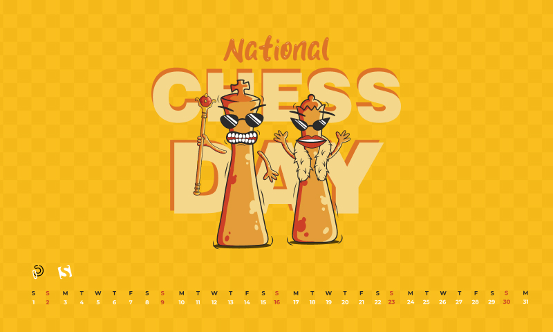
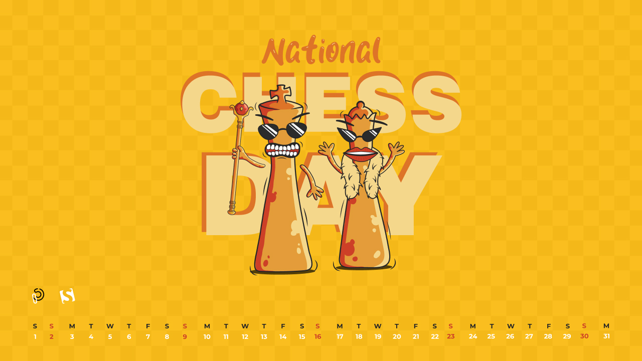
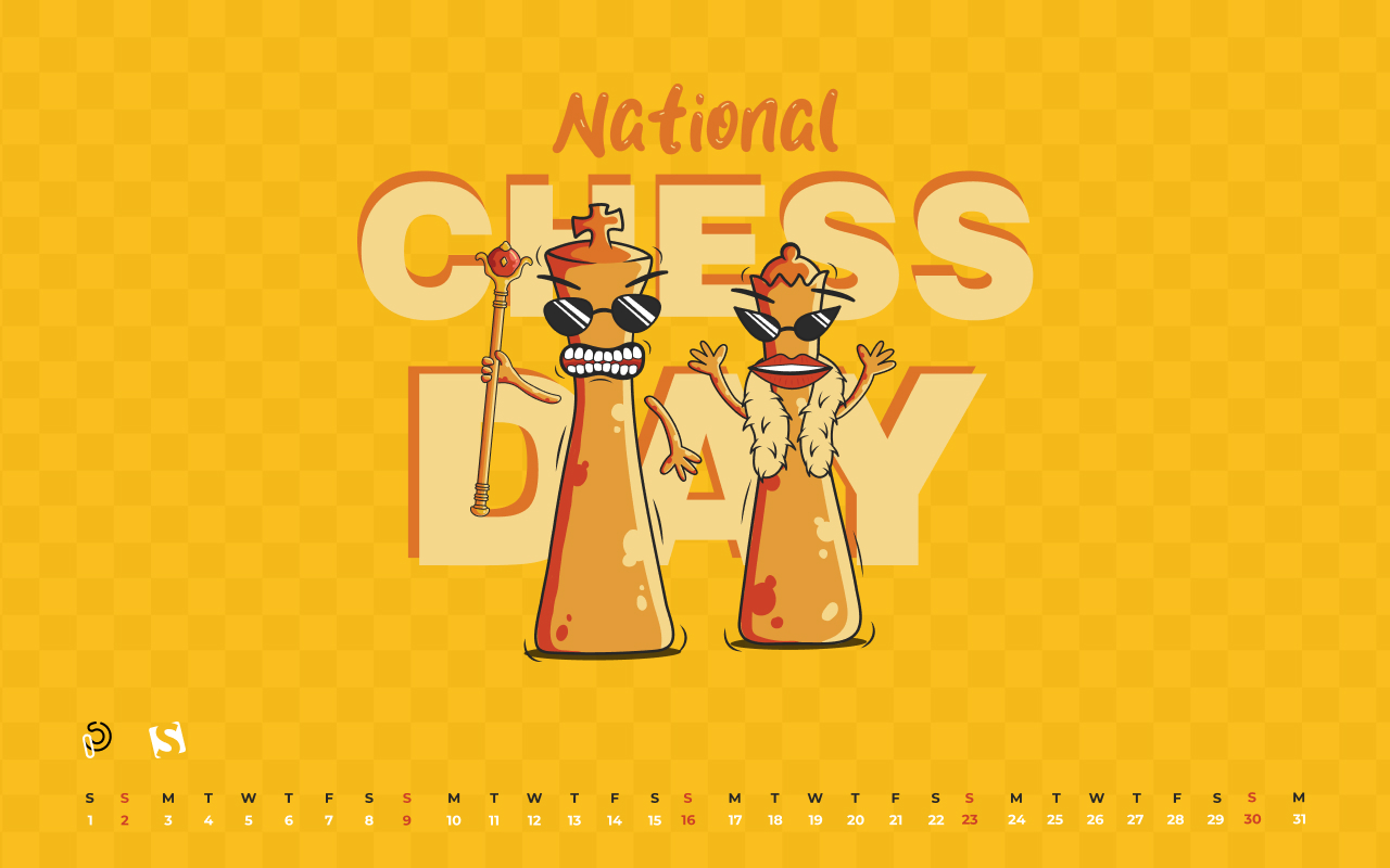
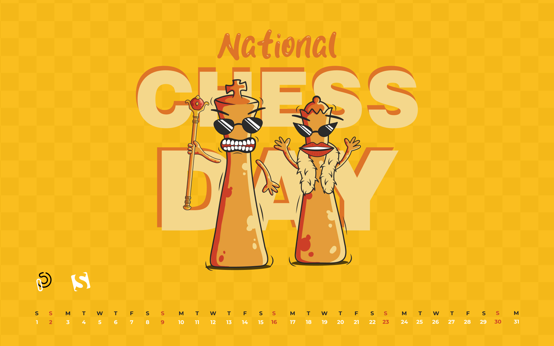
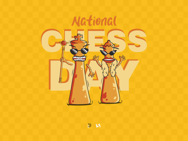
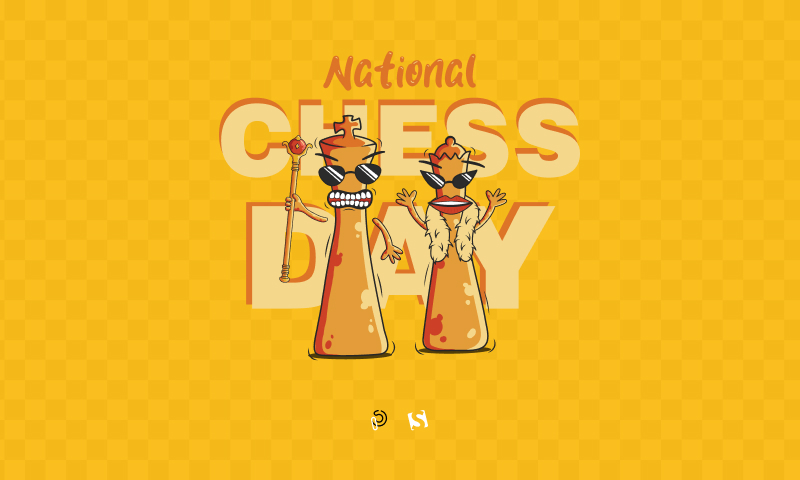
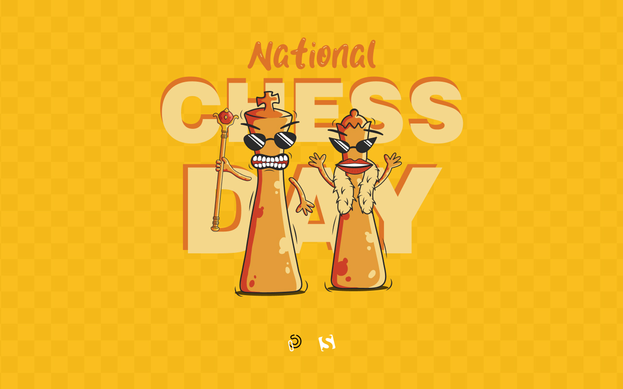
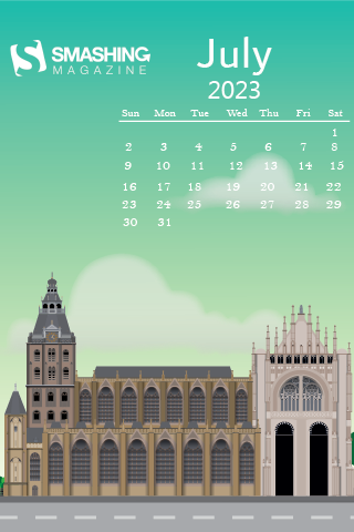
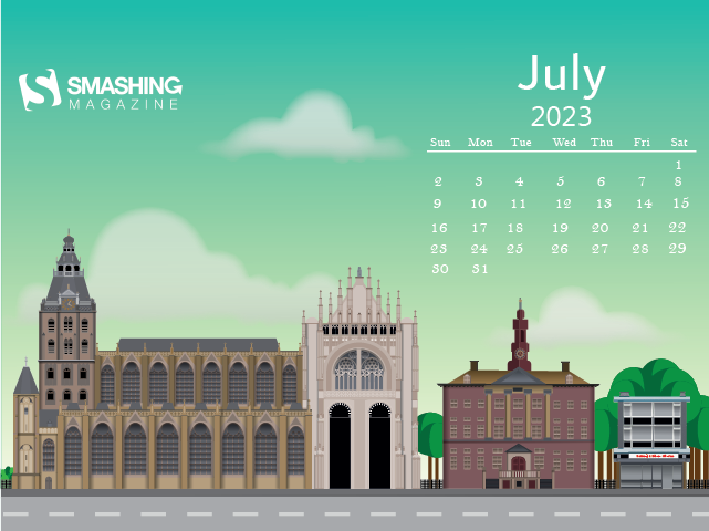
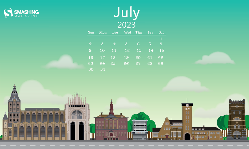
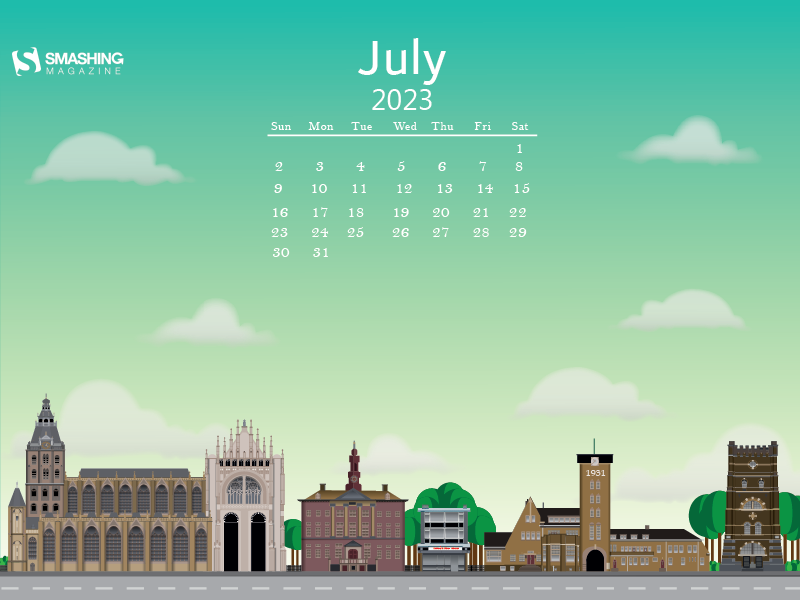
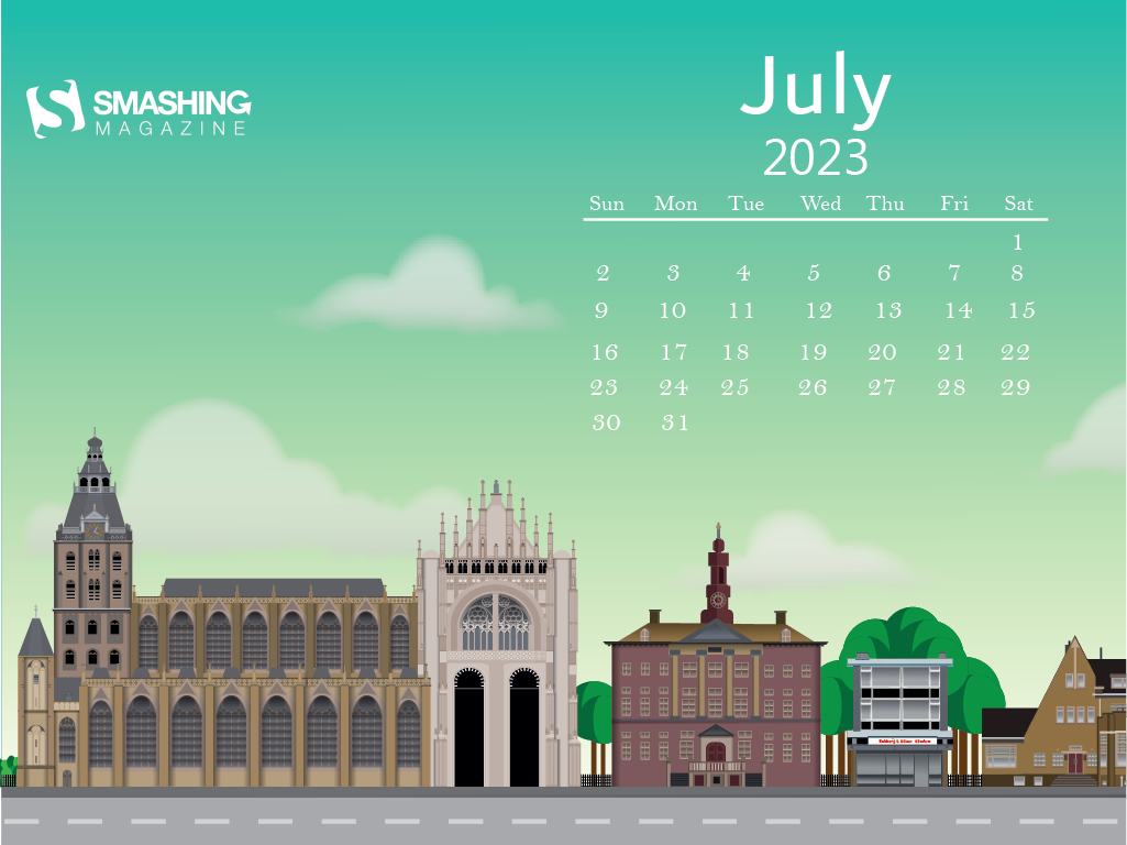
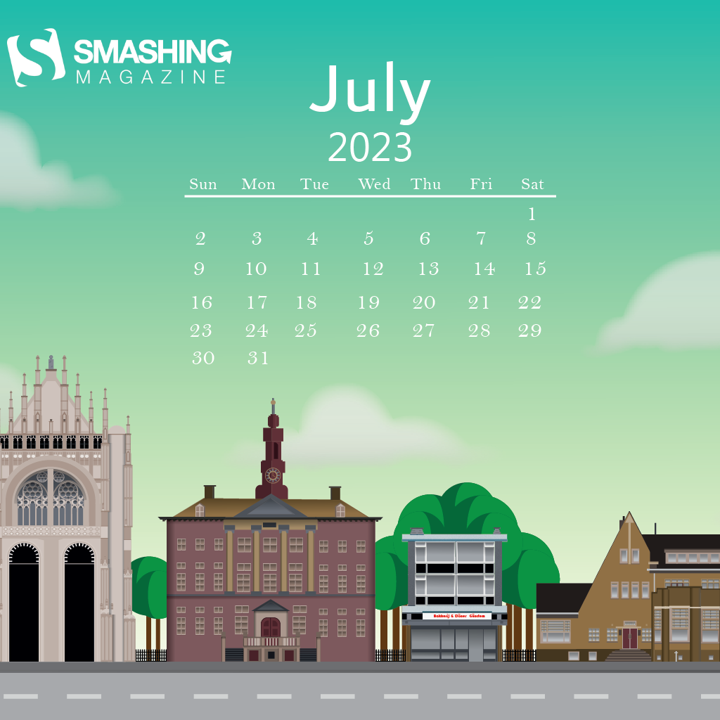
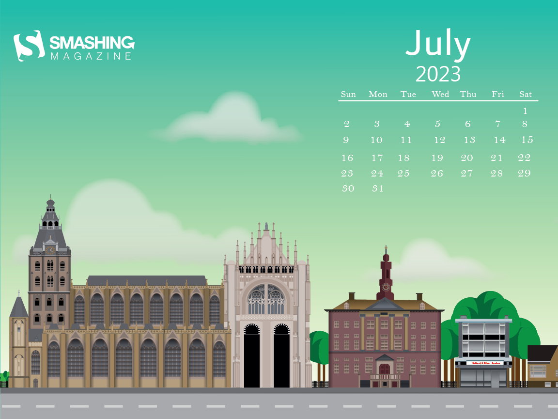
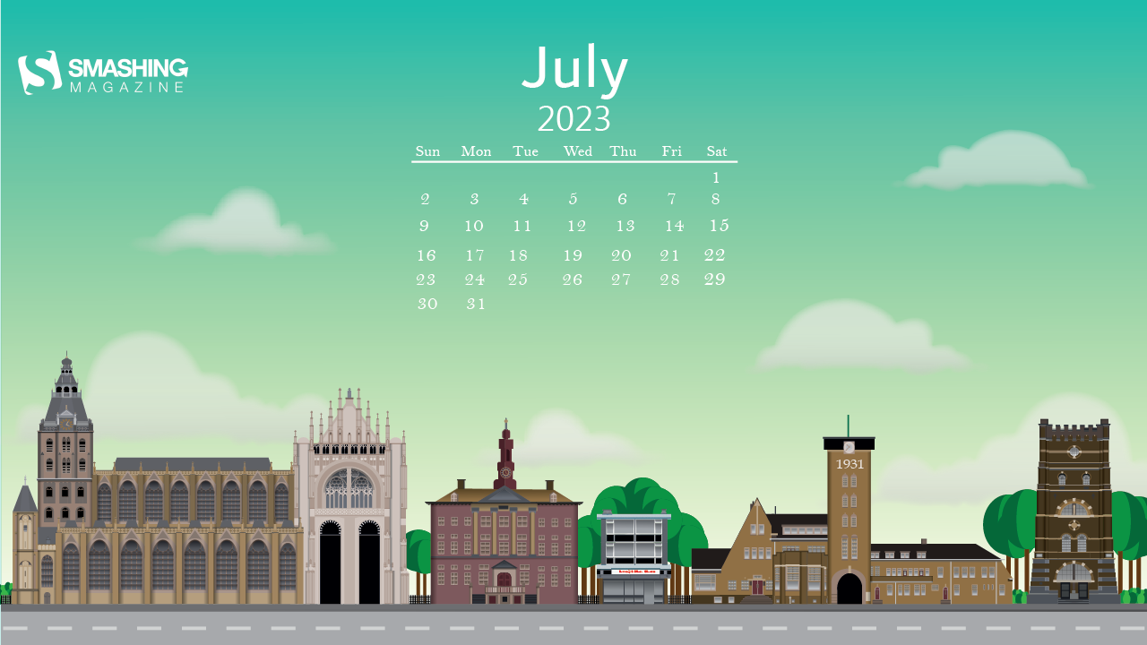
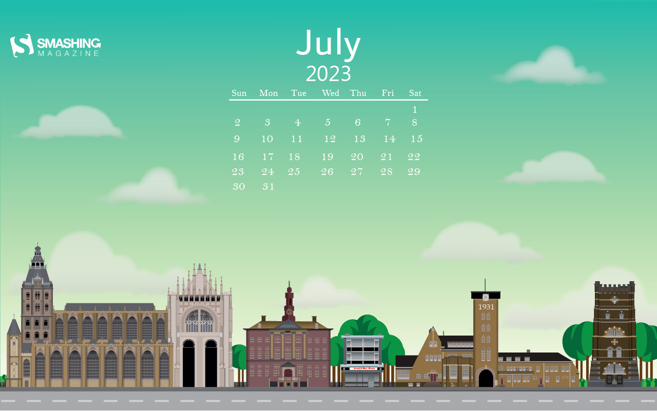
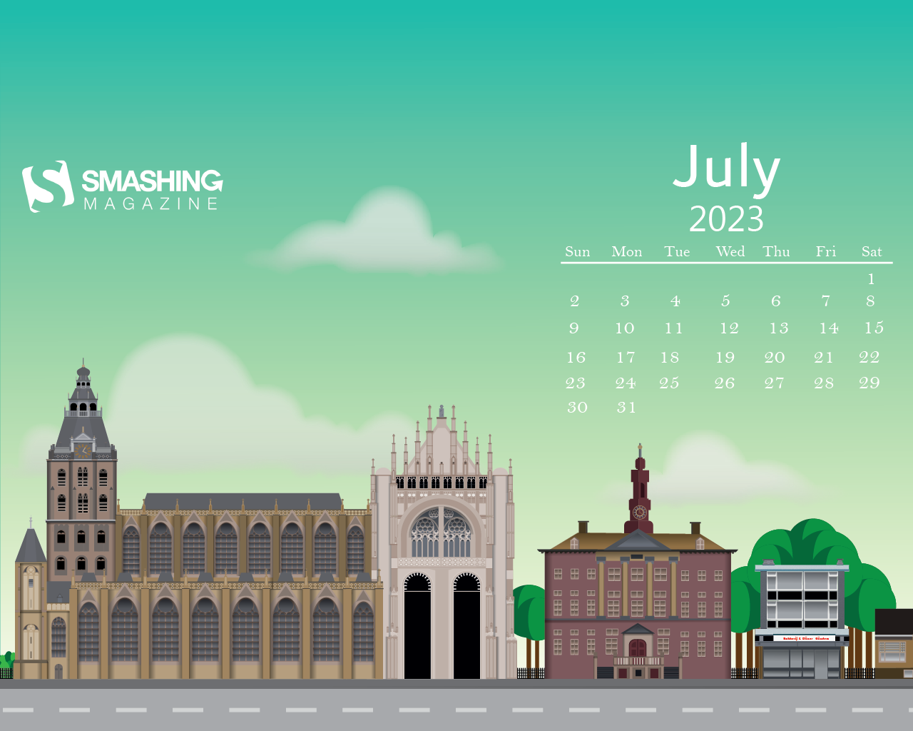
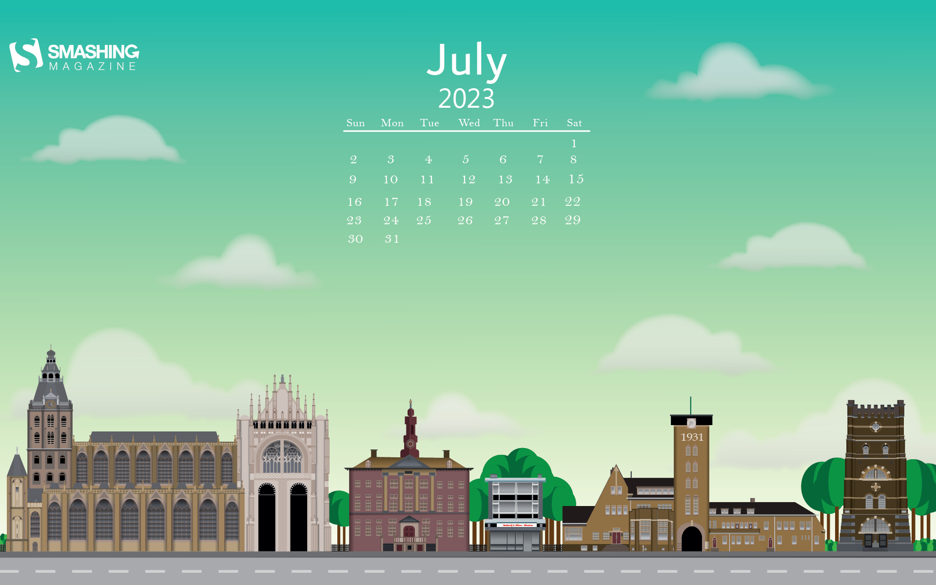
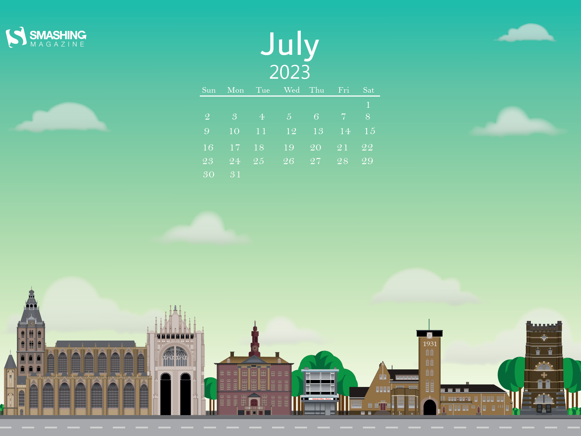
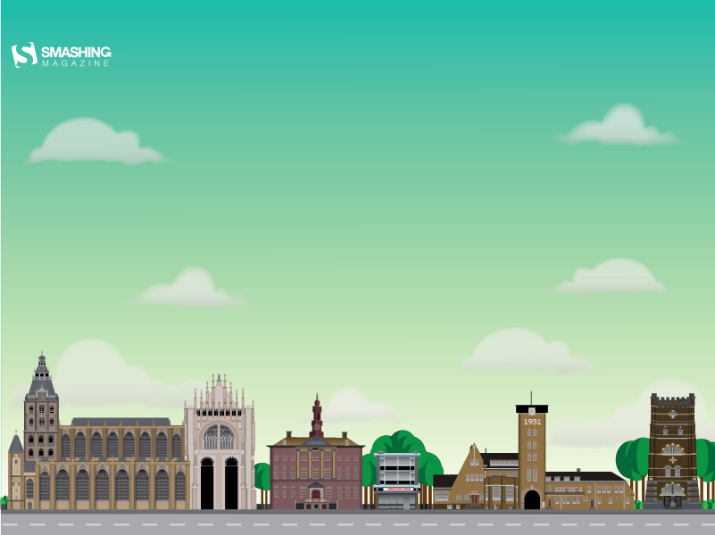
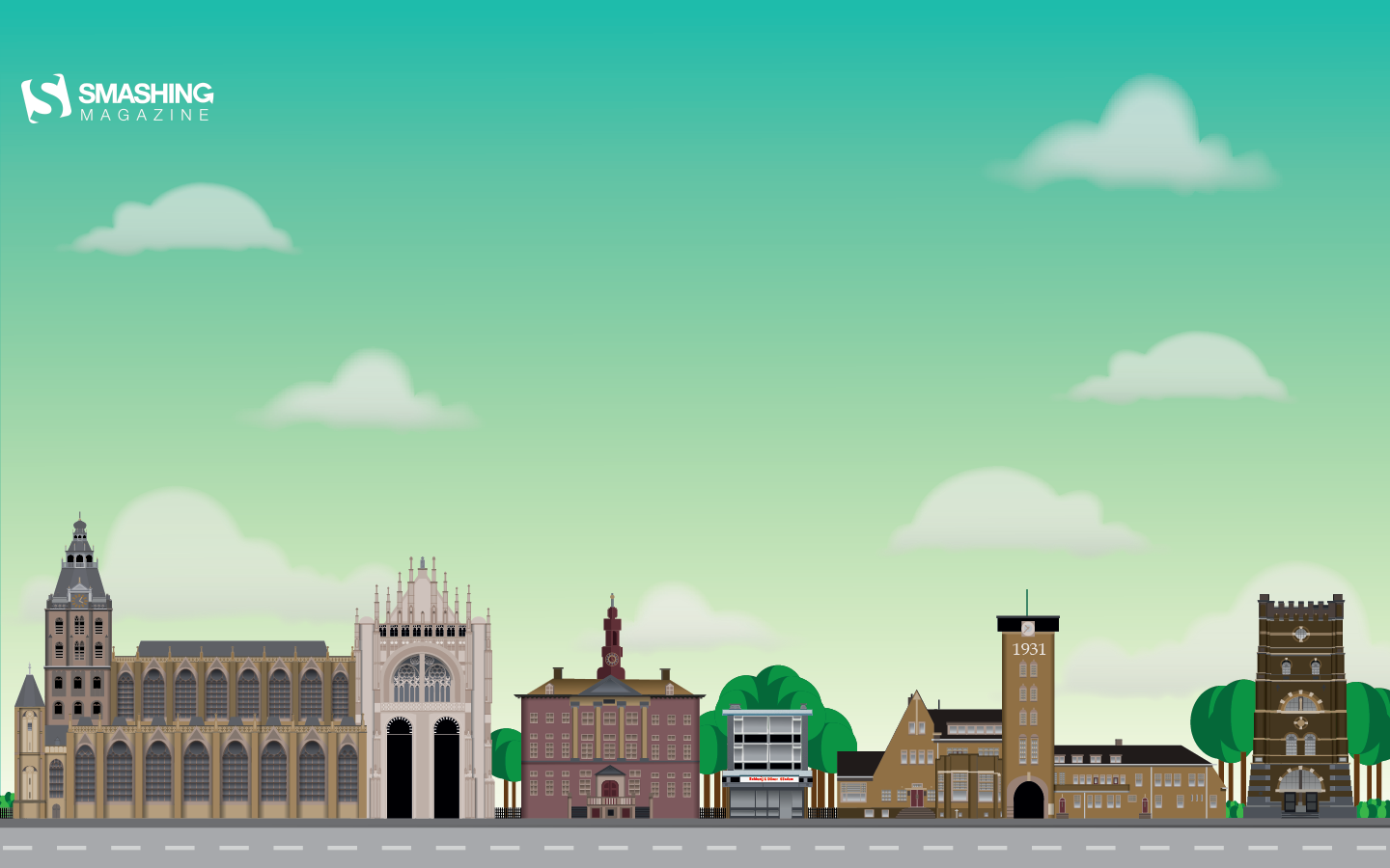
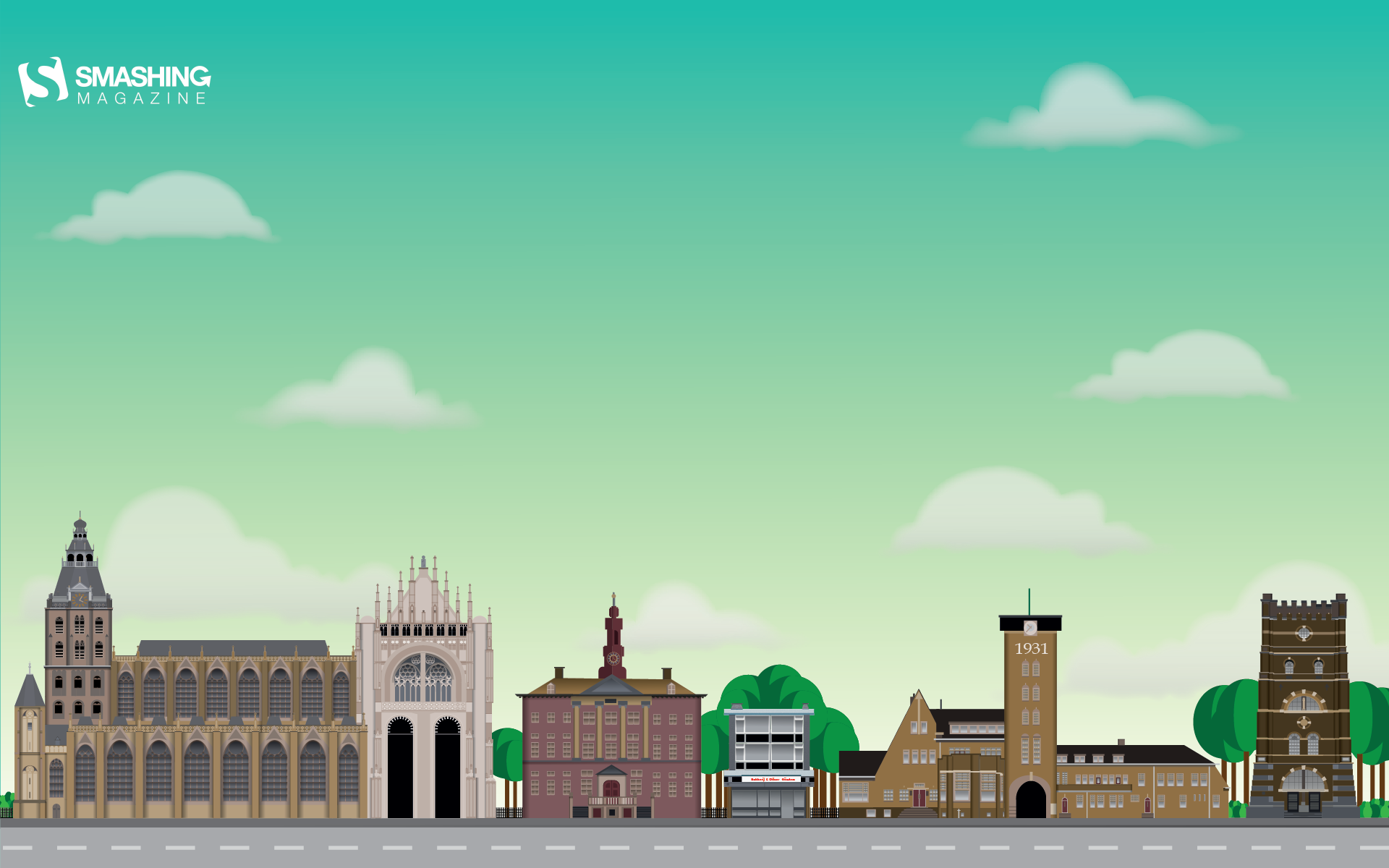
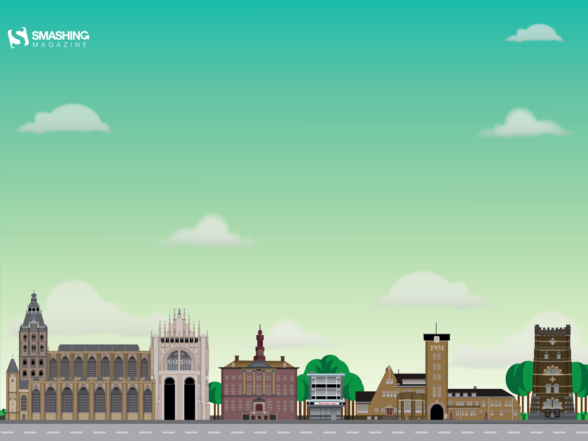
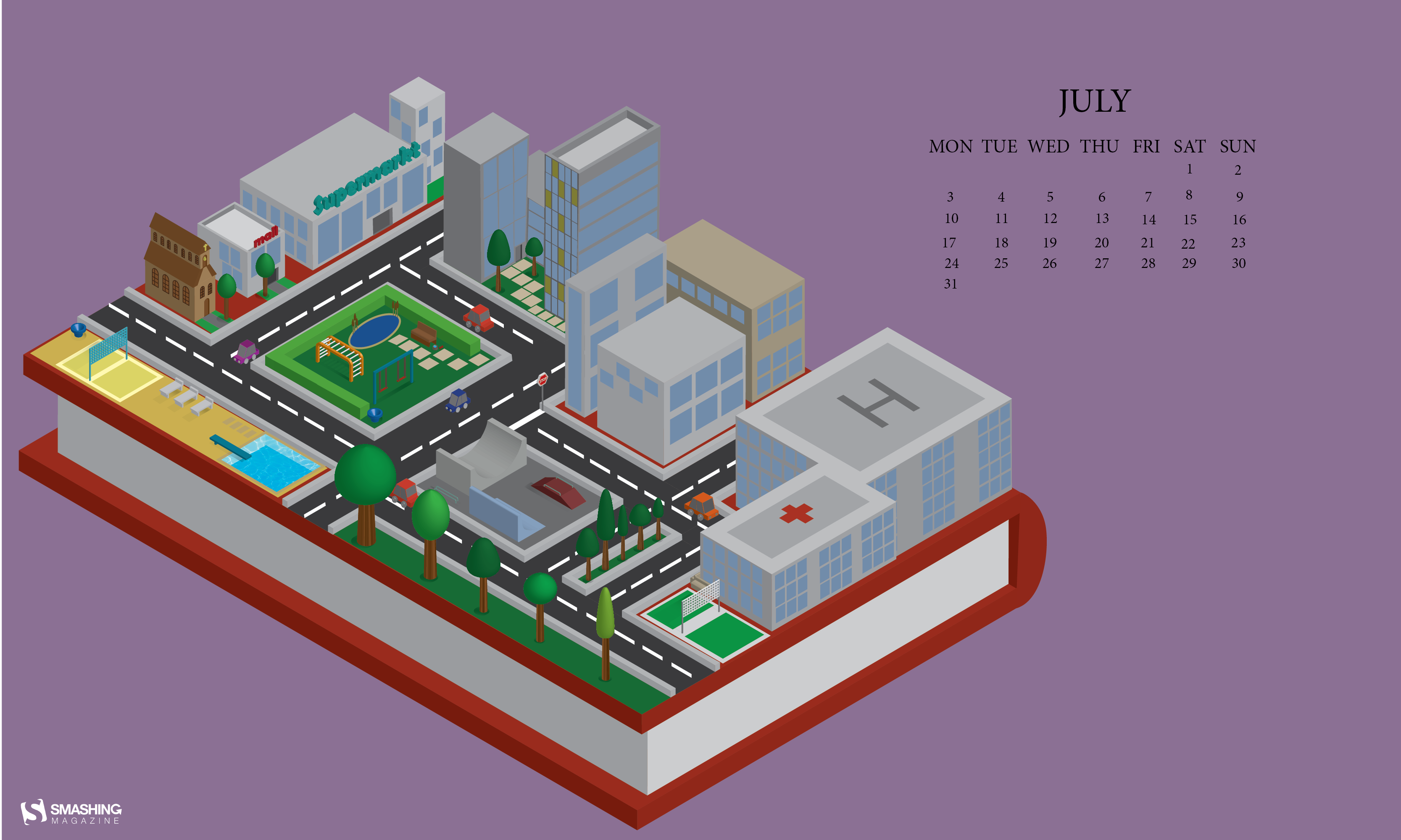
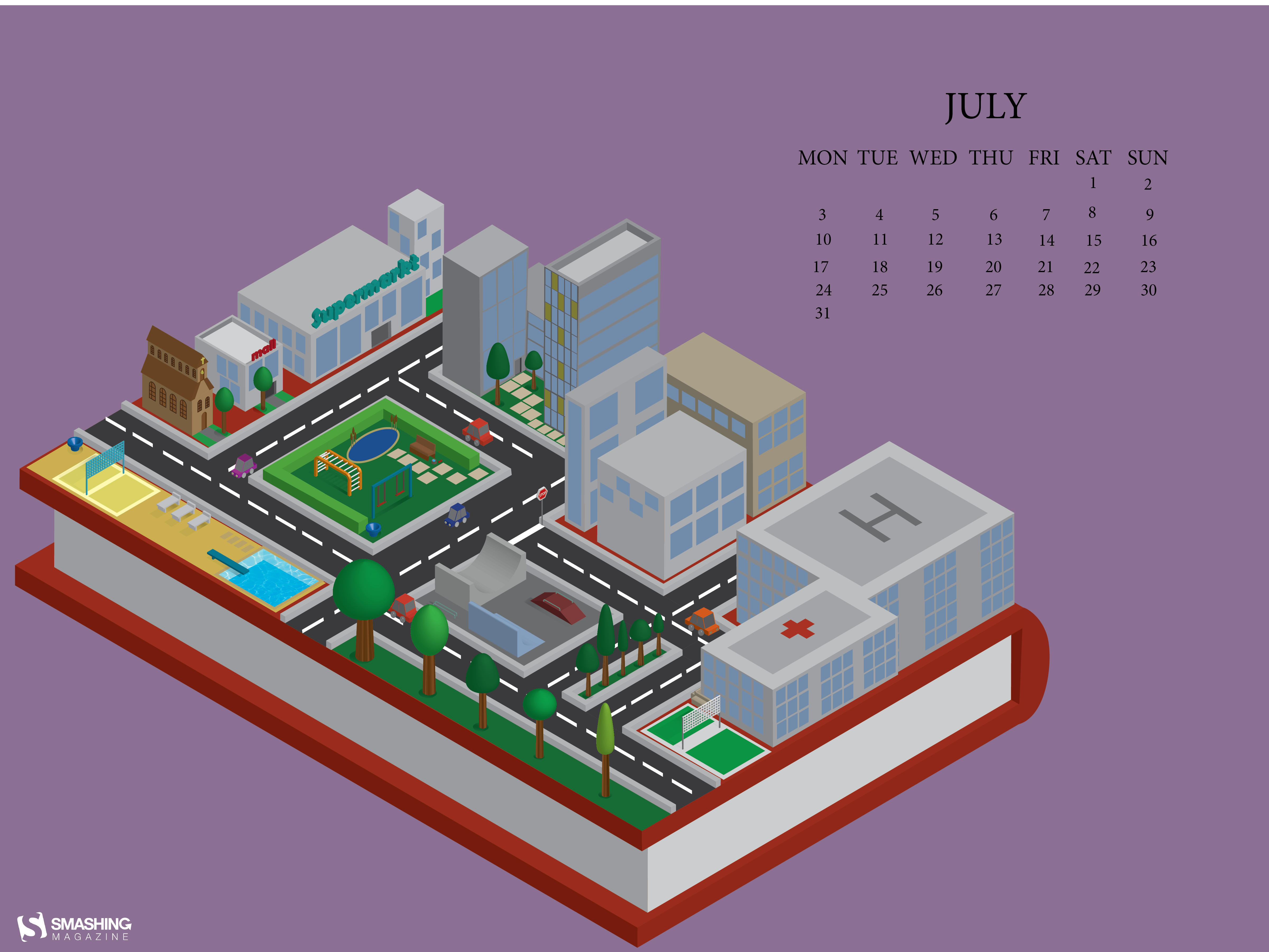
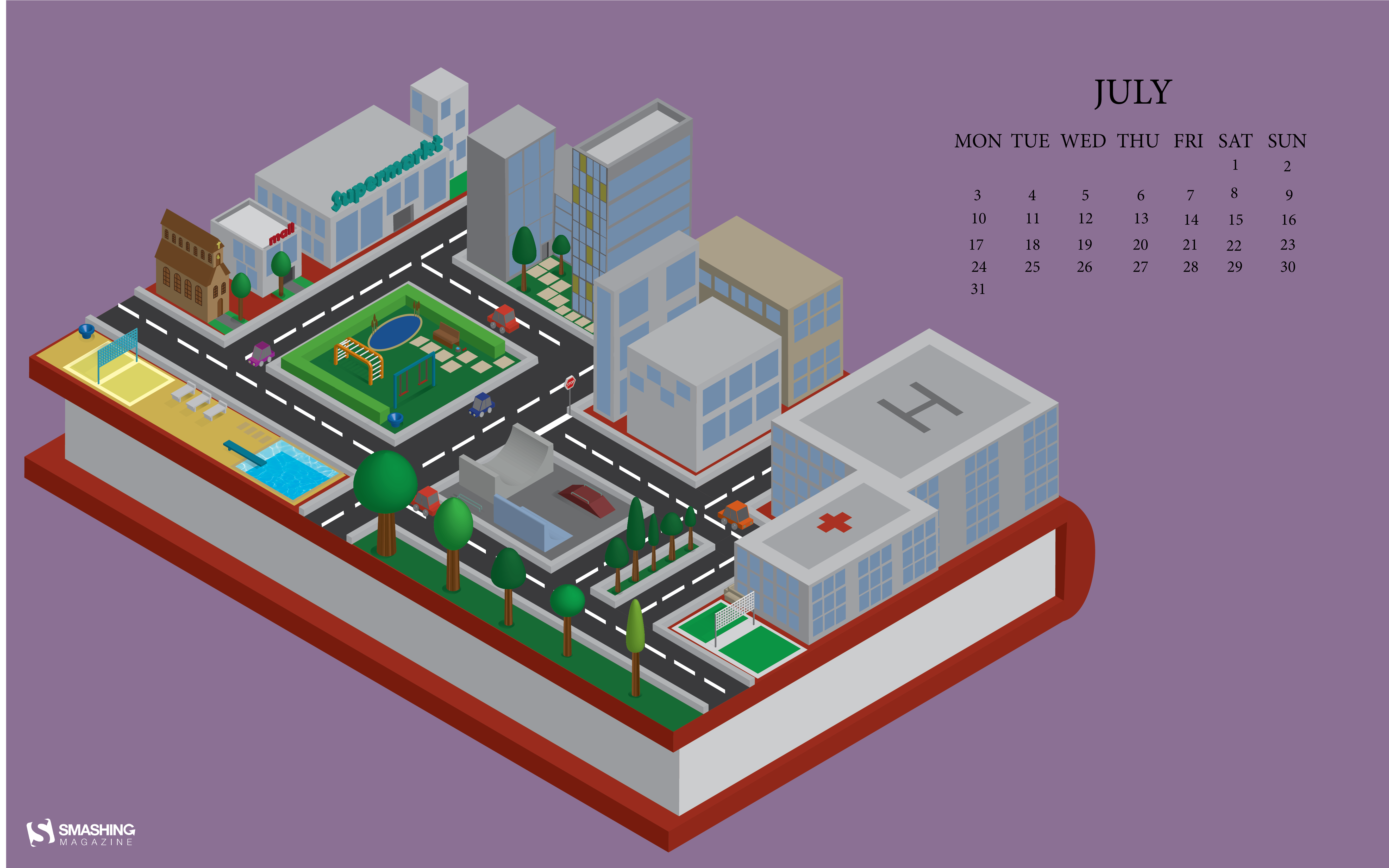
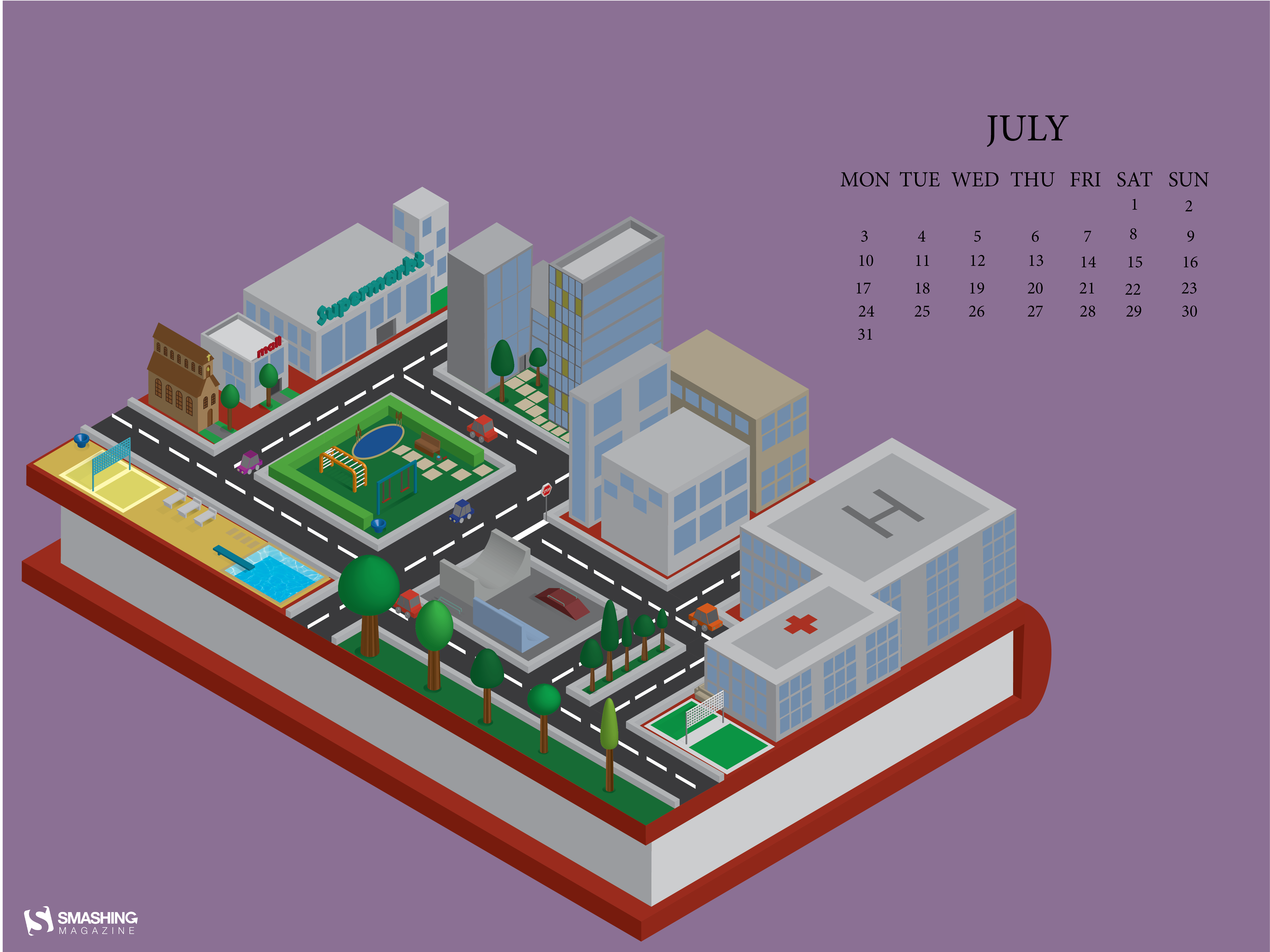
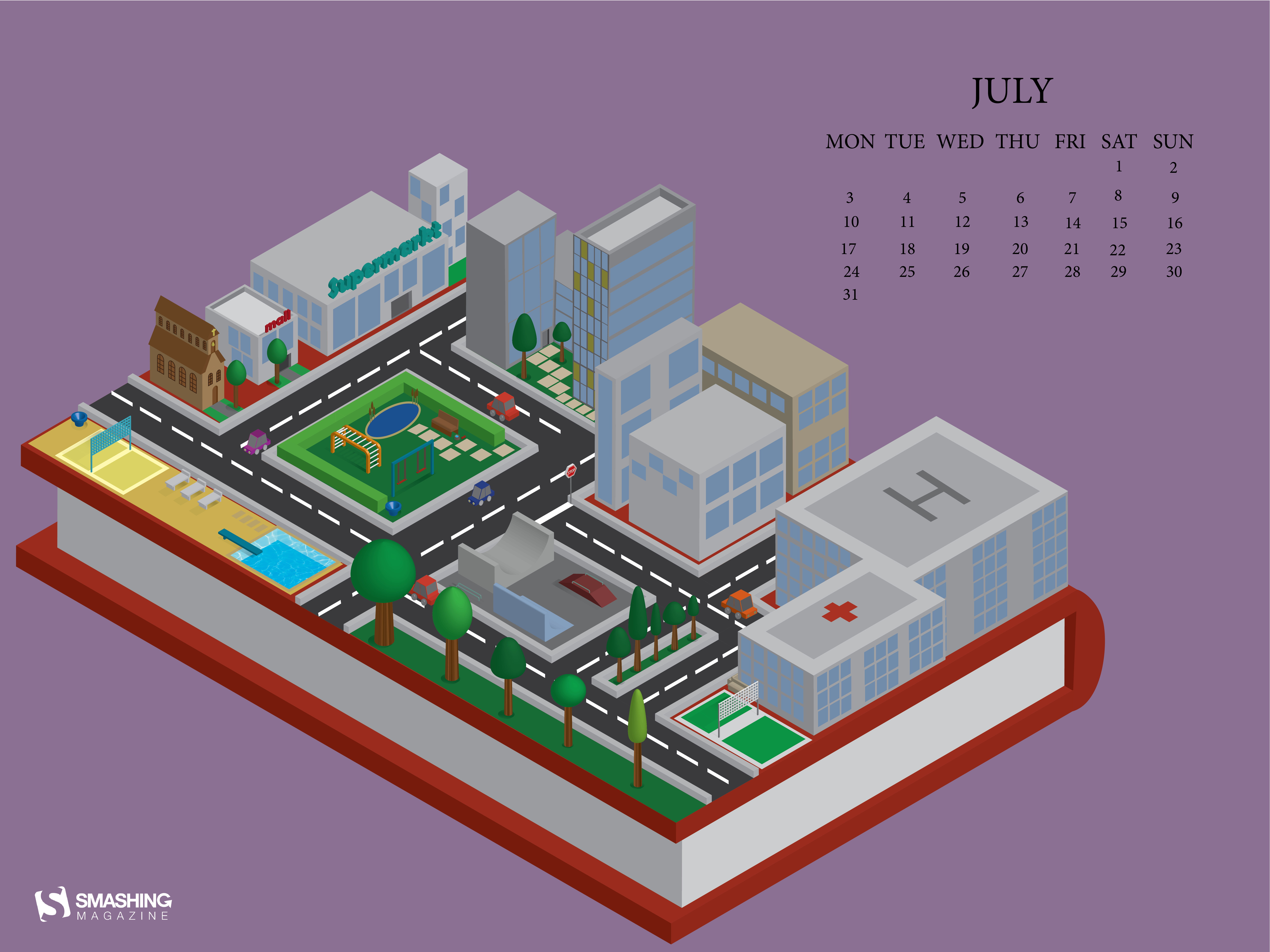