 Login
Login
This article is a sponsored by Penpot
Among design tools, Penpot holds a special place. It is an open-source design tool, meant for designers and developers to work together and help them speak the same language. It’s also the first design tool out there to be fully open-source and based on open web standards.
That’s a perfect choice for designers and developers working closely together as Penpot’s approach can help to radically improve design to development processes and effortlessly make them seamless and faster.
As open-source software, Penpot also evolves blazingly fast, fueled by the support of the community. When I was first writing about Penpot a few months ago, I shared my excitement about the app’s layout features that finally bring parity between design and code and follow the same rules as CSS does. Since then, the team behind Penpot has made creating layouts even better, so they deserve another look. I really enjoyed playing with the new Penpot’s features, and I believe you might want to give them a try too.
Designing Layouts Done RightIf you ever wrote or read CSS code, there are high chances you have already stumbled upon Flexbox. It’s a cornerstone of building layouts for the modern web, and quite likely, every single website you visit on an everyday basis uses it.
Flexbox is the bread and butter of creating simple, flexible layouts. It’s the most common way of positioning elements: stacking them in rows and columns and deciding how they are supposed to be aligned and distributed.
Therefore, creating Flexbox layouts is a vital part of most web hand-off processes. And not rarely time-consuming and causing friction between design and development. Usually, developers try to translate static mockups into code by rebuilding layouts made by designers from scratch. As most designers don’t write CSS code and most design tools follow a different logic than CSS does, lots can go wrong or get lost in translation.
This is where Penpot’s Flex Layout comes into play. Layouts built-in Penpot don’t need tedious translating into code. Even though designers can build them using a familiar visual interface, they come as production-ready code out-of-the-box. And even if they need tweaking, they can still save developers plenty of time and guesswork as they follow a logic that is already familiar and understandable to them.
So at the bottom line, it benefits everyone. It’s less work for developers as they get the code they need straight away. It’s better for designers as they have finer control over the final effect and a better understanding of the technologies they are designing for. And finally, it’s good for business as it saves everyone’s time.
All of that without making the designer's job an inch harder or forcing them to write a single line of code. Now, let’s take a look at what building designs with Flex Layout look like in practice!
Getting Started With Flex LayoutAs mentioned before, Flexbox can be understood as a toolkit for building layout and positioning elements.
Each Flex Layout is generally an array, a list of elements. This list can be sorted from left to write, right to left, top to bottom, or bottom to top.
Flex Layout allows you to control how elements in these lists are aligned against each other.
You can also control how elements are laid out within containers.
Flex layouts can wrap into multiple lines too. You can also nest them indefinitely to create as complex layouts as you wish.
And that’s just the beginning. There are many more options to explore. As you can see, Flex layout gives you much more possibilities and precision than most design tools do. Creating with it is not only a better process but a more powerful one.
To explore all the possible features of Flex Layout, Penpot’s team created a comprehensive Playground template for you to try. If you don’t have a Penpot account yet, go ahead and create one now. Then, duplicate the file and try to play with it yourself! The file will take you on a journey through each and every Flex layout feature, with clear examples and definitions, so you can start building complex, robust layouts in no time.
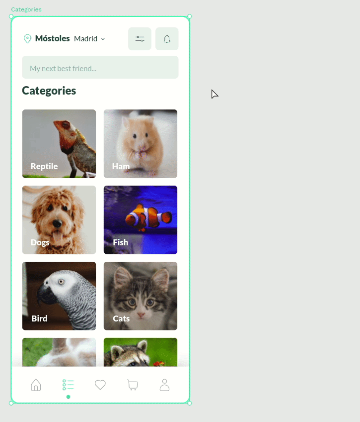
Building An Example TogetherTo give you an even better understanding of what working with Flex Layout is in practice, let’s look at a practical example. In the next few steps, we will dig into the structure of this little mockup and rebuild each and every part of it with Flex Layout.
For the first elements, we can use Flex Layout for our buttons. With a few clicks, we can make sure they are responsive to the size of the icon and the label inside, and set paddings and distances between the children elements.
We can also use Flex Layout for the avatars stack. To make the images overlap, a negative gap between the elements does the trick. We also have full control over the order of elements. We can lay out the stack in any direction. We can also control the stack order of each element individually. That’s thanks to Penpot’s support for z-index, another useful CSS property.
Flex layouts can be nested, creating more complex layouts and dependencies. In this case, we’ll create a separate Flex Layout for the navbar and another for the tiles grid below.
Remember that elements in Flex layouts can be wrapped? Let’s see this in action. In this case, we can create a flexible multi-dimensional layout of elements that’s responsive to the parent container and fill it with blocks both vertically and horizontally, just as CSS would do.
But what if some of the elements don’t belong to the grid? Alongside Flexbox, Penpot provides support for absolute positioning. This means that any element can be picked up from the Flex Layout to still leave in the same container but ignore the layout rules. That’s exactly what we need for the ‘Edit’ button.
Eventually, we can transform the whole board into a Flex Layout. Now, we have a design that is not only easy to work with and edit but is also fully flexible. Wondering how your design would perform on a smaller or bigger screen? All you have to do is to resize the board.
Next StepsIf you’d like to take a look at the source file of the layout we’ve just built, go ahead and duplicate this file.
To dig deeper and learn more about how to use Flex Layout, don’t forget to try the Flex Layout template.
In case you get stuck or have some questions, Penpot Community would be the best place to look for help.
There is also a great video tutorial that explains how designers and developers can work together using Flex Layout.
SummaryAs you can see, with Flex Layout, the possibilities for structuring your designs are endless. I believe that features like this are a welcome change in the design tools scene and a shift in the right direction. Helping designers to take more control over their work and helping developers to work as efficiently as possible.
Coming Soon: Support For CSS GridMaybe you’re now thinking the same as I am: CSS layouts are not only Flexbox, are they? If you work with CSS, you probably know that Flexbox alone is not enough. More complex layouts are often better built using CSS Grid. Flexbox and Grid work best when combined together — combined to create precise yet complex and fully responsive websites.
Penpot doesn’t support CSS Grid just yet, but that is about to change! You can learn more about it at the upcoming Penpot Fest. During the event, Penpot’s team will share their plan and a demo of the upcoming Grid Layout feature. Don’t hesitate to join (virtually or in person), if you’d like to learn more about the next steps for Penpot.
This article is a sponsored by Penpot
The world of developer tools lives and breathes open-source. Open, free programming languages, frameworks, or even code editors everyone can contribute to — lay at the heart of the premise of the free, open web. Yet, with the design tools, it’s always been a much different story. For our design processes, most are sticking to a palette of paid, commercial tools — the majority of them were either created or later acquired by big tech companies. Fortunately, also in this space, we’re starting to see some alternatives.
One such alternative is Penpot, an open-source design app that recently started to boom in popularity. With over 250k signups and 20k GitHub stars, Penpot has already made a name for itself, and it’s growing as a viable alternative to other design tools out there.
However, being open-source is not the only thing that makes Penpot unique. It also has a few killer features up its sleeve that make it a really great match for a good collaboration between designers and developers. Curious to learn more? Let’s take a closer look together.
A Design Tool Done RightIf you’ve ever done a fair share of designing and coding, I bet you also had your moments of confusion and frustration. One thing I never managed to understand: Why are the apps used primarily for designing user interfaces that are later built with web technologies often so bad at matching the standards of these exact technologies?
For example, they offer fancy layout tools that follow a completely different logic than how layouts are built on the web. Or they offer drawing tools that work differently than graphics on the web, so once you export your work, you get weird, unexpected results. Why?
The answer is actually quite simple. For most of the design tools, hand-off and developer-focused features were an afterthought. Based on different patterns and standards, they often prove to be confusing and frustrating for developers.
This is where Penpot is different. Created by a team of designers and developers working very closely together, great design-development collaboration was their priority from the start.
Same as other web apps, Penpot can be run on any operating system or web browser. But to make access to it truly open and democratic, it is also based on Open Web Standards. For example, Penpot’s design files are saved in SVG format — the same standard as the most popular image format for vector graphics on the web.
What it means in practice is not only better compatibility with web technologies but a natural parity between designs and code. With Penpot, you don’t have to export to SVG, your graphics are SVG, by definition.
Same works with translating styles from designs into code. Penpot doesn’t have to generate any CSS values. It can just read and cater CSS values directly from designs.
A great example of that in practice is Flex Layout, i.e. Penpot’s layouting feature that not only works exactly like CSS Flexbox. It simply is CSS Flexbox. We’ll give it a shot together in the later part of the article!
Open Source And Why Should You CareBefore we take a deeper dive into the tool itself, let’s talk about Open Source for a bit. But why is it so important, and what does it mean for you?
In the programming world, Open Source usually means that the source code of the tool, app, or framework is available for anyone to view, modify, and distribute. But why would that be important for you and your choice of a design tool?
First and foremost, the code of the app´ is 100% free and available for commercial use. Every part and feature of the app that is free today will remain as such. Personally, out of all the design tools I have ever tried, I’ve never seen an equally featured and solidly built design app that is completely free, even for a big team. In this field, Penpot is far ahead of any competition.
But open source is so much more. It also means greater transparency, control, and security. Anyone can audit the app’s code for potential security vulnerabilities or add new features to the tool that meet specific needs. Additionally, open source means that code cannot be controlled by a single entity or corporation, and users are not locked into a particular vendor’s ecosystem.
That all is true also for Penpot. It might not sound particularly significant or sexy at first glance, but if your company would ever have to worry about maintaining full control over its toolkit’s security standards or if you’d like to avoid vendor lock-in, choosing an app that is Open Source might be a big deal.
Have you ever used plugins in a design tool? If so, you’d probably be pleased to hear that customizability is what Penpot brings to a whole new level. Open source means that users can modify the tool’s source code to meet any specific needs, customizing it as necessary.
You not only can extend the functionality of the app. You can literally edit it in any way you like to match your team’s processes and specific needs.
Penpot being open source, also means the ability to host your own instance of the tool. This means that you can run Penpot on your servers, having full control over your data and the application itself.
Finally, open source provides peace of mind for the future of Penpot. With the tool being open source, users will always have control over the tool they work with, no matter what the future holds. Regardless of what happens next, you’ll always be able to use Penpot on your own terms. This means that people can invest in Penpot with confidence, knowing that they will always have access to the tool and their work (rather than being at the mercy of potential business shifts, acquisitions, pricing changes etc.)
I hope that by now, you’re left with no doubt about how many advantages it brings to work with Open Source tools. Now, let’s take a look at Penpot itself.
Where Penpot Shines...If you recently worked with any of the most popular design tools in Penpot, you’ll feel right at home. Its interface should be familiar and predictable, and also offer all the basic features you could be looking for.
The user interface is unobtrusive, the perceived performance is good, and everything works as expected. But it’s the handoff-related features where Penpot really shines.
I already mentioned Flex Layout, Penpot’s own layouting feature. If you have ever used the Flexbox model in CSS, it might look oddly familiar. In fact, it’s exactly that: CSS flexbox inside a design app.
And that means not only better parity with code than other design apps (at least as long as you’re planning to use CSS flexbox in your code) but also a better scope of possibilities inside the design tool itself (e.g. you can wrap items of the automatic layout into multiple rows).
More powerful layouts also mean much better possibilities when it comes to designing truly responsive designs. With what Penpot can do, there’s a high chance that, in many cases, you won’t have to create separate designs for different breakpoints ever again.
 (Large preview)
All of that wouldn’t be as good if not for the great Inspect tab. Penpot gives you all the CSS you might need at hand, as well as the source SVG code of any component you select.
Pretty neat!
...And Where It Doesn’t (Yet)Regardless of all the praise, Penpot is not perfect either. Being a relatively young tool makes it a challenging task to compete against the giants dominating the design tools scene.
If you compare it closely to other popular design apps, you’ll definitely find a few features missing, as well as some of them not as complex as elsewhere. For example, Penpot’s components toolkit and prototyping features are still relatively simple and limited.
That being said, Penpot’s roadmap is very actively being worked on. You can check what the team is onto right now on their website.
What’s also important to keep in mind is that Penpot’s development potential as an Open Source tool couldn’t be underestimated. The tool’s community of contributors is already pretty strong, and I believe it will only keep growing. That’s a competitive advantage closed source tools will never be able to meet.
Seeing what Penpot can do today, I personally can’t wait to see what’s next.
For example, looking at Penpot’s implementation of Flex Layout, think how cool it would be to have a similar tool for CSS Grid. Who’s in a better place to build it than Penpot? Spoiler alert: if you look at their public roadmap closely enough, you’ll find out they’re already working on it.
Final ThoughtsEven though Penpot is a relatively new tool, it stands as a solid choice for a design platform. It does a great job of narrowing the gap between designers and developers.
I believe it’s an open-source approach and a welcomed change that should only benefit our industry, as hopefully, others will follow.
If you’d like to give Penpot a try, it’s now out of beta and available for you and your team — completely for free
 FreshRSS