Sailor's Delight was one of two ink formulations chosen by the /r/fountainpens community on Reddit earlier this year, continuing a wonderful trend by Diamine in working with many collaborators - big and small - to create inks. Given all of the recent changes with Reddit, will they continue this project? Who knows, but let me be the first to ask: Mastodon ink when?
If you are Mastodon curious, check out the wonderful community being built at Penfount, where you can find all the details you need. And if you are shimmer ink curious, well, Sailor’s Delight is one you will want to take a look at asap.
The most interesting thing I noticed out of the box with this ink is the underlying color. I thought it would be bright red, and there is plenty of that shade, but the base color underneath that red is peach. That took me by surprise, in a positive way. My 1.1 mm stub nib in the TWSBI 580ALR Prussian Blue pen I used for this review spreads the ink thin at the top of the line, with the ink pooling more towards the bottom of stroke. That’s how shading happens, and in this case, that’s how the peach shade pokes out from underneath the red.
But let’s be clear, you aren’t buying this ink for the peachy-red color - you are buying it for the peachy-red color with shimmer! Diamine says the shimmer is silver, but I see a faint light blue tone where the shimmer breaks through. I think that shade is a perfect match for this ink, giving the ink a purple tone in some areas.
When I bought Sailor’s Warning, I was interested in how it compared to another favorite shimmer ink of mine, Wearingeul Dracula. My guess was that they would be close enough to be interchangeable, but that couldn’t be further from the truth. Dracula is very red in comparison, with a brighter blue shimmer. In the end, these two inks are very different.
If there is any downside to Sailor’s Warning it is that it seems dry, even from this 1.1 mm nib. I expected more ink flow, which shimmer inks need to show off their primary property. I want to give it a try in another pen and a different nib to see if I feel the same way, but I’ve tested several shimmer inks in this pen and flow has never been an issue.
At $22 for a 50 ml bottle, Diamine Sailor’s Warning is priced well. I wouldn’t hesitate to recommend it, but I would make sure to use a wide, wet nib. That goes for all shimmer inks, so that should come as no surprise, but I find it to be especially true with this one.
That’s my Sailor’s Warning.
Enjoy reading The Pen Addict? Then consider becoming a member to receive additional weekly content, giveaways, and discounts in The Pen Addict shop. Plus, you support me and the site directly, for which I am very grateful.
Membership starts at just $5/month, with a discounted annual option available. To find out more about membership click here and join us!
Cartridges from left: Pilot, Platinum, Sailor, Lamy, and “Standard” International
It doesn't take long for new fountain pen users to recognize that all fountain pen ink cartridges aren't created equal. While there is such a thing as a "standard international" ink cartridge and converter, it’s neither “standard” nor particularly “international”, as that term has essentially come to mean that the standard version "fits pens with JoWo, Bock, or Schmidt nib/feed assemblies." Nearly all of the Japanese brands, as well as some European brands like Lamy, use their own proprietary cartridge/converter format. Today I'll talk a bit about why I tend to prefer the Japanese-style cartridges to the standard international format.
Note: Whenever you buy a new pen from a brand you haven't previously used, ALWAYS check whether you also need a specific converter and/or cartridge to go with that brand.
Pilot pens such as the Custom Heritage 912, the Custom 74, and the Vanishing Point all take the proprietary Pilot Cartridge.
Why these two, you might ask? Capacity. While each format is unique to each brand, these cartridges hold a LOT of ink. Moreover, the "wide mouth" format of the cartridge both ensures better ink flow than the typical international cartridge (which has a narrower opening) and makes the cartridge easier to refill with ink of your choice using a pipette or small eyedropper rather than a syringe. Of course, part of the reason why these cartridges tend to work so well may be due to the proprietary nature itself, with the cartridge engineered to fit the brand's specific nib and feed.
Pilot cartridges are among the easiest to refill, so there’s even an “aftermarket” for things like these small rubber stoppers if you want to refill a full set. (Search eBay or your online marketplace of choice.)
As an aside, there has been a lot of speculation as to why Pilot recently released the Iroshizuku Inks in cartridge form, and why they believe they can price these cartridges at the relatively high price point of $14 for six. Personally, I think it's because a large portion of users write with fine or extra-fine nibs (if not finer). Given that Pilot cartridges hold a decent volume of ink, six of these cartridges could last someone up to a year, especially if they don't write extensively by hand and, for example, use their pen to make occasional notes in a planner. (Standard Pilot cartridges are much less expensive, as are Platinum cartridges, and are sold in boxes of one dozen.)
While Sailor cartridges also feature a proprietary format with a wider opening similar to Pilot and Platinum, and work just fine, they don't hold as much ink. On the other hand, I find that Lamy cartridges have narrower openings similar to the Western-style Standard International cartridge. As a result, the ink doesn't flow quite as well, and Lamy cartridges can be difficult to puncture to the point where I sometimes worry I'm about to break the pen.
Don’t be like me. Use your cartridges.
At the end of the day, the proprietary systems of cartridges and ink converters can be both a pain to navigate and part of the charm of using fountain pens. Sure, it would be much more convenient to have a single universal format for all brands, and to not have to worry about stocking refills from multiple brands, but over time I've just come to accept that "the cartridge singularity" is not going to happen and learned to love the different shapes and peculiarities of each cartridge. My own opinion is that the Japanese pen companies make better cartridges than Western manufacturers. Not only do I get better performance - mainly ink flow - when I use these cartridges, but the cartridges seem to last longer on the shelf. My insanely busy week/weekend of work saw me cycling through several cartridges on the fly, and the number of half-evaporated cartridges I discovered in my office desk drawer stash (mostly standard short international) reminded me that these things don't last forever. Use 'em if you got em'!
The Gentleman Stationer is supported by purchases from the T.G.S. Curated Shop and pledges via the T.G.S. Patreon Program.
We’re running a sale this weekend in the shop for Father’s Day - through 11:59pm on Sunday, June 18, take 10% off paper and desk accessories using the coupon code “DAD10” at checkout!
A while back I did an "inks of choice" post in which, for the first time, I discussed my favorite inks by broad color category. This wasn't easy, as many of the colors I love and use on a regular basis aren't easy to categorize. Is it a blue? A blue-black? A dusky purple? Is this a yellow or an orange? A red or a brown? Is burgundy it's own color family? (You get the idea.)
Lately I've been involved in a project at my job that has required me to do more writing than I've done in a long time, given my mostly supervisory responsibilities at this point in my career. This has resulted in (1) a lot of different pens getting written dry; and (2) lots of different pens getting inked up, mainly with unassuming blue-black inks chosen for both performance and the fact that they're less distracting than other brighter options. Whenever I get caught up in a project like this one, and find myself looking at multiple inks in the same color family, I end up struck by how much variation there is among supposedly "identical" inks and ultimately realize that it's a key part of why I have so much fun with this hobby. Here, you have six inks that vary pretty wildly, even within brands. At the same time, it’s fun to see the commonalities that certain brands have, like that Pilot red sheen!
My standard ink testing paper is Midori MD Cotton. It accurately reflects color despite being slightly off-white, and showcases ink properties such as sheen and shading fairly well.
Iroshizuku Tsuki-Yo. Tsuki-Yo won the "Blue-Black" slot in the "Favorite Inks" post, and as I mentioned in that post, the main reason I love Tsuki-Yo so much is because it's not your traditional blue-black ink. Typically translated as "Moonlight", this ink features a navy undertone with reddish sheen - an office-friendly ink with just enough subtlety to make it interesting for fountain pen aficionados.
Iroshizuku Shin-Kai. Shin-Kai is what I would call the "true" blue-black in the Iroshizuku lineup. Typically translated as "Deep Sea," Shin-Kai somewhat resembles standard Pilot Blue-Black, but dries to an almost steel grey with blue undertones and, again, red sheen.
Pilot Blue-Black. Whenever I get a new Vanishing Point or other Pilot cartridge-converter pen, often the first ink to run through that pen is a standard Pilot Blue-Black ink cartridge. This particular ink has a degree of water-resistance, which is one reason why so many people enjoy it. What surprises me the most with this ink is the degree of red sheen this ink exhibits, which is even more pronounced than its Iroshizuku counterparts.
I forget how much red sheen Pilot inks exhibit, until I swatch them next to other brands. The standard Pilot Blue-Black is kind of crazy, though the sheen only really comes out
Caran d'Ache Magnetic Blue. The "Grey-Blue-Black" of this group, albeit with purple (?) undertones when wet, Caran d'Ache Magnetic Blue is the most "traditional" blue-black ink of this group. It exhibits some shading but no sheen.
Platinum Blue-Black. Another standard Japanese blue-black ink that I use primarily in cartridge form, Platinum Blue-Black is more blue than other options, and also shows a good degree of water resistance.
Sailor Nano Souboku. Sailor makes a line of "nano" pigmented inks that are permanent, yet still "safe" for use in fountain pens. I've reviewed Kiwa-Guro (the "Nano-Black") in the past, but I've had this pack of the blue-black Souboku cartridges for more than a year and figured that I needed to put them through the rotation. Souboku looks almost teal when wet, and dries to a lighter blue-black shade than the other inks shown here. I like the Sailor "Nano" pigmented inks because they are permanent and tend to perform well on even the cheapest of office papers.
These three are the more “standard” blue-black inks that I’ve used.
Note: Why so many cartridges, you may ask? During my office reorganization/clean-out project from earlier this year, I came across more than a dozen boxes of cartridges, some of which had to be tossed because the ink had evaporated. Cartridges don't last forever, so if you have them, use them!
The Gentleman Stationer is supported entirely by purchases from the T.G.S. Curated Shop and Pledges via the T.G.S. Patreon Program.
Look Ma! No Bleed-through!
The Laban Greek Mythology Inks continue to impress me with their range of colors, and today I’ll look at the two excellent greens from the lineup (though one I would characterize as a bit more blue/teal). Either way, as someone who loves ink in both of these particular shades, both the Poseidon Green (Blue?) and Hera Dark Green have become standbys in my work pens.
First up is “Poseidon Green,” which I view as more of a teal/turquoise blue, but whatever you might call this color, I love it. It’s actually the first ink from this series that I tried, and it has some wonderful shading properties in a nib that provides line variation, especially in those places where the ink pools on the paper. Laban nailed the color matching here. Poseidon (Roman equivalent: Neptune) is the ancient Greek god of the sea, and while this particular color may not necessarily evoke the ocean where I personally go to the beach, they’ve attempted to capture the blue of the Mediterranean islands.
Not a trident, but a fountain pen!
Hera Dark Green is more of your traditional dark green “workhorse ink”. Hera (Roman equivalent: Juno) is the ancient Greek goddess of marriage and “the home,” so I’m not sure I see the connection between the dark green color of this ink and Hera’s traditional affiliations, but it’s a lovely ink nonetheless. As with Poseidon, you’ll experience some shading, with dark teal and grey undertones. Both Poseidon and Hera are drier inks than some of the other Laban colors like Athena Grey, Artemis Navy Blue, and Demeter Brown. That’s not to say they hard-start or dry up in the pen, and I’ve never had that issue with either. It’s more that I’ve noticed they take very little time to dry, making them quite good for work. These are two of the better Laban inks for working on cheaper papers at the office.
Laban continues to impress me with the Greek Mythology series. As I’ve mentioned before, it’s one of the few ink lines where I purchased a bottle of every color as quickly as I could, but again that says just as much about my personal fascination with mythology as it does about their excellent quality.
You can purchase the Laban Greek Mythology Inks directly from us in the T.G.S. Curated Shop, priced at $25 for a 50ml bottle. At this point, I’ve almost made my way through the entire lineup of the Laban Greek Mythology inks, and have reviewed Athena Grey and Artemis Navy Blue, Apollo Orange and Aphrodite Pink, and Ares Red. Some really interesting options remain, including Demeter Brown, Hermes Sky Blue, and Zeus Purple. Stay tuned as I round out this series of ten!
My Leonardo Momento Zero Maestro in Burkina Celluloid, alongside my Montblanc 146 UNICEF (with the small sapphire on top).
Back in September at the San Francisco Pen Show, I left a handful of pens with Gena at Custom Nib Studio for modification. Just before the Arkansas Pen Show, I received my pens in the mail, including two to which Gena had added their “Perspective” grind that I love so much. Both of these grinds are just as good as the original I had added to my Pelikan M800 Stone Garden and reviewed last year. You’ll notice that both pens I’ve used for today’s ink reviews feature Perspective nibs, which I highly recommend to those who are looking for some of the line variation of an Architect without the sharp edges. Plus, you get the ability to change line width from EF to Medium by adjusting your writing angle!
The Gentleman Stationer is supported entirely by purchases from the T.G.S. Curated Shop and pledges via the T.G.S. Patreon Program, and is an authorized retailer of all brands sold, including Laban.
(Kimberly (she/her) took the express train down the fountain pen/stationery rabbit hole and doesn't want to be rescued. She can be found on Instagram @allthehobbies because there really are many, many hobbies!.)
As soon as Lauren Elliott, AKA FlygirlElliott and Lucky Star Pens posted about the latest addition to the Lucky Star Colorverse lineup, I knew I had to buy one, which is exactly what I did at the recent Baltimore Pen Show. Colorverse Lucky Galaxy is the third exclusive release for Lucky Star Pens and was created to celebrate its 3rd anniversary. The prior two releases were Lucky Star and Lucky Star II. Like the other two before it, Lucky Galaxy is a shimmer ink, or what Colorverse calls “Glistening”. The ink comes in a 30ml glass bottle and sells for $20.
The 3 Colorverse x Lucky Star Pens inks: Lucky Star, Lucky Star II and Lucky Galaxy.
I inked up my trusty TWSBI Go with a Medium nib and used that for the writing samples on the Col-O-Ring cards. For the other writing samples, I used the Kakimori steel dip nib with 52 gsm and 68 gsm Tomoe River and Cosmo Air Light 75 gsm papers.
In large swatches, Lucky Galaxy leans more red than pink.
Writing sample on 52 gsm Tomoe River paper.
68 gsm TR.
Cosmo Air Light 75 gsm paper.
In the writing samples, the pink is more pronounced.
The shimmer is there but not in-your-face, which I like.
The turquoise/blue shimmer can make it look kind of blurple but what you see near the nib is the real ink color.
Lucky Star Galaxy had an average flow when writing but definitely took a while to dry on 68gsm TR. Dry times may be a bit slower on 52gsm TR or faster on papers like Rhodia, copy paper, Cosmo Air Light or with drier or finer nibs. The ink has blue/turquoise shimmer, minimal shading and no sheen.
Inks similar to Lucky Galaxy are Diamine Pink Glitz (gold shimmer), Diamine 2019 Inkvent (Blue Edition) Candy Cane (no shimmer), Sailor Ink Studio 731 (no shimmer but gold sheen), Colorverse #49 Felicette (no shimmer), and Diamine 2021 Inkvent (Red Edition) Pink Ice (silver shimmer.)
While I have similarly colored inks in my collection, it’s not often that non-gold or silver shimmer is used so I’m glad that Lucky Galaxy has a different shimmer. This ink sells for $20 per 30ml bottle on the Lucky Star Pens website, which is about the perfect amount for a bottle of ink.
BUT WAIT! There’s more!! Just when you thought this article was over, it’s not over!! I thought I’d share something new that I decided to do for ink reviews - chromatography! Basically, chromatography is a way to show the various components of a mixture (in this case, ink) as different parts get drawn up the strip via capillary action at different rates. As it relates to ink, this means chromatography allows you to see the colors that make up the ink.
What you need to do ink chromatography
Wine glass (cuz I’m bougie that way), binder clip, chromatography strip, paintbrush.
Strip is on the outside of the glass so I can see if it will touch the water.
Testing this outside the glass so I can add/remove water as needed.
You can see the ink line is above the water line and is already beginning to “move up.”
Roughly 4 minutes in.
I waited until 5 minutes when the ink “stopped moving” before removing it from the glass. Duration of wait time will vary based on how quickly the ink is separating up the strip. If you wait too long, the colors may get too diluted and be harder to detect.
Letting the strip dry on a paper towel (no, those aren’t blood stains, just Lucky Galaxy!)
Closeup reveals a hint of shimmer at the base where I drew the line and basically pink ink throughout.
Contrast that with a multi-shading ink (or chromashader) like Sailor Manyo Fuji which shows shades of magenta/pink and blue, with a bit of yellow above the pink.
While chromatography isn’t necessary to enjoy inks, it is a fun way to see how similarly colored inks may have underlying differences that aren’t as noticeable in writing samples or ink swatches. I can’t wait to see my future ink chromatographies.
(Disclaimer: I purchased Lucky Galaxy ink at regular price from Lauren Elliott at the 2023 Baltimore Pen Show.)
(Jeff Abbott is a regular contributor at The Pen Addict. You can find more from Jeff online at Draft Evolution and Twitter.)
Spring is in the air, and it's time for some bright and cheerful colors to get me out of the winter fog. I've recently been trying to step outside of my comfort zone in terms of ink colors. Diamine Claret is the first ink as part of this experiment. I normally go for blue, green, and purple inks that feature lots of saturation, shading, and bright character. On occasion, I also enjoy dark inks that are in the blue or blue-green shade. So, reds and pinks are really outside of my normal preference.
Magenta is always a tricky color for me to nail down. Is it pink, purple, or red? The answer is...yes. Depending on the color of the light in your environment, this ink can look more red or pink. In other cases where the ink has pooled, you can detect a hint of purple. It has a lot of character, and I've been surprised by how much it grew on me after writing a few lines. The color is red enough and dark enough to make it easy for me to use on a regular basis, and it has all the pop and saturation that I crave in my inks.
Diamine Claret is really well-behaved, which is something I've come to expect from any Diamine ink. It flows well, has plenty of lubrication while writing, and has a little bit of shading that pops out between the red and pink hues. On top of that, this ink dries really fast. In my tests, it was normally smudge-proof within 10 seconds. That time went up a few seconds for marks that had more ink pooled up, but it was always dry in 15 seconds. This isn't the fastest drying ink out there, but it's pretty respectable. Fast-drying inks isn't something that I look for, but I know that it's really important to many people and many different situations. This is a decent option if you want a magenta ink that dries quickly.
I chose think ink due to the bright color swatch on Goldspot's website. I figured that even if it wasn't a preferred color, it should still be loud and proud of what it is. Claret definitely delivers in this regard, but also provides some extra delight in the moderate shading that comes with it. I have some trouble identifying and/or naming specific colors in the pink and purple range, but I can easily tell that there is a nice amount of variation between different shades when writing with this ink. It's just enough to let you know that this isn't a wide gel pen — this is a nibbed pen that provides those beautiful little variances and pools of darker ink that collect in some strokes but not others. The more I've used this ink, the more I've come to appreciate and even love it. While it's not a preferred color by nature, it's quickly ascending the ranks of my favorite inks to use.
As the inaugural ink my experiment to push myself to use inks that are outside of my usual preferences, Diamine Claret is a strong and promising start. If you'd also like to try it out and add some spring-time colors to your life, you can pick it up in bottled or cartridge format. Bottles are available in 30ml or 80ml sizes, and the cartridges come in an 18-pack. I went with the 30ml bottle, and that came in at just $8. I'm pleasantly surprised by this cheery ink and look forward to trying more!
(Goldspot provided this product at a discount to The Pen Addict for review purposes.)
Enjoy reading The Pen Addict? Then consider becoming a member to receive additional weekly content, giveaways, and discounts in The Pen Addict shop. Plus, you support me and the site directly, for which I am very grateful.
Membership starts at just $5/month, with a discounted annual option available. To find out more about membership click here and join us!
We stationery lovers love picking out perfect product matches. Whether that is a wooden pencil paired with a textured paper, or a fountain pen inked with a complimentary color, we all spend way too much time and effort getting things just right. It’s our nature, and we love it!
One thing I am going to start doing is sharing some of the pairings I make, especially when testing new fountain pens and inks. I have plenty of both that come across my desk, and do consider how products work together, even if it is mostly aesthetic.
I went matchy-matchy with this pairing of the Onoto Scholar Highland Fountain Pen, inked with Ferris Wheel Press Central Park Greens. The greens of both work well together, with the ink color bringing out the subtle shades of green in the acrylic pen barrel.
This is my first experience with the Onoto Scholar, from the classic British pen maker. Onoto’s original run as a manufacturer ran from 1905 to 1958, with the Onoto we know today re-launching in 2005, restoring these British-made pens back to their former glory.
As great as Onoto packaging is, I’m not sure I need two pen sleeves. The leather option is beautiful, but removing that and dropping the total price to under $250 might be an easier sell.
Modern Onoto pens are classically-styled, and feature amazing craftsmanship at many different price points. Up until the release of the Scholar, there wasn’t a dedicated introduction product lineup to the brand. To jump into an Onoto at a base-level would cost you somewhere in the $400-$500 range, but the Scholar brought that down to a more reasonable $270 price point, while keeping the high quality they are known for. Yes, that is still pricey, but is a far better solution for those wanting to test out the brand for the first time.
That’s what I’m doing with the Scholar, and it has been great in every way. This gold trim model (silver trim is also available) features a uniquely-patterend green and grey polished acrylic barrel and cap material, with a polished black grip section and top finial. The Fine Steel two-tone gold-plated Onoto #7 nib is rock-solid, with a firm feel and a smooth line. It works perfectly with the overall size and feel of the pen, which checks in at a mid-range 25 grams in total. It uses a cartridge/converter filling system.
This is a Fine nib, and was a wet writer out of the box.
As a fan of classic designs for modern times, I would be remiss if I didn’t call out the beauty of the Onoto chevron clip. That, in conjunction with one of the best logos in the business on the top finial, completes this British design wonderfully.
To match the Highland, I went with another first-time test in Central Park Greens. Despite being around for years, this is my first Ferris Wheel Press experience. This is a standard ink, with good flow, average shading, no sheen, and a moderate dry time. The green ink leans slightly yellow, but is more than legible on most pages. In short, it is an excellent writing ink, and a great choice for putting words on the page.
The Onoto Scholar comes in many classic solid barrel colors including the vintage-styled Mandarin, and Rosso-both of which harken back to classic fountain pen barrel colors found in the early 1900’s. Along with Highland, Onoto has done a fantastic job bridging design philosophies of old and new, and now price points as well.
I stuck the converter directly into the bottle to fill due to the small opening, and unbalanced bottle.
As for Ferris Wheel Press, the choice is endless. I will say, as great as the ink is, and as beautiful as the bottles are, they are some of the least functional from a pen filling perspective. Syringes or pipettes may be required for wider-barreled pens, and a more solid bottle base maybe be required, less you end up with an inky mess on your hands-or counter top.
This pairing was a party, and a fun way to look at two products together-especially when both products are new to me. I’ll be looking for ways to work in more pairings posts into future reviews.
(Vanness Pens loaned this product to The Pen Addict for review purposes.)
Enjoy reading The Pen Addict? Then consider becoming a member to receive additional weekly content, giveaways, and discounts in The Pen Addict shop. Plus, you support me and the site directly, for which I am very grateful.
Membership starts at just $5/month, with a discounted annual option available. To find out more about membership click here and join us!
You may not have heard of Octopus Fluids prior to this review, but don’t be fooled: this is a big-time company. With a lineage dating back prior to 1900, the modern version of this German brand focuses on the industrial ink market, supplying manufacturers of varying sizes with ink used in large-scale production.
Over the last decade-plus, Octopus Fluids has used that expertise to expand into what they call the creative market. Ink for dyeing resins, alcohol-based ink for art, stamp ink, and so on. Importantly, for us Pen Addicts, Octopus branched out into fountain pen inks, which I have started to test, beginning with this review of Write & Draw Petrol Buffalo.
Octopus has two primary ink lineups for pen hobbyists: standard, and pigmented. The basic writing inks are simply marked Octopus Fluids, and ship in Pelikan-esque 30 ml bottles. The ink in this lineup is designed to be easy to use and clean, and is not waterproof. The pigmented inks are marked as the Write & Draw series, and are contained in taller, 50 ml bottles. These inks are designed to be permanent on the page, and require a little more consideration around their use and cleaning.
Petrol Buffalo is a beautiful dark teal-blue, which I inked up in my TWSBI 580ALR Prussian Blue pen, with a 1.1 mm stub nib. I like to use this pen for ink reviews for two reasons: the stub nib spreads the ink well, and the clear barrel shows if their is any staining, which is an important consideration for a pigmented ink.
From a writing perspective, Petrol Buffalo is fantastic. The flow is nice and smooth from this 1.1 mm nib, with various amounts of shading and light sheen depending on the paper being used. The color is relatively flat on bank paper, and shows more character on slower drying papers like Sanzen Tomoe River.
Top, dry, on Sanzen Tomoe River. Bottom, fully soaked under the faucet.
Permanence-wise, it is rock-solid under the faucet. Once dry, it is completely waterproof, with barely a fuzzy line edge to be seen. This level of performance is why you would buy a pigmented ink. Do know that you will want to take added care with any pigmented ink filled in your pen. If you leave the nib uncapped, it will dry out quicker than with a standard ink. Also, it could stain your barrel if you leave it inked for long periods of time. Time will tell on this one.
I don’t hesitate to use pigmented inks in most pens, but given the added care required, I will be particular to choose one that is easily cleanable, and that I will be using daily. If it isn’t in my regular writing rotation, it gets cleaned.
I’m impressed with my first Octopus Fluids experience so far. I’m a pigmented ink fan due to the colors available and permanence of the formula, and this Write & Draw Petrol Buffalo is as good as any as I have used. The price is right, too, at just over $17 for a 50 ml bottle. I have some of their standard inks on hand also, and so far so good with those as well. If their formulas or colors are something that ticks your boxes, I wouldn’t hesitate to recommend them.
(Vanness Pens provided this product at no charge to The Pen Addict for review purposes.)
Enjoy reading The Pen Addict? Then consider becoming a member to receive additional weekly content, giveaways, and discounts in The Pen Addict shop. Plus, you support me and the site directly, for which I am very grateful.
Membership starts at just $5/month, with a discounted annual option available. To find out more about membership click here and join us!
In the interest of building out a library of ink reviews similar to the current T.G.S. Fountain Pen Archive, I’m going to keep plowing ahead with my write-ups of the Laban “Greek Mythology” Ink Series. This week’s inks up for review are Apollo Orange and Aphrodite Pink. Apollo Orange is a solid mandarin orange ink that will see a lot of use as an annotator. Aphrodite Pink is a truly unique shade that’s difficult to describe and even harder to compare to anything else, but I love the muted tone for everyday use.
Aphrodite “Pink” and Apollo Orange, side-by-side.
This isn’t the first review of inks in this series (see below for links to the prior reviews), so I won’t spend too much time rehashing a history of Laban, but the company is based in Taiwan and has been a longstanding fixture at pen shows. I was somewhat surprised to see Laban launch this line of Greek Mythology-themed inks last year, and was pleased at the obvious level of effort that went into putting together not just excellent ink but an aesthetically pleasing product, packaging and all.
Apollo Orange with my current ink swatching tools. More on that below.
Apollo Orange is named for the Greek God Apollo, God of phrophesy, music, and healing (Roman equivalent: Phoebus), and the traditional association of Apollo with the Sun makes this pairing particularly appropriate! I would describe Apollo Orange as a classic “mandarin orange” with red tones when the ink is wet. Unlike many orange inks, Apollo Orange isn’t a particularly dry writer, so I’ve not had any issues with hard starts or nib crud. I’ve also found the ink cleans out of pens fairly easily, which is always a pleasant surprise with oranges.
Apollo Orange is just different enough from the lighter Saffron TWSBI ECO-T fountain pen to make this pen and ink a perfect match.
Finally, this brings us to Aphrodite Pink, one of the most popular inks in the Laban Greek Mythology series and, in my opinion, probably the best simply because it’s so unusual. In fact, I would have to put Aphrodite Pink up there as one of my favorite discoveries over the past year, because there just aren’t that many “pink” inks in general, and certainly not many with this unique shade that falls well outside the typical “hot pink” or “electric pink” colors that companies try to release. Named for the Greek Goddess of love (Roman Equivalent: Venus), Aphrodite Pink is more of a dusty brick red with pink undertones than a true pink. At first, I thought it might be comparable to KWZ Brown Pink, but the latter has much more purple. At the end of the day it doesn’t matter - this ink simply makes for a great everyday writer that I’ve used fairly regularly over the past year, and it’s now in my Pilot Custom 823.
I love nontraditional, muted colors like this one. As with all of the Laban Greek Mythology inks that I’ve used, this one dries quickly and has no maintenance issues.
I’m currently five inks into my review of the Laban Greek Mythology Series, and I’ve not yet found one that I don’t enjoy. These inks all behave well, and I’ve personally experienced no issues with feathering, bleedthrough, staining, or slow dry times. You can check out my prior reviews of Ares Red, Artemis Navy Blue, and Athena Grey here. In fact, I enjoyed these inks so much that I purchased the entire line at last year’s Baltimore Pen Show for my personal collection, and recently brought them into our own shop. The T.G.S. Curated Shop stocks all colors with the exception of Aphrodite Pink (currently on backorder), and these Laban inks are priced at $25 per 50ml bottle. The packaging alone is a work of art, especially with the incorporation of fountain pens into the different depictions of the various gods and goddesses.
View fullsize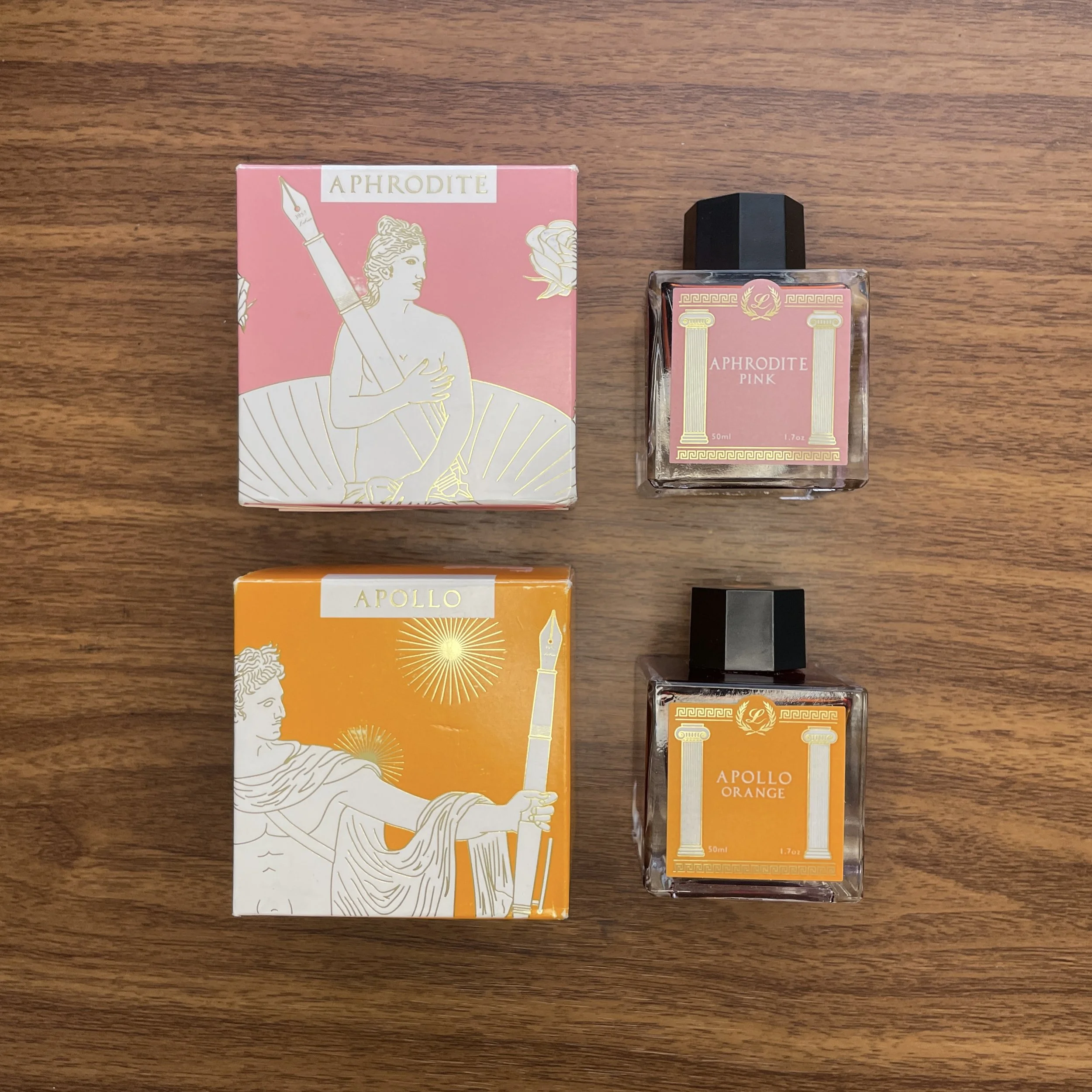
Somebody recently asked me how I organize ink swatches (probably prompted by my Ink-o-Dex video), and what paper I use to photograph samples and organize my collection. The simple answer is that I really don’t have any sort of system. I’ve been doing this for a long time, and many different storage and sampling options have come and gone over the years.
Laban Aphrodite Pink on a Col-o-Ring Card. (Stamp courtesy of Angela at Inky Converters!)
Currently, I use a combination of Col-o-ring cards (stored in the repurposed Rol-o-dex), A5 planner paper, and a 68gsm Tomoe River notebook. Typically when I’m reviewing/archiving an ink I’ll use a q-tip and my Kakimori Brass Dip Pen to make a standard color sample on Col-o-Ring paper, which goes into the Col-o-dex. Blog posts nearly always feature ink swatches and writing samples on A5 sheets of Midori MD Cotton paper and 68gsm Tomoe River paper (while I can still get it), since these are the two papers I use the most. Lately, in addition to individual ink swatches, I’ve been creating comparison sheets so that I can easily view multiple colors from a single brand or line.
My ongoing ink comparison sheet for the Laban Greek Mythology Series
The Gentleman Stationer is supported entirely by purchases from the T.G.S. Curated Shop and pledges via the T.G.S. Patreon Program. The Gentleman Stationer is an authorized retailer of certain brands, including the Laban inks shown here. This post otherwise does not contain paid advertising or affiliate links.
Sometimes what’s fun from a hobby perspective isn’t always what’s best for everyday use. That multichromatic triple-shading ink with shimmer? Probably not the best choice for quick meeting notes or signing closing paperwork on your mortgage. That triple-broad double-eagle reversible stub architect nib? That’s gonna bleed through a legal pad. While most of us enjoy our crazy stationery, it can’t take us everywhere.
The most common questions I get, both here on the blog and in-person when I’m behind a table at a pen show, concern what pen/ink/paper I can use everyday, without worrying how it’s going to perform. I often recommend that those planning on using their pens for everyday writing keep at least a couple of “workhorses,” or pens designed to write, without regard to unique design, collectibility, etc. I feel so strongly about this that I’ve devoted an entire series of articles on the blog to this topic, which I’ve compiled into an archive that’s constantly being updated.
So-called “safe”- dare I say “boring” - inks don’t have to be ugly, especially if you like muted shades. It’s when you get into super-saturated colors and special properties when things get tricky.
But while pens get the most attention, more critical components of “everyday writing” are ink and paper. With fountain pens, I would say that ink is the key variable, since you often cannot control the paper you’re forced to use in a context such as the office. You therefore need to have a handful of “workhorse” inks in addition to your “workhorse” pens, that you can use knowing that they will likely perform decently on most paper options. Back in 2020, I even put together a sample pack of some of my favorite inks, including Waterman Blue, Sheaffer Skrip Red, and Lamy Black. While I may consider running that one back in the future, I’m not sure that recommending specific inks is all that helpful or necessary. For the most part, standard inks made by major pen company such as Waterman, Lamy, Sheaffer, Pilot, TWSBI, etc. will generally be “safe” to use in most pens and on most papers, and even boutique lines such as J. Herbin and Diamine - both made by ink companies that have existed for a very long time - are extremely reliable provided you stick to the water-based core lineup for your office writing, as opposed to inks with special properties such as shimmer that can be unpredictable on anything other than high-quality paper.
“Boring” is relative. I’d consider all three of the inks pictured here to be “safe” inks in the sense that they water-based inks from longstanding, well-regarded brands. The Herbin “Vert de Gris” is a new discovery that I spent all day yesterday using at the office.
So why don’t quality, reliable inks get more attention? Honestly, the fountain pen internet and social media tends to be driven in large part by people who either don’t actually write with their pens everyday, or use their inks for art and journaling where practical considerations are less relevant. When those creating the content consider the inks “boring,” they don’t get promoted and fall by the wayside. But I’m here to tell you that sometimes “boring” has a lot to offer! Consider:
Ease of Cleaning. While some exceptions exist (pinks and purples in particular tend to be hard to clean no matter what), I value inks that flush out of pens quickly when you refill or change colors. Most of the brands I mentioned above take little to no effort to flush, and shouldn’t stain most materials, vintage or modern.
Expense. Looking for an ink that you’re going to use a lot? While ink isn’t the most expensive part of this hobby, if you write through several converters a week like I can when I’m really busy, you probably don’t want to be stocking up on ink at $50 per bottle. Most of the inks I consider workhorses are less than $20 for 30-50ml.
Permanence. People tend to treat “permanence” (more specifically, the lack thereof) as a negative rather than a positive when it comes to fountain pen ink, but I’ve come to believe it’s overrated. While it’s nice to have some water resistance, I can count on one hand the number of times I’ve spilled water or a drink on some notes, and completely lost what I had written. On the other hand, I’ve frequently spilled ink when filling pens, when a pen leaks during travel, or when I accidentally drag a shirtsleeve across some writing that’s not quite dry. If it’s permanent ink, it’s probably going to stain. On the other hand, a few weeks ago I spilled a sample vial of Iroshizuku Tsukushi onto the rug in my office. I ran the rug through the washing machine and the ink washed out completely on the first try. On the other hand, I spilled a bottle of permanent blue-black on some carpet several years back and had to recarpet the room. Personally, I’ll take the safe/impermanent/washable option for those inks I plan to use everyday, but I’m also a klutz.
Oops.
Now here’s the part where I sort of contradict myself: When I first entered this hobby, it used to be a reliable rule-of-thumb that if you were looking for a “safe” ink (i.e., to use in a finicky, valuable, or vintage pen) any ink made by a “pen company” was generally suitable. Today, I still get e-mails from people asking whether “X” shimmer ink is safe for vintage pens, since it’s made by “X” pen company. Having seen the rapidly expanding market for fountain pen ink, including inks that shimmer, sheen, and multi-shade, pen companies are expanding into these more specialized offerings. So while you can take the “pen company manufacturer rule” into account, it’s no longer something you can solely rely upon, and you have to do some homework. I generally advise people that if you want to purchase a particular ink for use everyday, and you want the ink to be versatile enough to use in as many different pens, on as many different papers as possible, it’s wise to avoid inks with special properties.
As I mentioned above, I’m getting ready to visit this year’s Baltimore Washington International Pen Show, as well as the Arkansas Pen Show the following week, and at both shows I’ll be conducting a free workshop tentatively titled “Stationery for Daily Use with the Gentleman Stationer,” in which I plan to discuss pens, inks, paper, and notebook systems appropriate for managing your daily life and work. The class will be similar to the “Everyday Writers: Choosing the Best Pens for Home and Office” seminar that I held at the last Baltimore Show I attended as a vendor, back in 2020.
We will also plan to bring a curated selection of pens, inks, and notebooks with us to both shows, so you’ll have the opportunity to test out many of the goods in our shop in person. We hope to see you there!
The Gentleman Stationer is supported entirely by purchases from the T.G.S. Curated Shop and pledges via the T.G.S. Patreon Program, and is an authorized retailer of all brands sold, including certain ink brands mentioned in this article.
Because I have so many inks in my collection, it generally takes either an unusual color or an interesting story to prompt me to make a purchase. If I’m inspired to buy the entire line, the ink must be really special, and that’s where I found myself at last year’s Baltimore Pen Show, visiting multiple vendors trying to put together a full set of Laban’s Greek Mythology-inspired inks.
This one is all about nostalgia for me: I’m a huge history fan, was an even bigger fan of Greek/Roman mythology as a child, and I now have a child who loves history, including the ancient myths. While there’s nothing particularly unusual about most of the ten colors in this series - they’re all fairly standard riffs on inks you would expect to find in a lineup made by a pen manufacturer - each ink writes really well, and the color has been paired with a god or goddess from ancient Greek mythology. (While the colors themselves are different than what is typically associated with each of the specific namesakes, only a hardcore mythology nerd will catch this, and frankly these colors are far more practical and will appeal to more people than gold or silver, for example.)
Athena Grey: the “decisive” ink. Writing samples done with Kakimori Brass dip nib and Majohn P136 on Midori MD Cotton Paper.
Athena Grey was the Laban ink that I first jumped at, not necessarily because of the color but because of the association. The Greek goddess of wisdom (Roman equivalent: Minerva), Athena holds a special place for me because my hometown hosts a full-scale replica of the Athenian Parthenon, complete with statue of Athena. You can read more about the backstory here, but a version of the Parthenon was first built for the 1897 Tennessee Centennial Exposition before being made permanent, with the Athena statute added later in the 1990s. The venue serves as an art museum located in Nashville’s Centennial Park.
Athena Grey is a very dark grey ink, which some might even consider black, especially when writing with fine or extra-fine nibs. In a wetter, wider nib, the ink will show as more of a dark grey with purple undertones, similar to a dark, more concentrated Sailor Chu-shu. I’ve found this particular color to be an excellent ink for everyday office work, as the color is conservative while still remaining interesting enough to intrigue fountain pen users looking for those slightly offbeat shades of classic tones.
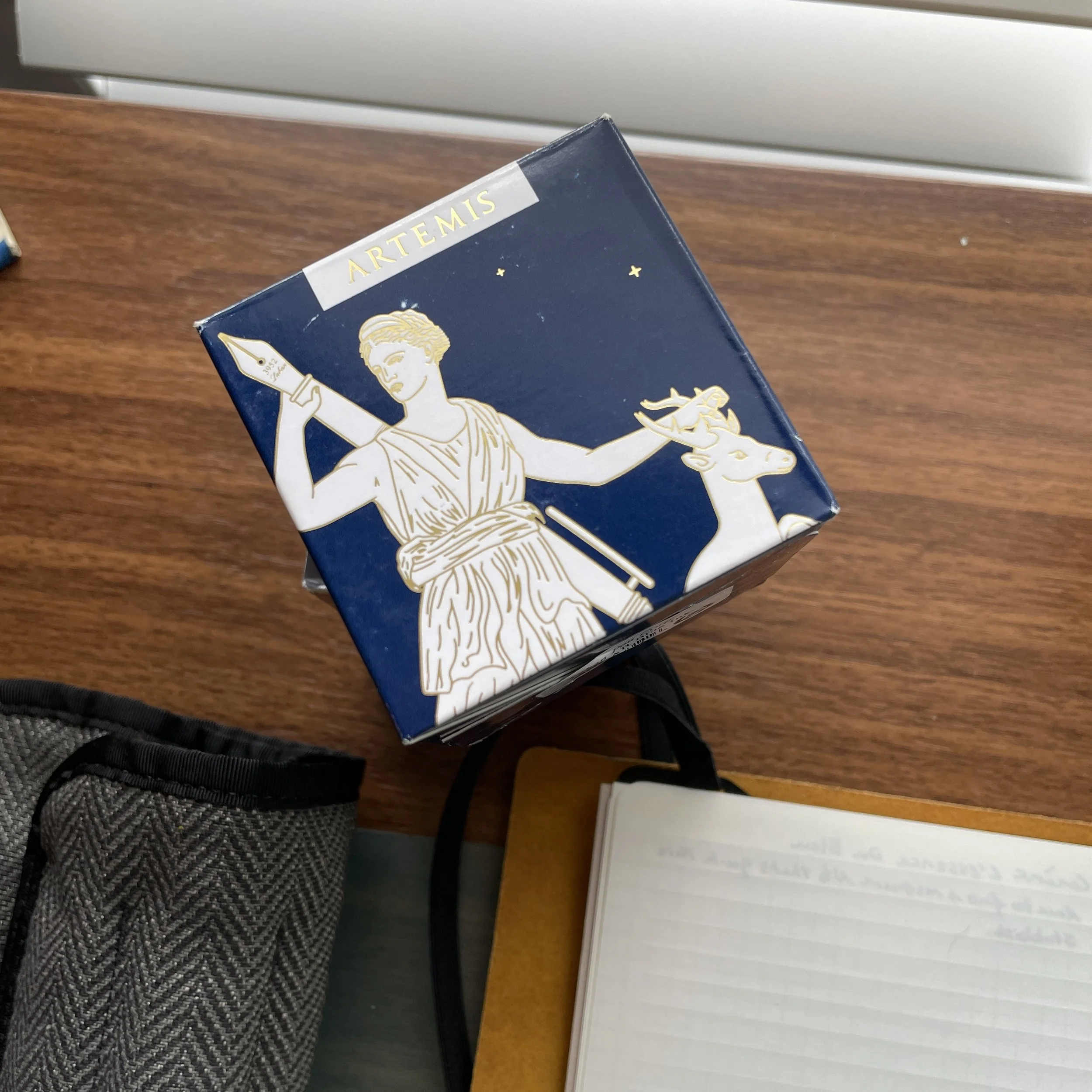
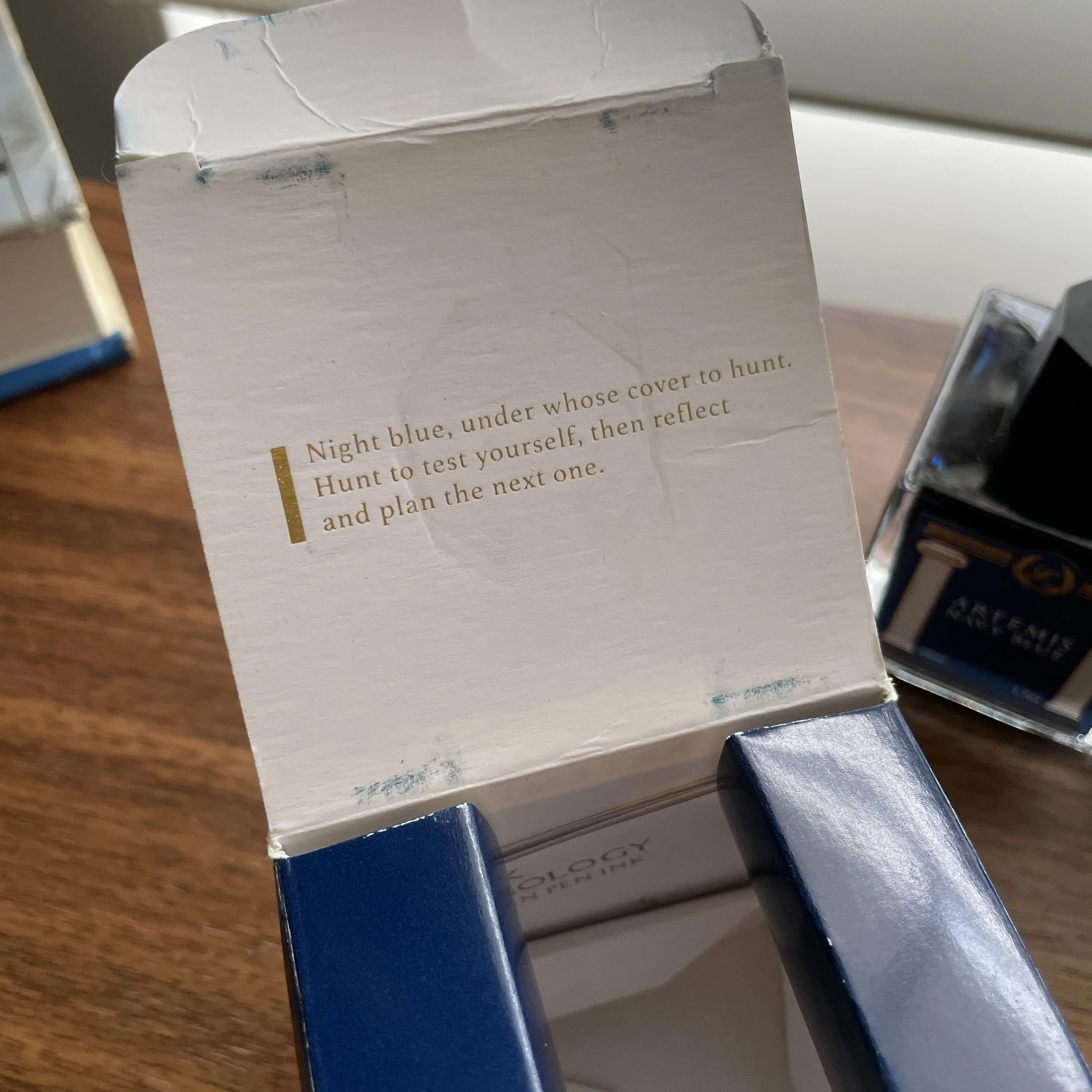
Artemis Navy Blue: the “bright” ink
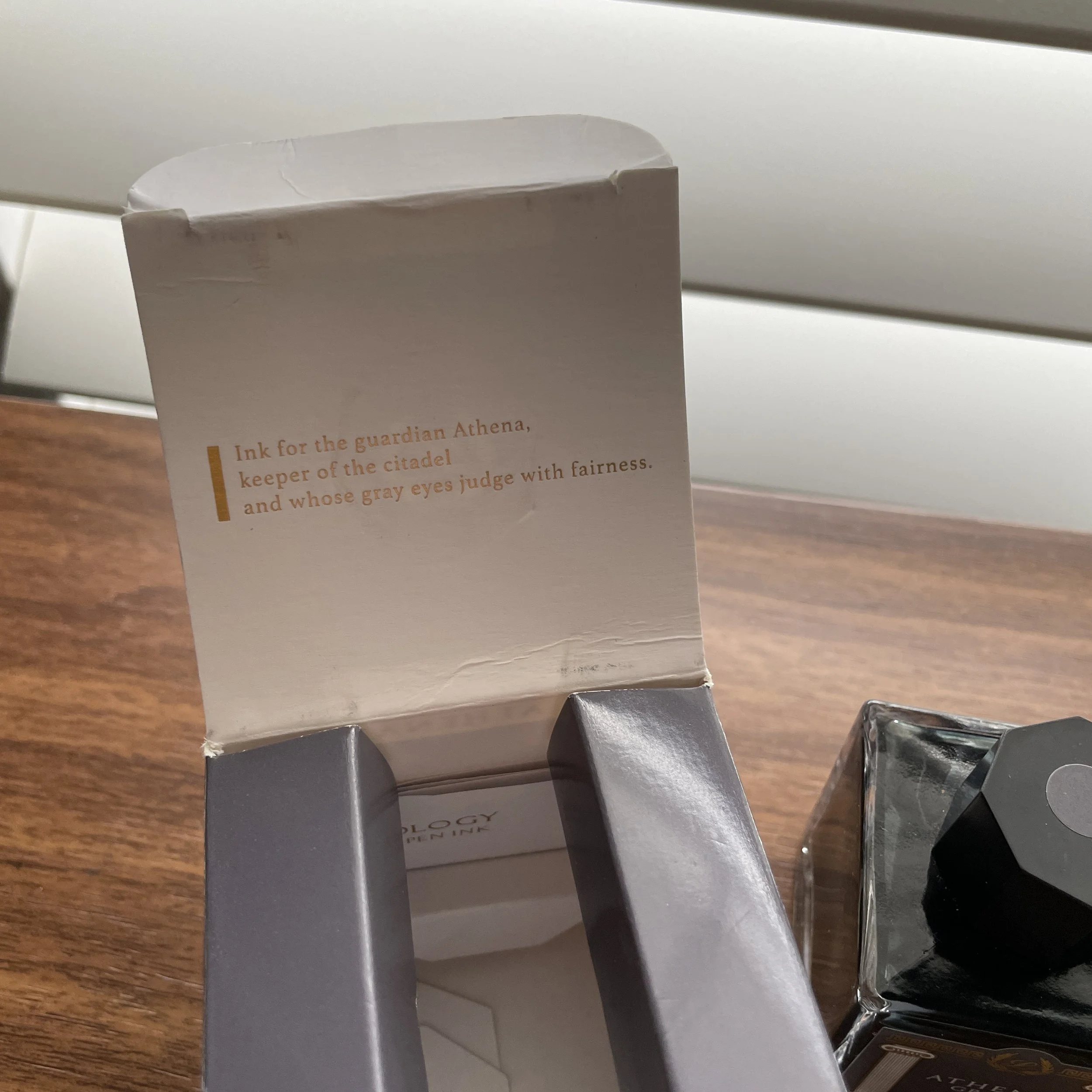
A true navy ink is surprisingly (and somewhat frustratingly) hard to find. Artemis Navy Blue is a dark, rich blue with a touch of sheen - think the now-discontinued JFK Navy Blue from Montblanc, only darker (I would say “richer”) and with less grey. Named after Artemis, the Greek goddess of animals and the hunt (Roman equivalent: Diana), the artwork features the classic motif of Artemis reaching for her bow and arrow, only to find that her bow is a fountain pen! (See the gallery below for the images from the packaging, which I find really well done.)
Like Athena Grey, this ink is a bit of a sleeper and actually one of the last inks I tested from the lineup because I thought it would be a “boring” blue. As it turns out, it has become one of my favorites, and was the surprise hit at pen club a couple weekends back when I brought it for people to test in person.
View fullsize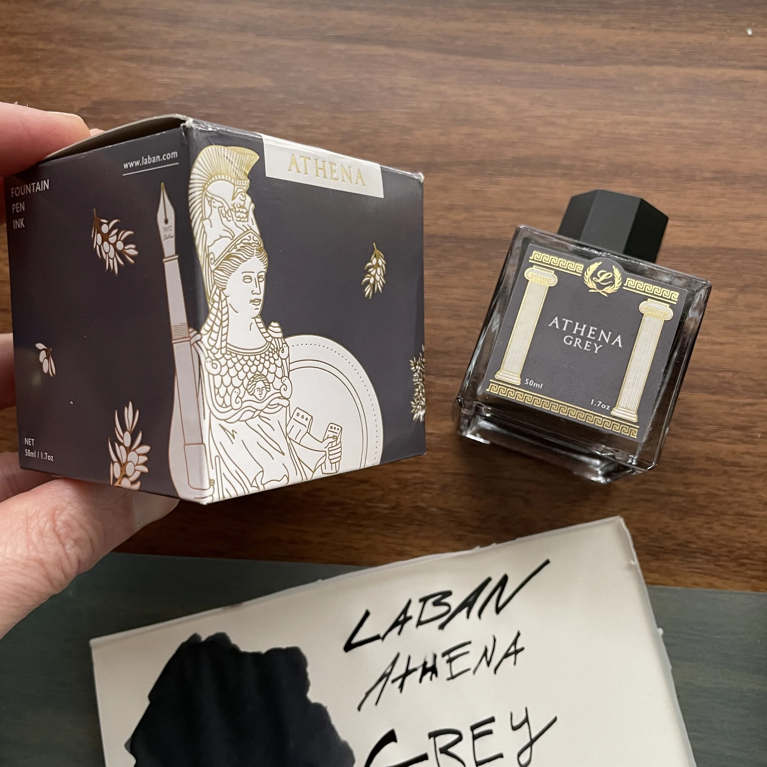
It’s rare that I’ve purchased all of the inks in a given series of releases, much less in a single weekend, so that should tell you something about how much I enjoy what Laban has done here. In fact, I liked these inks so much that I put them on the short list for inks I wanted to sell in our own shop, and we’re happy to be able to offer the Laban Greek Mythology inks directly as of last week. Each ink comes in a 50ml glass bottle, priced at $25.
I’m starting a full comparison ink swatch sheet for this line as I review the rest of them. (Don’t ask me for this paper - go bother the folks at Plotter, because this is exceptionally good Midori MD Cotton Paper with letterpress ruling that they’ve been refusing to make generally available in the US!)
While I’m still personally working my way through this series of ten different inks, you can read my prior post on Ares Red, named after the God of war, here. I’m trying to be better about finishing reviews of full series/sets, hopefully with the goal of creating an organized archive of past content as I’ve done with fountain pens. Stay tuned!
The Gentleman Stationer is supported entirely by purchases from the T.G.S. Curated Shop and pledges via the T.G.S. Patreon Program.
Finding a new ink to break into my regular writing rotation is not an easy task. I have a lot of inks, and even more particularness when it comes to picking out an ink to use on a regular basis. Some pens have specific inks tied to them-my Namiki Milky Way and Pilot Iroshizuku Tsui-yo, for example-while other inks are a favorite in a lesser used color category, like Akkerman #28 Hofkwartier Groen.
Since I purchased Wearingul Cheshire Cat late last year, I haven’t limited it to a single matchy matchy pen setup, but have actively looked to use it in as many pens as possible. That’s how much I’ve been enjoying it.
Disney’s Cheshire Cat. (Image via Disney Wiki.)
Cheshire Cat, from South Korean ink maker Wearingul, features a mixture of magenta, fuchsia, pink, and purple shades, designed to mimic it’s mysterious Alice in Wonderland namesake. I find it colorful, yet extremely comfortable on the eyes. It’s not one of those searing hot pinks.
Tested on Mitsubishi Bank Paper from The Paper Mind.
Performance-wise, it is a simple and safe color. It flows well while not being overly wet, dries quickly, has slight shading even in finer nibs, and has been easy to clean each time I’ve used it. That’s a good feature list in my book.
Wearingul not only makes great inks, they tell good stories. Many of their ink creations are based on literature. Cheshire Cat isn’t the only Alice in Wonderland ink-there is the shimmery blue and gold Alice, and the deep green Mad Hatter, among others. There are more classic tie-ins with the Wizard of Oz, feature inks for women in Korean literature, and wild ink sets like Dr. Jekyll and Mr. Hyde. And lest we forget one of the greatest inky creations of all-time: Chicken ink!
I’m a fan of the stories Wearingul is telling, and an even bigger fan of the qualities of their ink. Cheshire Cat is by no means a groundbreaking color or formulation, but it doesn’t need to be for me to love using it. I look forward to adding a few more to my ink shelf ink the coming year.
(I purchased this ink from Goldspot at a discount.)
Enjoy reading The Pen Addict? Then consider becoming a member to receive additional weekly content, giveaways, and discounts in The Pen Addict shop. Plus, you support me and the site directly, for which I am very grateful.
Membership starts at just $5/month, with a discounted annual option available. To find out more about membership click here and join us!