![]()
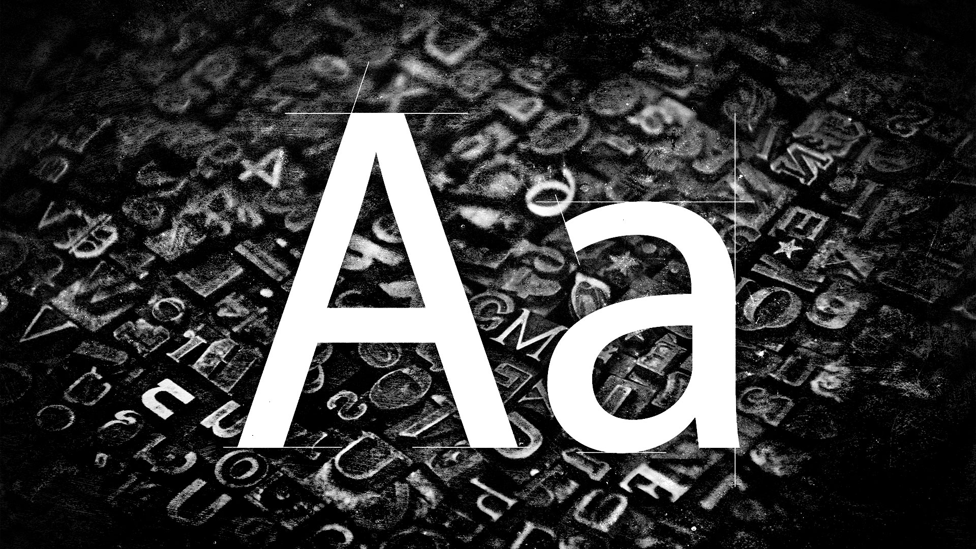
Artist Shantell Martin has been catching peoples’ eyes for more than a decade with her large-scale black-and-white drawings. They simply can’t be ignored! Often times they include messages and questions – such as “Who are You” – in Martin’s signature all-caps handwriting. Now, with the open source release of Shantell Sans, everyone has access to this bold, playful, easy-to-read font!
![]()
The marker-style font was built for all types of creative expression by Martin, Arrow Type, and Anya Danilova. They made sure to include Latin and Cyrillic characters to support languages throughout the Americas, Europe, Central Asia, and Vietnam. Shantell Sans can be adjusted by weight, spacing, informality, bounce, and italics. It’s also worth mentioning that its all-caps design is especially easy to read.
![]()
![]()
Martin’s relationship with fonts and type go way back because she lives life as a proud dyslexic. “I always wanted to reclaim that space due to my dyslexia, and defeat my past challenges. The creation of my own font was an innate process and an extension of my artwork, and something I always wanted to do,” she said. “I think fonts can really change the mood of a person in the way that they can be dense and limiting, or, on another hand, open and playful. I think we do pick up on these subtle messages on a subconscious level. I wanted to share my work in a new, exciting medium accessible to anyone.”
![]()
![]()
Fun, welcoming, energetic, approachable, and creative are just a few of the words Brooklyn-based Arrow Type’s Stephen Nixon used to describe Shantell Sans. “The variable axes of bounce, informality, and spacing take the basic font and add in more of the natural variance and personality from Shantell’s writing, and I especially hope to see people find uses for those in animated text in video titles and stuff,” he shared. “Shantell Sans is a little bit like an elevated, less stiff Comic Sans. It’s also a little bit soft and inky like Cooper Black or Windsor.”
Download Shantell Sans for free here.
![]()
![]()
To learn more about the making of Shantell Sans, visit shantellsans.com.
It’s only Wednesday and I’ve had a couple of occasions this week to refer to Nonviolent Communication (NVC) and the FONT framework that I learned in workshops run by Outlandish. I’d highly recommend that you also attend their Reframing Conflict sessions.
I’m publishing this post so that I’ve got something to point people towards during conversations in which I reference FONT and NVC.
Let’s begin by defining terms:
Nonviolent Communication (NVC) is an approach to communication based on principles of nonviolence. It is not a technique to end disagreements, but rather a method designed to increase empathy and improve the quality of life of those who utilize the method and the people around them.
[…]
NVC is a communication tool with the goal of firstly creating empathy in the conversation. The idea is that once there is empathy between the parties in the conversation, it will be much easier to talk about a solution which satisfies all parties’ fundamental needs. The goal is interpersonal harmony and obtaining knowledge for future cooperation. Notable concepts include rejecting coercive forms of discourse, gathering facts through observing without evaluating, genuinely and concretely expressing feelings and needs, and formulating effective and empathetic requests.
Wikipedia
I have to be honest, I thought this was some real hippy-dippy stuff when I first read it. But the FONT framework in particular changed my mind. As Pete Burden and Abi Handley explain:
“FONT” is not a single model – it is a bricolage; it draws on:
Marshall Rosenberg’s Nonviolent Communication, Gervase Bushe’s Clear Language, Thomas Gordon’s work on I-statements and requests.
Ideas from several people (such as Bill Isaacs and Diana McLain Smith) at the MIT Dialogue and Harvard Negotiation projects ; David Grove’s Clean Language; Agazarian and Simon’s System for Analysing Verbal Interaction (SAVI™); Bill Torbert’s collaborative enquiry.
And work by Arnold Mindell, Bob Kegan, Carl Rogers, David Cooperrider, David Kantor, Douglas Stone, Lisa Lahey, Mary Follett, Reg Revans, Robert Plutchik, Stephen Hayes, Susan Wheelan, Richard Schwartz and many, many more.
So what is it? How does it work?

FONT is an easy way to remember the four constituent parts, but when you use this as an approach, you actually use it in this order:
Since I attended the workshop, I’ve used this approach in both professional and personal conflict situations. Sometimes I’ve done it verbally, starting with “I noticed that…” whereas other times I’ve gone through the FONT process in written form to prepare me for a potentially-awkward conversation.
Step 1: Observe the situation objectively — focus on the specific behaviour that’s causing the issue, rather than making assumptions or jumping to conclusions. For example, if a colleague is frequently interrupting you during meetings, observe that behaviour without making any assumptions about their intentions or motivations.
Step 2: State your thoughts — try and articulate what you are thinking or have noticed in an uncontroversial way. For example, you could say to your colleague, “I notice that you often have a lot that you want to communicate during meetings.”
Step 3: Identify your feelings — are you feeling frustrated, angry, or upset? By identifying your emotions, you can communicate more effectively and avoid becoming defensive or confrontational. For example, you might say “I feel frustrated when you interrupt me during meetings because I want to make sure my ideas are heard.”
Step 4: Articulate your needs — what do you need in order to feel more comfortable or productive in the situation? This is an opportunity to express your needs in a positive and constructive way. For example, you might say “I need to have uninterrupted speaking time during meetings so that I can share my ideas and feel heard.”
Step 5: Make a request — this is an opportunity to ask for what you need in a constructive and positive way. For example, you might say “can we agree that everyone will have an opportunity to speak uninterrupted during our meetings?”
As a side note, it’s worth mentioning that “I noticed that…” is a bit of a magic phrase. For example, there are cars which travel too fast down the 20mph street next to my house. I tend to get annoyed at this and have a tendency to shout at the drivers, but my neighbour has a better approach. He smiles, asks them to wind down their window, and says something like, “I noticed that you seemed to be in a hurry?” His going on to explain that the road has a 20mph speed limit feels overall like a less confrontational approach.
In closing, one of the things I’ve learned during my career to date is that coercion and manipulation tends is a hallmark of hierarchical and paternalist organisations. We can do without it:
Nonviolent Communication holds that most conflicts between individuals or groups arise from miscommunication about their human needs, due to coercive or manipulative language that aims to induce fear, guilt, shame, etc. These “violent” modes of communication, when used during a conflict, divert the attention of the participants away from clarifying their needs, their feelings, their perceptions, and their requests, thus perpetuating the conflict.
Wikipedia
People may bristle at the accusation that many of our ‘normal’ ways of communication tend to be violent but, it’s worth thinking about adding the FONT framework and nonviolent communication techniques to our toolboxes. I think my family, friends, and colleagues would still say I’m perhaps a little too quick to anger, but at least I now have tools to defuse situations that would previously feel out of my control!
The post FONT and Nonviolent Communication first appeared on Open Thinkering.(Jeff Abbott is a regular contributor at The Pen Addict. You can find more from Jeff online at Draft Evolution and Twitter.)
Pretty sure it has something to do with the on/off nature of this past winter, but I'm definitely ready for some warmer weather (or maybe just some consistency?). At any rate, a new notebook is always a good method to add some excitement to the dull weather. This week, I've been enjoying a new notebook from Clairefontaine that rocks an exquisite cover that has a lot of summer vibes.
The Neo Deco line of notebooks from Clairefontaine all feature a unique and bold art deco cover design that can fit any occasion. I couldn't pass up the Turquoise option because of the bright colors and contrast.
The specs of the notebook are very familiar if you've ever used Clairefontaine before. It features 48 pages of 90 gsm paper that provides an excellent writing experience with virtually all writing instruments. All of Clairefontaine’s paper is lined, so that normally turns a portion of people away who prefer other options. It's really a shame and something that I wish the company would change. I happen to enjoy lined paper on some occasions, and Clairefontaine is probably my favorite lined notebook maker. But, I'd buy a lot more of their products if they offered other options like blank, grid, and even dot.
Still, if you dislike lined paper, you still need to at least try Clairefontaine's excellent paper. It really is fantastic, and their notebooks are fairly accessible and affordable.
The Neo Deco line uses a soft cardboard material for the covers and a stitched binding that holds up well. At just 48 pages, the notebook easily stays open when writing, but the front cover will always stand up when the notebook is closed. That's easy to fix with an elastic band, though.
The 48 pages inside are all the same lined pages — no tables of contents or information pages in these notebooks. Branding is also small with this notebook. There are Clairefontaine logos on the front and back, and some information about the company and materials used on the inside of the back cover. Still, the branding is minimal.
Besides the silky paper, the real star of this show is the cover design. In the Turquoise option I picked, the main cover is a bright turquoise blue with gold leaf accents in the shape of tropical leaves. There's also light-blue tropical leaves on top of the blue cover that provide another layer to the design that gives it more dimension. The bright blue and reflective gold are a knockout combination that I love having on my desk.
Sticking with the art deco theme, there are several other cover options if the bright tropical cover isn't your thing. These A5 notebooks come in at $11, which is a great value for the fun covers and excellent paper. I always have at least one Clairefontaine notebook in my active rotation, and the paper quality and writing experience is the main reason. With this new notebook, it stays on top of the stack longer because the bright cover just makes me smile.
(This product was purchased from Goldspot at a discount.)
Enjoy reading The Pen Addict? Then consider becoming a member to receive additional weekly content, giveaways, and discounts in The Pen Addict shop. Plus, you support me and the site directly, for which I am very grateful.
Membership starts at just $5/month, with a discounted annual option available. To find out more about membership click here and join us!
![]()
Enlarge (credit: Aurich Lawson | Getty Images)
Official correspondence from America's diplomats is getting a bit of a spruce-up next month. From February 6, the US Department of State will adopt Microsoft's sans-serif Calibri in 14-point size "for all paper submitted to the Executive Secretariat," according to The Washington Post's diplomacy reporter John Hudson.
big news for font freaks: Times New Roman is being phased out at the State Department & replaced by Calibri. Secretary Blinken sent a cable to all embassies today directing staff not to send him any more papers with Times New Roman. Subject: "The Times (New Roman) are a-Changin" pic.twitter.com/HENLbRH3UQ
— John Hudson (@John_Hudson) January 17, 2023
The move sparked a somewhat tendentious discussion in the Ars virtual office earlier today. In the cable, the State Department refers to Times New Roman and Calibri as fonts. But teeeeeeechnically, it should have referred to Times New Roman and Calibri as typefaces. A font, rather, is how you manipulate that typeface—changing the size or weight, the character spacing, or making it italic, for example.
"If we’re being pedantic (AND I AM!), a font is a clade of a typeface, I think? And yes, while switching typefaces might mean you are also switching the style of text you’re using, it’s not a semantically meaningful phrase," said a rather pedantic colleague.