![]()
Ben Vinson III is a historian, with his focus cast outside of the United States.
![]()
Richard D. Kahlenberg, whose hero is Robert Kennedy, wants to build a multiracial progressive coalition.
One fusion startup is betting that a 70-year-old idea can help it leapfrog the competition, so much so that it’s planning to skip the experimental phase and hook its prototype reactor up to the grid.
The decades-old concept, known as a stellarator, is deceptively simple: design a fusion reactor around the quirks of plasma, the superheated particles that fuse and generate power, rather than force the plasma into an artificial box. Easier said than done, of course. Plasma can be fickle, and designing “box” around the fourth state of matter is fiendishly complex.
That’s probably why stellarators spent years in the fusion-equivalent of the desert while the simpler doughnut-shaped tokamak ate everyone’s lunch, and nearly all of their research funding.
But not all of it. Type One Energy is the brainchild of a handful of physicists steeped in the stellarator world. One built the HSX stellarator at the University of Wisconsin-Madison, two more performed experiments on it, and a fourth worked on the Wendelstein 7-X reactor, the world’s largest stellarator.
Together, they founded Type One in 2019 and nudged forward their approach to fusion at a steady pace. The company wasn’t in stealth — TechCrunch+ identified it as a promising fusion startup last year — but it was operating on a slim budget.
Fusion startup Type One Energy gets $29M seed round to fast-track its reactor designs by Tim De Chant originally published on TechCrunch
(Sarah Read is an author, editor, yarn artist, and pen/paper/ink addict. You can find more about her at her website and on Twitter. And check out her latest book, Out of Water, now available where books are sold!)
I have wanted to try CW&T Pen Type-B ever since I heard Brad annoy Myke with it on the podcast, many years ago. The POP it makes when you open it is endlessly satisfying, and the machined precision that causes it to float back into place when capped is absolutely magical. I'm unabashedly obsessed with this slightly ridiculous pen.
The version of the Pen Type-B that I have here is a stainless steel body with a brass tube cap that extends almost the full length of the body. Both are plain cylinders, except that the cap has one flattened side that keeps the pen from rolling away. There's no lettering, no grip section--just two metal tubes living together in perfect harmony. The brass cap is meant to take on character as it is used, though I've used it almost daily for weeks and it hasn't started to patina yet. It did take on some character where I dropped it in my driveway, but that's just a wee scratch, and the pen itself appears indestructible.
The precision tolerance of the machining is what creates the air-tight seal between the body and cap, resulting in that glorious POP when you open it, and the slow piston closure. If you open the pen partway, it will slowly sink back into the cap from the suction generated by the airtight seal. This trick only works if the pen is machined absolutely perfectly, and CW&T inspect every pen to make sure they are indeed perfect. The fidget factor here is off the charts. I had to attend two all-day professional training seminars last month, and I have a weekly 3-hour zoom class. This pen is responsible for keeping me in my seat, appearing somewhat sane (that's as good as it gets, for me. Fully sane is unattainable).
The pen body has no seams or interruptions. The access to the refill is through the back end of the pen, where there is a small bolt that unscrews. It's easy to do--I was able to unscrew it with my fingernail, though a coin or key would also work. When the small bolt is removed, the refill simply slides out.
The pen body can be used by itself for writing, or the cap-sleeve can be posted if you want a thicker, heavier pen. This isn't a light pen, as one can probably guess from the materials. It's 90 grams altogether. I haven't used it for long writing sessions, though I think I could if it were unposted, and I continuously reach for it to jot down quick notes or sign something.
The included refill is fantastic. It's the Pilot Hi-Tec C, and it comes with a black 0.3 mm insert. I love the ultra-fine point on this refill, and it writes like a dream. It's smooth and has a nice flow, with no scratching or skipping. The ink is dark enough to be visible even with fine writing. It's perfect for writing very small notes, or in the wee squares of a pocket calendar.
But what if you don't like the Pilot Hi-Tec C? There are a variety of spacer inserts available, from 2mm to 27mm, that allow this pen to take just about any refill you can imagine.
It's quite a feat for a pen to be so minimal and yet so EXTRA at the same time, and I am totally here for it. I'm about to sit down to my last 3-hour lecture of my grad school career, and I've got it right here on my desk, ready for notes--and fidgets.
(JetPens provided this product at no charge to The Pen Addict for review purposes.)
Enjoy reading The Pen Addict? Then consider becoming a member to receive additional weekly content, giveaways, and discounts in The Pen Addict shop. Plus, you support me and the site directly, for which I am very grateful.
Membership starts at just $5/month, with a discounted annual option available. To find out more about membership click here and join us!
![]()
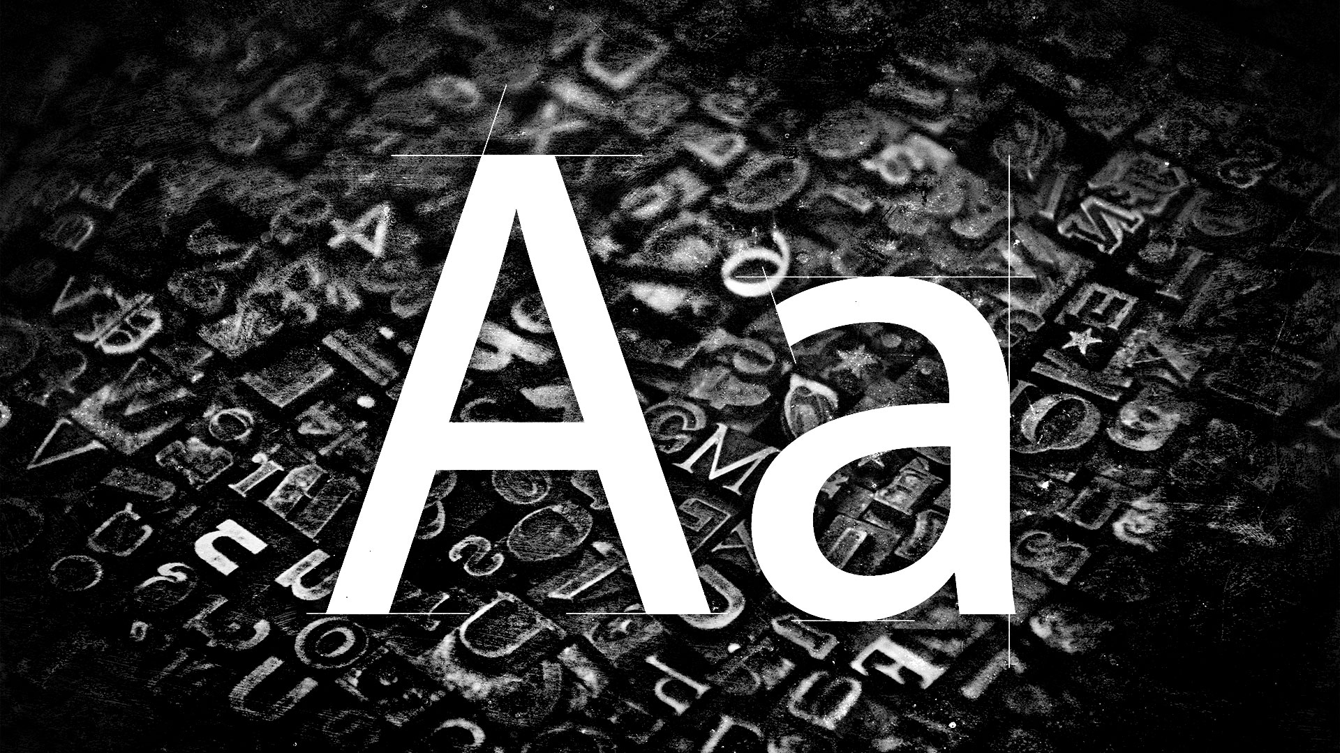
Artist Shantell Martin has been catching peoples’ eyes for more than a decade with her large-scale black-and-white drawings. They simply can’t be ignored! Often times they include messages and questions – such as “Who are You” – in Martin’s signature all-caps handwriting. Now, with the open source release of Shantell Sans, everyone has access to this bold, playful, easy-to-read font!
![]()
The marker-style font was built for all types of creative expression by Martin, Arrow Type, and Anya Danilova. They made sure to include Latin and Cyrillic characters to support languages throughout the Americas, Europe, Central Asia, and Vietnam. Shantell Sans can be adjusted by weight, spacing, informality, bounce, and italics. It’s also worth mentioning that its all-caps design is especially easy to read.
![]()
![]()
Martin’s relationship with fonts and type go way back because she lives life as a proud dyslexic. “I always wanted to reclaim that space due to my dyslexia, and defeat my past challenges. The creation of my own font was an innate process and an extension of my artwork, and something I always wanted to do,” she said. “I think fonts can really change the mood of a person in the way that they can be dense and limiting, or, on another hand, open and playful. I think we do pick up on these subtle messages on a subconscious level. I wanted to share my work in a new, exciting medium accessible to anyone.”
![]()
![]()
Fun, welcoming, energetic, approachable, and creative are just a few of the words Brooklyn-based Arrow Type’s Stephen Nixon used to describe Shantell Sans. “The variable axes of bounce, informality, and spacing take the basic font and add in more of the natural variance and personality from Shantell’s writing, and I especially hope to see people find uses for those in animated text in video titles and stuff,” he shared. “Shantell Sans is a little bit like an elevated, less stiff Comic Sans. It’s also a little bit soft and inky like Cooper Black or Windsor.”
Download Shantell Sans for free here.
![]()
![]()
To learn more about the making of Shantell Sans, visit shantellsans.com.
Matthew Zapruder’s Royal Quiet Deluxe typewriter and a typewritten draft of a 2018 poem. Photographs courtesy of Zapruder.
When I was in my twenties, my grandparents finally moved out of the house my mother had grown up in. In the attic where we used to sleep as kids, and where my grandfather would come in at bedtime and sing “Goodnight, Irene” to me and my younger brother and sister as we lay in a row in our little cots, I had found my mother’s typewriter, a Royal Quiet Deluxe, perfectly preserved from her high school days. My grandfather was the sort of person who would make sure it was in pristine working order, and when I opened the case, the keys gleamed. It didn’t even need a new ribbon. It made a satisfying, well-oiled clack.
I lugged it to the house I was living in on School Street, in Northampton, Massachusetts. I had moved from California back to the same weird little valley where I had gone to college, to go to graduate school for poetry. Thankfully I did not yet know that a manual typewriter was a writerly cliché. For a while, the typewriter just sat there in the corner of my room.
I was still toiling away, writing a lot of poems the way I used to: choose a subject, and try to write something “about” it. Use a computer. Those poems always felt labored and ponderous. No matter what I said, the thoughts in them were never new. Nothing was being added by my writing. I had already figured it out, and mostly it was banal and obvious. Death is sad. The city, if you have not been informed, is lonely at night. In it, other people are mysteriously uninterested in me, which is sad and lonely for me, and for them, whether or not they know it.
Occasionally I would try to let things go completely, and exert as little control as possible over the language. Those poems were a mess, and I would stare at them afterward with bored incomprehension.
My bedroom on the second floor of that house on School Street tilted alarmingly. A row of poorly sealed windows looked out onto the street and other crooked little houses. A giant morning glory had taken over the backyard, and I marveled at how its purple flowers would open to admit the pollinators, and then close in the afternoon and die. The next day new flowers would do the same thing.
Winter came, and a cold wind constantly blew through the room. Sometimes flakes of snow would somehow appear inside. A ring of frost on the lip of a glass. I was growing more and more frustrated with the destabilizing ease with which I was able to continually write and erase words on a computer. Things were always happening too fast, and changes were being made and unmade with alarming frequency. The poems, in their clean, professional fonts, looked so much better than they were. More often than not, I couldn’t stop myself tinkering long enough to figure out what felt right and true to me. I desperately needed to slow down.
My new existence felt barely tethered. I thought nothing in my life mattered, and I was willing at a moment’s notice to alter it. This made me careless and cruel. An equivalent lack of responsibility manifested in my writing. I was always willing, recklessly, to change anything in the poem to make it more musical, more strange, always skating along the edge of irrelevance. While this makes one an awful boyfriend, friend, brother, or son, I think it is an excellent place to be as a young artist. It hones one’s skill and teaches the line between intuitive meaning and pointless weirdness.
When I gained a small audience of fellow poets in graduate school—who became friends who deeply mattered to me, and whose work I read, too—something began to change. It would be a long time before I’d come to understand how much these connections meant, in life and in writing. But their presence affected me deeply as a writer. Not only was I finally in a place where other people were serious about poetry, I began to think about them while I was writing. I was able to imagine them moving through the poem. I would move things around and imagine what the effect would be on my readers. And I moved through their poems too, marking where I was baffled or uncertain, always considering the possibility that things could be in a different order. On the one hand, I felt a growing freedom and understanding of the composition process, which could sometimes feel dizzying. On the other, there was the actual, physical presence of readers who gave direction to that freedom.
***
In a desperate attempt to get away from the limits of my own emotions and experiences, I began walking around the quaint little town, along streets canopied by trees full of blossoms, in a permanent unhappy daze, gathering lines and transcribing in my notebook whatever I heard in my mind. What I saw became words, not just to describe what I was seeing. I was also collecting stray thoughts, memories, observations, jokes, comments, questions, strange bits of language on signs or the sides of passing trucks; whatever I saw, overheard, and thought, with no discrimination. Each house seemed to emanate a friendly, familial light. I told myself I wasn’t writing poetry, just lines, most of which were not particularly promising, but I kept collecting.
I didn’t realize it at the time, because I was only vaguely familiar with surrealism, but like those misunderstood idealists I was trying to maintain a more or less constant dream state while I was awake, so that many lines would come to me and bridge the gap between reality and the unconscious. I was also obsessed with a particular group of artists, Der Blaue Reiter (The Blue Rider), whose most famous member was Wassily Kandinsky. They operated in the space between figurative art and abstraction, and their gorgeous, colorful canvases shimmered with the twin energies of representation of the world and the intimation of all that was beyond mere representation.
I wanted my poems, like those paintings, to reflect and engage with reality while also pointing always to something beyond it, something I did not truly understand or grasp but could feel was there. I desired the presence of both worlds in my work, and had no idea how to summon either, much less both. Out of desperation I began setting my alarm earlier and earlier and getting up just to assemble those lines, along with others that I had written earlier and cut out of poems that were not working. Most of the lines were not good. I wasn’t sure what to do with them, other than retype them and try to move them around, again and again, until something felt like a poem.
I signed up for a workshop with James Tate, whom I worshipped. The feeling was not mutual. We both suspected I could not write any good poems, and the evidence appeared weekly. It was early spring and, I remember, very cold. Winter dragged on. I brought in poem after poem, and like the weather they just got worse. One week I read with a growing sense of dread as I heard my voice in the room, and Jim looked at me for what seemed like a very long time. Then, with one hand ceremoniously turning the paper over in the air, he placed it with exaggerated care back on the table, facedown, saying just one word: “No.”
In rearranging these lines, I wasn’t writing poems exactly, just trying to connect things from different times I had walked around to see what suggested itself. I was looking for anything that meant something. I searched through them for clues or signs, a faint suggestion of a scene or situation.
I did this for many weeks without much success. Then, without warning, I realized that the lines were collecting themselves into a scene, like in an auditorium when an orchestra is warming up before the performance. Those disorganized sounds become the real performance, the one that happens before the official one begins. The audience rises and applauds. Guided by something nameless, I kept writing and putting things together with a new instinct, or maybe an old one that had at last emerged. The poem felt in some way both lighter and, for the first time, essential, though (or perhaps because) I couldn’t say what I was doing.
I brought the poem to class, but strangely, for the first time, I did not care what anyone said. After I read it, Tate looked up at me, and gave an enigmatic “Huh.” Then he spoke for a long time about what he liked. But I did not really listen. I had already learned something about writing poetry, something that could never be forgotten.
***
In that little room overlooking School Street, surrounded by snow, I began to type many versions of whatever poem I was writing, over and over again, on the Royal Quiet Deluxe, which was not quiet at all. Each time I was done I would yank the poem dramatically out of the platen and stare at it, maybe making some marks. If I wanted to see what the change would look like, I’d have to retype it, even if it was just a single word. The process was slow, meditative, hypnotic. I could work for many hours like this. The sound of a typewriter is unmistakable. It resonates in a room, timelessly, through doors, into the world. The sounds dominated my skull entirely. I began not to think about but to hear how necessary each word was or wasn’t: if I skipped something to avoid typing it for the fiftieth or hundredth time, and then when I read it, it sounded fine, I would never look back.
I also had a secret, immutable rule. If I ever mistyped a word— horse for house, ward for word, vary for very, or find for fine—I would have to keep it. It was a pact I made with myself, to trust my unconscious, that what seemed to be an error was actually a sign. Occasionally I would accidentally place my fingers on the keys incorrectly and type an unpronounceable word or string of gibberish, which I would then have to try to decipher.
The poems changed, becoming more focused. There are at least fifty and up to several hundred typewritten versions of each of those poems in boxes somewhere. It was when I came at last upon very simple poems, short ones by Vasko Popa, by the Greek poets Yannis Ritsos and C. P. Cavafy, and by the Poles Wisława Szymborska and Zbigniew Herbert, that I started to see the possibilities of a simple, clear narrative that allowed for both worldly and dreamlike events. I wrote that way for a while, imagining a reader, and being as deliberate as possible. I was also writing for myself, to find out what I would say. I was like a child, finally hearing the stories I had wanted all along.
The combination of gathering lines constantly by hand and returning to them to see what emerged was both elongated and focused by using the typewriter. Plus it was just fun to pound the keys hard and hear the satisfying clacking sound. I was, at last, working.
An excerpt from Story of a Poem: A Memoir, forthcoming from Unnamed Press this April.
Matthew Zapruder is the author of five collections of poetry, including Come On All You Ghosts and Father’s Day, as well as Why Poetry, a book of prose. In 2000, he cofounded Verse Press, now known as Wave Books, where he is editor at large and edits contemporary poetry, prose, and translations.
![]()
Emoni Bates played one season at Eastern Michigan, in his hometown, Ypsilanti, but is expected to enter the upcoming N.B.A. draft.
![]()
Kenneth Roth, the former director of Human Rights Watch, in New York last April. The Harvard Kennedy School recently reversed its early decision to reject his fellowship application because of his criticisms of Israel.
Download 3D printable typewriter parts on this site. There are parts available for 8 various old-school typewriters. These include Hermes, Oliver, Legacy Olivetti, Legacy Remington, Legacy Royal, Seidel and Naumann, Legacy and Smith-Corona, and Legacy Rheinmetall. To be clear, the website doesn't include every part you need to make a 3d printed replica of a specific typewriter, but includes some important parts you can print out to replace broken ones. — Read the rest
Enlarge (credit: Aurich Lawson | Getty Images)
Official correspondence from America's diplomats is getting a bit of a spruce-up next month. From February 6, the US Department of State will adopt Microsoft's sans-serif Calibri in 14-point size "for all paper submitted to the Executive Secretariat," according to The Washington Post's diplomacy reporter John Hudson.
big news for font freaks: Times New Roman is being phased out at the State Department & replaced by Calibri. Secretary Blinken sent a cable to all embassies today directing staff not to send him any more papers with Times New Roman. Subject: "The Times (New Roman) are a-Changin" pic.twitter.com/HENLbRH3UQ
— John Hudson (@John_Hudson) January 17, 2023
The move sparked a somewhat tendentious discussion in the Ars virtual office earlier today. In the cable, the State Department refers to Times New Roman and Calibri as fonts. But teeeeeeechnically, it should have referred to Times New Roman and Calibri as typefaces. A font, rather, is how you manipulate that typeface—changing the size or weight, the character spacing, or making it italic, for example.
"If we’re being pedantic (AND I AM!), a font is a clade of a typeface, I think? And yes, while switching typefaces might mean you are also switching the style of text you’re using, it’s not a semantically meaningful phrase," said a rather pedantic colleague.