The Rainforest Retro51 ($59) is an exclusive Retro51 design from Luxury Brands of America. Limited to just 500 units, the pen is a partnership with the Rainforest Trust, a leading rainforest and endangered species conservation organization. With each purchase of the Rainforest Retro51, a portion of the proceeds will be donated to the Rainforest Trust to help protect and maintain the animals and habitat for the future.
![]()
![]()
![]()
The design is a multicolor screenprint in lush greens on a black background with animals hidden in the greenery including showy parrots, sloths, monkeys and wild cats (my animal identification might be incorrect so if you know more accurate descriptions, please leave them in the comments).
![]()
My favorite part is the frog end cap. He’s such a cute little guy who peers at you every time you open your pen case or sticks out of your pen cup.
The classic Retro51 Tornado design with its Schmidt rollerball refill is always a go-to at the Desk for on-the-go writing and especially for gateway gifts for loved ones. If you have a friend or family member who loves the tropics and rainforest conservation, grab one of these before they are gone.
DISCLAIMER: The items included in this review were provided free of charge by Luxury Brands of America for the purpose of review. Please see the About page for more details.
The post Mini-Review: Retro51 Rainforest Trust appeared first on The Well-Appointed Desk.
When is a Platinum Preppy not a Platinum Preppy? When its a Muji Fountain Pen (price not available online). In the past, I’ve acquired other pens from Muji that were “white-labelled” but none more perfectly fits this description than this Preppy.
![]()
The exterior is entirely opaque white plastic with a clear ring at the cap band. The clip is integrated into the cap and is smooth straight line with no embellishment.
![]()
The only branding is the classic “p” and the nib width indication of “03” which is the fine nib.
![]()
The pen performs just as well as a regular Preppy but with a simple, clean exterior. The Platinum nib, as always, is smooth and the snap cap makes it a great on-the-go pen. If you have access to a Muji store, I would recommend looking for this gem.
This pen was sent to me by a dear friend.
The post Mini-Review: Muji Fountain Pen appeared first on The Well-Appointed Desk.
I don’t know precisely why I love my TWSBIs as much as I do. Sure there’s the fact that they’re sort of modern, tech-y looking with the see through barrels, and the piston filler. There’s the fact that my TWSBIs almost always start on the first go, and don’t run dry unless they are literally out of ink. The, ECOs, of which I have three, are incredibly reasonably priced so they make great entry-level fountain pens. They provide a nice, if not exceptional, writing experience. They’re available in a ton of different nib sizes. Ok… I guess I’ve given myself a few reasons.
![]()
Despite really liking my TWSBI ECOs, I’ve never actually branched out and tried any of their other pens. (I take that back, I tried the TWSBI Swipe a while ago and thought it was ok.) But this time I saw the TWSBI Diamond Mini AL in Grape (a limited edition color!; $62.50) and decided to give the more expensive model a go!
![]()
![]()
The Diamond Mini AL is TWSBI’s version of a pocket pen. It is styled similarly to the other pens, in the sense that it has a transparent plastic barrel which gives you a bird’s eye view of the piston filling system. There are differences though. The grip and part of the piston system are designed in aluminum. The barrel of the pen is faceted (hence the “Diamond” feel and look). While the ECO and the SWIPE tend to be boxier, with edges on the cap, the Diamond Mini’s edges are rounded, and the cap is tapered. Overall while the ECO is utilitarian, the Diamond Mini is a bit sleeker looking.
I decided to compare a few pens that I use as daily writers to give you a sense of size.
![]()
![]()
L to R: TWSBI Eco, TWSBI Diamond Mini AL, Kaweco AL Sport, Sailor Pro-Gear Slim.
While the pens vary quite a bit in length when capped, when uncapped the Diamond Mini AL and the Kaweco AL Sport aren’t that different in length. The nibs, however, do have a size differential. In terms of weight they’re very similar: The Pro Gear comes in at 19gm, the ECO at 20, the AL Sport at 21g, and finally the Diamond Mini AL is the heaviest at 23g. But that’s not a HUGE range.
![]()
So what do I think? If I’m entirely 100% honest, I don’t feel much of a writing difference between the ECO and the Diamond Mini AL. This is my first extra fine nib from TWSBI, and given that TWSBI tends to use western-style nibs, I don’t find the extra fine to be scratchy in the least. In fact I quite like it. The pen is a bit weightier in my hand, and it’s smaller in size, but I have small hands and it seems like a comfortable writer. So what would make me pay more for the Diamond AL Mini? To me, it comes down to aesthetics. The Mini is fun, and often I do prefer aluminum to plastic (see my preferences for Kawecos!), but given that I don’t see a huge writing difference, I feel like I’m more apt to stick with the ECOs than amass another collection.
Do you have a favorite TWSBI? I’d love to hear about it!
DISCLAIMER: Some of the items included in this review were provided to us free of charge or at a discount for the purpose of review. Please see the About page for more details.
The post Fountain Pen Review: TWSBI Diamond Mini AL Grape – Limited Edition appeared first on The Well-Appointed Desk.
We have reviewed the classic Kaweco Sport fountain pen many times but we continue to come back to it. It is a great gateway pen and its is inexpensive enough to live in your bag or on your desk at work. So, of course, you need more than one, right?
![]()
So, over the past few weeks, I’ve acquired TWO new models into my collection: the Smooth Sage ($29, EF nib) and the Frosted Blush Pitaya ($24.50, B nib).
I must confess that this is the first Kaweco Sport with a B nib and I am surprised how much I am enjoying it. It isn’t as broad and the BB I tested out years ago and preformed like a Sharpie marker.
![]()
Needless to say, my recommendation is that if you’ve never purchased a Kaweco Sport, what in the world are you waiting for? There are dozens of color options and you can even upgrade to the AL-Sport if you want a shiny, and more durable version. We like those too.
DISCLAIMER: The items included in this review were provided free of charge by JetPens for the purpose of review. Please see the About page for more details.
The post Mini-Review: Kaweco Sage Fountain Pen (& Frosted Blush Pitaya) appeared first on The Well-Appointed Desk.
The proof of concept period is complete, which means it is time for Lamy to finish the transformation of the Balloon Rollerball into the Vista Fountain Pen.
I first reviewed the Balloon over a decade ago, and the tale of two pens that was present in that design - great barrel, poor refill - unfortunately continues on in their latest version of this colorful pen. That’s what gets me the most about the Balloon: it’s a stunner! At least to look at. Writing? Not so much.
The Lamy T11 rollerball refill is the single worst proprietary refill they make, in a sea of other good to great proprietary refills. That was my primary complaint with the previous model. Given the usage of the same refill, I had hoped to see some performance improvements over the years, but my hope was misplaced.
The medium blue refill is inconsistent. That’s the long and short of it. A good rollerball line should be consistent and smooth, laying down a saturated ink color. The line from the Lamy T11 is so inconsistent, repeatedly going from thin line to thick, that I would almost say it is skipping. That’s a word I’ve never used in relation to a rollerball refill. It’s a bad writing experience, to be kind.
Odds were that this would be the expected result of the writing experience, but that’s not why I bought this pen to review. I bought it for the barrel.
Even though the Balloon uses the same terrible refill it always has, Lamy made some changes to the barrel design. Primarily focusing on the cap, they changed the clip to the famed Lamy wire clip, including the addition of a separate finial cap to slot the clip into.
Kind of looks like a Lamy Vista, doesn’t it?
Lamy Vista.
My dream for Lamy has long been to upgrade the Vista fountain pen lineup to include transparent color barrels. Fun colors, as seen in the Balloon for years. Currently, Blue, Lime, and Pink are part of the rotation. Imagine Purple, or Orange? The technology to manufacture this type of barrel is obviously available, and now parts to match have been added to the lineup. So I have to ask: when, Lamy?
Soon, I hope.
Until then, I would avoid the Lamy Balloon, despite the cool looks, and the reasonable $18 price tag. The writing experience isn’t worth it.
(Pen Chalet provided this product at a discount to The Pen Addict for review purposes.)
Enjoy reading The Pen Addict? Then consider becoming a member to receive additional weekly content, giveaways, and discounts in The Pen Addict shop. Plus, you support me and the site directly, for which I am very grateful.
Membership starts at just $5/month, with a discounted annual option available. To find out more about membership click here and join us!
inkophile
![]()
![]()
inkophile
![]()
![]()
![]()
(Kimberly (she/her) took the express train down the fountain pen/stationery rabbit hole and doesn't want to be rescued. She can be found on Instagram @allthehobbies because there really are many, many hobbies!.)
After almost 6 years in this rabbit hole, it may come as a surprise that I still enjoy “entry-level” or budget-friendly pens very much. I still use a Pilot Metropolitan every day to write the day/date in my bullet journal, while Platinum Preppies, Lamy Al-Stars (Team #AlStarAlways), and others are also in regular rotation. I’ve asked the Bossman to keep me in mind whenever these kinds of pens come up for review. And when Pen Chalet sent us the Pilot Explorer for review, I jumped at the opportunity.
Released in 2019, the Pilot Explorer enters a fairly crowded budget-friendly steel nibbed fountain pen field, especially since several of the pens in that field are also made by Pilot. Other Pilot pens in this range include the Kakuno, Plumix/Pluminix/Penmanship and of course, the Metropolitan (the Prera is just on the cusp of budget-friendliness).
The Pilot Explorer that I am reviewing today is the clear one, but it also comes in a total of 12 colors (hmm, is Clear a color?) ranging from Black Matte to Blue, Silver or Turquoise, etc. which are metallic finishes. All of them come with a black clip and black finials. The snap cap has an embossed Pilot brand and logo and inside is a black inner liner - which is very obvious with the Clear model - which prevents ink from drying out in the cap. After inking it and writing with it on/off for several weeks, I deliberately left this pen untouched for over a month - thank you, Fountain Pen Companion for keeping track of this - and it wrote up right away without any issue.
Hard to tell but the logo is the same color as the cap, which in this case, is clear.
The Pilot Explorer comes in a metal tin and depending on where you buy it, may or may not include a Con-B squeeze converter. (Tip: if it does include the Con-B, do yourself a favor and use anything else but that converter because you can’t see if there’s any ink in it, can’t tell if it’s clean, etc.) It can also fit the Con-40, Con-50 and is also long enough to use the Con-70 if you wish to do so (it’s my second least favorite converter). Resist the urge to eyedropper this pen because there are small holes/gaps at the base of the barrel which will leak - I’m glad I tested this with water over my dump cup because the leak was immediate and messy, lol.
It comes in Fine and Medium nib sizes and is the same size steel nib as the Pilot Metropolitan, Plumix/Pluminix, Penmanship, Prera; and Kakuno (though the Kakuno has irresistibly cute faces on it), and they are interchangeable if you wanted to swap nibs. Just gently pull the nib/feed straight out to remove them. This means that the writing experience will be the same as with the other models if you’ve already tried them before. This one is a Fine and writes just like my Metropolitan Fine which I use every day. I inked the Explorer up with a Pilot Mixable Blue Black cartridge and it wrote right away without any issue. As expected, the writing experience is good - the nib is firm, no flex, and the nib lays down a fine line without being scratchy.
Yup, writes just like a Pilot steel nib fountain pen should.
The Pilot Explorer and Kakuno are the two pens in the steel lineup that are the most similar to each other. The Explorer weighs in at 0.42 ounces (11.9g), with the cap weighing 0.20 oz (5.39g) and the rest without converter or cartridge is 0.22 oz (6.24g). The Kakuno is 0.39 oz (11g), cap 0.13 oz (3.69g) and the pen 0.26 oz (7.37g). The Metro is almost double the weight.
Left to Right: Pilot Kakuno, Explorer, Metropolitan - you can see that the Kakuno’s grip section is a little girthier than the other two.
The Explorer and Metropolitan have more similar grips. Both are flared near the nib to prevent your fingers from sliding forward. The Explorer does not have the step near the barrel that the Metro does - this step is one of the things that some users don’t like about the Metro. The Kakuno, Metro and Explorer all have snap caps.
Comparison L to R: Pilot Metropolitan, Pilota Kakuno, Pilot Prera, Pilot Explorer, Pilot Pluminix, Pilot Plumix, Pilot Penmanship, Platinum Preppy, Platinum Prefounte, TWSBI Eco.
The Pilot Explorer retails for $25, and whether a Con-20 or Con-B is included is up to the retailer, so be sure to check what is/is not included with your purchase. The Kakuno, on the other hand, sells for around $15. The Kakuno doesn’t have a clip, doesn’t include a converter and its color combinations may not look and feel as “professional” as the Explorer but I’m not sure that either of those things justify the near double price tag. I will admit that comparing two Clear pens doesn’t help the Explorer because the metallic finish does look and feel nicer than the plastic versions. The Explorer is priced about the same as the Metropolitan, which feels much more substantial and has a more traditional style, and also the TWSBI Swipe or Eco, both of which have a much larger ink capacity.
All in all, the Pilot Explorer is a good pen, but at its price point, it really doesn’t compete with the Pilot Metropolitan in looks and heft or with the TWSBI Eco in function and ink capacity. Nor does it compete in price with its cuter sibling, the Kakuno or with the Platinum Preppy or Prefounte. But if you like how the Metro writes, but don’t like the step or the weight (or both), the Explorer might be the pen for you.
(Pen Chalet provided this product at no charge to The Pen Addict for review purposes.)

In early February, I came across fountain pens made of titanium in our local pen group. After some discussion with the creator and developer behind f-inks, I checked the pens and agreed to do a full fountain pen review of their stainless steel pen. I only have a few metal fountain pens, and the ones that I have are either made of aluminum or brass. When I received f-inks' F1 SS316 fountain pen, I used a fountain pen that is made from solid stainless steel for the first time. The SS316 surprised me; it was love at first sight and more love at first write!
 |
| f-inks fountain pens are presented in a wooden box with etched art and the stylized "F" and ink drop logo. I like this box because it's sturdy and ensures the safety of the pen inside. It can also be repurposed as a pen box for several pens. |
 |
| Here's the F1 SS316 fountain pen inside the presentation box. |
 |
| f-inks F1 SS316 fountain pen, a sturdy, solid, and firm pen made of pure stainless steel. This pen is very smooth and glossy in person. The "markings" that you will see in some of the photos in this review are my reflection and some machine marks. |
 |
| The F1 SS316 has a minimalistic female shape, a shape that is comfortable to hold while writing. |
 |
| The F1 SS316 fills with ink through a standard international converter. |
 |
| Engraved on the cap's top is f-inks logo of ink drop and stylized "F" |
 |
| These are threading on the pen's section and barrel. Notice the thick stainless steel used on this pen. That means sturdy, solid, and (almost) unbreakable. |
 |
| Francesco uses #6 JoWo nibs on his pens at the moment, but he is open to using other compatible brands in the future, including using flex and ultraflex nibs. I got an elastic EF nib in my pen. |
 |
| From top: TWSI ECO Rosegold, Laban 325 Snow, F1 SS316, Sailor Pro Gear Slim, and Lamy Al-star. While the F1 SS316 shares almost the same length as the Al-star and ECO, it is shorter than the 325. |
 |
| Uncapped, the F1 SS316 is longer than the 325. |
 |
| The elastic EF nib wrote so smoothly! Instead of a simple one-sentence quote, I chose a longer text for this writing sample to check if I will have any discomfort. I'm glad to report that there was none, and it was an enjoyable writing experience. |
 |
| The F1 SS316 can also transform! You can swap the pen's nib with a pencil tip and voila! You now have a stainless steel pencil! These pencil tips are inexpensive and are easily available in stationery shops. |
We stationery lovers love picking out perfect product matches. Whether that is a wooden pencil paired with a textured paper, or a fountain pen inked with a complimentary color, we all spend way too much time and effort getting things just right. It’s our nature, and we love it!
One thing I am going to start doing is sharing some of the pairings I make, especially when testing new fountain pens and inks. I have plenty of both that come across my desk, and do consider how products work together, even if it is mostly aesthetic.
I went matchy-matchy with this pairing of the Onoto Scholar Highland Fountain Pen, inked with Ferris Wheel Press Central Park Greens. The greens of both work well together, with the ink color bringing out the subtle shades of green in the acrylic pen barrel.
This is my first experience with the Onoto Scholar, from the classic British pen maker. Onoto’s original run as a manufacturer ran from 1905 to 1958, with the Onoto we know today re-launching in 2005, restoring these British-made pens back to their former glory.
As great as Onoto packaging is, I’m not sure I need two pen sleeves. The leather option is beautiful, but removing that and dropping the total price to under $250 might be an easier sell.
Modern Onoto pens are classically-styled, and feature amazing craftsmanship at many different price points. Up until the release of the Scholar, there wasn’t a dedicated introduction product lineup to the brand. To jump into an Onoto at a base-level would cost you somewhere in the $400-$500 range, but the Scholar brought that down to a more reasonable $270 price point, while keeping the high quality they are known for. Yes, that is still pricey, but is a far better solution for those wanting to test out the brand for the first time.
That’s what I’m doing with the Scholar, and it has been great in every way. This gold trim model (silver trim is also available) features a uniquely-patterend green and grey polished acrylic barrel and cap material, with a polished black grip section and top finial. The Fine Steel two-tone gold-plated Onoto #7 nib is rock-solid, with a firm feel and a smooth line. It works perfectly with the overall size and feel of the pen, which checks in at a mid-range 25 grams in total. It uses a cartridge/converter filling system.
This is a Fine nib, and was a wet writer out of the box.
As a fan of classic designs for modern times, I would be remiss if I didn’t call out the beauty of the Onoto chevron clip. That, in conjunction with one of the best logos in the business on the top finial, completes this British design wonderfully.
To match the Highland, I went with another first-time test in Central Park Greens. Despite being around for years, this is my first Ferris Wheel Press experience. This is a standard ink, with good flow, average shading, no sheen, and a moderate dry time. The green ink leans slightly yellow, but is more than legible on most pages. In short, it is an excellent writing ink, and a great choice for putting words on the page.
The Onoto Scholar comes in many classic solid barrel colors including the vintage-styled Mandarin, and Rosso-both of which harken back to classic fountain pen barrel colors found in the early 1900’s. Along with Highland, Onoto has done a fantastic job bridging design philosophies of old and new, and now price points as well.
I stuck the converter directly into the bottle to fill due to the small opening, and unbalanced bottle.
As for Ferris Wheel Press, the choice is endless. I will say, as great as the ink is, and as beautiful as the bottles are, they are some of the least functional from a pen filling perspective. Syringes or pipettes may be required for wider-barreled pens, and a more solid bottle base maybe be required, less you end up with an inky mess on your hands-or counter top.
This pairing was a party, and a fun way to look at two products together-especially when both products are new to me. I’ll be looking for ways to work in more pairings posts into future reviews.
(Vanness Pens loaned this product to The Pen Addict for review purposes.)
Enjoy reading The Pen Addict? Then consider becoming a member to receive additional weekly content, giveaways, and discounts in The Pen Addict shop. Plus, you support me and the site directly, for which I am very grateful.
Membership starts at just $5/month, with a discounted annual option available. To find out more about membership click here and join us!
Enigma Stationery released an exclusive pen from Nahvalur in honor of the Lunar New Year, the ‘Brilliant Bunny’ Nautilus Fountain Pen ($295). This pen features a classic Chinese New Year colorway with a red blank accented with teal, blue, and purple sparkle. The hardware is gold to coordinate with the 14K nib.
![]()
![]()
![]()
The Nautilus pen design features porthole windows around the barrel, just below the cap that allows the user to see the ink piston inside. Ahoy, ink matey!
In the past we’ve reviewed other Nahvalur (formerly Narwhal) designs like the Key West and the Voyage. The design of the Voyage is similar in terms of build and size. The porthole windows being the only distinct visual difference in the two models. The big upsell on the Brilliant Bunny is the 14k nib.
![]()
The 14k nib is specially engraved for this limited edition. I love with waves around the edge of the nib. Unfortunately, the only nib size available for this special edition is M but there’s enough tipping material that it could be ground to a finer size, if desired. We did not want to ink this up so that it would be pristine for the winner but we did “dry test” it to get a feel for the nib. The 14k nib has a bit of spring to it but it is not a flex nib. It will be a very expressive nib, reacting to the amount of pressure the writer applies.
![]()
Size:
The Nautilus does not post.
Weight:
The cap is heaver than I expected but since it can’t be posted it won’t throw the balance of the pen off.
![]()
![]()
There have only be 50 of the Brilliant Bunny pens made and we are fortunate to have one to giveaway to a lucky reader. If you want to guarantee that you’ll be a proud owner of one of these pens, hop over to Enigma Stationery and order yours today.
TO ENTER: Leave a comment below and tell us what your Chinese Zodiac sign is. If you don’t know, make one up. It makes reading through entries more interesting for me, okay? One entry per person.
If you have never entered a giveaway or commented on the site before, your comment must be manually approved by our highly-trained staff of monkeys before it will appear on the site. Our monkeys are underpaid and under-caffeinated so don’t stress if your comment does not appear right away. Give themonkeys some time.
FINE PRINT: All entries must be submitted by 10pm CST on Friday, March 17, 2023 (St. Patrick’s Day — oh, the irony!). All entries must be submitted at wellappointeddesk.com, not Twitter, Tumblr or Facebook, okay? Winner will be announced on Monday. Winner will be selected by random number generator from entries that played by the rules (see above). Please include your actual email address in the comment form so that I can contact you if you win. I will not save email addresses or sell them to anyone — pinky swear. If winner does not respond within 5 days, I will draw a new giveaway winner. Shipping via USPS first class is covered. Additional shipping options or insurance will have to be paid by the winner. We are generous but we’re not made of money. US and APO/AFO only, sorry.
DISCLAIMER: The items included in this review were provided free of charge by Enigma Stationery for the purpose of review. Please see the About page for more details.
The post Fountain Pen Giveaway: Enigma Stationery Nahvalur Exclusive ‘Brilliant Bunny’ Nautilus Fountain Pen appeared first on The Well-Appointed Desk.
(Sarah Read is an author, editor, yarn artist, and pen/paper/ink addict. You can find more about her at her website and on Twitter. And check out her latest book, Out of Water, now available where books are sold!)
I have wanted to try CW&T Pen Type-B ever since I heard Brad annoy Myke with it on the podcast, many years ago. The POP it makes when you open it is endlessly satisfying, and the machined precision that causes it to float back into place when capped is absolutely magical. I'm unabashedly obsessed with this slightly ridiculous pen.
The version of the Pen Type-B that I have here is a stainless steel body with a brass tube cap that extends almost the full length of the body. Both are plain cylinders, except that the cap has one flattened side that keeps the pen from rolling away. There's no lettering, no grip section--just two metal tubes living together in perfect harmony. The brass cap is meant to take on character as it is used, though I've used it almost daily for weeks and it hasn't started to patina yet. It did take on some character where I dropped it in my driveway, but that's just a wee scratch, and the pen itself appears indestructible.
The precision tolerance of the machining is what creates the air-tight seal between the body and cap, resulting in that glorious POP when you open it, and the slow piston closure. If you open the pen partway, it will slowly sink back into the cap from the suction generated by the airtight seal. This trick only works if the pen is machined absolutely perfectly, and CW&T inspect every pen to make sure they are indeed perfect. The fidget factor here is off the charts. I had to attend two all-day professional training seminars last month, and I have a weekly 3-hour zoom class. This pen is responsible for keeping me in my seat, appearing somewhat sane (that's as good as it gets, for me. Fully sane is unattainable).
The pen body has no seams or interruptions. The access to the refill is through the back end of the pen, where there is a small bolt that unscrews. It's easy to do--I was able to unscrew it with my fingernail, though a coin or key would also work. When the small bolt is removed, the refill simply slides out.
The pen body can be used by itself for writing, or the cap-sleeve can be posted if you want a thicker, heavier pen. This isn't a light pen, as one can probably guess from the materials. It's 90 grams altogether. I haven't used it for long writing sessions, though I think I could if it were unposted, and I continuously reach for it to jot down quick notes or sign something.
The included refill is fantastic. It's the Pilot Hi-Tec C, and it comes with a black 0.3 mm insert. I love the ultra-fine point on this refill, and it writes like a dream. It's smooth and has a nice flow, with no scratching or skipping. The ink is dark enough to be visible even with fine writing. It's perfect for writing very small notes, or in the wee squares of a pocket calendar.
But what if you don't like the Pilot Hi-Tec C? There are a variety of spacer inserts available, from 2mm to 27mm, that allow this pen to take just about any refill you can imagine.
It's quite a feat for a pen to be so minimal and yet so EXTRA at the same time, and I am totally here for it. I'm about to sit down to my last 3-hour lecture of my grad school career, and I've got it right here on my desk, ready for notes--and fidgets.
(JetPens provided this product at no charge to The Pen Addict for review purposes.)
Enjoy reading The Pen Addict? Then consider becoming a member to receive additional weekly content, giveaways, and discounts in The Pen Addict shop. Plus, you support me and the site directly, for which I am very grateful.
Membership starts at just $5/month, with a discounted annual option available. To find out more about membership click here and join us!
(Jeff Abbott is a regular contributor at The Pen Addict. You can find more from Jeff online at Draft Evolution and Twitter.)
This Leonardo Supernova that I've had on my desk the last couple of weeks has really stolen the show in terms of my stationery rotation. I couldn't pass it up when I saw it online, but seeing the pen in person is even more striking.
The Leonardo Supernova is a regular edition that features a beautiful marbled acrylic that is made in Italy. The color I have is called Star Light Blue with Ruthenium Trim, but there are three other colors options as well. All four materials are gorgeous, but I'm a sucker for bright blues and turquoise with hints of green.
The swirl of color in this material is one thing, but Leonardo added a little extra character by including a sprinkle of reflective particles that subtly sparkle and twinkle under the light. The sparkle gives the acrylic just a little more depth and visual interest that makes the pen pop.
The fit and finish of this pen is fantastic, and I was impressed by how well-made it is for the price. Everything lines up perfectly and feels solid in the hand, and the dark trim complements the bright blue body beautifully. The wide band features a geometric design that looks great without drawing attention away from the acrylic. Aside from the band, there's also a small ring at the bottom of the pen and a functional clip on the cap. The clip is a sleek shape and has a wheel at the end that makes it just a little easier to clip onto things while still keeping the pen secure.
The Supernova sports a steel #6 Jowo nib with some decorative scroll work and the nib size inscribed at the base. The dark nib matches the rest of the trim on the pen and continues that delicious contrast between the dark metal and bright acrylic. The fine nib on this pen was smooth and crisp out of the box, and flows well with the couple of inks I've already tried with it.
Writing with the Supernova is fantastic due to the smooth nib and even balance of the pen body. You can post the cap on the back of the pen, but I prefer leaving it unposted since it's a full-size fountain pen. I like the balance without the cap a little better, but just know that the cap posts securely if you like to write with the additional weight. No one likes a loose cap on the back of the pen when trying to write!
Along with the pen and gift box, Leonardo include a standard cartridge converter so that you can ink the pen up with your favorite ink. I wish more pen manufacturers would do this instead of including a couple of generic black or blue ink cartridges!
From when I first saw the Leonardo Supernova on Goldspot's website, I had high expectations. At $152, it's not a cheap pen, and straddles a really interesting and competitive price point. At a minimum, it needs to perform like other amazing pens that you can buy at this price. I'm happy to say that this pen exceeds my expectations. It's a pleasure to use, and it looks so awesome on my desk. I can't help but pick it up and twirl it around under the light to admire the personality in the acrylic.
Aside from the fine nib, you have the option of extra fine, medium, broad, elastic extra fine, elastic fine, and 1.5mm stub. And good luck picking just one color out of this exceptional lineup of materials!
(Goldspot provided this product at no charge to The Pen Addict for review purposes.)
Enjoy reading The Pen Addict? Then consider becoming a member to receive additional weekly content, giveaways, and discounts in The Pen Addict shop. Plus, you support me and the site directly, for which I am very grateful.
Membership starts at just $5/month, with a discounted annual option available. To find out more about membership click here and join us!
I hadn’t thought about getting a new fountain pen for my new job, until I was watching a Friday happy hour edition of Mike’s podcast (Inkdependence) and he announced he was releasing a special design collaboration with Ian Schon of SchonDSGN, the “Cheerio Waterpen.” And just like that I was sucked in.
![]()
Back in April of 2022 Mike collaborated with Pennonia to produce a Cheerio Waterbus ink and, at the same time, his wife Audrey created a special edition nail polish color of the same name. The ink was a lovely emerald green with lots of blue pigment – a blue green color after my own heart. So when the pen came out I just couldn’t skip it.
![]()
The Cheerio Waterpen was designed as a full size Schon Dsgn pen. It has an aluminum barrel with an anodized finish, and houses a Jowo #6 nib which I ordered in fine. Despite being a full size pen, the Cheerio Waterpen is a small size (nice for those of us with small hands!) coming in at about 5″/13cm capped, and 4.875″/12.5cm uncapped. It is postable, but I choose not to as it’s perfectly balanced without. The pen came with a standard international converter and can be used with cartridges as well.
![]()
In terms of weight, it weighs in at 27g, not unexpected for a metal barreled pen.
![]()
As part of my green/teal/blue collection, it stands in good company.
![]()
L to R: Kaweco x Hello Kitty Opal Green AL Sport, Franklin Christoph Vanness Pocket 45, SchonDSGN Cheerio Waterpen, Pelikan M205 Apatite
![]()
The pen itself is exceedingly pretty, but it’s also a delight to write with. The nib is perfectly bouncy and writes smoothly, with good ink flow. The pen itself is fairly lightweight, and the section in particular is the perfect length and circumference for me to write comfortably.
So now I’ve got a pretty new pen and a great new notebook – I just need a few meetings to get started!
![]()
The post Fountain Pen Review: SchonDsgn x Inkdependence “Cheerio Waterpen” appeared first on The Well-Appointed Desk.
(Kimberly (she/her) took the express train down the fountain pen/stationery rabbit hole and doesn't want to be rescued. She can be found on Instagram @allthehobbies because there really are many, many hobbies!.)
Color me shocked when the Bossman sent me a pen for review and it was orange! It was the Kilk Orient - I had never heard of the brand Kilk, so I was eager to check it out and see how it performed.
Kilk is a pen company that was founded in 2012 in Istanbul, Turkey. They have several models of fountain pens in addition to the Orient.
The pen comes with a steel “V2 nib” (per Goldspot, it is a #6 Bock) engraved with the Kilk logo and nib size. The pen also comes with a screw-in standard international converter as well as a polishing cloth for cleaning the silver band and instructions on how to care for the pen. The pen comes with a 2 year warranty against manufacturing defects.
The first thing I noticed was how distinctive the shape is. It has its own look and doesn’t really look like other pens out in the market. The second thing I noticed was the silver band and trim, as in 925 silver, not just silver colored. You don’t see actual silver accents on a pen in this (or any) price point very often. The band design is classy and detailed without being overly intricate or busy.
The cap is quite large and has an almost bulbous shape to it. The clip band sits a little lower down from the tip of the cap (reminds me a little of vintage Pelikan caps) and the clip point is very pointy, maybe a little too pointy. The clip works well and easily slides over my binder’s elastic straps as well as over shirt pockets. The metal band is not on the cap, as is often the case with other pens, but on the barrel of the pen. To me, it looks a little odd but this is definitely personal preference and does not affect writing performance since the band sits between one’s fingers and the crook of the hand. The barrel of the pen is also a bit curvy, with a slight flare at the nib which prevents fingers from sliding down. The taper on the other end also allows you to post the cap fairly deeply without making it too back-weighted.
Pen still feels fairly balanced when posted, though it does extend a ways back. Of course, I would prefer this one (and all pens) unposted.
The Orange Orient is made from a beautiful bright orange acrylic that has swirls of chatoyance and is slightly translucent. You can just barely see the converter if you look carefully. The material is highly polished and can feel a bit slick, especially if you live/work in a more humid environment. The Kilk Orient is well-made and doesn’t feel cheap or flimsy in any way even though it isn’t a heavy pen.
Slightly translucency of the material.
Comparison to similarly sized pens (L to R): Opus 88 Halo, Leonardo Momento Zero, Kilk Orient, Pelikan M800, Pilot Custom 823, Visconti Homo Sapiens.
You can really see how much girthier the Kilk Orient grip and body are compared to the others.
Despite it’s girth, it is the shortest pen when posted.
As I’ve mentioned in past reviews, I know it’s good advice to rinse/clean pens prior to first use but honestly, I’m lazy and too eager to try out new pens, so I went ahead and inked it up with Visconti Cafe Terrace at Night without any cleaning. The Fine nib was smooth but the writing experience felt a bit dry. Hard to tell if it was the nib or the ink so I flushed out the converter and nib and put in good ol’ Waterman Serenity Blue.
The nib didn’t perform much better with Serenity Blue. It wasn’t hard starting or anything like that but the ink just didn’t seem to flow very well. I used my loupe to check for any misalignment or baby’s bottom and there wasn’t any but since I wasn’t sure my loupe handling skills should be trusted, I took it to the Philly Pen Show to have it looked at by a professional. I asked Gena Salorino of Custom Nib Studio to take a quick peek (without making any nib modifications) and they agreed that it was a bit on the dry side, so phew, it wasn’t just me. The nib is usable as-is but I think it would be so much better with a little bit of tuning. According to Goldspot, the nibs are tested and tuned in the Kilk workshop before being exported so maybe they don’t tune them as much for a wetter flow.
The Kilk Orient fountain pen costs $260 USD with a steel nib and is available from EF to BB. A gold nib option is available from the Kilk website for $380. The aesthetics of the Kilk Orient fountain pen aren’t really my jam, but I appreciate that it is a different design that doesn’t look like every other pen out there. I also like that it has real silver accents, which does add to the price, though it is still in the range of many custom pens. Given its unique styling, the Kilk Orient pen may not be for everyone, but if you like how it looks and appreciate the addition of real silver trim, this might be a good addition to your collection.
(Goldspot provided this product at no charge to The Pen Addict for review purposes.)
Enjoy reading The Pen Addict? Then consider becoming a member to receive additional weekly content, giveaways, and discounts in The Pen Addict shop. Plus, you support me and the site directly, for which I am very grateful.
Membership starts at just $5/month, with a discounted annual option available. To find out more about membership click here and join us!
(Note from Brad: Since I wouldn’t review this pen myself, my friend Diane asked if she could step in and tackle a product I had a direct hand in making. This is her review below. Thank you Diane!)
In early 2021, Spoke Design introduced not one but 3 fountain pens - the Icon, Axle and Axle S. All 3 designs are available in a variety of mix and match color combinations.
Right away I wanted to get at least one of these pens, but. which? I loved all 3, and it took time to narrow down the choices. Despite its cuteness, I managed to eliminate the tiny Axle S because of its cartridge-only filling system. While the Axle’s tool-like aesthetic was appealing and I liked the threaded posting, I found the Icon the most intriguing with its open 6-slotted barrel revealing a contrasting inner sleeve. Soon after the release, alternative grips including a knurled version were added for the Icon only.
For a while I held out for a pen show where I could evaluate the models in person, but over a year passed with no pen shows attended by Spoke.
I had decided that I wanted the knurled grip and sleeve in the same color, with a surprise color contrast to the cap and barrel. Of all the knurled grip colors, I liked the cyan best. That just left the choice of cap and barrel color.
I found the gunmetal or silver combination with cyan too conservative; the purple and cyan, on the other hand, seemed too gaudy.
Time passed, and the unfinished business of choosing an Icon remained. Meanwhile the colors slowly sold out and my choice was made - cobalt blue and cyan.
The pen arrived securely packed in foam-line tin within a Spoke Design logo box,. In the website photos, the Icon looks like a chunky, heavy pen. In fact it’s smaller than I expected and also at 23.6g capped, it weighs about the same as a Lamy Safari, substantially less than most of the pens I use daily. There are benefits to lighter weight and benefits to substance. The option of brass grip and insert may allow the pen to be customized to be heavier if that’s preferred.
From the top: Rotring 600 pencil; Rotring Newton; Lamy Al-Star; Spoke Icon; Diplomat Aero; Levenger L-Tech.
Fitting a new pen into my life When taking handwritten notes in meetings, I like a pen with an efficient, geometric, logical appearance; unconventional but not flamboyant. I also have a dread of a pen drying up while uncapped, so I like to use either a snap cap or a retractable. My go-tos are Rotring Newton, Diplomat Aero, Pilot Vanishing Point and Platinum Curidas, all with EF nibs. My heptagonal, F nibbed Levenger L-Tech could be a runner up here as it channels the Rotring design aesthetic; although it’s not a snap cap, it can be uncapped in less than a full turn.
For daily ephemeral work notes and sketches, I use my notetaking pen du jour, something else from rotation, plus a stub or architect with a different colored ink for accents and separators.
When flying, I value pens that don’t dry out if left unused for a while as I believe this makes them more resistant to air pressure changes and leaking. Kaweco Al-Sport, Schon DSGN pocket 6, Esterbrook Estie and Platinum 3776 have served well here; the retractables stay at home.
For home note-taking and journaling, abalone and crazy resins are welcome as well as modern flex nibs, stubs and italics.
Viewed through this lens, the Spoke Icon has the logical, geometric aesthetic that I like for the office. It wrote instantly and did not leak after 2 flights with 2 weeks of non-use over the holidays. In the months since obtaining the Icon, it has been a daily driver for work and home.
Unlike its Axle siblings, the Icon is not designed to post. At first glance the cutouts look like they are there to provide roll stop behavior. They don’t - the pen rolls easily and when placed on a desk, defensive measures are necessary.
The Icon’s barrel has an o-ring that prevents it from unscrewing on its own, and attempts to unscrew the cap don’t cause the barrel to come undone. The cap thread does not make contact with fingers while in use. One downside is that the cap has a single thread and takes over 3 full rotations to undo. While this provides for a moment of quiet meditation when uncapping the pen, it makes it a less than ideal choice for meeting notes.
There’s a special fatigue caused by writing with a slippery pen. The mental energy required to keep control of the pen is not available for the thought processes involved in writing. The first time I picked up a pen with a knurled grip, I experienced an unexpected peace and increased focus.
Until the Icon, I only had two knurled grip writing instruments - a Rotring 600 pencil and the Rotring-inspired Levenger L-Tech fountain pen. I received all 3 available grip variants with my Icon and rated each on the following factors:
Grip Comfort - 1 minimum, 5 maximum, higher is better.
Slip vs grip - 1 slippery, 5 grippy, higher is better.
The Icon’s concave grip scored 5; it is one of the most comfortable grips I have ever used. However, it scored 2 on the slip versus grip scale, being slippery both longitudinally and rotationally.
The Icon’s groove grip scored 3 for comfort and 4 for slip vs grip; longitudinal slip is gone but rotational slip remains.
The Icon’s knurled grip scored 4 for comfort, dropping a point relative to the concave, and a perfect 5 for grip.
While the Levenger L-Tech also scored 4 + 5 due to its knurled grip, both the Rotring Newton and Diplomat Aero have unforgiving straight slippery grips, scoring 2+2 = 4 each.
Retractables have their own grip comfort challenges, which I see as a necessary compromise for retractable functionality, so I won’t rate them here.
The knurled grips are clear winners in this highly subjective evaluation. The surprise is just how badly I rate two of my go-to pens in comparison.
Spoke Icon Concave Grip.
Spoke Icon Groove Grip.
The Icon uses standard cartridge / converter filling and with the barrel sleeve in place, there’s no ink window. The sleeve can be removed with the available tool in order to replace it with a different color. Removing the sleeve completely gives a view of the ink level in the converter, at the expense of the flash of contrasting color from the sleeve. It’s worth noting that the sleeve is open ended, so if the cartridge or converter were dislodged, ink could escape from the barrel. This is also a consideration for the Lamy Safari and Al-Star; I have never had it happen with either. The main downside of the knurled grip is that when filling from an ink bottle, ink may get into the knurled texture and is then hard to remove. Even when it seems to be gone, tiny amounts of ink remain and transfer to fingers when writing. There are many ways to avoid this - rinsing the grip after filling, syringe-filling the converter, filling the converter from the bottle or from a TSWBI inkwell - and I’m happy to use these methods in return for the knurled grip.
The nib is always the most important part of any pen and yet in this case, also the least important. Since the Icon takes a standard Jowo #6 nib unit, any other Jowo #6 will fit, giving access to needlepoint, stub, fine cursive italic, modern semi-flex, architect and more from a variety of sources.
The Spoke Icon is available with a standard Jowo #6 nib unit in EF, F, M and B, all engraved with the Spoke logo. I selected the Jowo #6 EF somewhat reluctantly as I already have several in other pens. I have come to think of the Jowo #6 EF as Heaven - every time I come back to it, I marvel at its precise, clean line, reliability and ease of use. But it’s Heaven by the Talking Heads - the ennui of perfection.
The Spoke Icon is everything I hoped it would be. Its clean but unconventional design suits me both at work and at home. It sparks joy when its cyan accents flash through the barrel cutouts or appear when the cap is removed. Its knurled grip allows me to focus on writing. Its nib is perfect and also easily replaced. And I can live with the 3 turns to remove the cap.
As I made arrangements to get the Icon’s nib tailored to UEF and obtain a reverse architect / engineering nib, I reflected on one of my all-time favorites - the gold fine cursive italic in the Lamy Dialog, purchased from the Pen Addict during a previous herd-thinning event.
For me, this is all that’s missing from the Spoke Icon - it would be great to be able to order a Spoke pen pre-sprinkled with Pen Addict nib magic.
(I received the Spoke Icon at no charge in return for this unbiased review.)
For a brand that has been in existence for less than four years, Nahvalur has remained extremely busy. From the launch of the Original at the 2019 Washington D.C. Pen Show, to store collaborations, to new pen models and materials, and yes, even to manufacturing and naming drama, they have made even the most active stationery fans heads spin. Mine included.
All of that work in has led to their latest release, the Original Plus, a vacuum-filling upgrade to the Original, which uses a piston filling system. It’s my favorite Nahvalur pen yet.
The first Original Plus models released mimicked the transparent swirl barrels of the Original, but it was only when the two latest models launched-Matria White and Lovina Black-that I got my hands on them to test.
Easy to take apart for cleaning.
Right out of the box, the Original Plus impressed. I chose the Matria White model to ink up, with a Fine Steel nib, dunking the section right into an ink bottle and engaging the vacuum filler. On first fill, the barrel reached around 50% capacity. I wanted more, so I pushed the ink back into the bottle and went with a double-pump vac, which got me a more expected 75% plus fill. If I were perfectly efficient, I’m sure I could get close to the full 1.5 ml of ink capacity available in the barrel.
When writing, the barrel feels perfectly balanced and comfortable. It checks in at 27 grams due to the added internal mechanism (the Lamy Safari weighs 15 grams, for example,) but it doesn’t feel heavy. The barrel is cylindrical, and the grip section has a slight taper down to a ridge at the bottom edge. The Original Plus doesn’t break any new ground design-wise, but is built for all-day writing. It succeeds in that aspect.
What I was most impressed with was the performance of Nahvalur’s Fine Steel nib in this pen. I had the same nib in my Original review and didn’t enjoy it nearly as much as this one. The tipping of Nahvalur’s nibs made the line too wide and inconsistent for me, but that tipping seems to have been refined on nibs used for the Original Plus. My lines are perfect, and meet my line width expectations for a Fine nib.
The nib was my primary hangup with the Original. The build quality was there, but I didn’t love using it. The Original Plus changed that for the better, and added a vacuum filling system to the mix. And the best part? The price. At $55, the Original Plus is a great value for such an enjoyable experience.
Only 500 of each of the Matria White and Lovina Black were created, and they have begun to sell out at various retailers. The original Original Plus fountain pen colors are still available as well. Either would make a great choice no matter your experience level.
L to R: Lamy Safari, Original Plus, TWSBI 580AL, Kaweco Sport.
Nahvalur has become a brand to watch as they broaden their fountain pen, nib, and ink offerings. The next thing I’m keeping my eye out for is the addition of Extra Fine nibs into their lineup. One can hope!
(Nahvalur provided this product at no charge to The Pen Addict for review purposes.)
Enjoy reading The Pen Addict? Then consider becoming a member to receive additional weekly content, giveaways, and discounts in The Pen Addict shop. Plus, you support me and the site directly, for which I am very grateful.
Membership starts at just $5/month, with a discounted annual option available. To find out more about membership click here and join us!
 |
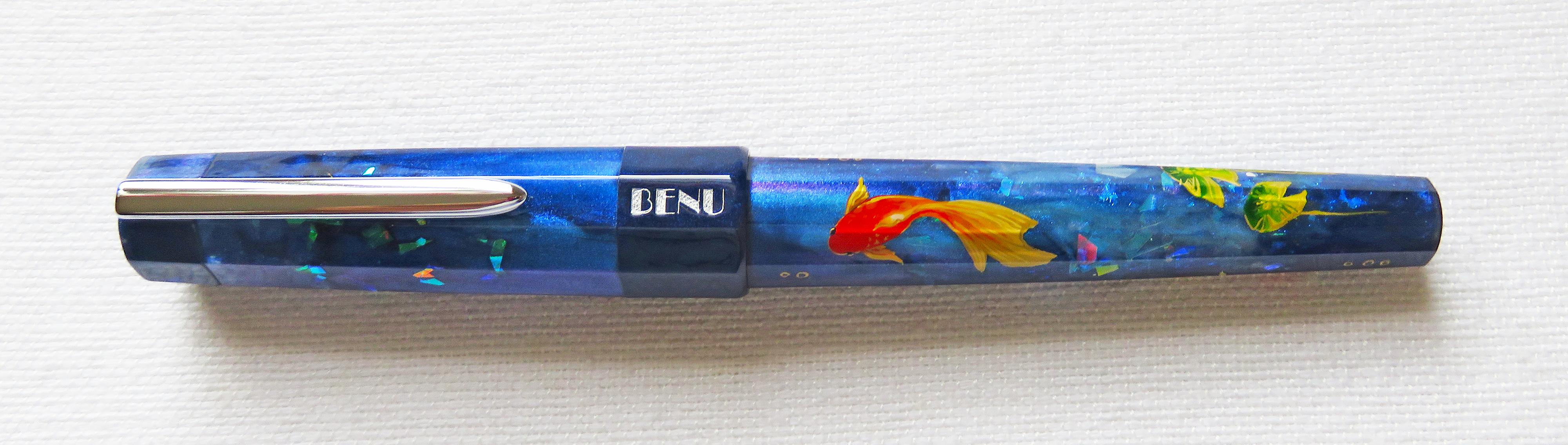
| BENU Euphoria Forest Pond fountain pen, an online store exclusive. |
 |
| The Forest Pond fountain pen features hand-painted goldfish and white water lilies. |
 |
| BENU Euphoria fountain pens can be filled with ink using cartridges or converters. |
 |
| Euphoria fountain pens have the standard BENU stainless steel clip which adds gloss and shine to the pen. Note that the BENU logo in the hand-painted Euphoria pens is painted white. Logos in regular Euphoria pens are not painted. |
 |
| These are the hand-painted goldfish and white water lilies in the Forest Pond's barrel. The depth and color in these hand-painted details are amazing! |
 |
| BENU Euphoria fountain pens' long sections help a lot in writing comfortably. |
 |
| BENU has continuously used Schmidt nibs on their pens. I love that they are consistently smooth, wet, and trouble-free. They write so well out the box! For a while now, I have shifted to using Medium and Fine nibs from Broad and stubs. BENU's Fine nibs are smooth writers! |
 |
| Some of my BENU fountain pens. From top: Tattoo, Tessera, Euphoria, and Talisman. |
 |
| I'm a proud owner of three BENU Euphoria fountain pens. From top: Forest Pond, Scent of Irises (now sold out), and the 2021 Limited Edition Halloween Orange. |
 |
| From the top: TWSBI ECO-T Blue, Leonardo Momento Zero Positano Blue, BENU Euphoria Forest Pond, On A Whim Woodworks Peacock Springs, and Lamy Safari Blue. |
 |
| Uncapped, Euphoria is still the longest pen in this group. Note this pen's long section. |
 |
| The Fine Schmidt nib wrote smooth and wet out of the box. This pen is going to my pen case of daily writers! |
(Sarah Read is an author, editor, yarn artist, and pen/paper/ink addict. You can find more about her at her website and on Twitter. And check out her latest book, Out of Water, now available where books are sold!)
Sometimes I pick a pen based on looks (I'll admit it) and "odd" is definitely a look. The Uni Jetstream Edge looks odd. But I love Uni refills and I like Mint Green, so I had to try it. And it's a decent pen, though I think there are better houses for the exceptional Jetstream refill.
The metallic sheen on this pen deceives the eye, as the body is all plastic--only the grip section (and clip) are metal. The plastic is smooth and well made, but very light, so almost the entire weight of the pen is in the grip. This is apparently to give the pen a low center of gravity, which is intended for better control. I don't know all the science of the ergonomics behind that, but the imbalance it creates is something that takes a little getting used to. The pen also tapers so that the grip is the widest point, with a snorkel-like tube to protect the super-fine refill tip.
The body has a hexagonal shape, while the grip is round with some light etching along the length. I do find the grip a bit slick. I think the etching could have gone around the grip instead of along it, for better traction.
The clip has a wave pattern to it, and it looked like it might have a hinge, but it's a friction clip. It's fairly stiff, though the lip on it makes it easy to slide onto papers.
The top of the pen has a black plastic click mechanism to deploy the tip. It's a satisfying click, and the parts are all up in the top of the pen, so there are no flying springs or loose pieces when you change refills.
And the refill is where this pen shines. Because inside this slightly alien looking pen body is one of the best refills I've ever used, the Uni Jetstream .38 ballpoint.
This is the smoothest ballpoint ink I've ever used. It has the glide of a gel ink, but it is water-resistant, fade-resistant, and forgery-resistant, so it's perfect for taking your most important notes. Despite the absolute itty bittiness of the tip, there is no scratchiness or dragging feeling to this refill at all. It looks like you're writing with a sewing needle, but it writes like hot butter. I would use this refill every day.
But, I confess, I am not reaching for this pen every day--and when I am, it's because I need the refill, not because I want to write with the pen itself. It's not a bad pen at all, it's just odd, and that imbalance throws me off a bit. Beyond that, the $15 price feels a bit high, especially when you can get a 3-color Jetstream pen for $7.
I don't mind an odd pen (to be fair, I'm odd, myself), and I'd say that if you like the look of this pen, you're bound to be very happy with it. While I prefer other Uni pen models, my critiques of this pen are all very subjective, and you may find this one to be your personal favorite.
(JetPens provided this product at no charge to The Pen Addict for review purposes.)
Enjoy reading The Pen Addict? Then consider becoming a member to receive additional weekly content, giveaways, and discounts in The Pen Addict shop. Plus, you support me and the site directly, for which I am very grateful.
Membership starts at just $5/month, with a discounted annual option available. To find out more about membership click here and join us!